Jordan
LandonGraphic Design
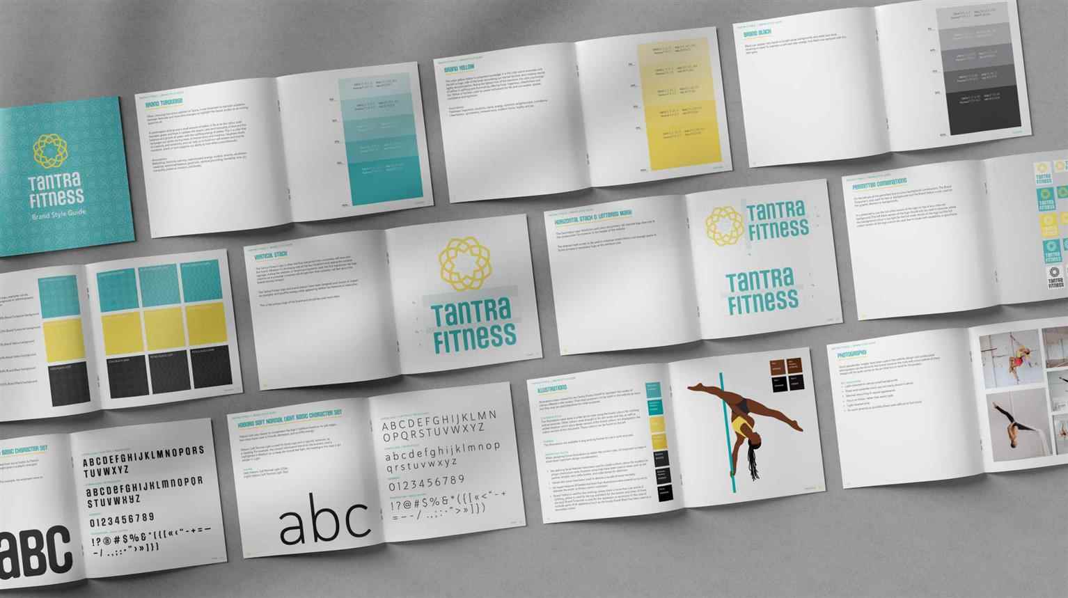
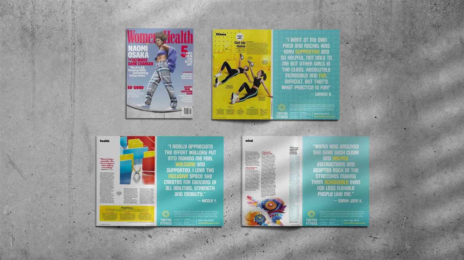
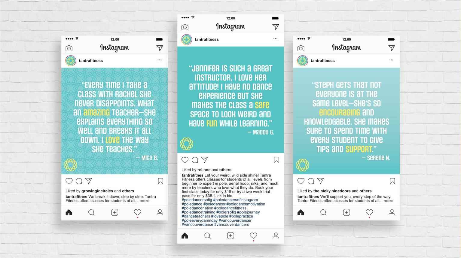
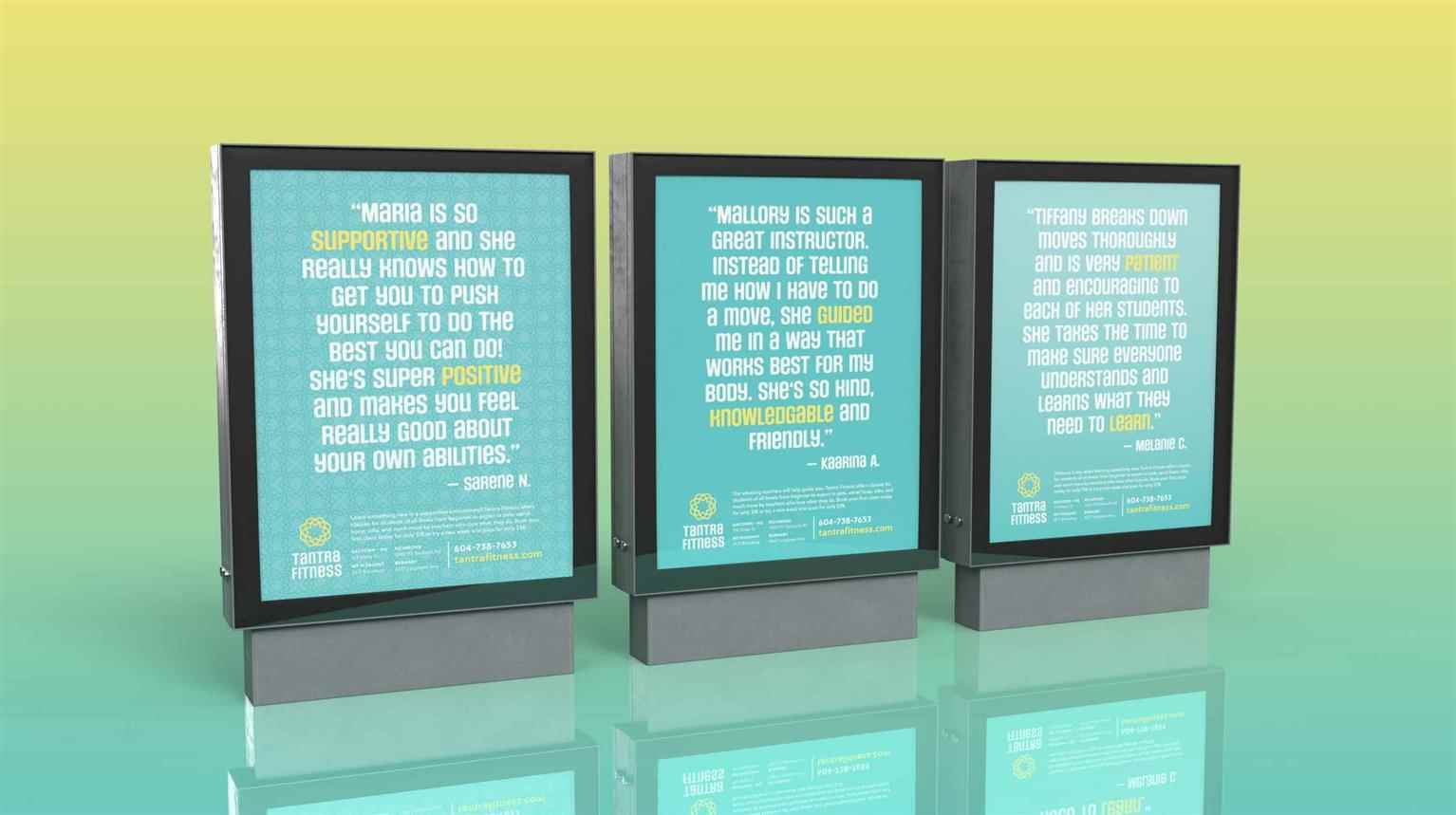
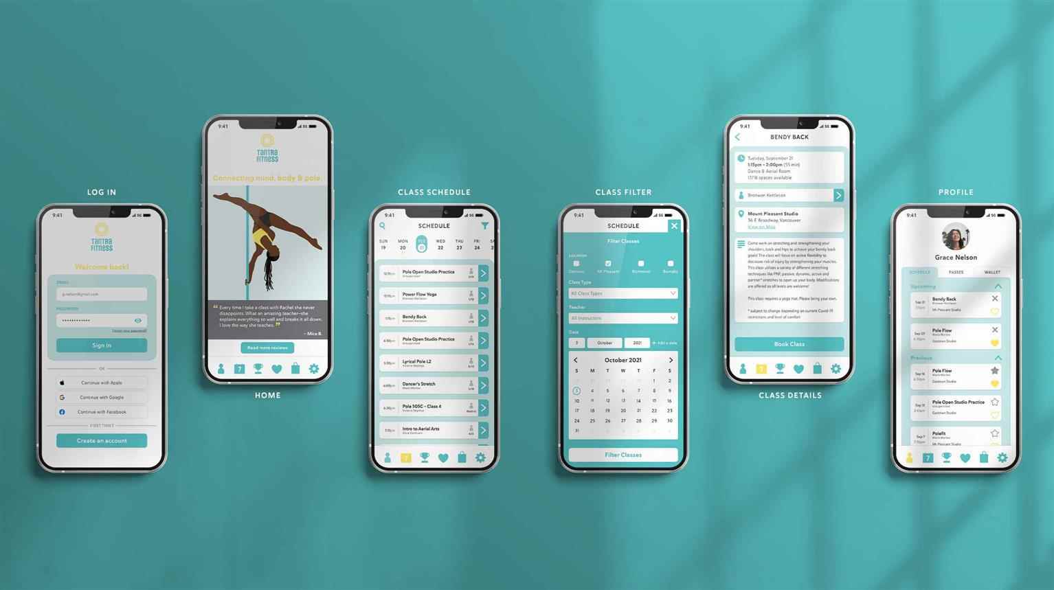
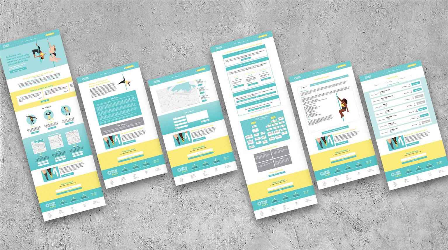
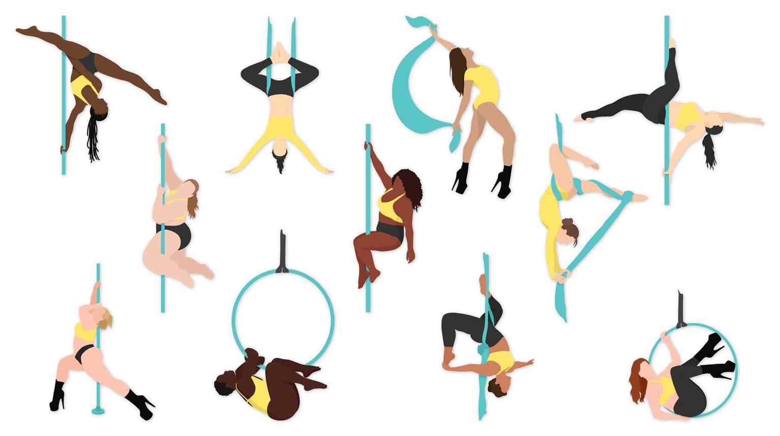
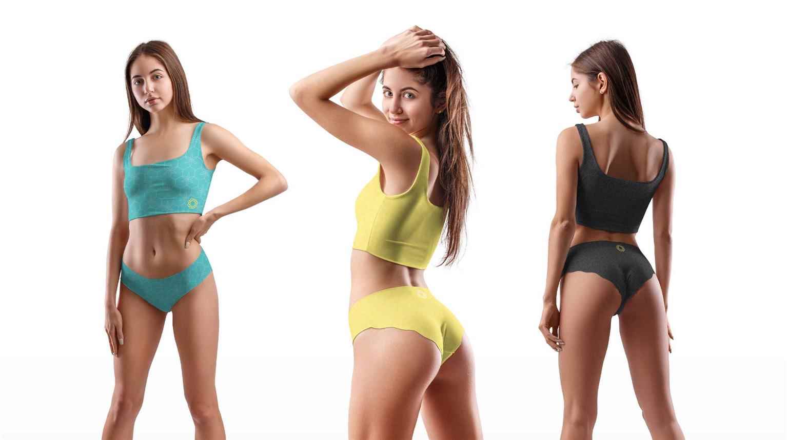
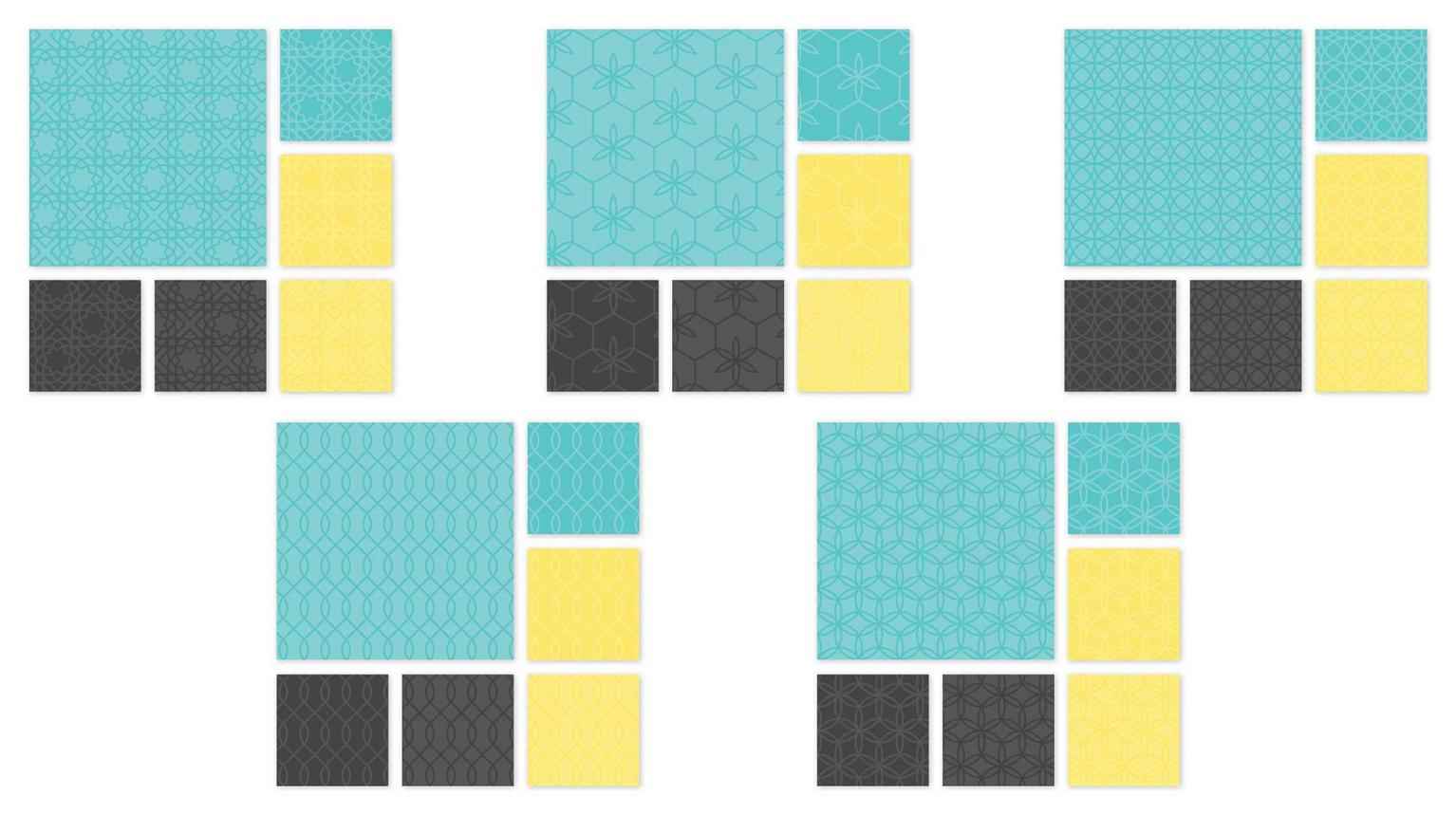
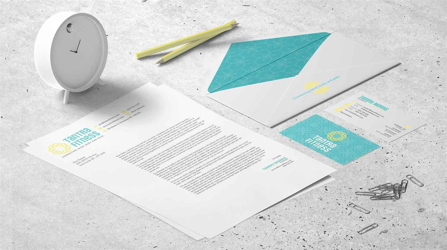
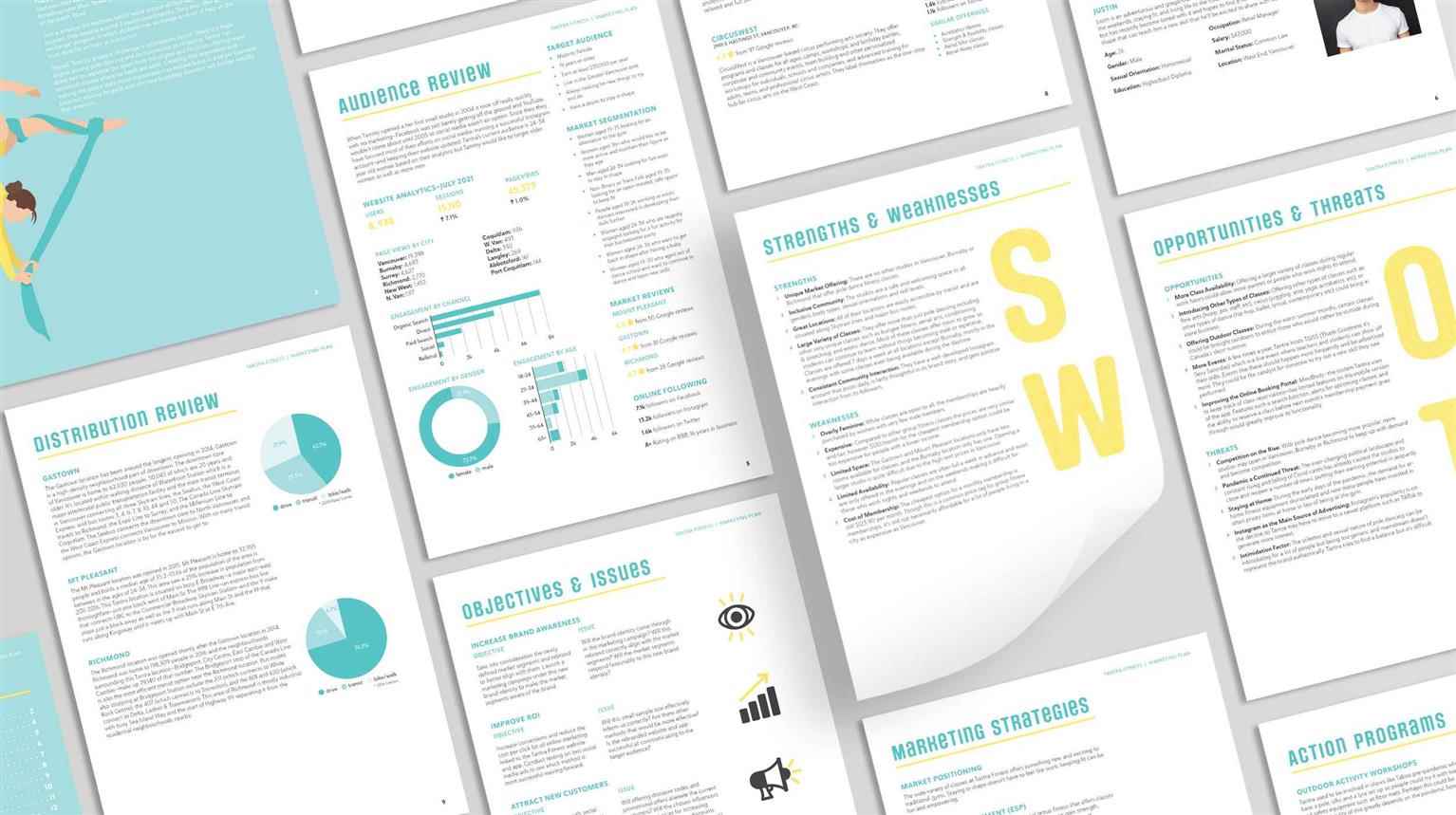
Tantra Fitness
Tantra Fitness is an alternative dance studio that provides classes in aerial arts and acrobatics, as well as exotic dance and curiosity classes like aerial yoga and bungee fitness. Tantra Fitness ha...
Tantra Fitness is an alternative dance studio that provides classes in aerial arts and acrobatics, as well as exotic dance and curiosity classes like aerial yoga and bungee fitness. Tantra Fitness ha...
Tantra Fitness is an alternative dance studio that provides classes in aerial arts and acrobatics, as well as exotic dance and curiosity classes like aerial yoga and bungee fitness. Tantra Fitness has solidified itself as an inclusive, non-judgmental space for people to express themselves through dance and experience an alternative fitness experience that helps raise confidence while building strength and flexibility. Their wide variety of types of dance, multiple locations, and availability of online classes make it easy to find something interesting that works for people’s complicated schedules and busy lives.
This rebrand focuses on empowerment, confidence building, and a style direction that is marketable to all segments. To steer away from the stigma around pole dancing and offset the sexual connotations associated with the name, the Tantra Fitness logo was taken in a spiritual direction with reference to the flower of life. This ties together beautifully with their slogan: Connecting mind, body and pole. It also reflects the brand’s desire to help nurture not just the physical health of its customers, but their mental health as well.
Share:
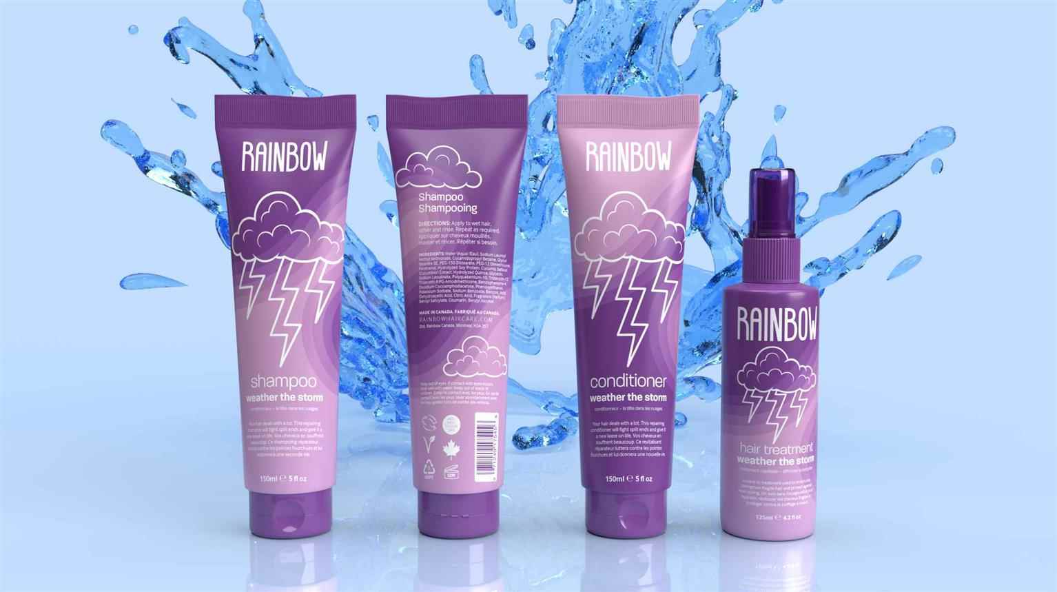
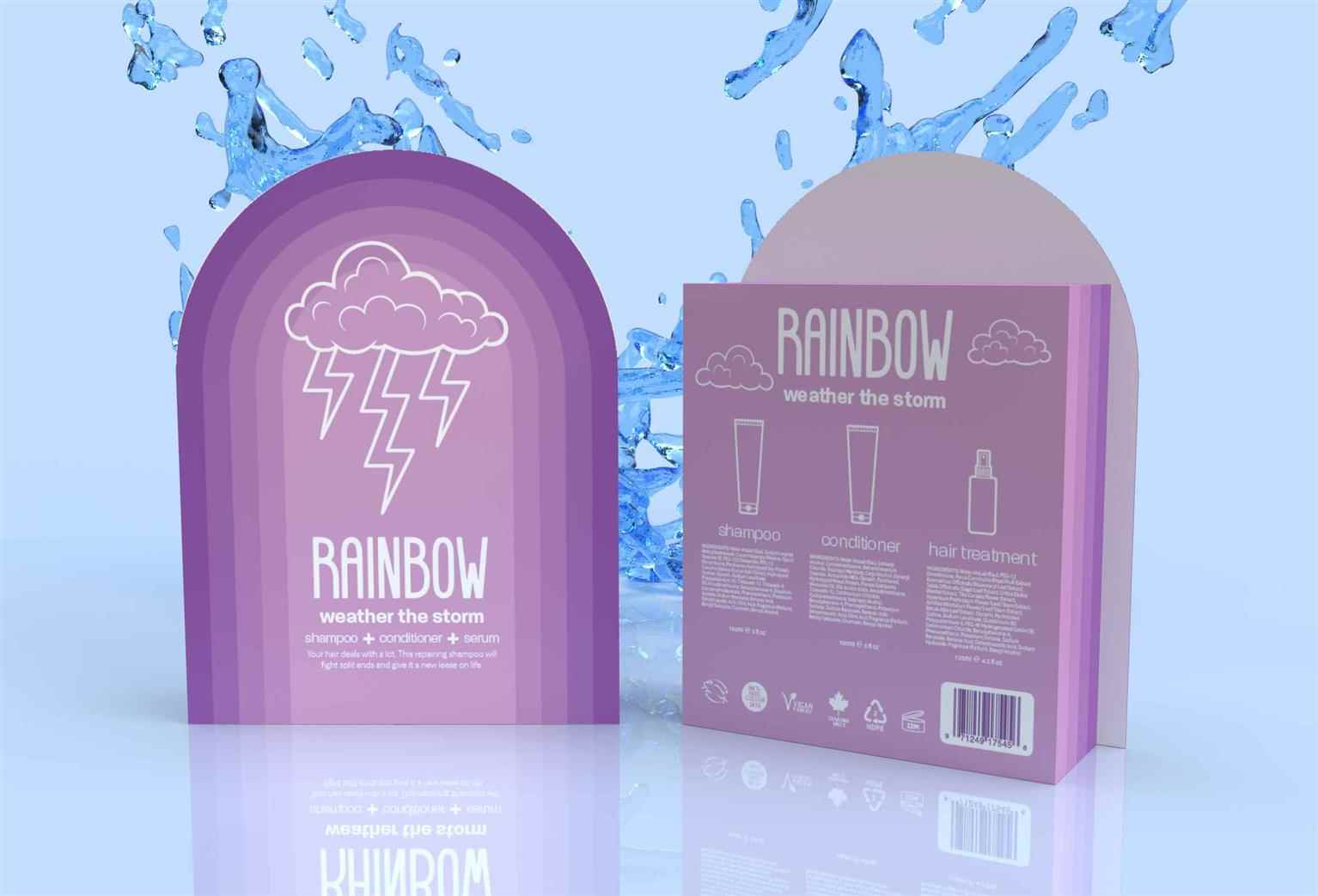
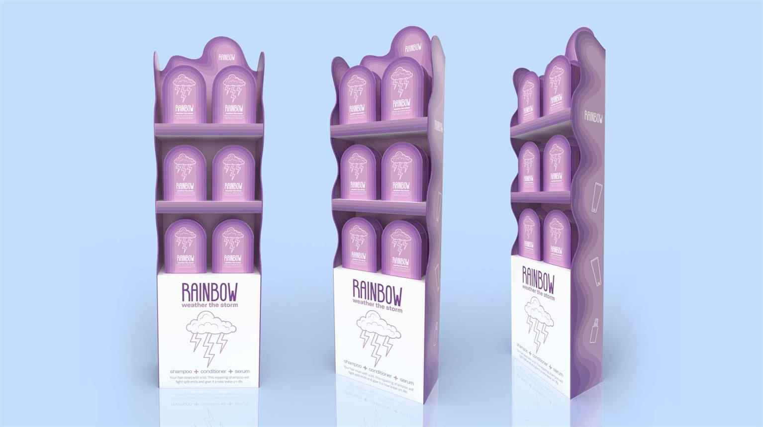
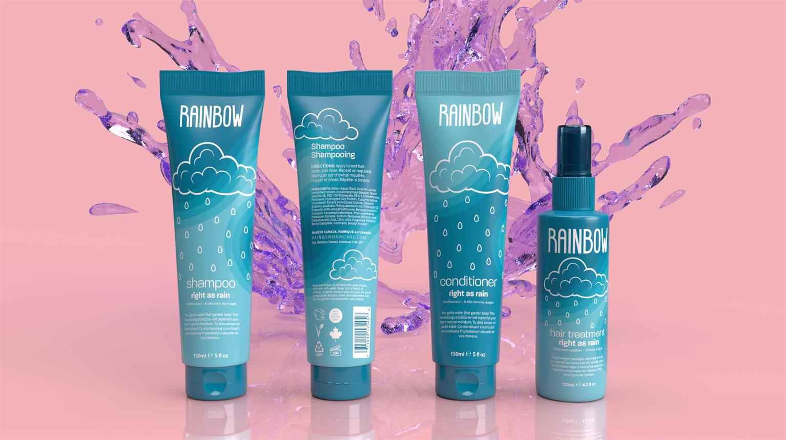
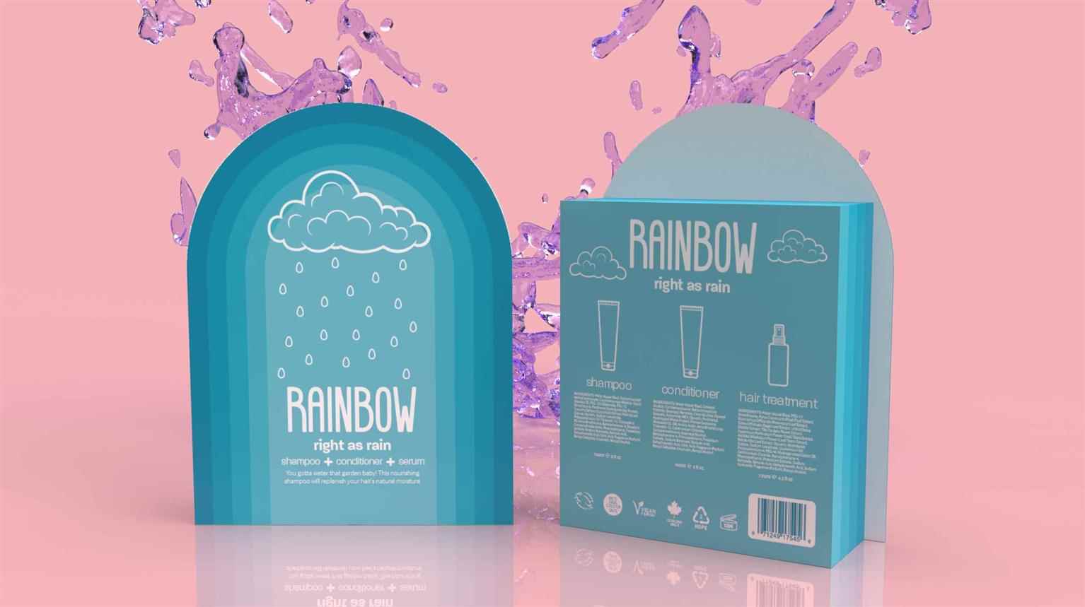
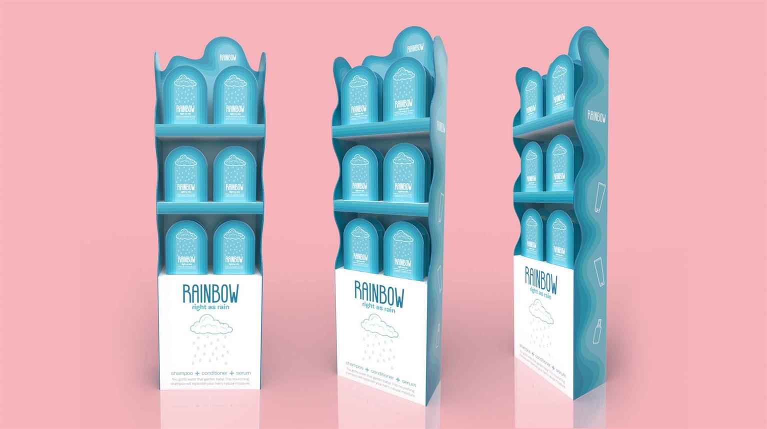
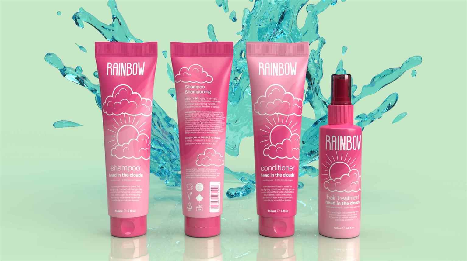
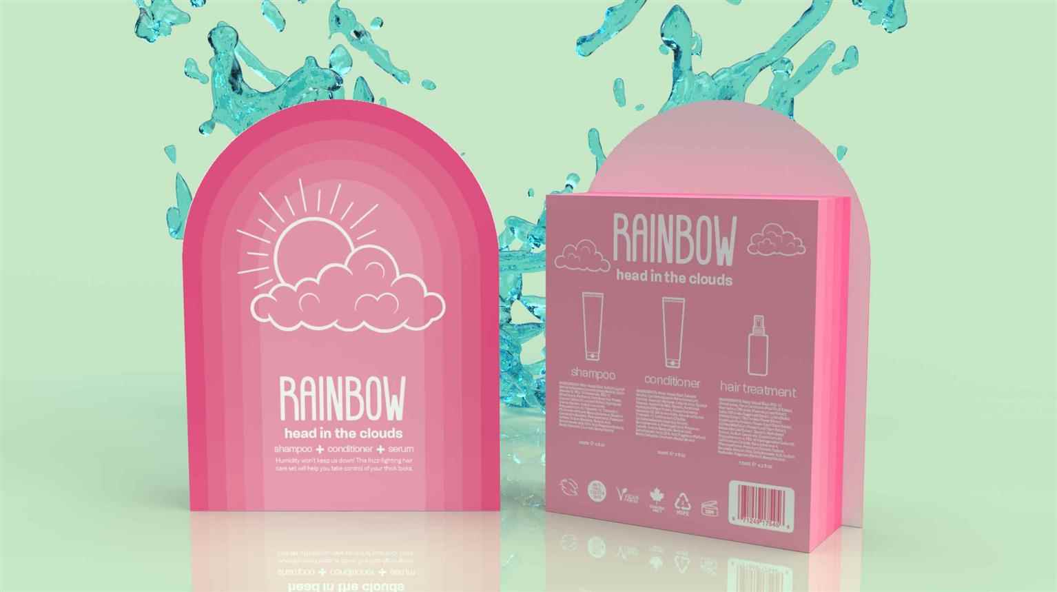
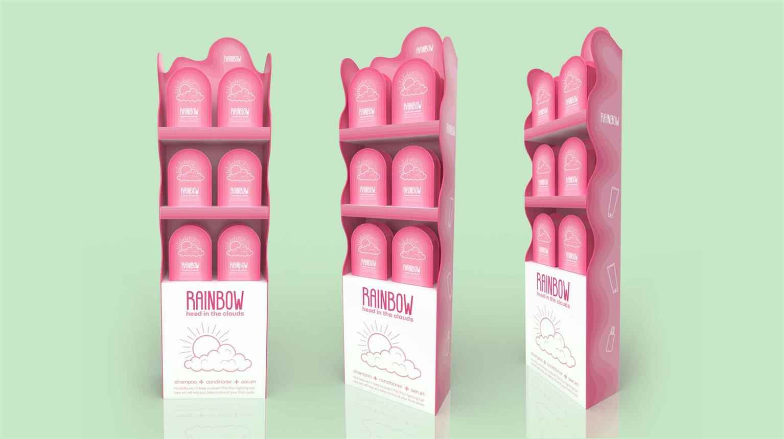
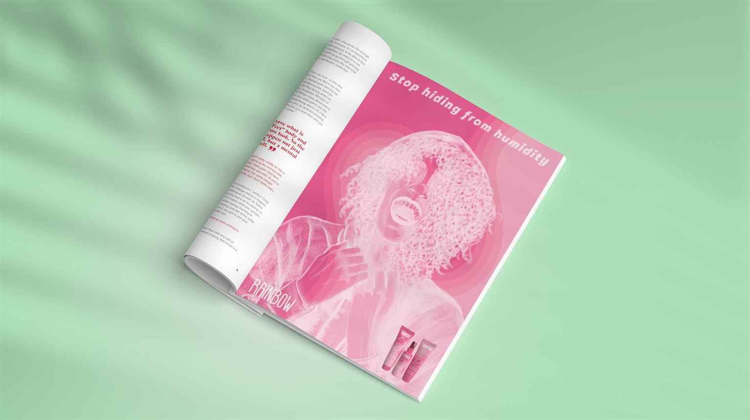
Rainbow Haircare
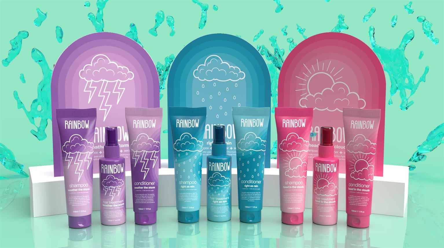
Rainbow is a haircare brand dedicated to providing products for all hair types on all budgets. Products for specialized hair types can be pricey and difficult to find—often only found online, i...
Rainbow is a haircare brand dedicated to providing products for all hair types on all budgets. Products for specialized hair types can be pricey and difficult to find—often only found online, i...
Rainbow is a haircare brand dedicated to providing products for all hair types on all budgets. Products for specialized hair types can be pricey and difficult to find—often only found online, in salons, or at beauty supply stores. Rainbow aims to provide products that can be found in any drug store at a price most people can afford. There shouldn’t be a financial barrier to having healthy hair, nor should the products meant for specialized hair types be difficult to find. The initial line of products Rainbow offers tackles the most common issues first with plans to expand to more specialized products in the future while maintaining quality, affordable price, and accessibility. All of Rainbow’s products are cruelty-free, vegan, and produced in Montreal.
Share:
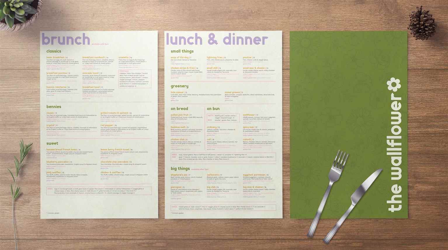
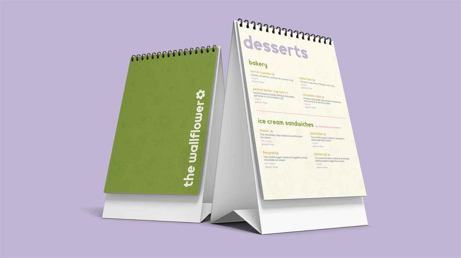
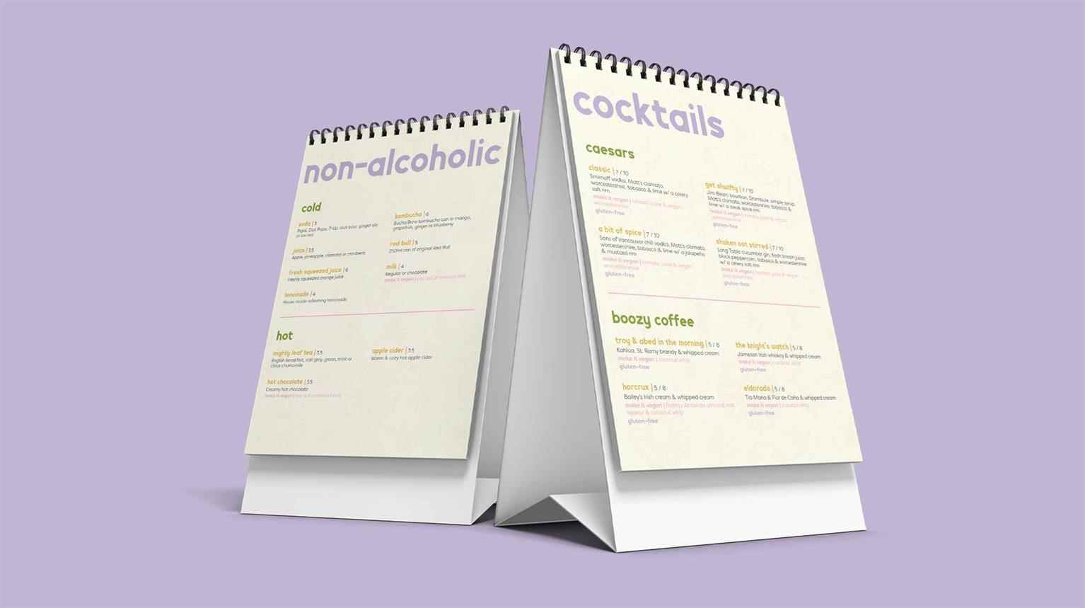
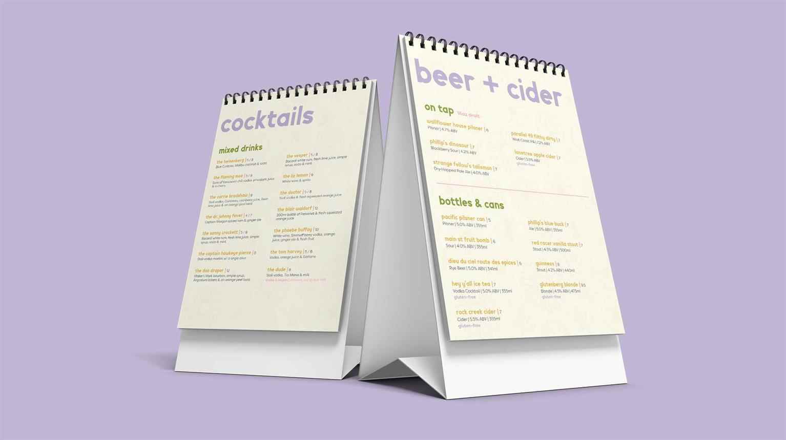
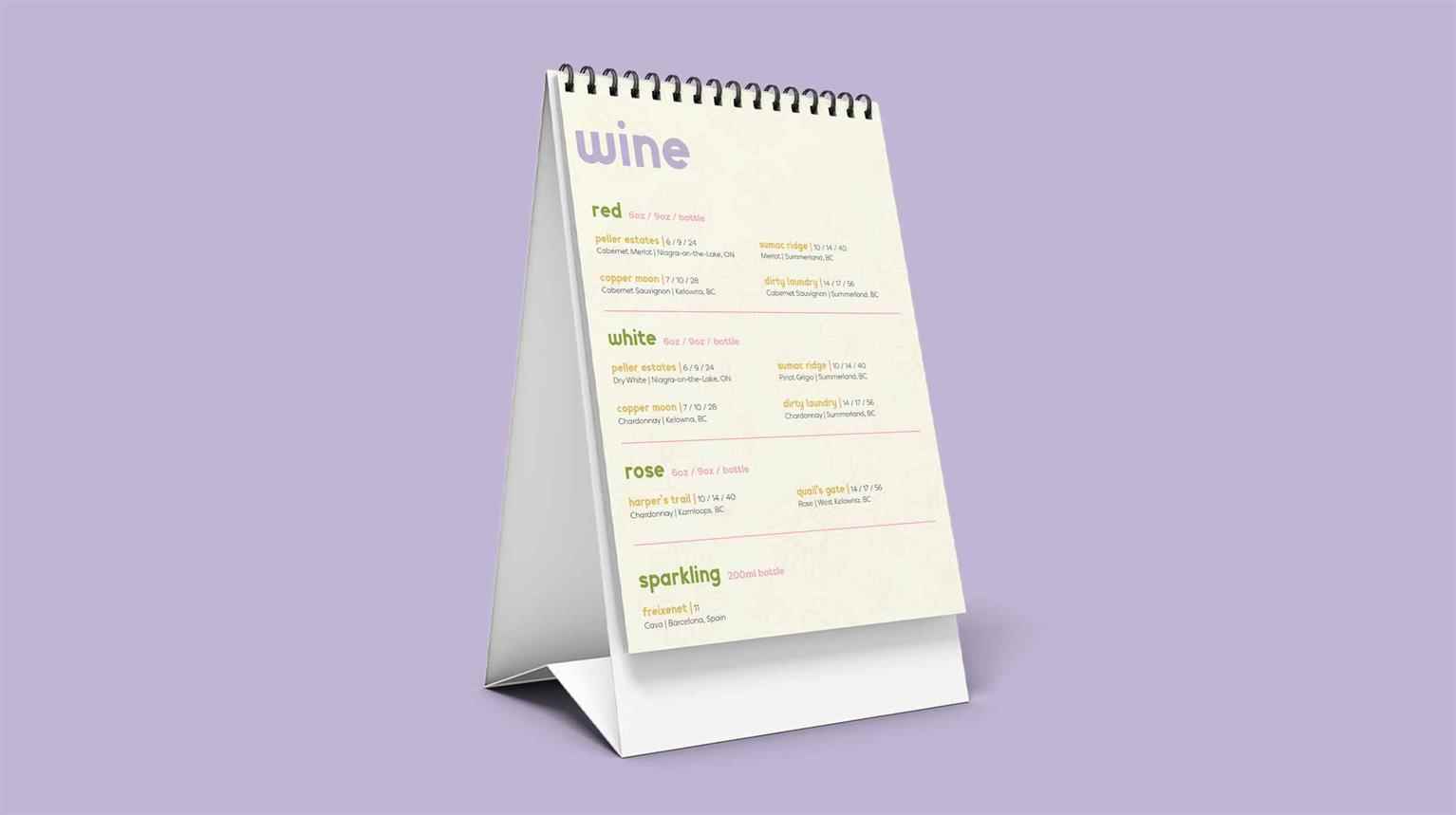
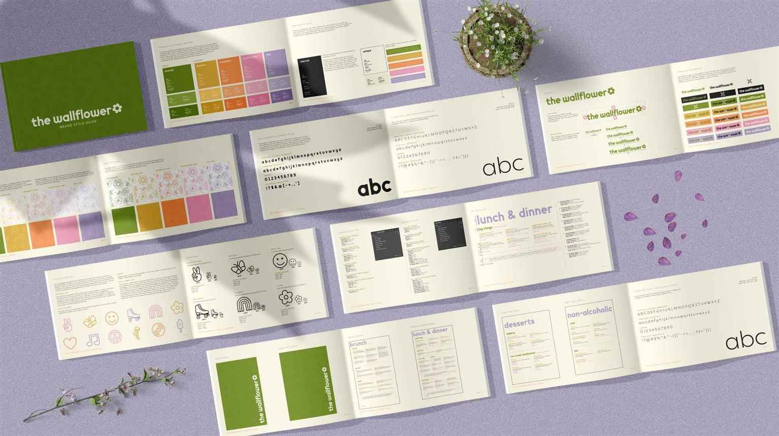
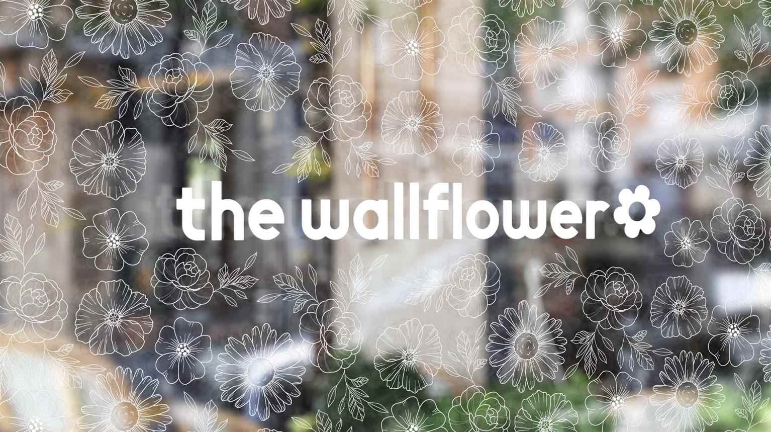
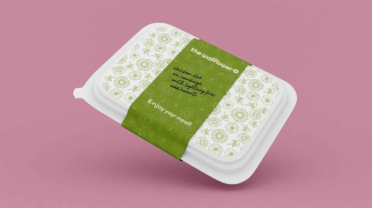
The Wallflower
The Wallflower opened its doors in 2009 at 2420 Main St. The diner prides itself as a place where people with all diets and dietary restrictions can dine together in comfort. The menu is made up of p...
The Wallflower opened its doors in 2009 at 2420 Main St. The diner prides itself as a place where people with all diets and dietary restrictions can dine together in comfort. The menu is made up of p...
The Wallflower opened its doors in 2009 at 2420 Main St. The diner prides itself as a place where people with all diets and dietary restrictions can dine together in comfort. The menu is made up of plenty of comfort food and offers twists on all of them to allow easing swapping of ingredients to make almost anything vegetarian, vegan, or gluten-free. The surrounding community is populated by one of the youngest demographics in Vancouver with limited budgets and a strong desire to support small businesses. This demographic is considered in the rebrand which aims to maintain its approachability while upgrading the overall customer experience. The look and feel of the brand has been completely overhauled to represent the '60s and '70s flower child aesthetic, a nostalgic reminder with a modern twist chosen for its alignment with The Wallflower’s values and main focus—vegan and vegetarian food which echoes the era of free love and anti-war sentiment.
Share:
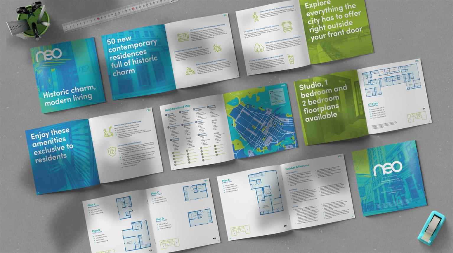
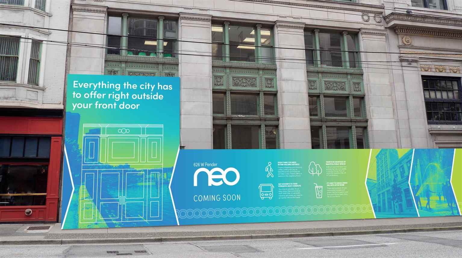
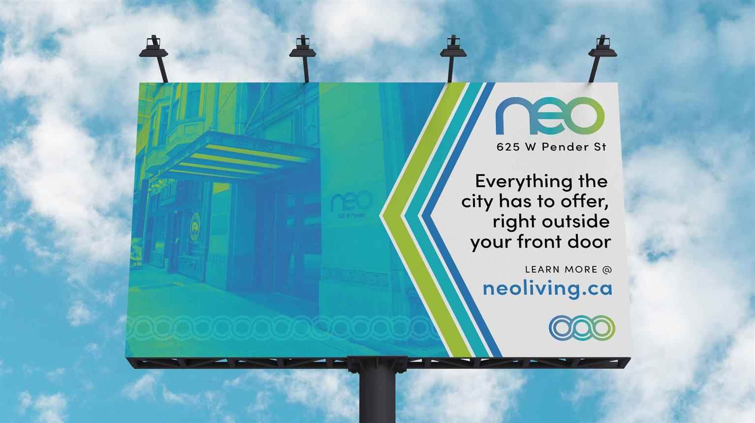
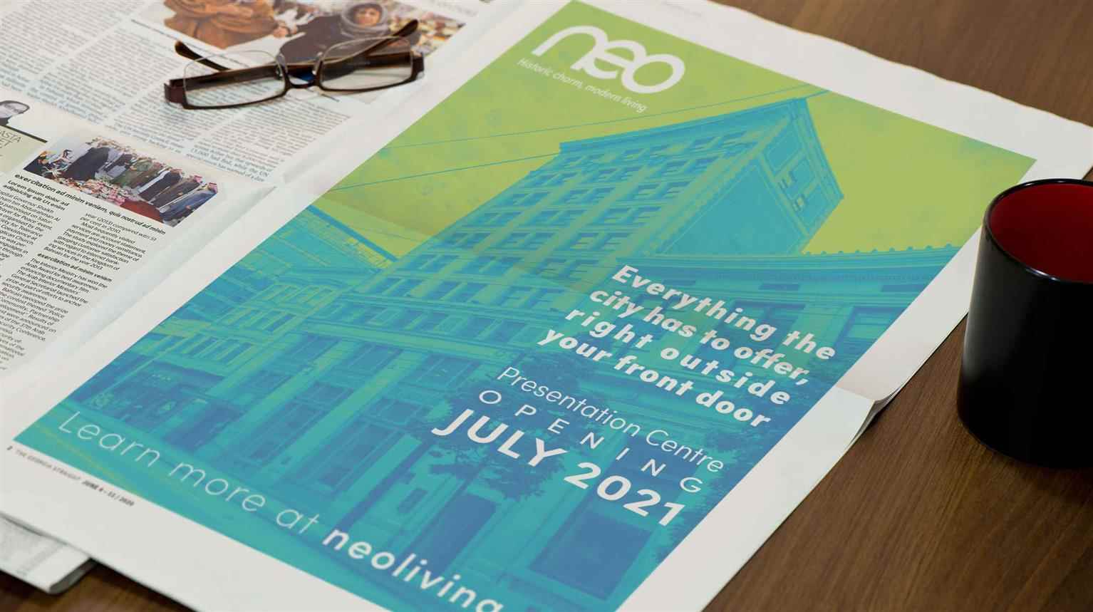
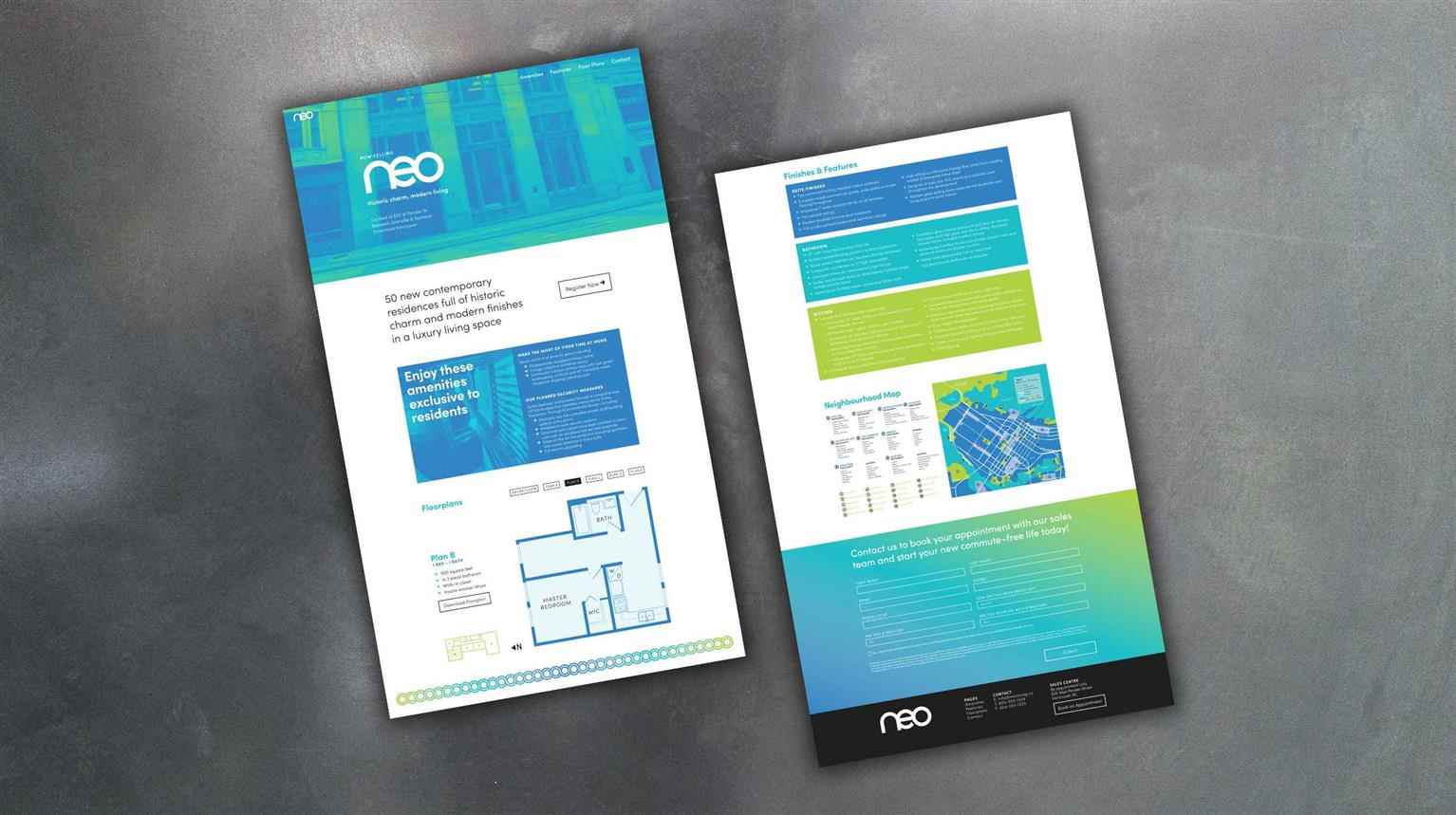
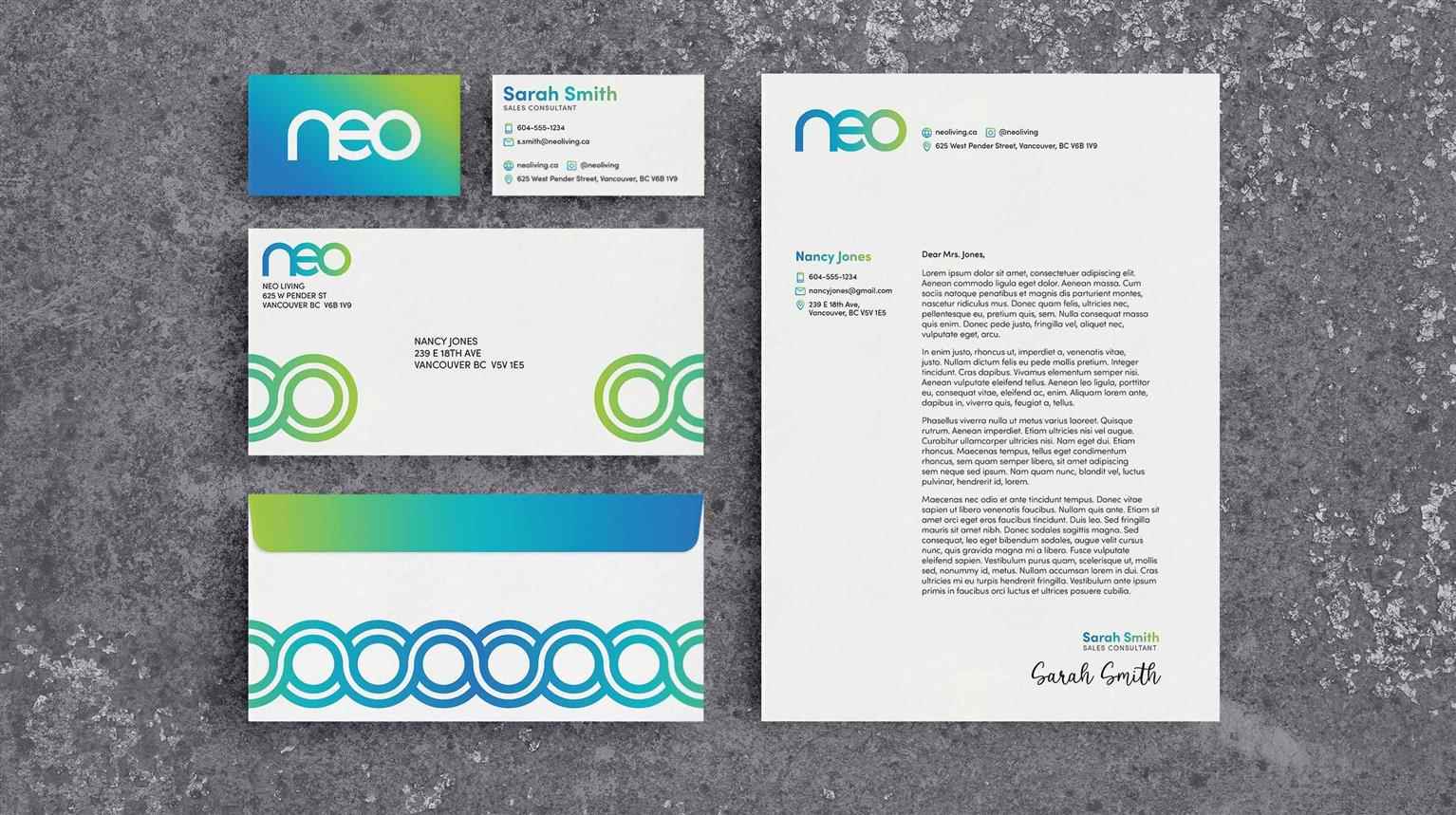
Neo
Originally constructed in 1912, this 11 storey heritage office tower underwent a complete restoration to provide much-needed space in Vancouver’s hot real estate market. As the pandemic has raged on,...
Originally constructed in 1912, this 11 storey heritage office tower underwent a complete restoration to provide much-needed space in Vancouver’s hot real estate market. As the pandemic has raged on,...
Originally constructed in 1912, this 11 storey heritage office tower underwent a complete restoration to provide much-needed space in Vancouver’s hot real estate market. As the pandemic has raged on, the need for office space downtown has decreased dramatically with more and more employers opting to have their employees work from home. Neo—previously The London Building—is a carefully detailed example of Edwardian Commercial Neoclassicism. Located on Pender Street between Granville and Seymour, Neo is within walking distance of some of Vancouver’s best restaurants and shopping districts, plenty of options for public transit, bike lanes that weave throughout the city, and beautiful public spaces.

Share:
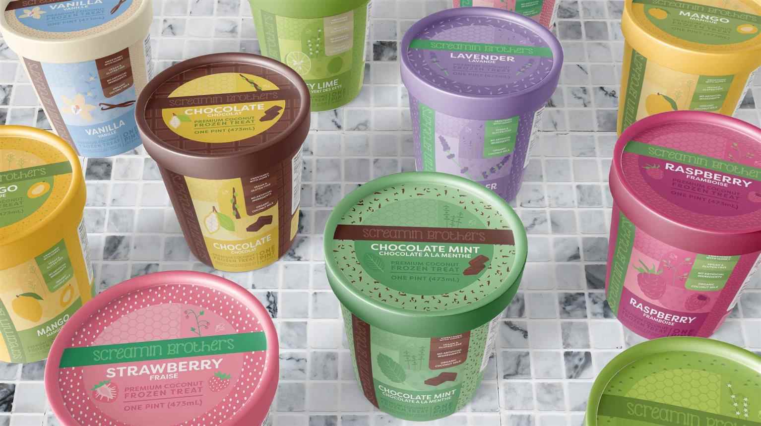
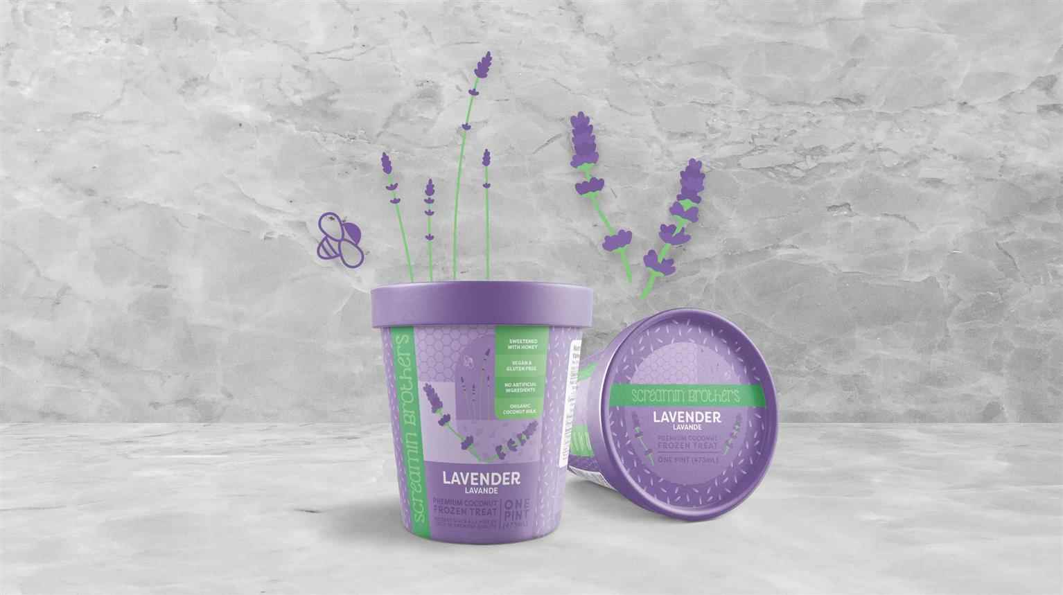
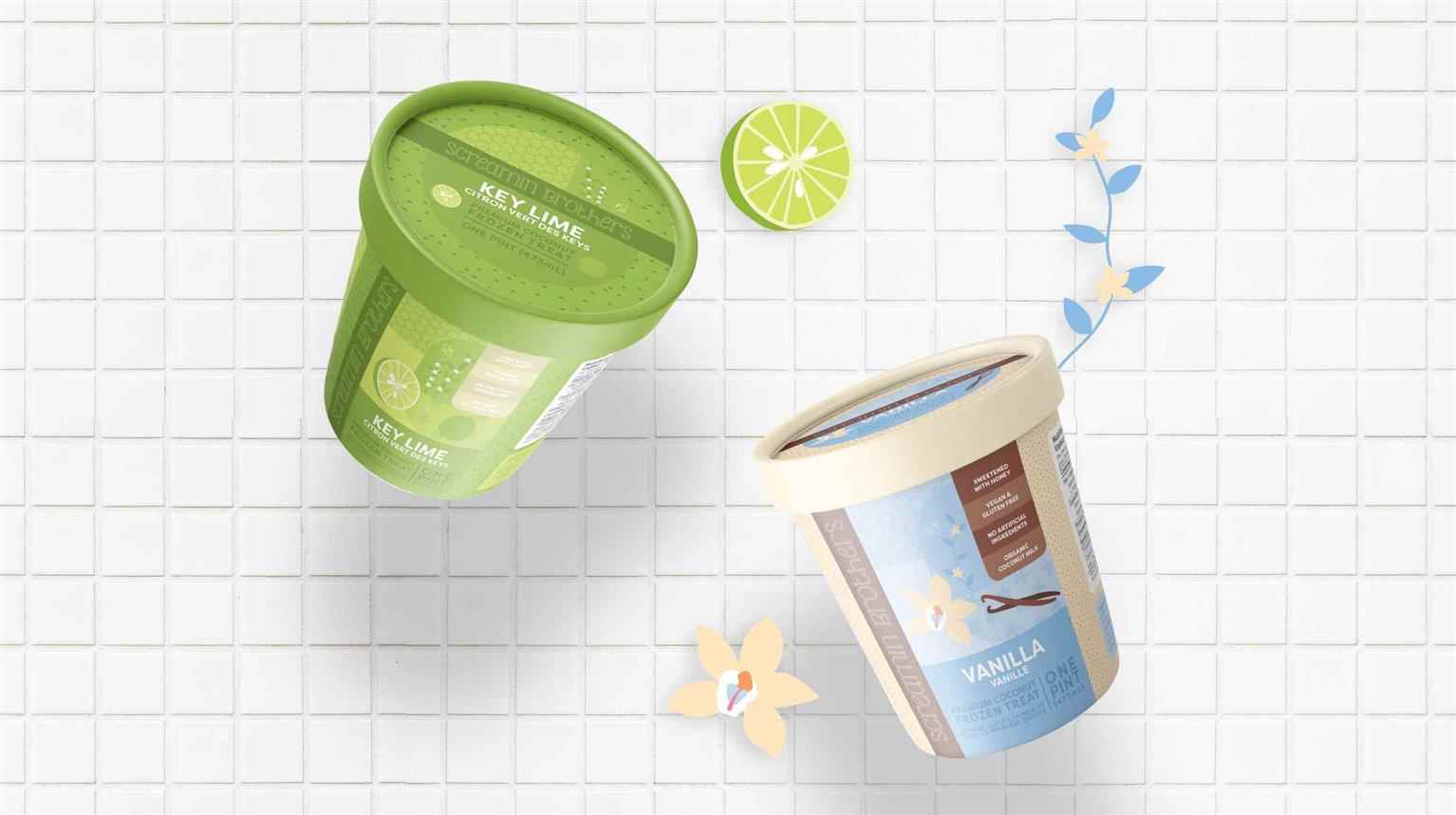
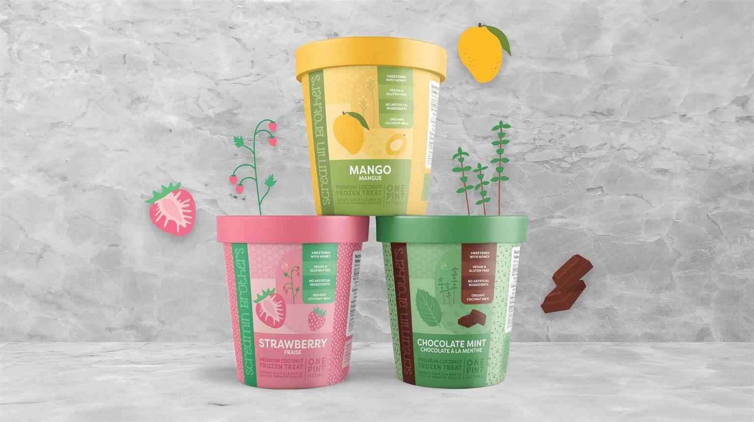
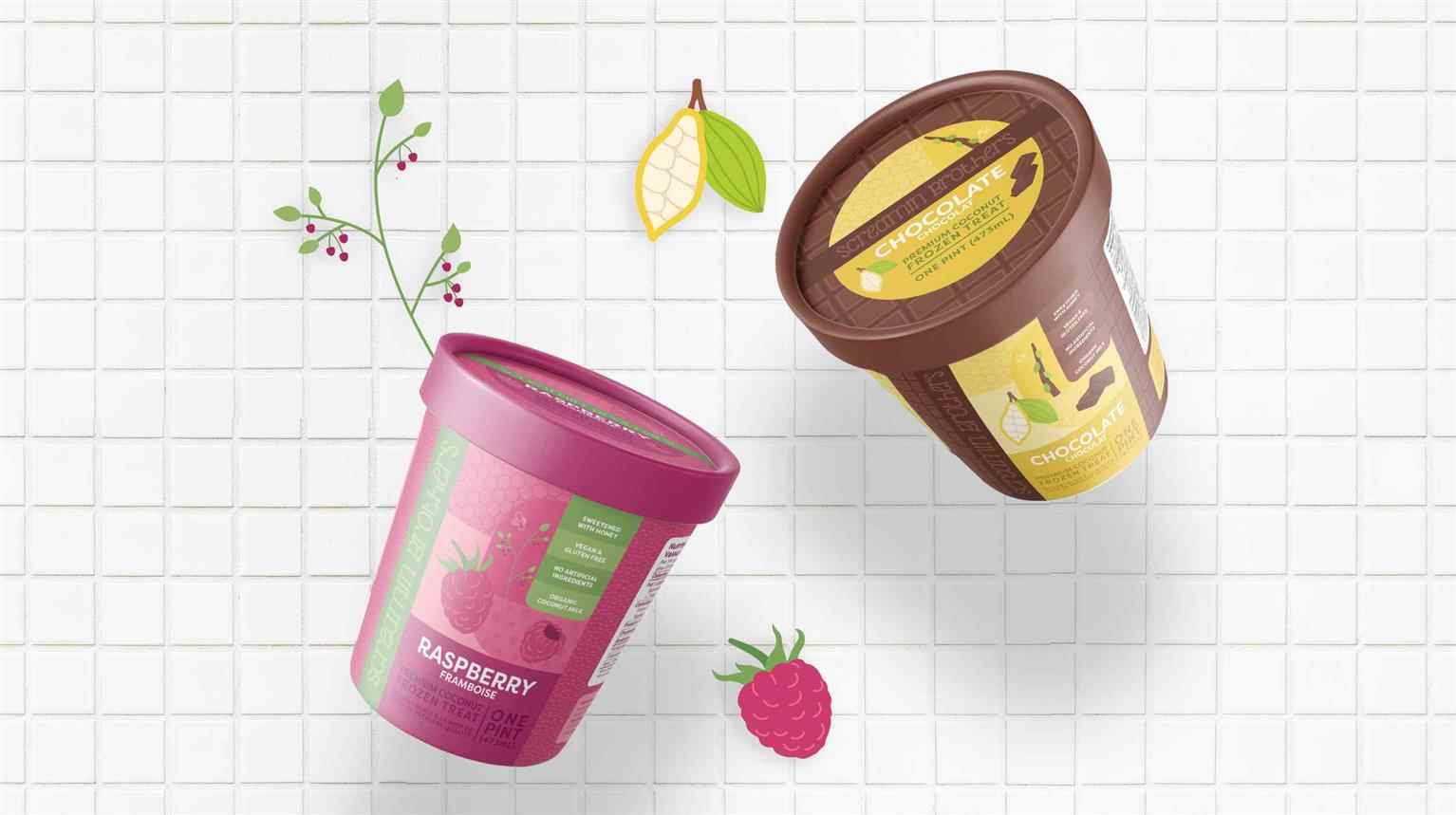
Screamin Brothers
Screamin Brothers is a line of premium frozen treats acquired by Foothills Creamery in 2019. They currently carry six flavours of dairy-free ice cream and are looking to expand their line and refresh...
Screamin Brothers is a line of premium frozen treats acquired by Foothills Creamery in 2019. They currently carry six flavours of dairy-free ice cream and are looking to expand their line and refresh...
Screamin Brothers is a line of premium frozen treats acquired by Foothills Creamery in 2019. They currently carry six flavours of dairy-free ice cream and are looking to expand their line and refresh the packaging design to compete with the growing dairy-free frozen treat market. To stand out on store shelves, emphasize the best aspects of the brand, and align more closely to the proposed target market, the six current flavours of frozen treats’ product packaging and branding have received a complete refresh. The only font used in this project, Filson Soft, was chosen to soften the branding with its rounded edges and curving legs. The logo was simplified from the original and created using custom, hand-drawn typography to ensure the logo mark is unique. An additional two flavours have been added to round out the product line.
Share:
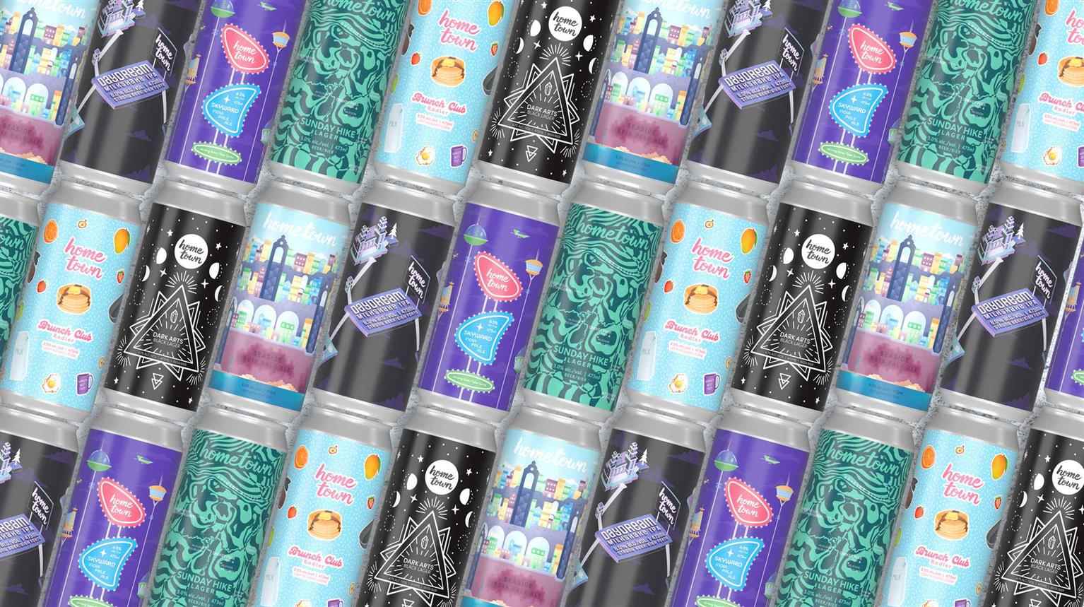
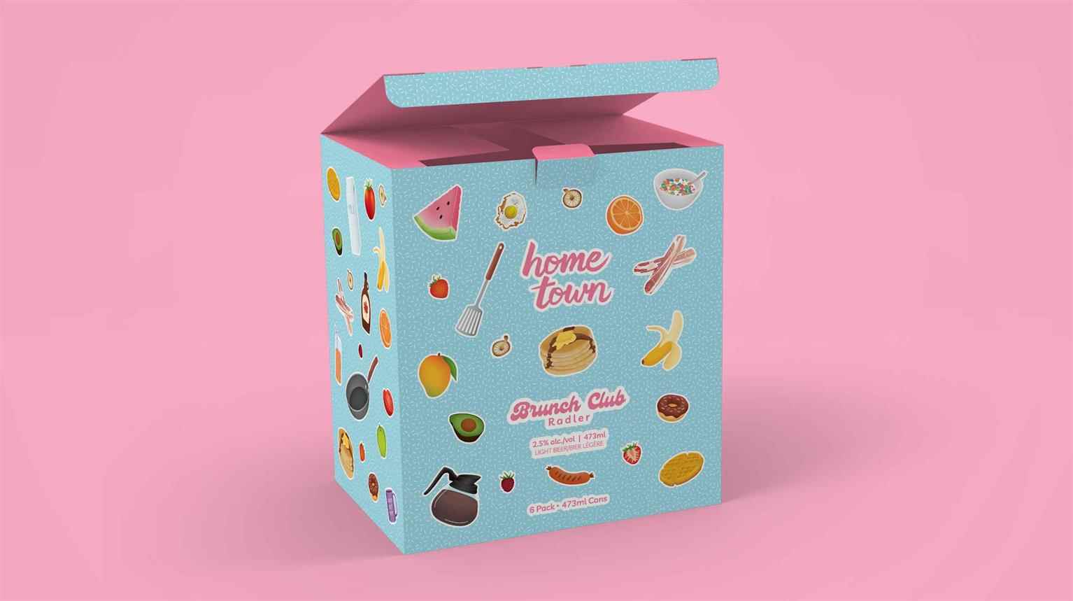
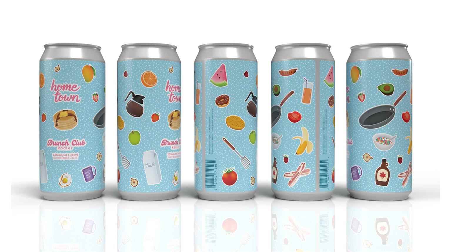
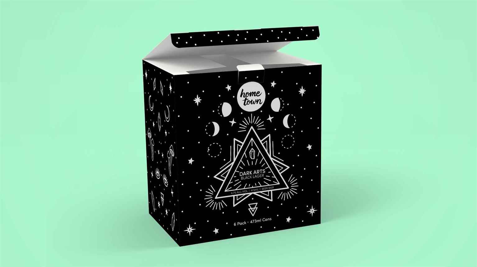
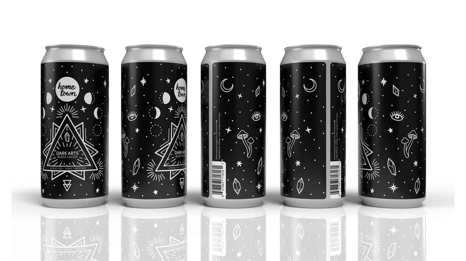
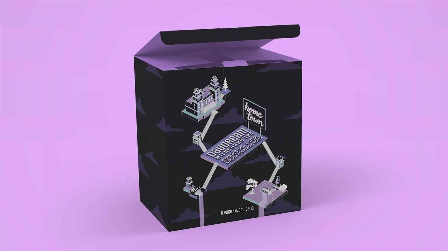
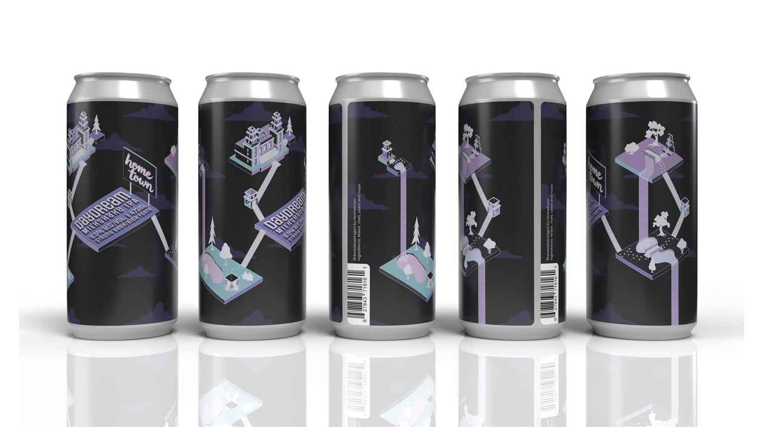
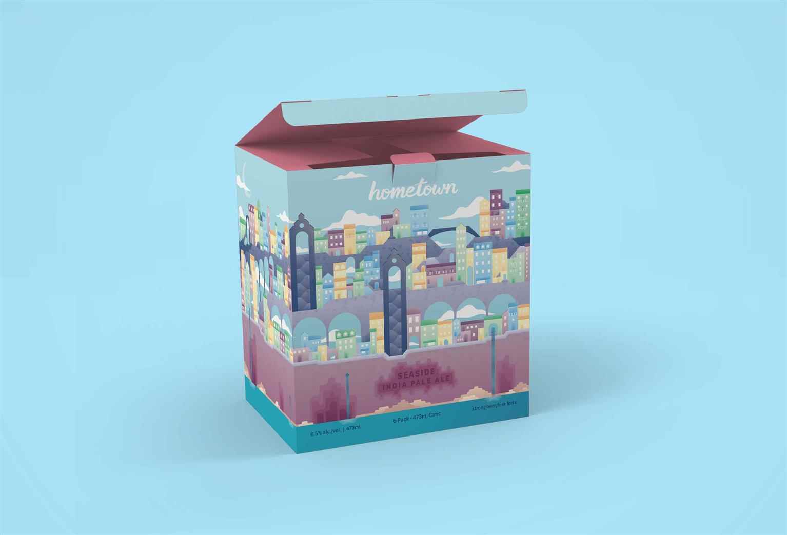
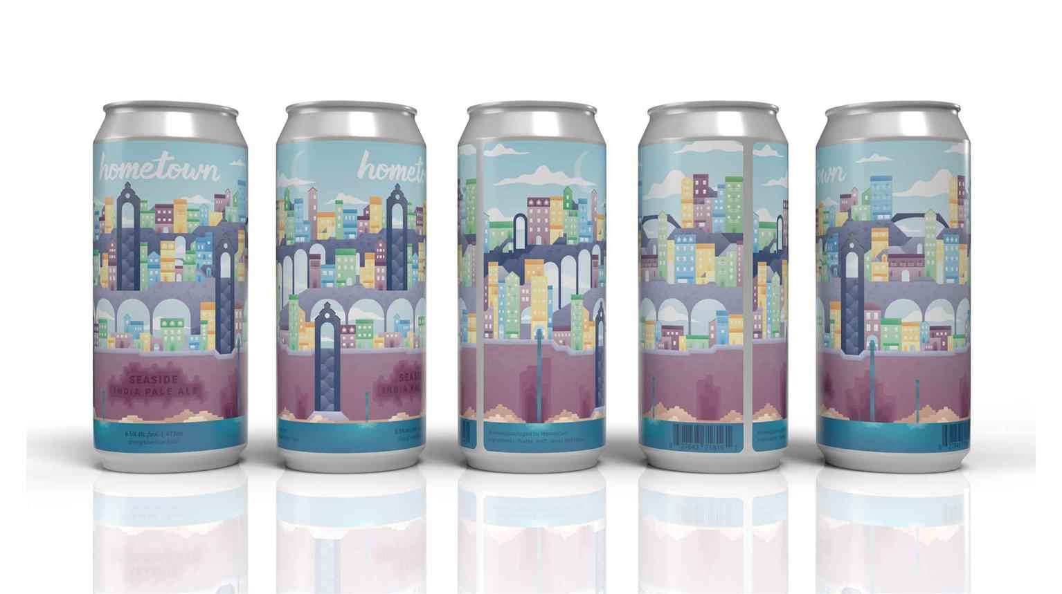
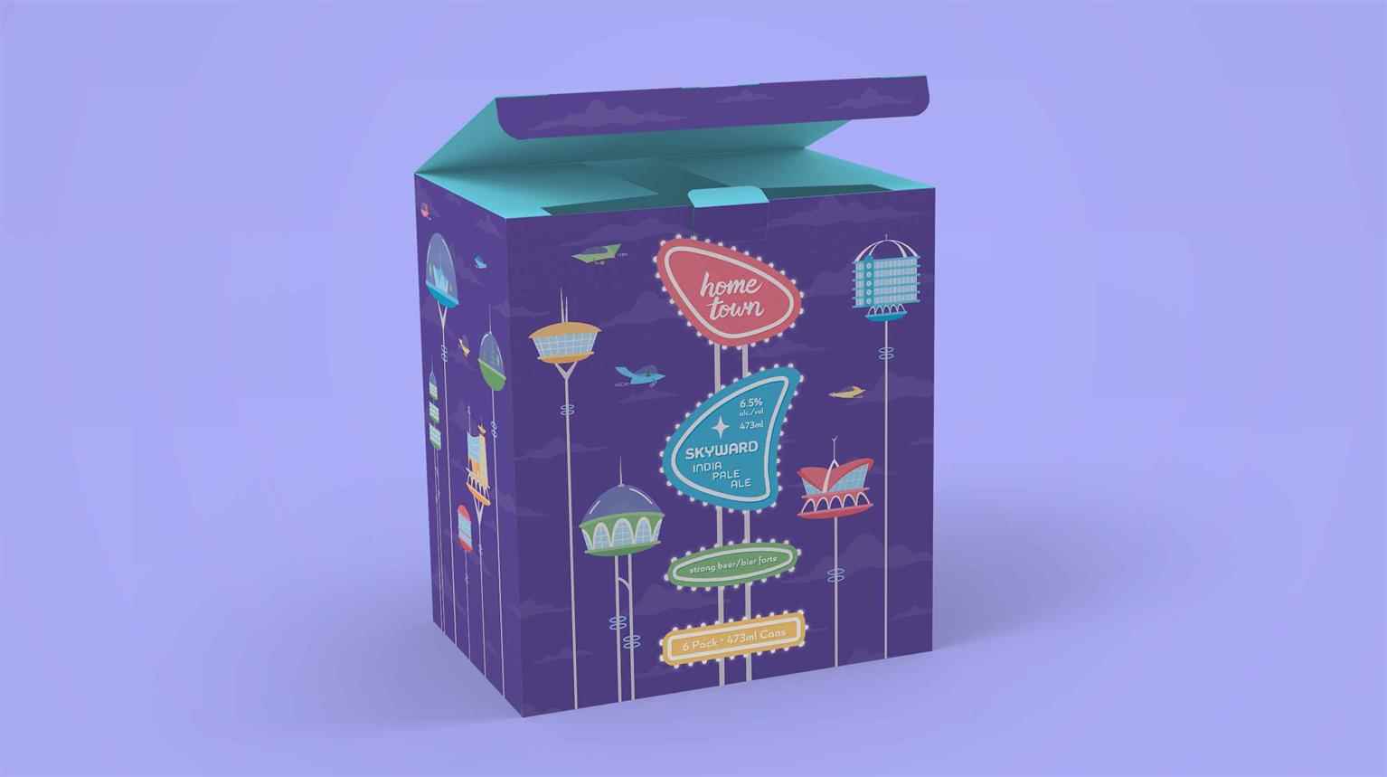
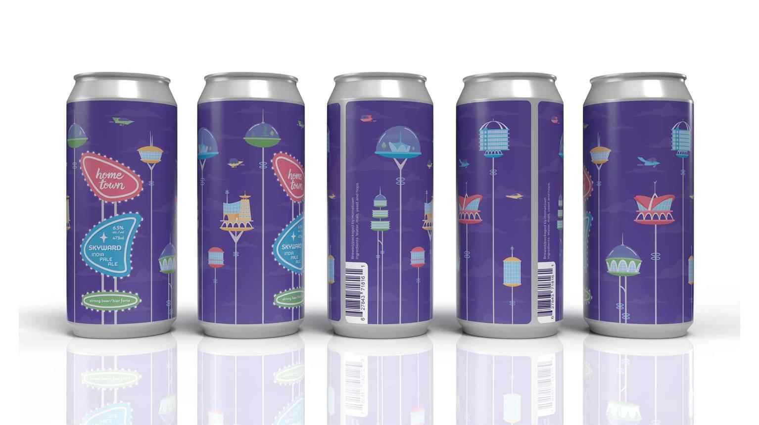
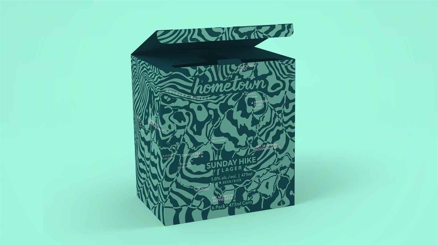
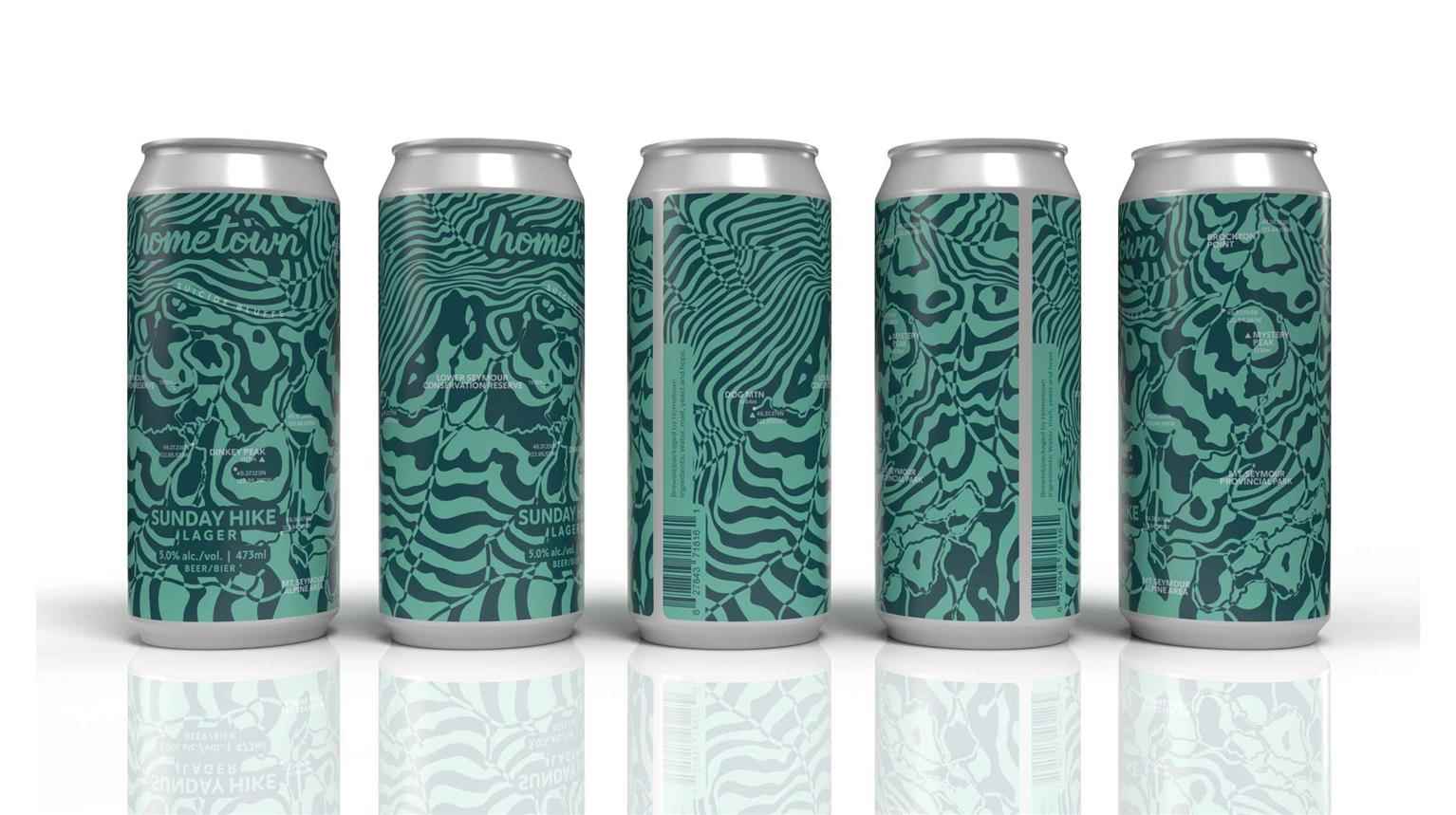
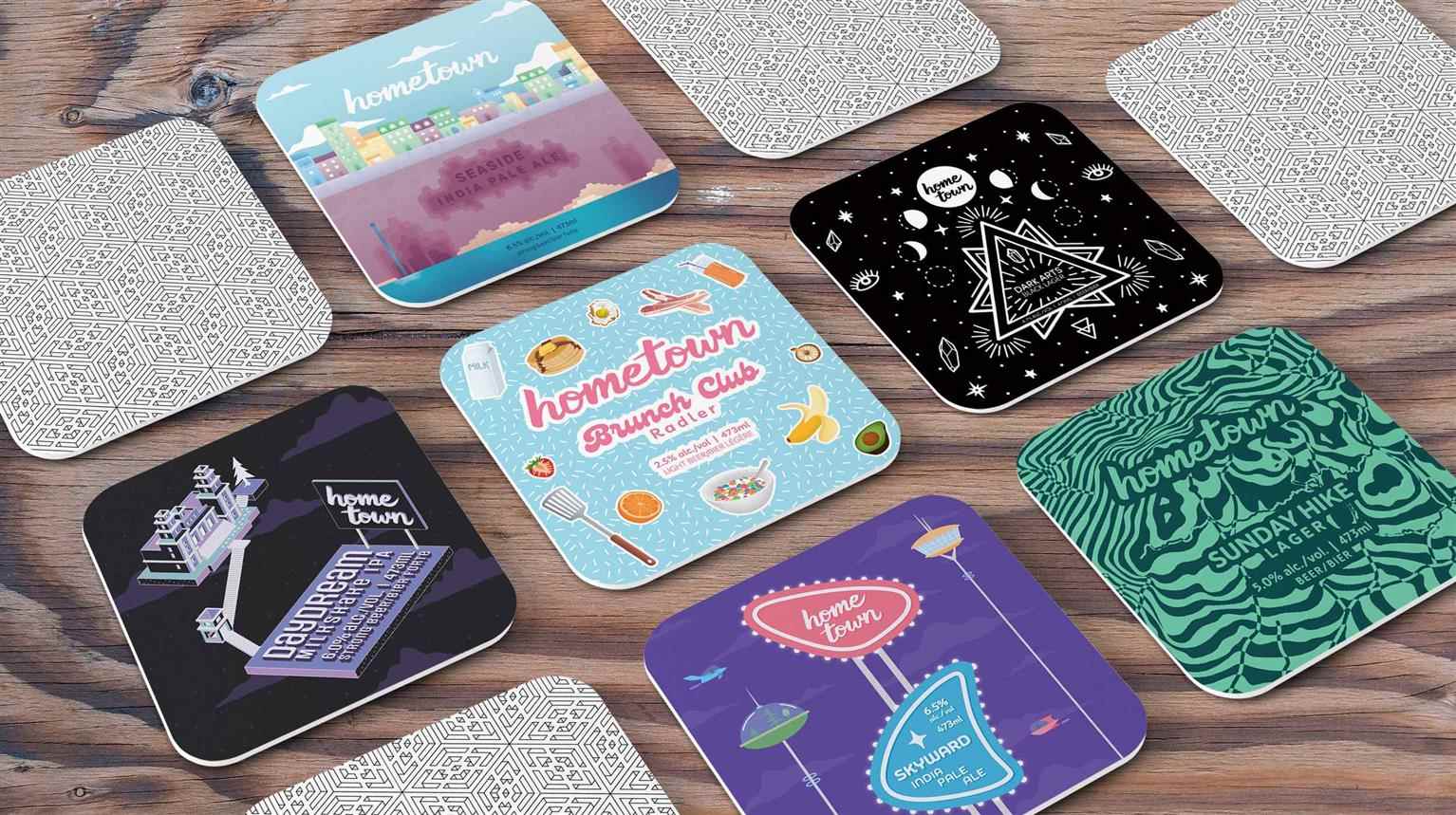
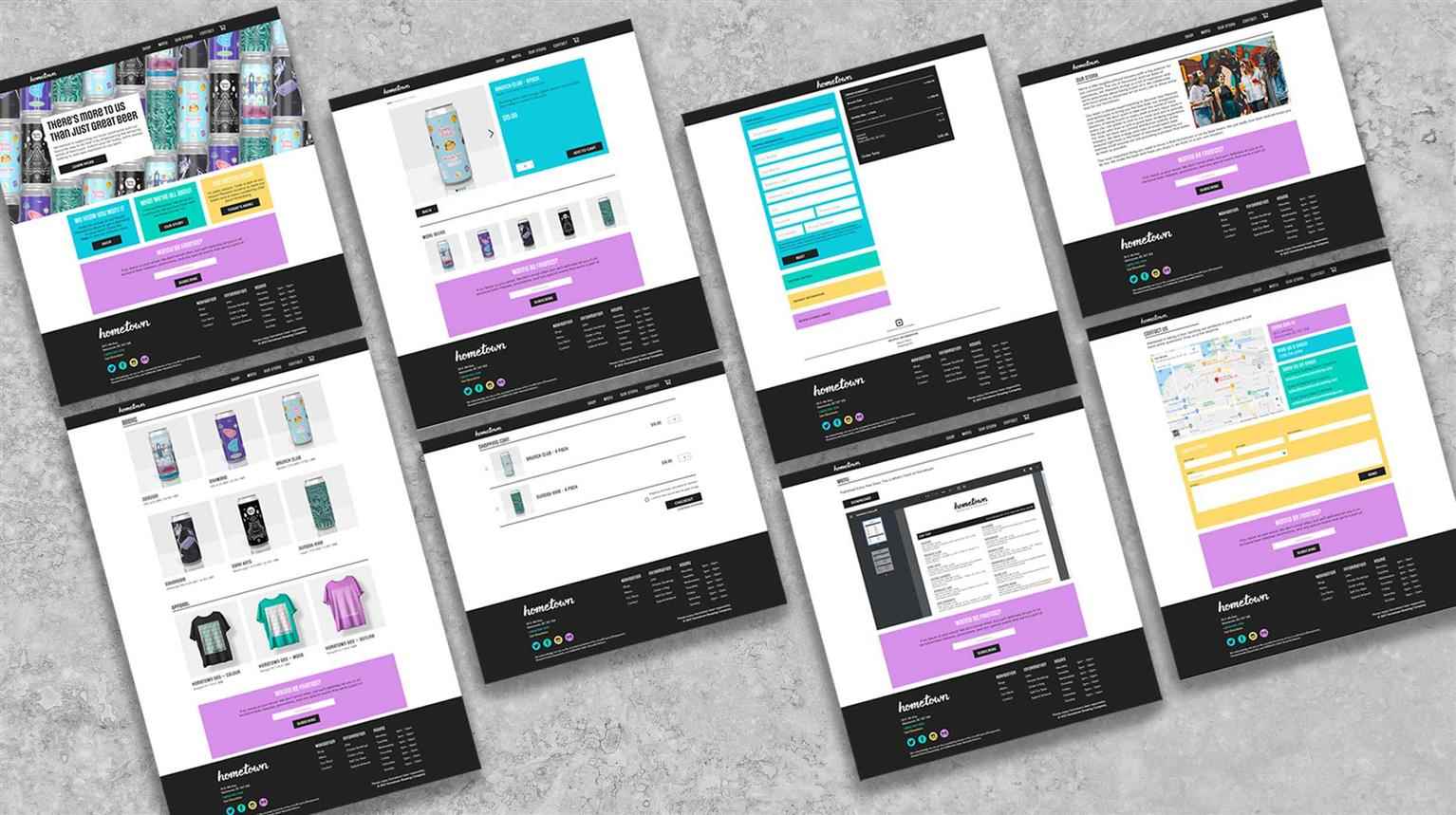
Hometown Brewing
Hometown Brewing is a Vancouver brewery that supports the local art scene with vibrant can art commissioned by local artists. The proposed Mt. Pleasant location is a vibrant neighbourhood with young,...
Hometown Brewing is a Vancouver brewery that supports the local art scene with vibrant can art commissioned by local artists. The proposed Mt. Pleasant location is a vibrant neighbourhood with young,...
Hometown Brewing is a Vancouver brewery that supports the local art scene with vibrant can art commissioned by local artists. The proposed Mt. Pleasant location is a vibrant neighbourhood with young, artistic energy known for its rejection of mainstream culture, beautiful murals covering buildings down every alley, and (pre-pandemic) bustling underground music scene. Hometown’s style is geek-chic meets street—this aesthetic choice is supported by the surrounding community and extends to all levels of branding. The artwork featured on Hometown’s cans is in the style of vector art in a variety of styles—including flat and isometric design—based on popular media, and local style and culture in playful colour palettes that speak to the youthful nature of the brand.
Share:
Would you like to get more information or apply?
Click on the button below and we'll get back to you as soon as possible.
Speak To An Advisor
