Jonah Dominic
FloresGraphic Design
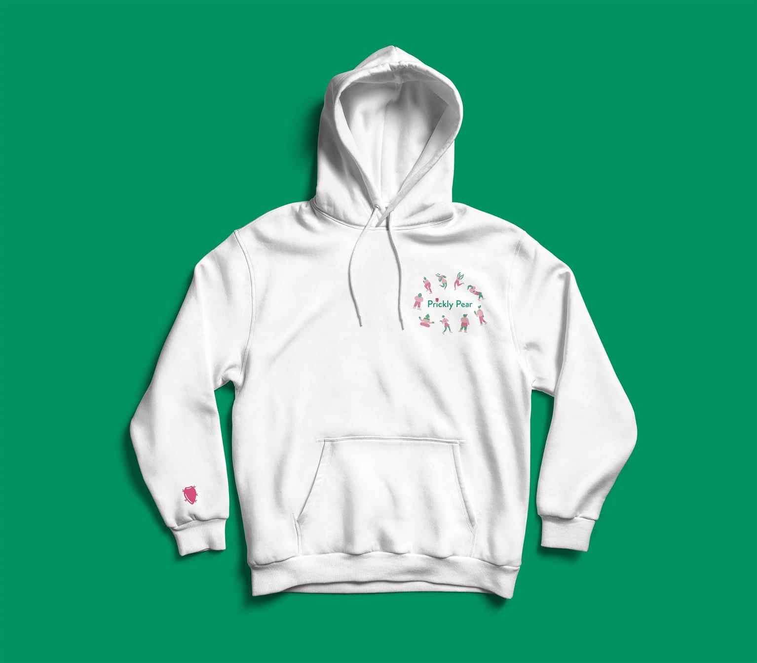
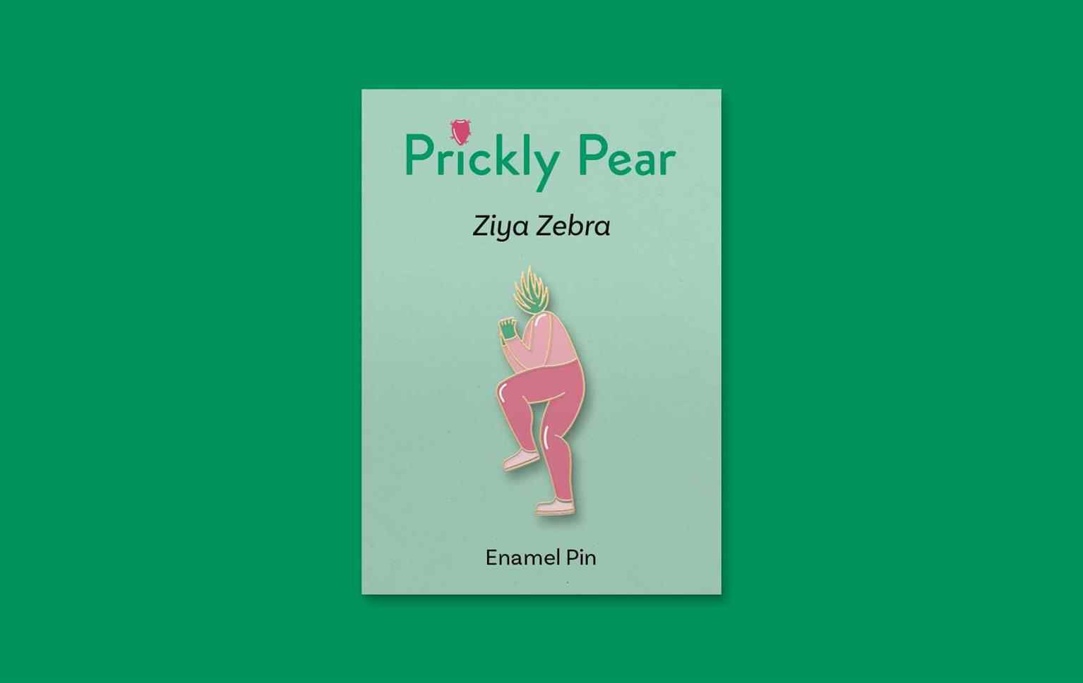
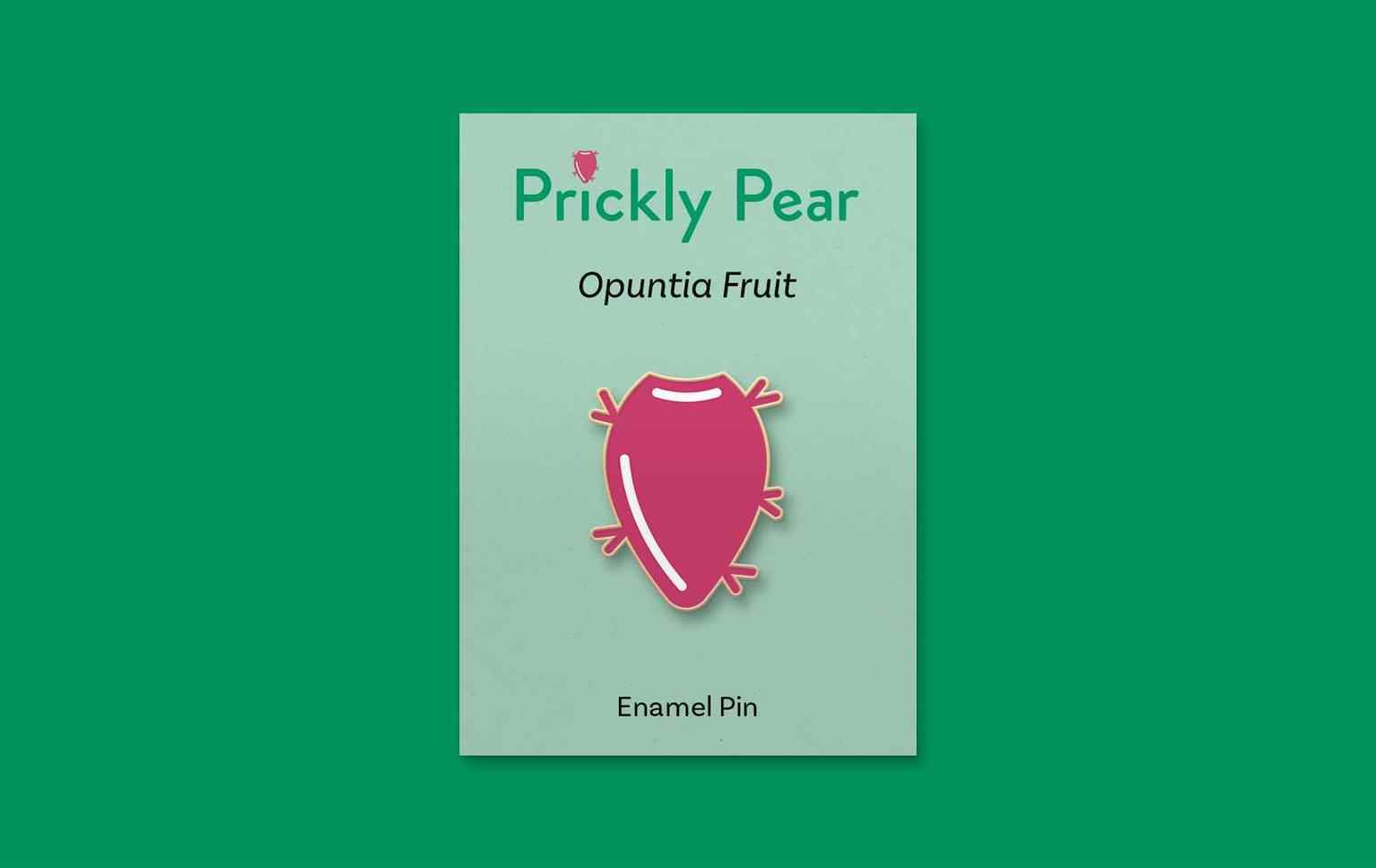
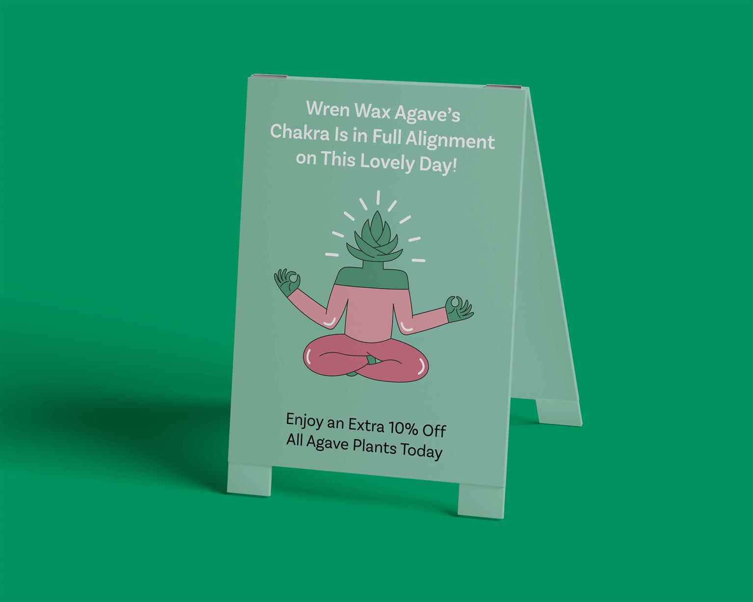
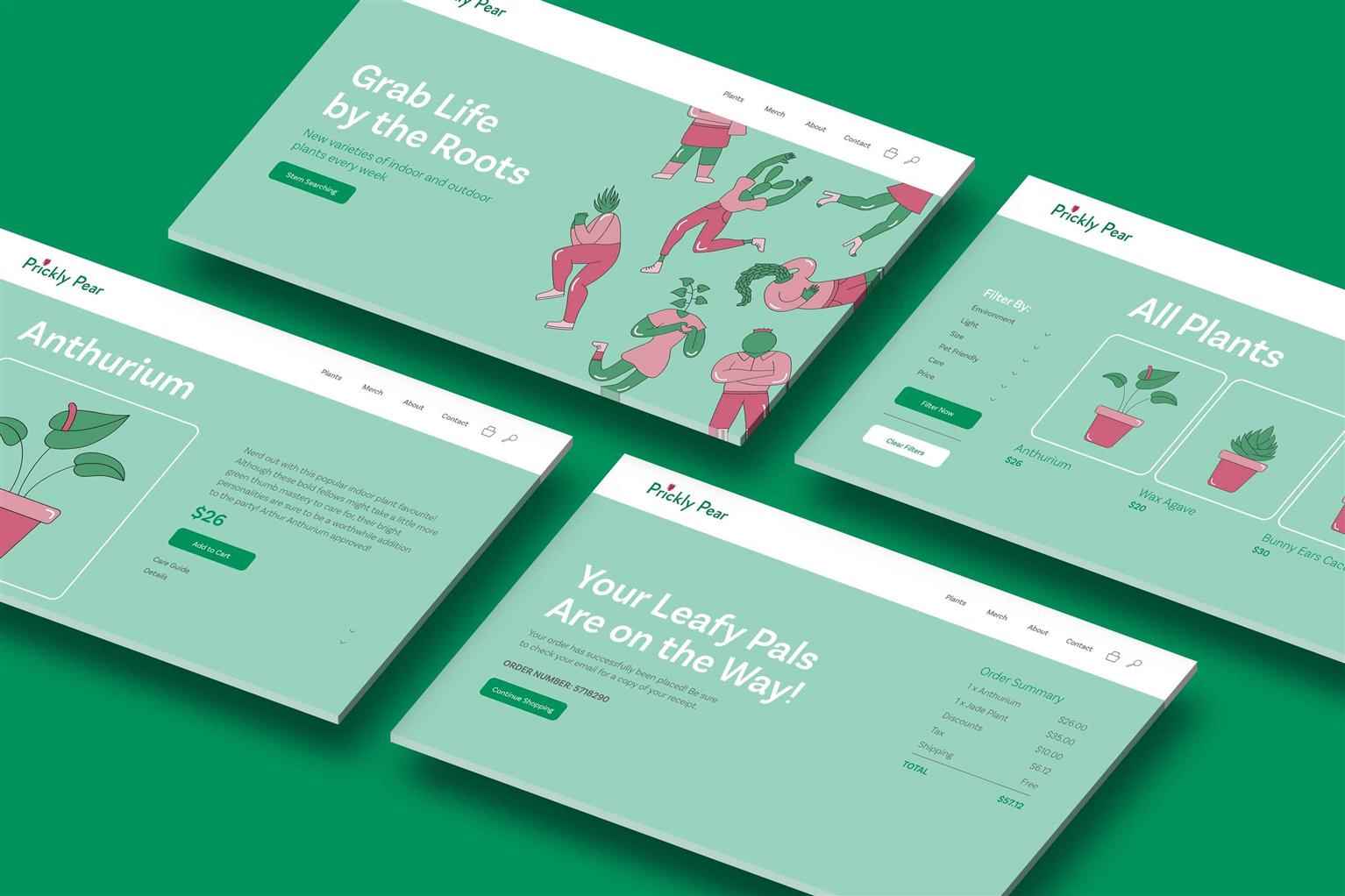
Prickly Pear Rebrand
Prickly Pear is a garden centre located in Richmond, British Columbia, delivering locals with a wide selection of indoor and outdoor plants, garden decor, and merchandise. Unfortunately, outside of...
Prickly Pear is a garden centre located in Richmond, British Columbia, delivering locals with a wide selection of indoor and outdoor plants, garden decor, and merchandise. Unfortunately, outside of...
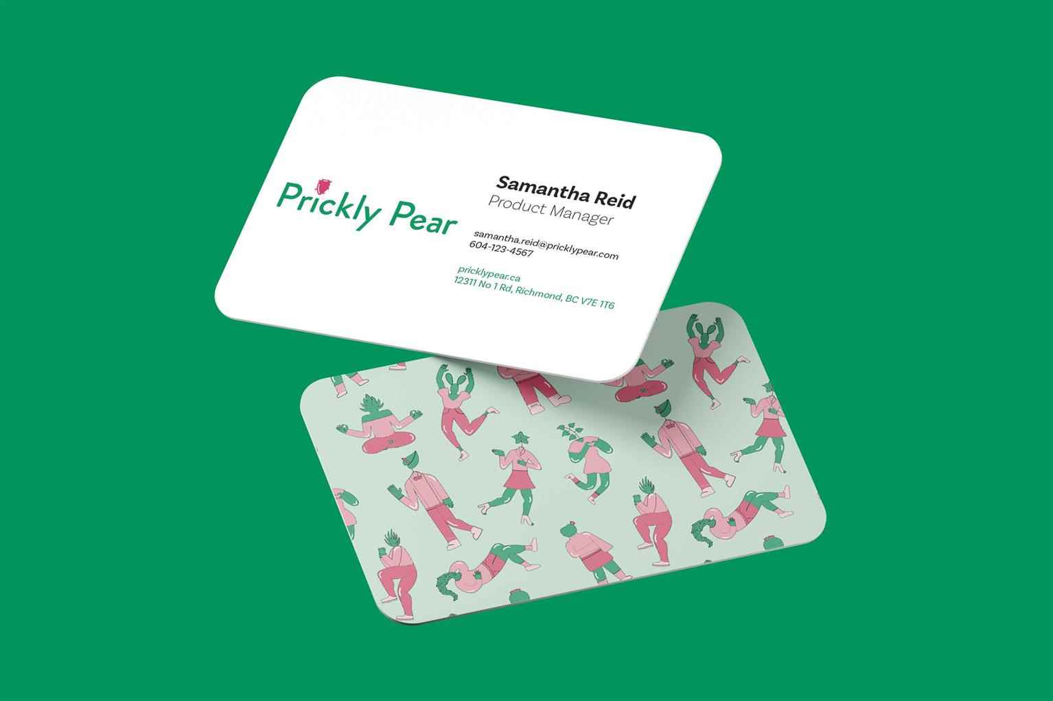
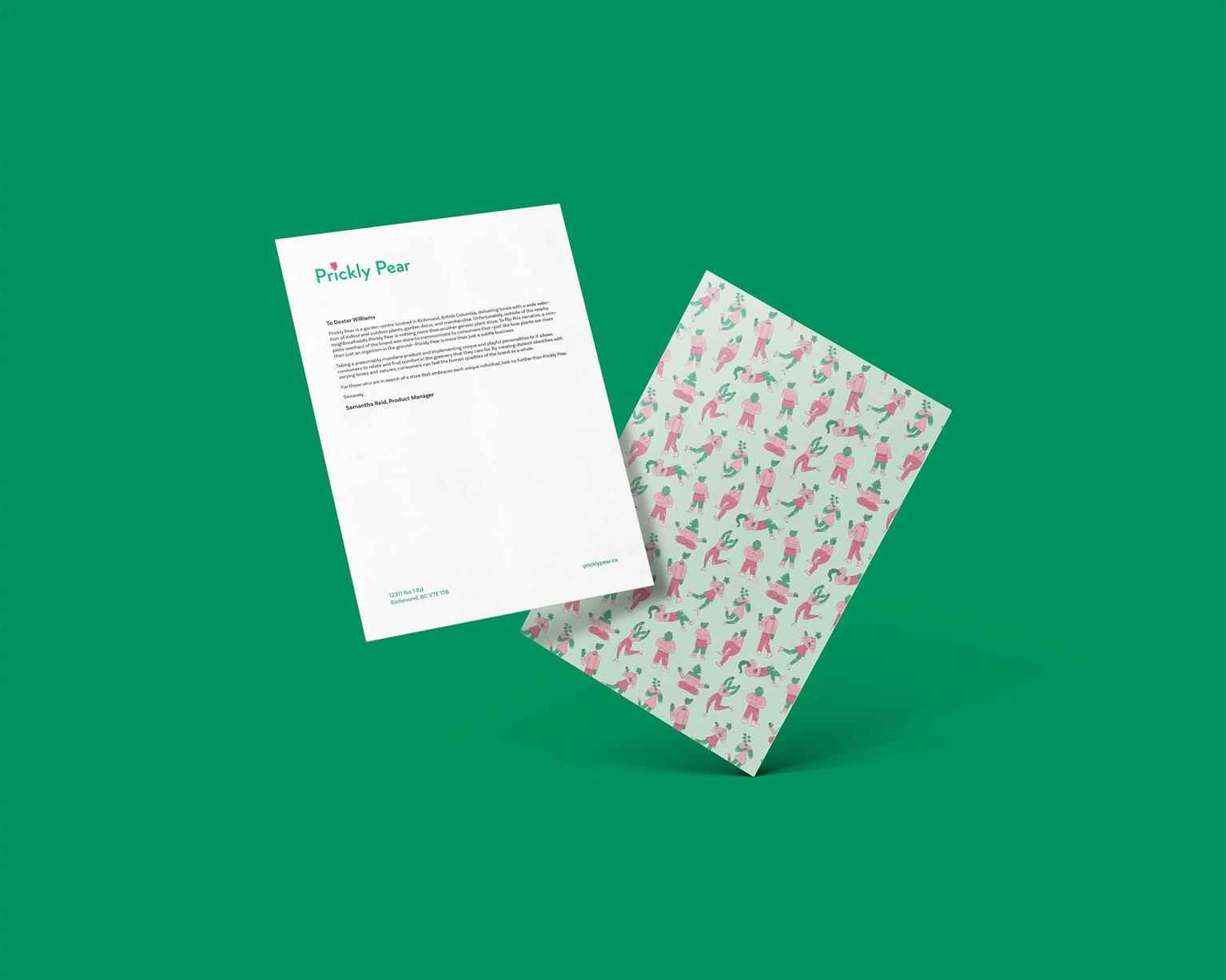
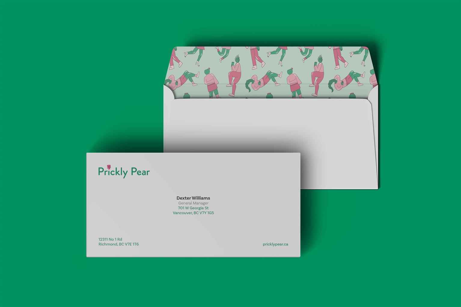
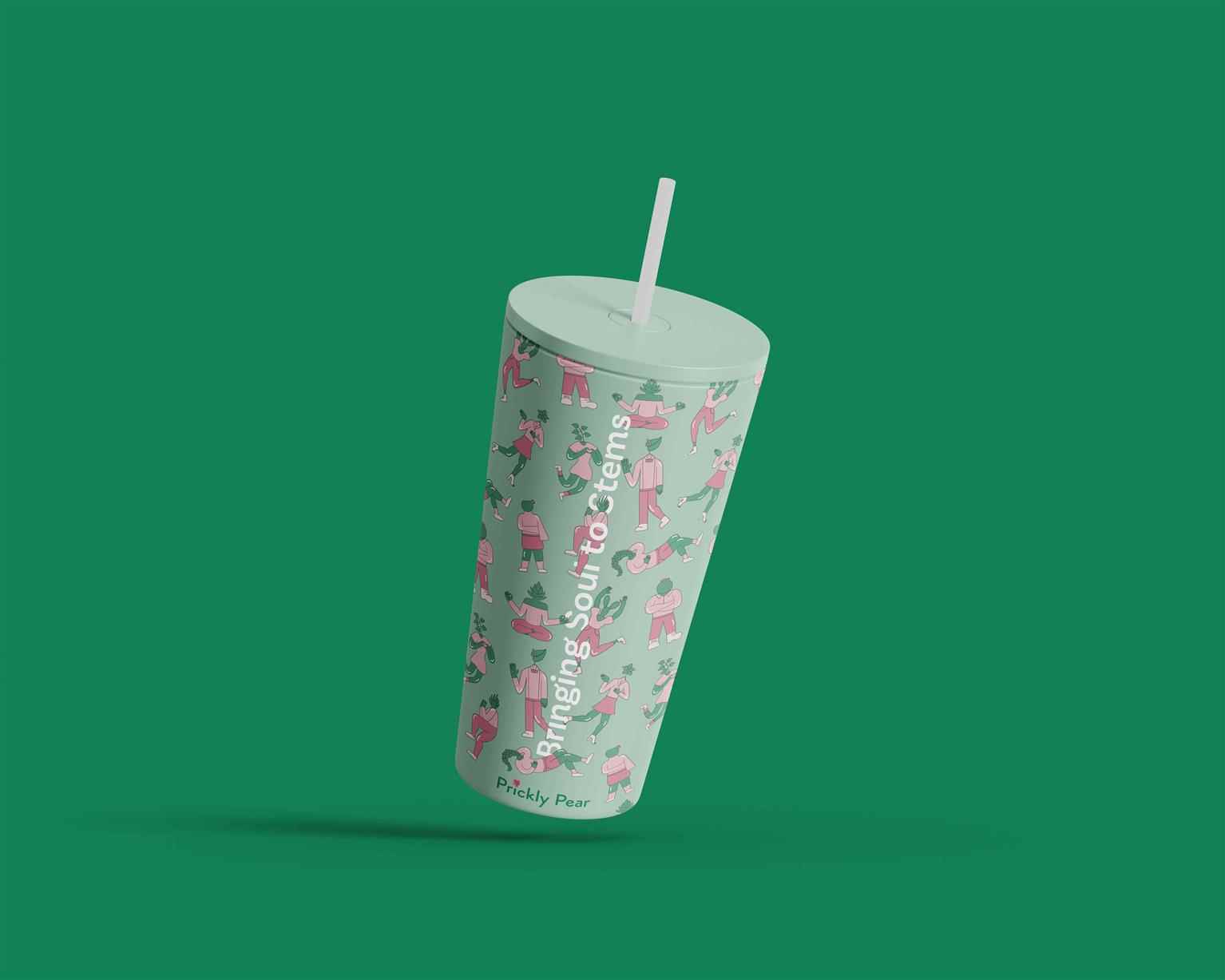
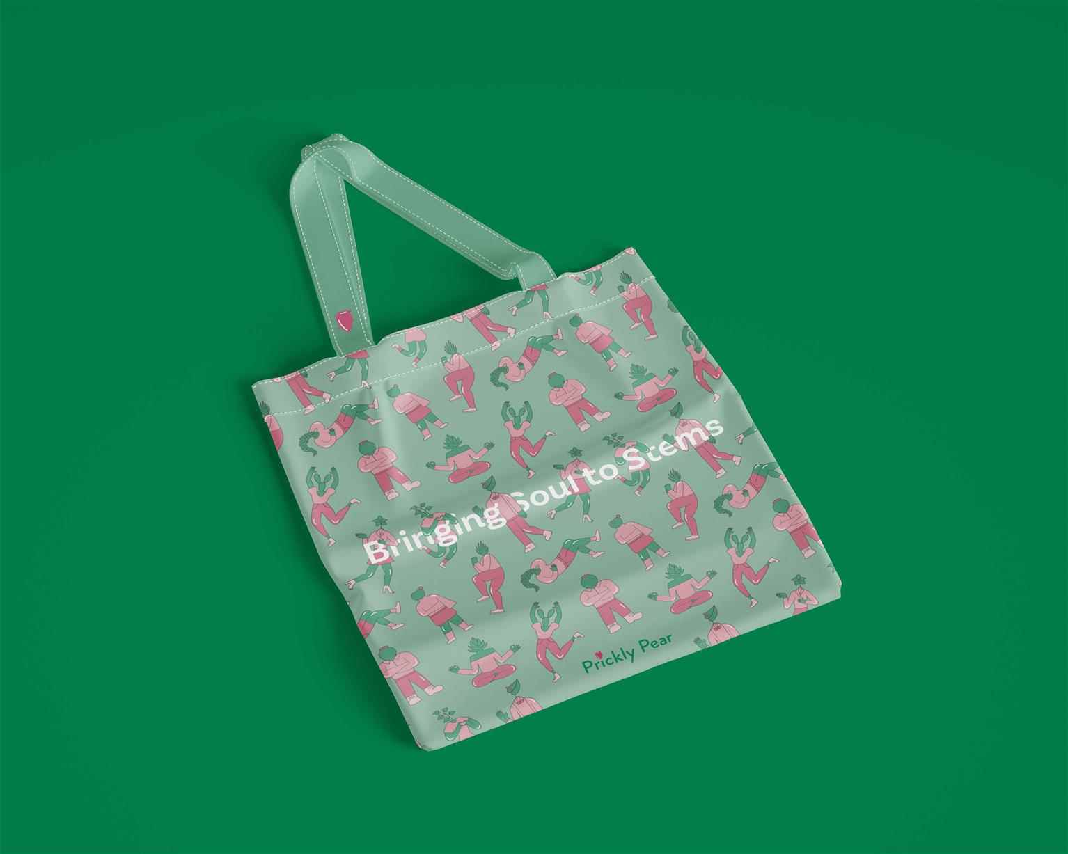
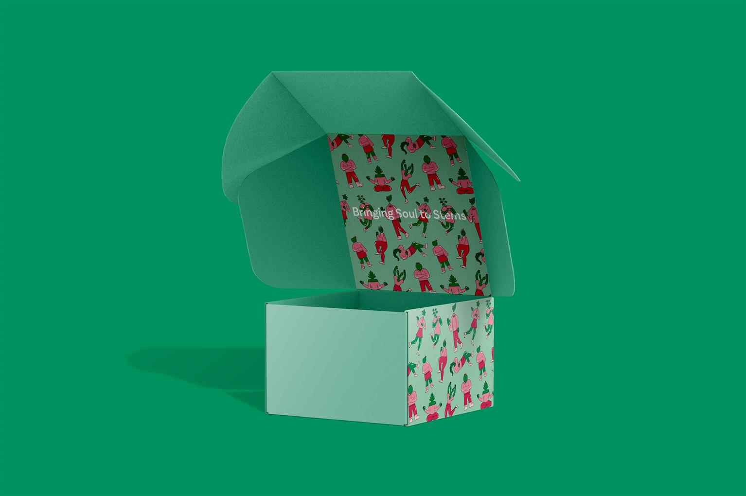
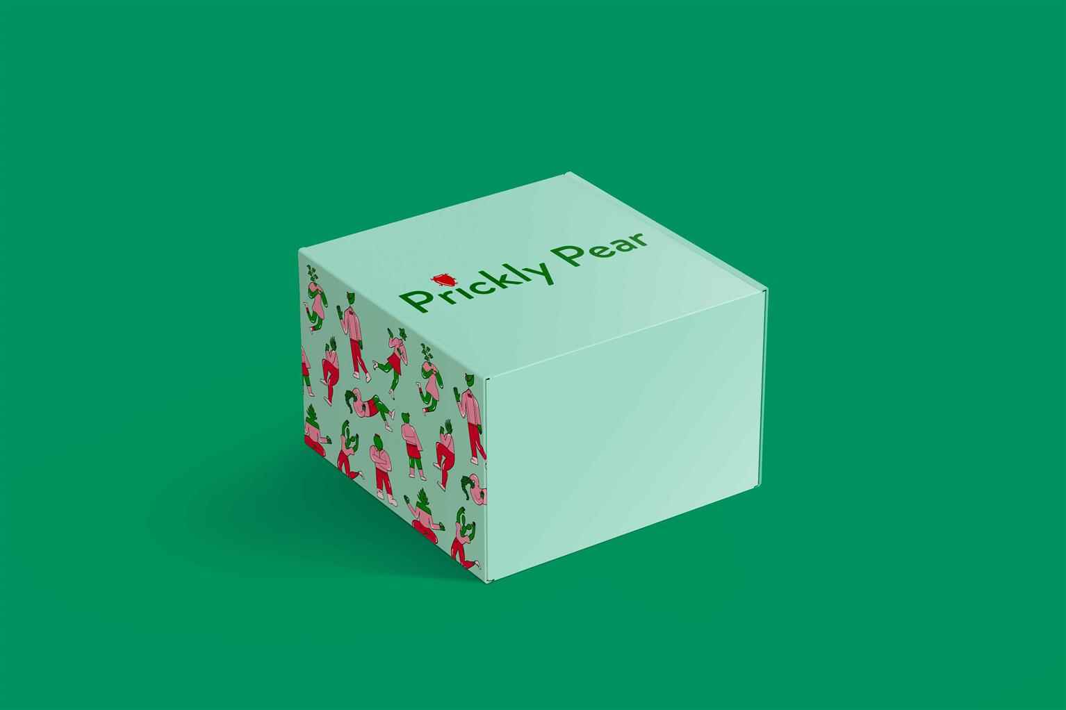
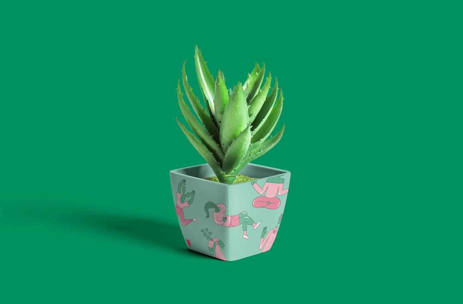
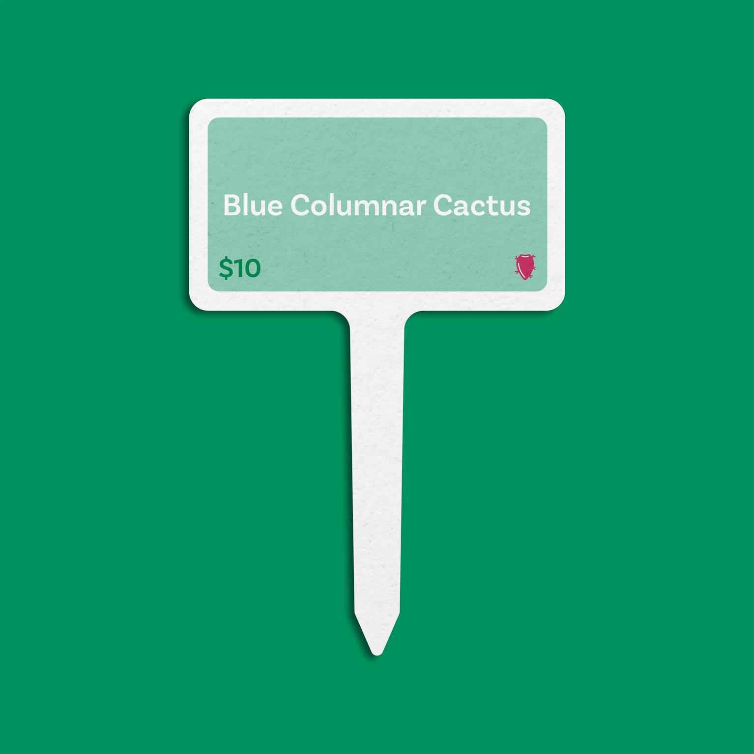
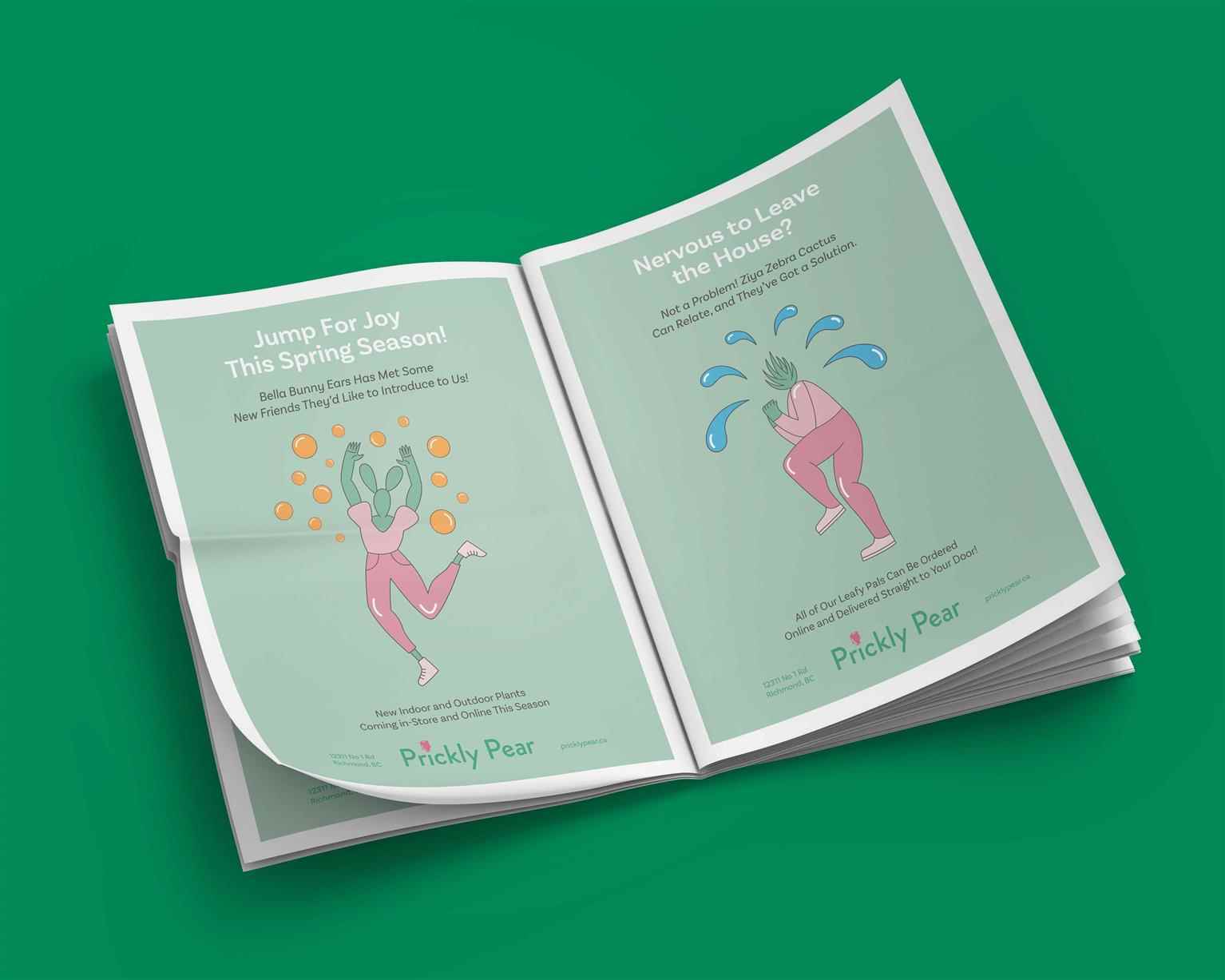
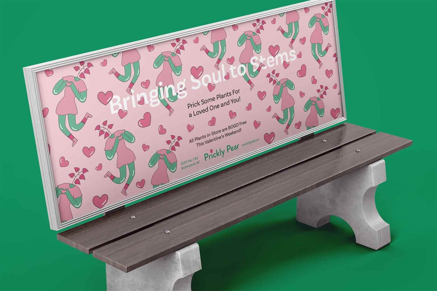
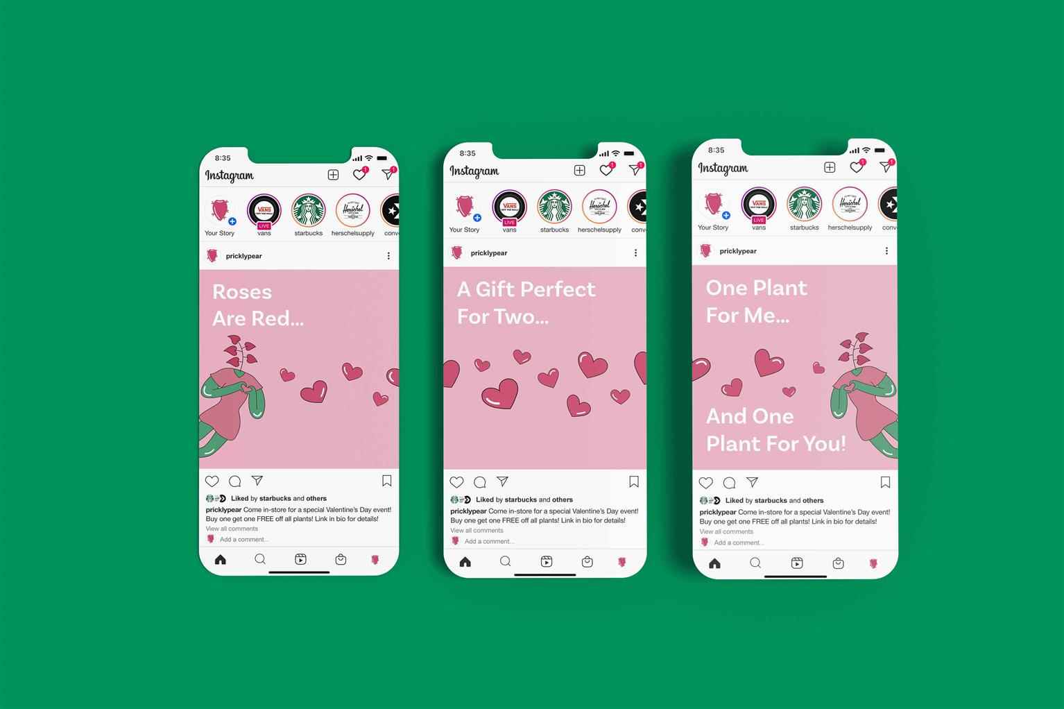
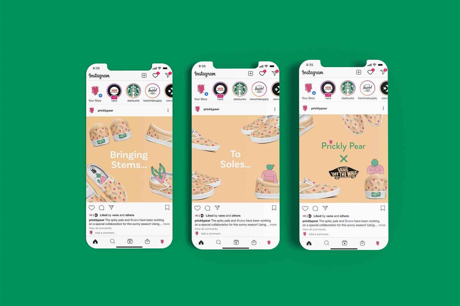
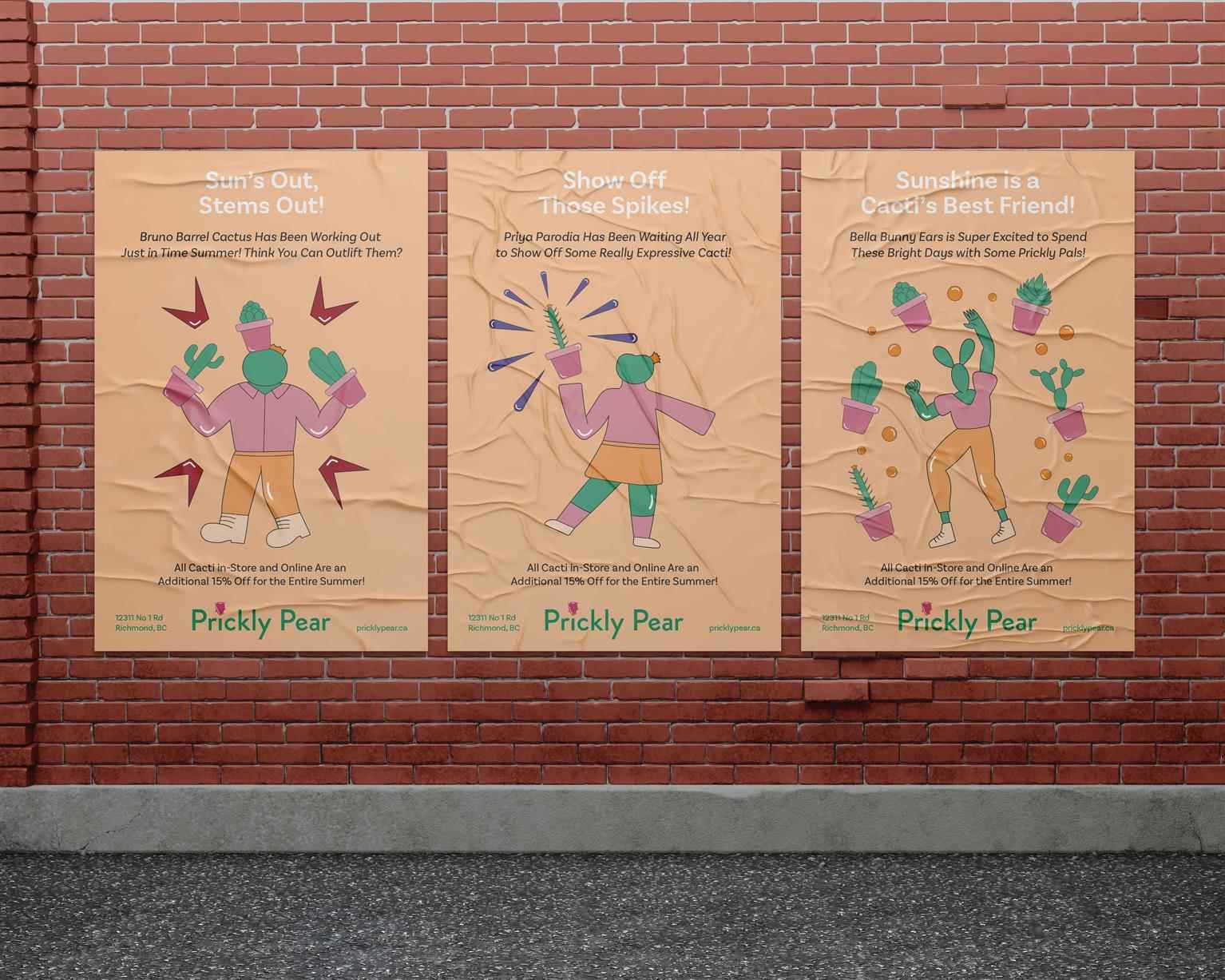
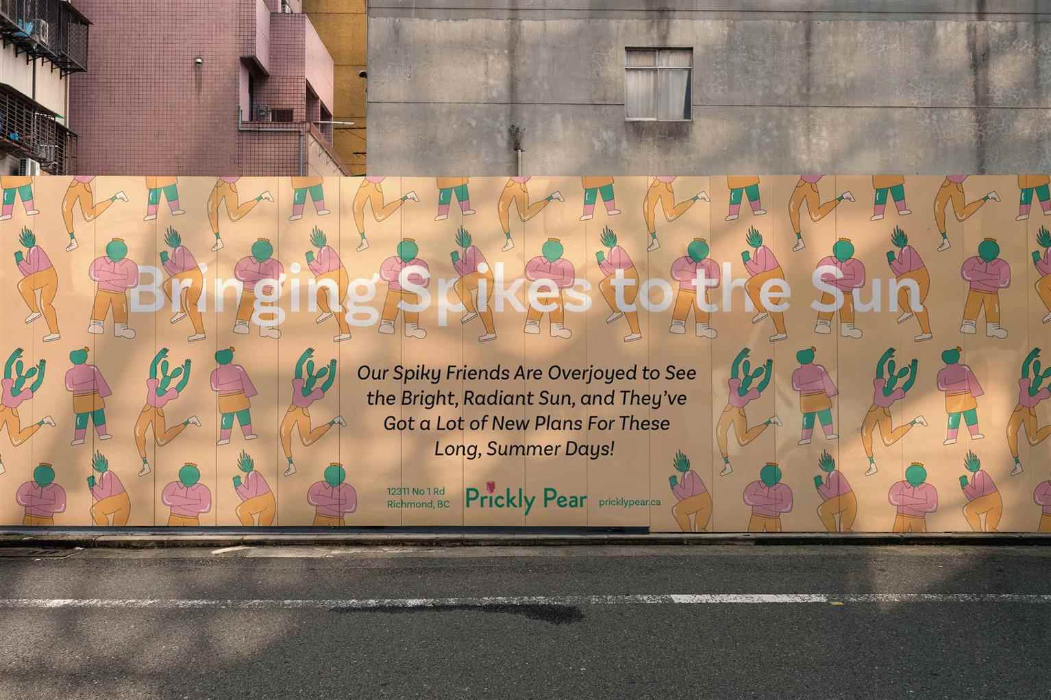
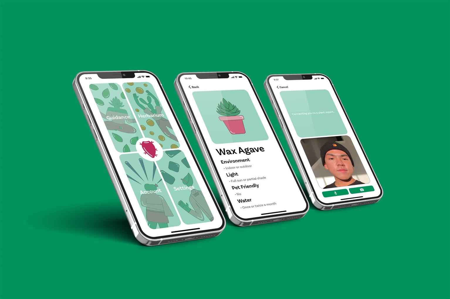
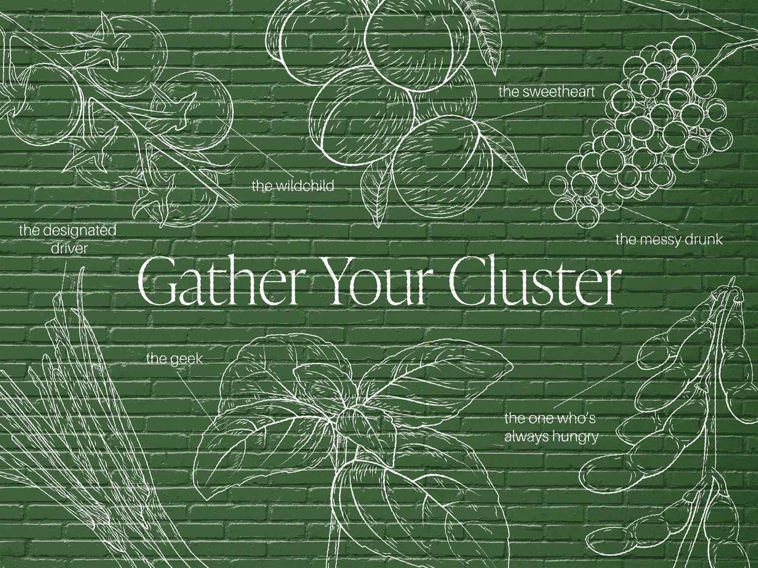
Prickly Pear is a garden centre located in Richmond, British Columbia, delivering locals with a wide selection of indoor and outdoor plants, garden decor, and merchandise. Unfortunately, outside of the nearby neighbourhoods Prickly Pear is nothing more than another generic plant store. To flip this narrative, a complete overhaul of the brand was done to communicate to consumers that—just like how plants are more than just an organism in the ground—Prickly Pear is more than just a subtle business. Taking a presumably mundane product and implementing unique and playful personalities to it allows consumers to relate and find comfort in the greenery that they care for. By creating distinct identities with varying tones and natures, consumers can feel the human qualities of the brand as a whole. For those who are in search of a store that embraces each unique individual, look no further than Prickly Pear.

Share:
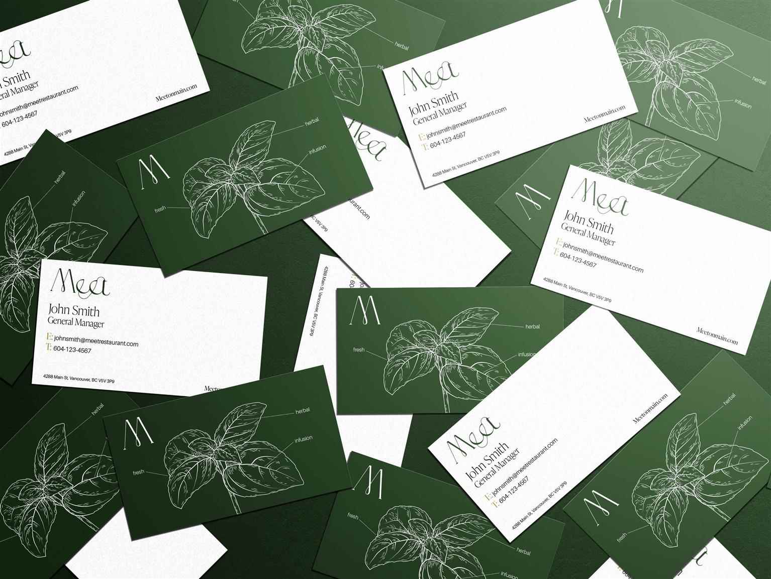
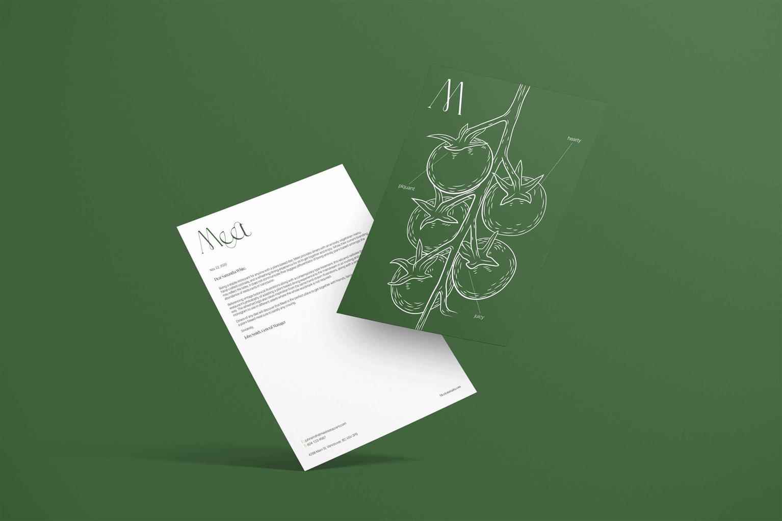
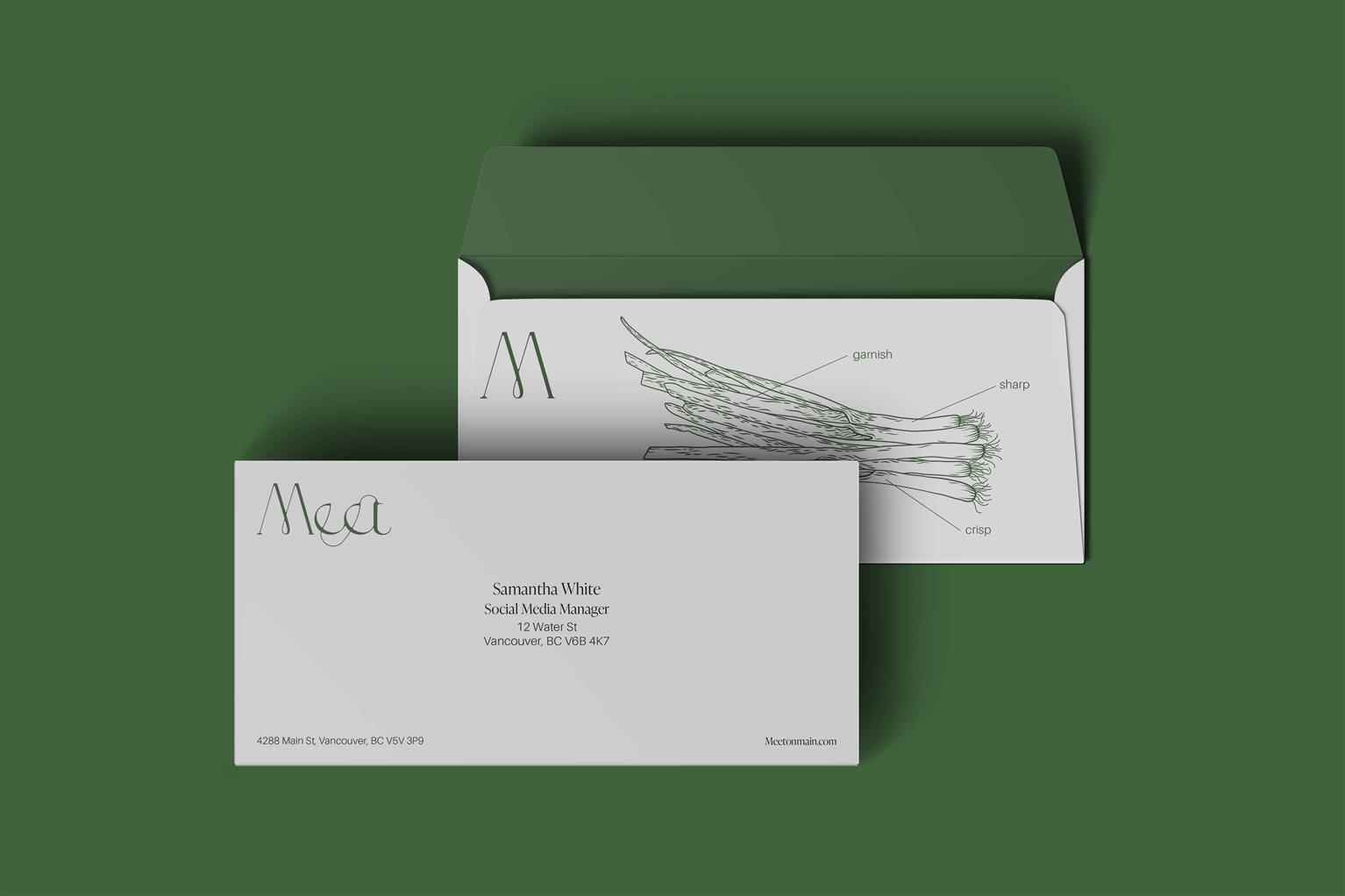
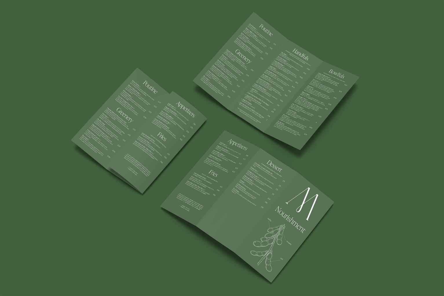
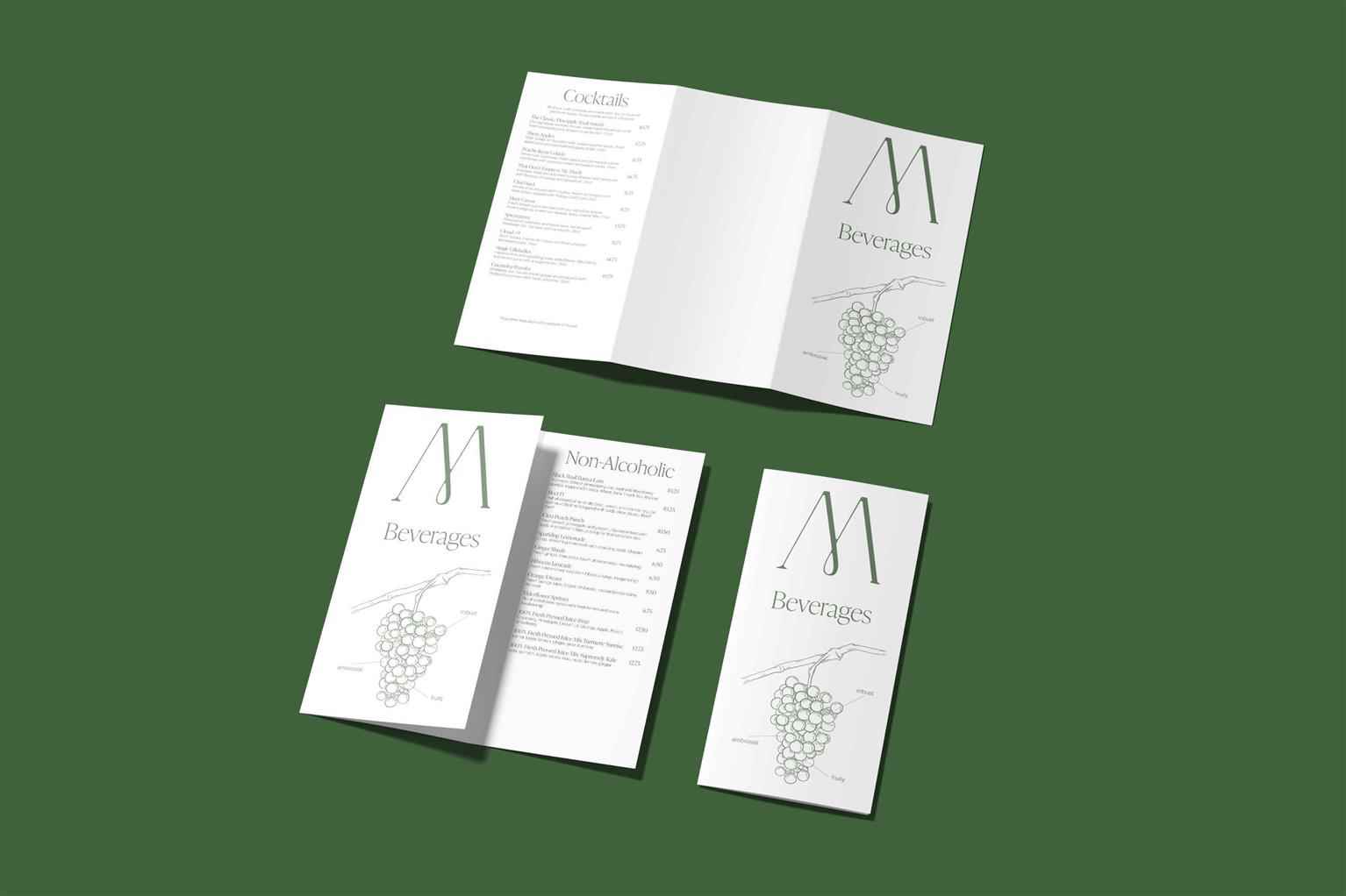
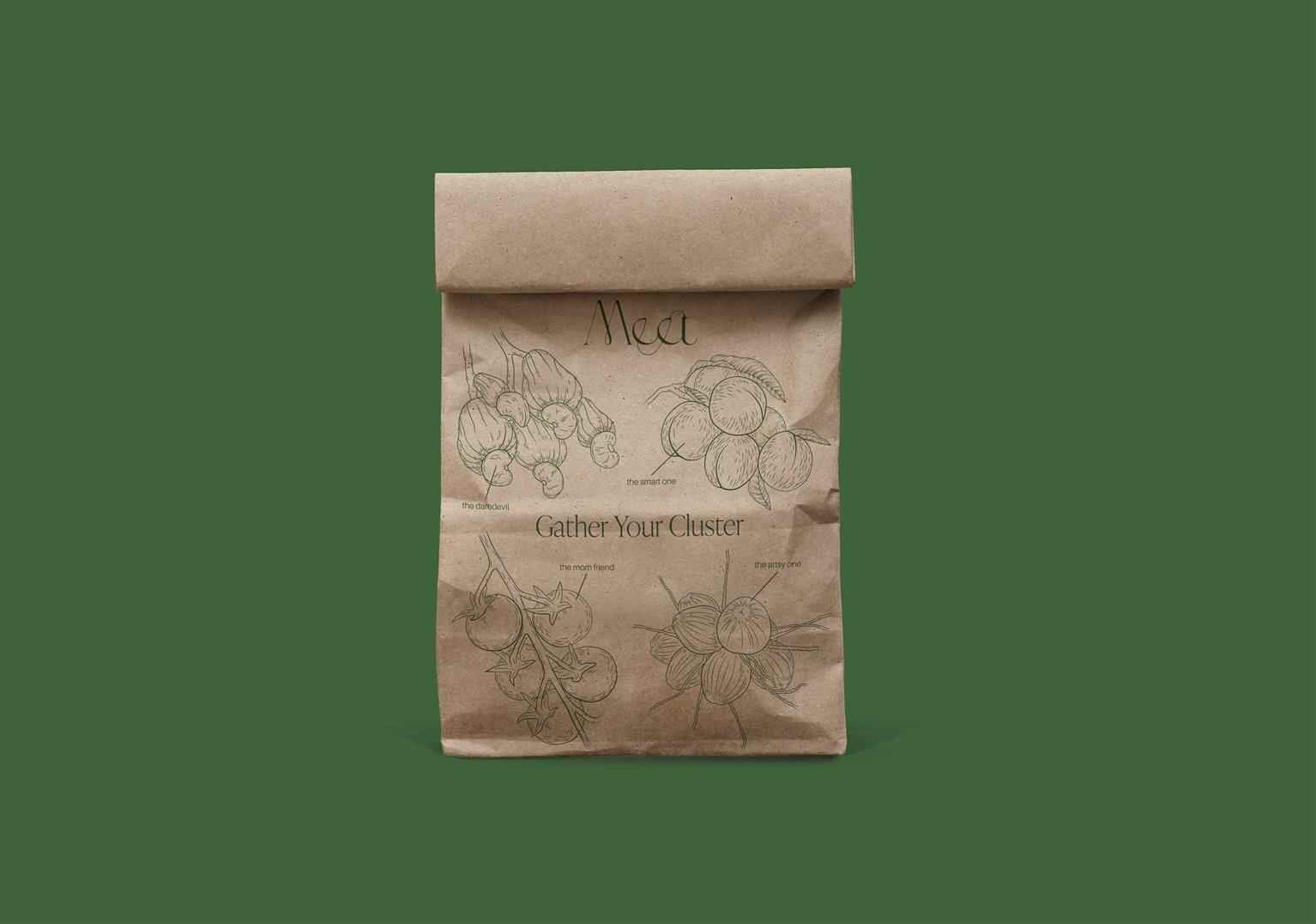
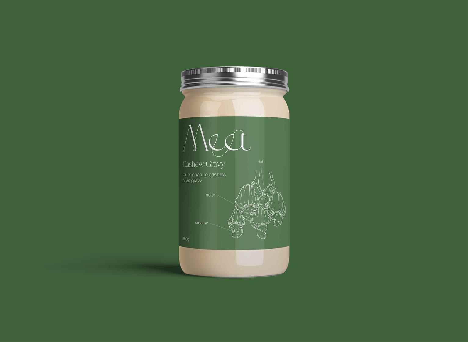
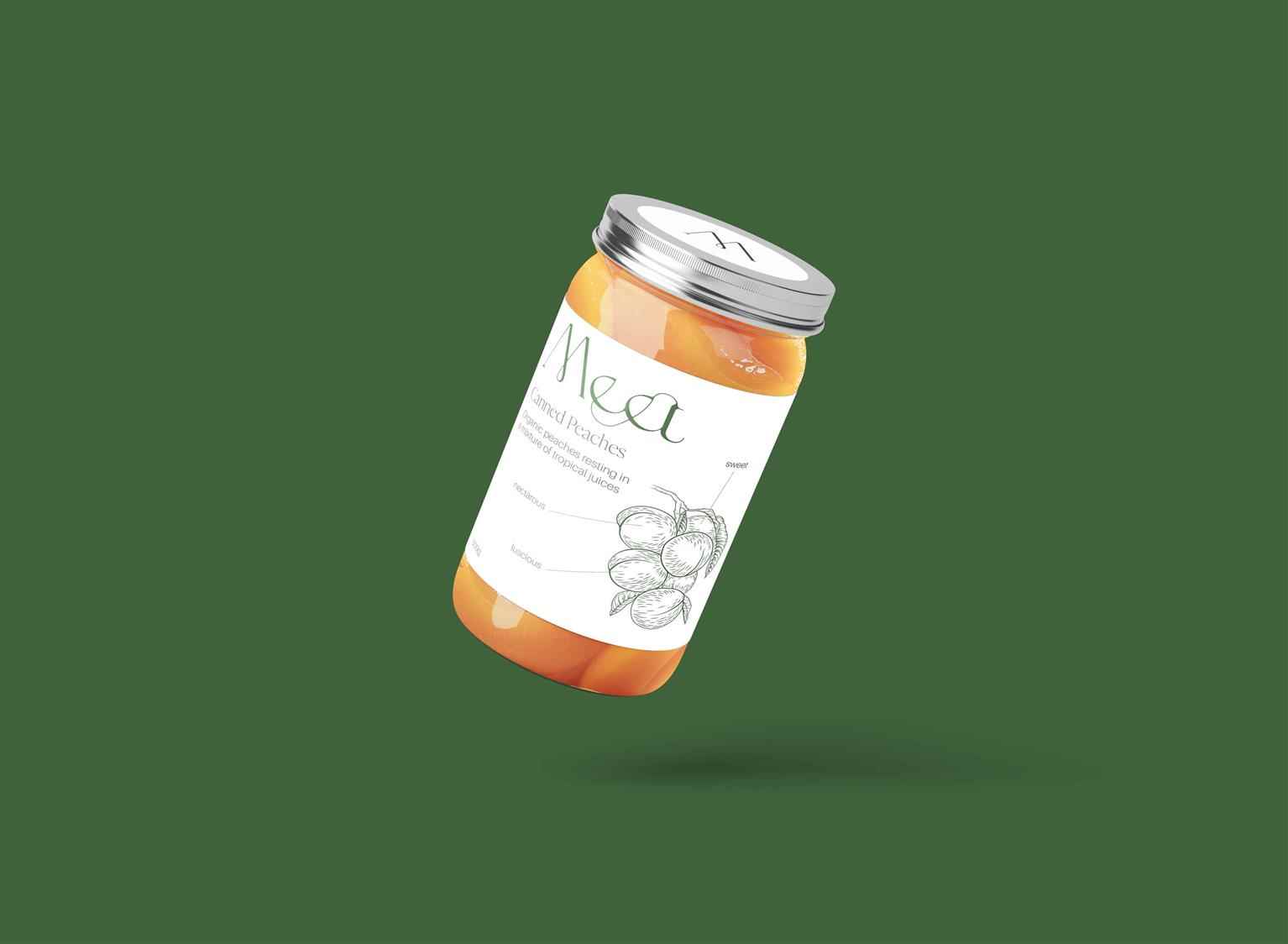
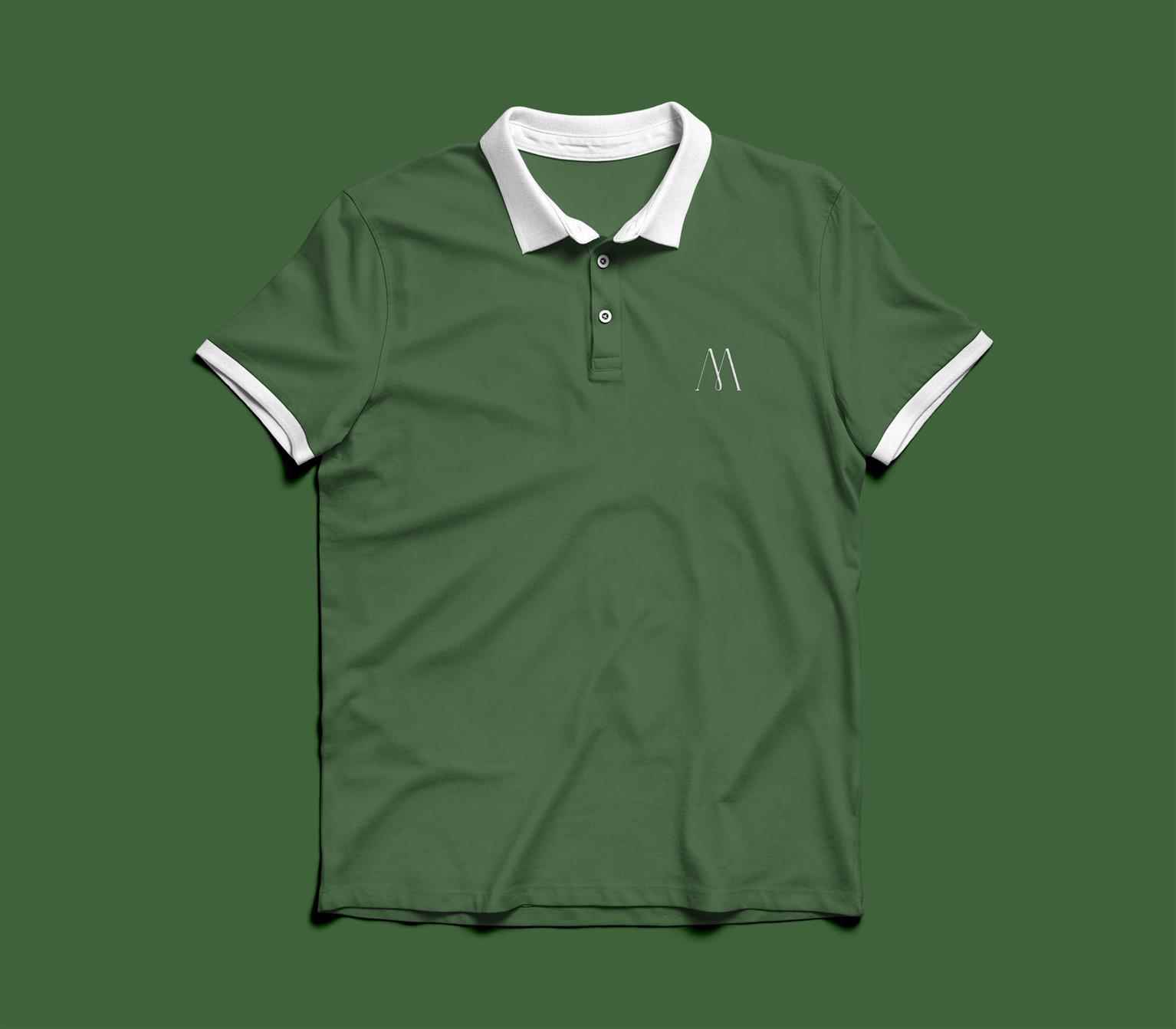
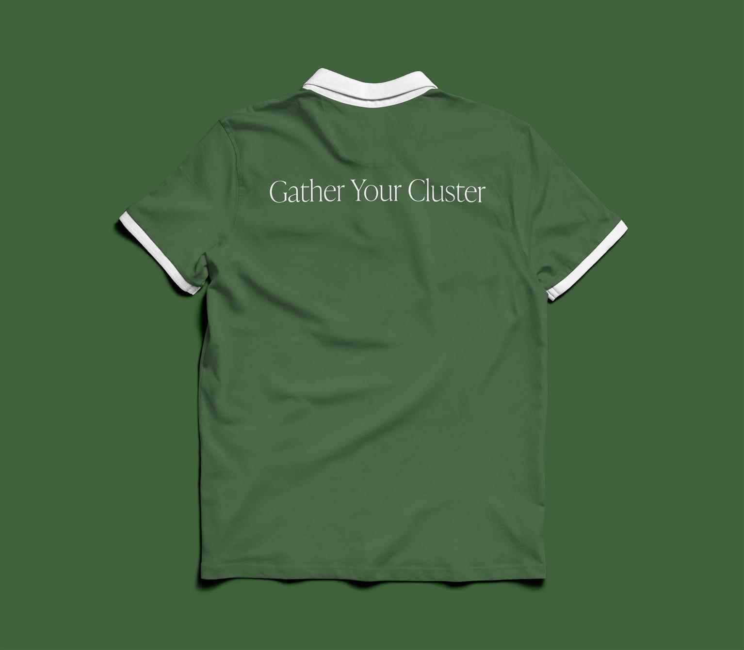
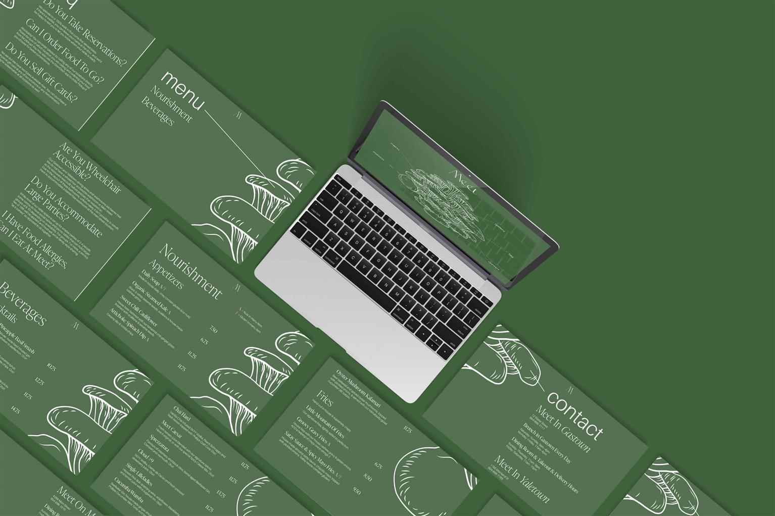
Meet Rebrand
Being a staple restaurant for anyone with a plant-based diet, Meet provides diners with an entirely vegetarian menu, hand-crafted cocktails, and a refreshing dining experience for all to get together...
Being a staple restaurant for anyone with a plant-based diet, Meet provides diners with an entirely vegetarian menu, hand-crafted cocktails, and a refreshing dining experience for all to get together...
Being a staple restaurant for anyone with a plant-based diet, Meet provides diners with an entirely vegetarian menu, hand-crafted cocktails, and a refreshing dining experience for all to get together and enjoy. This rebrand puts Meet's biggest differentiator of being entirely plant-based front and center of the restaurant's visual identity. Diners of any diet will discover that Meet is the perfect place to gather with friends, family, and colleagues to enjoy a plant-based meal sure to satisfy any craving.


Share:
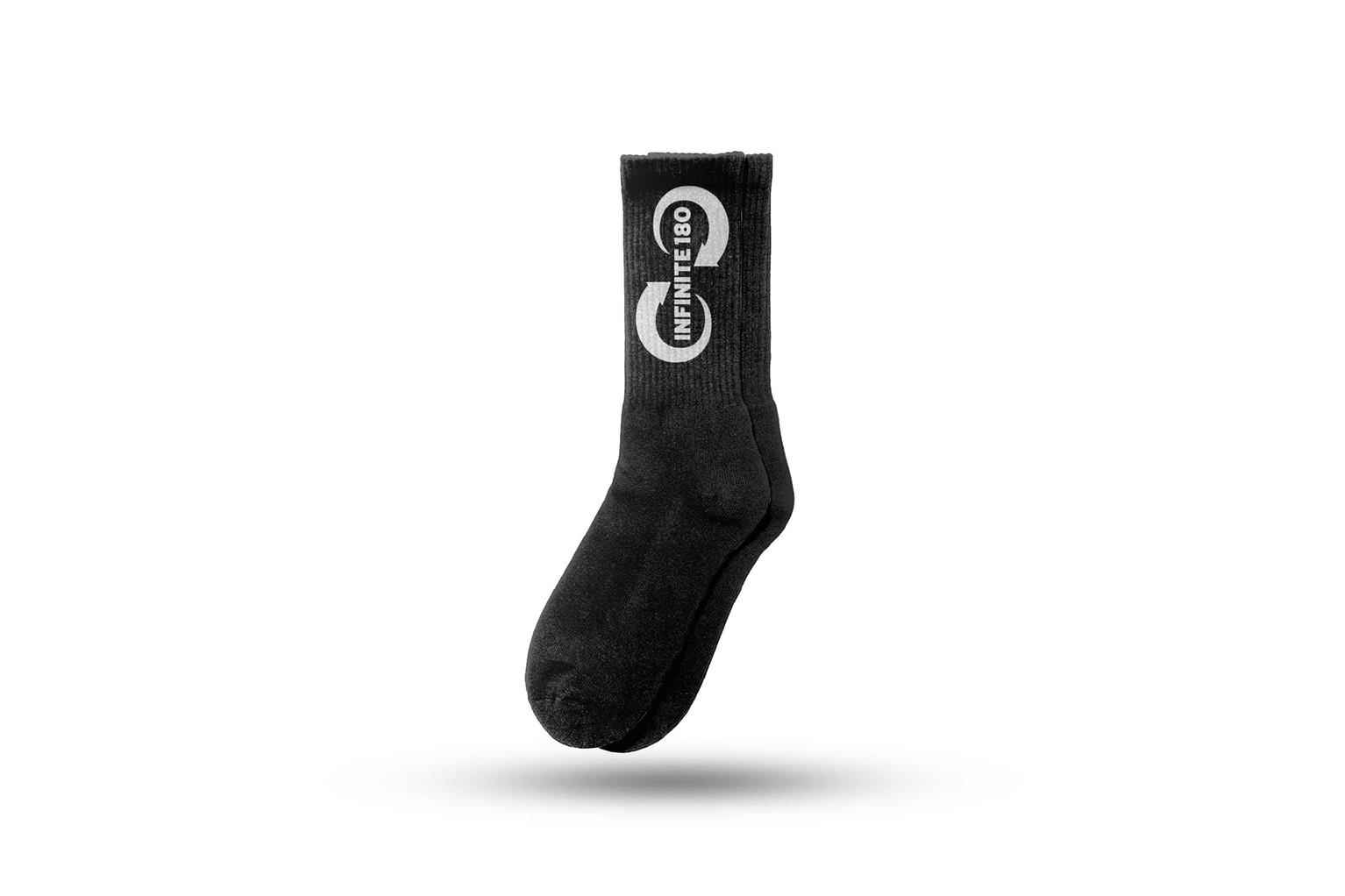
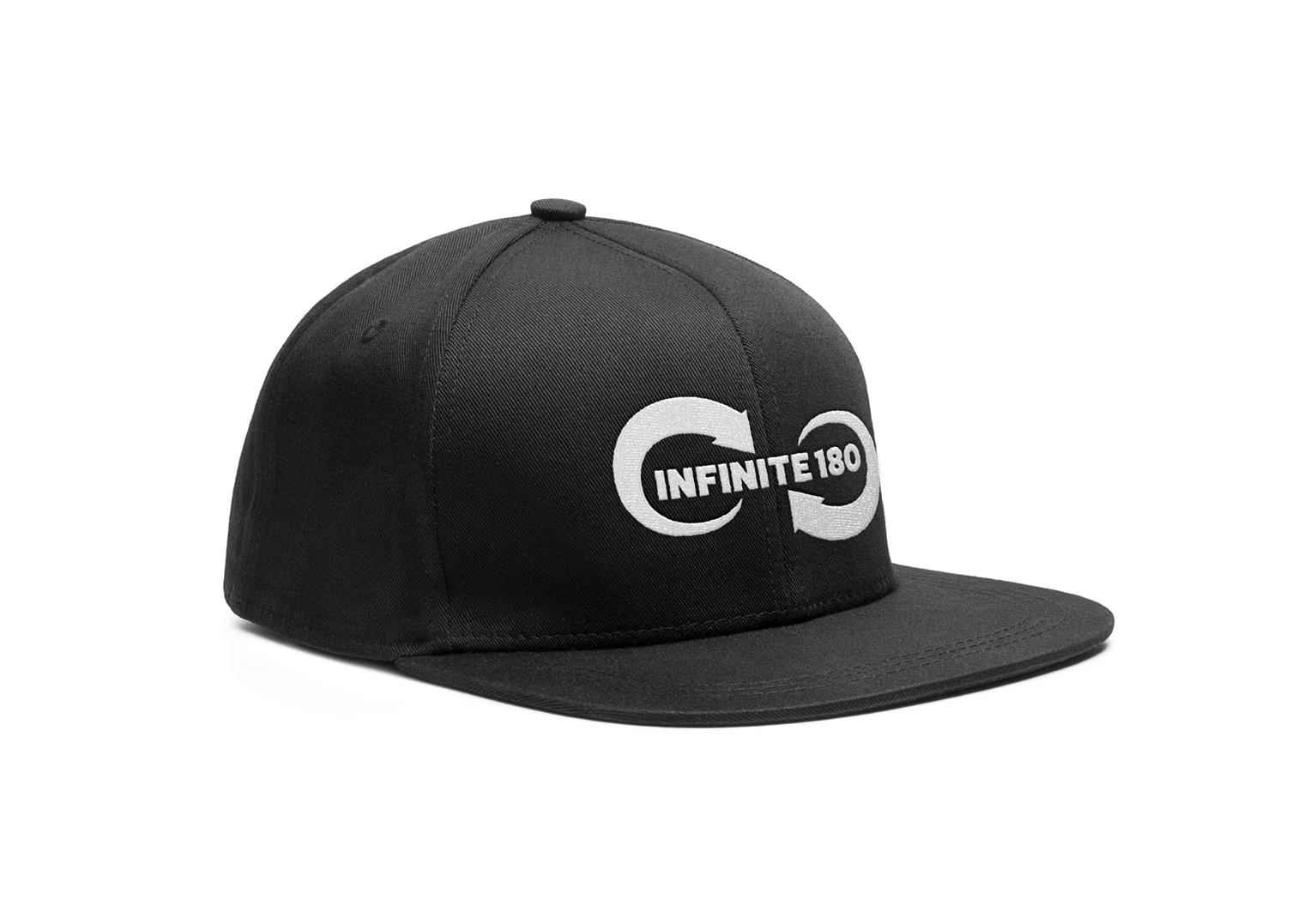
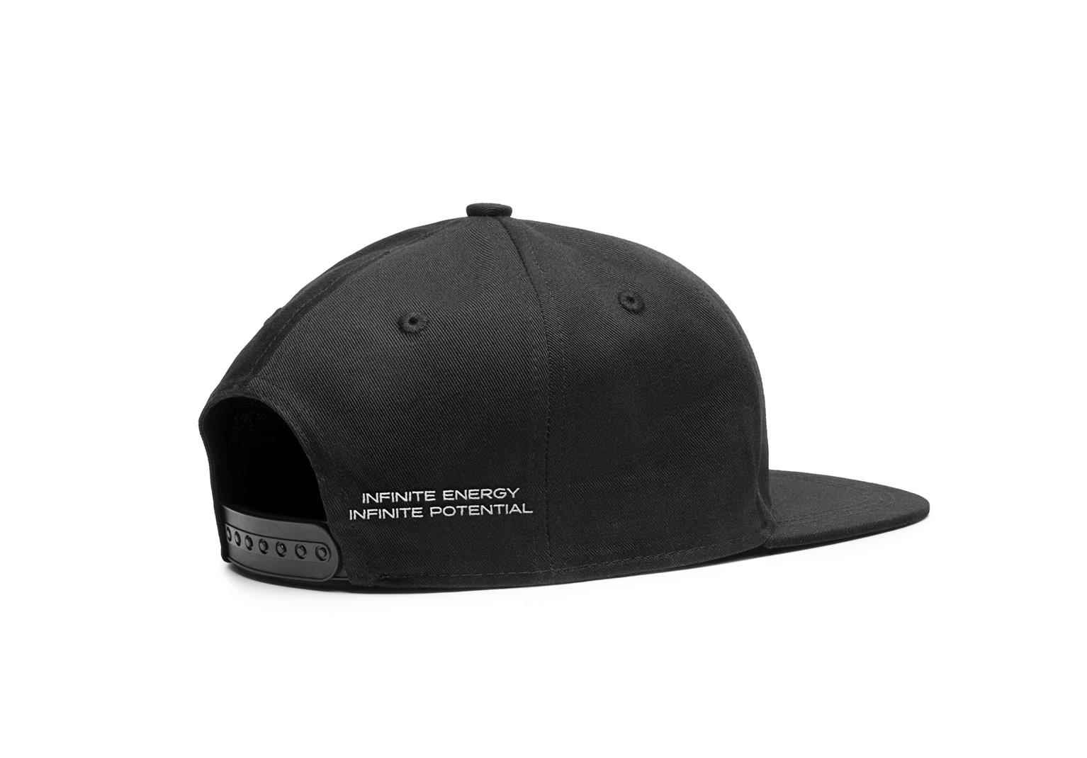
Infinite 180
In a world consumed by an abundance of energy drink options with outdated formulas, Infinite 180 stands above the rest by providing customers with high-quality ingredients and innovative engineering...
In a world consumed by an abundance of energy drink options with outdated formulas, Infinite 180 stands above the rest by providing customers with high-quality ingredients and innovative engineering...
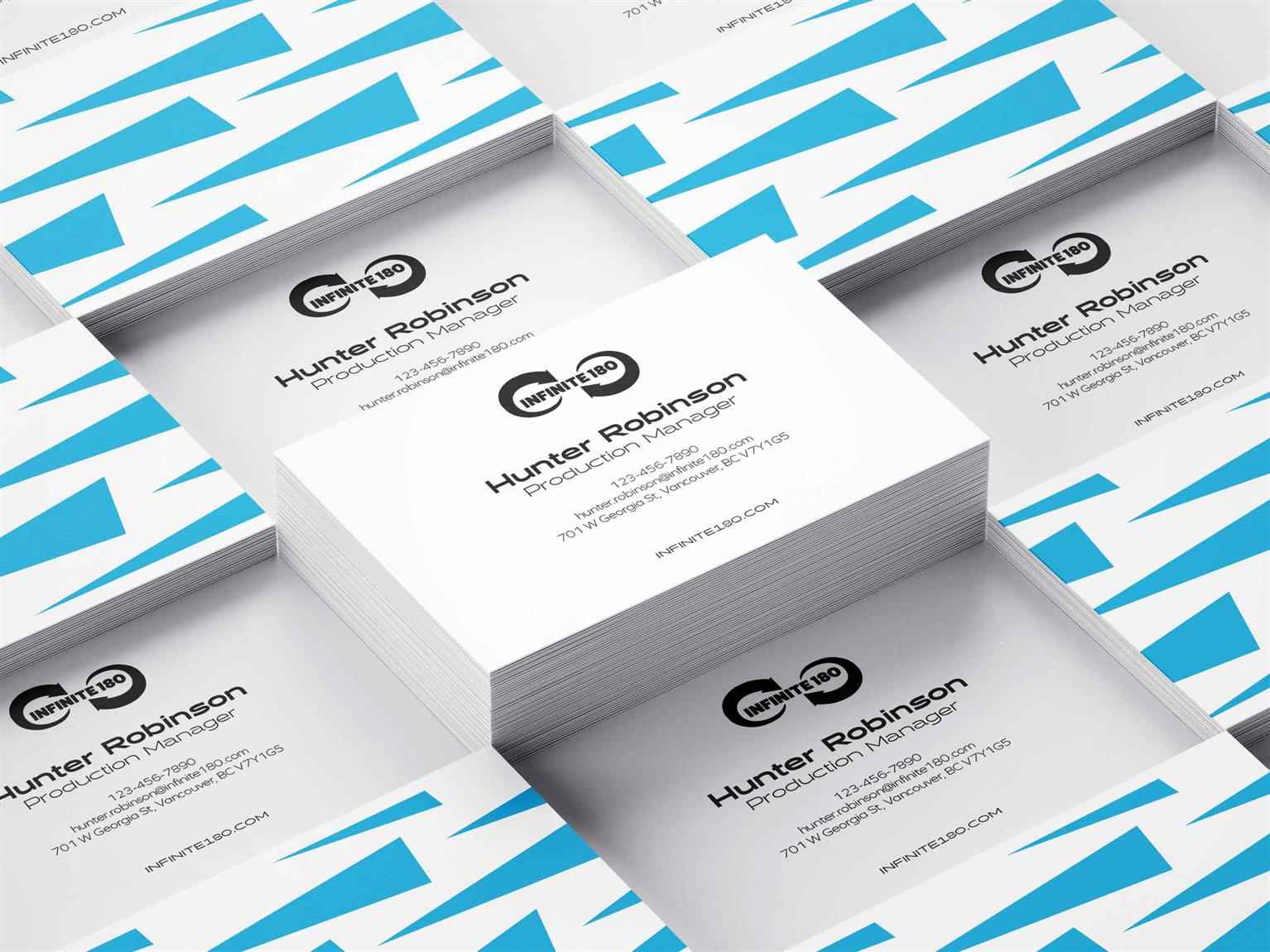
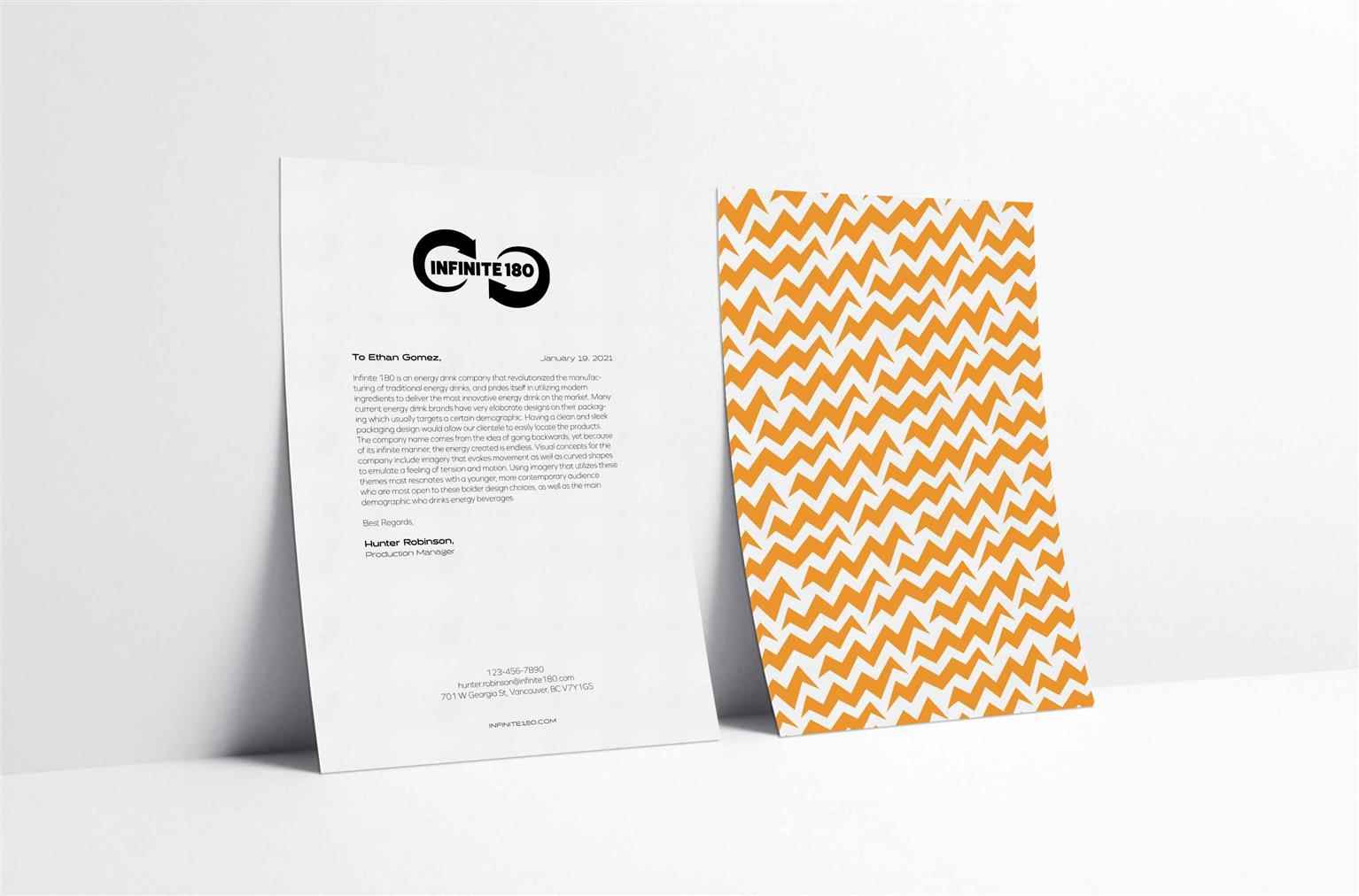
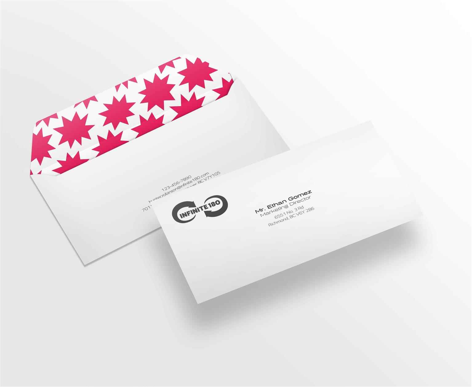
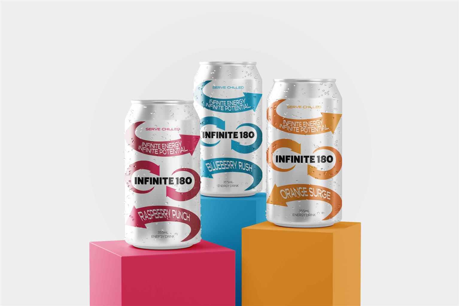
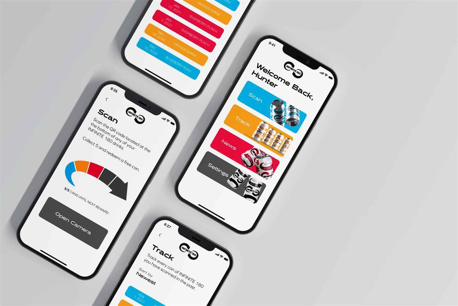
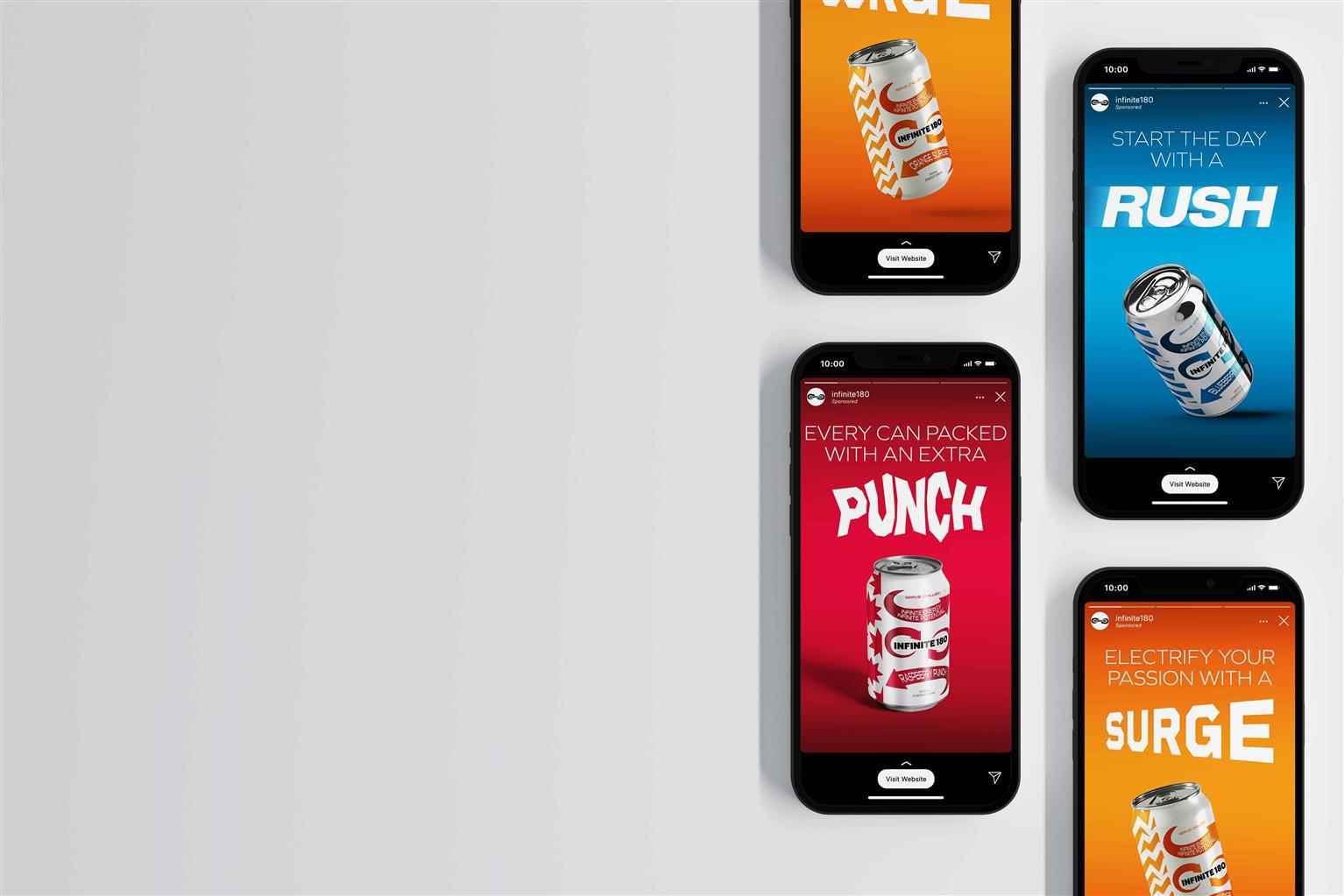
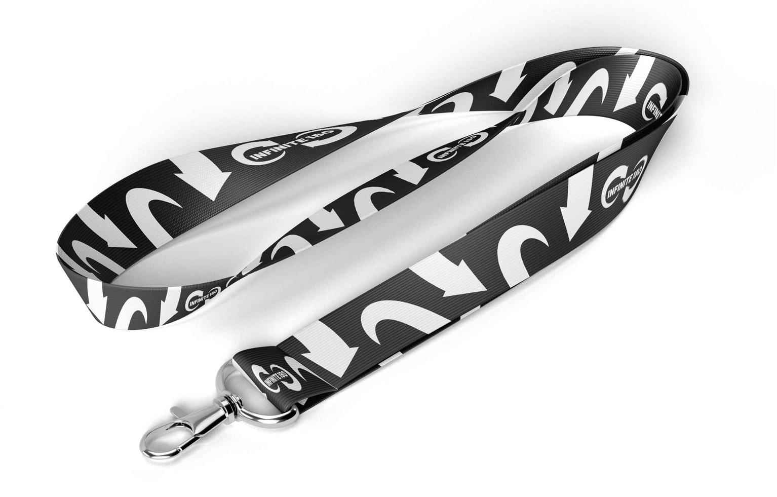
In a world consumed by an abundance of energy drink options with outdated formulas, Infinite 180 stands above the rest by providing customers with high-quality ingredients and innovative engineering technologies to invigorate drinkers to achieve the most out of their rigorous lifestyles. The logo embodies the company’s tag line, “Infinite Energy, Infinite Potential” setting the tone for the brand’s aesthetics. By utilizing motifs and typography that evoke movement and motion, Infinite 180’s bold visual identity puts the company's mission at the forefront. Drinkers are sure to feel that extra rush of vigour by experiencing any Infinite 180 refreshment.
Share:
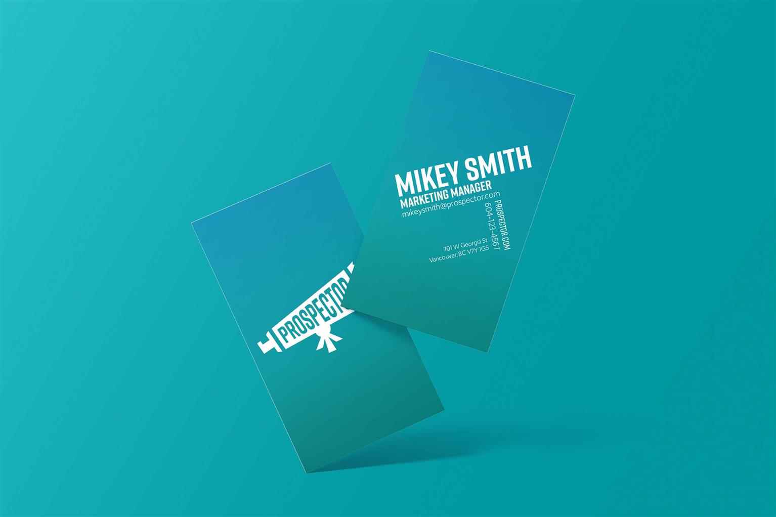
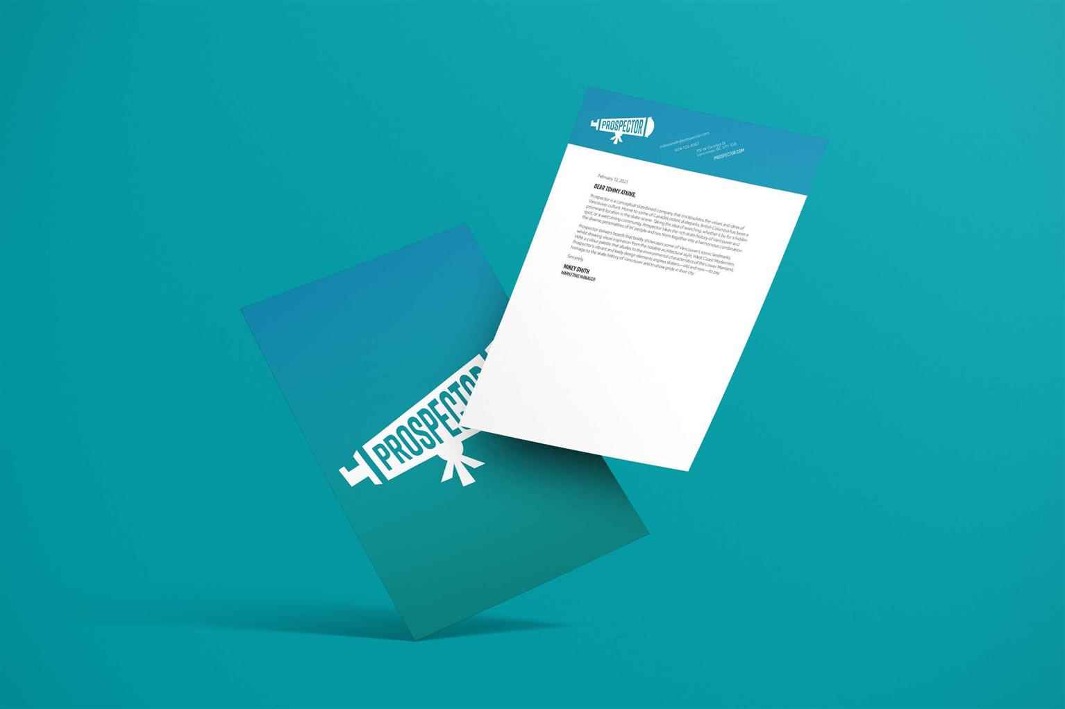
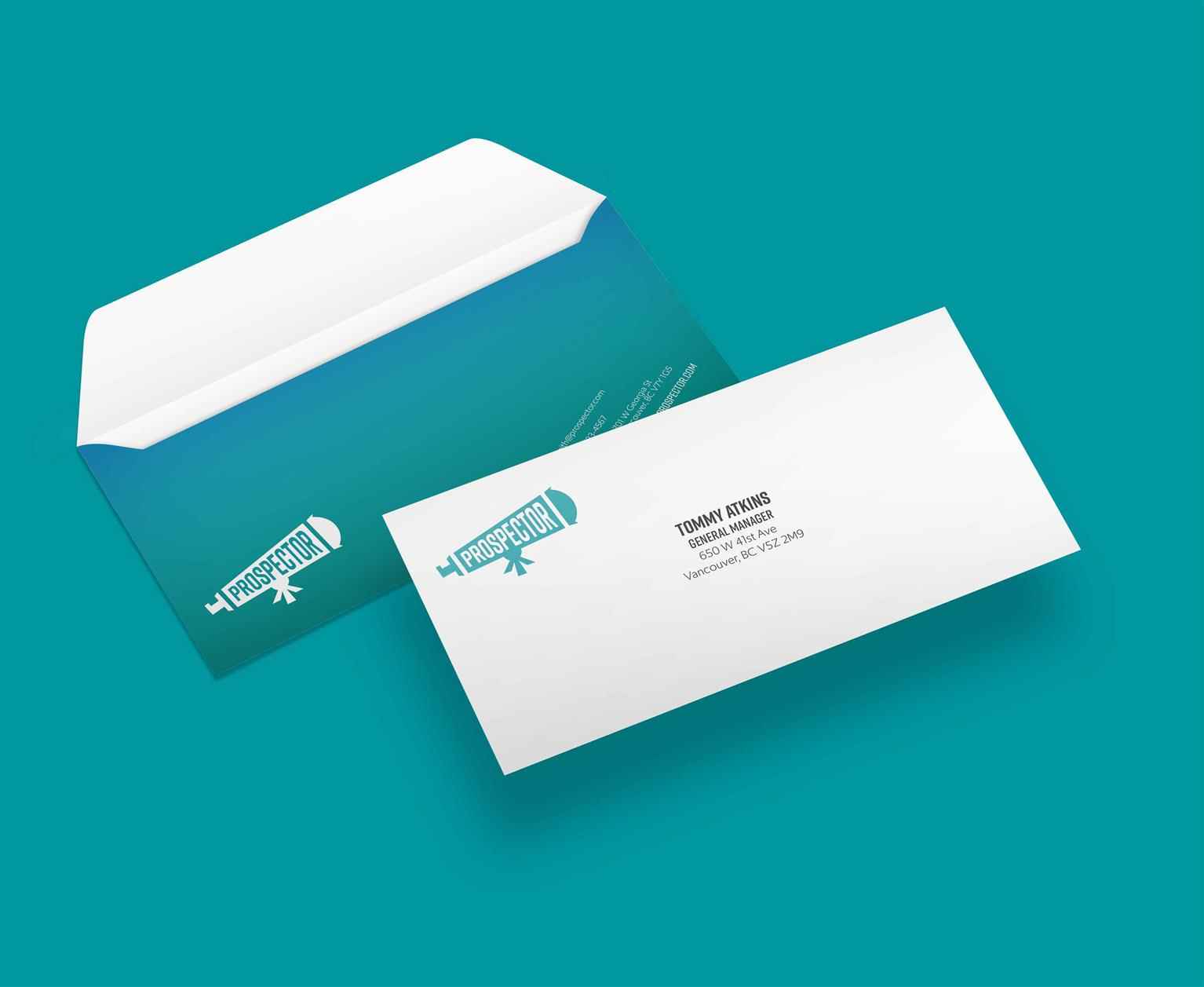
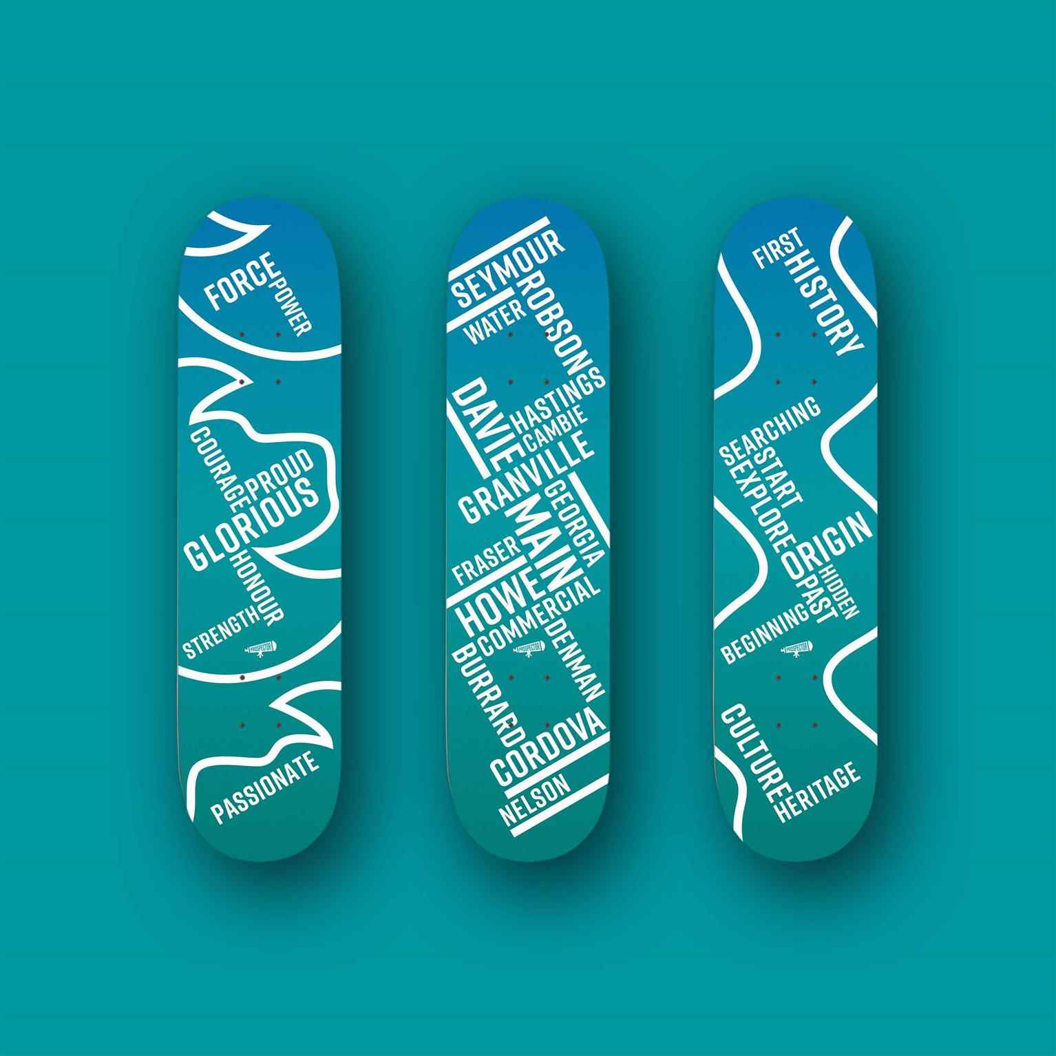
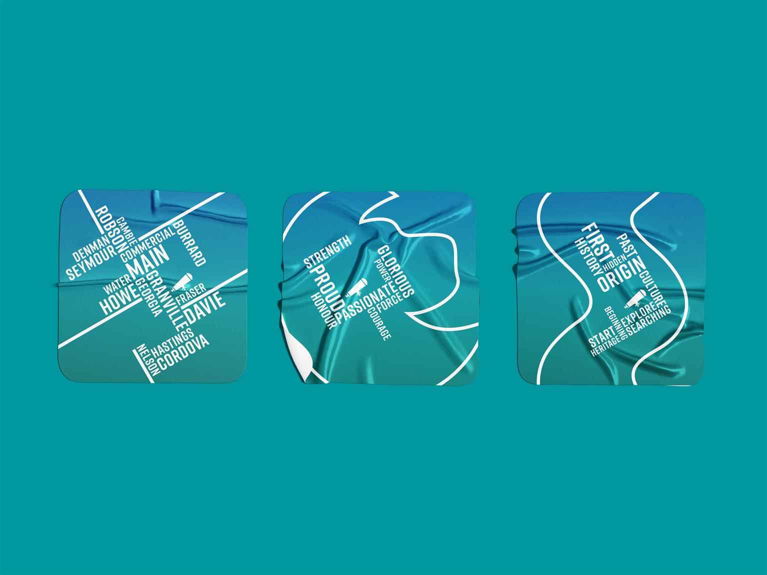
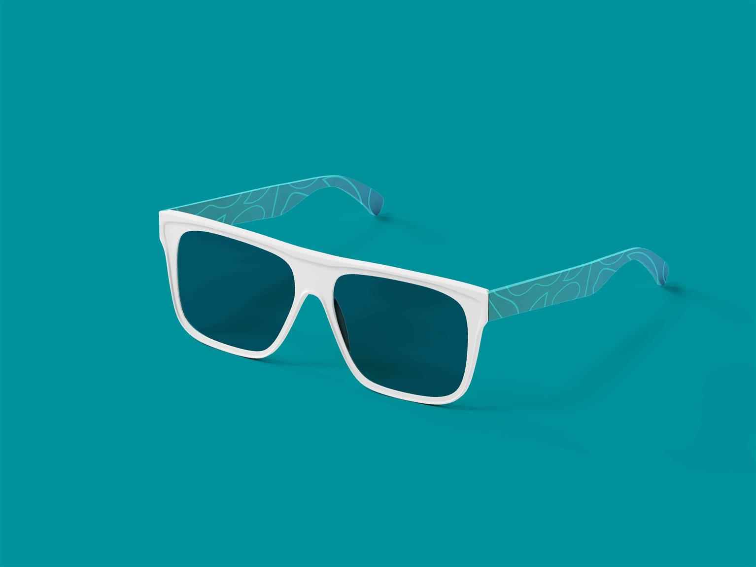
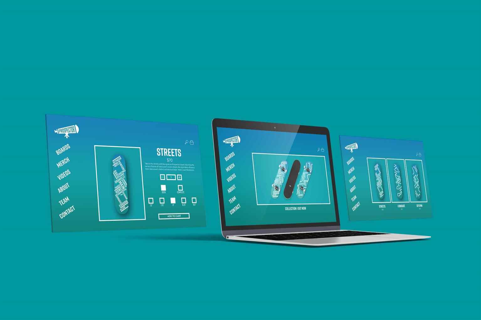
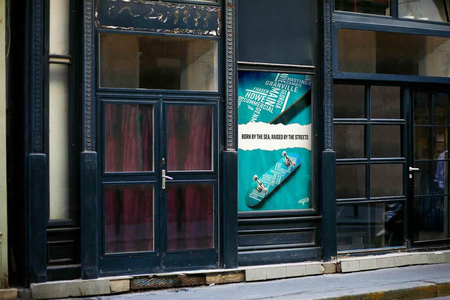
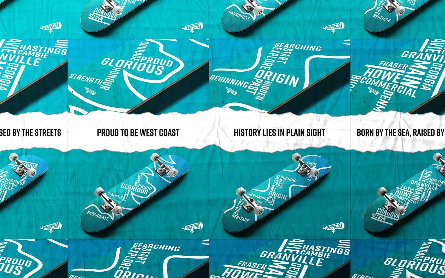
Prospector
Prospector is a conceptual skateboard company that encapsulates the values and ideas of Vancouver culture. Home to some of Canada’s oldest skateparks, British Columbia has been a prominent location...
Prospector is a conceptual skateboard company that encapsulates the values and ideas of Vancouver culture. Home to some of Canada’s oldest skateparks, British Columbia has been a prominent location...
Prospector is a conceptual skateboard company that encapsulates the values and ideas of Vancouver culture. Home to some of Canada’s oldest skateparks, British Columbia has been a prominent location in the skate-scene. Prospector delivers boards that boldly showcase some of Vancouver’s iconic landmarks, whilst drawing visual inspiration from the notable architectural style; West Coast Modernism. With a colour palette that alludes to the environmental characteristics of the Lower Mainland, Prospector’s vibrant and lively design elements inspire skaters—old and new—to pay homage to the skate history of Vancouver and to show pride in their city.

Share:
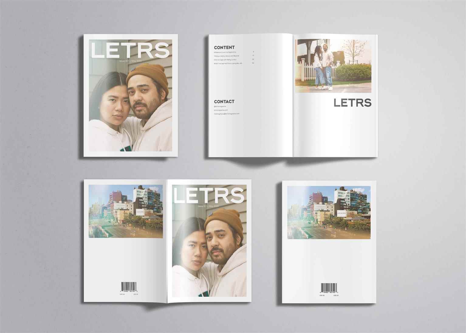
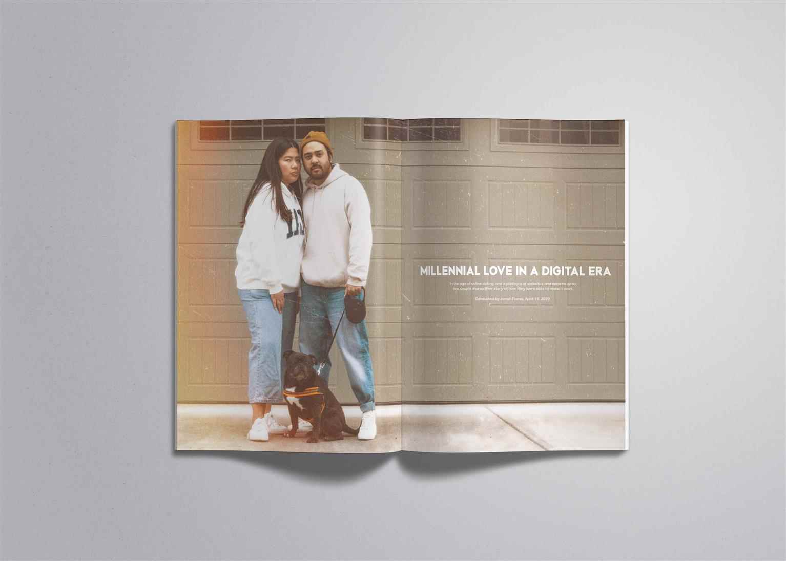
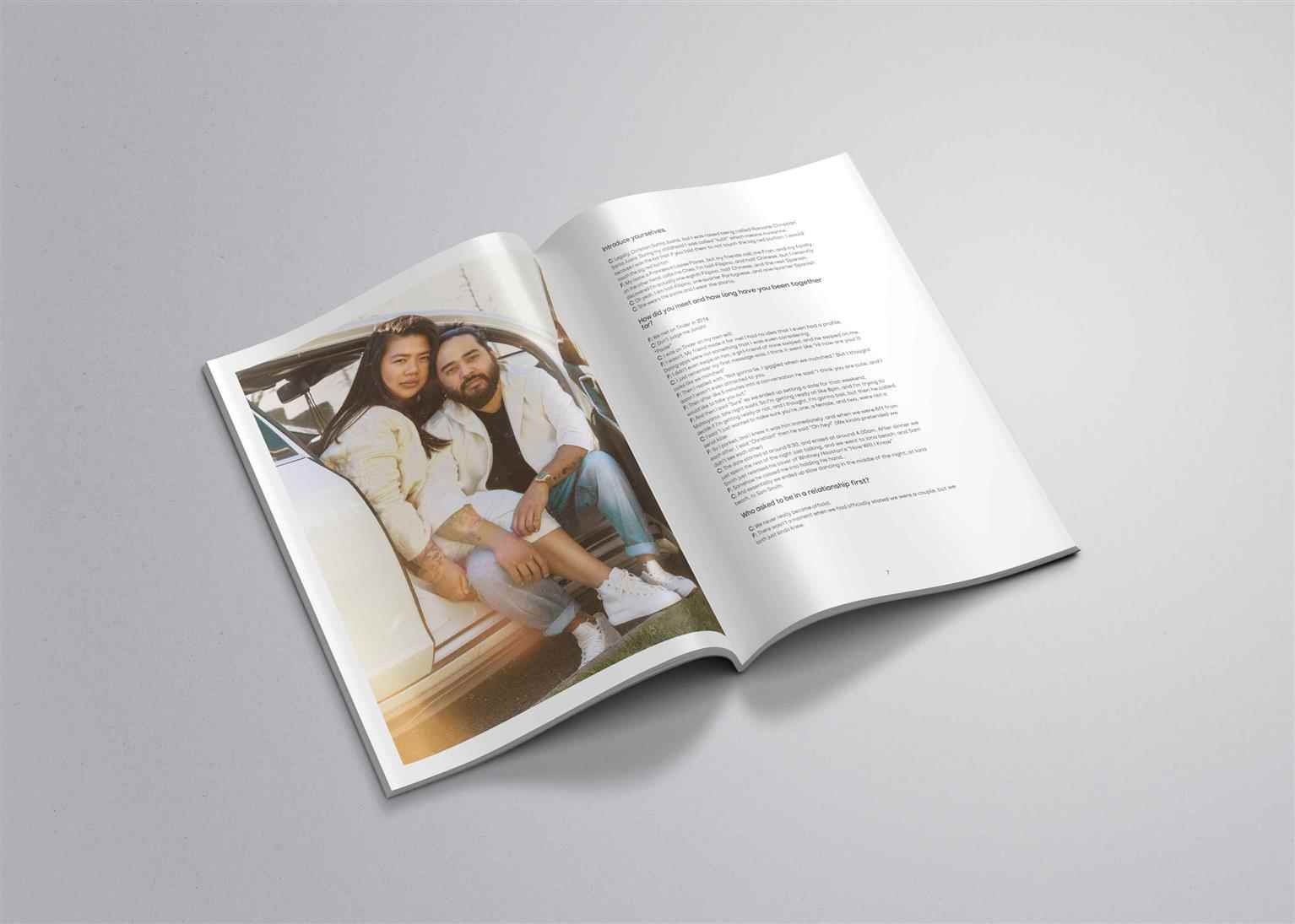
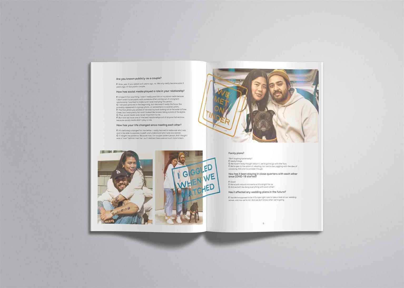
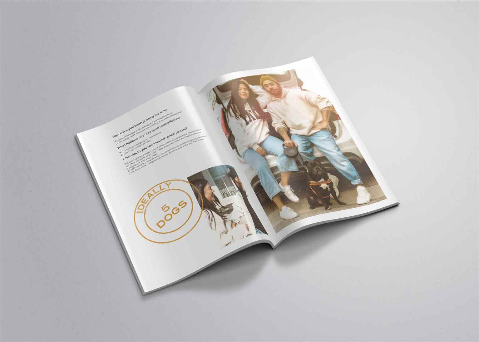
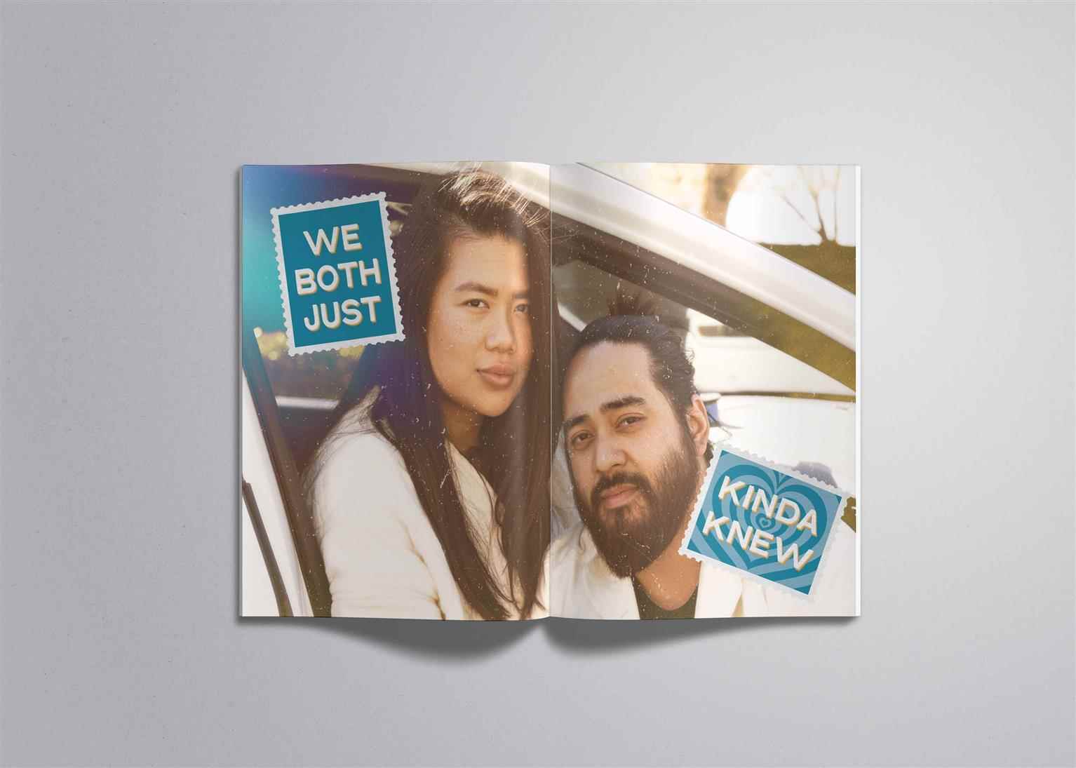
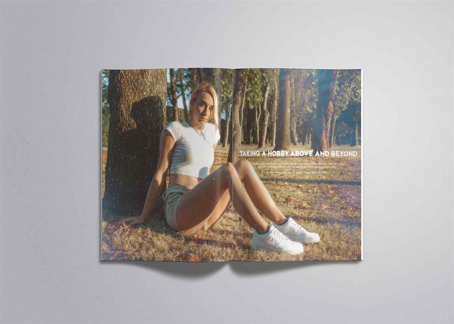
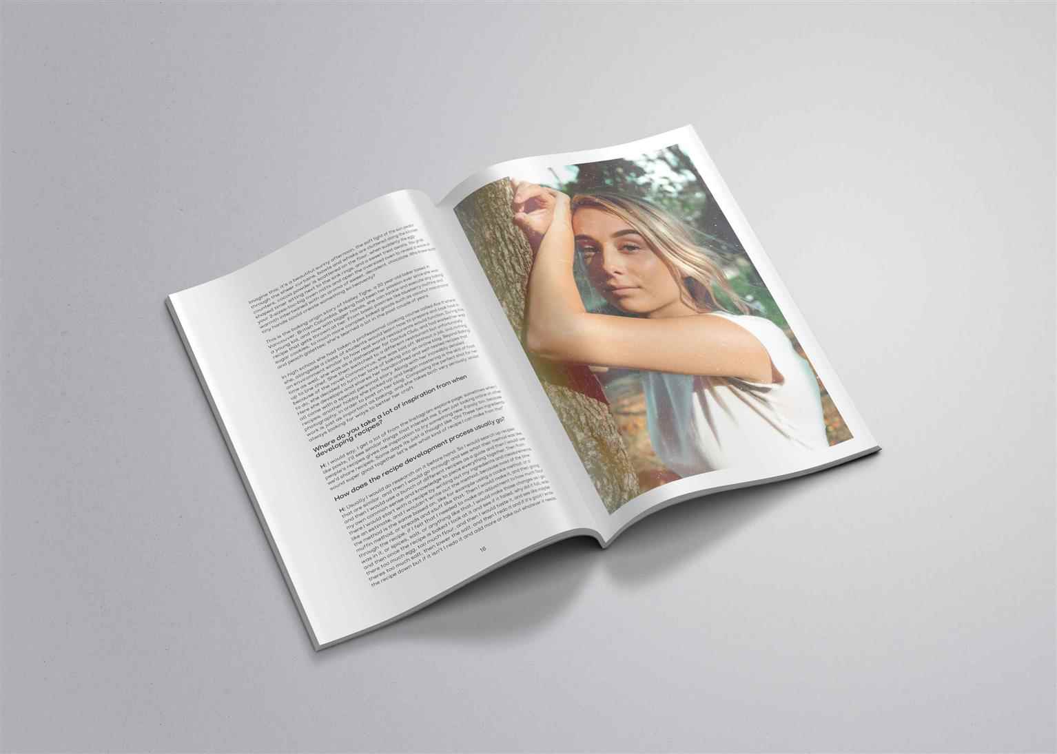
LETRS
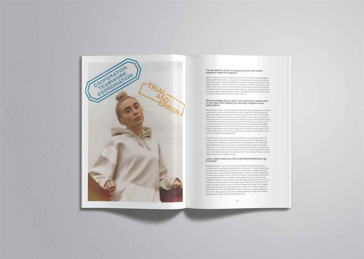
With a plethora of publications covering various topics and ideas, LETRS shines the spotlight on the smaller stories that delve into the intricacies of peoples’ lives, experiences, and communities....
With a plethora of publications covering various topics and ideas, LETRS shines the spotlight on the smaller stories that delve into the intricacies of peoples’ lives, experiences, and communities....
With a plethora of publications covering various topics and ideas, LETRS shines the spotlight on the smaller stories that delve into the intricacies of peoples’ lives, experiences, and communities. Allowing the details of every story to be shared and understood from an up-close and personal perspective influences readers to empathize with every story. Referencing vintage 70’s photography and colour palettes, treating each photograph to this aesthetic delivers a more humanistic and intimate atmosphere, fitting for the topics covered by the publication. The wordmark and heading typeface both exhibit hand-written characteristics, further developing the publication’s overall messaging.
Share:
Would you like to request more information?
Click on the button below and we'll get back to you as soon as possible.
Get in Touch with Us
