Piper

Matthews

Graphic Design

I am a graphic designer that specializes in using colour, storytelling, and thoughtful composition to create work that feels engaging and helps communicate a clear idea. I work to be a trustworthy and flexible designer that can provide illustrations in the style the clients need, while still being supported by strong layout and design fundamentals. I make a conscious effort to learn and expand my style so I can meet the needs of all sorts of established brands looking for an illustration, pattern design, or packagi

TEST

Omg look at this :3

Salamonkey Sweets

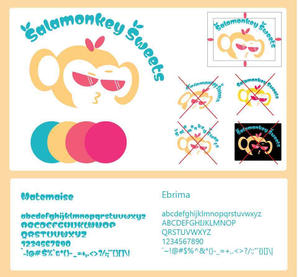
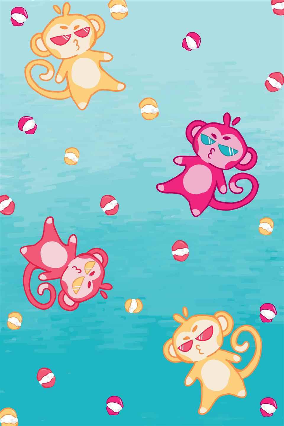
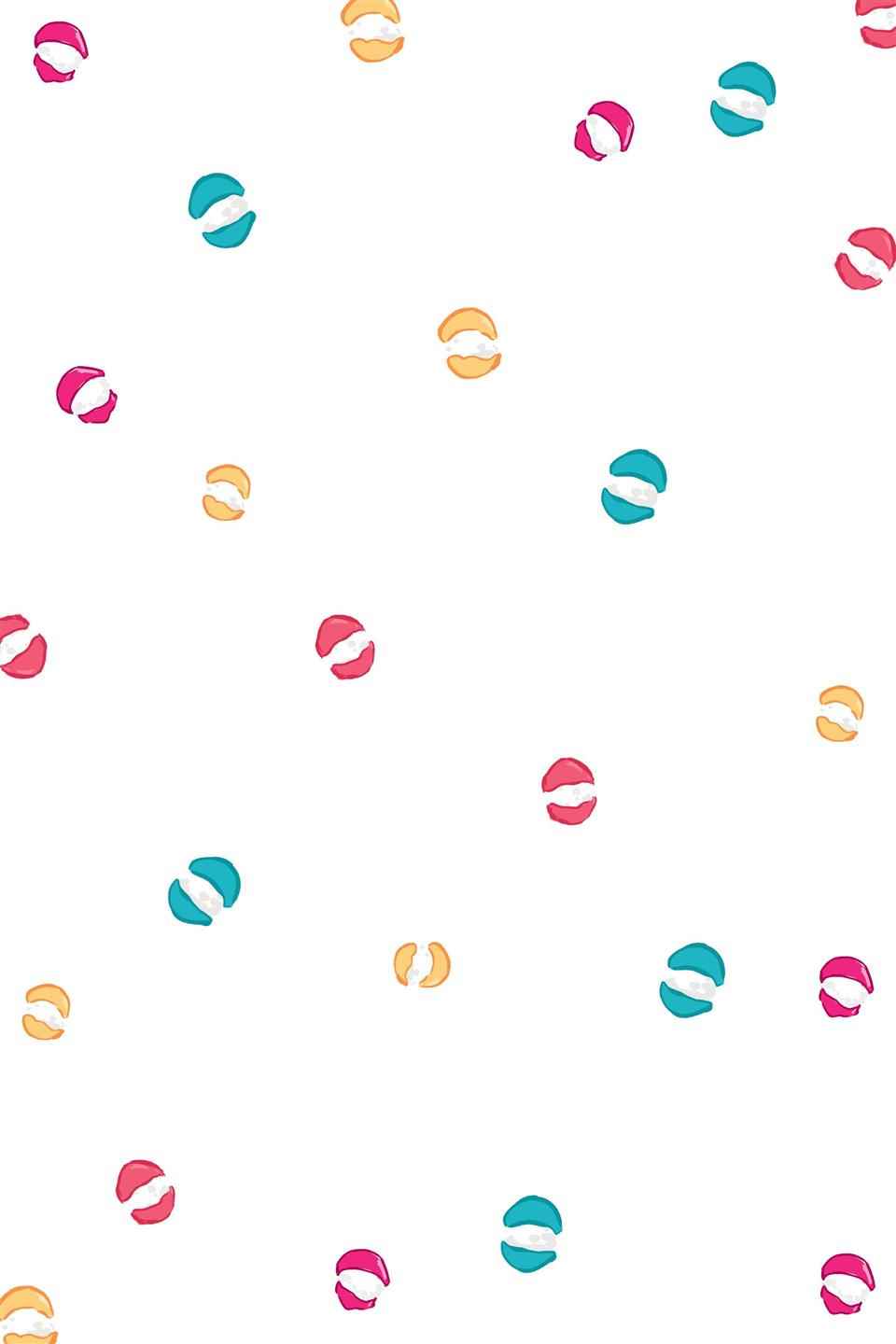
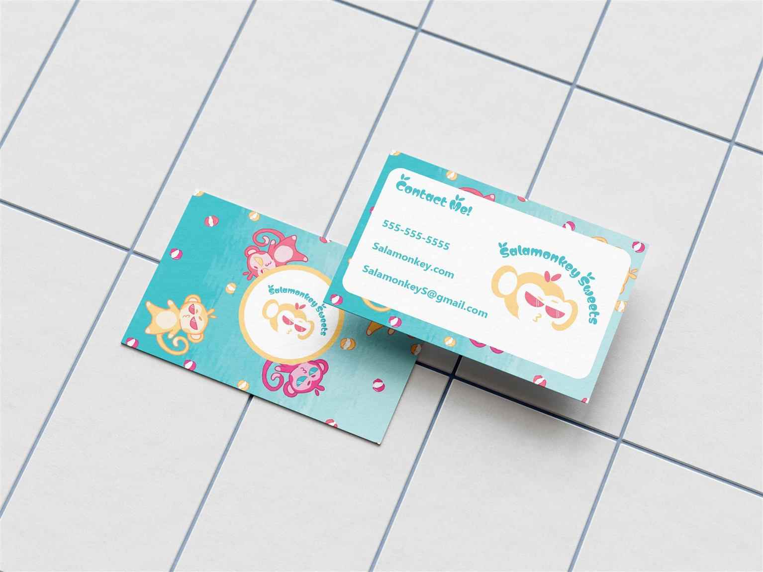
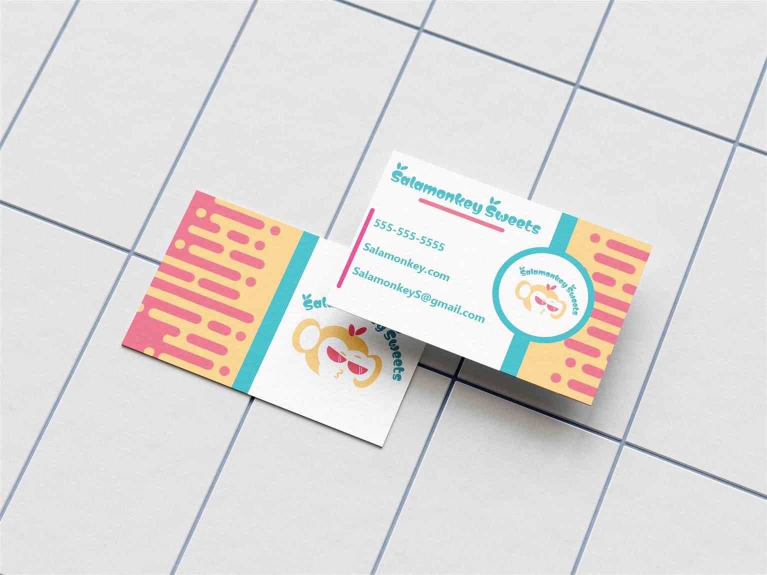
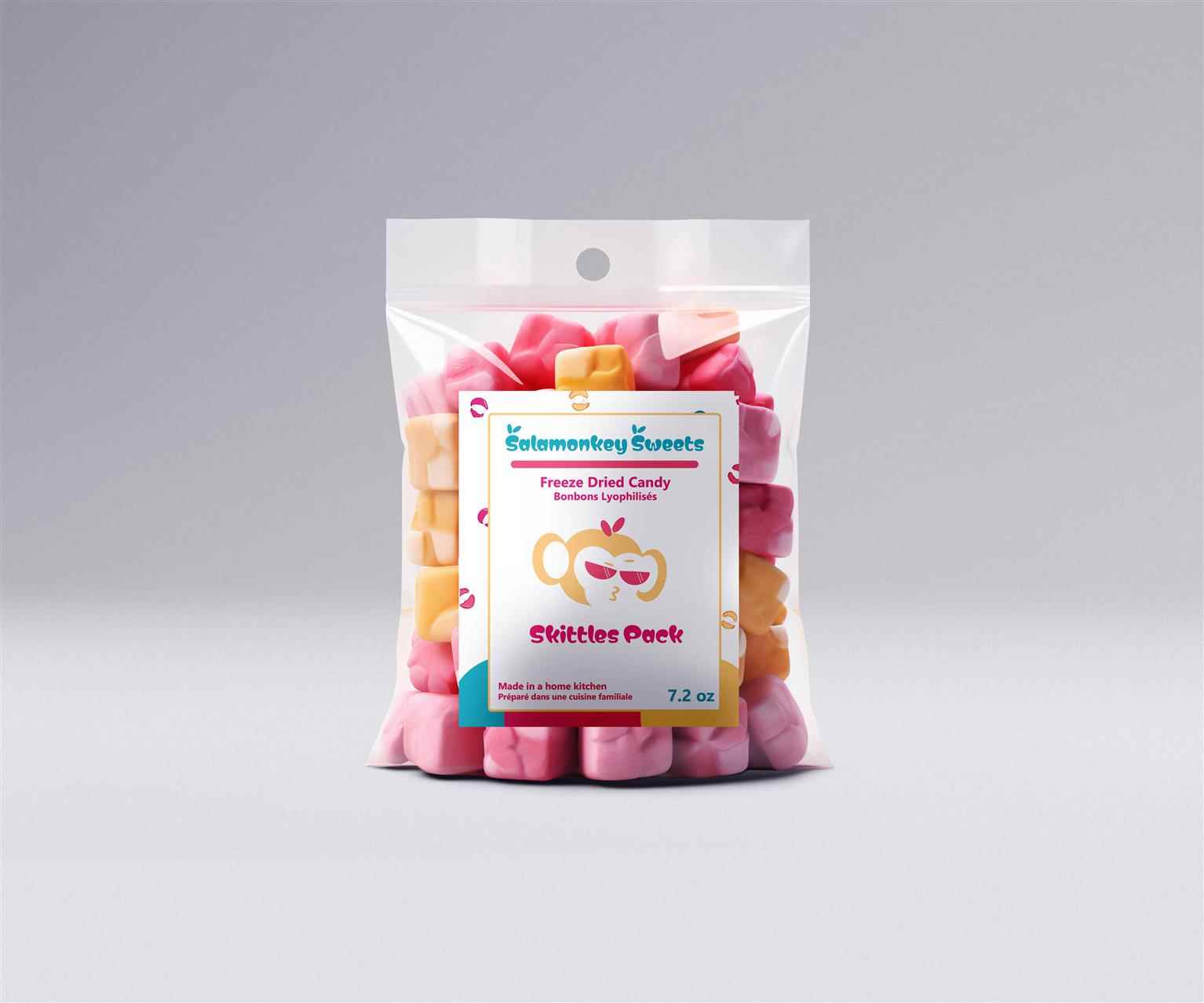
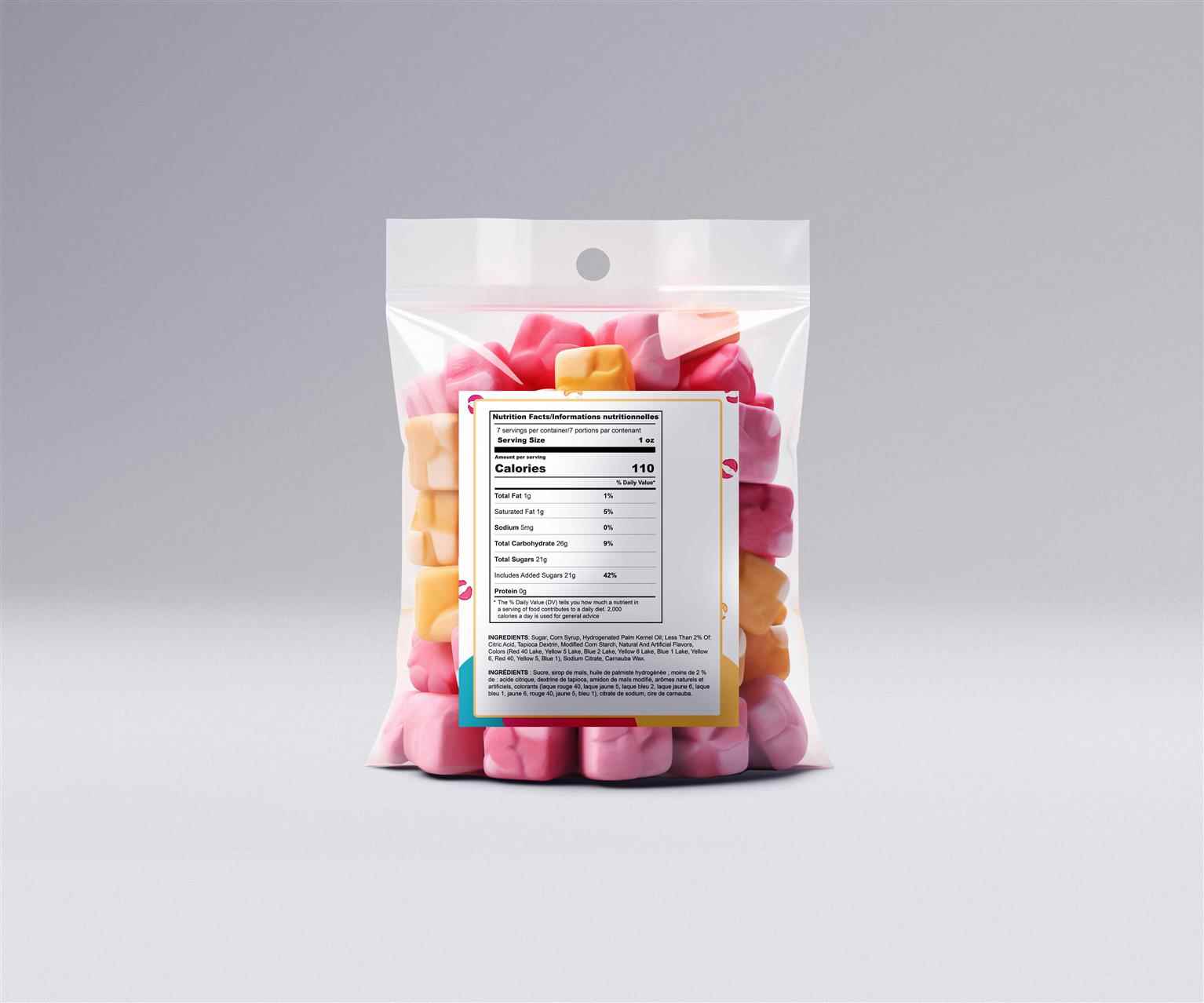
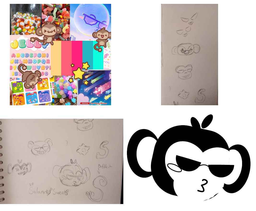
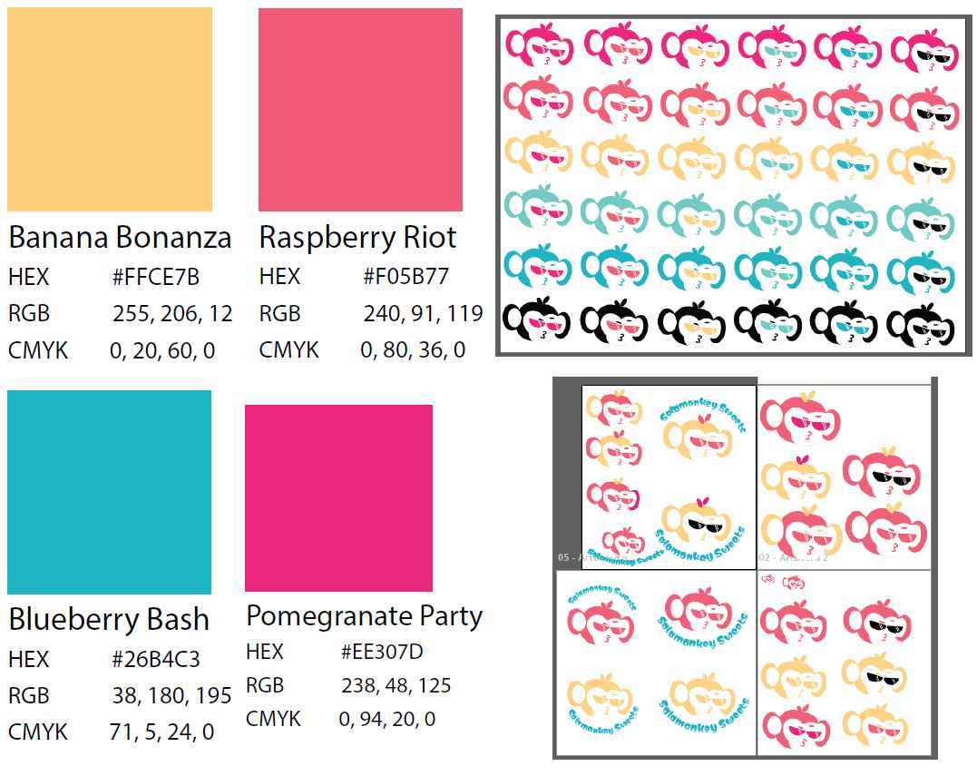
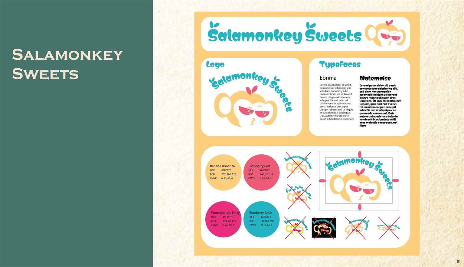
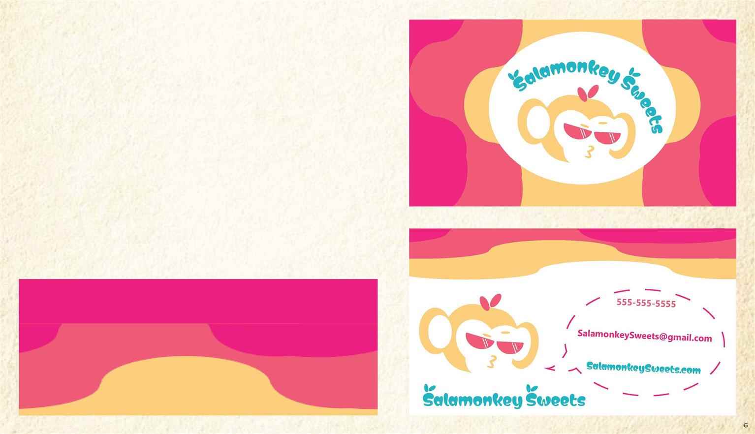
This is an identity created for the Salamonkey Sweets brand, with added deliverables and illustrative work. Using the Logo, colours, and typography chosen for the brand, a set of three illustrations were created and applied to various stationary and deliverables. Salamonkey Sweets is a brand run by a kid, for kids. This distinction was a large part of the...

This is an identity created for the Salamonkey Sweets brand, with added deliverables and illustrative work. Using the Logo, colours, and typography chosen for the brand, a set of three illustrations were created and applied to various stationary and deliverables. Salamonkey Sweets is a brand run by a kid, for kids. This distinction was a large part of the...

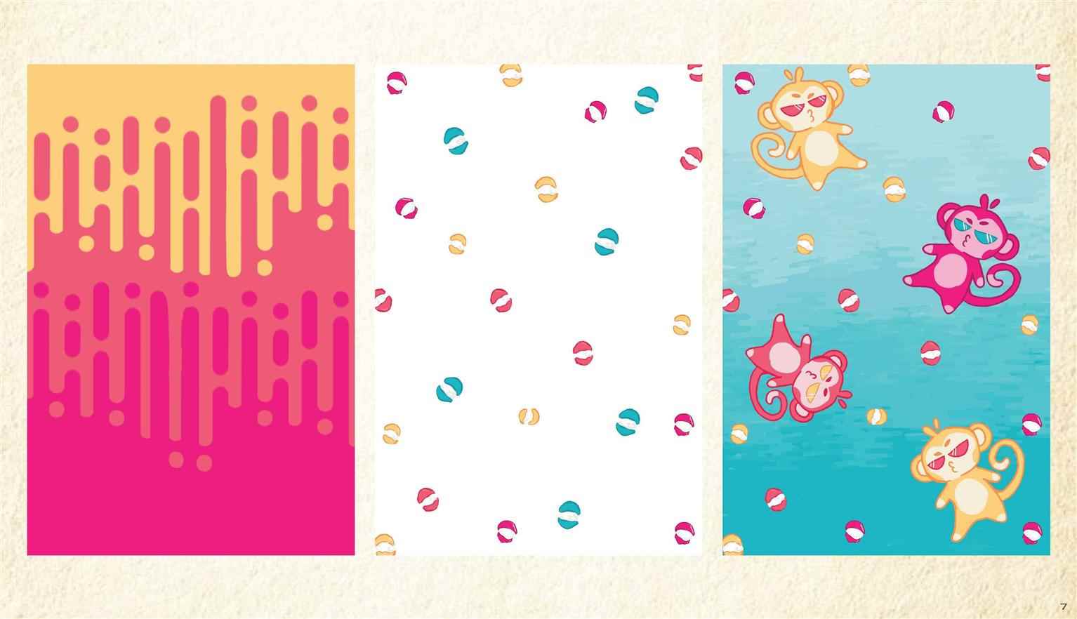
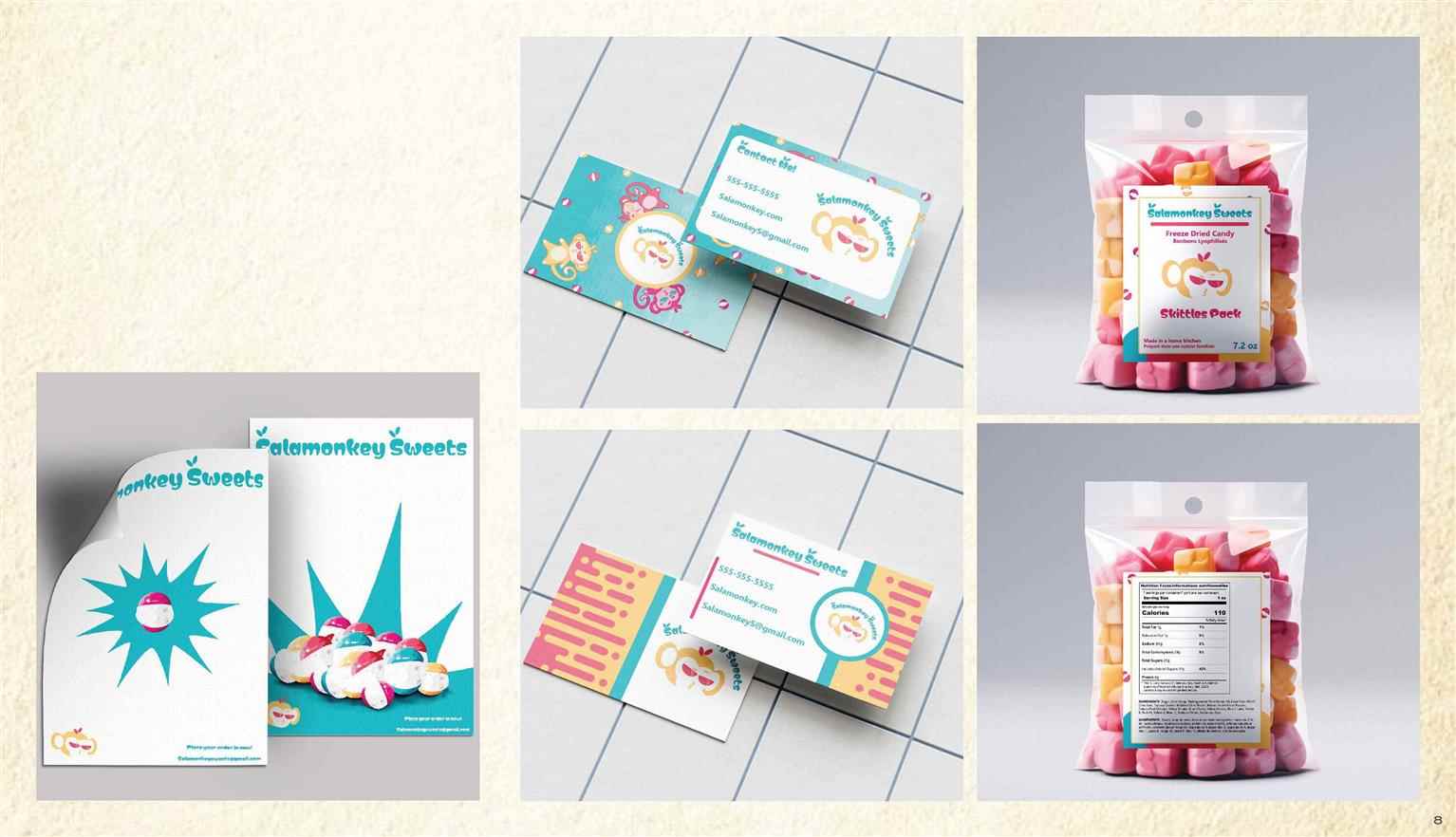
This is an identity created for the Salamonkey Sweets brand, with added deliverables and illustrative work. Using the Logo, colours, and typography chosen for the brand, a set of three illustrations were created and applied to various stationary and deliverables. Salamonkey Sweets is a brand run by a kid, for kids. This distinction was a large part of the brand creation process, leading to the heavy focus on bright colours and inviting, legible typography. Utilizing interesting illustrative patterns and a clean visual hierarchy, the brand identity was applied to deliverables that kept the exciting and bright look, while still being easy for younger children to read.
Read more

The Crane Wives Conceptual Poster Set

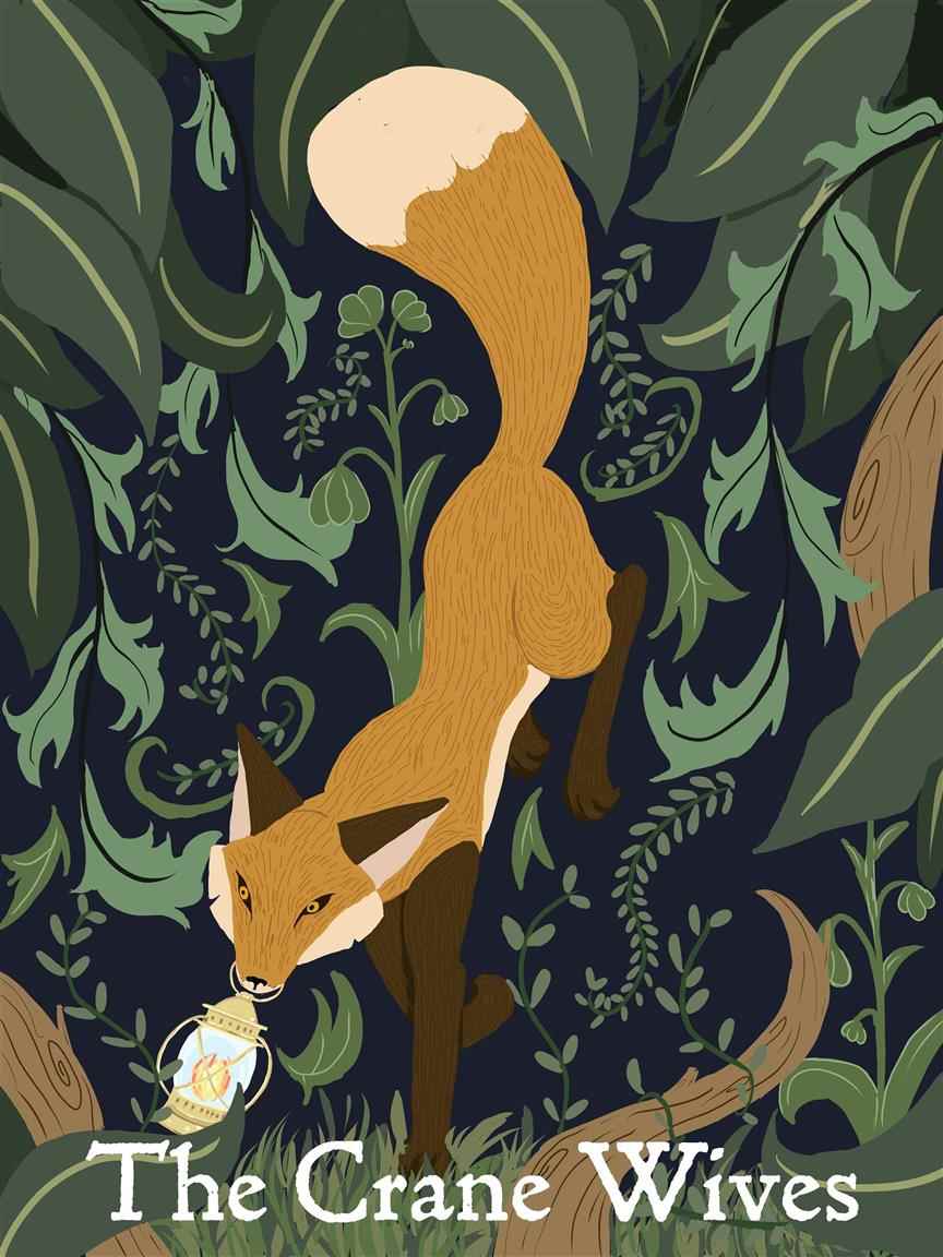
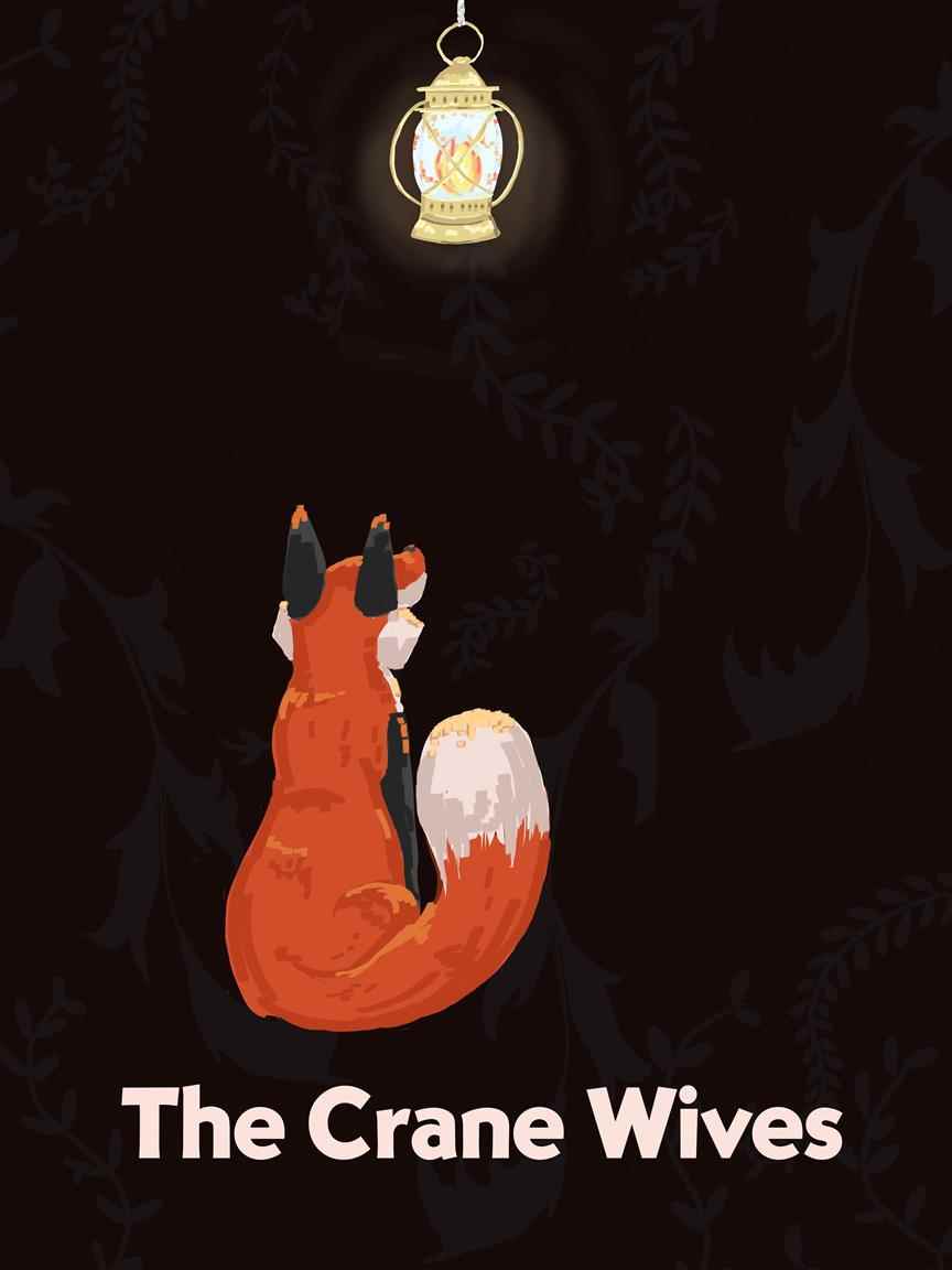
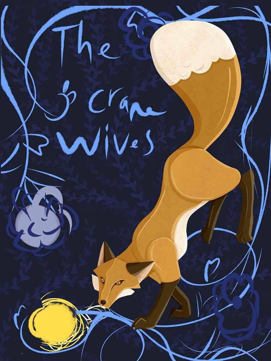
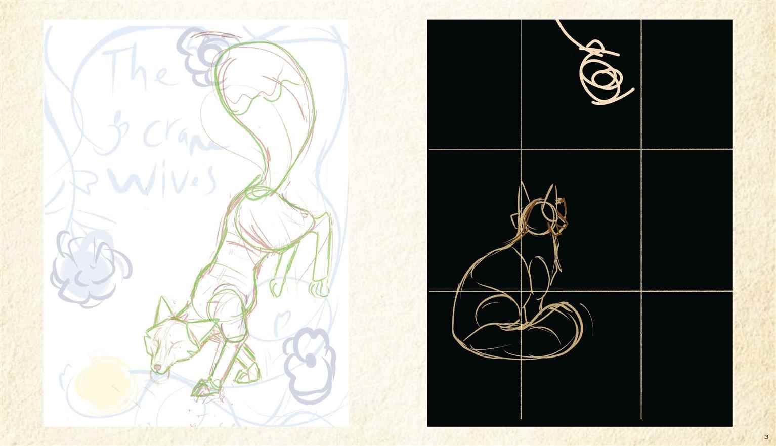
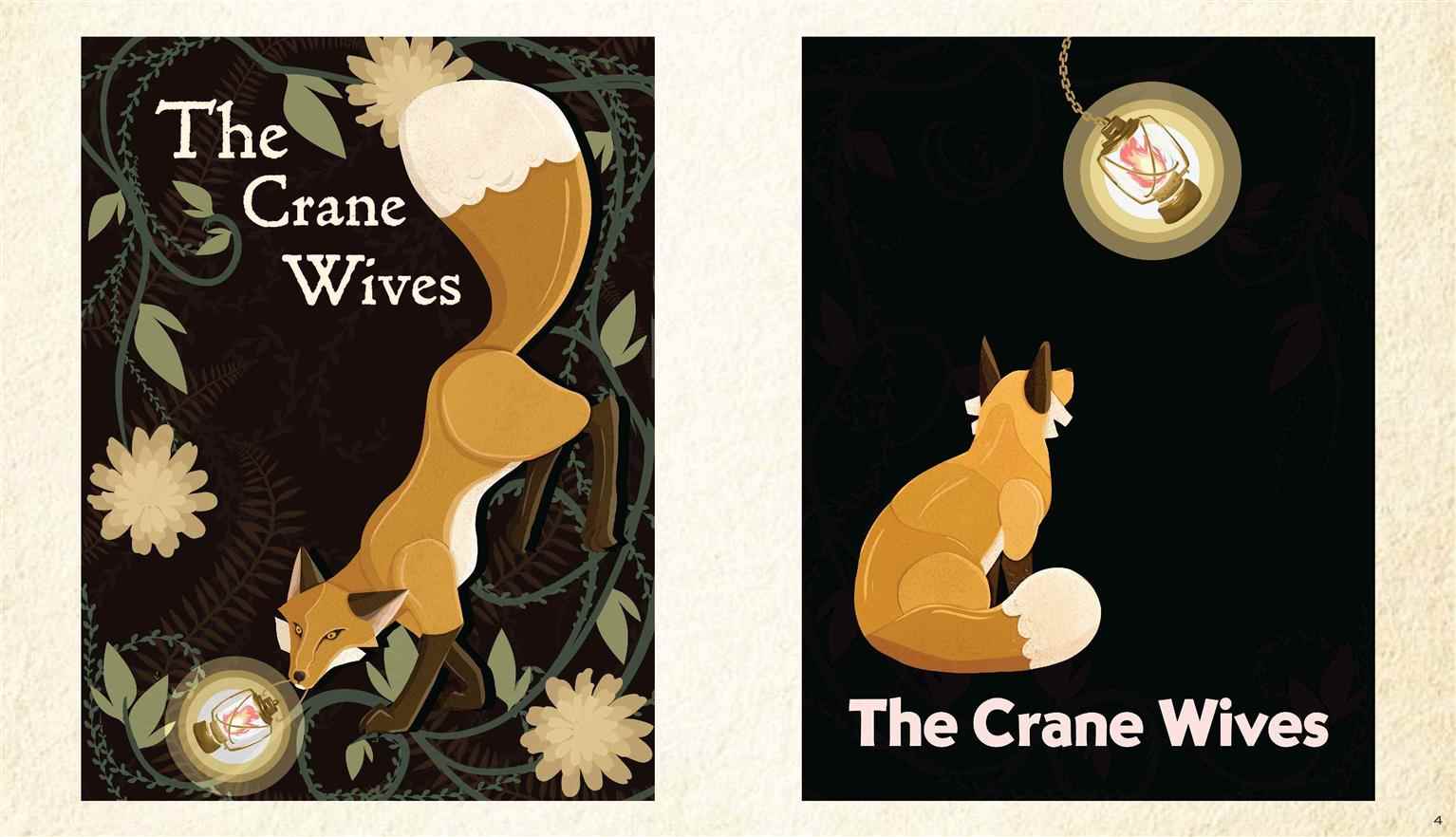
This is a set of two conceptual posters created to promote the band "The Crane Wives". The two posters take inspiration from contrasting maximalist and minimalist styles. The maximalist poster takes inspiration from the Arts and Crafts movement, specifically William Morris' floral patterns. The minimalist poster uses the simple colours and bold fonts from the Sa...
This is a set of two conceptual posters created to promote the band "The Crane Wives". The two posters take inspiration from contrasting maximalist and minimalist styles. The maximalist poster takes inspiration from the Arts and Crafts movement, specifically William Morris' floral patterns. The minimalist poster uses the simple colours and bold fonts from the Sa...

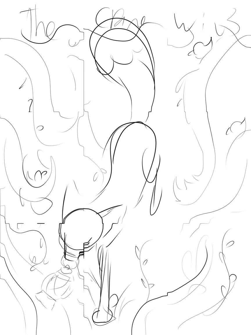
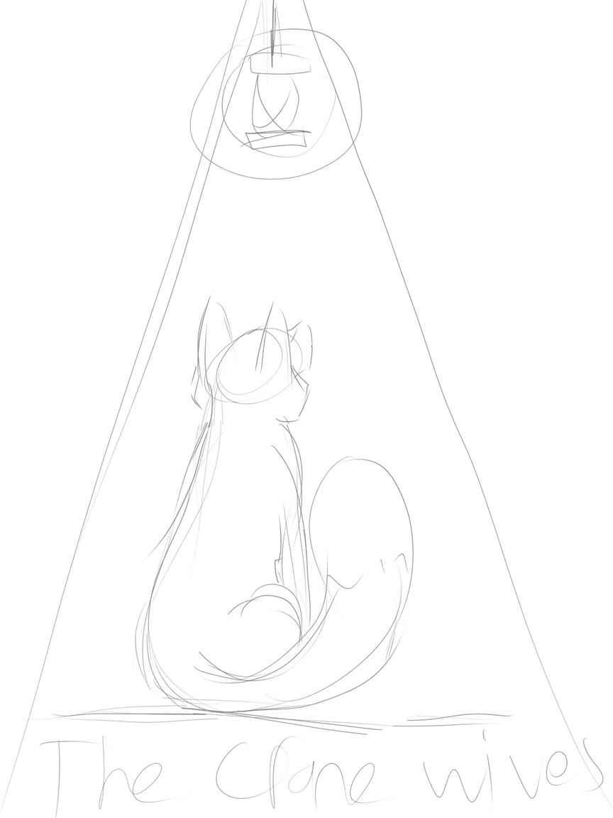
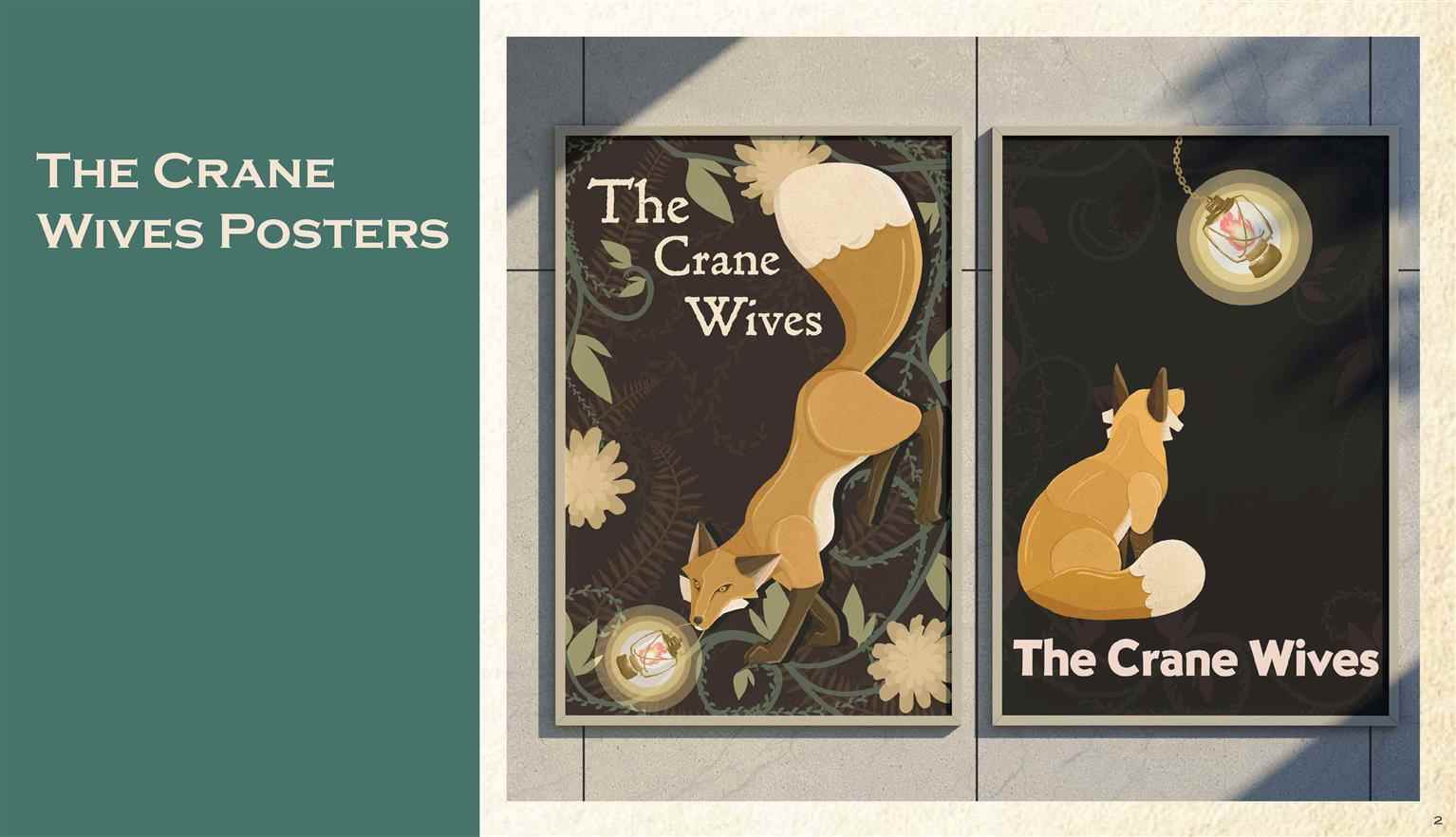
This is a set of two conceptual posters created to promote the band "The Crane Wives". The two posters take inspiration from contrasting maximalist and minimalist styles. The maximalist poster takes inspiration from the Arts and Crafts movement, specifically William Morris' floral patterns. The minimalist poster uses the simple colours and bold fonts from the Sachplakat movement, heavily inspired by the Priester match advertisement. These two posters are currently in the process of being revamped and reimagined!

Read more

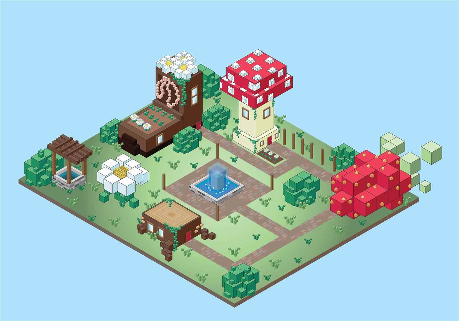
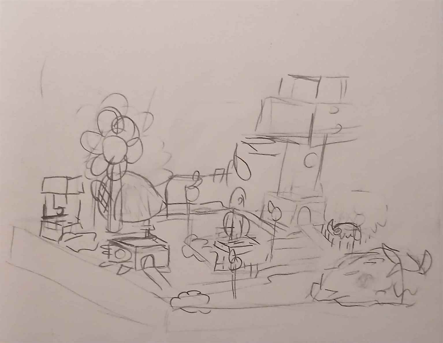
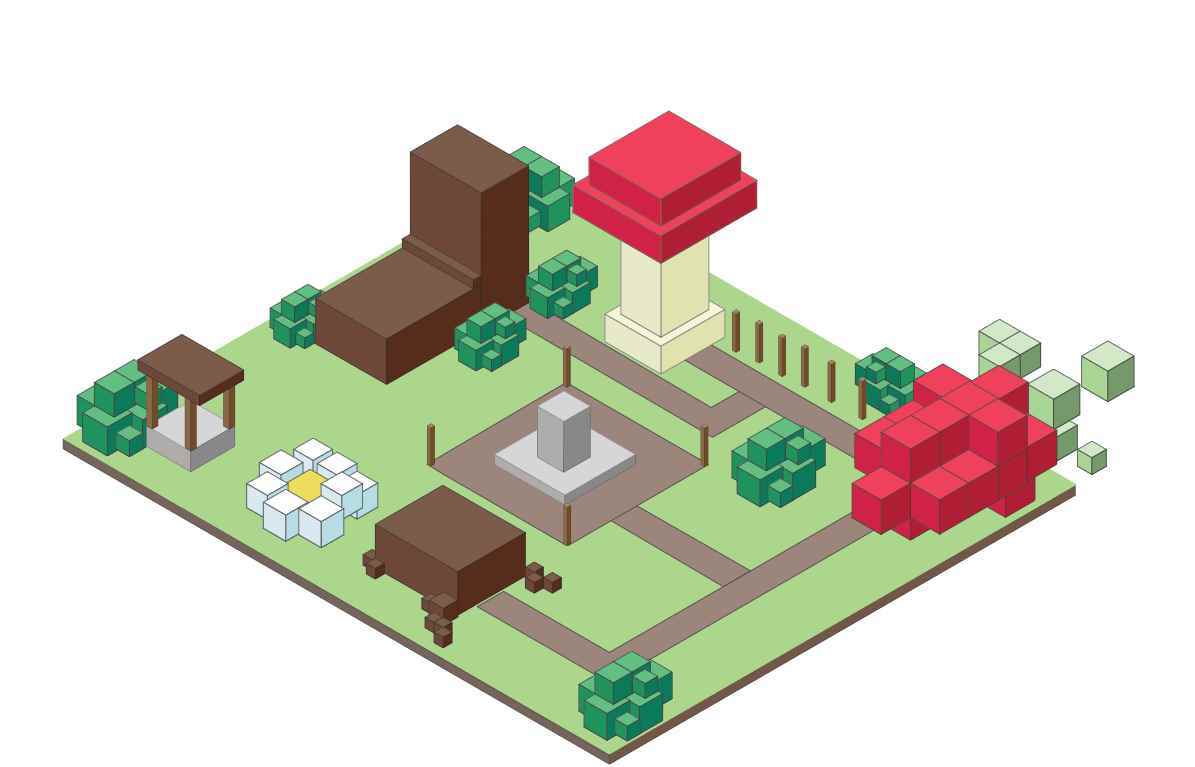
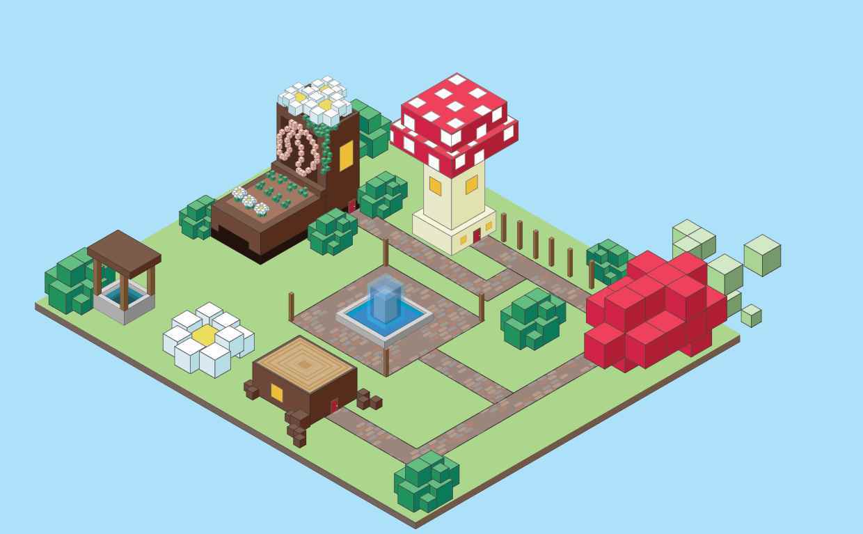
Isometric World

This was a project meant to test the limits of what could be done only using isometric cuboids in a short time frame. Taking inspiration from The Legend of Zelda: The Minish Cap and other pixel games, this small world was created within the constraints of the the project challenge.

Tomato Poster

The design challenge presented was creating a “perfectly imperfect” poster utilizing Adobe Illustrator’s brush tools. The poster created is meant to adveritise fresh produce at a farmers market, where the rough and imperfect strokes would match the overall tone. The poster is meant to look rough and handmade, despite being created in a precise software suc...

The design challenge presented was creating a “perfectly imperfect” poster utilizing Adobe Illustrator’s brush tools. The poster created is meant to adveritise fresh produce at a farmers market, where the rough and imperfect strokes would match the overall tone. The poster is meant to look rough and handmade, despite being created in a precise software suc...

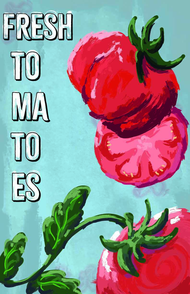
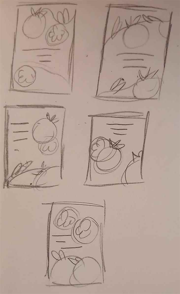
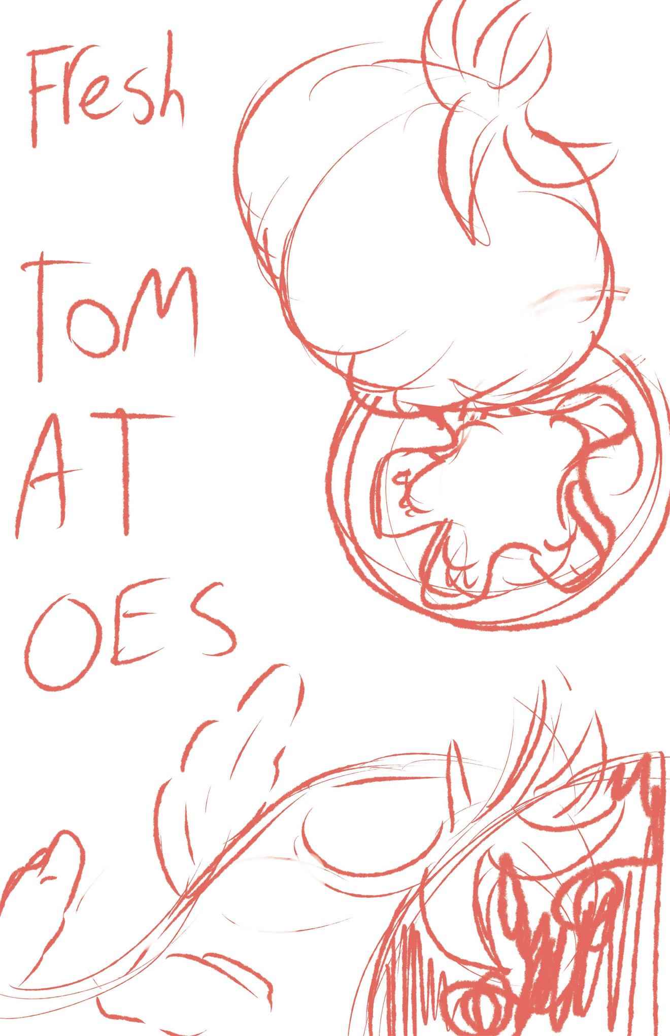
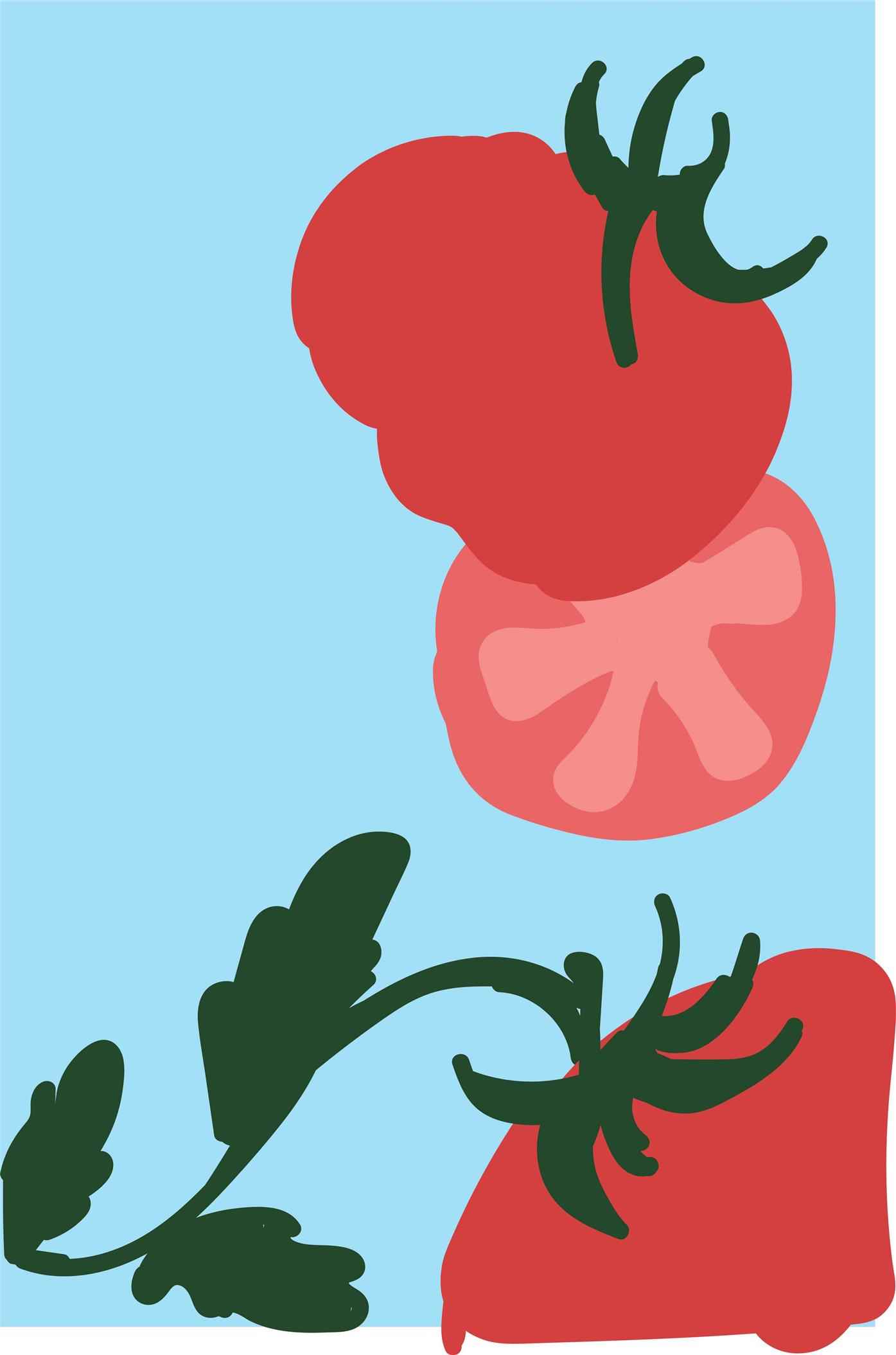
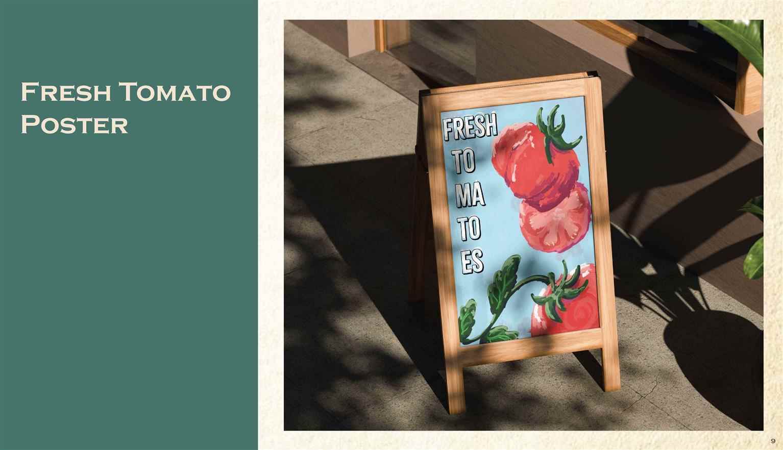
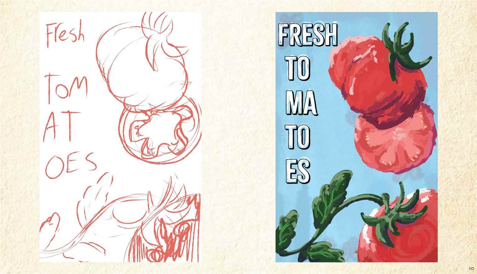
The design challenge presented was creating a “perfectly imperfect” poster utilizing Adobe Illustrator’s brush tools. The poster created is meant to adveritise fresh produce at a farmers market, where the rough and imperfect strokes would match the overall tone. The poster is meant to look rough and handmade, despite being created in a precise software such as Adobe Illustrator. I created a rough texture with traditional water colour and used that image to create interest in the otherwise plain background. For the tomatoes themselves, I used the brush tool and tried to capture a rough acrylic look.

Read more

Dravic Springs

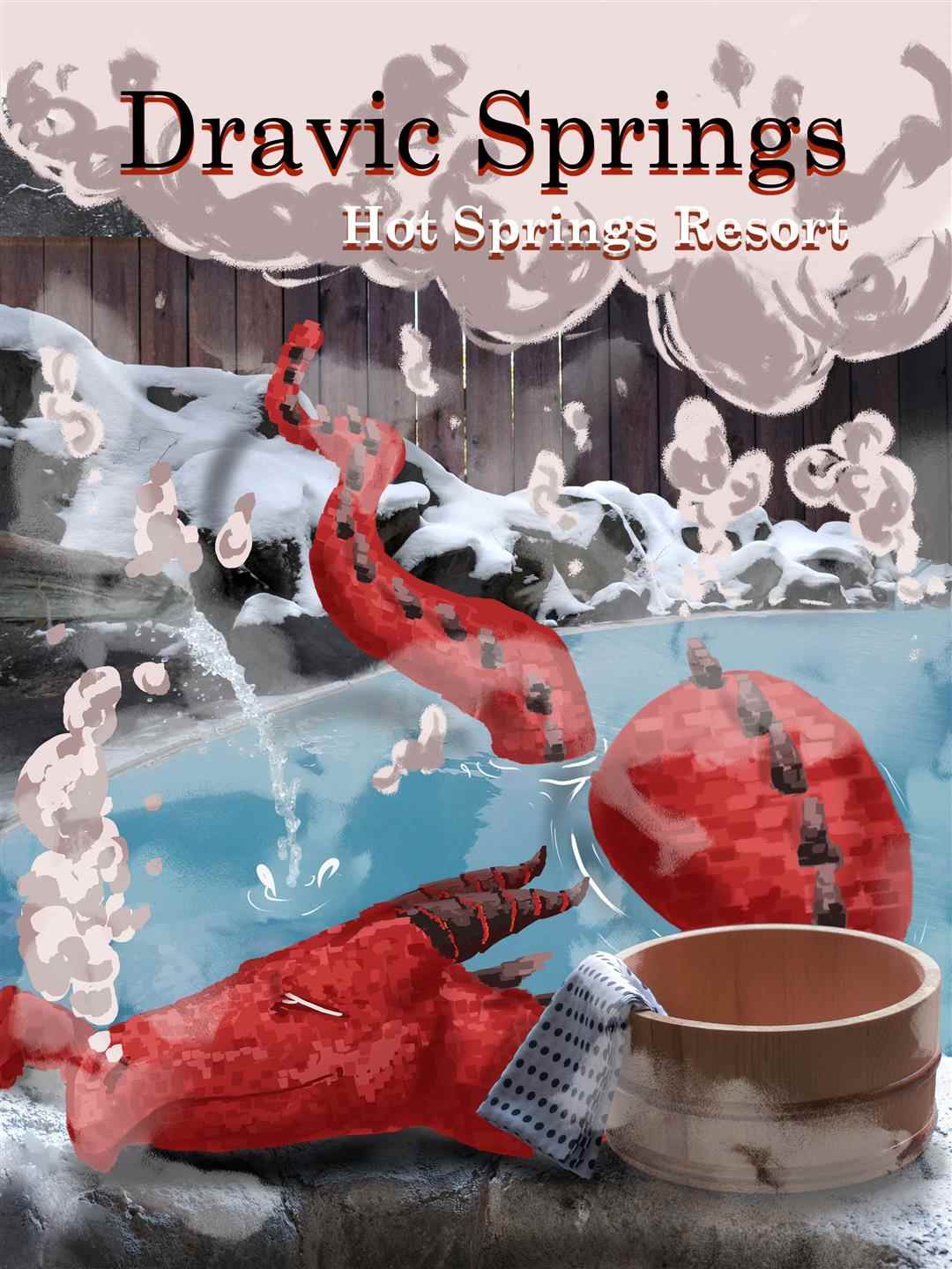
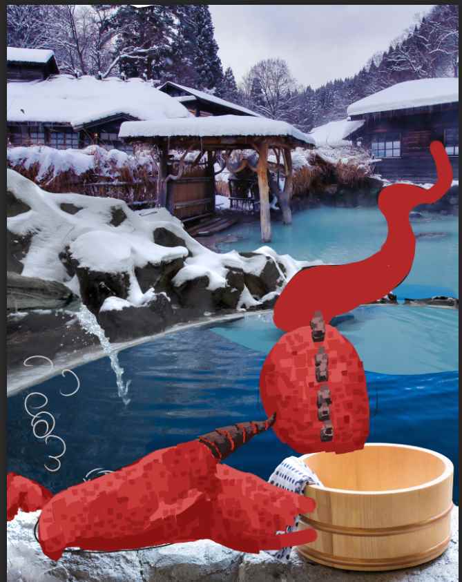
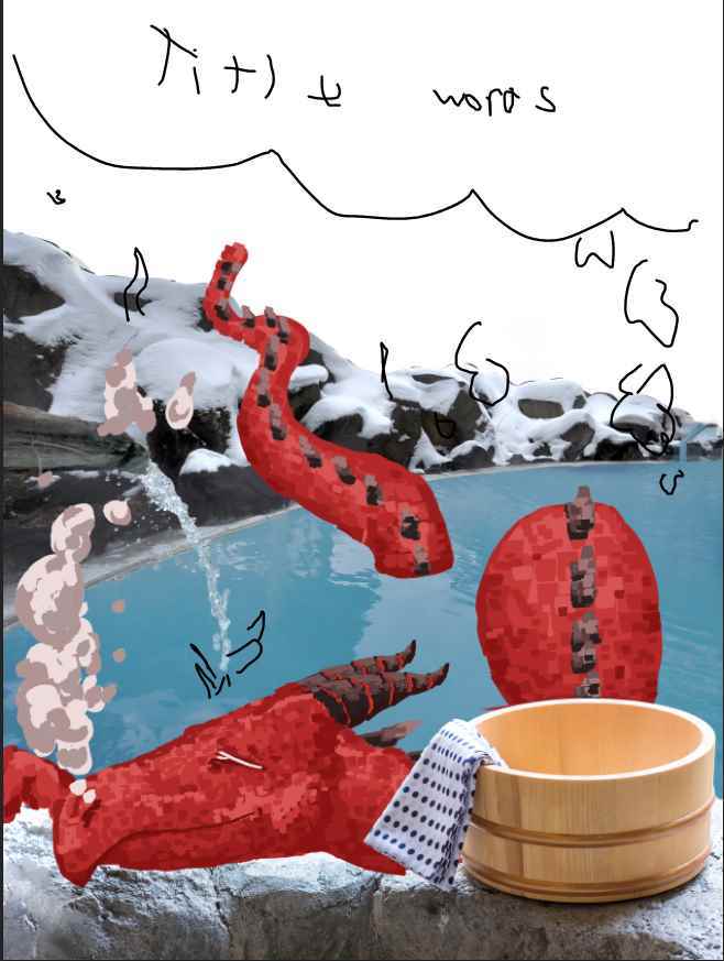
This project was an advertisment for a conceptual hot springs resort, combining real world and fantasy elements through illustration and photoshop to promote a fantastical resort. Various photos were created to make a snowy hot springs background to create a visual dichotomy when paired with the red dragon and warm coloured steam and smoke.

Mellow Brand Identity

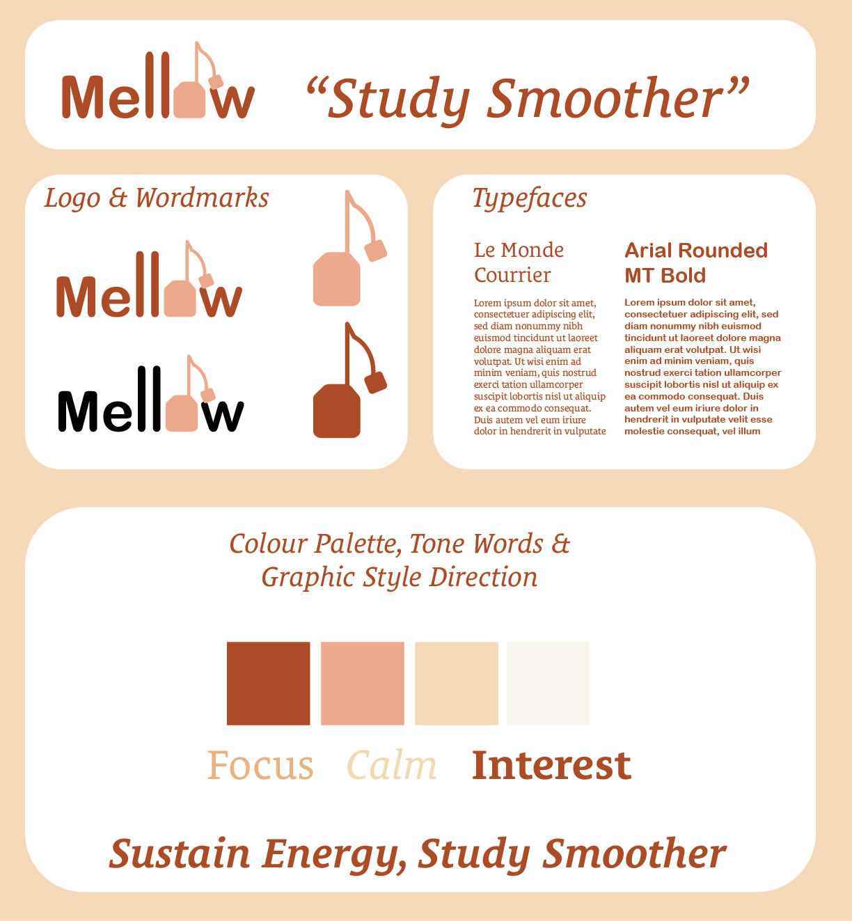
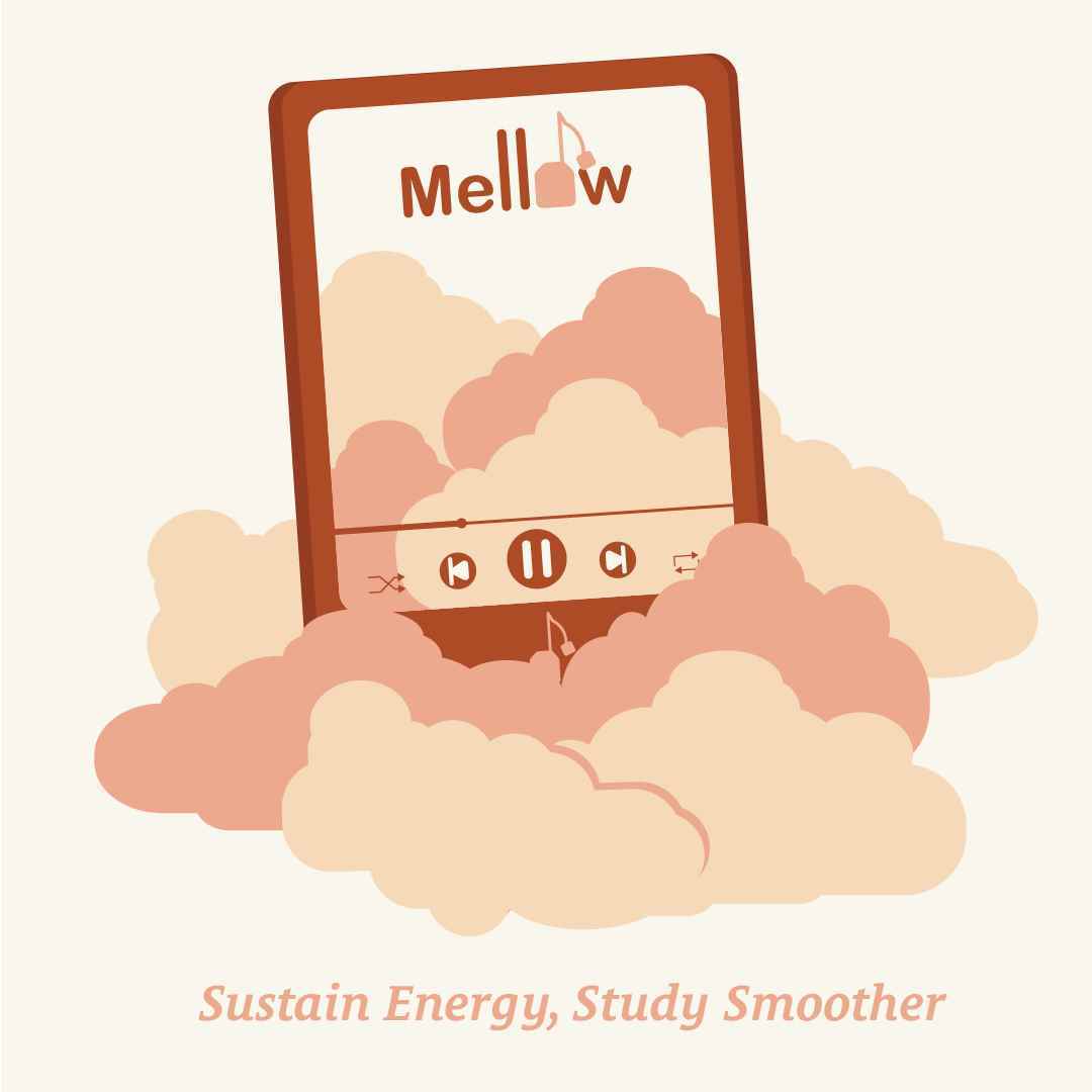
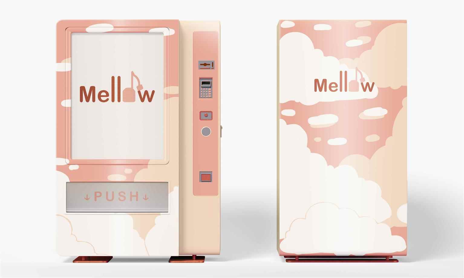
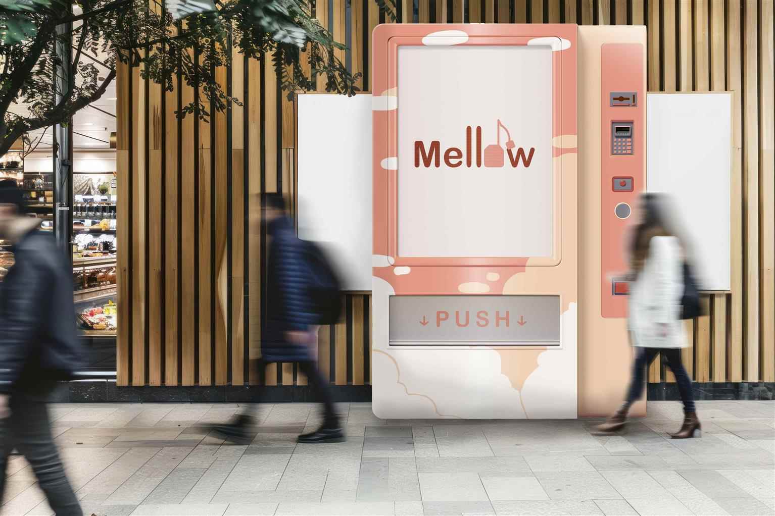
A brand identity created for the Mellow milk tea brand, applied to an instagram advertisement. The advertisement is an illustration utilizing the brand’s soothing colours and the imagery of clouds to enforce the idea of calm and comfort. The brand identity created was then applied to an illustrated pattern, vending machine, and an Instagram advertisement.

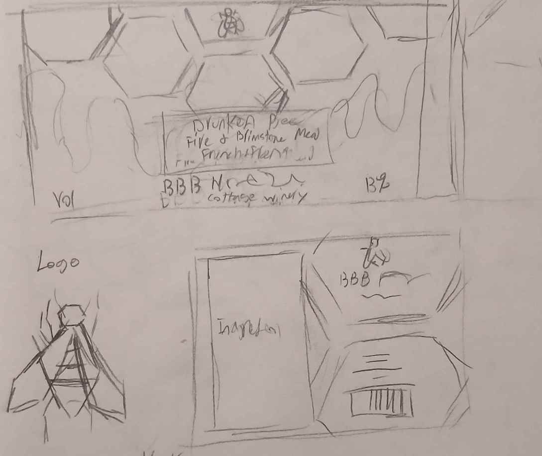
Drunkin’ Bee: Fire and Brimstone Mead Redesign

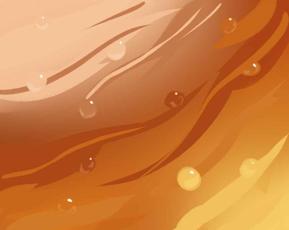
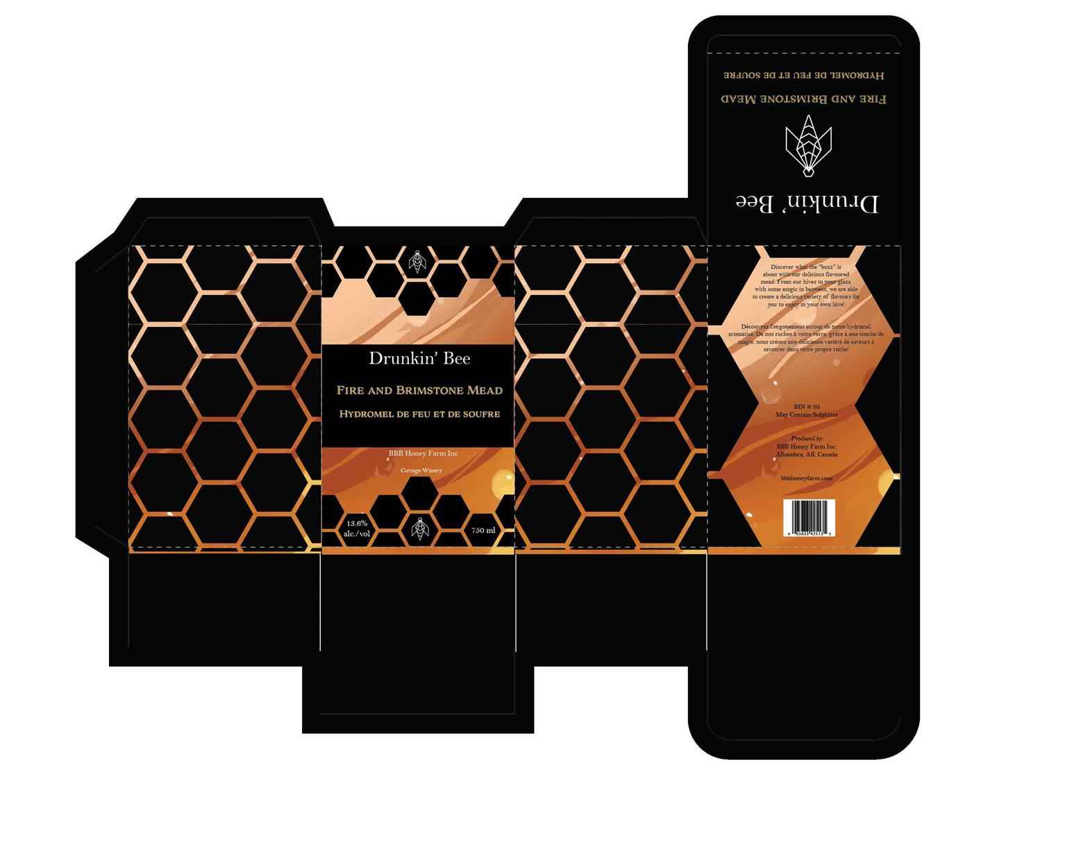
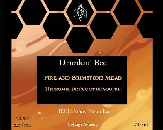
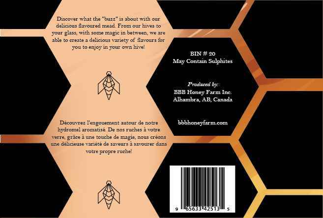
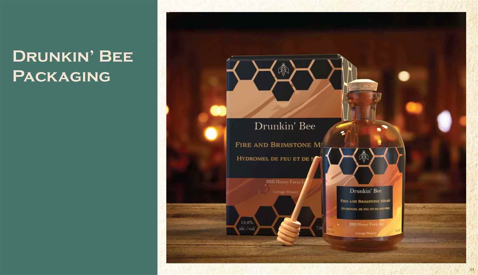
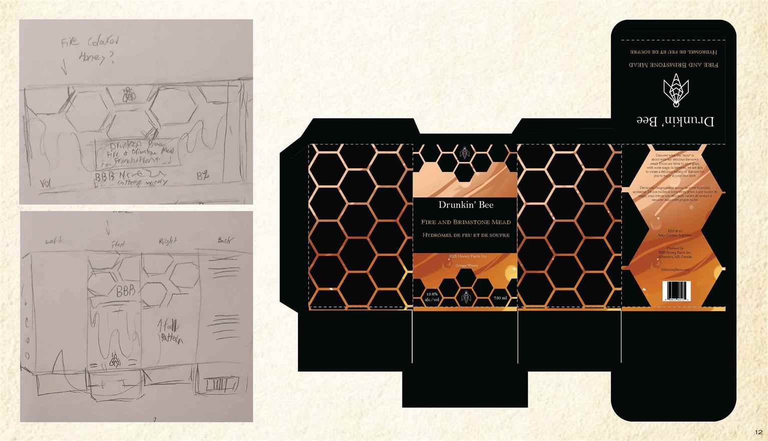
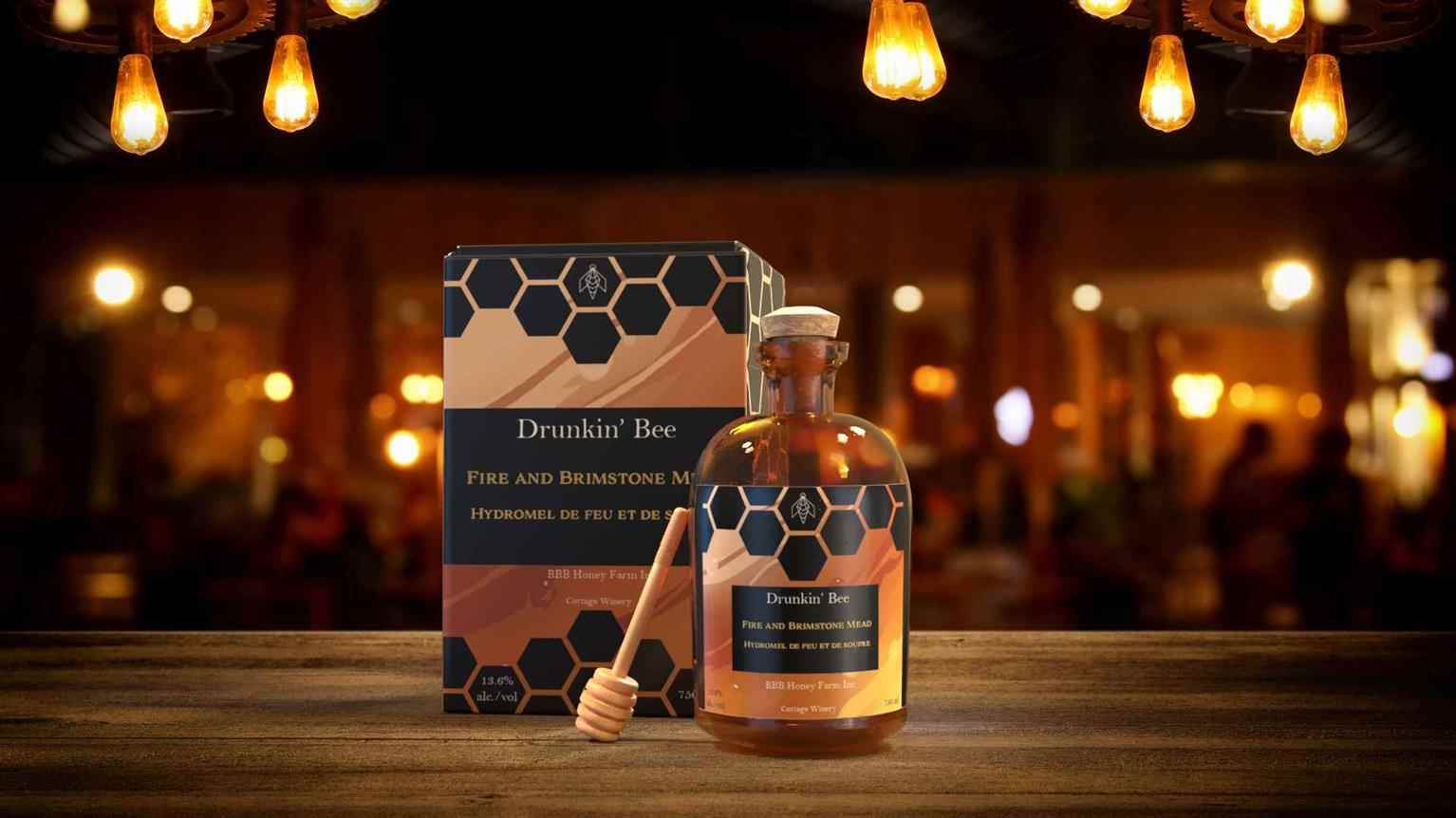
A packaging redesign project where a pre-existing alcohol or beverage brand was chosen, rebranded, redesigned, and mocked up. The design was an experimental approach to combining an illustrative texture with clean and readable packaging. With a combination of my digital illustration software, Adobe Illustrator, and Adobe dimension, I created the texture, p...

A packaging redesign project where a pre-existing alcohol or beverage brand was chosen, rebranded, redesigned, and mocked up. The design was an experimental approach to combining an illustrative texture with clean and readable packaging. With a combination of my digital illustration software, Adobe Illustrator, and Adobe dimension, I created the texture, p...

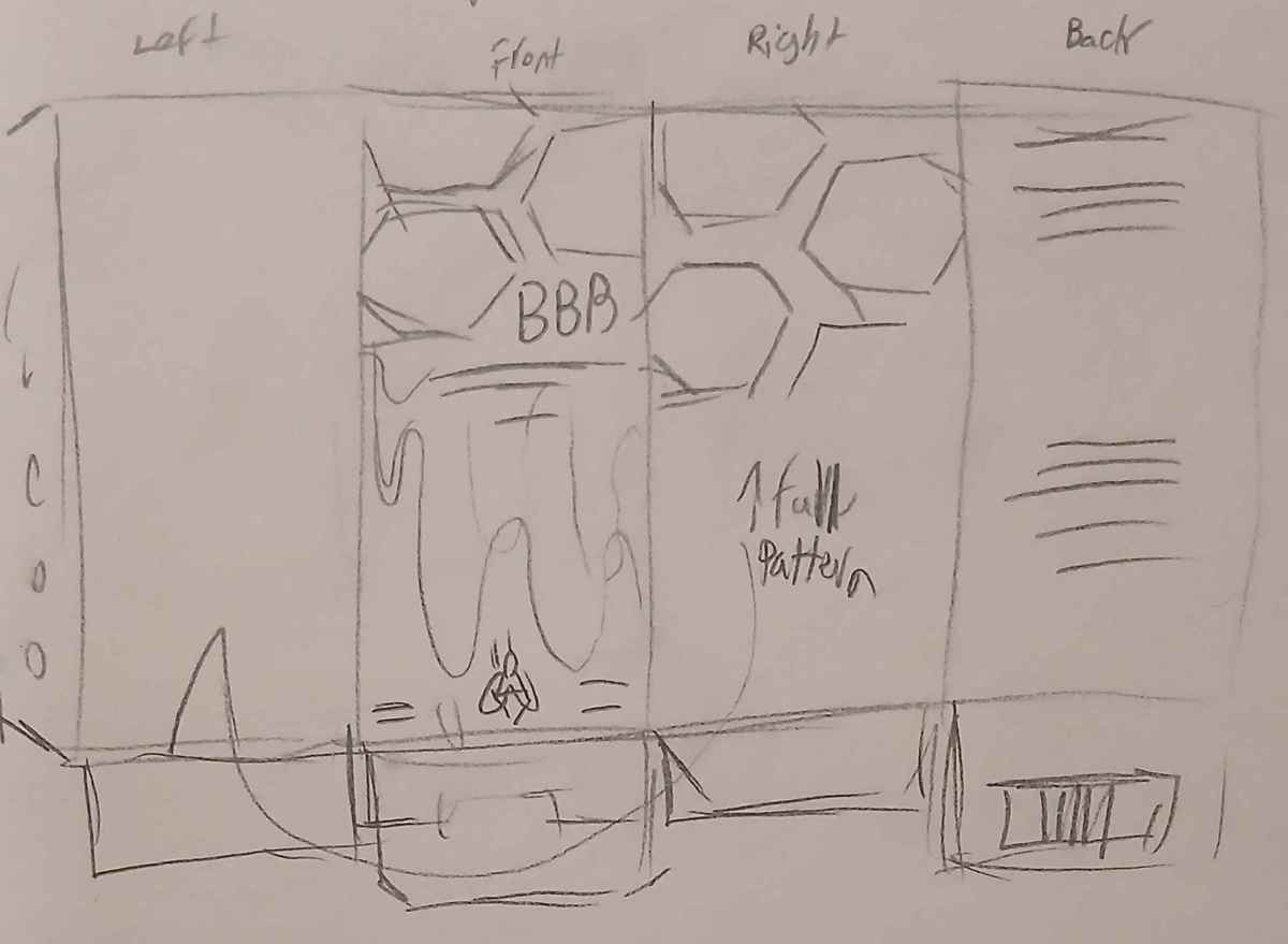
A packaging redesign project where a pre-existing alcohol or beverage brand was chosen, rebranded, redesigned, and mocked up. The design was an experimental approach to combining an illustrative texture with clean and readable packaging. With a combination of my digital illustration software, Adobe Illustrator, and Adobe dimension, I created the texture, packaging design, and 3D mockup. My personal goal while creating this design was to apply a raster illustrated texture beneath clean vector elements for an interesting contrast.

Read more

Piper Matthews Designs Presentation

The portfolio presentation for Piper Matthews Designs

Would you like to request more information?

Click on the button below and we'll get back to you as soon as possible.

Get in Touch with Us