Simon
de KlerkGraphic Design
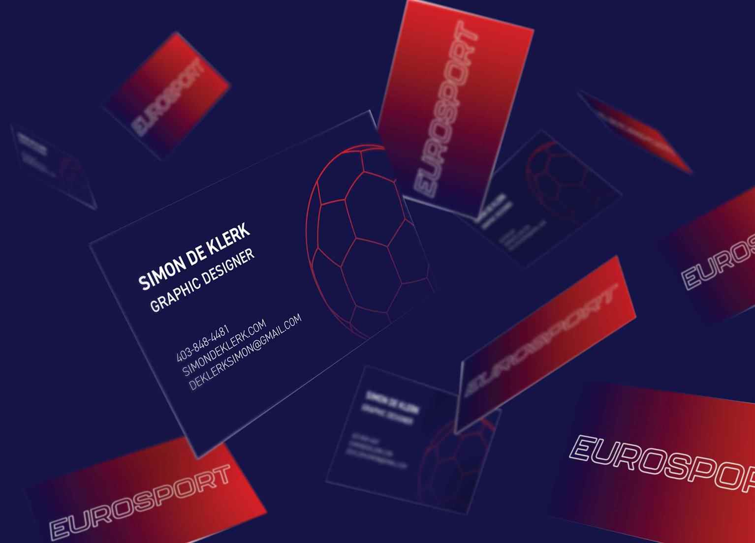
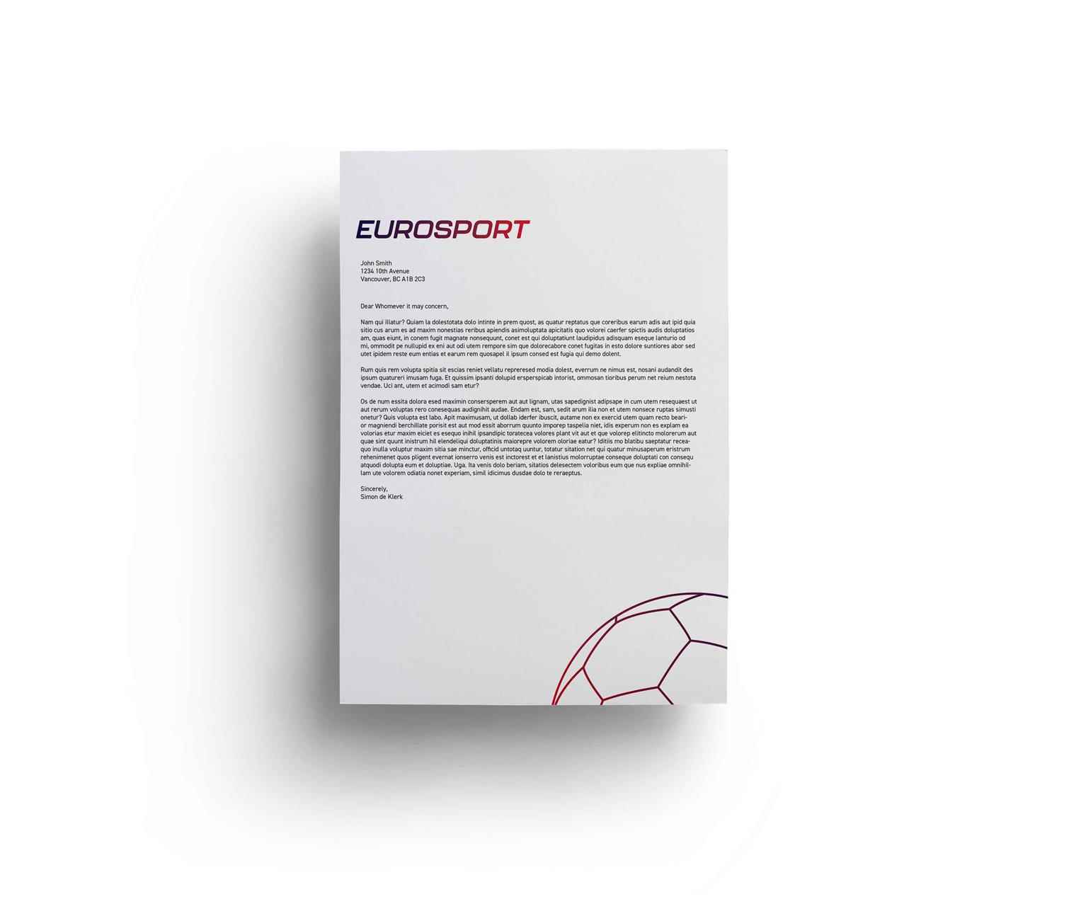
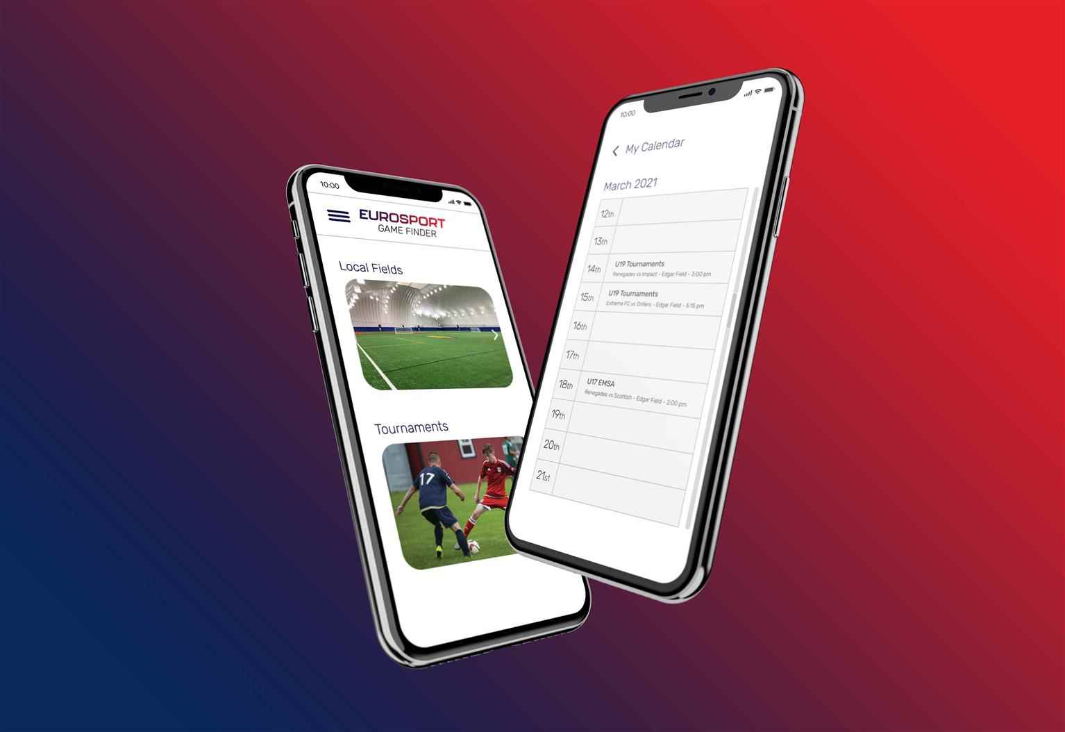
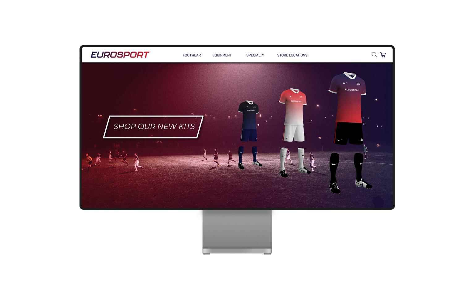
Eurosport Rebrand
Eurosport, located in Red Deer, Alberta, is a Soccer retail store that offers a wide variety in brands and expertise. Eurosport’s main audience is the players of the sport and in a lot of cases, thei...
Eurosport, located in Red Deer, Alberta, is a Soccer retail store that offers a wide variety in brands and expertise. Eurosport’s main audience is the players of the sport and in a lot of cases, thei...
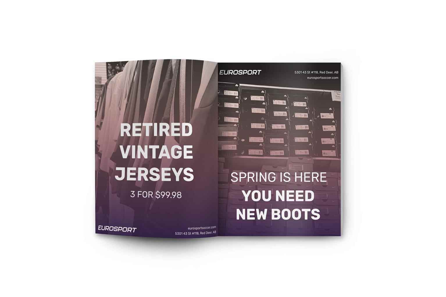
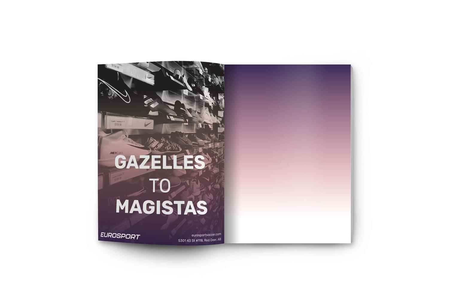
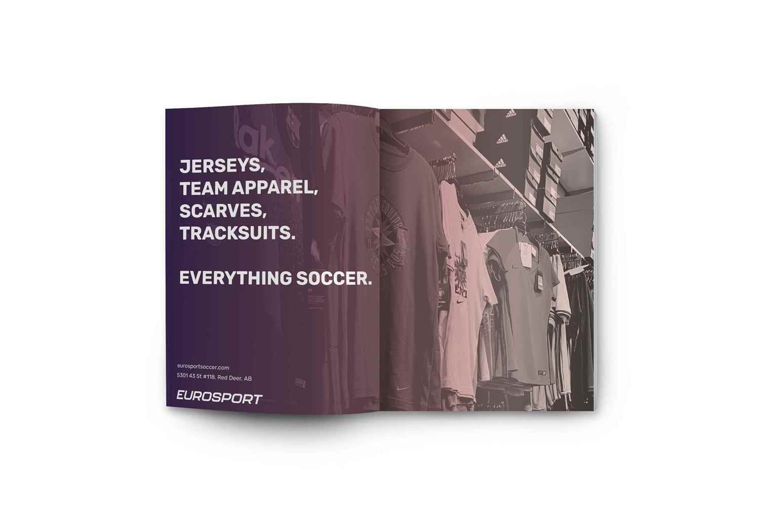
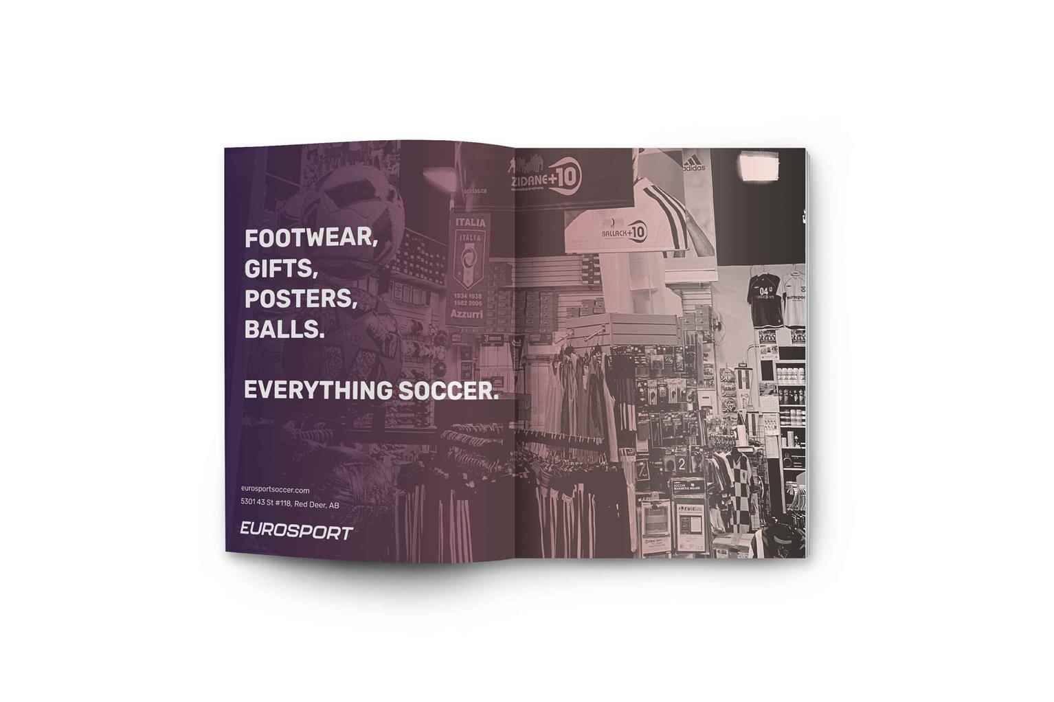
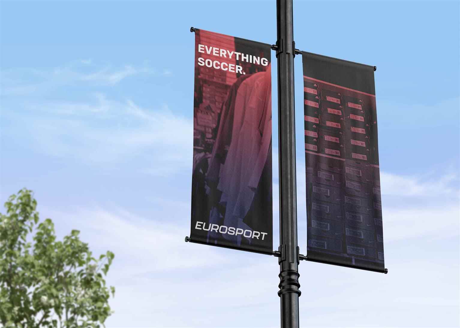
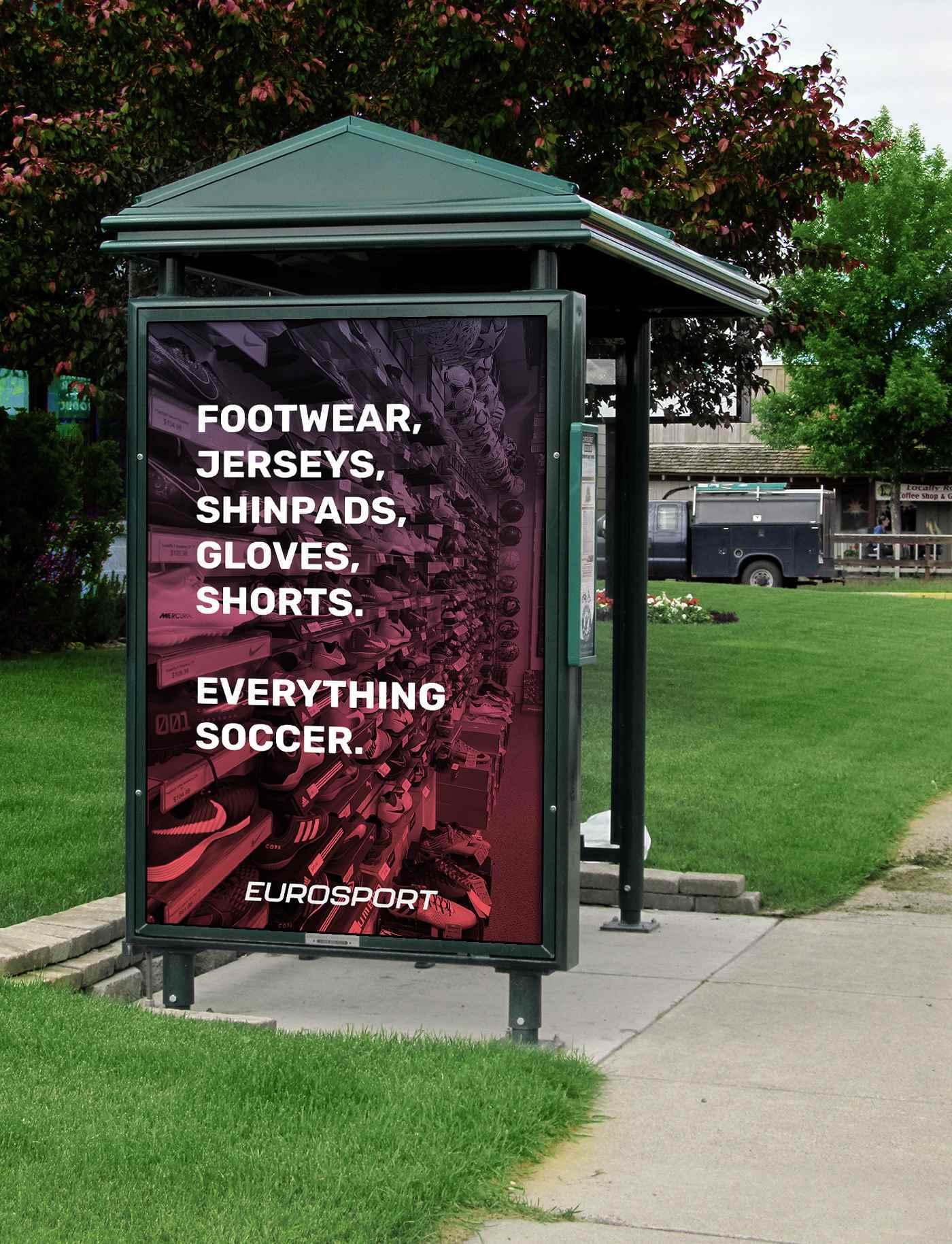
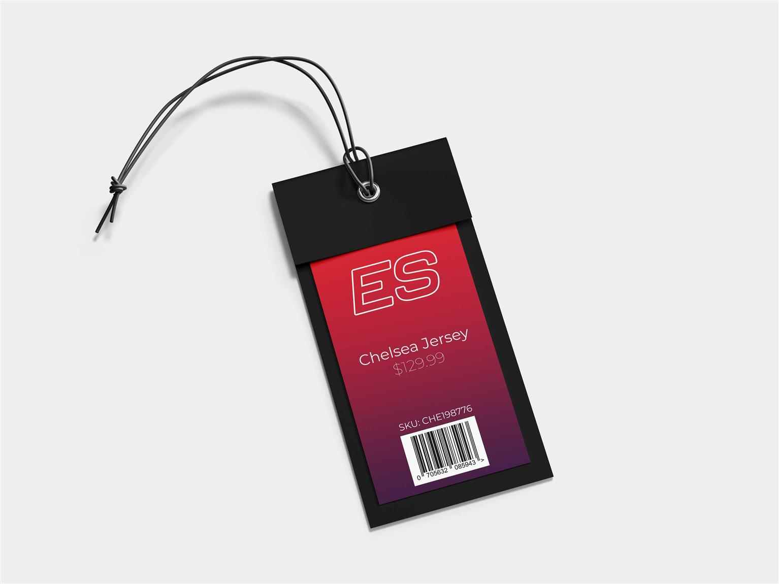
Eurosport, located in Red Deer, Alberta, is a Soccer retail store that offers a wide variety in brands and expertise. Eurosport’s main audience is the players of the sport and in a lot of cases, their parents. In Red Deer, the soccer community is growing slowly but surely. This rebrand was designed to refresh and create a more appealing look for the young and older customer base. A focus was put on the gradient, which is very popular in most soccer branding. Much inspiration came from the recent Premier League and Champions League rebrands which really enlightened and excited the brand. A sense of movement was necessary in the branding and was provided through the italicized word mark of the logo
Share:
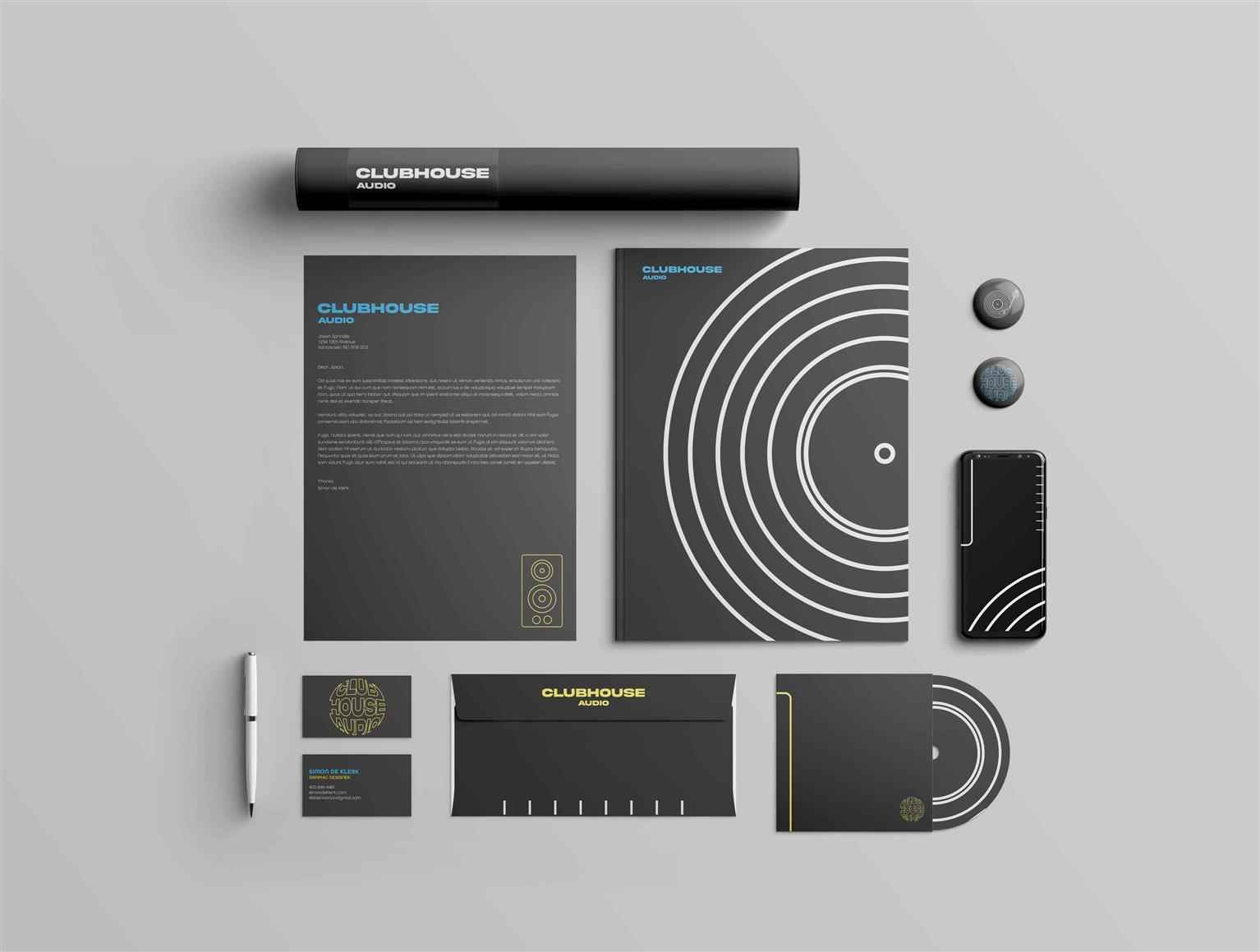
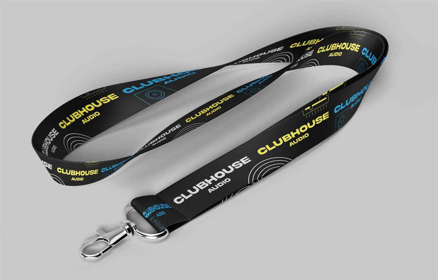
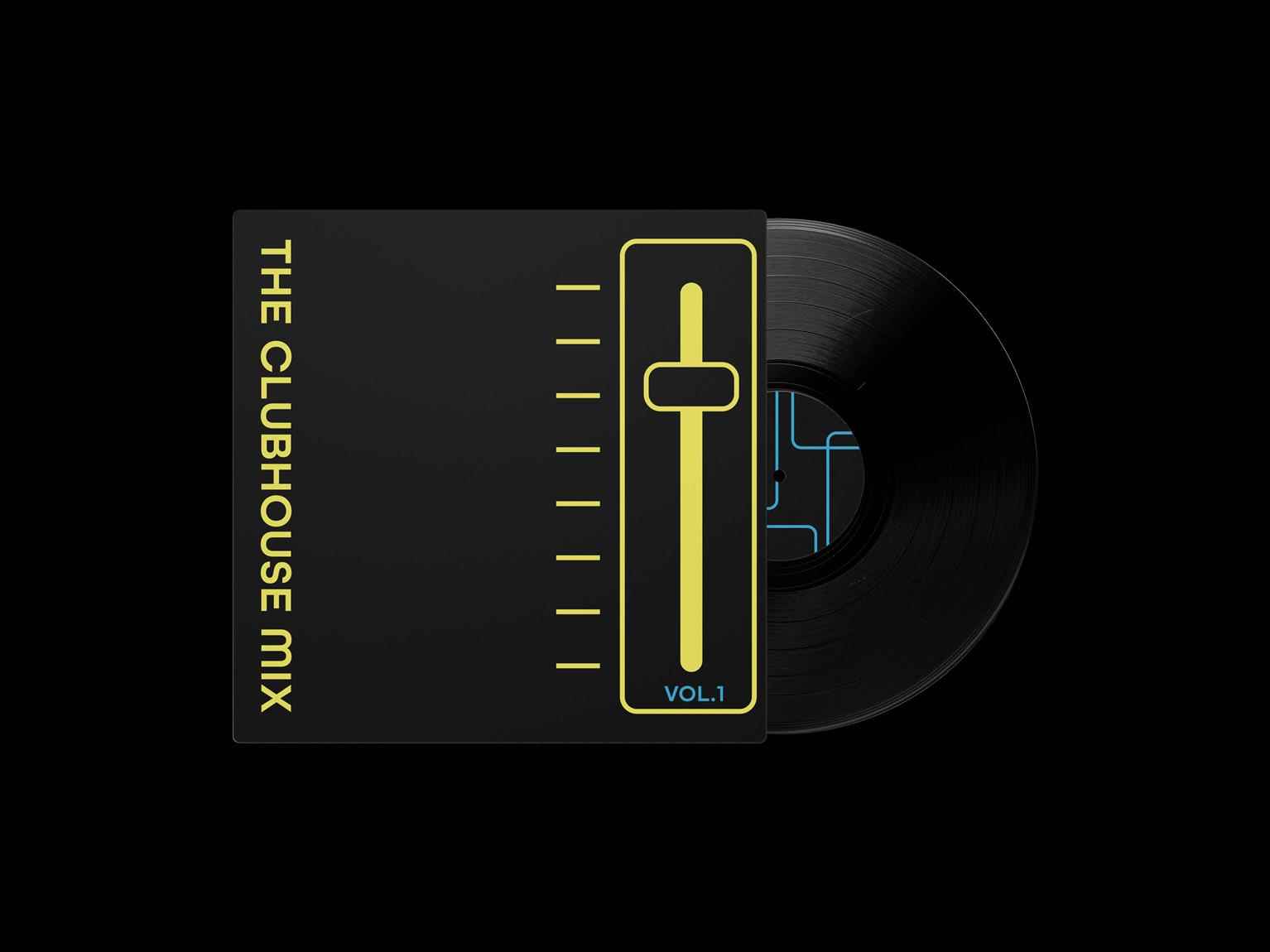
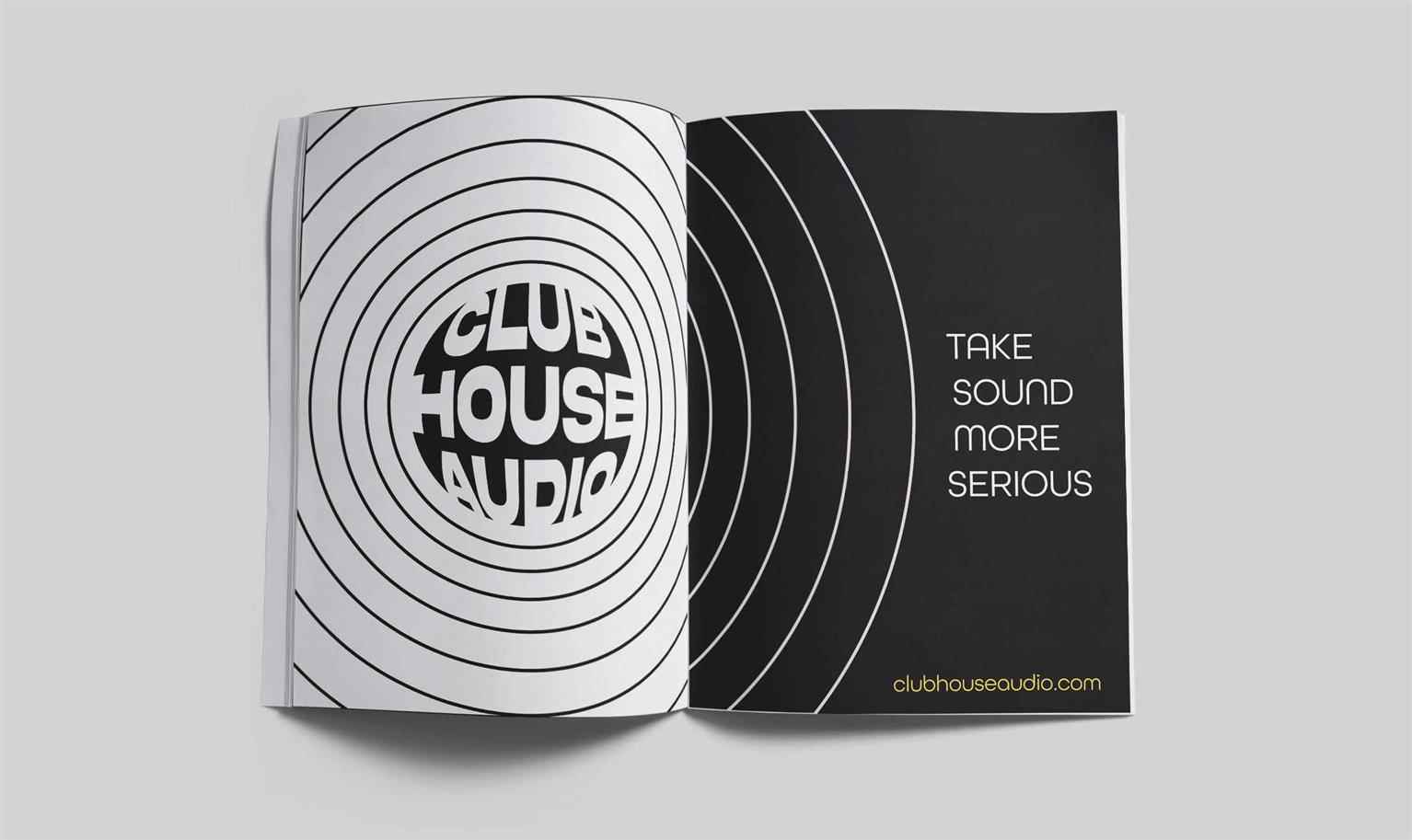
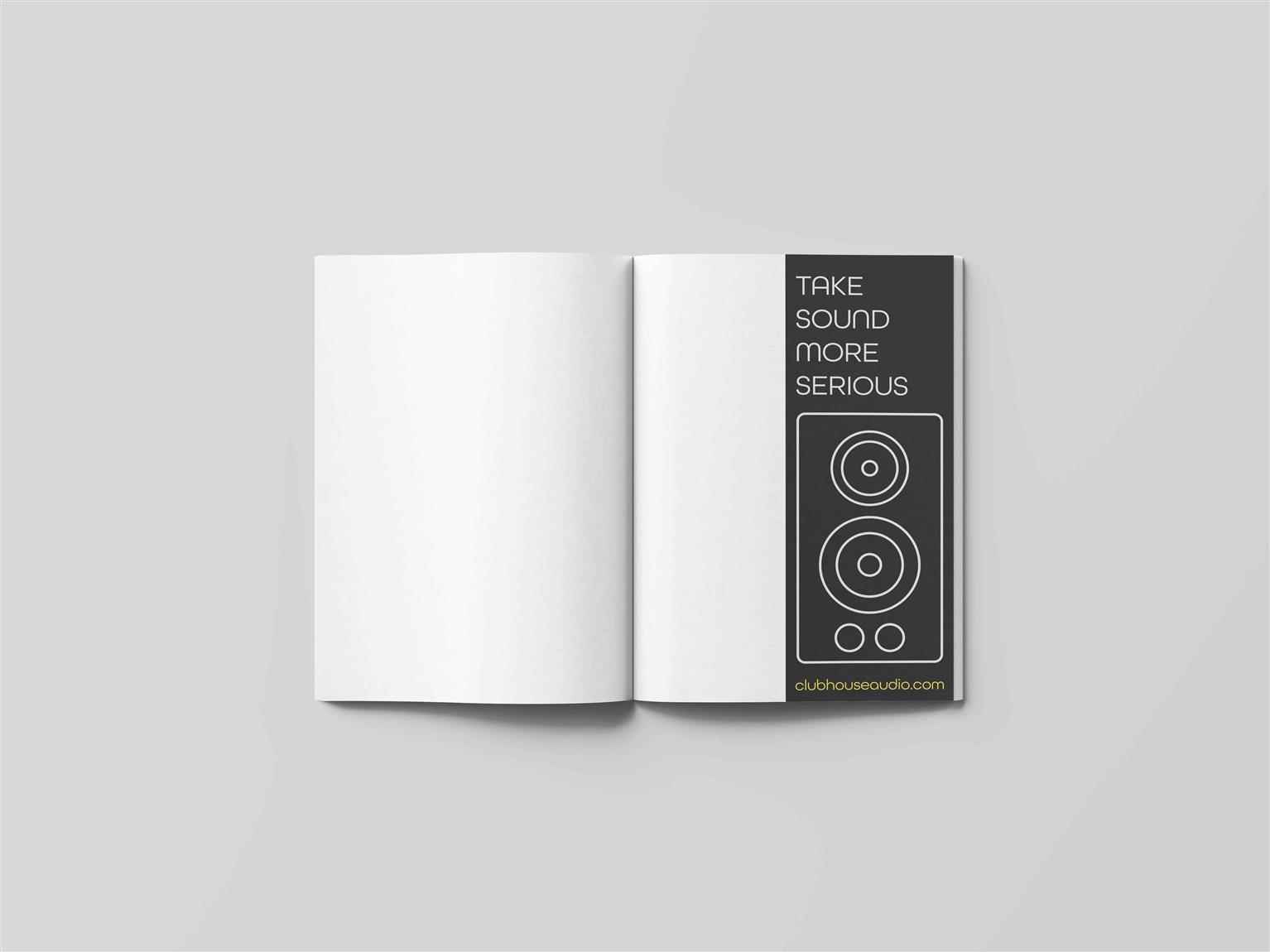
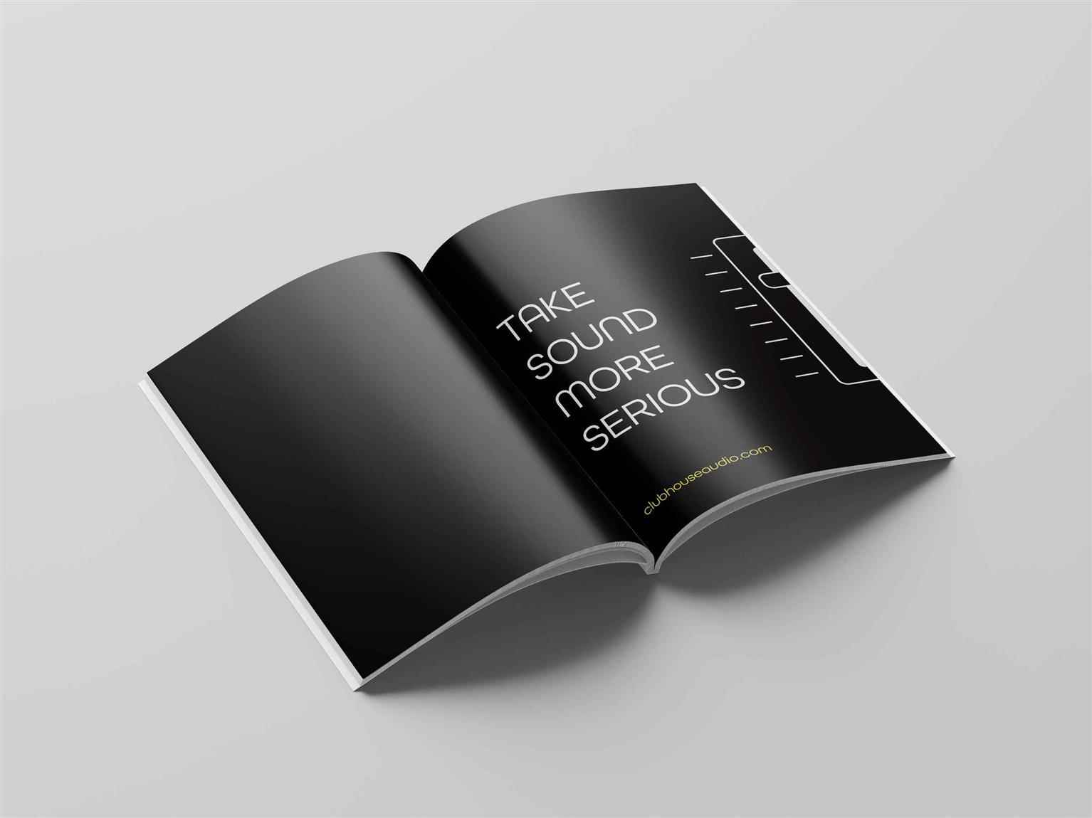
ClubHouse Audio
Clubhouse is an audio system retailer. They rent their products for large gatherings and festivals, primarily house music shows. The concept behind the branding was to bring forth the aesthetic of so...
Clubhouse is an audio system retailer. They rent their products for large gatherings and festivals, primarily house music shows. The concept behind the branding was to bring forth the aesthetic of so...
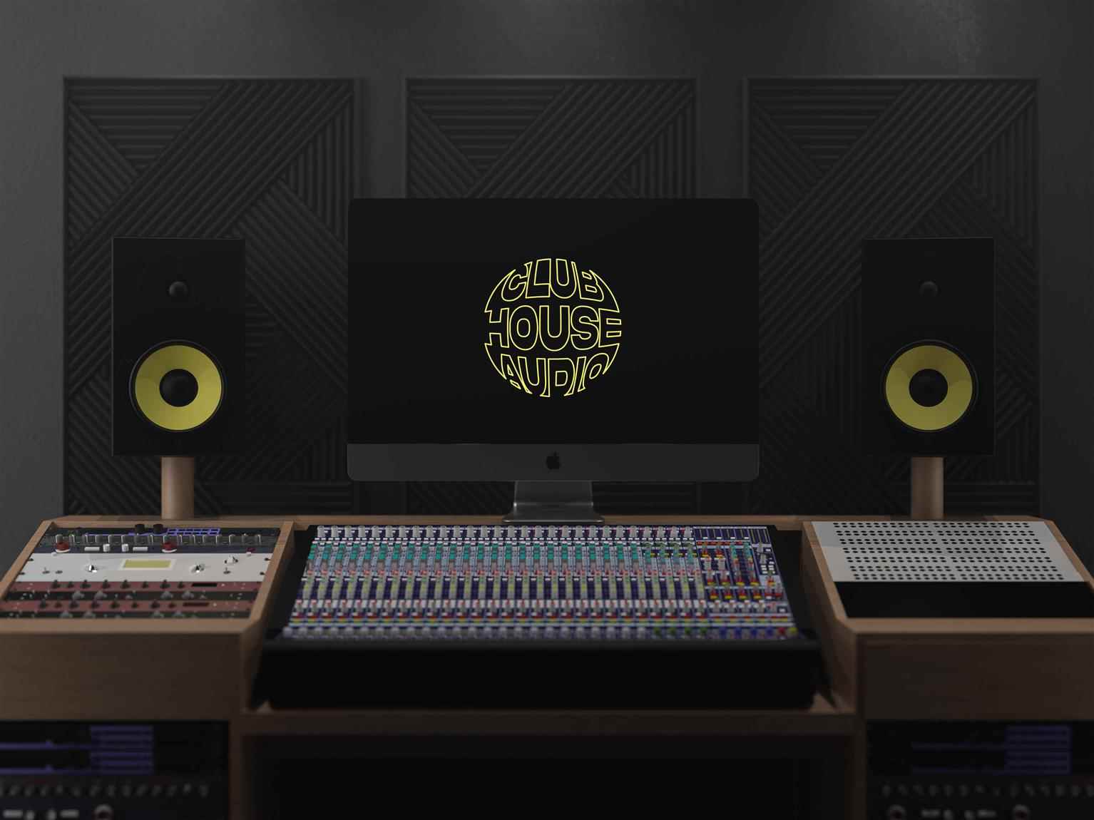
Clubhouse is an audio system retailer. They rent their products for large gatherings and festivals, primarily house music shows. The concept behind the branding was to bring forth the aesthetic of sound and the tools/instruments used to project it. The bright colors chosen are to bring out the vibrancy and flamboyance of house music. I went with a more underground feel which aligns with the house scene. I wanted to push this project to the max (hence the black letterhead) and have fun with the assets I created.
Share:
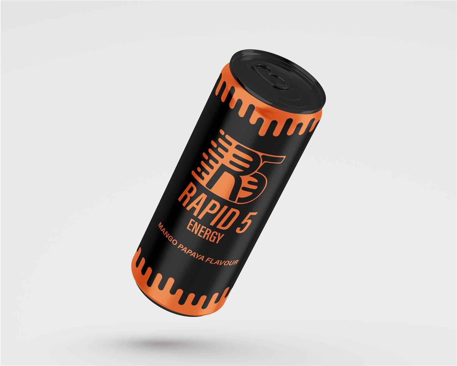
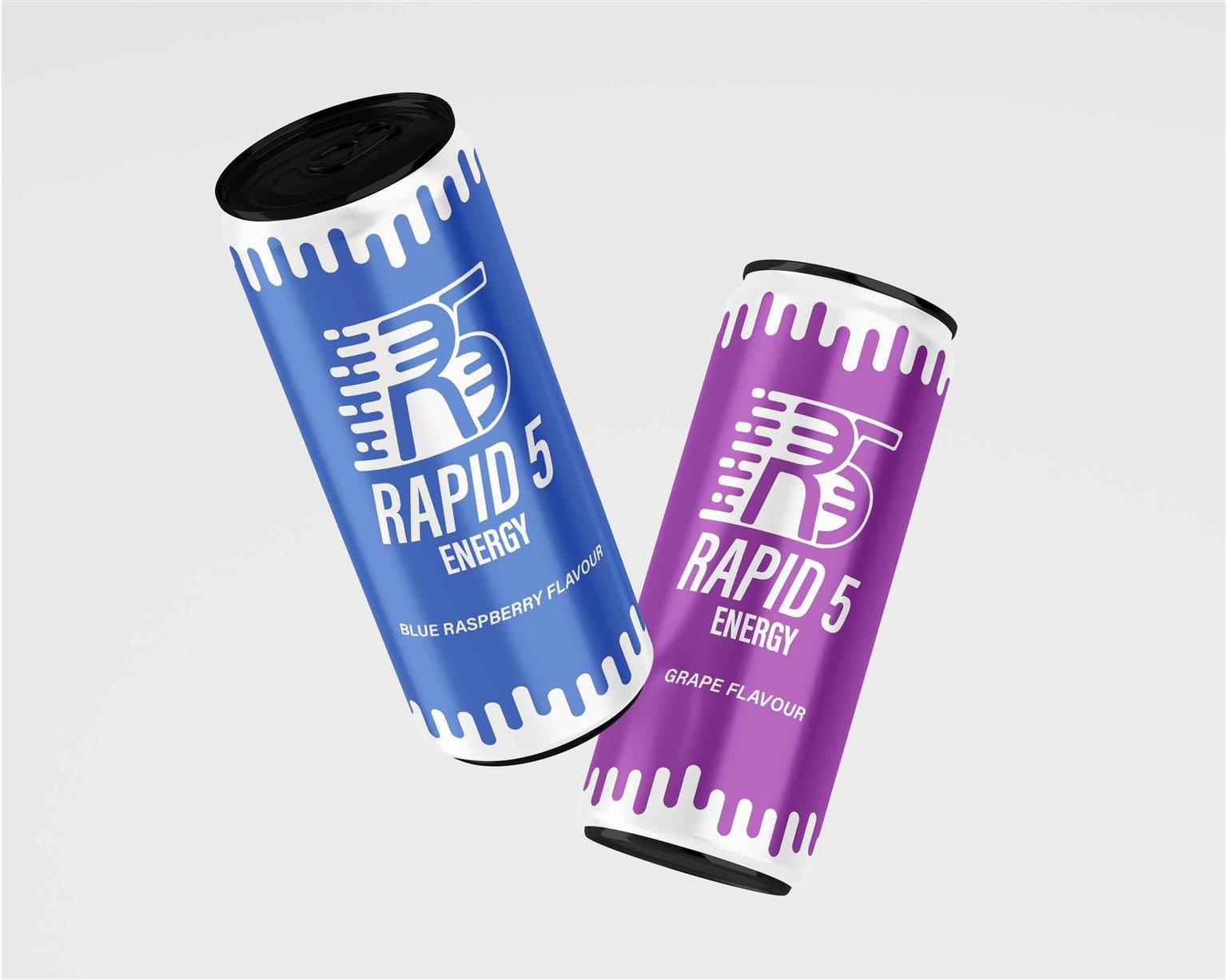
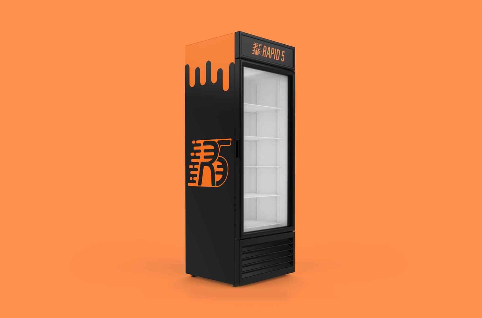
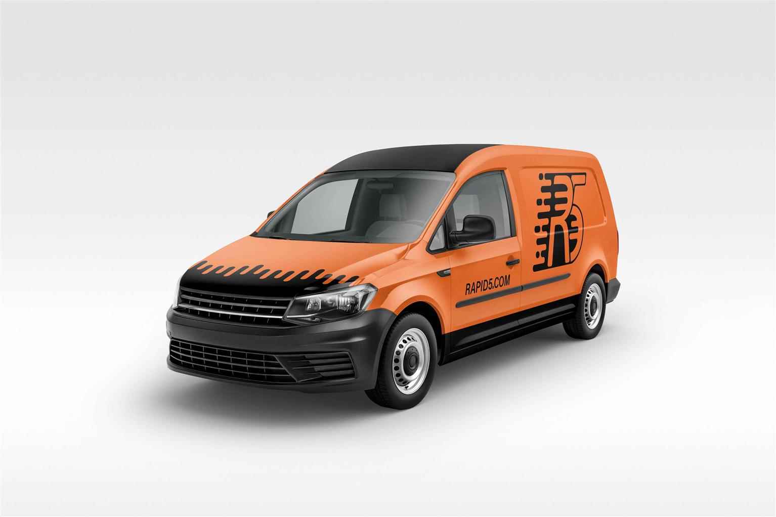
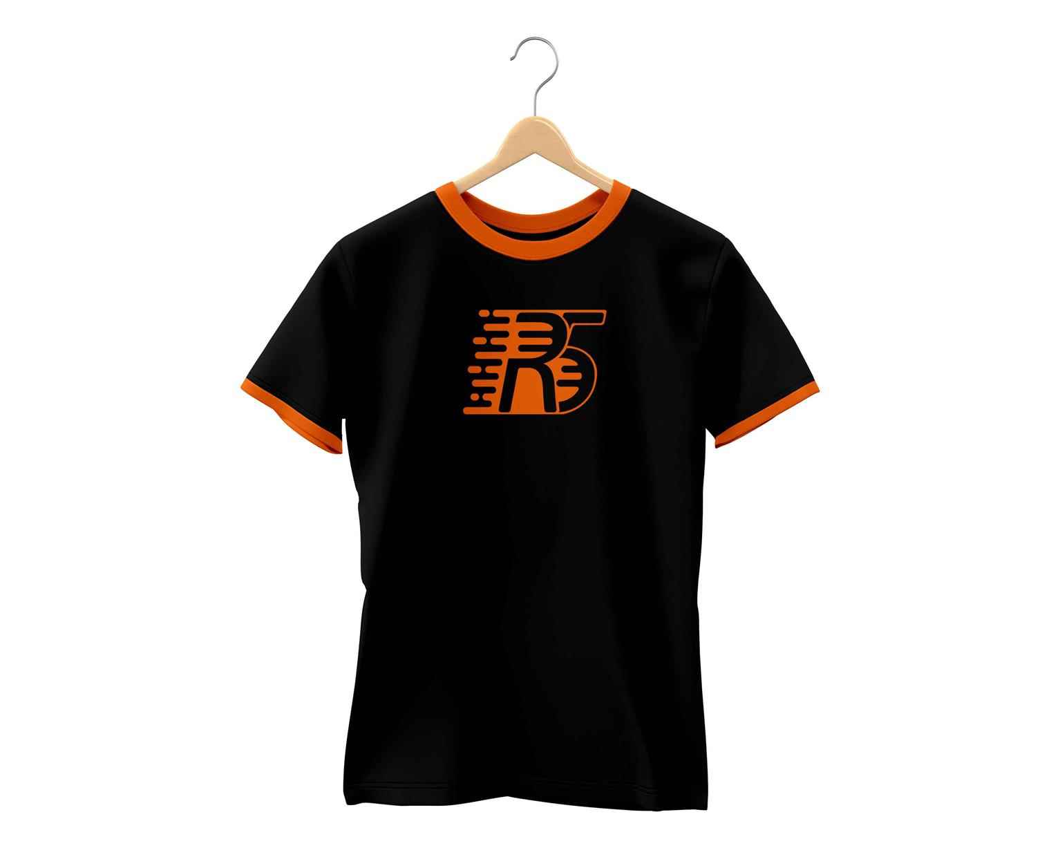
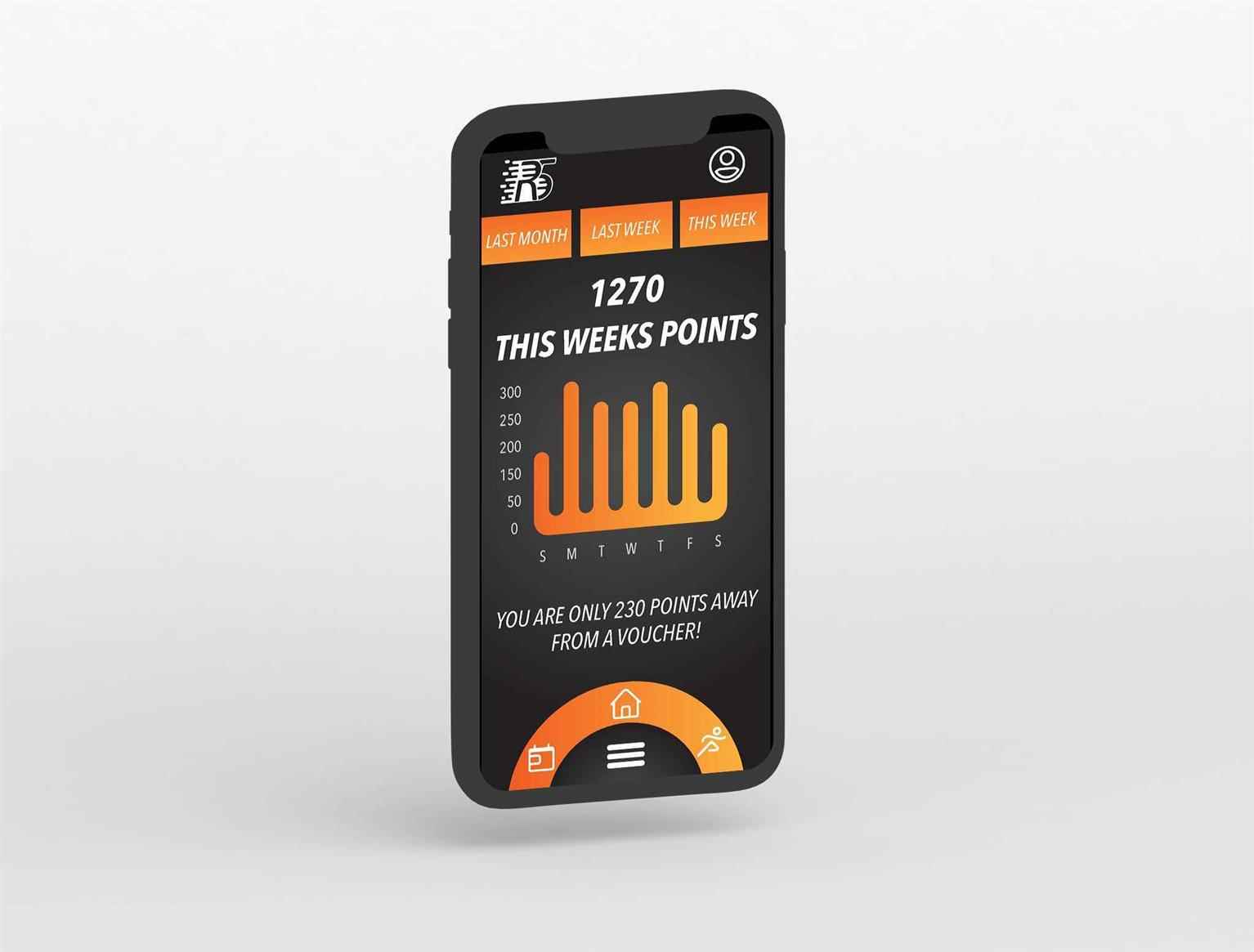
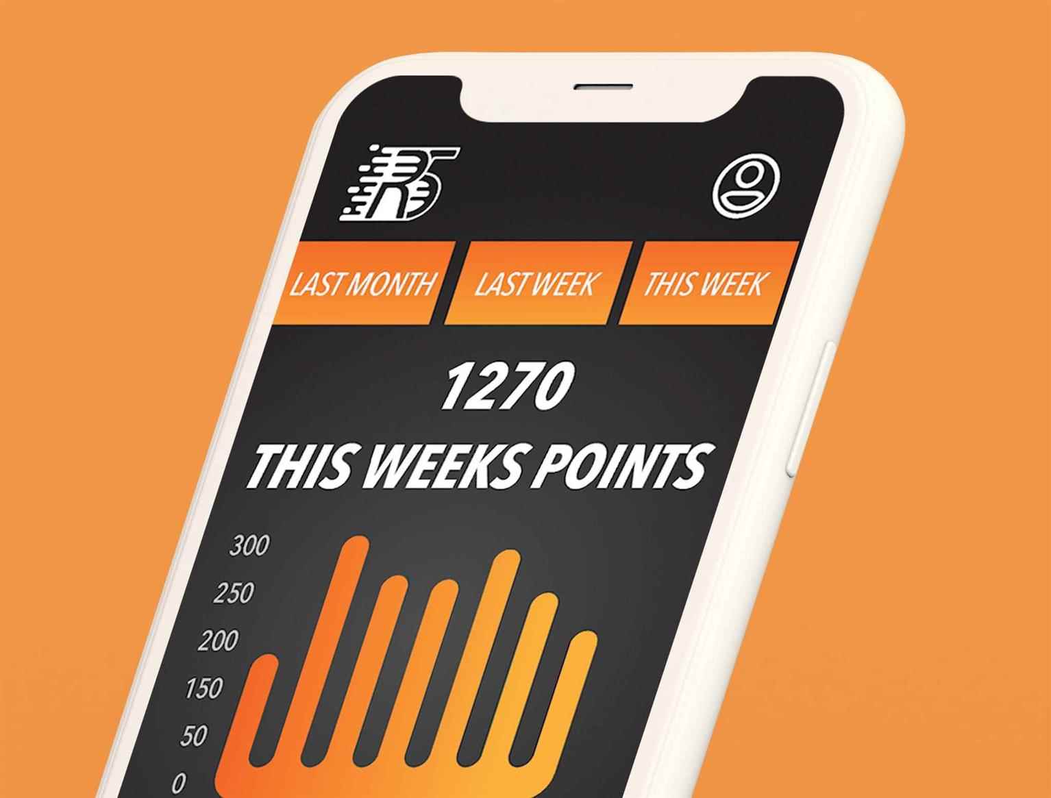
Rapid 5
Rapid 5 is an energy drink company with 5 flavors. With only the use of all natural flavors and vitamins, the main target audience of this brand is younger adults and teenagers who need a kick to sta...
Rapid 5 is an energy drink company with 5 flavors. With only the use of all natural flavors and vitamins, the main target audience of this brand is younger adults and teenagers who need a kick to sta...
Rapid 5 is an energy drink company with 5 flavors. With only the use of all natural flavors and vitamins, the main target audience of this brand is younger adults and teenagers who need a kick to start their day. The main focus of this project was to convey movement and energy in the best way possible. Bright, action packed colors and lines of movement are used throughout the designs to push this idea.
Share:
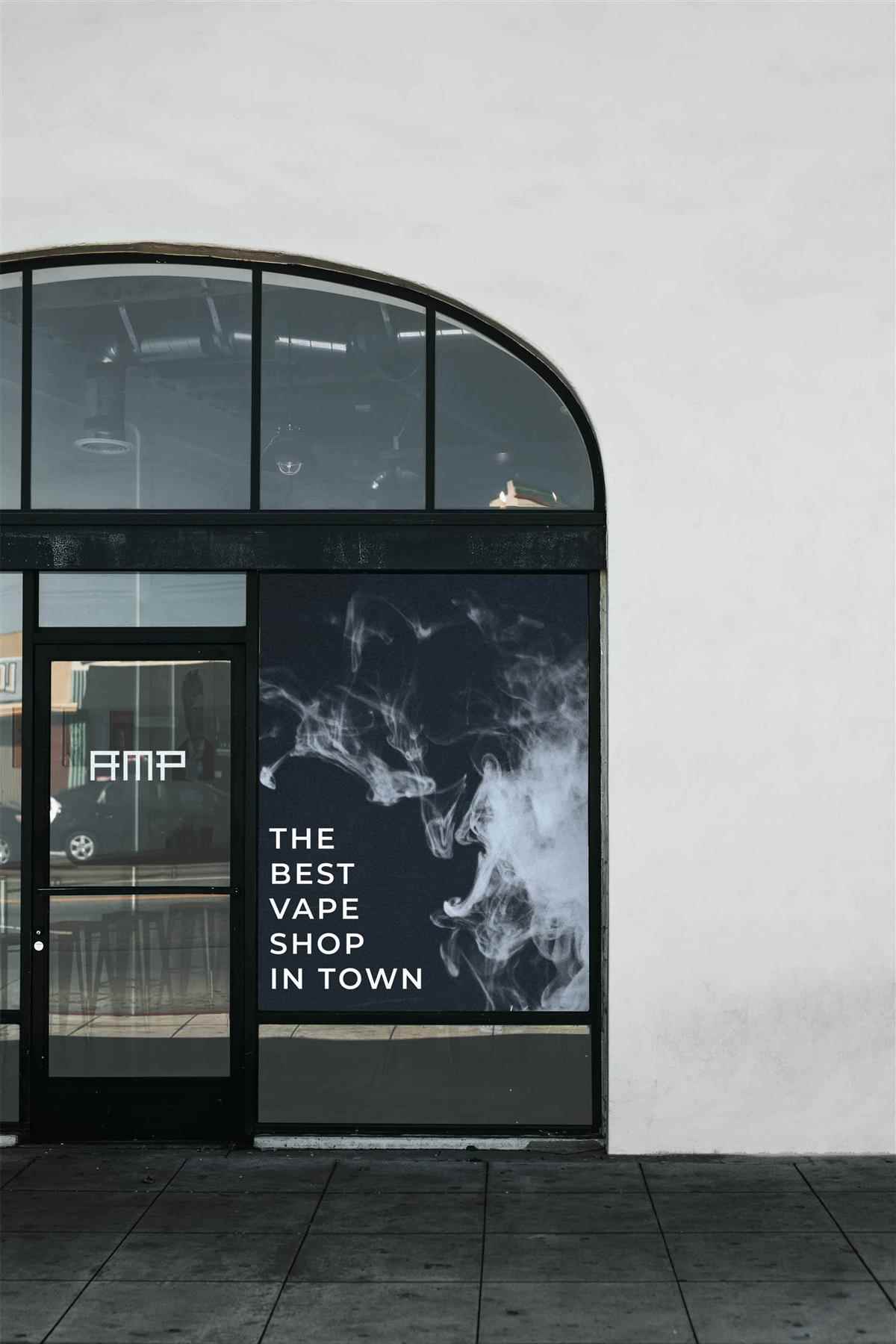
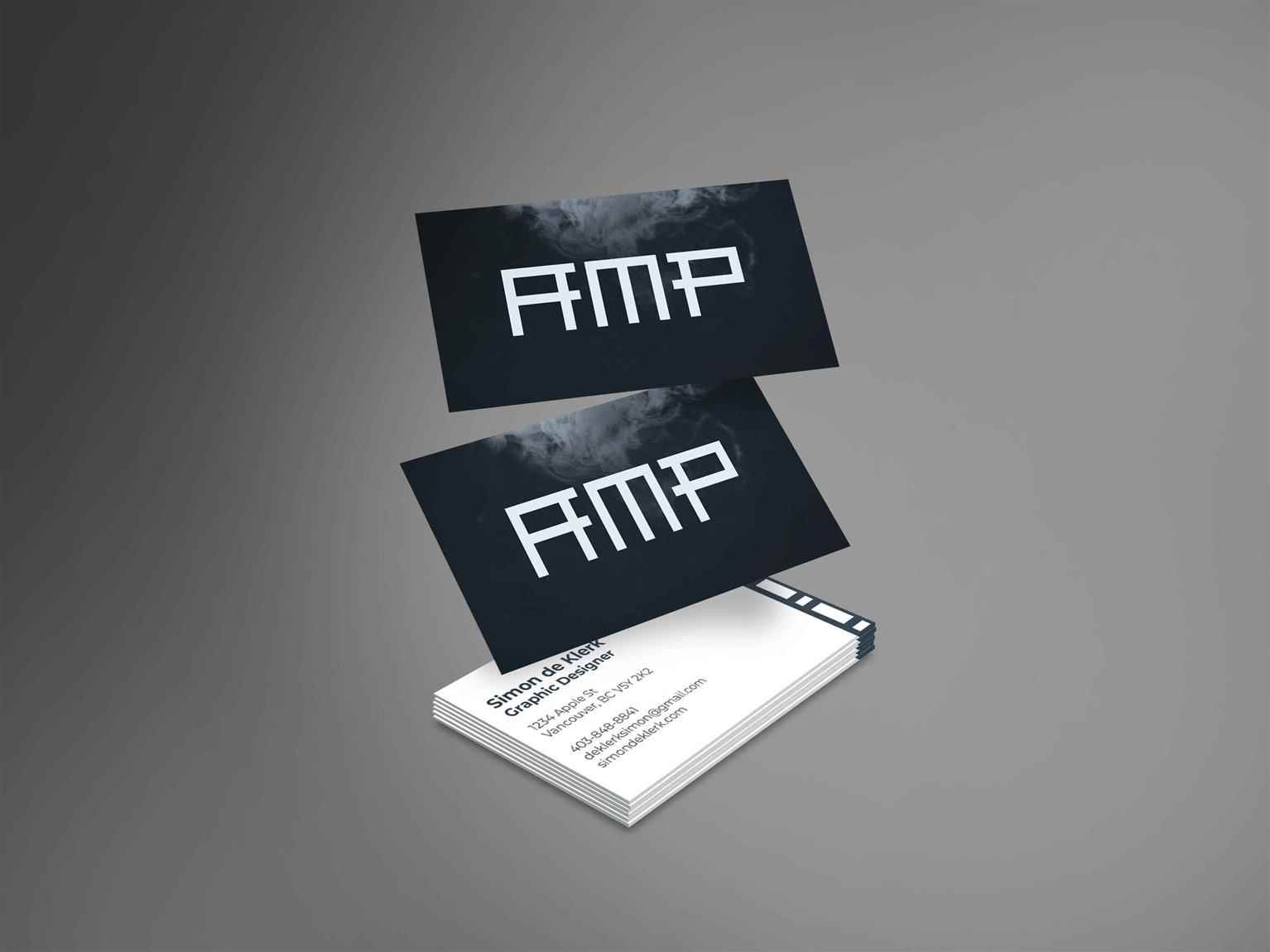
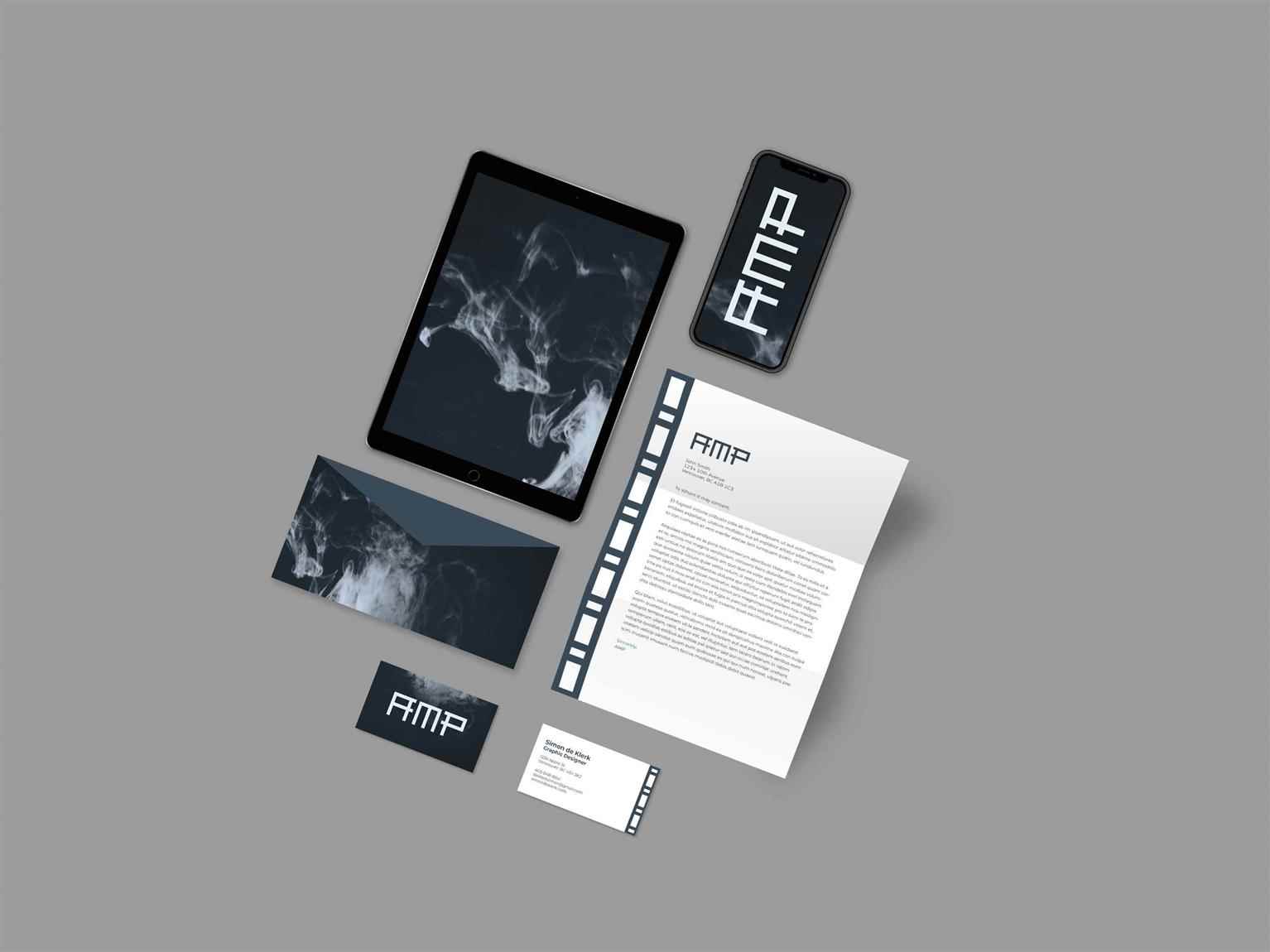
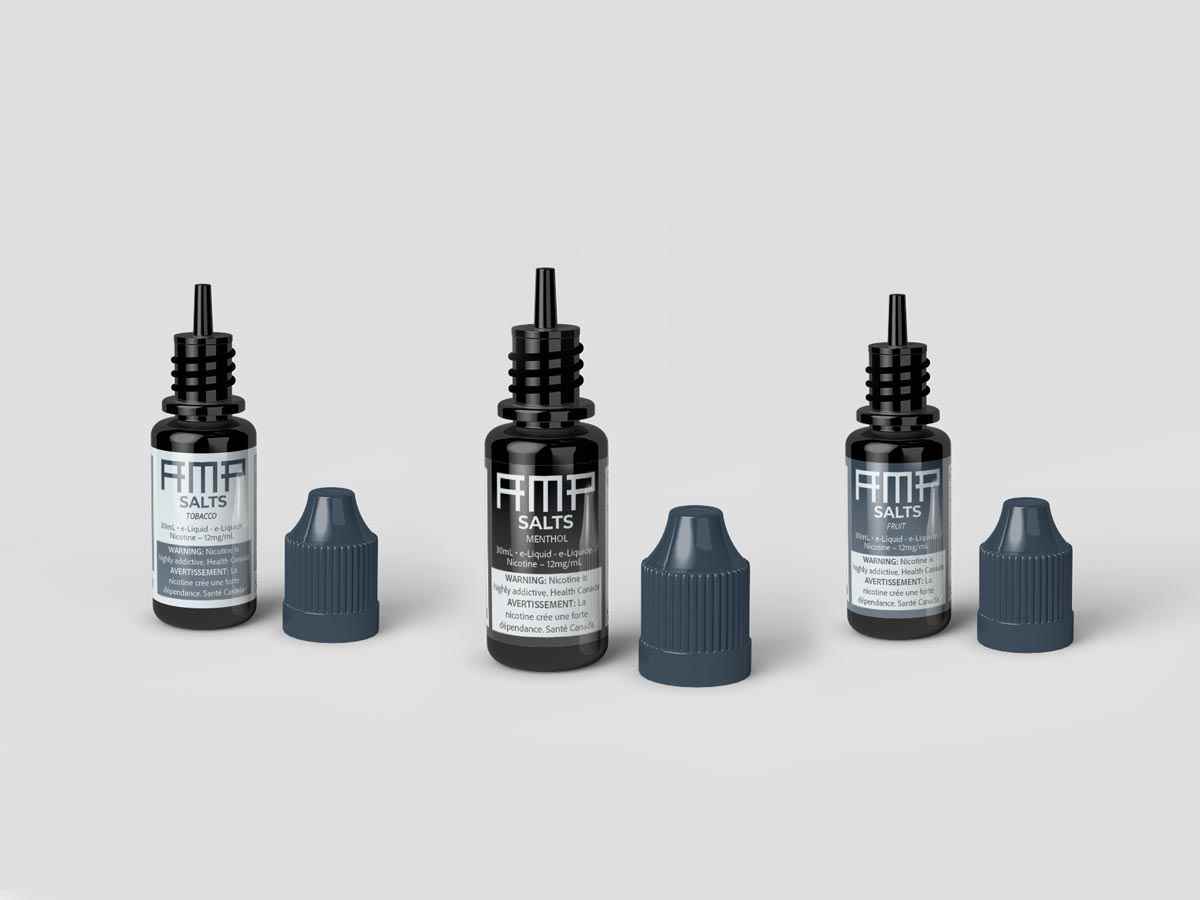
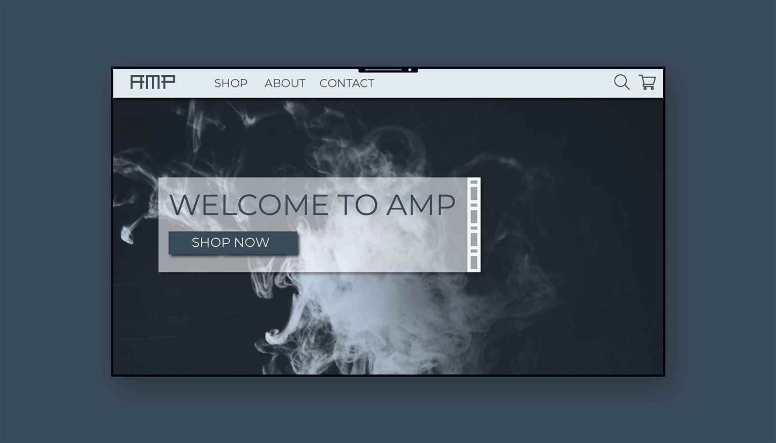
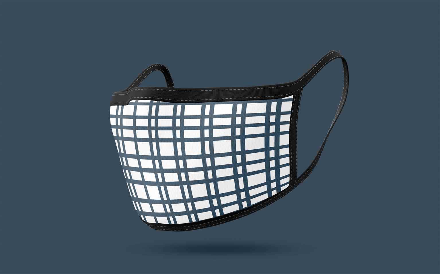
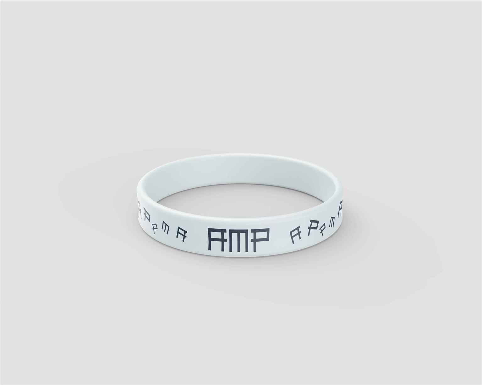
Amp Vape Shop
AMP is the premier supplier of the highest end vape products. A sense of clean, sleek, professionalism matched with the most clear representation of smoke, provides the customer with a sense of secur...
AMP is the premier supplier of the highest end vape products. A sense of clean, sleek, professionalism matched with the most clear representation of smoke, provides the customer with a sense of secur...
AMP is the premier supplier of the highest end vape products. A sense of clean, sleek, professionalism matched with the most clear representation of smoke, provides the customer with a sense of security when choosing AMP. The logo construction was created through the use of a circuit, which is essential in all vape products. I really wanted to challenge myself with this project because of all of the rules and regulations that come along with the vaping industry.
Share:
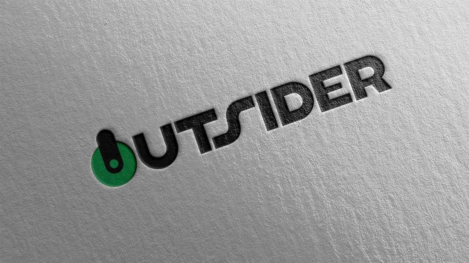
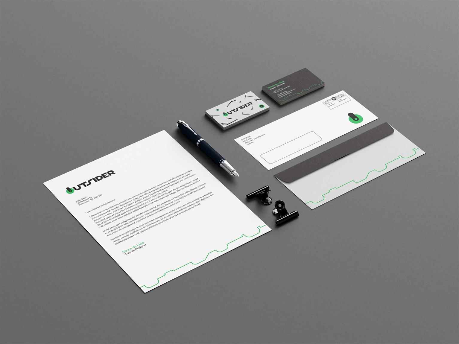
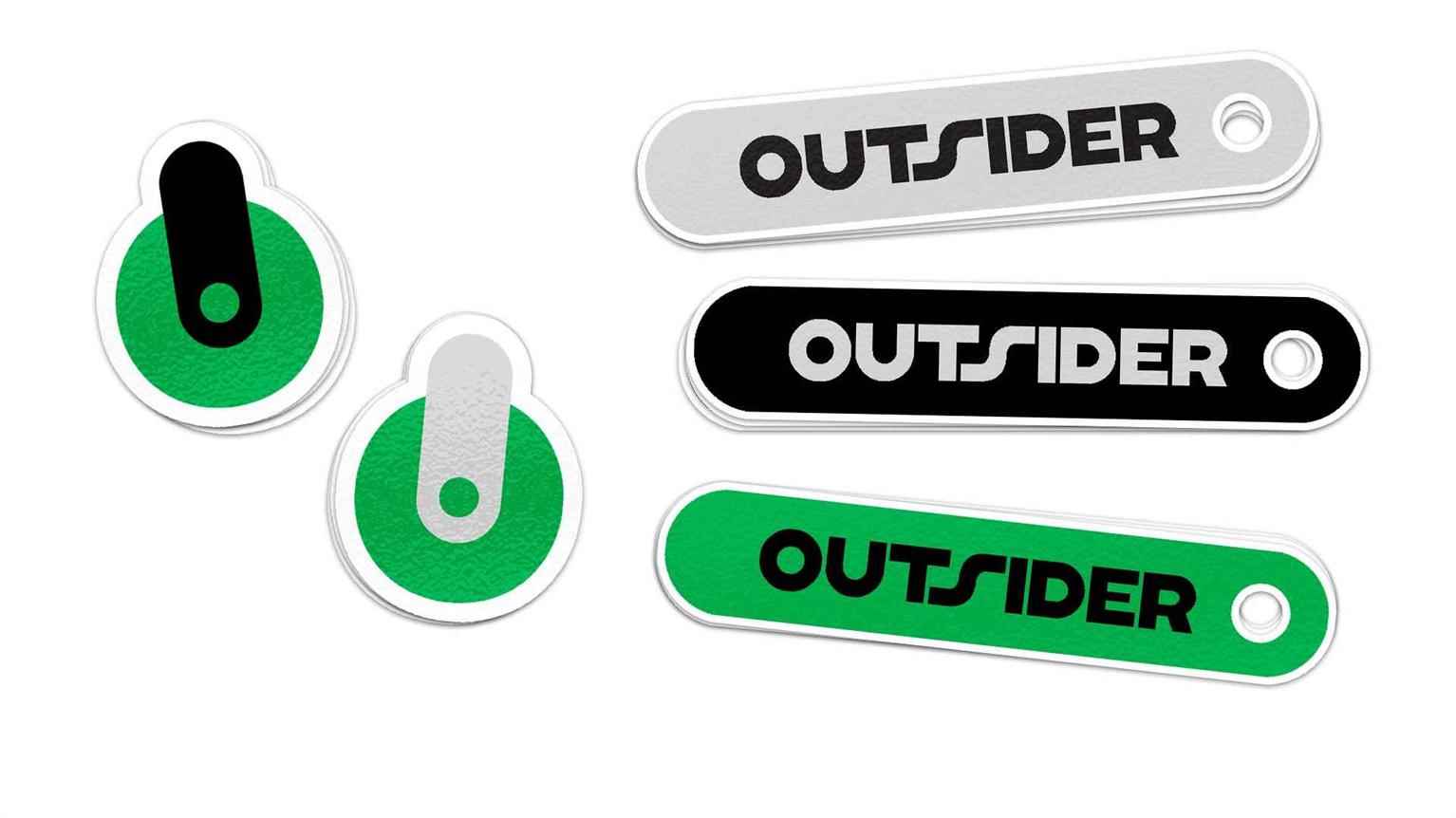
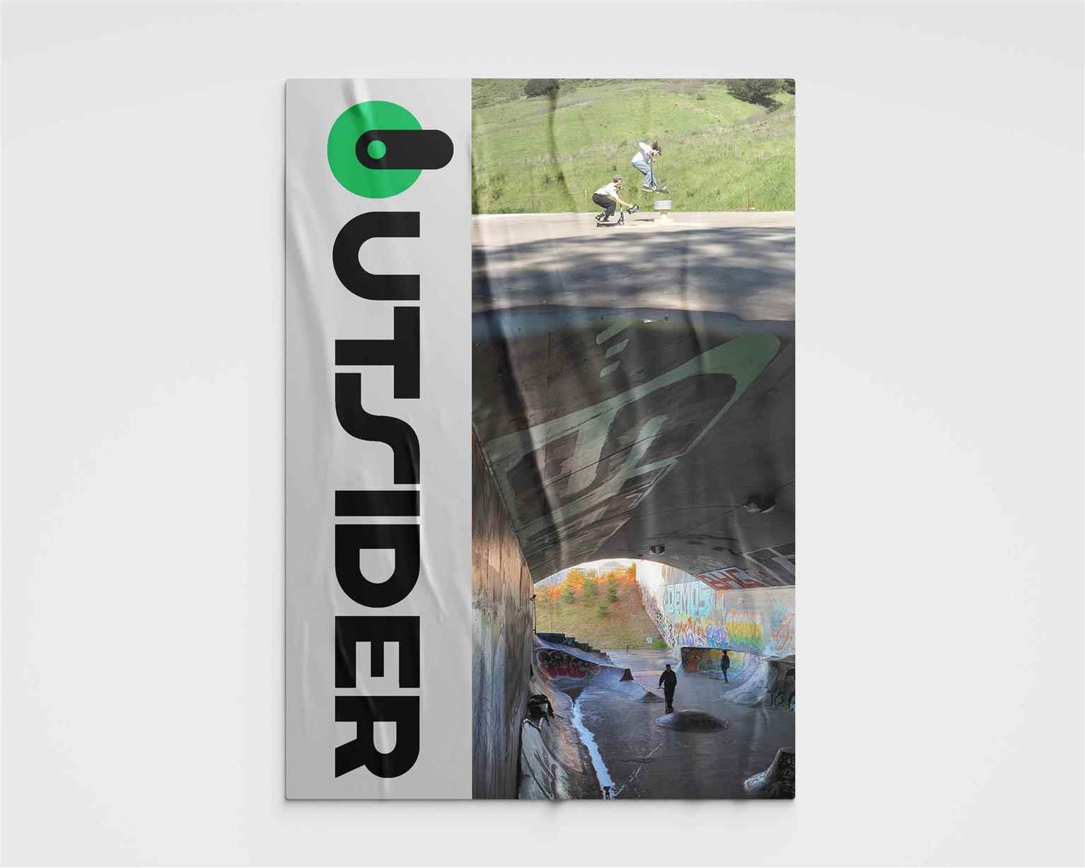
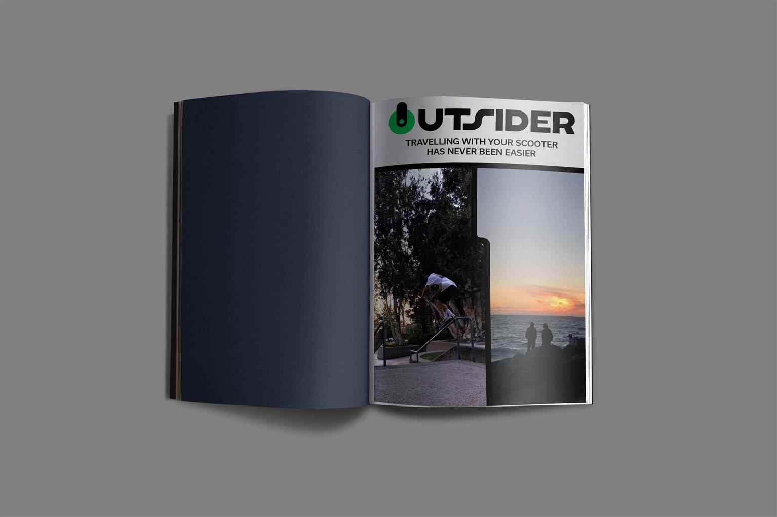
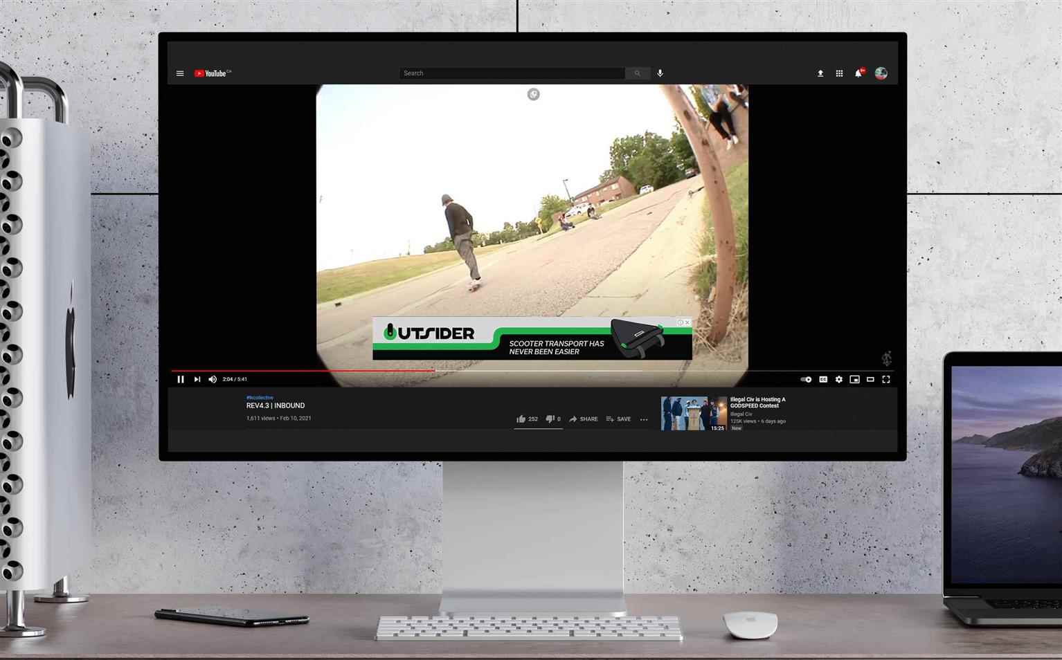
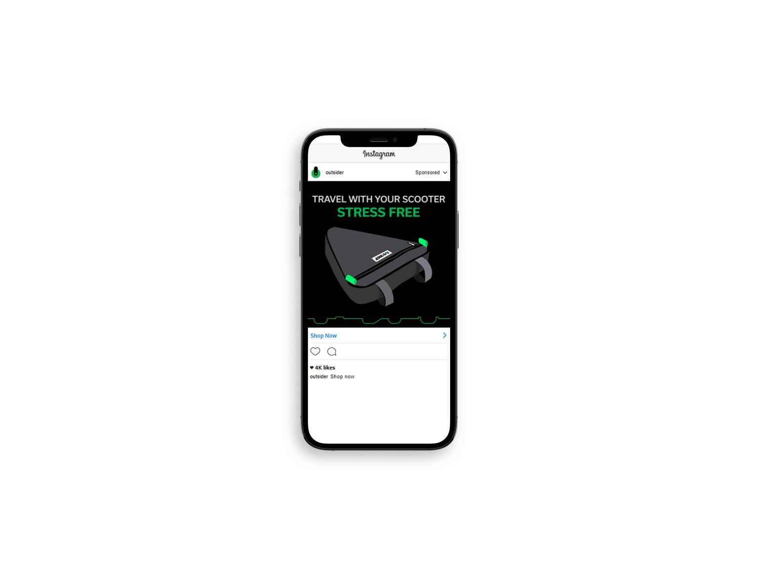
Outsider
Outsider at its core is meant to make the lives of professional scooter riders easier. The vision is to create a standard of how to travel with a scooter. Their main target audience is professional a...
Outsider at its core is meant to make the lives of professional scooter riders easier. The vision is to create a standard of how to travel with a scooter. Their main target audience is professional a...
Outsider at its core is meant to make the lives of professional scooter riders easier. The vision is to create a standard of how to travel with a scooter. Their main target audience is professional and travelling scooter riders who want to keep their scooter safe. This company aims to provide the scooter community with a bag that can allow for easy travel without sacrificing convenience of size and money. The branding was created in a way that communicates the scooter industry itself. Skatepark and scooter elements are seen throughout to tie this idea together. The colors chosen are popular within the industry. The construction of the logo was created through the design of a front wheel of a scooter and the fork that holds it in place, similar to a bicycle.
Share:
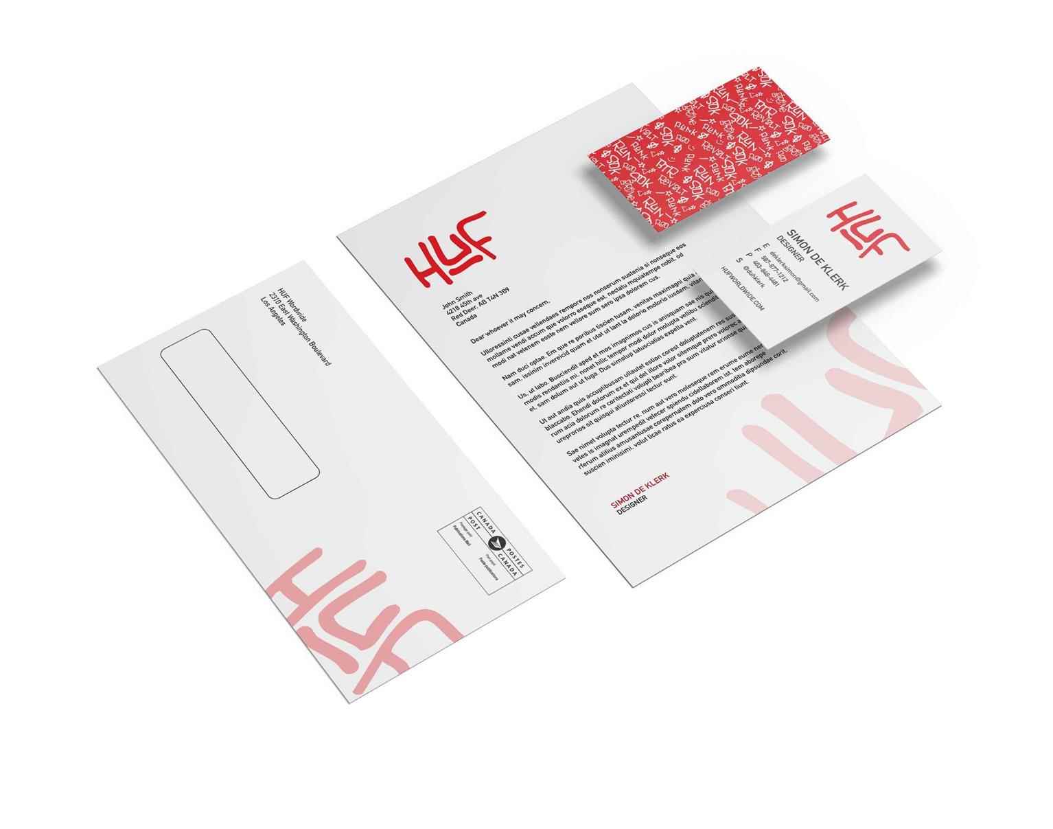
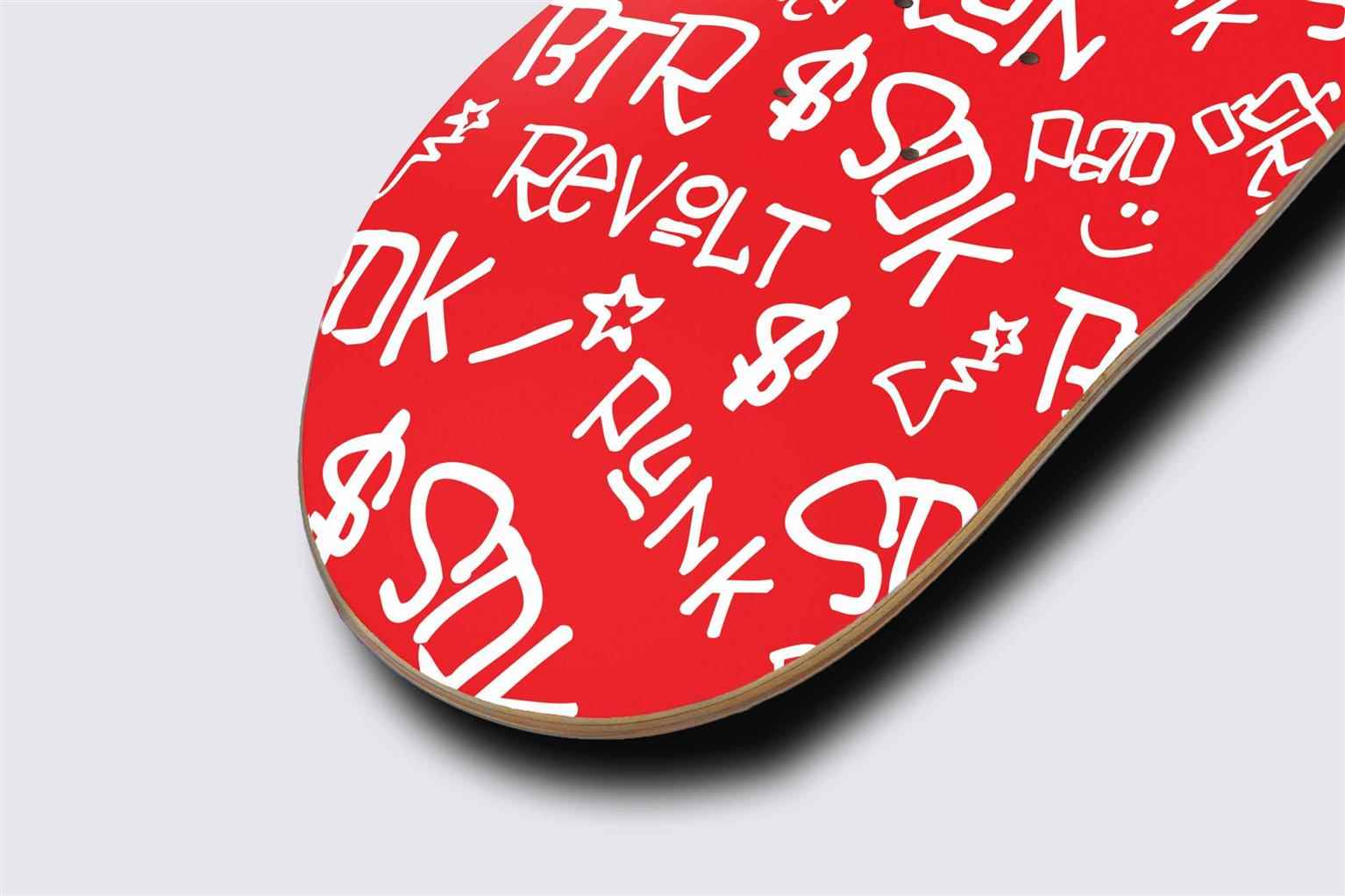
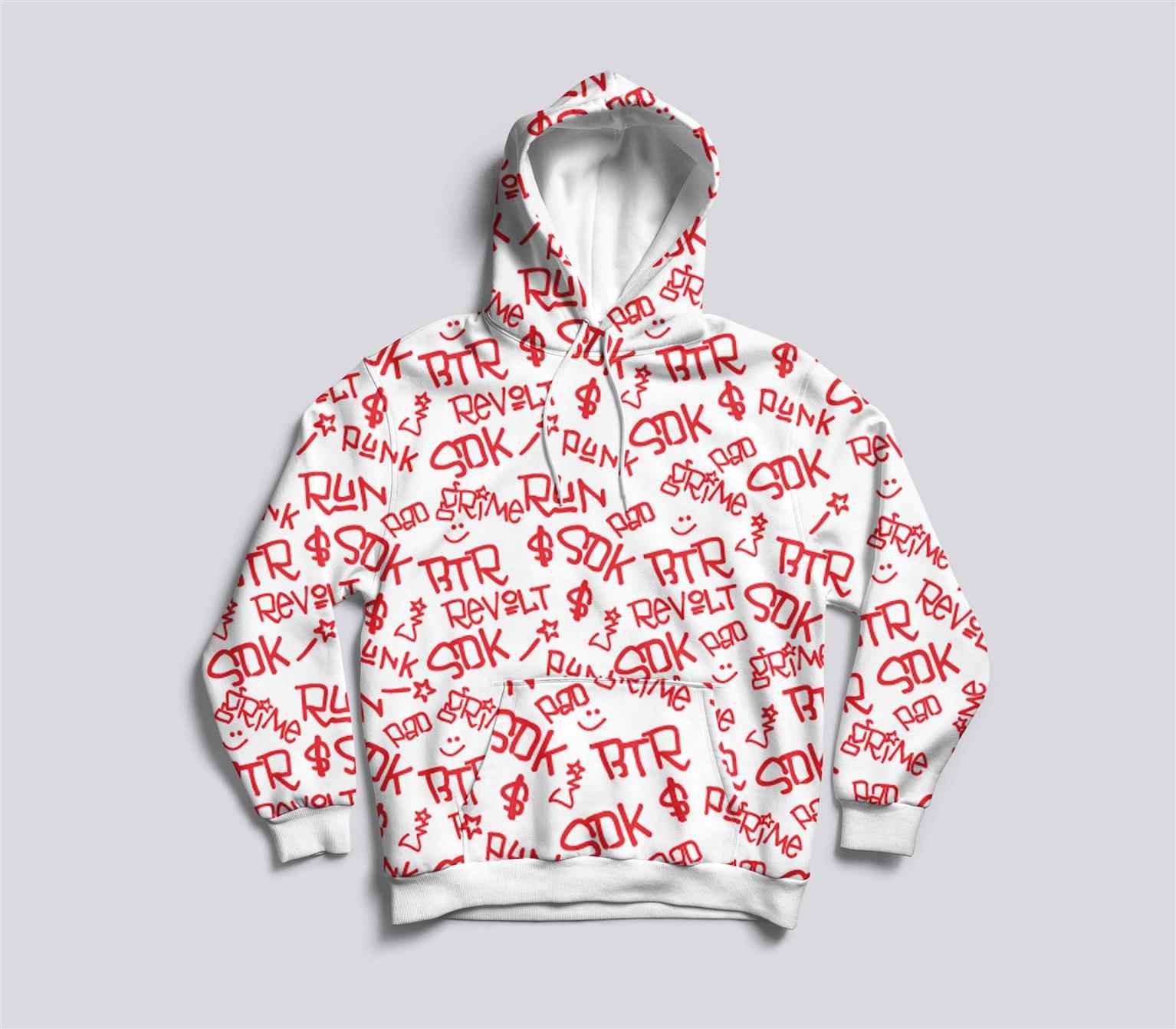
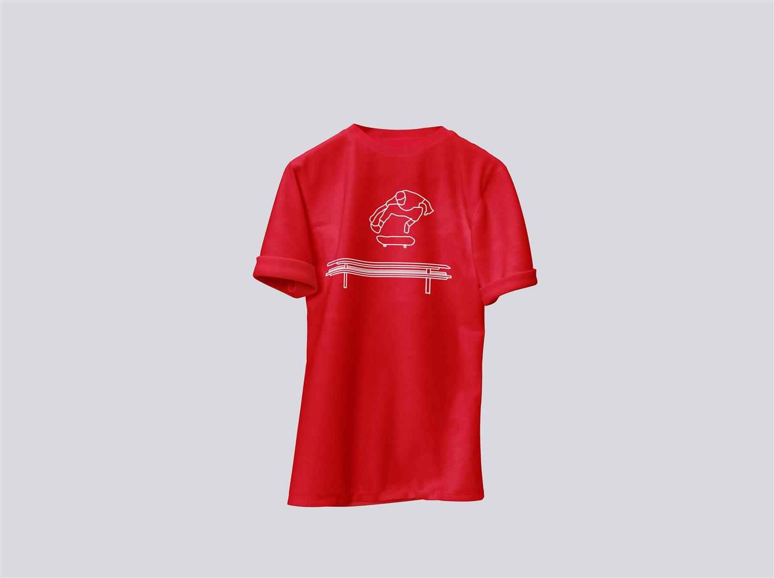
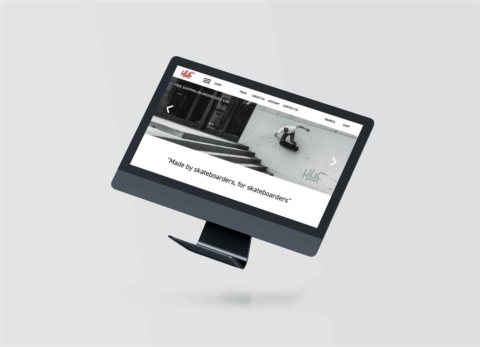
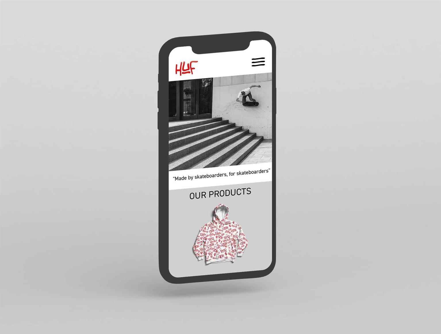
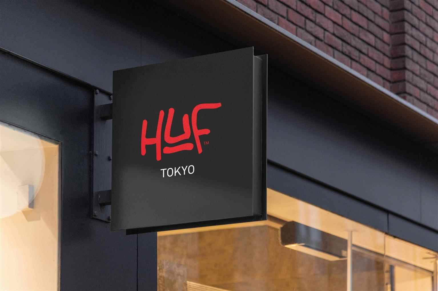
HUF Rebrand
In this rebrand, HUF wants to go back to utilitarian ideas tied to the counterculture origin of the company. Their current branding doesn’t resemble them as a counter-culture collective but rather a...
In this rebrand, HUF wants to go back to utilitarian ideas tied to the counterculture origin of the company. Their current branding doesn’t resemble them as a counter-culture collective but rather a...
In this rebrand, HUF wants to go back to utilitarian ideas tied to the counterculture origin of the company. Their current branding doesn’t resemble them as a counter-culture collective but rather a high fashion clothing outlet. They needed a new system that allowed for the origins to shine through and for their skateboarding supporters to feel a true relation to the brand. This is why I went with the tag-style approach with a grunge feel. The color red incites passion and even anger which aligns with the counterculture feel. In turn, a new, powerful system will attract the true supporters and those who may have been there since the beginning if it were not for their more corporate approach.
Share:
Would you like to get more information or apply?
Click on the button below and we'll get back to you as soon as possible.
Speak To An Advisor
