Siri
OlsonGraphic Design
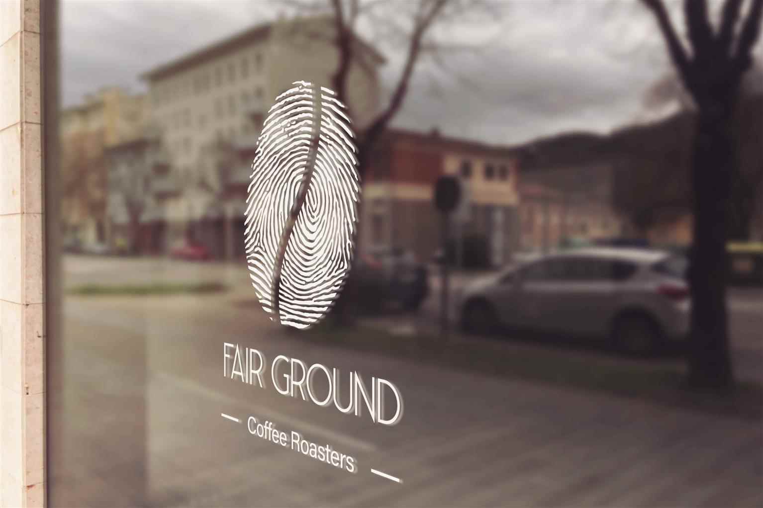
Fairground Coffee Roasters
Fair Ground Coffee Roasters was designed to be a fair trade coffee company. With a fingerprint as a logo, Fair Ground Coffee Roasters hope to enforce this idea, Choosing Fair Trade, which means helpi...
Fair Ground Coffee Roasters was designed to be a fair trade coffee company. With a fingerprint as a logo, Fair Ground Coffee Roasters hope to enforce this idea, Choosing Fair Trade, which means helpi...
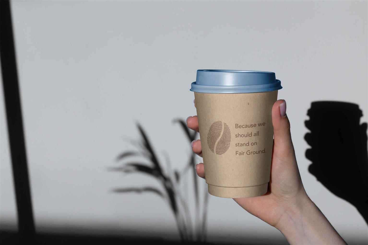
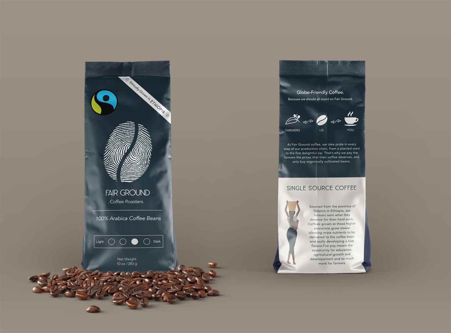
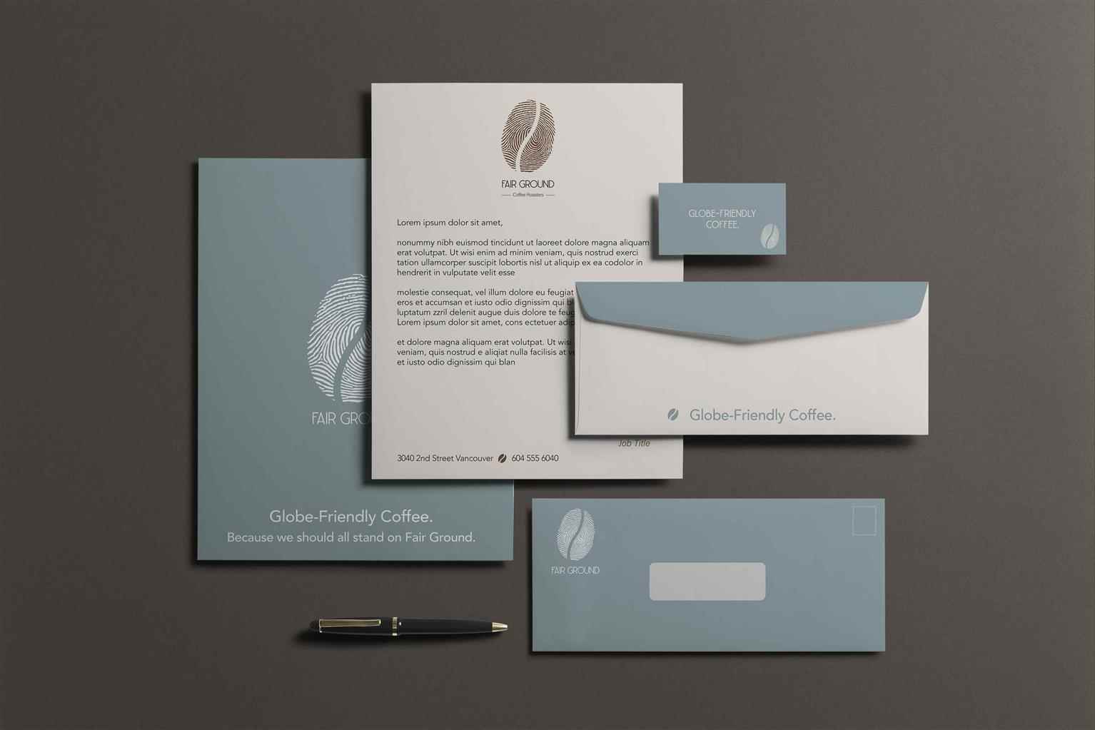
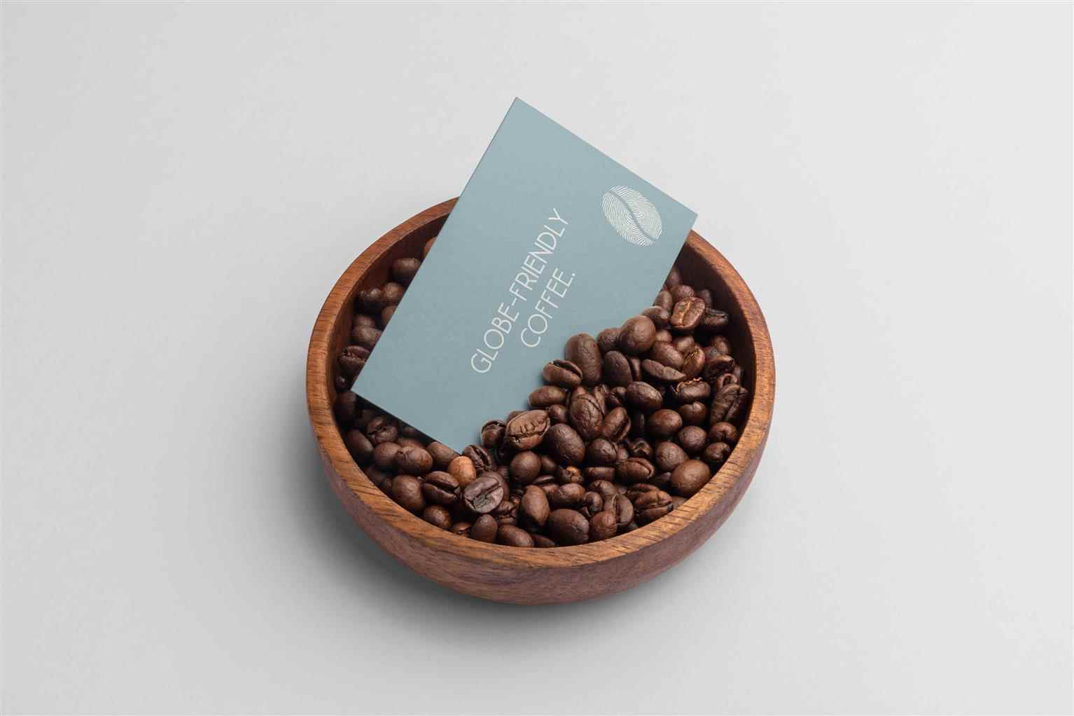
Fair Ground Coffee Roasters was designed to be a fair trade coffee company. With a fingerprint as a logo, Fair Ground Coffee Roasters hope to enforce this idea, Choosing Fair Trade, which means helping coffee farmers. By being properly paid for their work, farmers can invest in education, reforestation and agricultural advancement. For this company, I chose a neutral shade of blue because it is a calming colour, and that is what this coffee should do—make you feel slightly more at peace because your purchase is making a difference.
Share:
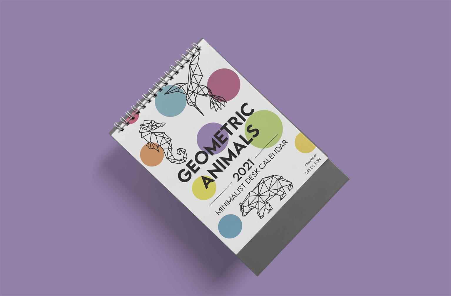
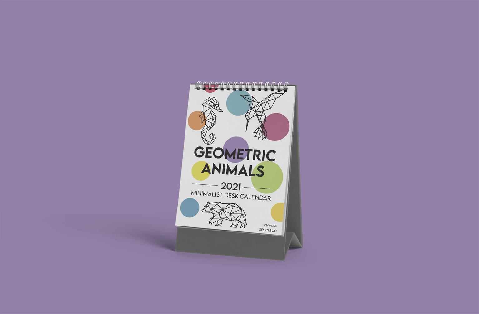
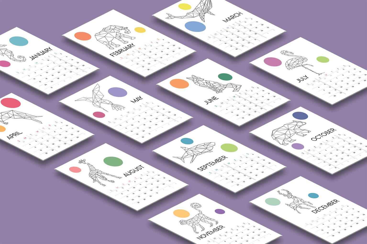
Desk Calendar
This project was fun to create. A perfect blend of the freedom to playfully illustrate and the technical aspects of gridding out a calendar. I went with a minimalist line drawing style to execute eac...
This project was fun to create. A perfect blend of the freedom to playfully illustrate and the technical aspects of gridding out a calendar. I went with a minimalist line drawing style to execute eac...
This project was fun to create. A perfect blend of the freedom to playfully illustrate and the technical aspects of gridding out a calendar. I went with a minimalist line drawing style to execute each animal for their respective months. Each month has colours associated with it in my mind, and I was able to demonstrate this in the project with the coloured circles on each page.
Share:
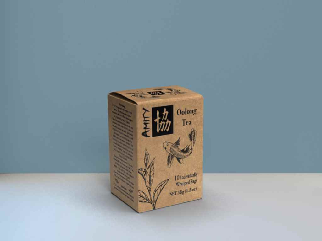
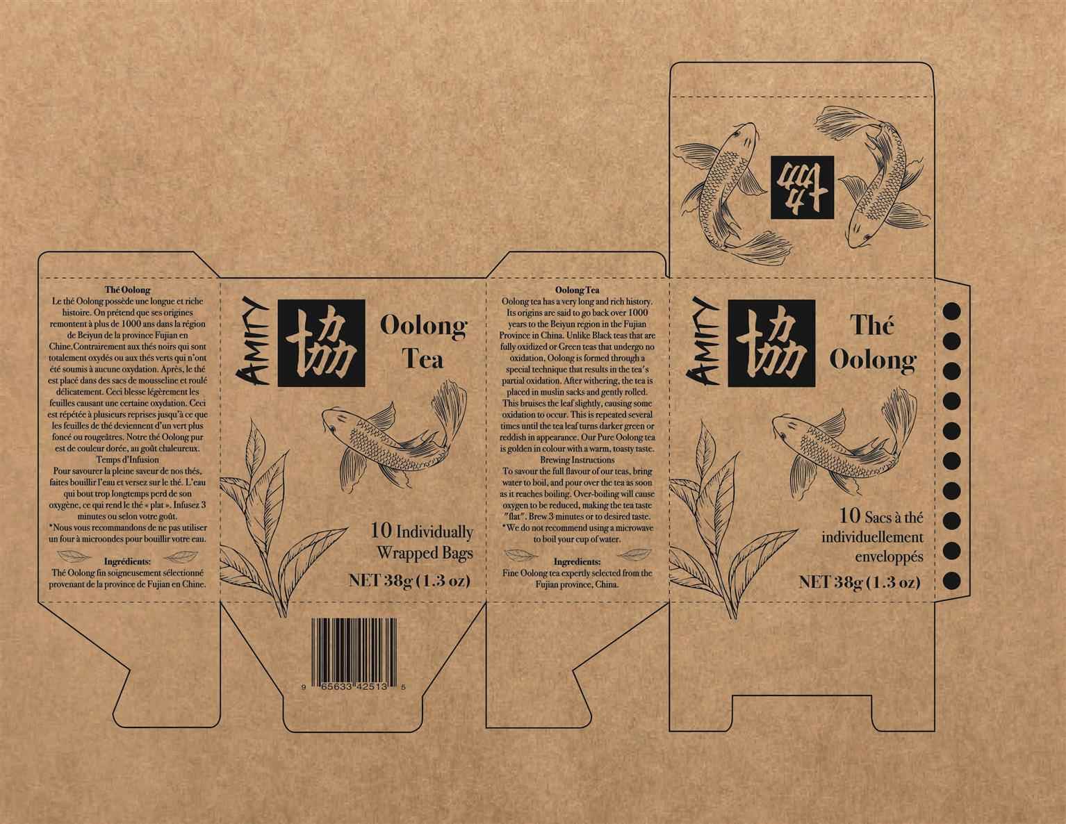
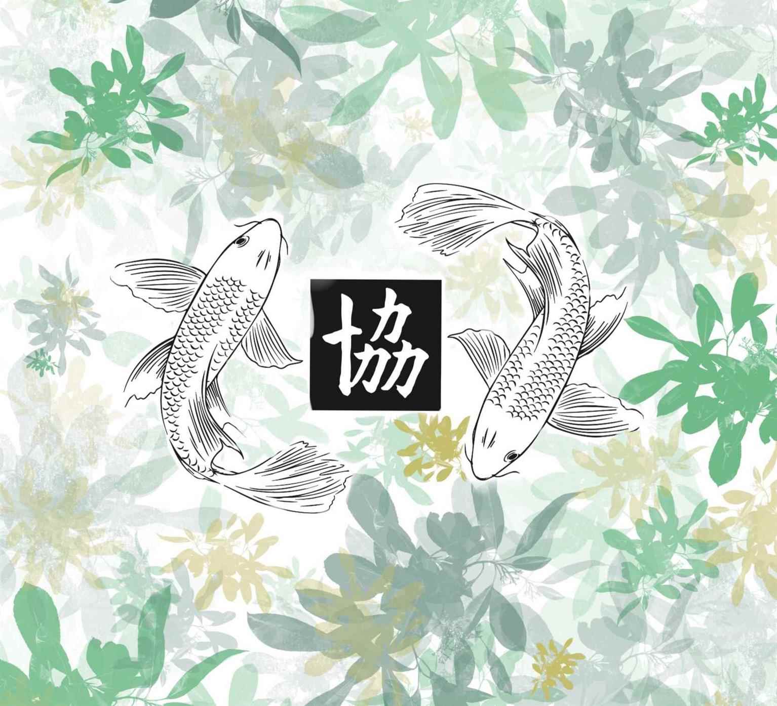
Tea Box Package Design
Inspired by the style of traditional Chinese art, this teabox shows a line art style of art. Featuring tea leaves and Koi fish, the design is meant to pay respect to oolong tea and the Chinese cultur...
Inspired by the style of traditional Chinese art, this teabox shows a line art style of art. Featuring tea leaves and Koi fish, the design is meant to pay respect to oolong tea and the Chinese cultur...
Inspired by the style of traditional Chinese art, this teabox shows a line art style of art. Featuring tea leaves and Koi fish, the design is meant to pay respect to oolong tea and the Chinese culture behind it. The koi fish symbolizes unity and fidelity which ties in to the Chinese character for ‘unity’ that is the logo. Printed on a natural brown paper box, this design would be cost efficient yet symbolic of the natural earth from which tea and fish come from.
Share:
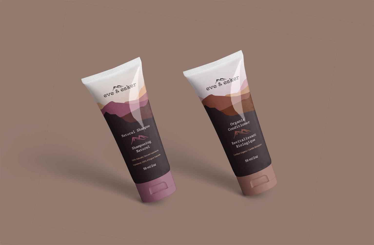
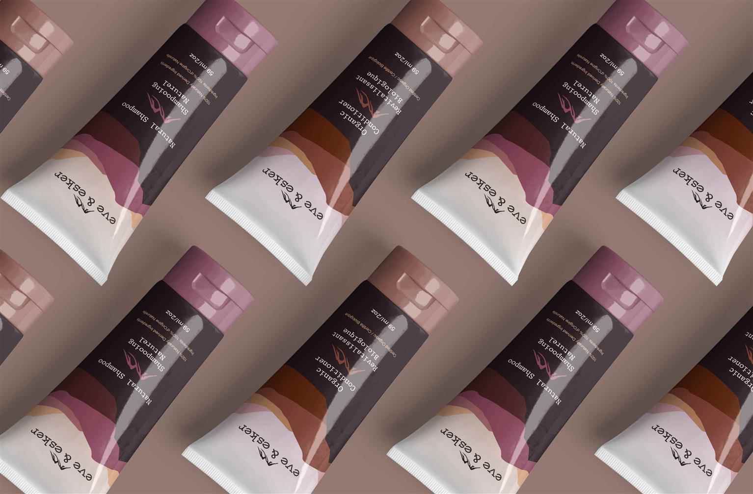
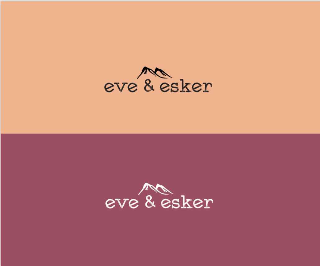
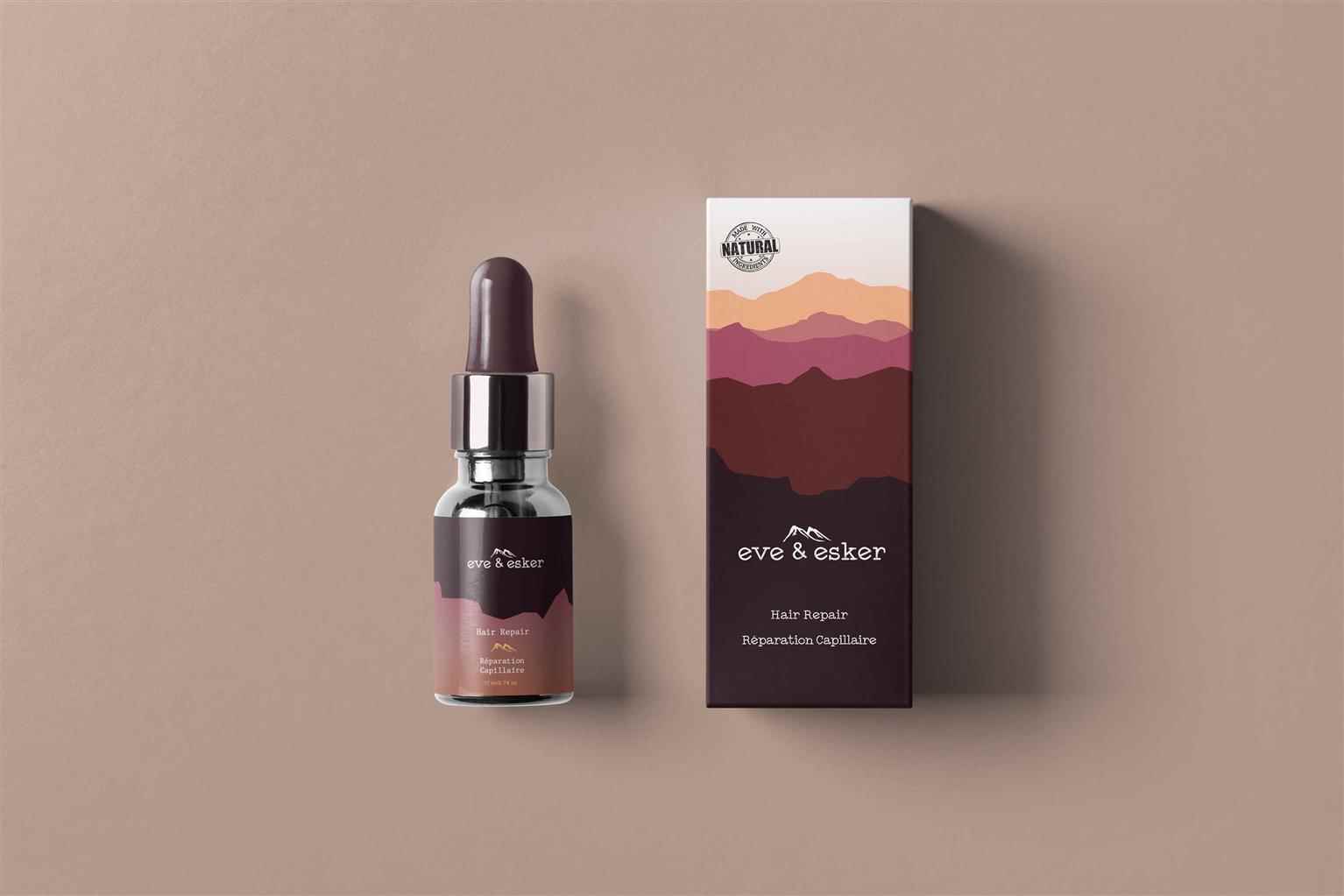
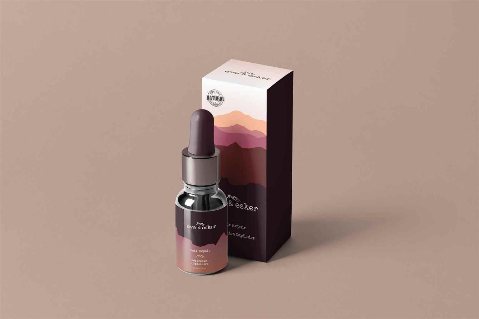
Eve & Esker Haircare
This design is created for those who enjoy the outdoors, and all things natural. With a target audience of 18- to 30-year-old outdoorsy people, the goal of the design is to catch their eye through th...
This design is created for those who enjoy the outdoors, and all things natural. With a target audience of 18- to 30-year-old outdoorsy people, the goal of the design is to catch their eye through th...
This design is created for those who enjoy the outdoors, and all things natural. With a target audience of 18- to 30-year-old outdoorsy people, the goal of the design is to catch their eye through the colour scheme and mountain layout of the product. Natural hair care items, with a natural company name, are guaranteed to bring in customers who care about the earth and quality of the cosmetics they buy. “Eve” comes from its meaning as “evening", and that is what inspired the colour scheme of this brand. “Esker” is a natural word describing the ridges of sand deposited by glacial meltwater flowing through the mountains, which is what inspired the icon of the mountains in this logo.
Share:
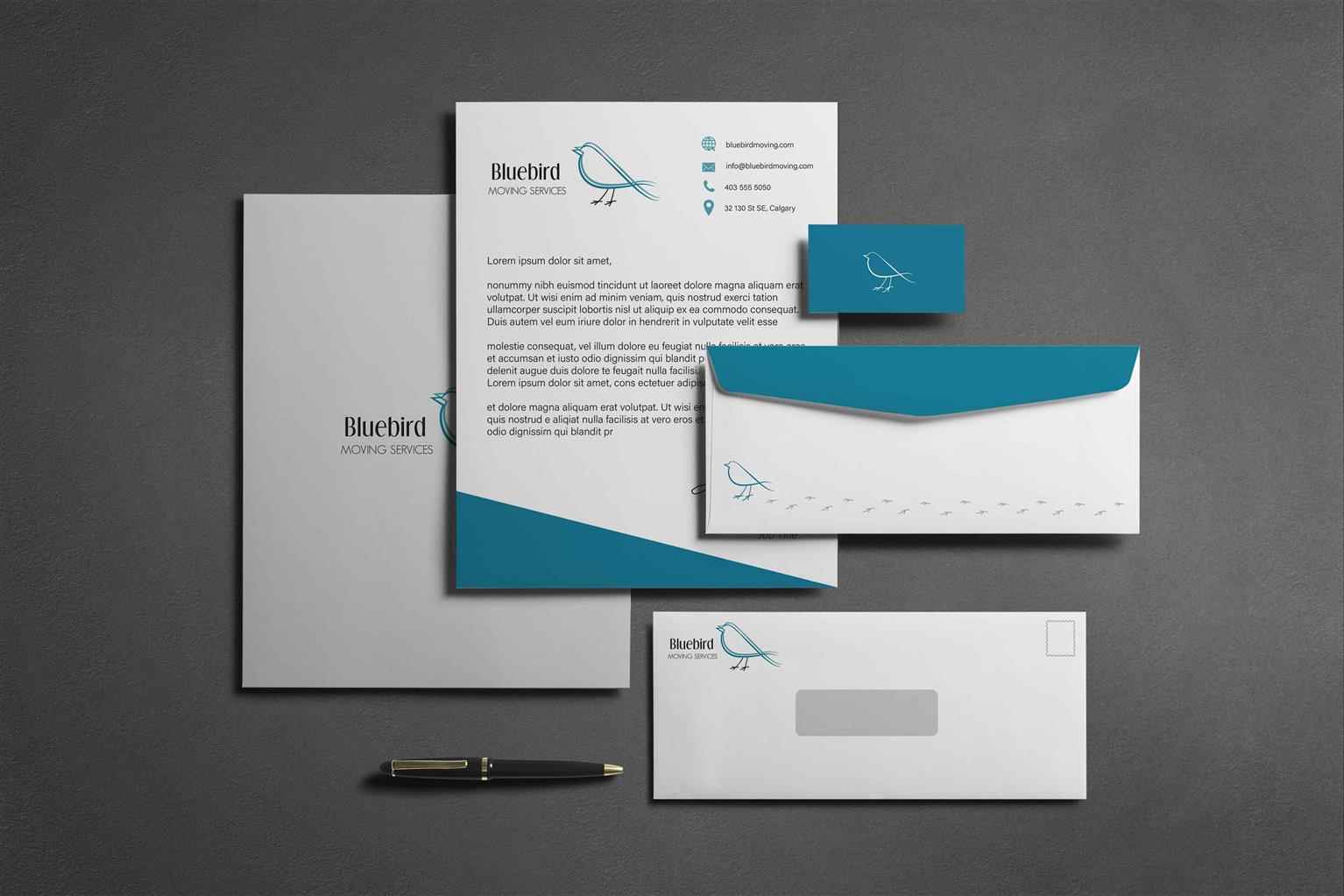
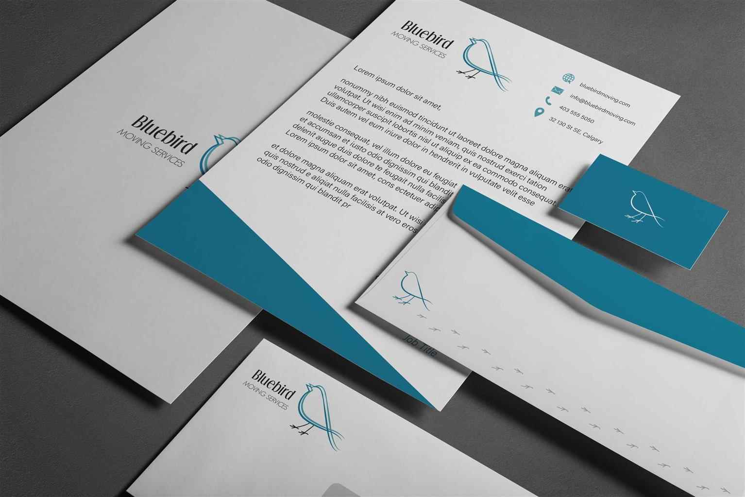
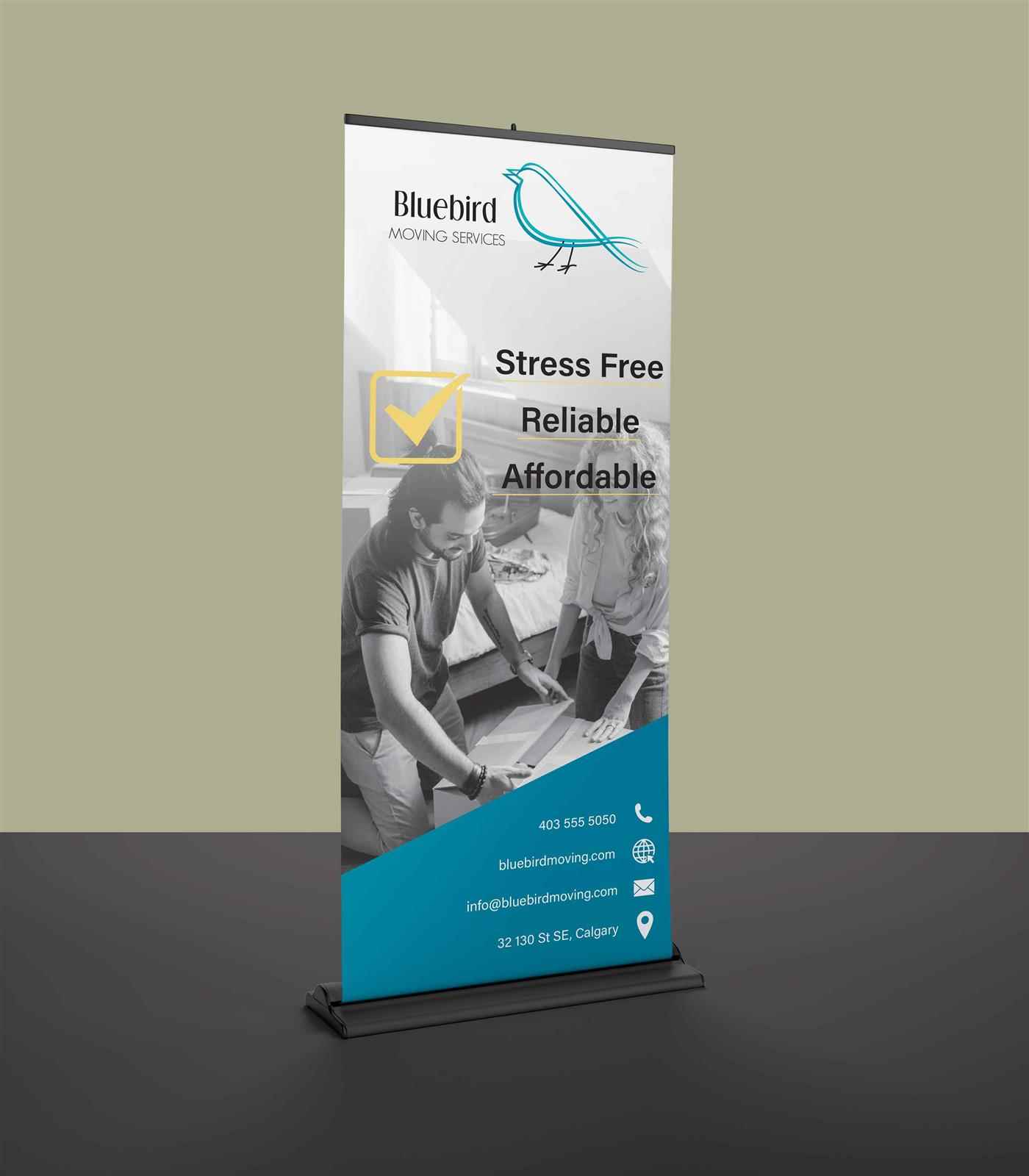
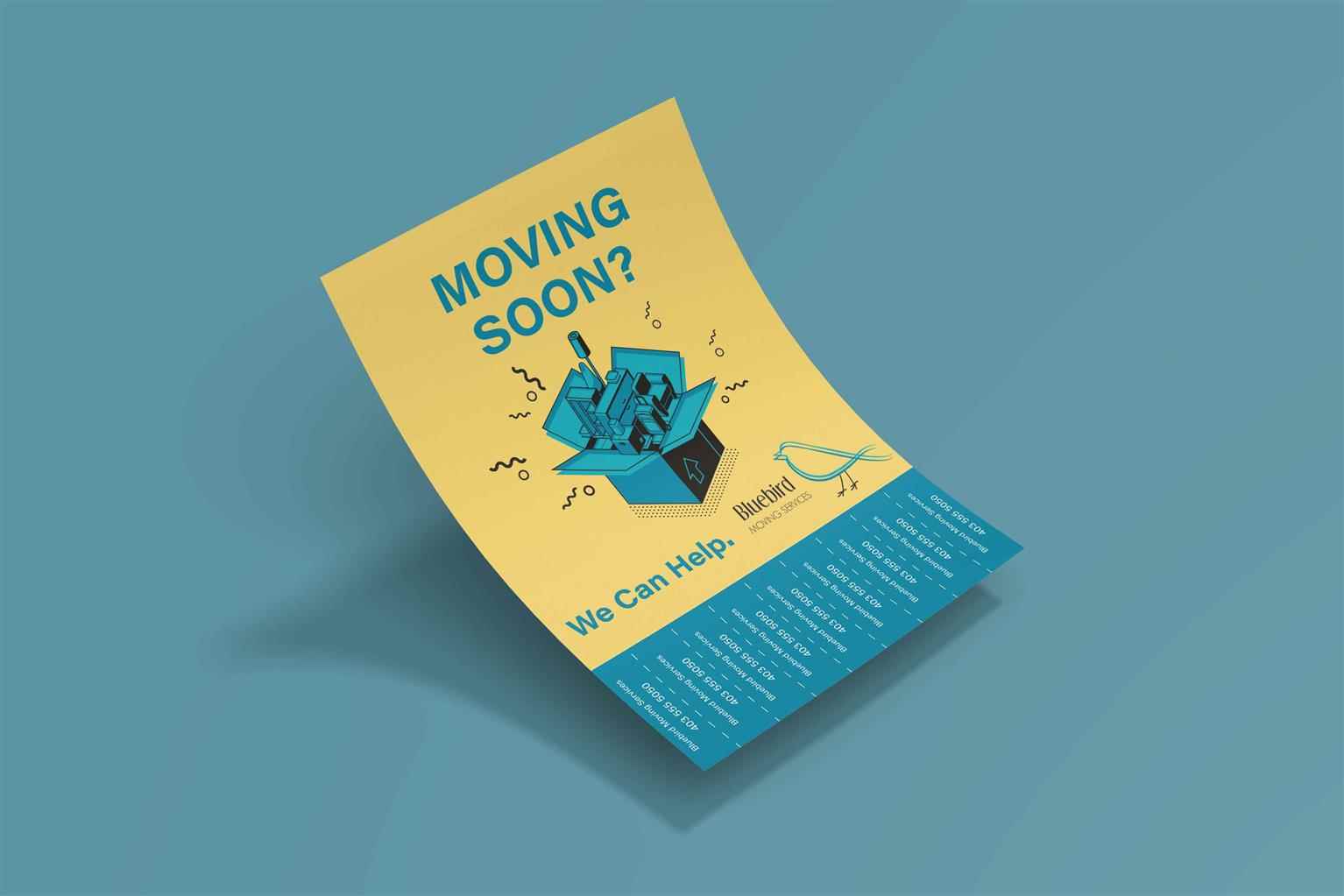
Bluebird Moving Services
Bluebird Moving Services was created as an alternate company to help you move. As we all know, moving can be an incredibly stressful time, so I wanted to counteract that stress with a lively, little...
Bluebird Moving Services was created as an alternate company to help you move. As we all know, moving can be an incredibly stressful time, so I wanted to counteract that stress with a lively, little...
Bluebird Moving Services was created as an alternate company to help you move. As we all know, moving can be an incredibly stressful time, so I wanted to counteract that stress with a lively, little bird logo. Blue is a calming colour, and yellow is a very happy one, so seeing them together ideally generates both of these feelings in clients, and brings in business. The stationery for this brand focuses on both the blue colour, and the bird logo of this business. These two elements are what make Bluebird Moving Services approachable, yet trustworthy, so that clients can feel at ease during their move.
Share:
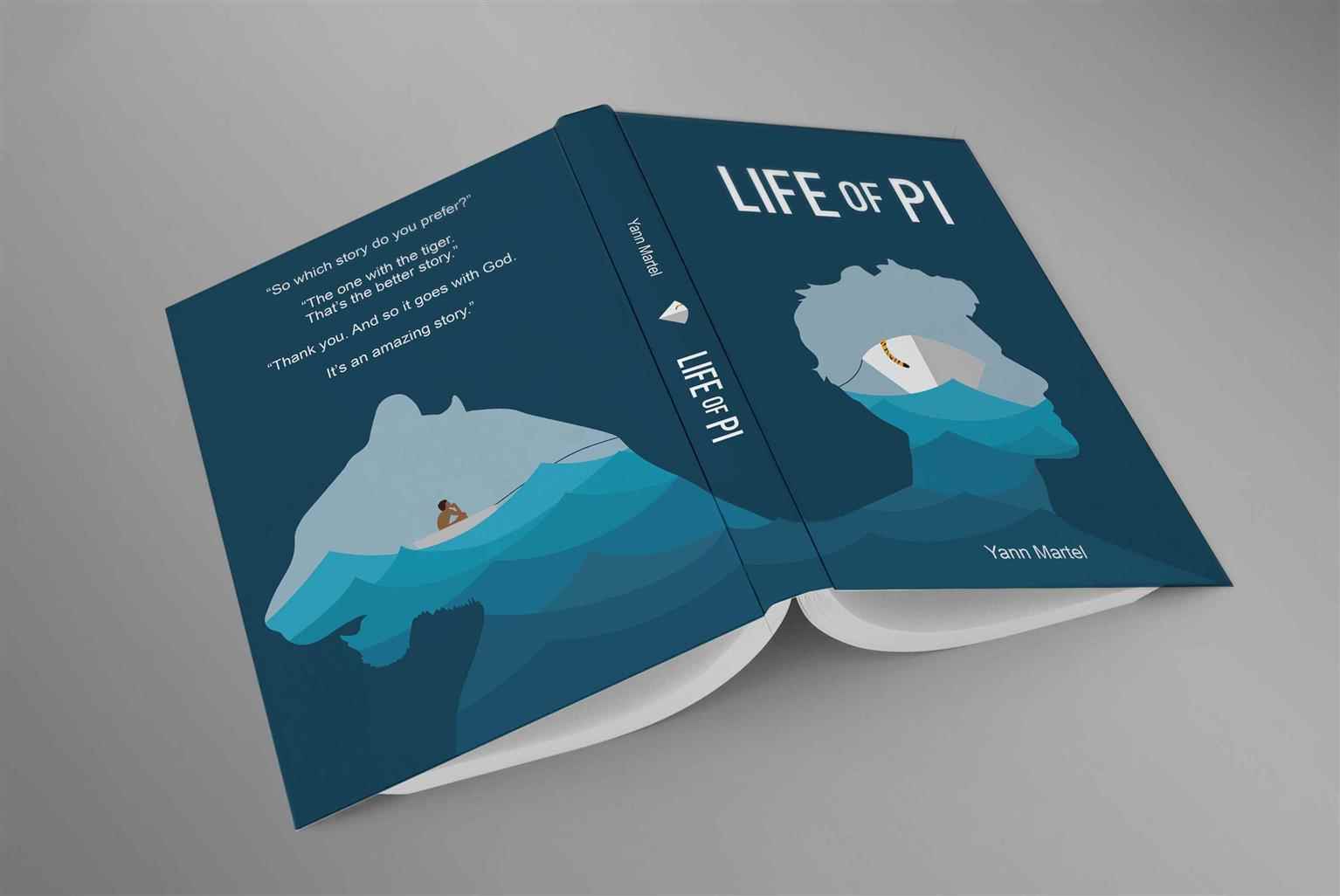
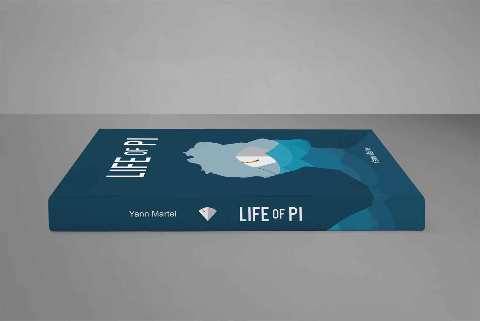
Life of Pi Book Cover
This book cover redesign is meant to convey the emotions of the characters through illustration. Created out of inspiration from the original cover, I wanted to make viewers look twice to catch the s...
This book cover redesign is meant to convey the emotions of the characters through illustration. Created out of inspiration from the original cover, I wanted to make viewers look twice to catch the s...
This book cover redesign is meant to convey the emotions of the characters through illustration. Created out of inspiration from the original cover, I wanted to make viewers look twice to catch the story I left behind—that being that Pi Patel and Richard Parker together, surviving, with only the other for comfort. While the outlines of their heads are turned away, their bodies remain connected. Similarly, in the main illustration, they are on different rafts, yet still connected by the rope. These connections help create a visual to understand their bond, as that is a driving force to why this book is loved by so many. The shades of blue were chosen to balance the waves of the sea. Throughout the majority of the book, there are not a lot of mentions of a “raging sea”, so I didn’t want that to be the message conveyed through the visual of the waves. The slightly deeper and more neutral shades of blue harmonize with the action of the sea, while also posing a strong colour contrast to the tiger’s tail.
Share:
Would you like to get more information or apply?
Click on the button below and we'll get back to you as soon as possible.
Speak To An Advisor
