Pooya
SalahiGraphic Design
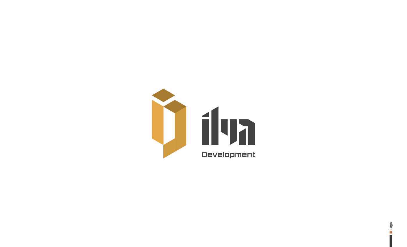
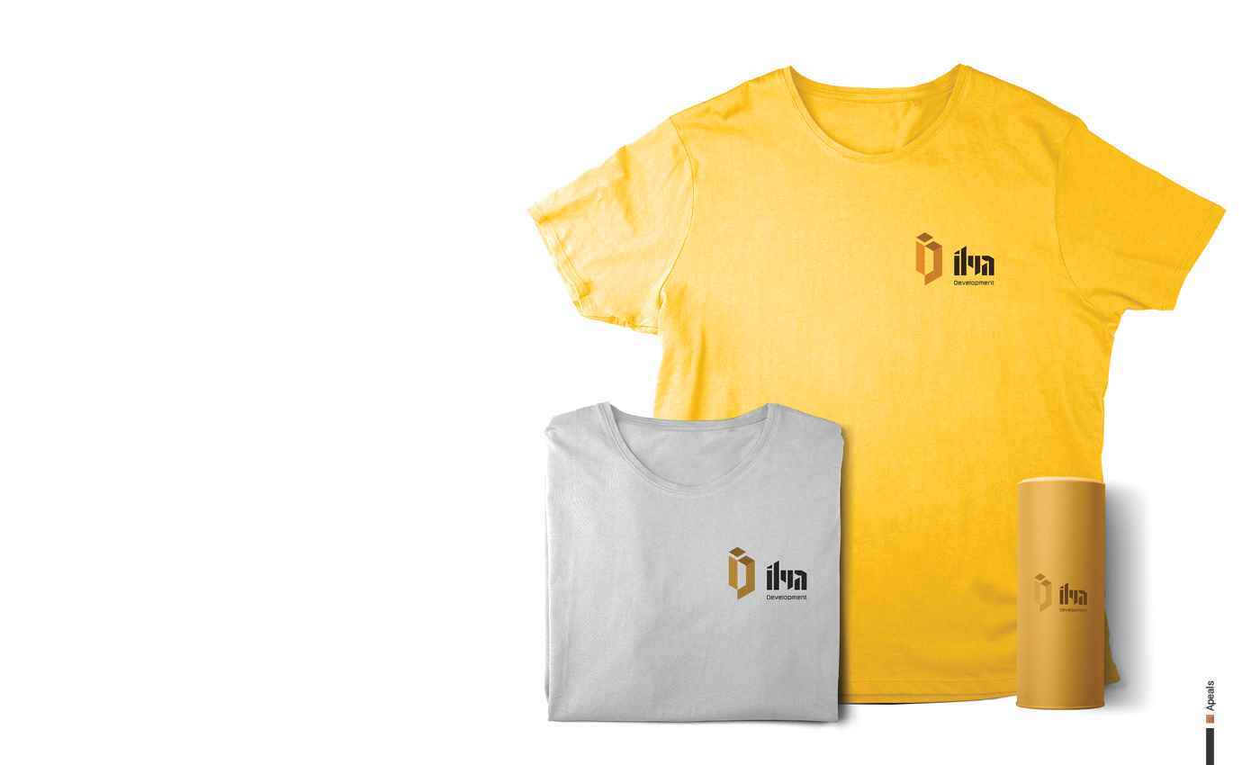
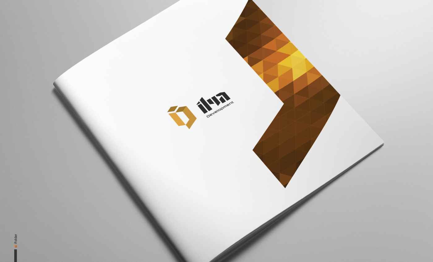
01-llya Development Inc 2
INDUSTRY Development, Interior Design PROJECT TYPE Branding, Logo Design, Stationary DESCRIPTION Ilya Development provides a complete home building package to clients in building, renovation...
INDUSTRY Development, Interior Design PROJECT TYPE Branding, Logo Design, Stationary DESCRIPTION Ilya Development provides a complete home building package to clients in building, renovation...
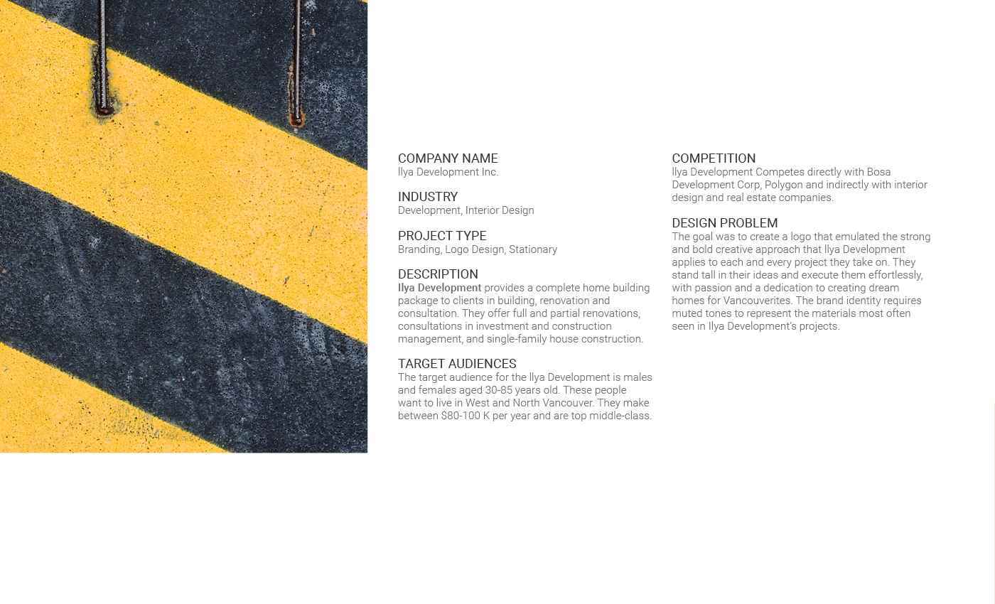
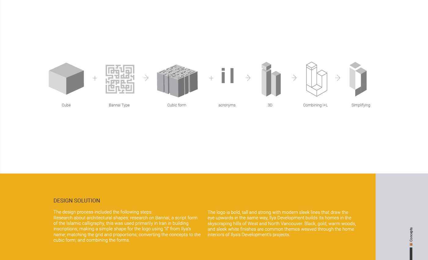
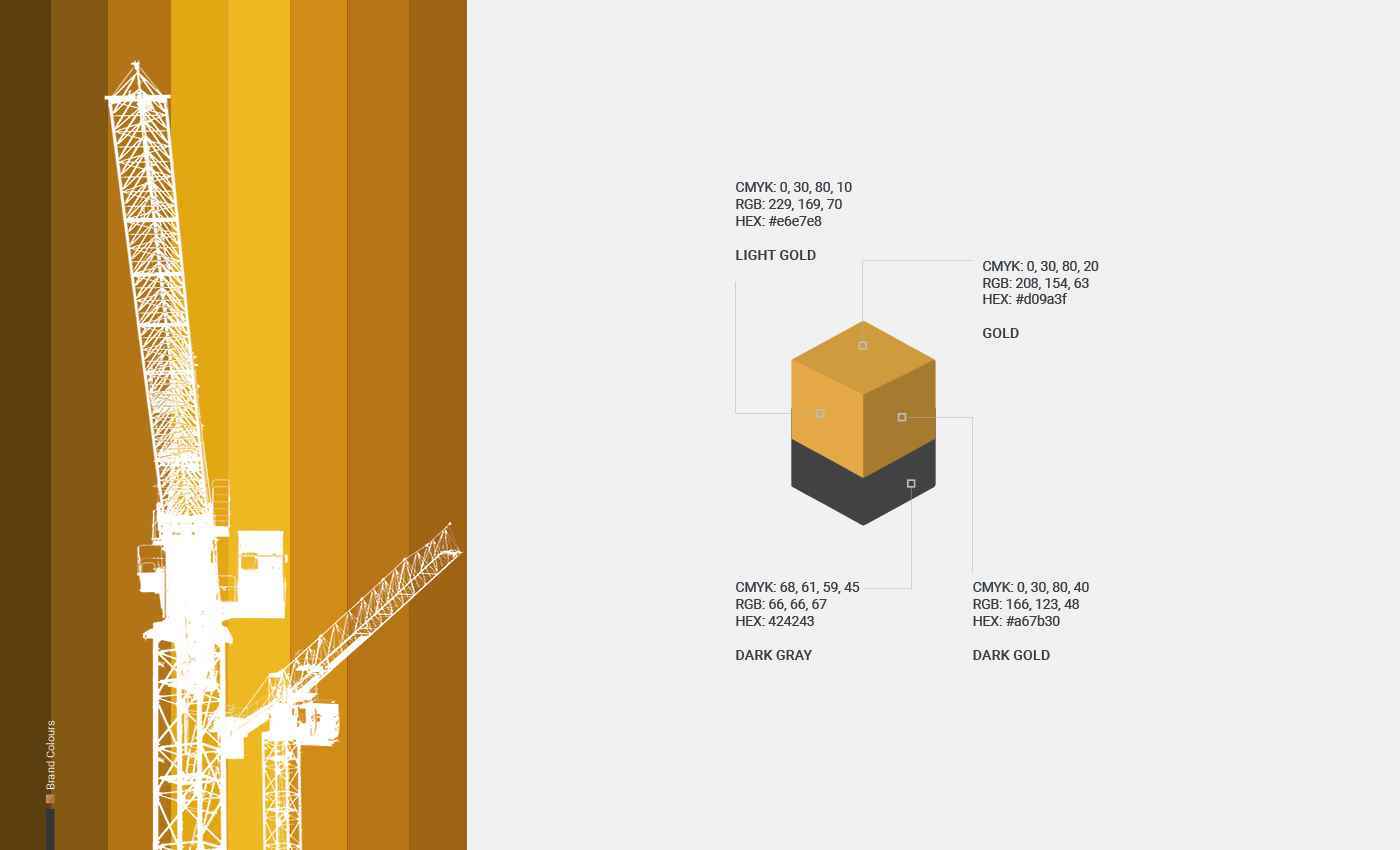
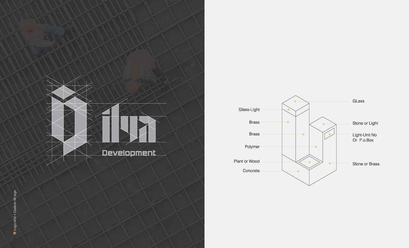
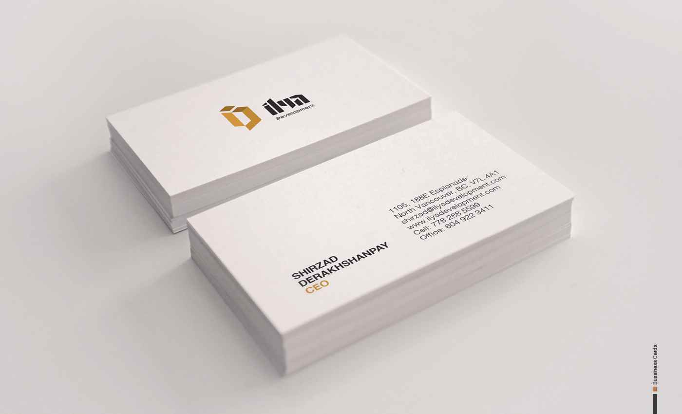
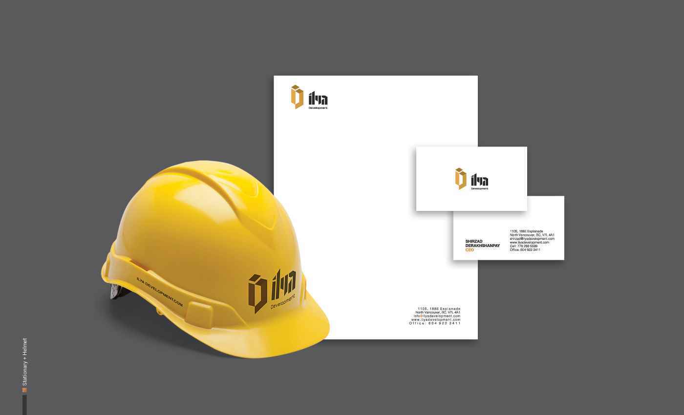
INDUSTRY Development, Interior Design PROJECT TYPE Branding, Logo Design, Stationary DESCRIPTION Ilya Development provides a complete home building package to clients in building, renovation and consultation. They offer full and partial renovations, consultations in investment and construction management, and single-family house construction. TARGET AUDIENCES The target audience for the llya Development is males and females aged 30-85 years old. These people want to live in West and North Vancouver. They make between $80-100 K per year and are top middle-class. COMPETITION llya Development Competes directly with Bosa Development Corp, Polygon and indirectly with interior design and real estate companies. DESIGN PROBLEM The goal was to create a logo that emulated the strong and bold creative approach that llya Development applies to each and every project they take on. They stand tall in their ideas and execute them effortlessly, with passion and a dedication to creating dream homes for Vancouverites. The brand identity requires muted tones to represent the materials most often seen in Ilya Development’s projects. DESIGN SOLUTION The design process included the following steps: Research about architectural shapes; research on Bannai, a script form of the Islamic calligraphy, this was used primarily in Iran in building inscriptions; making a simple shape for the logo using “il” from Ilya’s name; matching the grid and proportions; converting the concepts to the cubic form; and combining the forms.
Share:
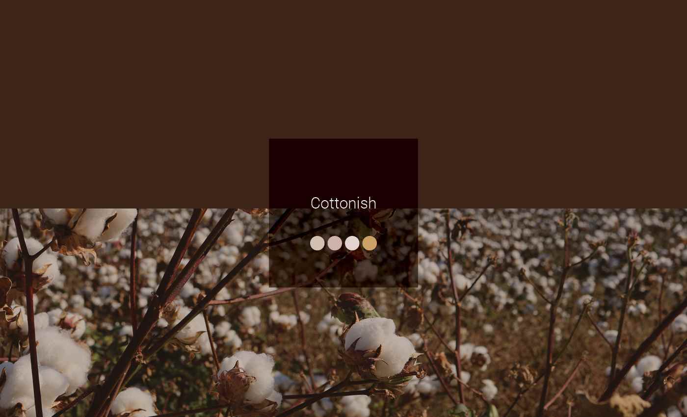
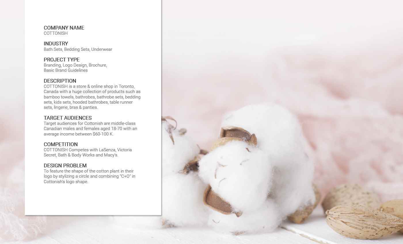
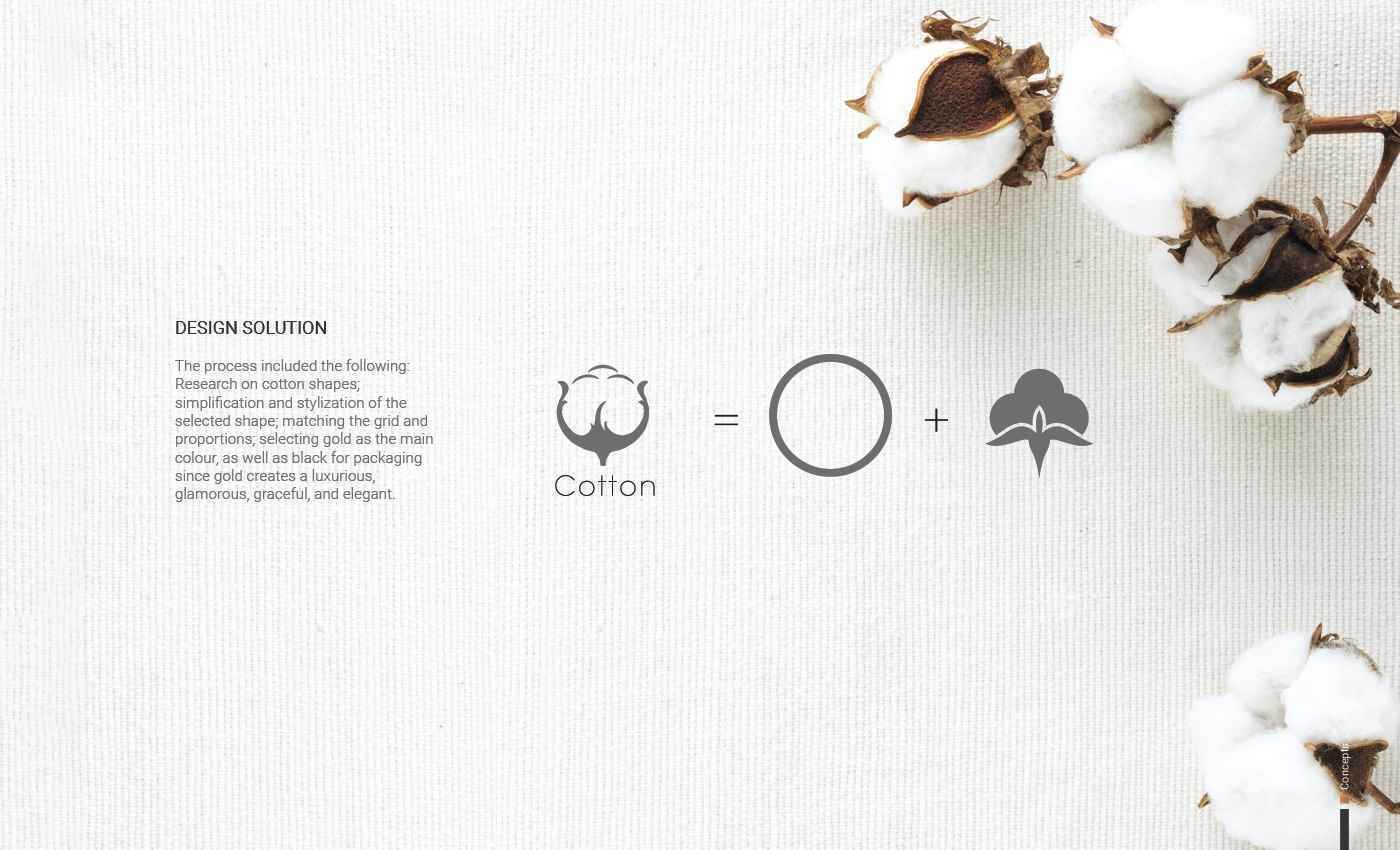
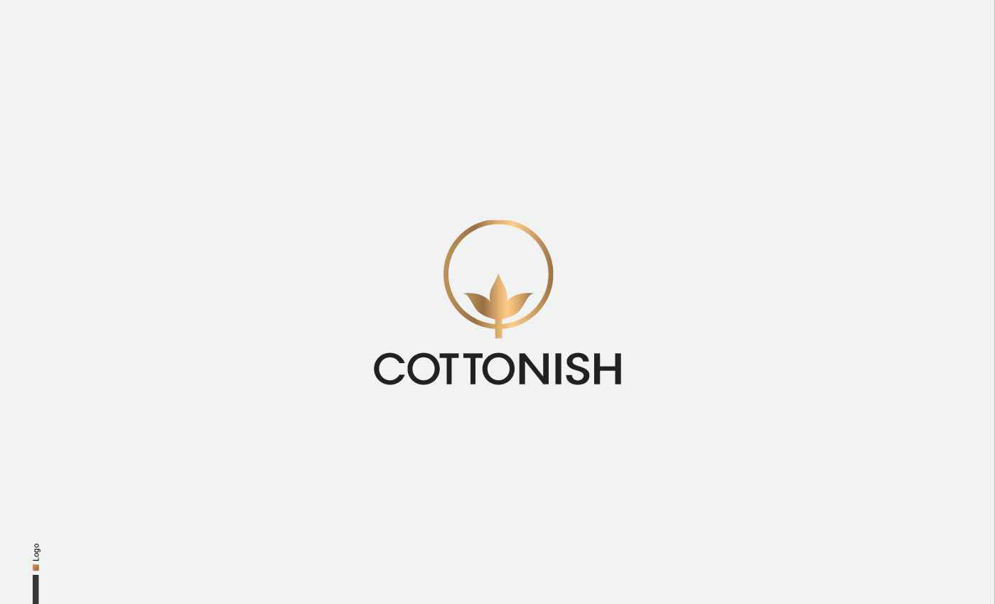
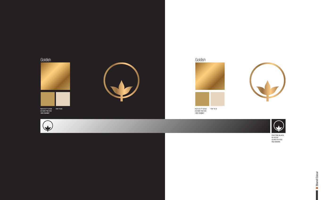
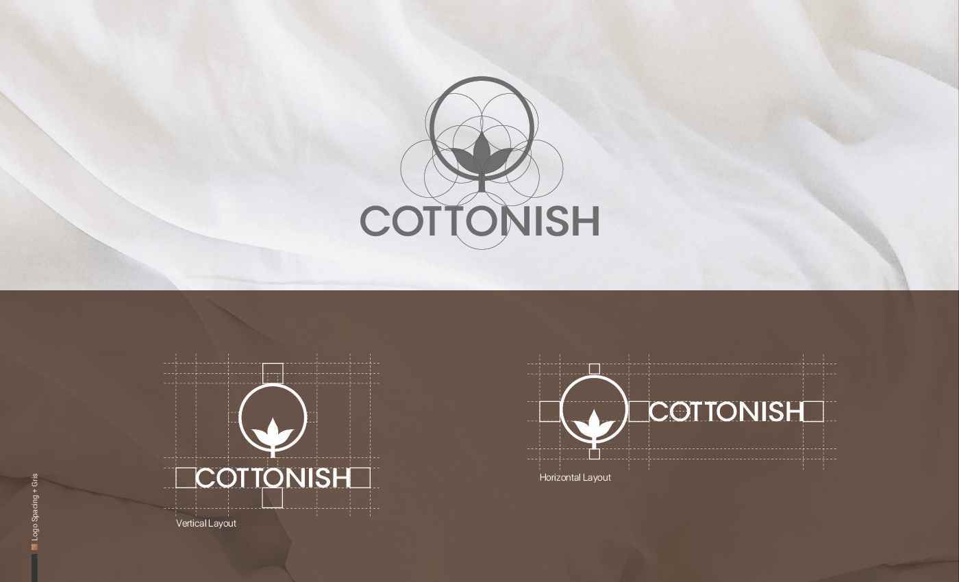
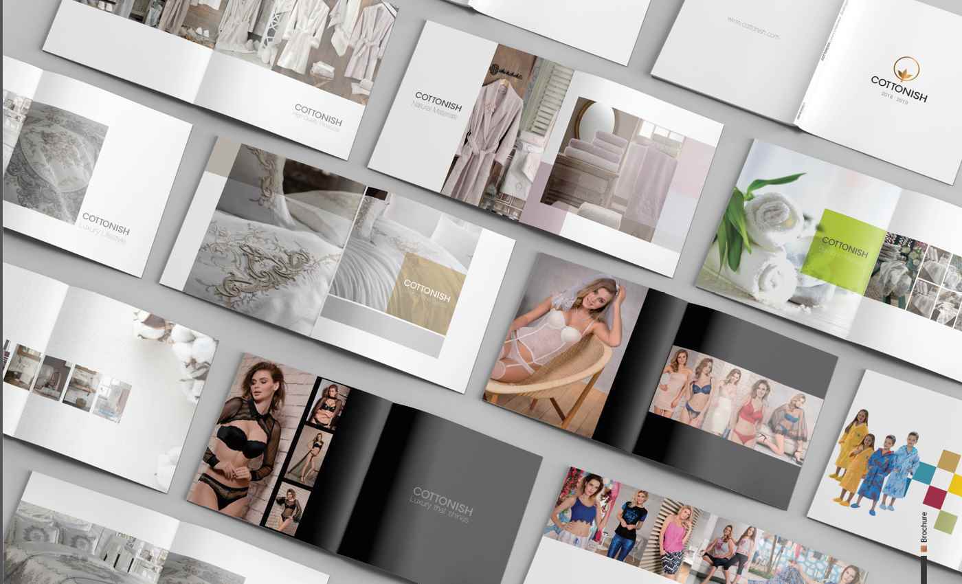
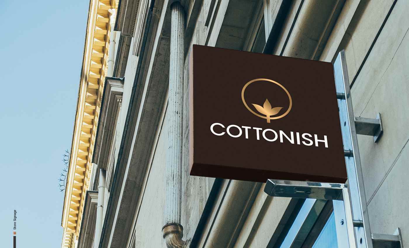
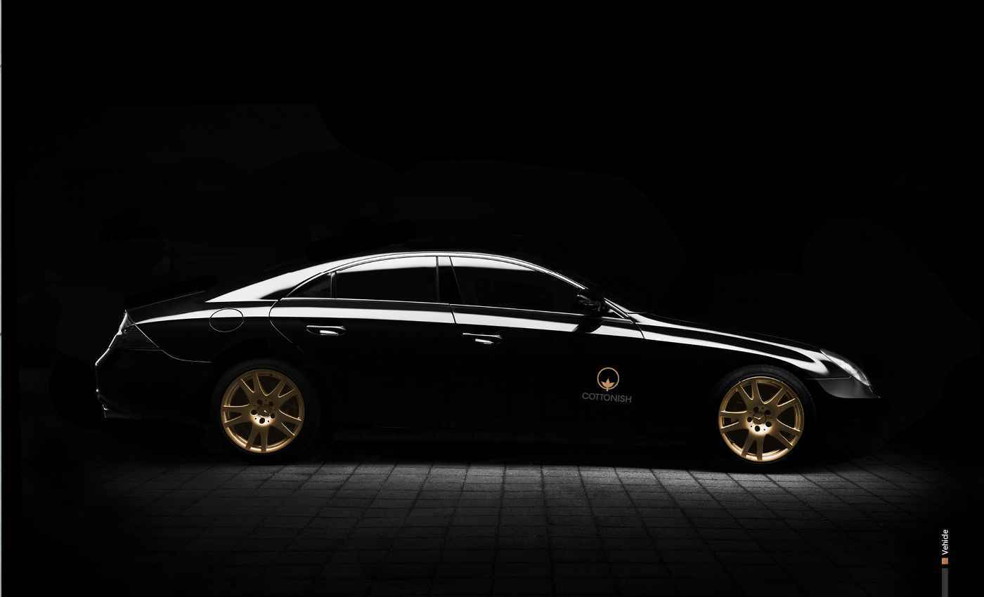
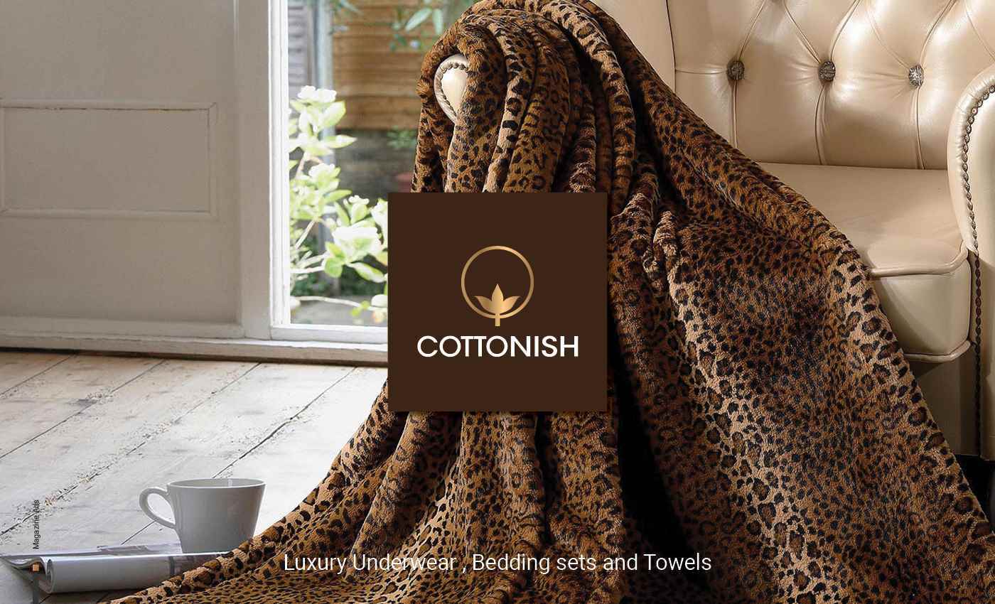
02-COTTONISH 2
INDUSTRY Bath Sets, Bedding Sets, Underwear PROJECT TYPE Branding, Logo Design, Brochure, Basic Brand Guidelines DESCRIPTION COTTONISH is a store & online shop in Toronto, Canada with a h...
INDUSTRY Bath Sets, Bedding Sets, Underwear PROJECT TYPE Branding, Logo Design, Brochure, Basic Brand Guidelines DESCRIPTION COTTONISH is a store & online shop in Toronto, Canada with a h...
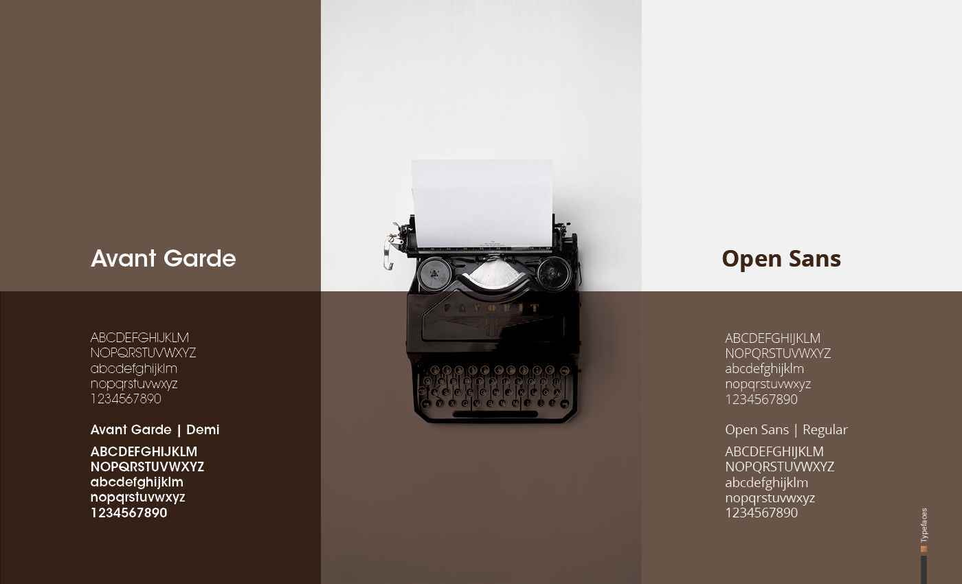
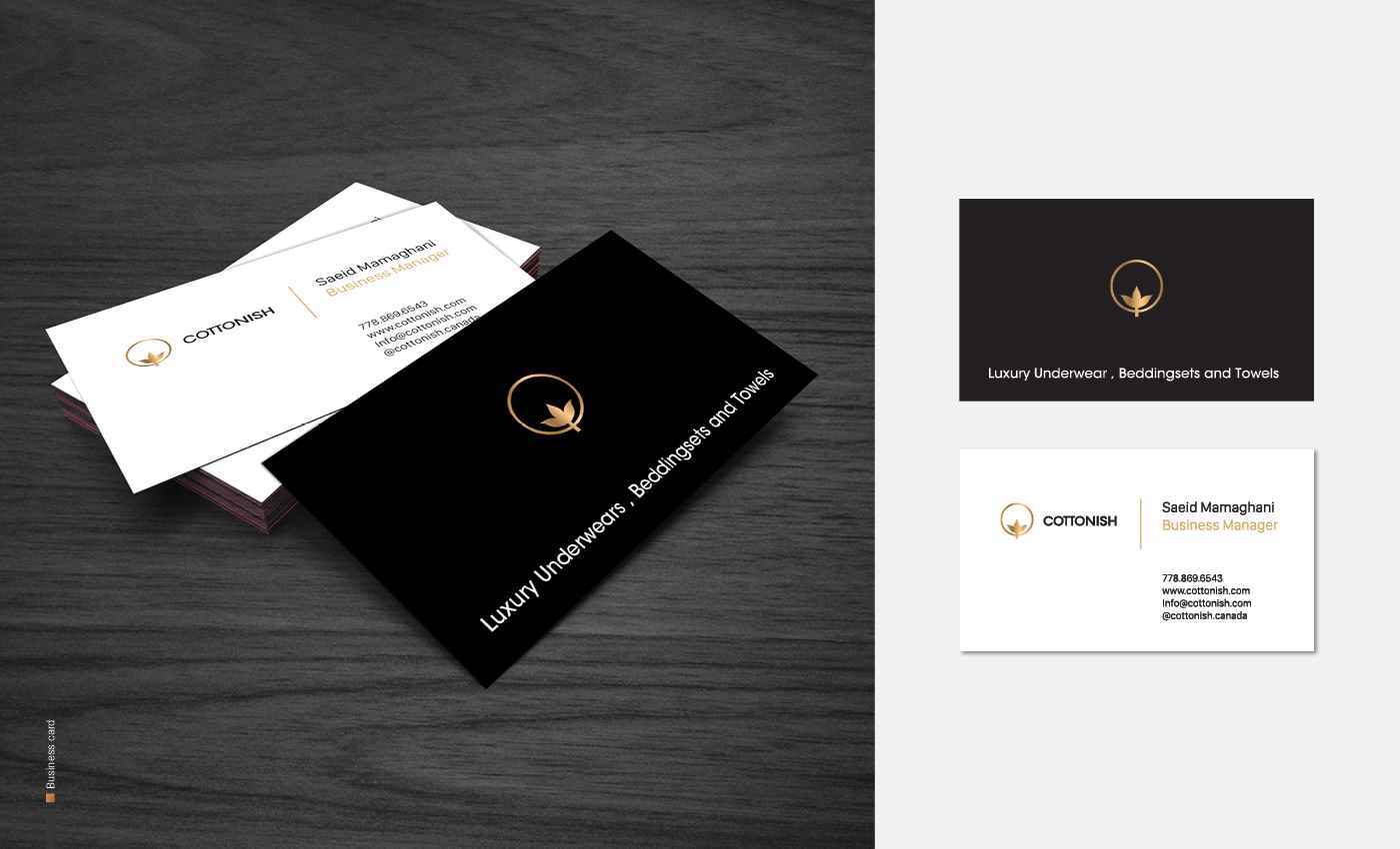
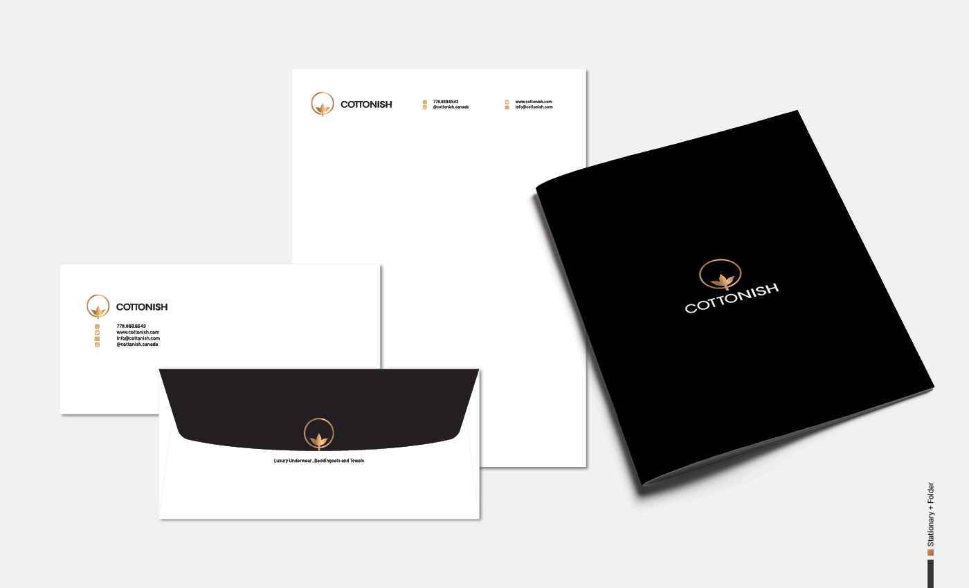
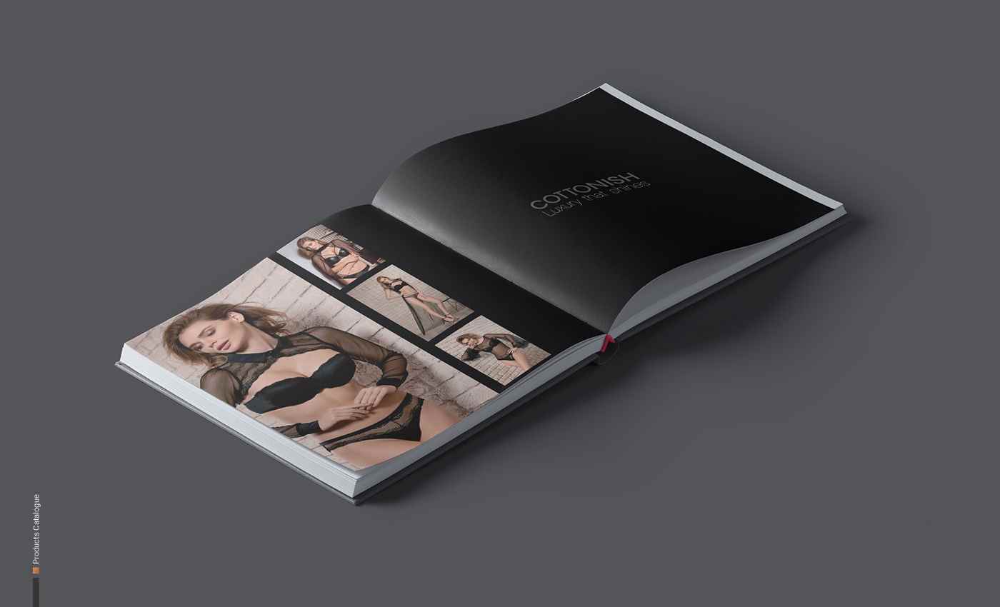
INDUSTRY Bath Sets, Bedding Sets, Underwear PROJECT TYPE Branding, Logo Design, Brochure, Basic Brand Guidelines DESCRIPTION COTTONISH is a store & online shop in Toronto, Canada with a huge collection of products such as bamboo towels, bathrobes, bathrobe sets, bedding sets, kids sets, hooded bathrobes, table runner sets, lingerie, bras & panties. TARGET AUDIENCES Target audiences for Cottonish are middle-class Canadian males and females aged 18-70 with an average income between $60-100 K. COMPETITION COTTONISH Competes with LaSenza, Victoria Secret, Bath & Body Works and Macy’s. DESIGN PROBLEM To feature the shape of the cotton plant in their logo by stylizing a circle and combining “C+O” in Cottonish’s logo shape. DESIGN SOLUTION The process included the following: Research on cotton shapes; simplification and stylization of the selected shape; matching the grid and proportions; selecting gold as the main colour, as well as black for packaging since gold creates a luxurious, glamorous, graceful, and elegant.
Share:
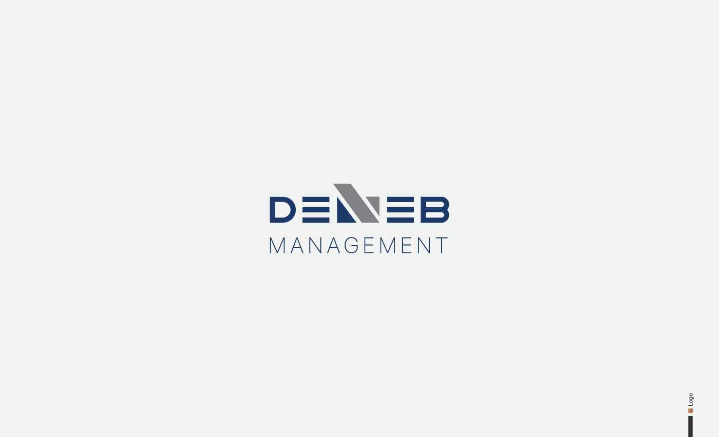
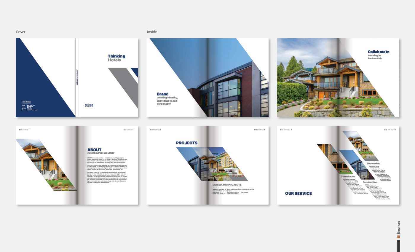
03-Deneb Management Inc 2
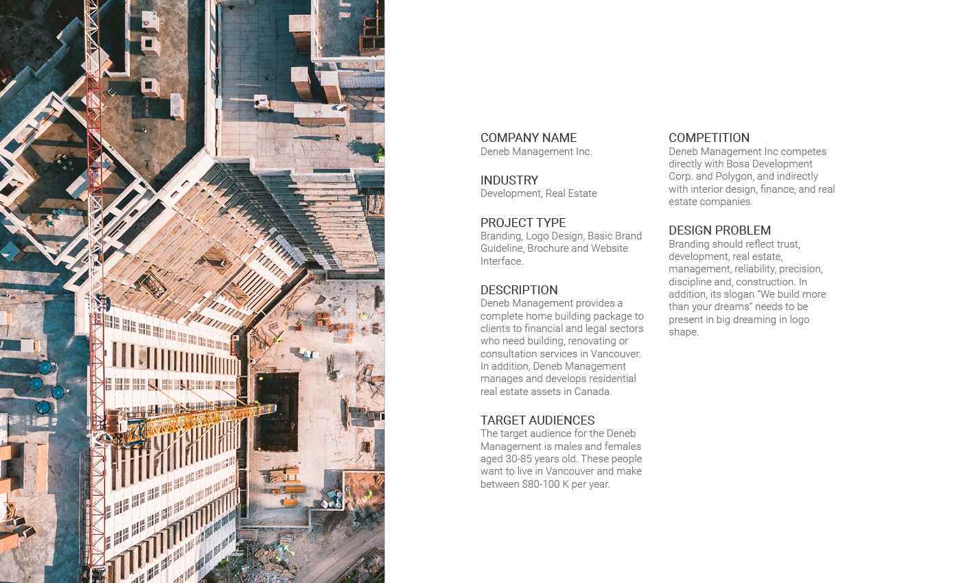
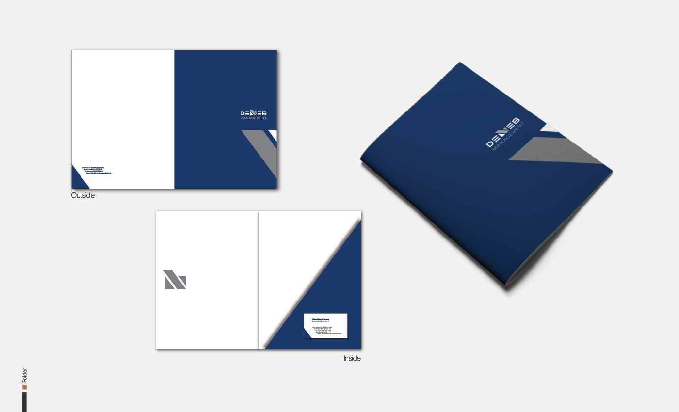
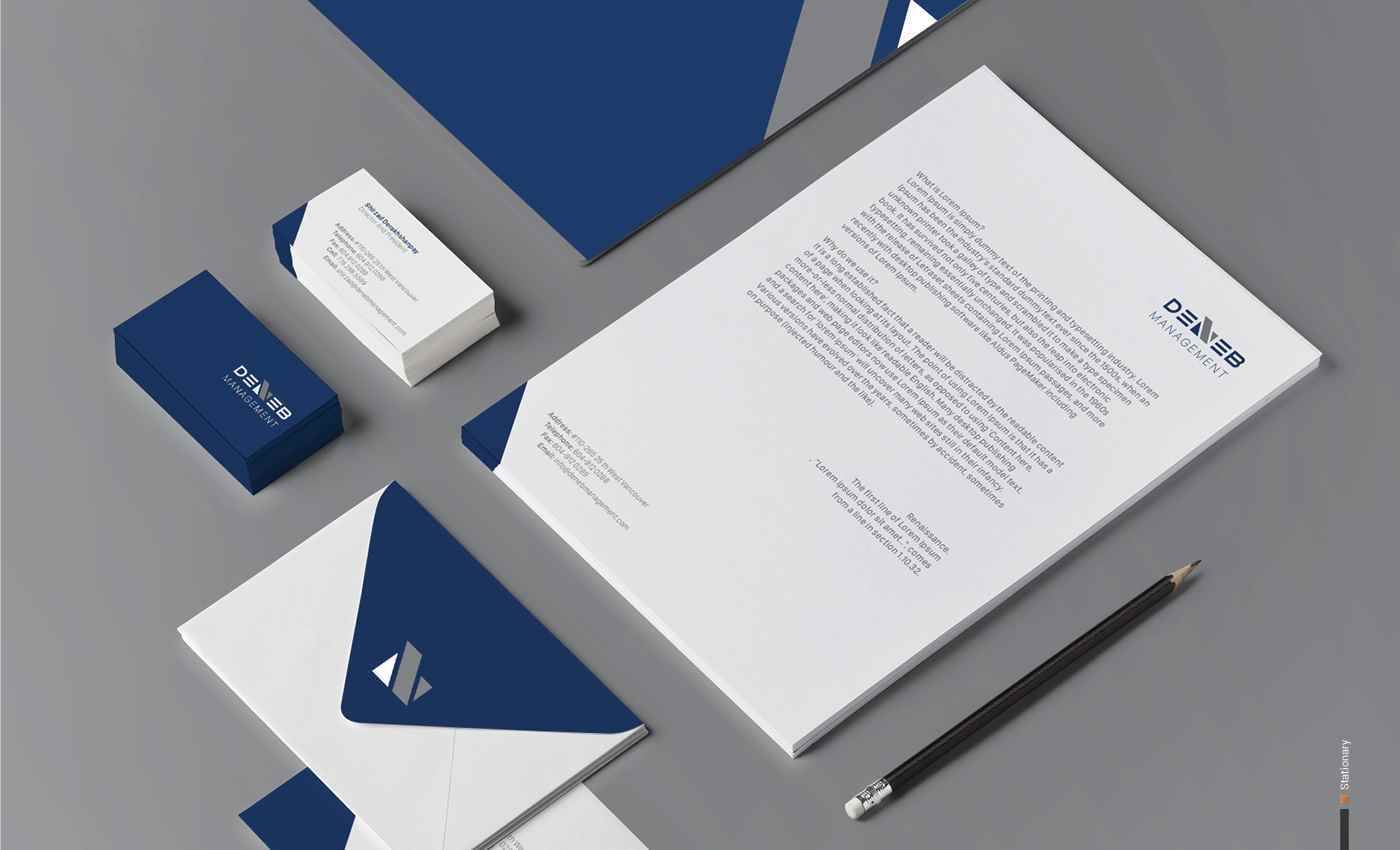
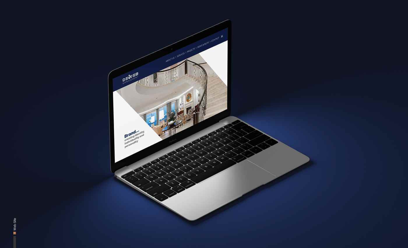
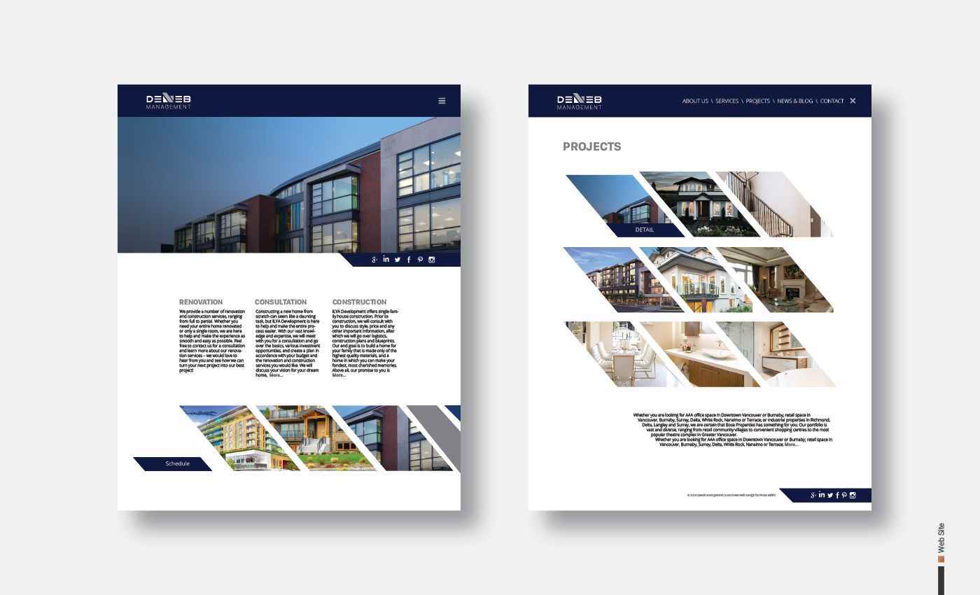
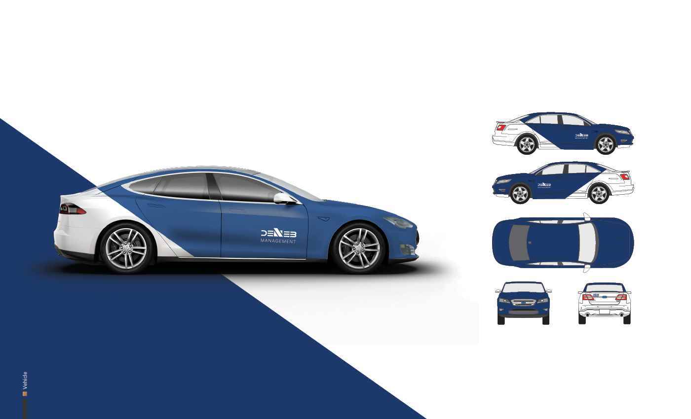
INDUSTRY Development, Real Estate PROJECT TYPE Branding, Logo Design, Basic Brand Guideline, Brochure and Website Interface. DESCRIPTION Deneb Management provides a complete home building pa...
INDUSTRY Development, Real Estate PROJECT TYPE Branding, Logo Design, Basic Brand Guideline, Brochure and Website Interface. DESCRIPTION Deneb Management provides a complete home building pa...
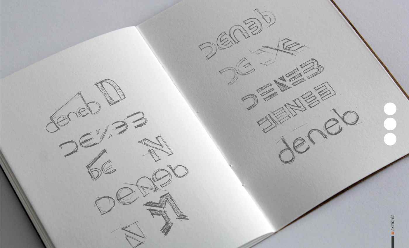
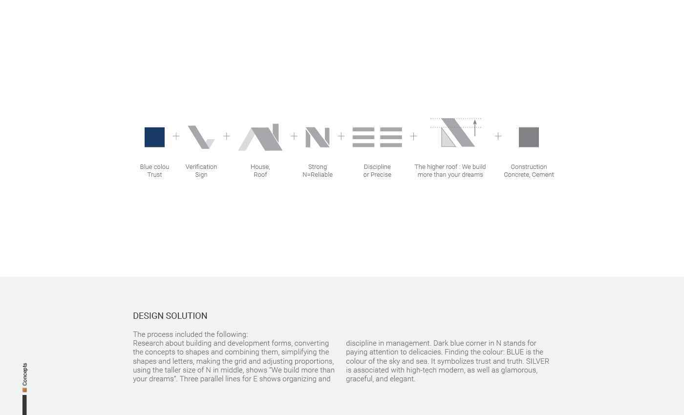
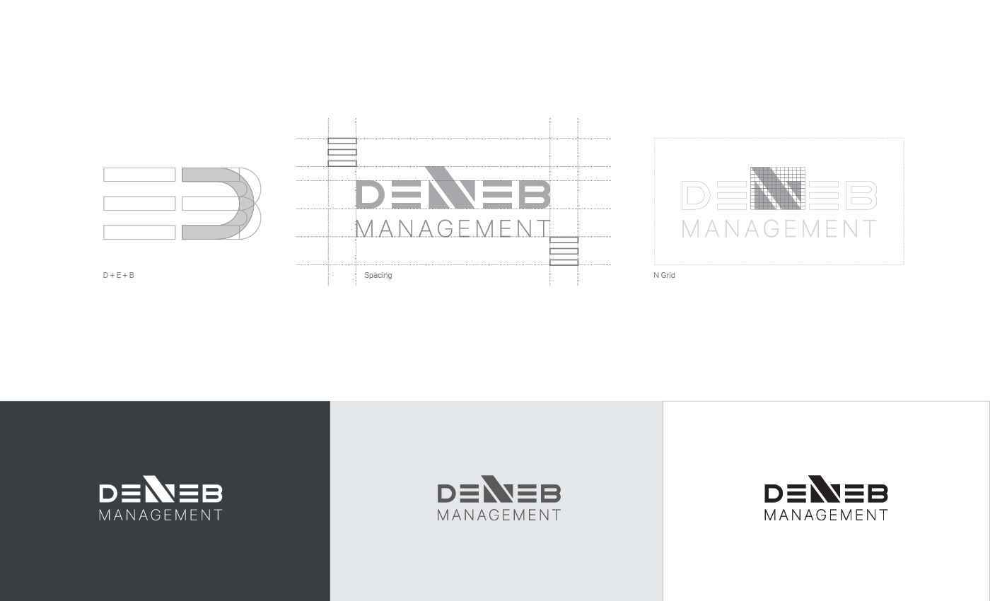
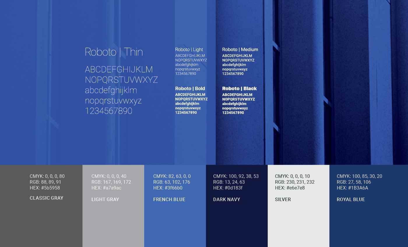
INDUSTRY Development, Real Estate PROJECT TYPE Branding, Logo Design, Basic Brand Guideline, Brochure and Website Interface. DESCRIPTION Deneb Management provides a complete home building package to clients to financial and legal sectors who need building, renovating or consultation services in Vancouver. In addition, Deneb Management manages and develops residential real estate assets in Canada. TARGET AUDIENCES The target audience for the Deneb Management is males and females aged 30-85 years old. These people want to live in Vancouver and make between $80-100 K per year. COMPETITION Deneb Management Inc competes directly with Bosa Development Corp. and Polygon, and indirectly with interior design, finance, and real estate companies. DESIGN PROBLEM Branding should reflect trust, development, real estate, management, reliability, precision, discipline and, construction. In addition, its slogan “We build more than your dreams” needs to be present in big dreaming in logo shape. DESIGN SOLUTION The process included the following: Research about building and development forms, converting the concepts to shapes and combining them, simplifying the shapes and letters, making the grid and adjusting proportions, using the taller size of N in middle, shows “We build more than your dreams”. Three parallel lines for E shows organizing and discipline in management. Dark blue corner in N stands for paying attention to delicacies. Finding the colour: BLUE is the colour of the sky and sea. It symbolizes trust and truth. SILVER is associated with high-tech modern, as well as glamorous, graceful, and elegant.

Share:
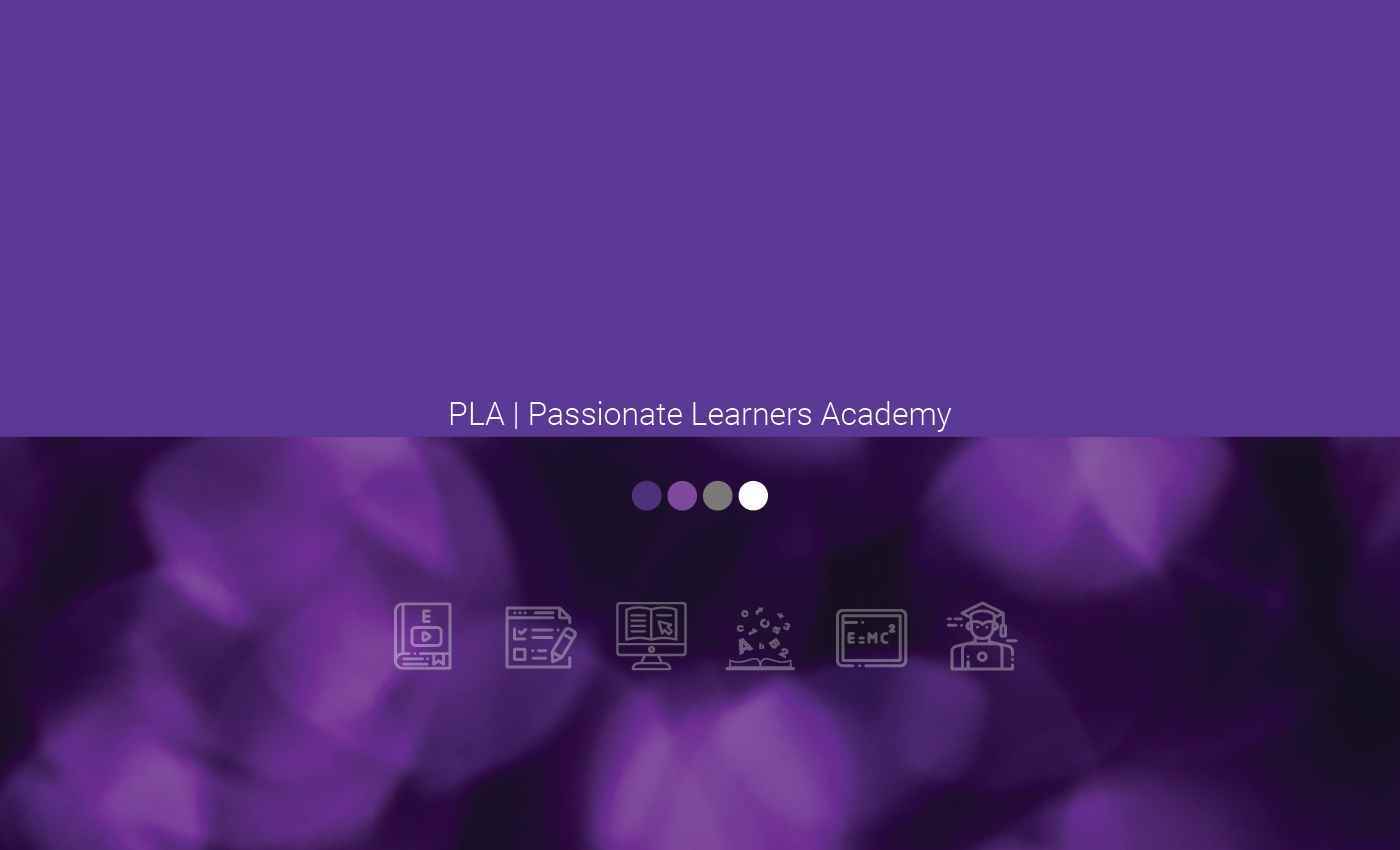
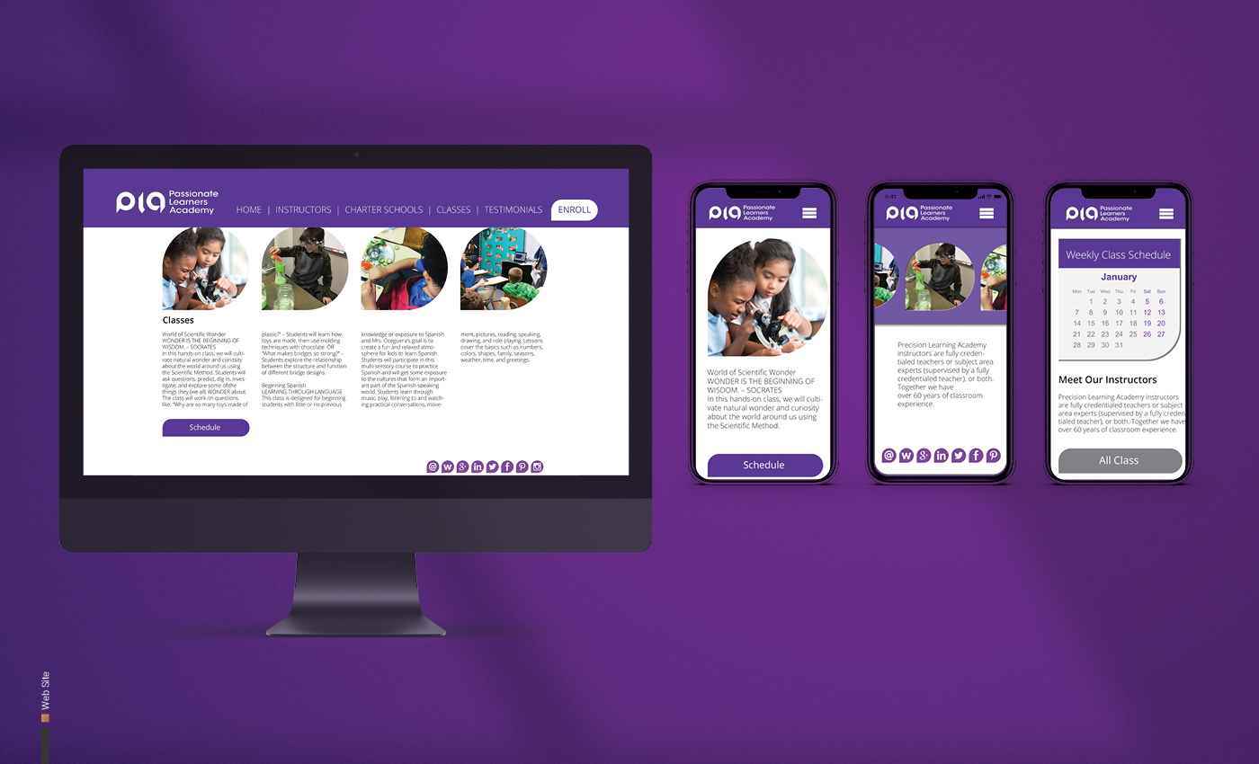
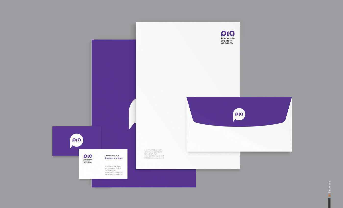
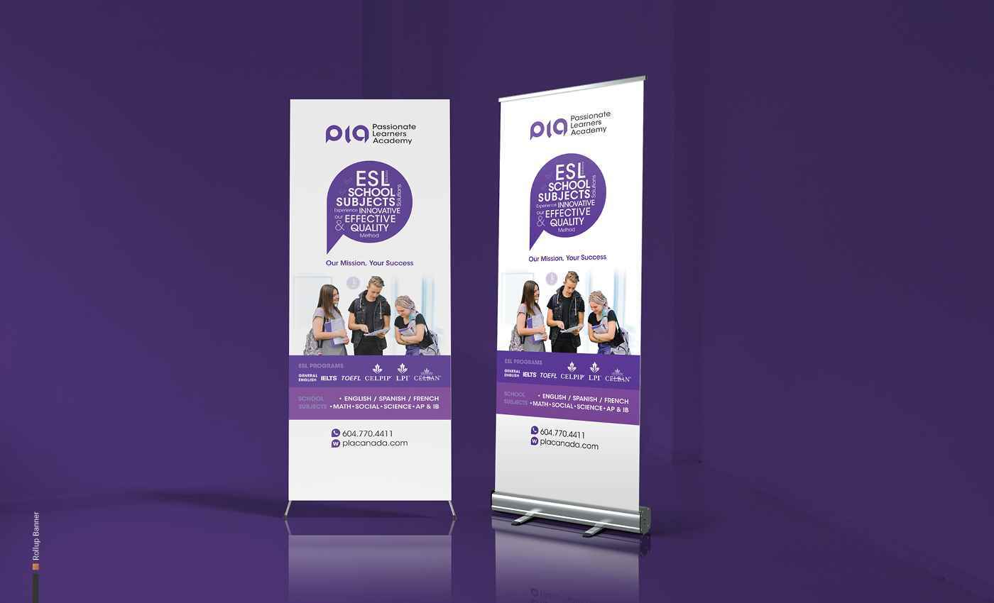
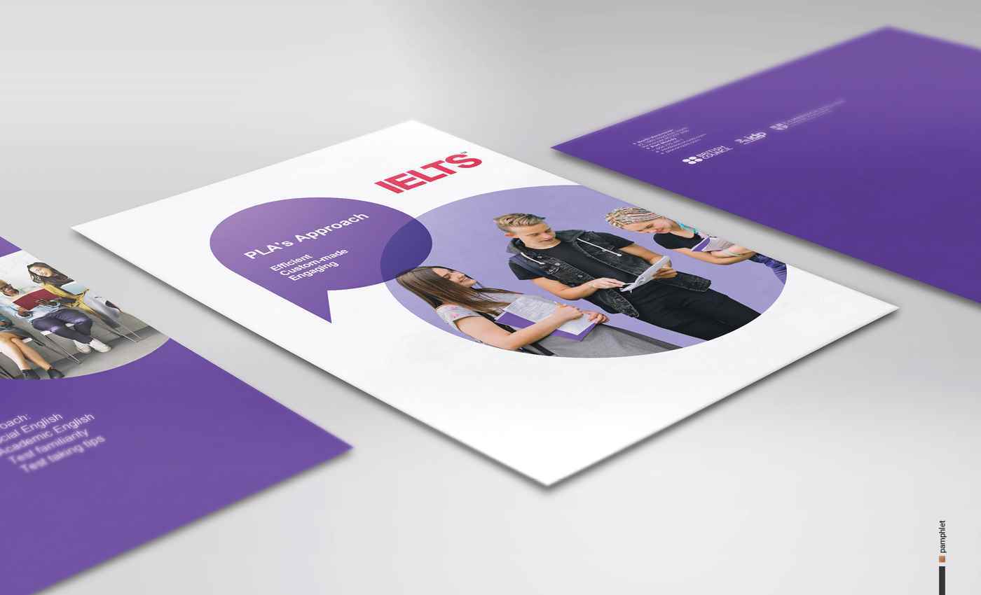
04-PLA 2
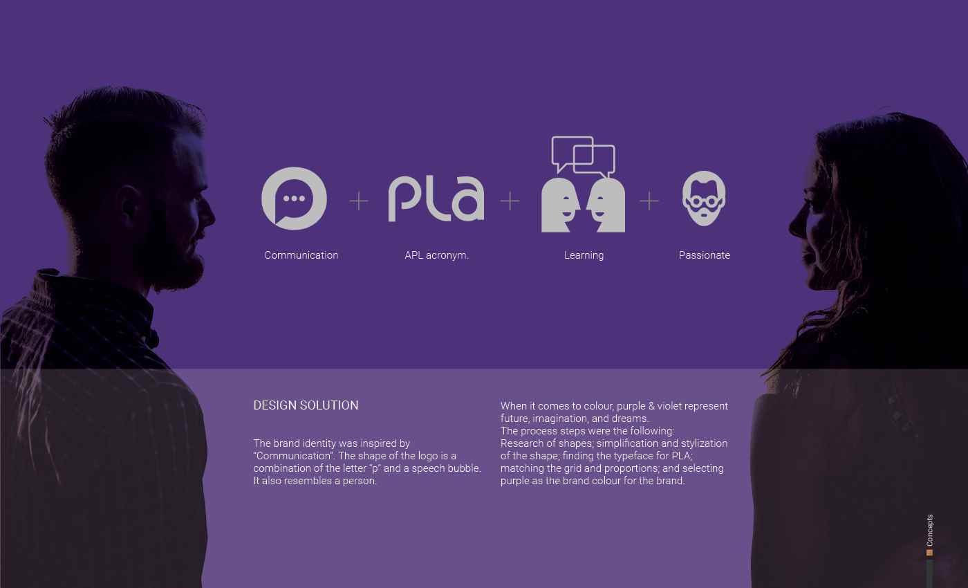
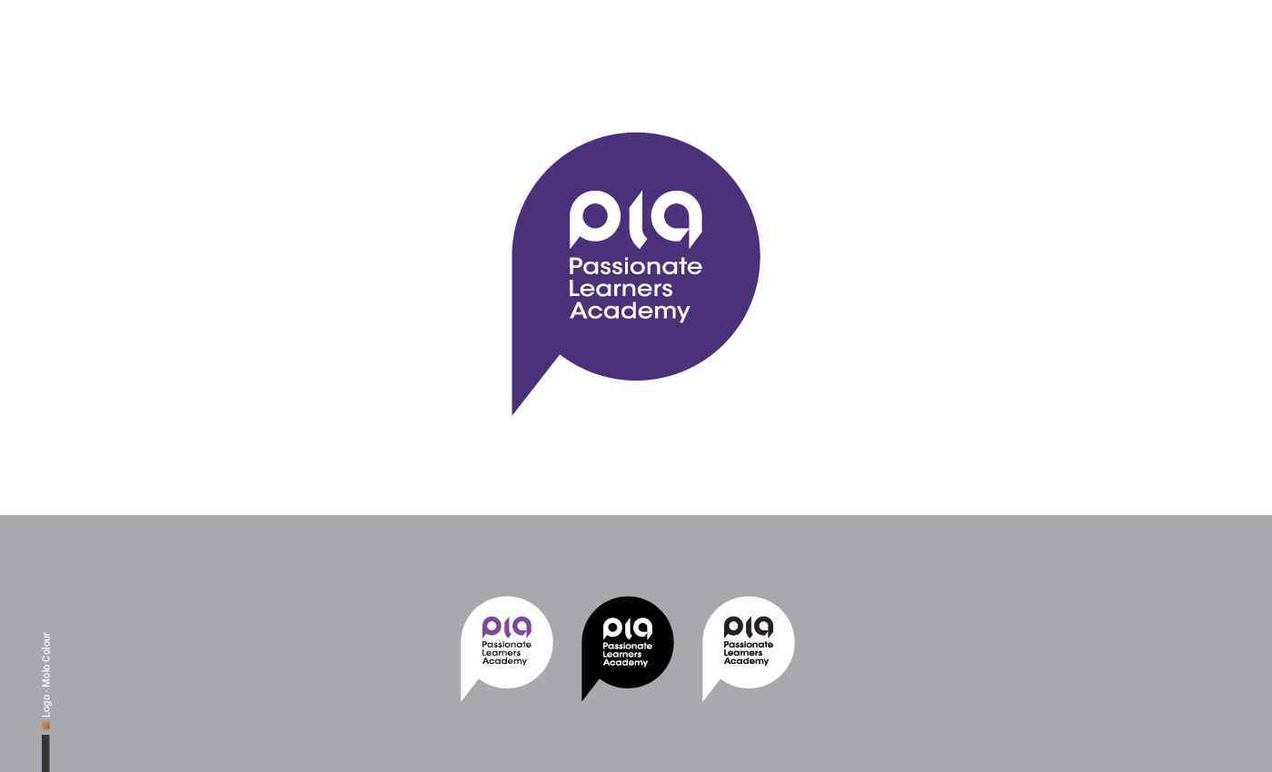
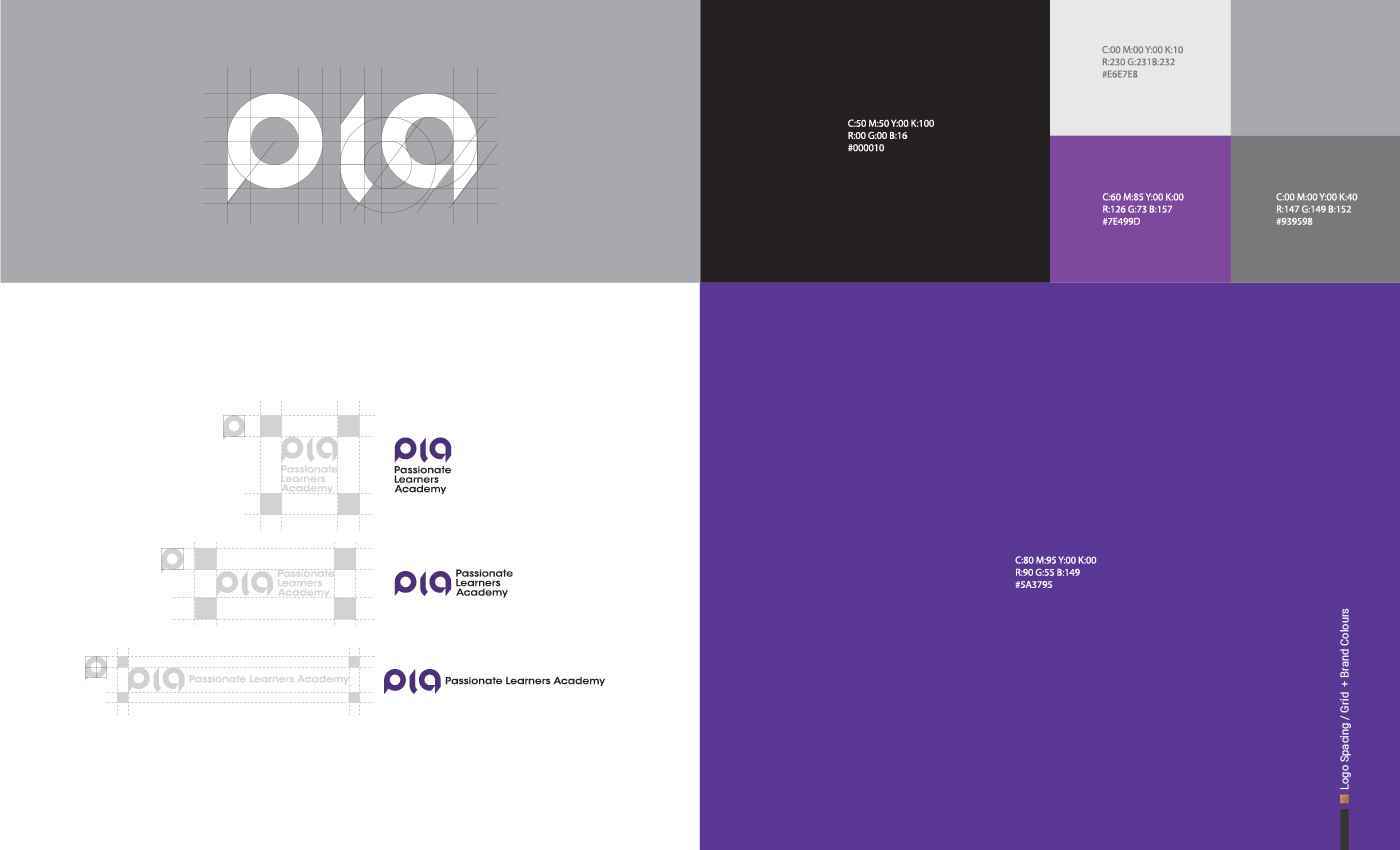
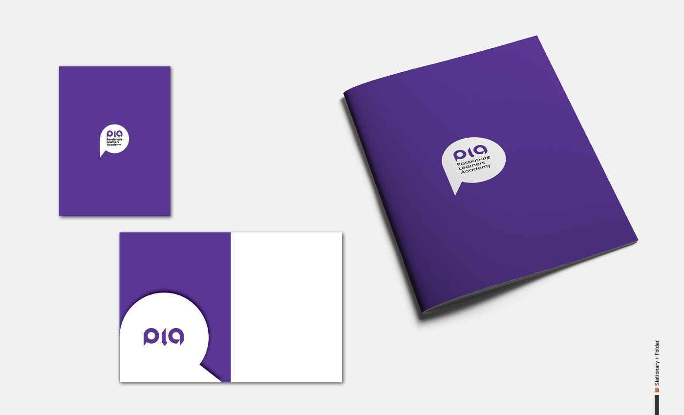
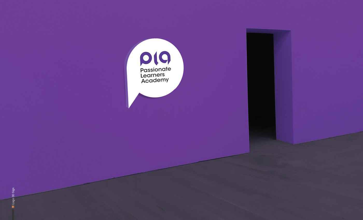
COMPANY NAME PLA | Passionate Learners Academy INDUSTRY ESL & School Subjects institute PROJECT TYPE Corporate Brand Identity Design, Stationery and Webpage Theme. DESCRIPTION PLA is a...
COMPANY NAME PLA | Passionate Learners Academy INDUSTRY ESL & School Subjects institute PROJECT TYPE Corporate Brand Identity Design, Stationery and Webpage Theme. DESCRIPTION PLA is a...
COMPANY NAME PLA | Passionate Learners Academy INDUSTRY ESL & School Subjects institute PROJECT TYPE Corporate Brand Identity Design, Stationery and Webpage Theme. DESCRIPTION PLA is a private education center with 25 years of professional background in the fields of ESL and school subjects. PLA has a unique approach towards teaching and learning that helps students to be prepared for a wonderful academic future. TARGET AUDIENCES Middle-class Kids and adults ages between 6-85 living in Vancouver. COMPETITION PLA competes with all the ESL education centers in Vancouver in a friendly and professional context. DESIGN PROBLEM The logo needs to represent communication for language learners in a minimal, yet effective way, and it should also include the APL acronym. The company wants to include “passionate learners” as a slogan in order to appeal to its target audience. DESIGN SOLUTION The brand identity was inspired by “Communication”. The shape of the logo is a combination of the letter “p” and a speech bubble. It also resembles a person. When it comes to colour, purple & violet represent future, imagination, and dreams. The process steps were the following: Research of shapes; simplification and stylization of the shape; finding the typeface for PLA; matching the grid and proportions; and selecting purple as the brand colour for the brand.
Share:
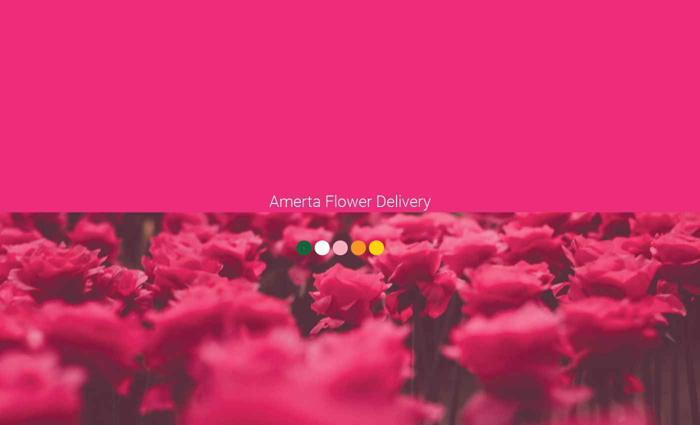
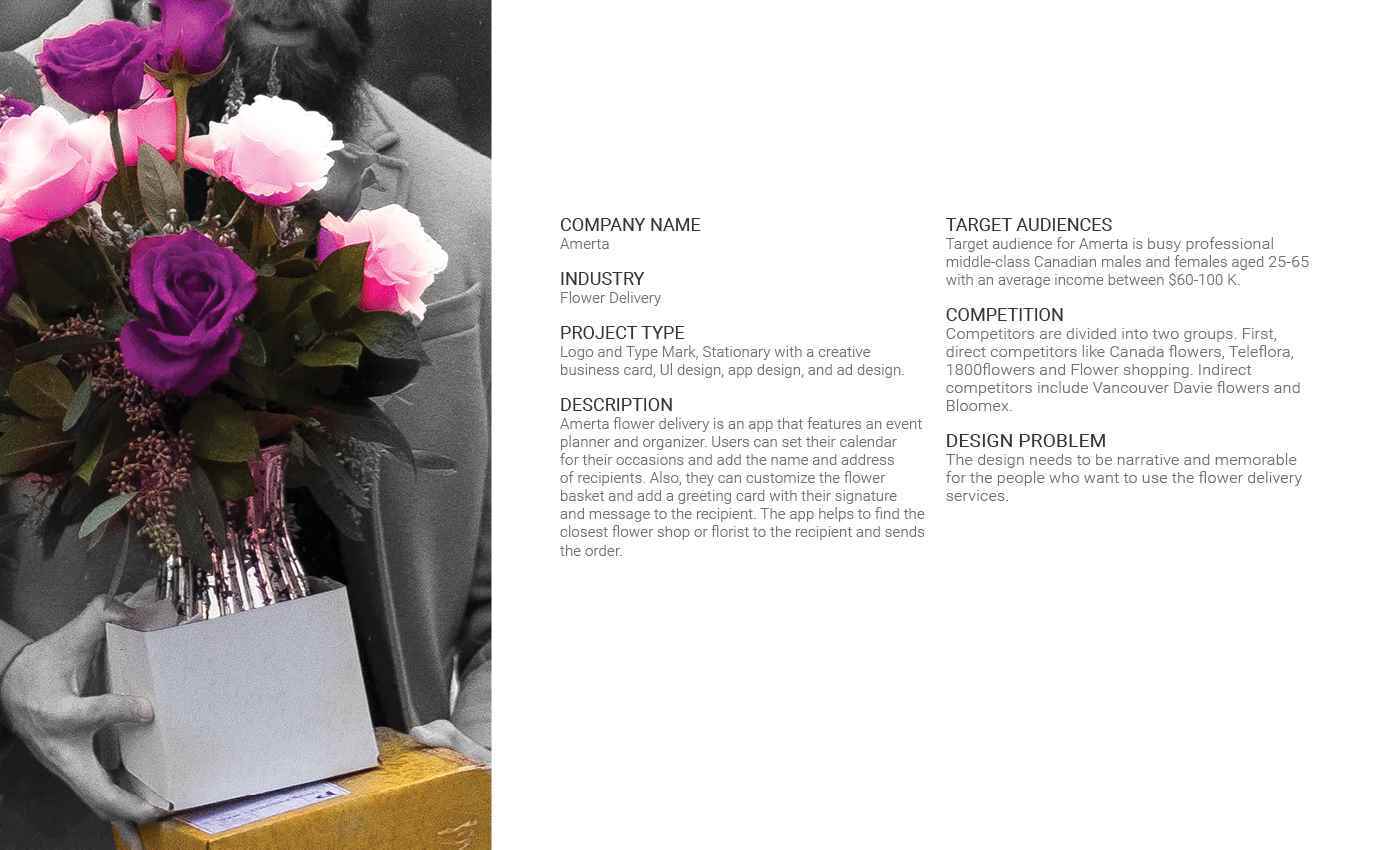
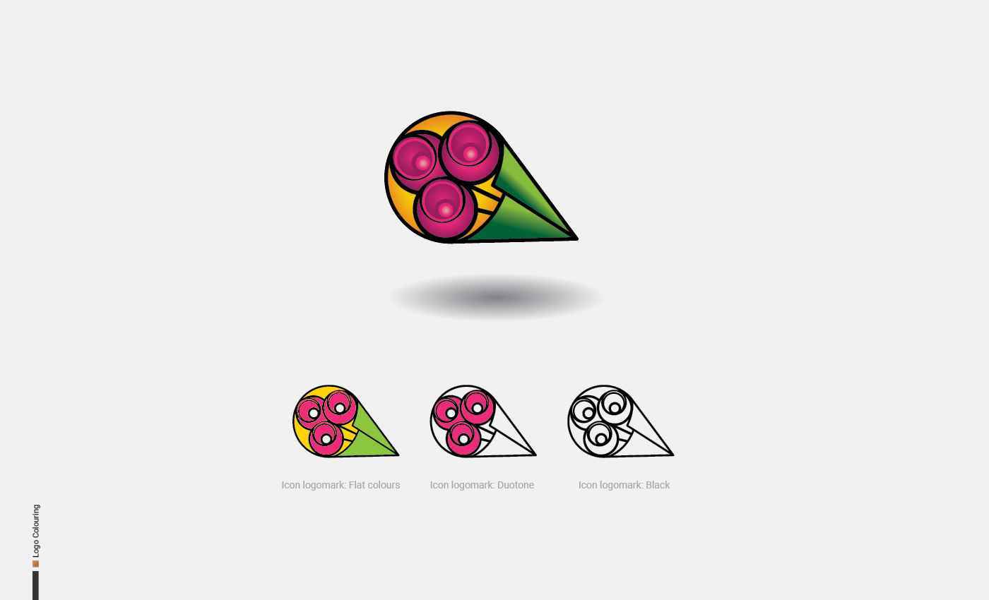
05-Amerta 2
INDUSTRY Flower Delivery PROJECT TYPE Logo and Type Mark, Stationary with a creative business card, Ul design, app design, and ad design. DESCRIPTION Amerta flower delivery is an app that fe...
INDUSTRY Flower Delivery PROJECT TYPE Logo and Type Mark, Stationary with a creative business card, Ul design, app design, and ad design. DESCRIPTION Amerta flower delivery is an app that fe...
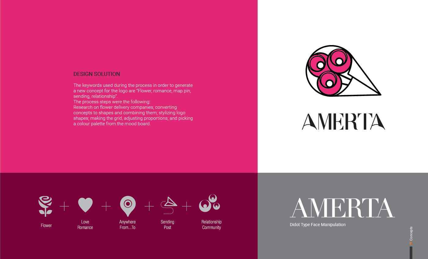
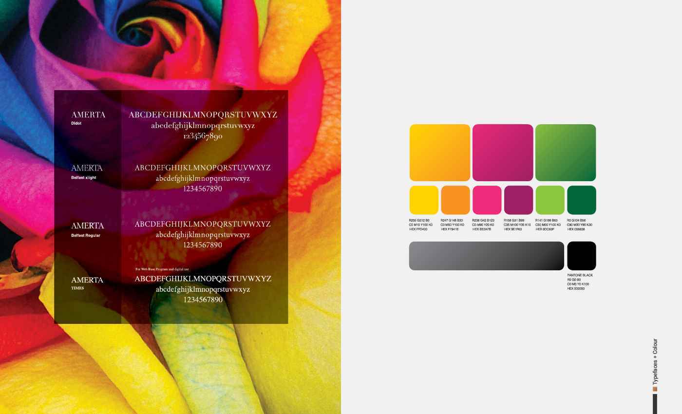
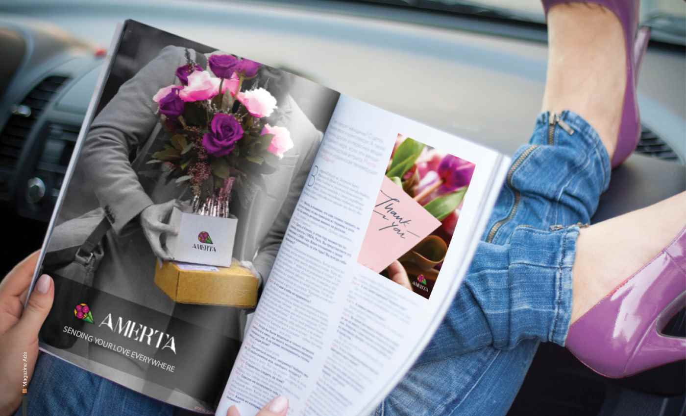
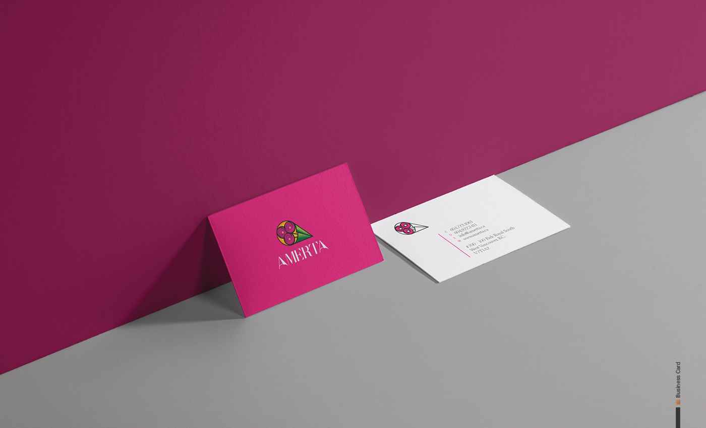
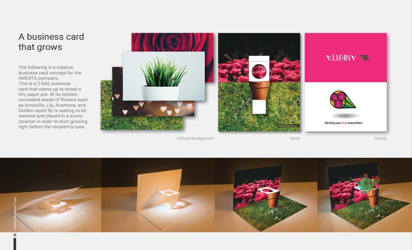
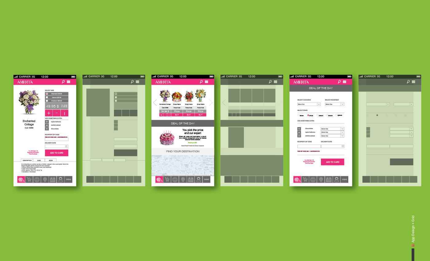
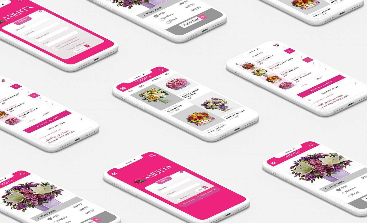
INDUSTRY Flower Delivery PROJECT TYPE Logo and Type Mark, Stationary with a creative business card, Ul design, app design, and ad design. DESCRIPTION Amerta flower delivery is an app that features an event planner and organizer. Users can set their calendar for their occasions and add the name and address of recipients. Also, they can customize the flower basket and add a greeting card with their signature and message to the recipient. The app helps to find the closest flower shop or florist to the recipient and sends the order. TARGET AUDIENCES Target audience for Amerta is busy professional middle-class Canadian males and females aged 25-65 with an average income between $60-100 K. COMPETITION Competitors are divided into two groups. First, direct competitors like Canada flowers, Teleflora, 1800flowers and Flower shopping. Indirect competitors include Vancouver Davie flowers and Bloomex. DESIGN PROBLEM The design needs to be narrative and memorable for the people who want to use the flower delivery services. DESIGN SOLUTION The keywords used during the process in order to generate a new concept for the logo are “Flower, romance, map pin, sending, relationship”. The process steps were the following: Research on flower delivery companies; converting concepts to shapes and combining them; stylizing logo shapes; making the grid, adjusting proportions; and picking a colour palette from the mood board.
Share:
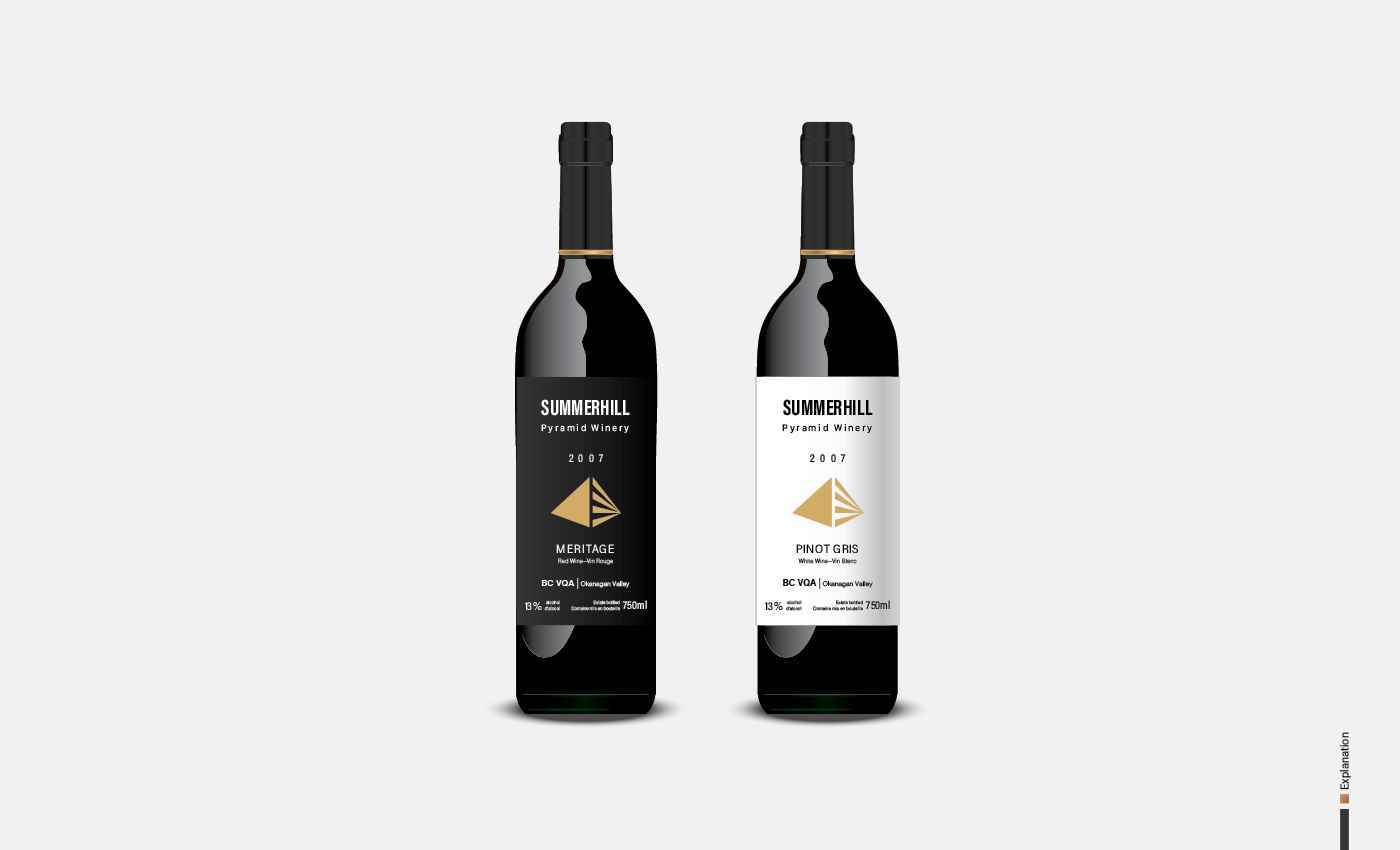
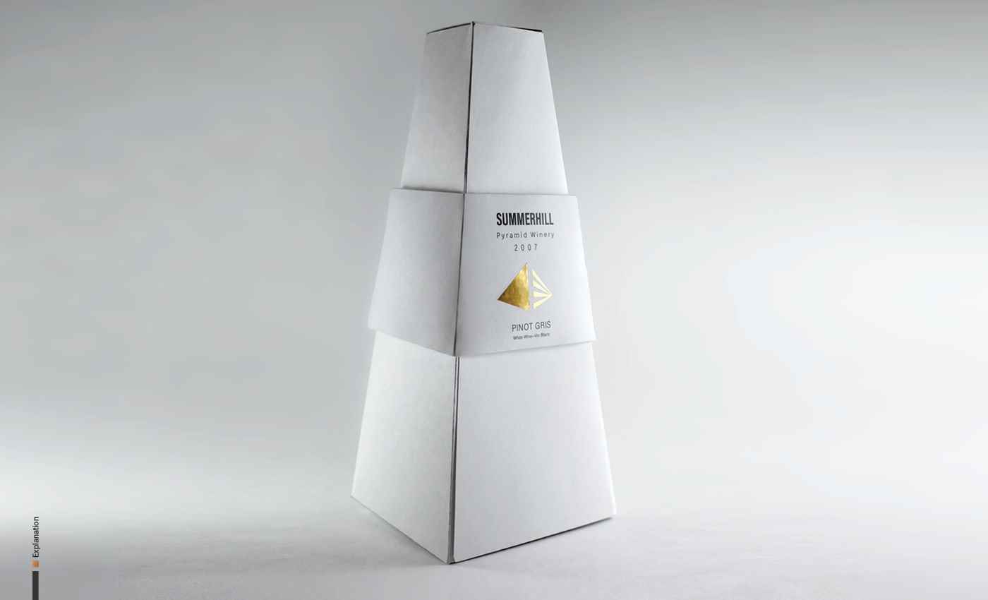
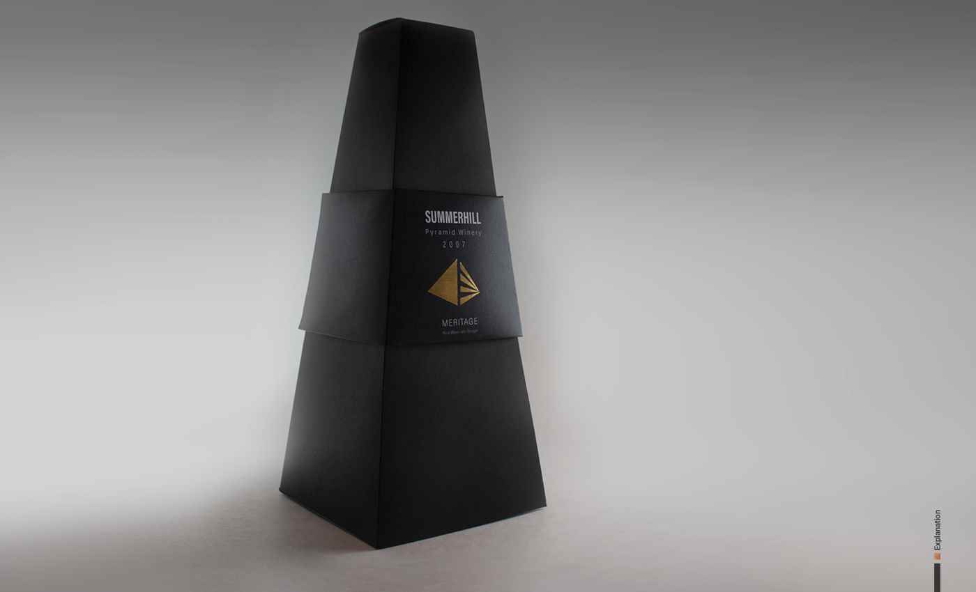
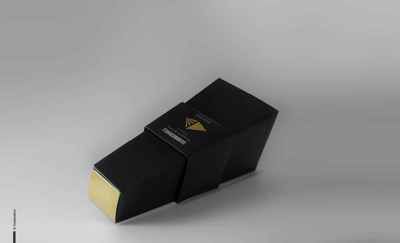
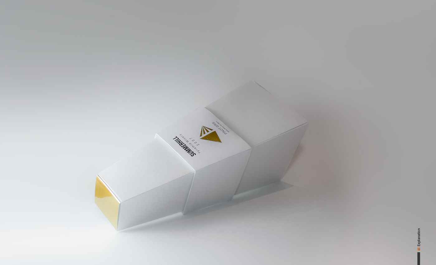
06-Summerhill Pyramid 2
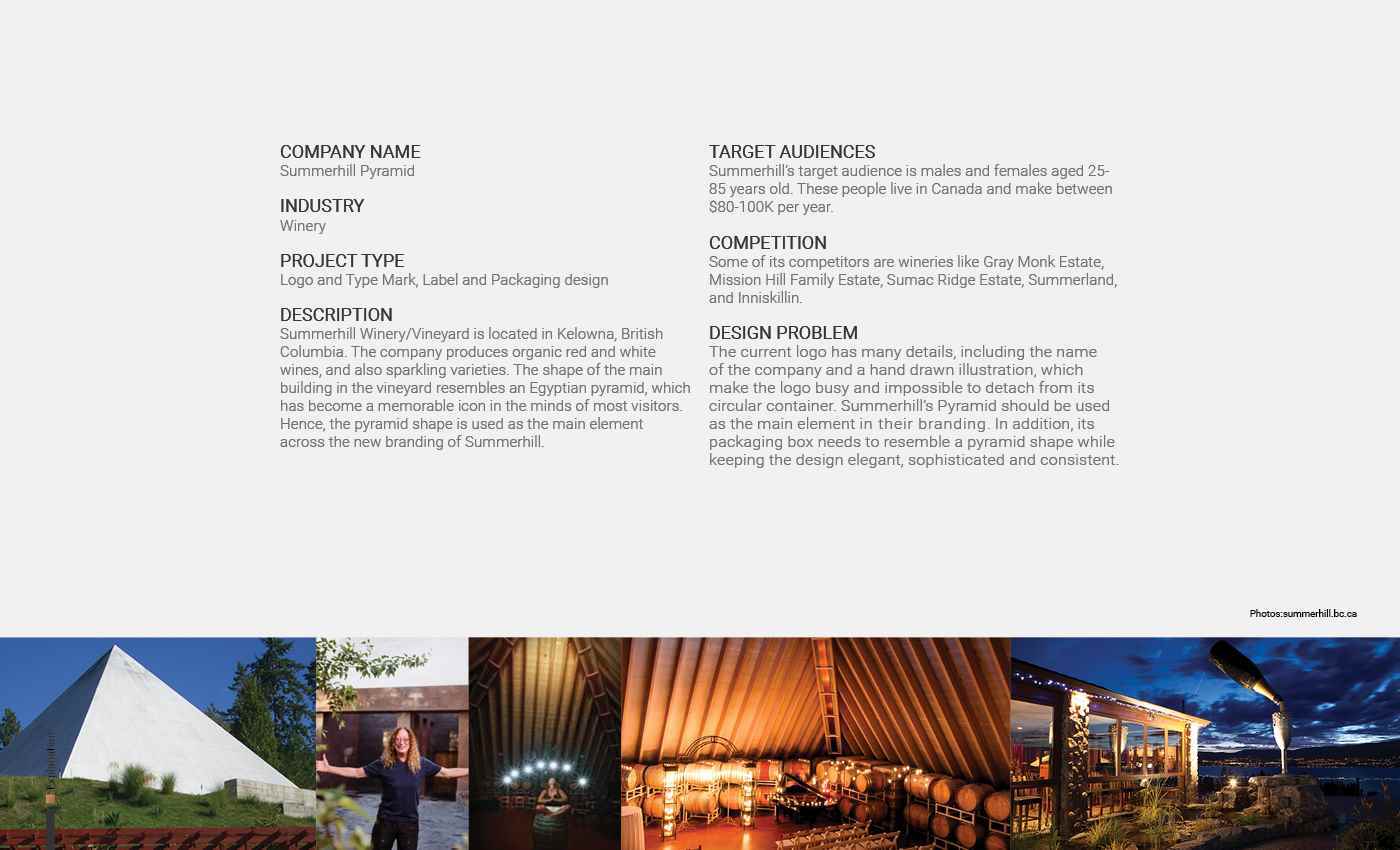
COMPANY NAME Summerhill Pyramid INDUSTRY Winery PROJECT TYPE Logo and Type Mark, Label and Packaging design DESCRIPTION Summerhill Winery/Vineyard is located in Kelowna, British Columbia...
COMPANY NAME Summerhill Pyramid INDUSTRY Winery PROJECT TYPE Logo and Type Mark, Label and Packaging design DESCRIPTION Summerhill Winery/Vineyard is located in Kelowna, British Columbia...
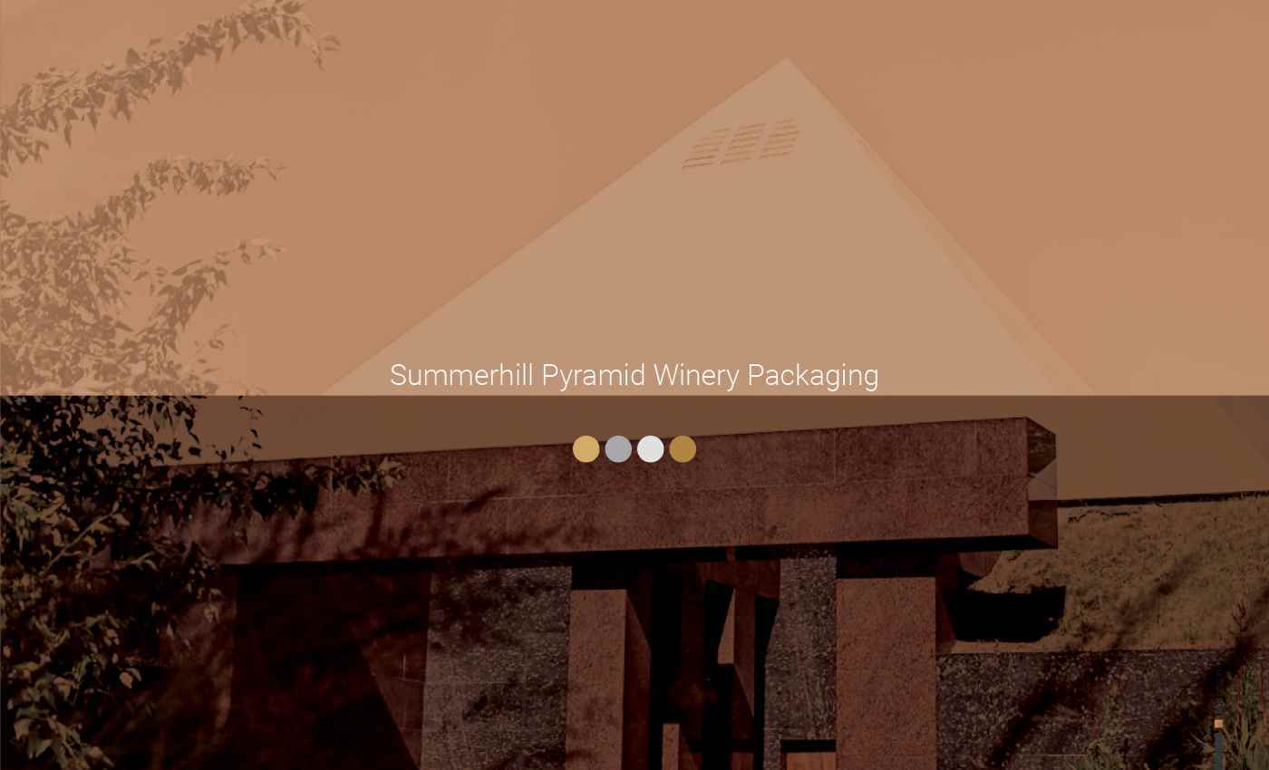
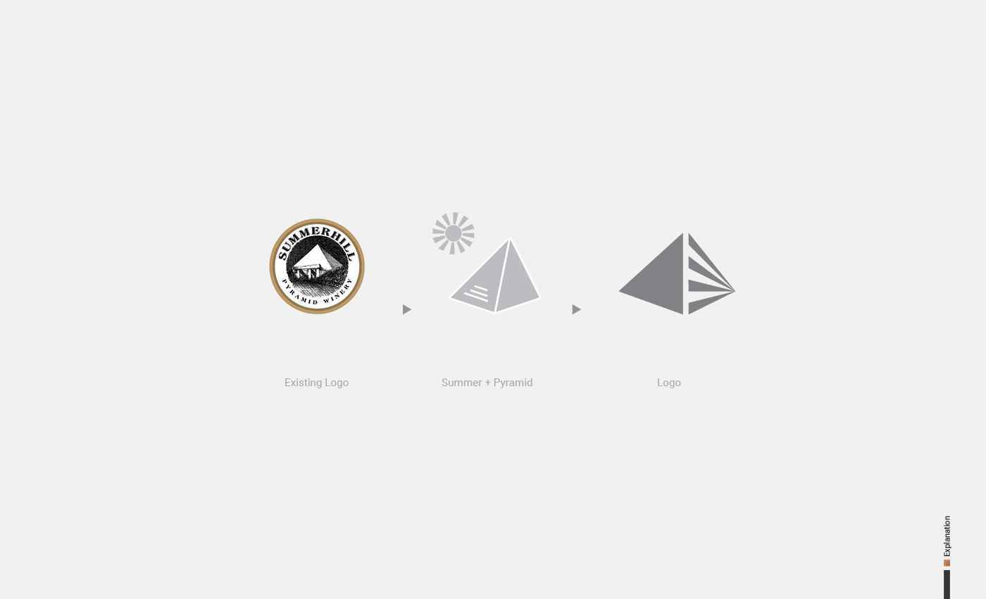
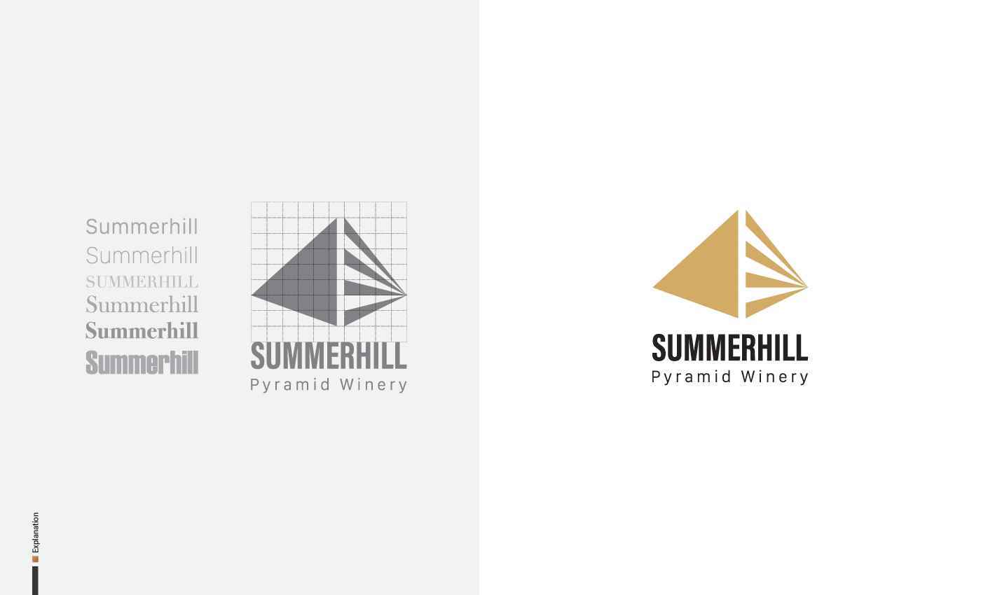
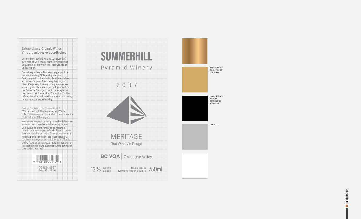
COMPANY NAME Summerhill Pyramid INDUSTRY Winery PROJECT TYPE Logo and Type Mark, Label and Packaging design DESCRIPTION Summerhill Winery/Vineyard is located in Kelowna, British Columbia. The company produces organic red and white wines, and also sparkling varieties. The shape of the main building in the vineyard resembles an Egyptian pyramid, which has become a memorable icon in the minds of most visitors. Hence, the pyramid shape is used as the main element across the new branding of Summerhill. TARGET AUDIENCES Summerhill’s target audience is males and females aged 25-85 years old. These people live in Canada and make between $80-100K per year. COMPETITION Some of its competitors are wineries like Gray Monk Estate, Mission Hill Family Estate, Sumac Ridge Estate, Summerland, and Inniskillin. DESIGN PROBLEM The current logo has many details, including the name of the company and a hand-drawn illustration, which make the logo busy and impossible to detach from its circular container. Summerhill’s Pyramid should be used as the main element in their branding. In addition, its packaging box needs to resemble a pyramid shape while keeping the design elegant, sophisticated and consistent.
Share:

Would you like to get more information or apply?
Click on the button below and we'll get back to you as soon as possible.
Speak To An Advisor
