Juan
AragonGraphic Design
Taste of the Tropic
Exoju gift packages is created in order to do a representation of some of the most popular fruits in Colombia. The main colours are based off the original colours of these fruits, vibrant colours are...
Exoju gift packages is created in order to do a representation of some of the most popular fruits in Colombia. The main colours are based off the original colours of these fruits, vibrant colours are...
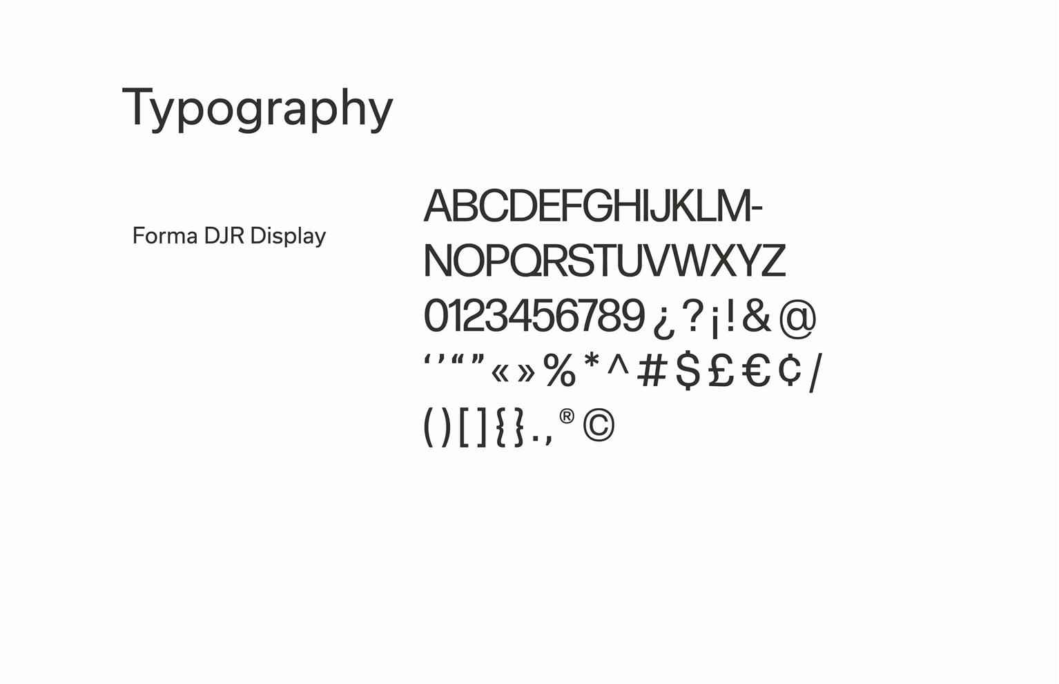
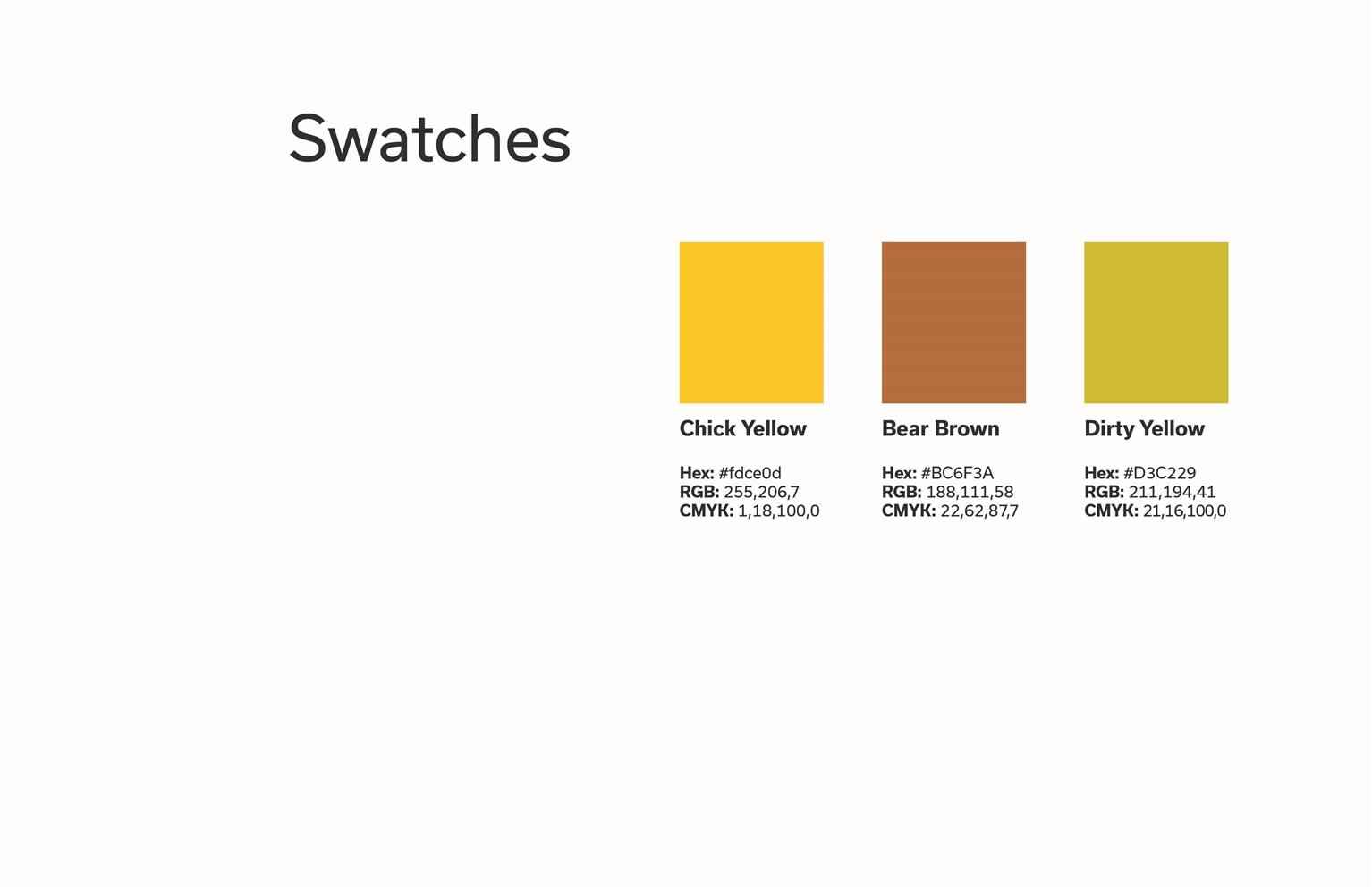
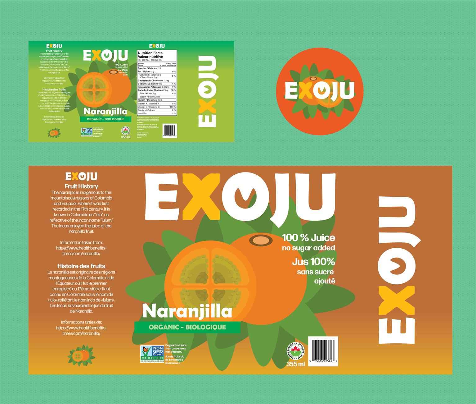
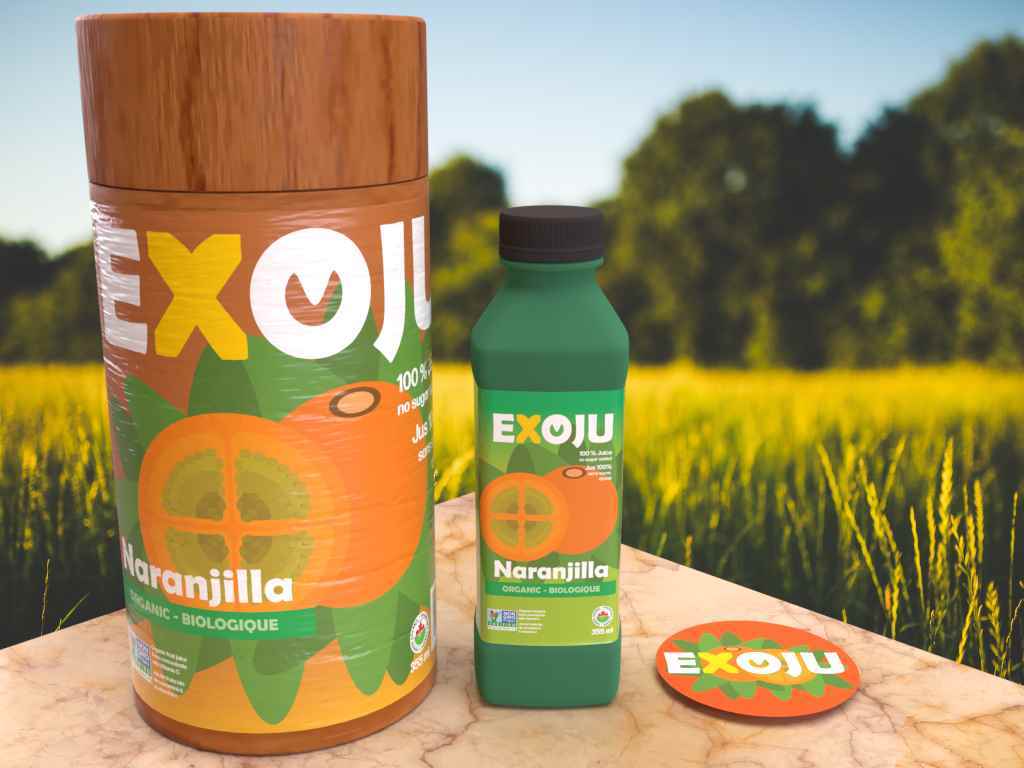
Exoju gift packages is created in order to do a representation of some of the most popular fruits in Colombia. The main colours are based off the original colours of these fruits, vibrant colours are also introduced as complementary to highlight the location of these fruits which is the tropic. Typography is developed with a modern feel with the purpose of reaching the target audience which are young adults between 18-25. The design problem was to introduce Colombian exotic fruits as juice flavours that can be commercialized. The design solution is to choose some of the most exotic looking Colombian fruits and develop each as a gift package. The competition for this brand would be any beverage company that focuses on foreign flavours with an organic feel. Exoju differs from these companies in the sense that it will only offer flavours from the south american tropic specifically Colombia.
Share:
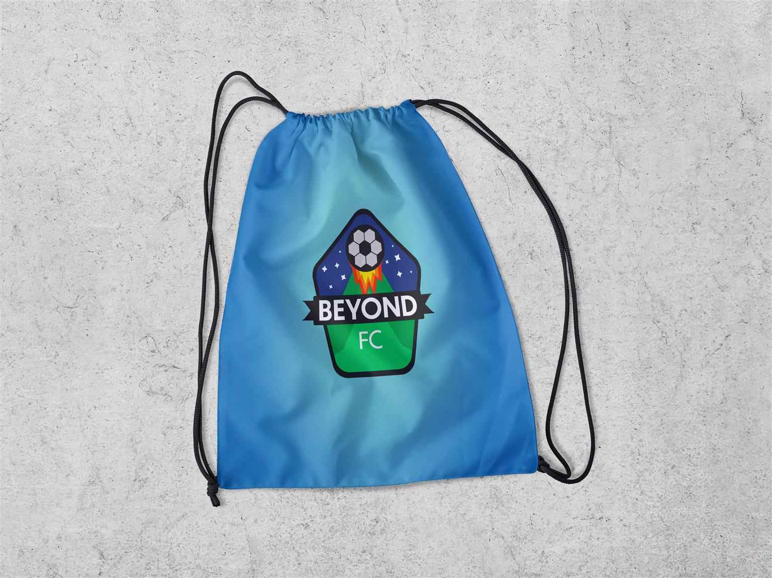
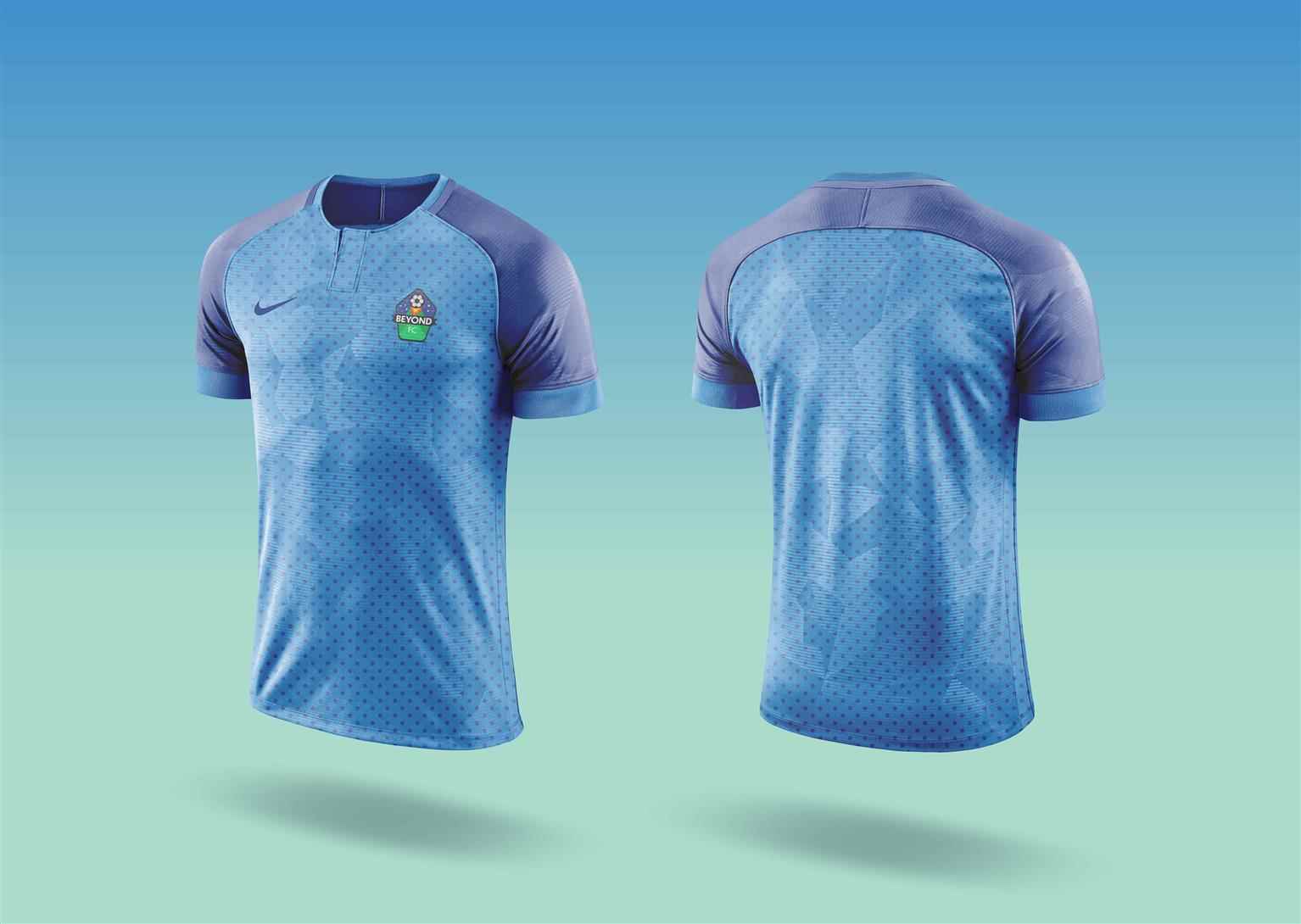
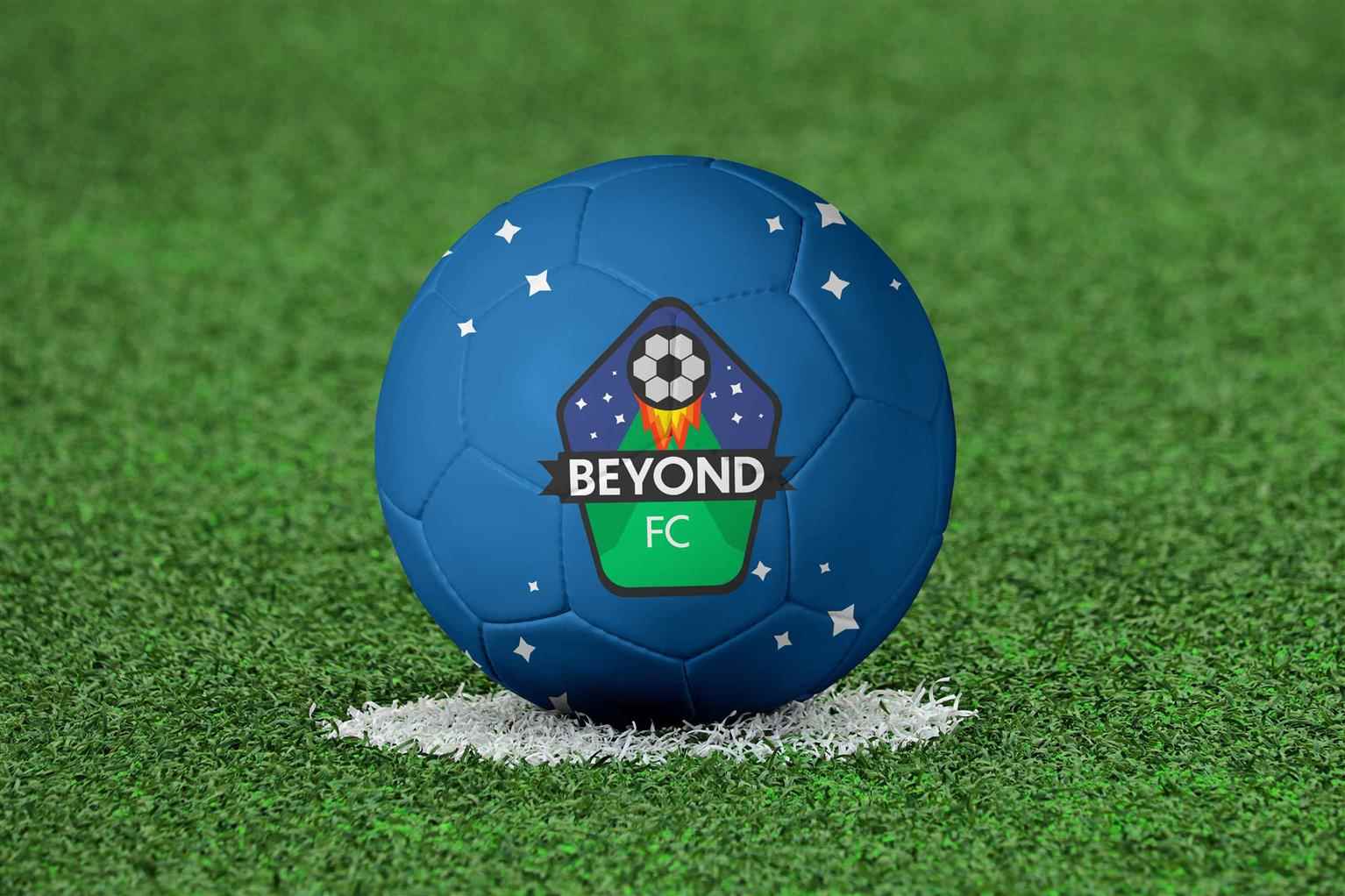
Design for Soccer
Beyond F.C. brand created in order to represent themodern era of soccer team logos with MLS teams logos as inspiration. Colours chosen are based off colour theory bringing both the professionalism of...
Beyond F.C. brand created in order to represent themodern era of soccer team logos with MLS teams logos as inspiration. Colours chosen are based off colour theory bringing both the professionalism of...
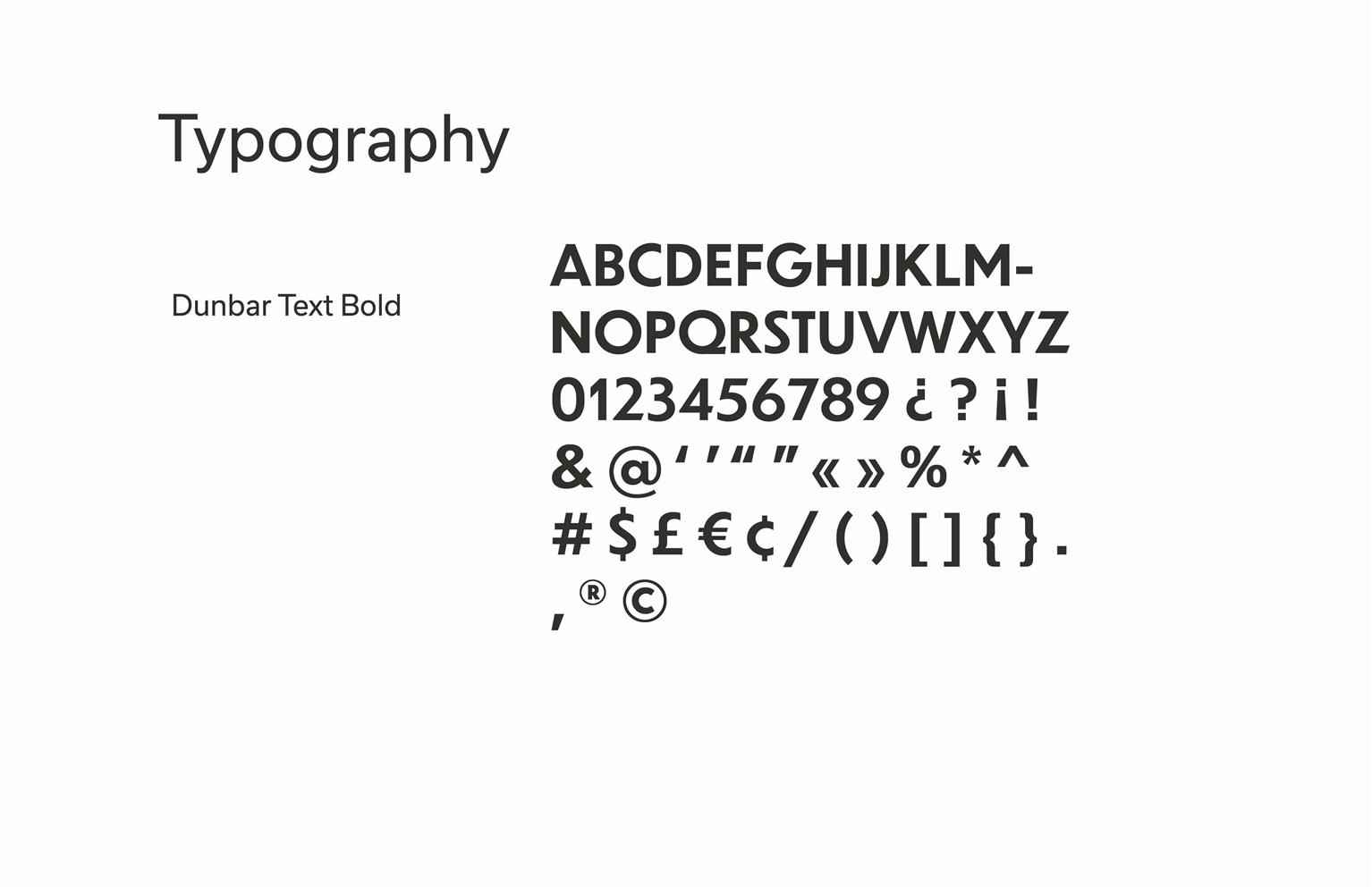
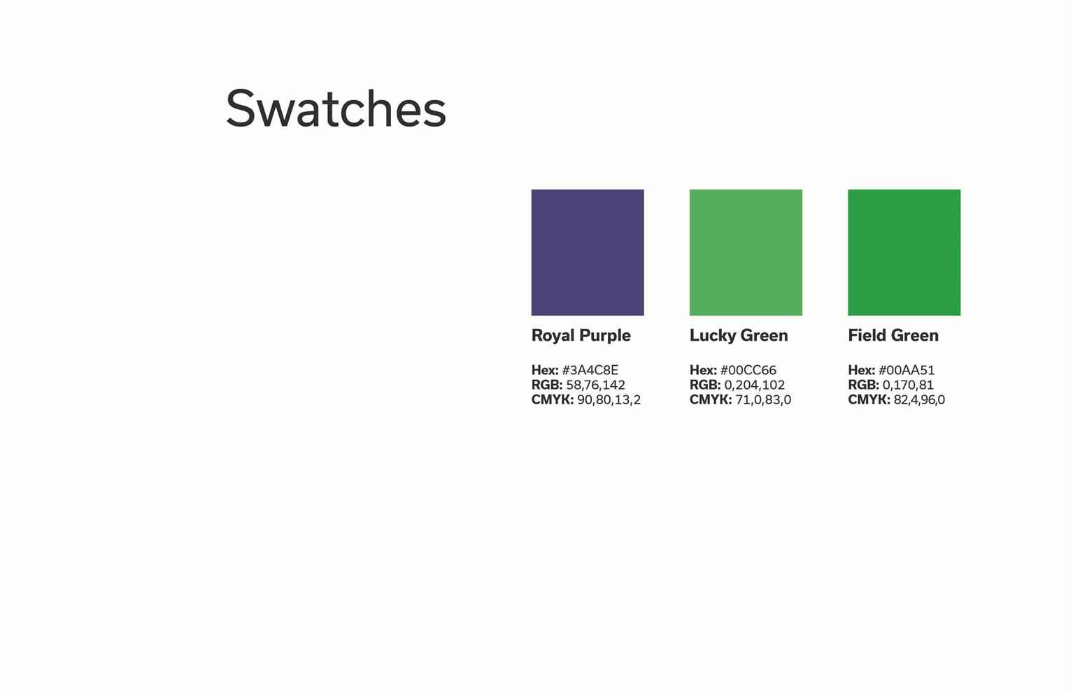
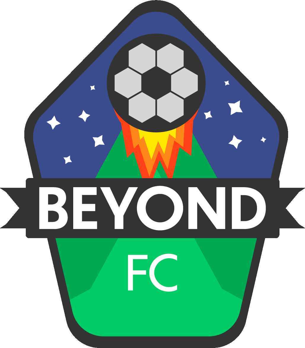
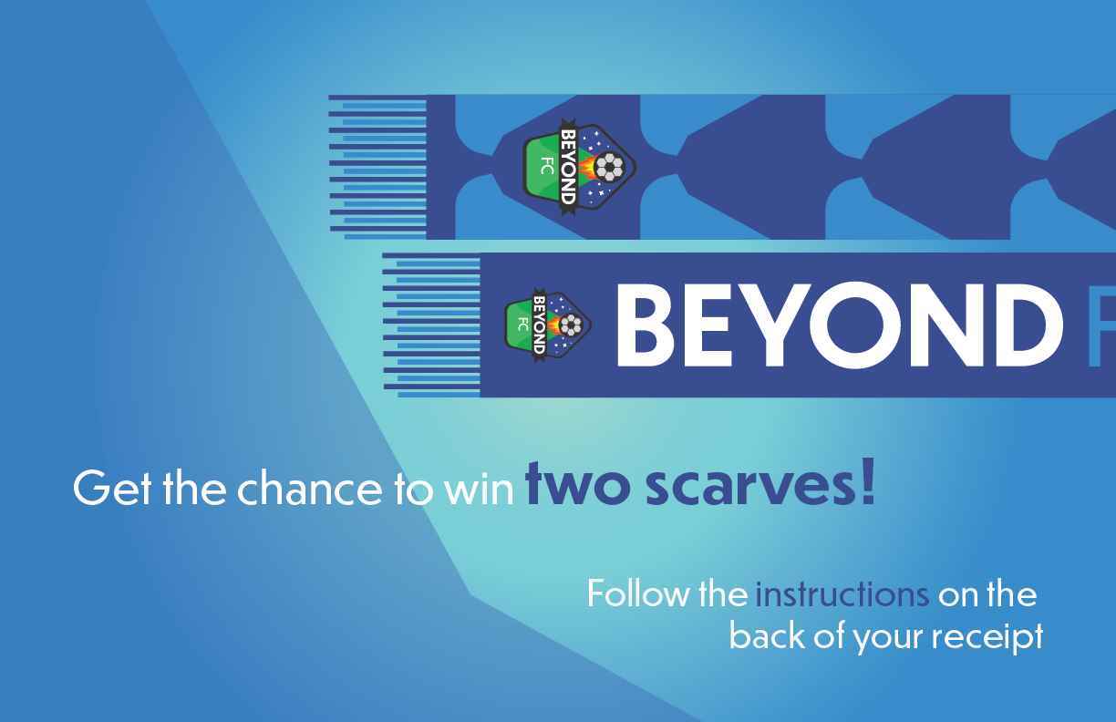
Beyond F.C. brand created in order to represent themodern era of soccer team logos with MLS teams logos as inspiration. Colours chosen are based off colour theory bringing both the professionalism of the blue and the energy/growth of the green to the table. Type is developed with a modern feel replicating what newer MLS teams are doing which is focusing on easy to read sans serif type. Logo animation is developed to catch the attention of the target audience which are teenage soccer players. The design problem was to showcase the modern logo style being implemented in soccer teams specifically MLS teams. The design solution is to develop a logo and a brand that incorporate the soccer ball as their main subject alongside simple yet cohesive elements. The competition for this brand would be any amateur soccer brand that wants to get people together to play soccer. Beyond F.C. differs from its competition by focusing completely on the user experience with its app.
Share:
Gusto Colombiano
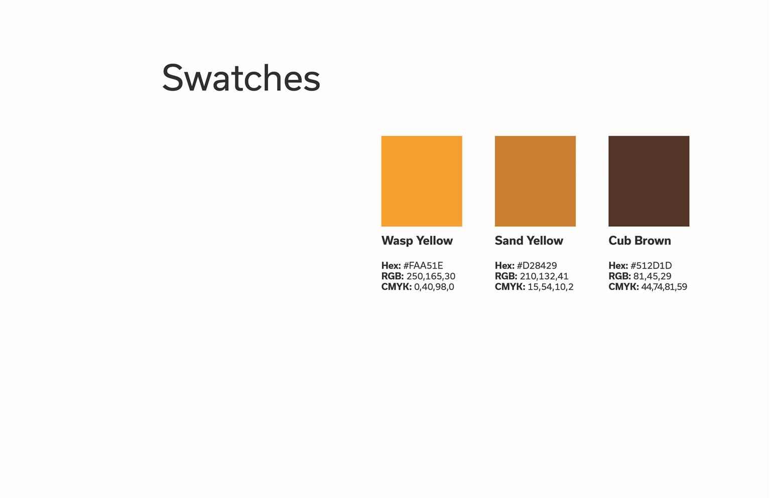
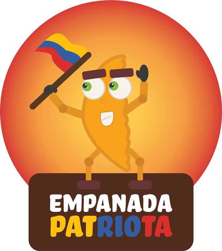
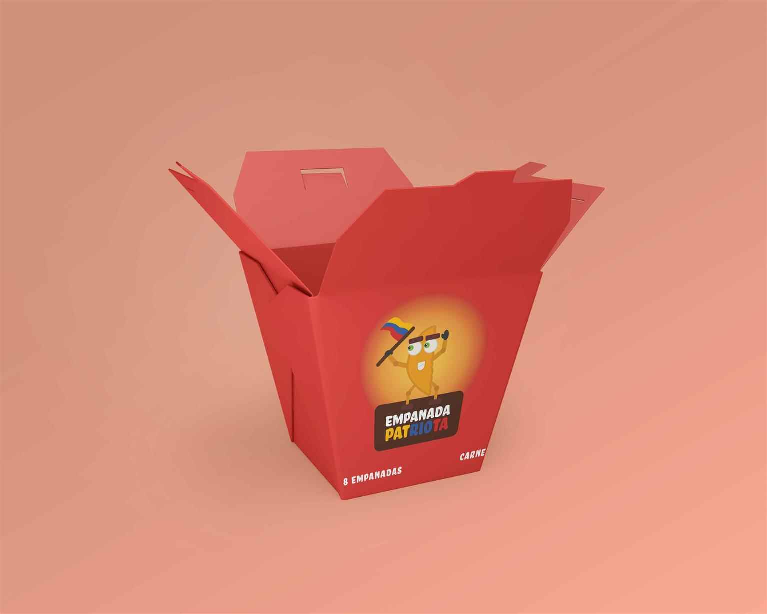
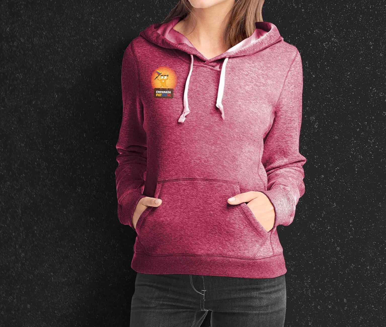
Empanada Patriota is a brand created in order to introduce Colombian empanadas to Vancouver. Empanadas are one of the most popular comfort foods in Colombia. Main colours are based off the Colombian...
Empanada Patriota is a brand created in order to introduce Colombian empanadas to Vancouver. Empanadas are one of the most popular comfort foods in Colombia. Main colours are based off the Colombian...
Empanada Patriota is a brand created in order to introduce Colombian empanadas to Vancouver. Empanadas are one of the most popular comfort foods in Colombia. Main colours are based off the Colombian flags. Typogrpahy is developed with a modern feel that compares to the most popular fonts in Colombia. The main aspect of the brand is turned into a character with the purpose of bringing an energetic and curious personality to this type of food. The design problem was to introduce colombian empanadas to Vancouver in an interesting an welcoming way. The design solution is to create a food truck brand with an energetic character proud of its heritage. The competition for this brand would be any food truck brand that sells food from Latinamerica. Empanada Patriota differs from its competition by only offering Empanadas made “the colombian way”.
Share:
Mad Potions
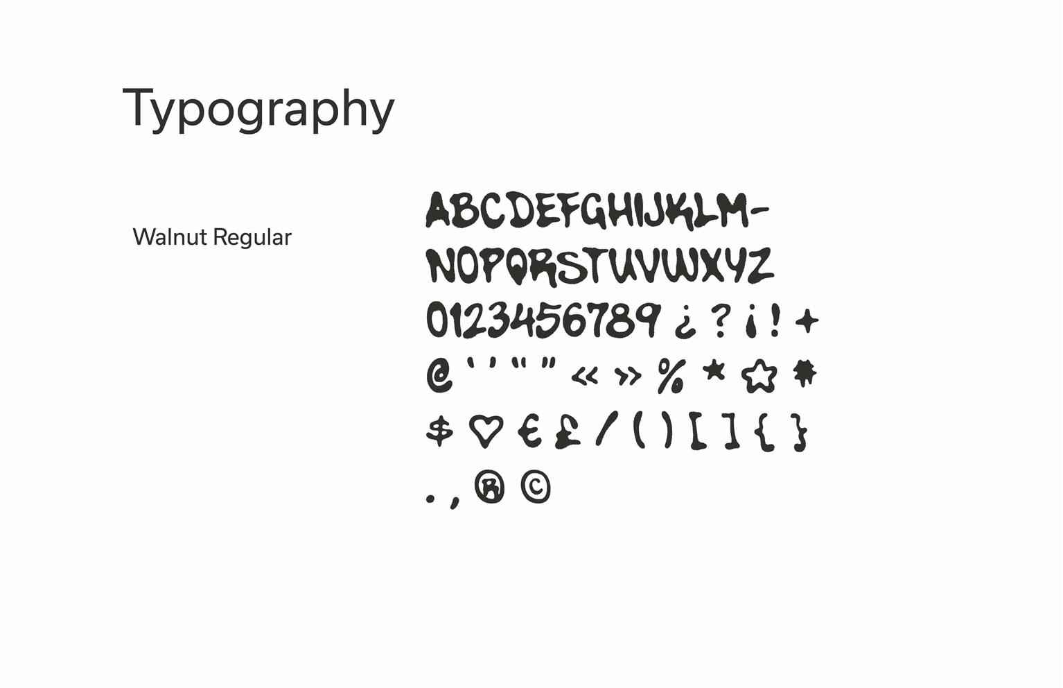
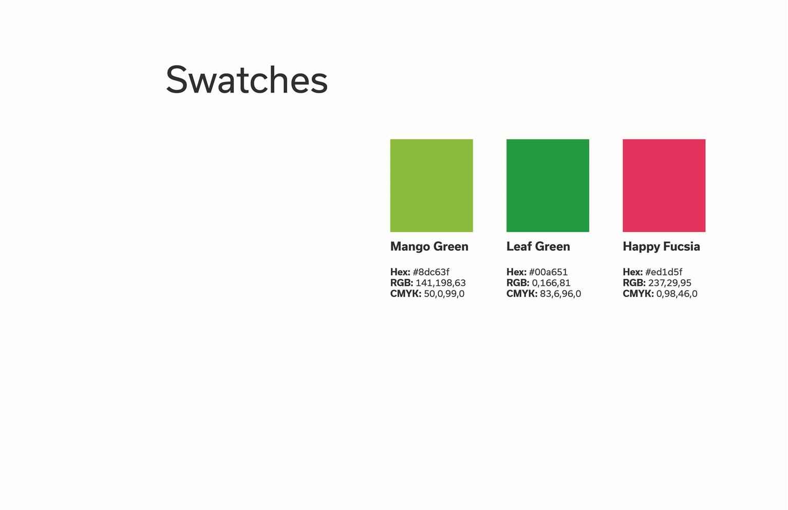
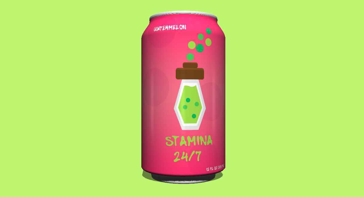
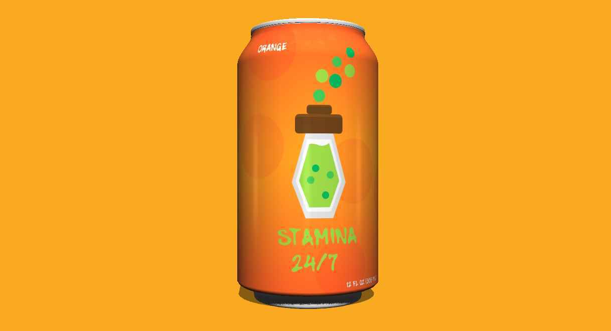
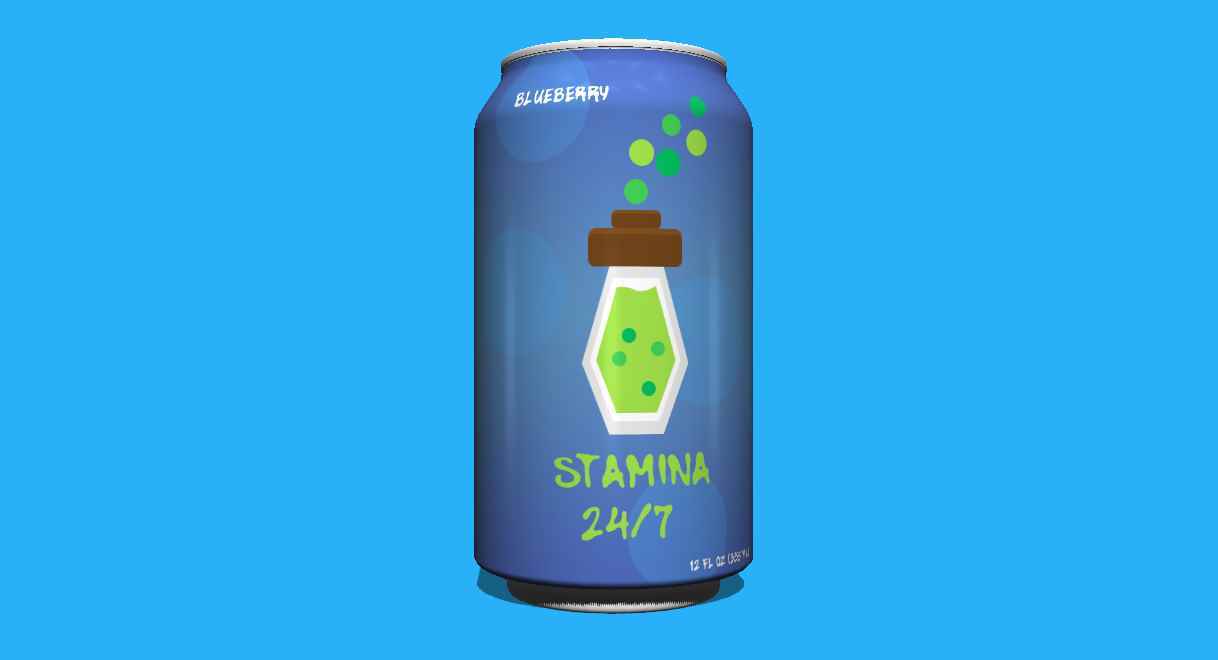
Stamina 24/7 is a beverage brand created to represent the concept of a Mad Scientist from a visual standpoint. Bright colours are used to highlight the temperament of the concept already mentioned; l...
Stamina 24/7 is a beverage brand created to represent the concept of a Mad Scientist from a visual standpoint. Bright colours are used to highlight the temperament of the concept already mentioned; l...
Stamina 24/7 is a beverage brand created to represent the concept of a Mad Scientist from a visual standpoint. Bright colours are used to highlight the temperament of the concept already mentioned; logo illustration is vectorized in order to bring familiarity to the target audience which are teenagers interested in videogames. The design problem was to create an energy drink capable of catering to the teenage videogamers. The design solution focuses on colours, typography and illustrations which feature a heavy cartoonish feel. Some of the competitors for this brand would be Beaver Buzz, Rockstar or NOS. Stamina 24/7 differs from the competition by using illustrations on their packaging that are familiar to their target audience and also by only offering beverage flavours that a are common within the teenage gaming community.
Share:
Colombia in Blocks
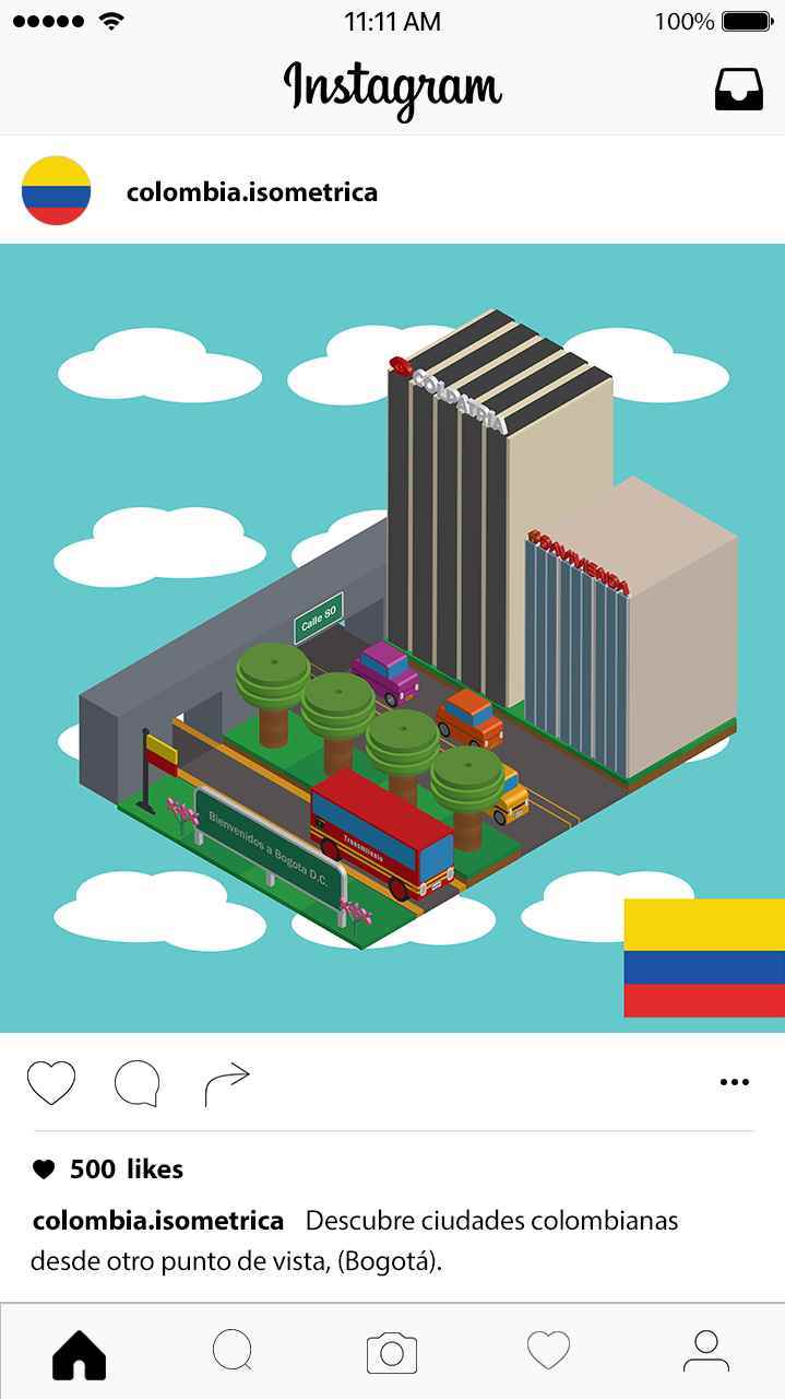
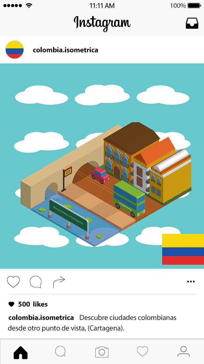
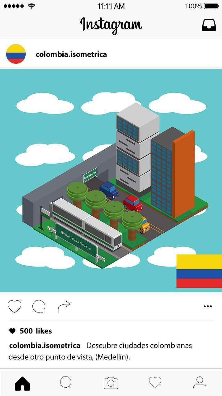
Colombia in blocks illustrations were created for social media purposes in order to create visual representation of some of the most important cities in Colombia. The colour palette is based off the...
Colombia in blocks illustrations were created for social media purposes in order to create visual representation of some of the most important cities in Colombia. The colour palette is based off the...
Colombia in blocks illustrations were created for social media purposes in order to create visual representation of some of the most important cities in Colombia. The colour palette is based off the predominant colours found in the cities represented; a part of the city is displayed in order to bring familiarity to the target audience which are Colombian residents within the ages of 16 to 22 interested in illustration. The design problem was to showcase Colombian cities in a special way. The design solution is to choose the most recognized cities in Colombia to draw them in an isometric plane, catching the attention of the target audience thanks to the modern style chosen.
Share:
Would you like to get more information or apply?
Click on the button below and we'll get back to you as soon as possible.
Speak To An Advisor
