Gena
Dela CruzGraphic Design
Kollections Publication
What started out as a fashion magazine turned and revised into a “lifestyle” magazine about COVID as a Gen-Zer hoarding plants. Kollections is a lifestyle magazine that adapts a blog–like voice in...
What started out as a fashion magazine turned and revised into a “lifestyle” magazine about COVID as a Gen-Zer hoarding plants. Kollections is a lifestyle magazine that adapts a blog–like voice in...
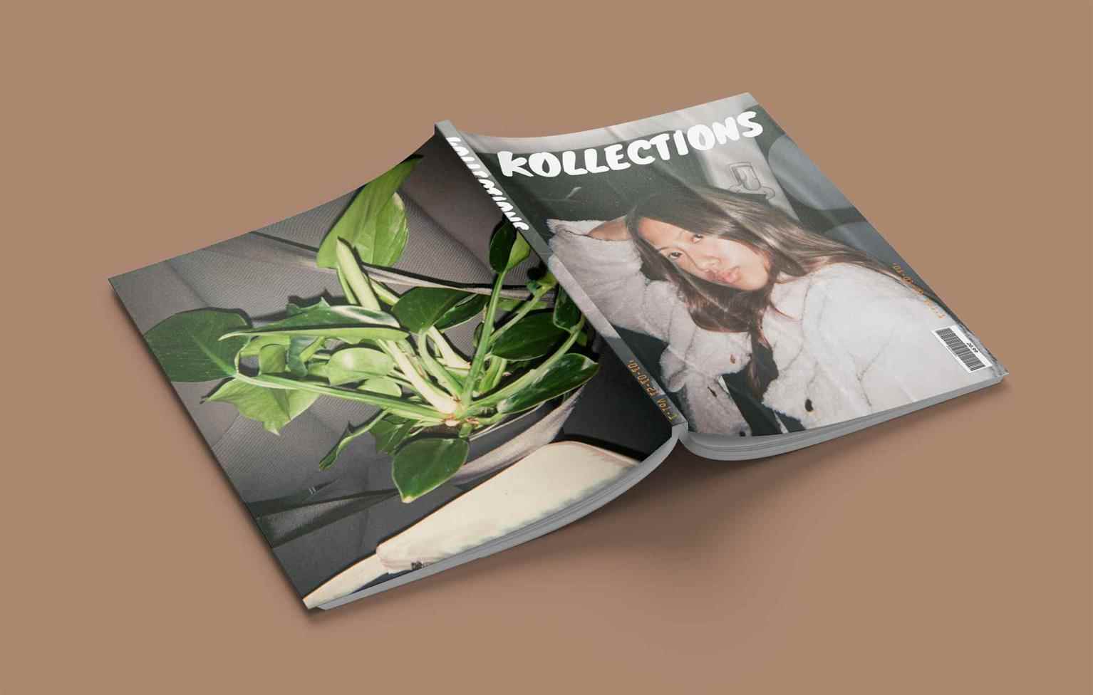
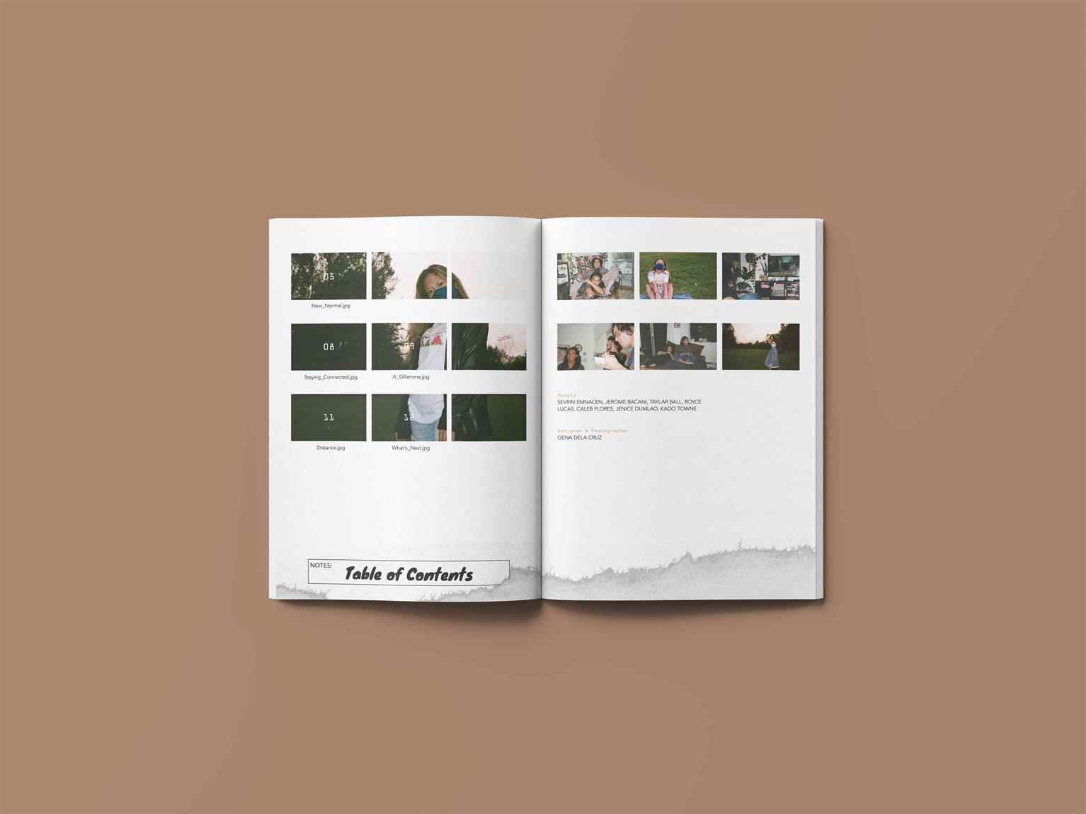
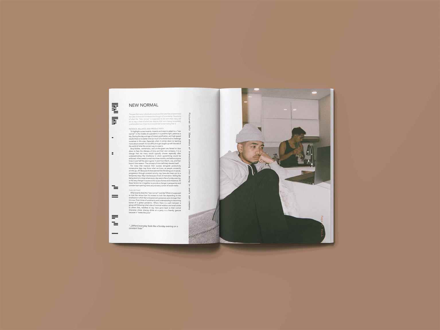
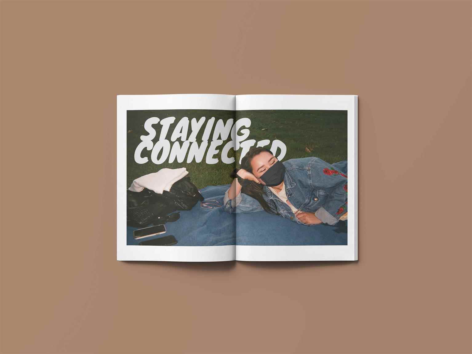
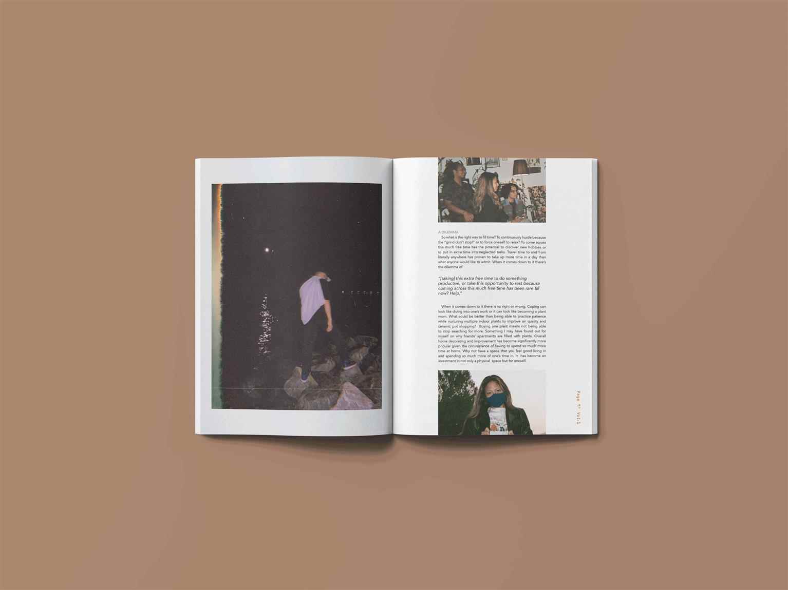
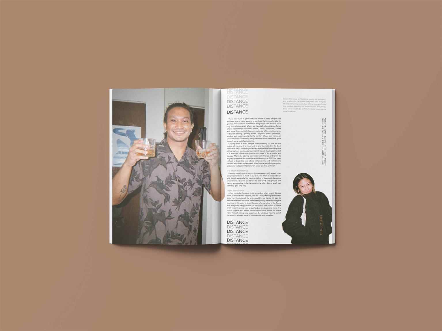
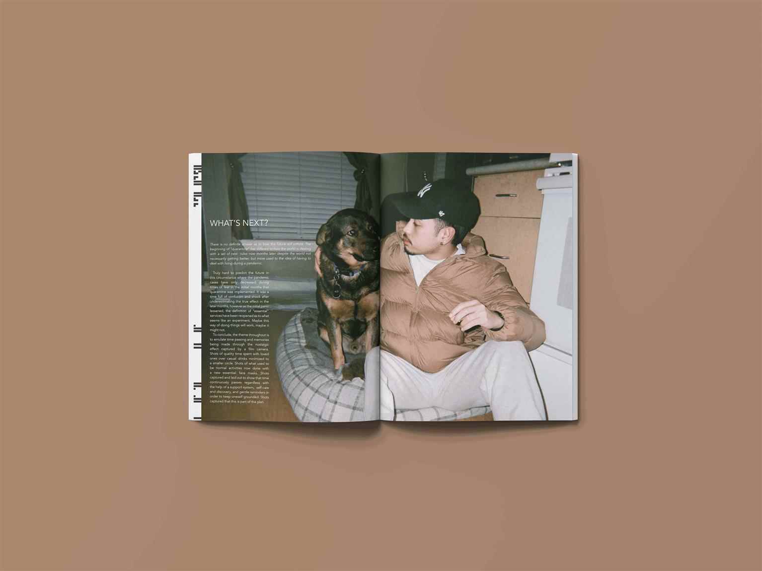
What started out as a fashion magazine turned and revised into a “lifestyle” magazine about COVID as a Gen-Zer hoarding plants. Kollections is a lifestyle magazine that adapts a blog–like voice in its style of writing. Its content focuses on current events that affects young adults that are now living in the midst of a pandemic. Elements such as socialization, entering the workforce, and dealing with the uncertainty of the future are discussed in this specific volume. The objective of the publication is nostalgia. Nostalgia is captured through the use of a 35mm Fujifilm camera and its effects. The typeface, Knewave, resembles the weight of a marker pen in which dates or descriptions are written on the back of photographs. The colours emulate a warm tone to emulate a cozy and inviting atmosphere. lastly, the layout in text maintains a vertical orientation spanning across three columns throughout to reference a vertical film strip. The images are shown in a cut–out effect to effectively collage select photos together, or in a classic rectangular shape of print. The pristine, crisp outcomes are no longer sought after, but the imperfect, candid factor is the end goal. The familiarity of grainy home videos and captured memories frozen in time prints is what I hoped an audience can draw back to.
Share:
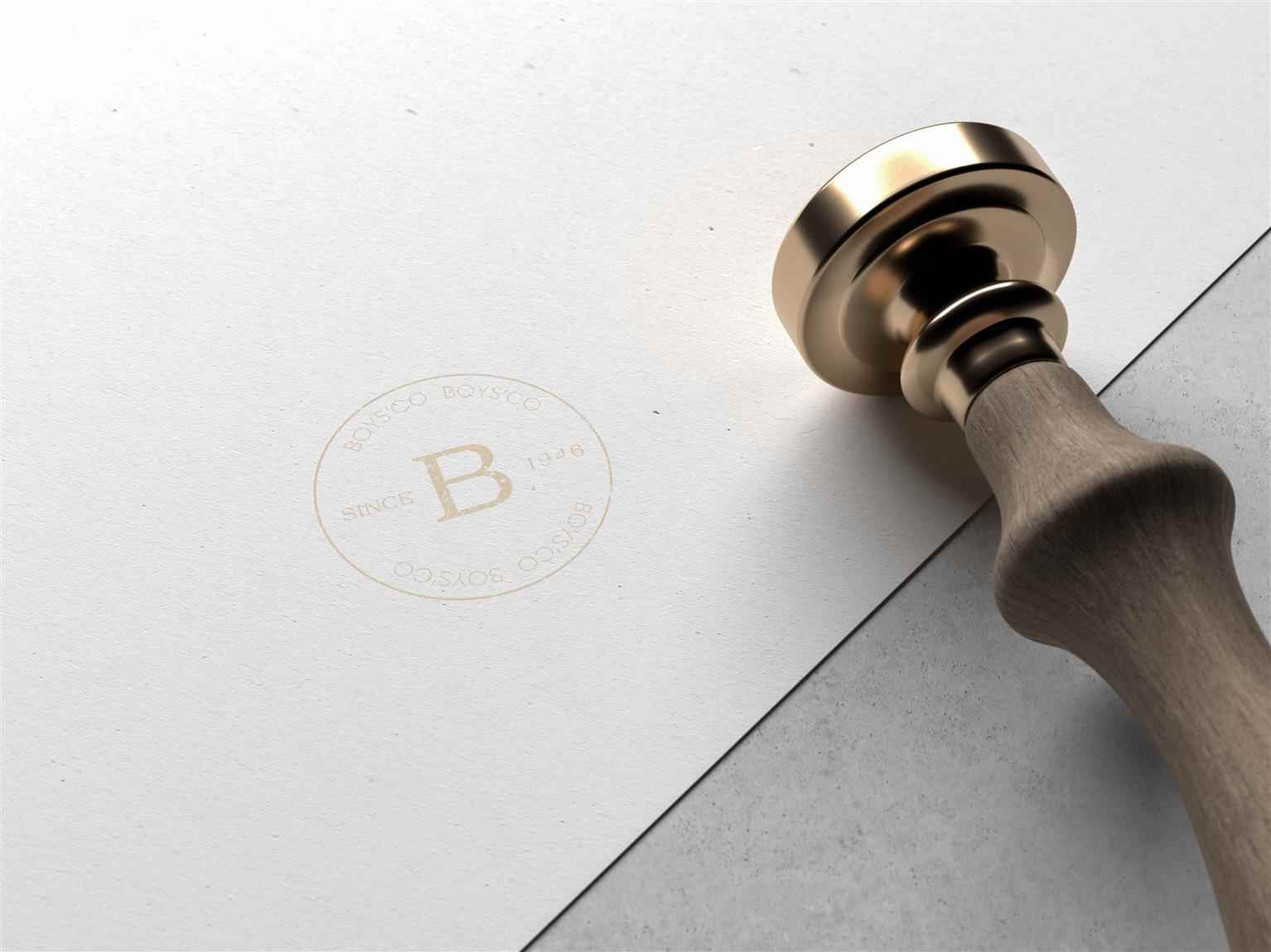
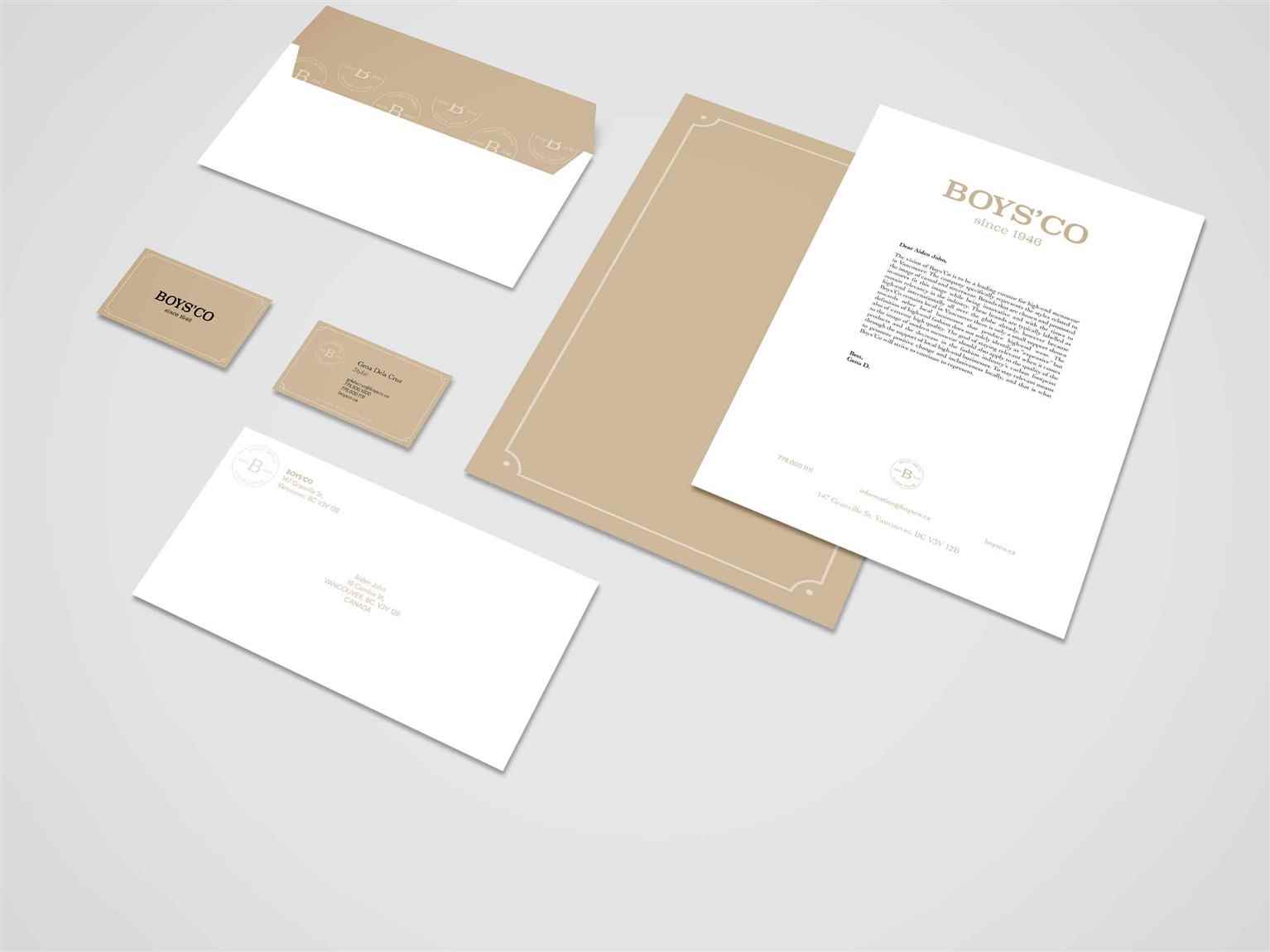
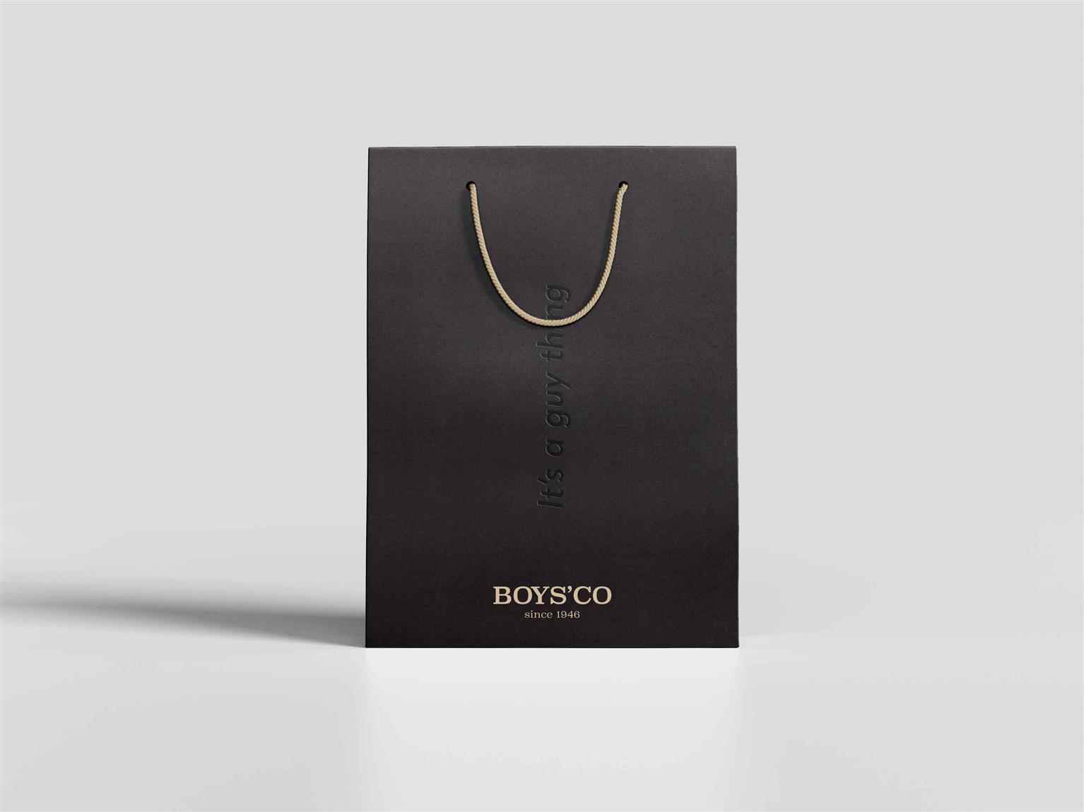
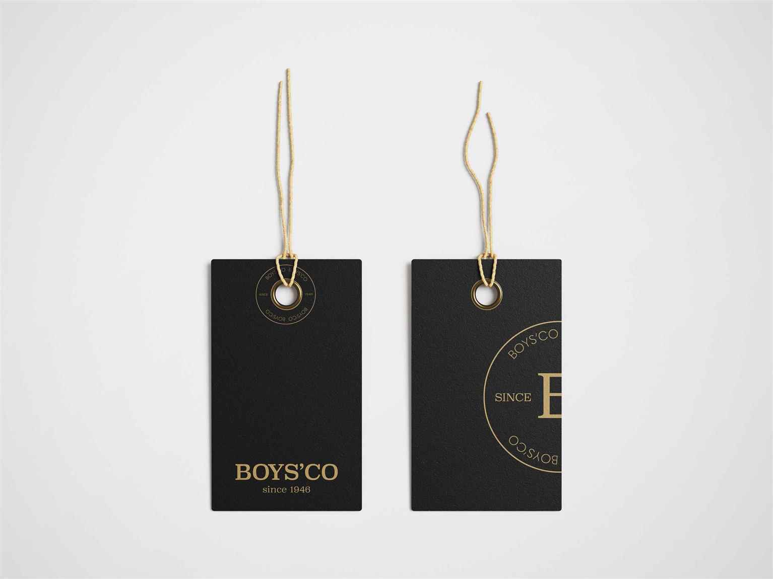
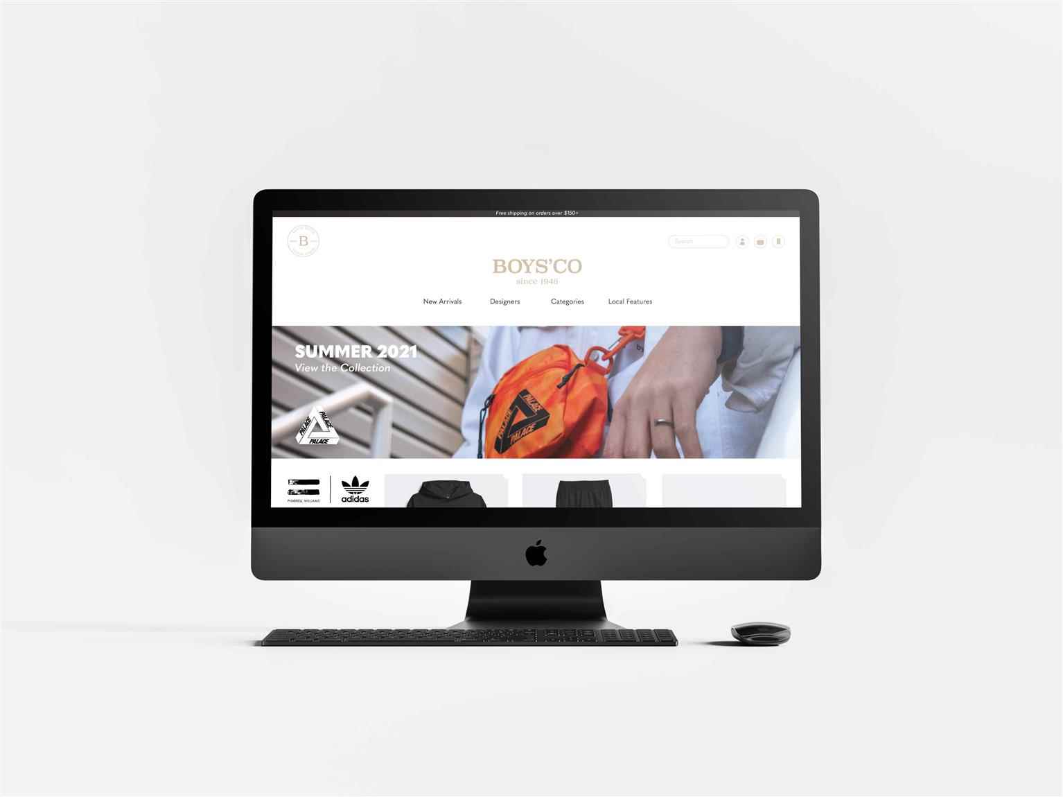
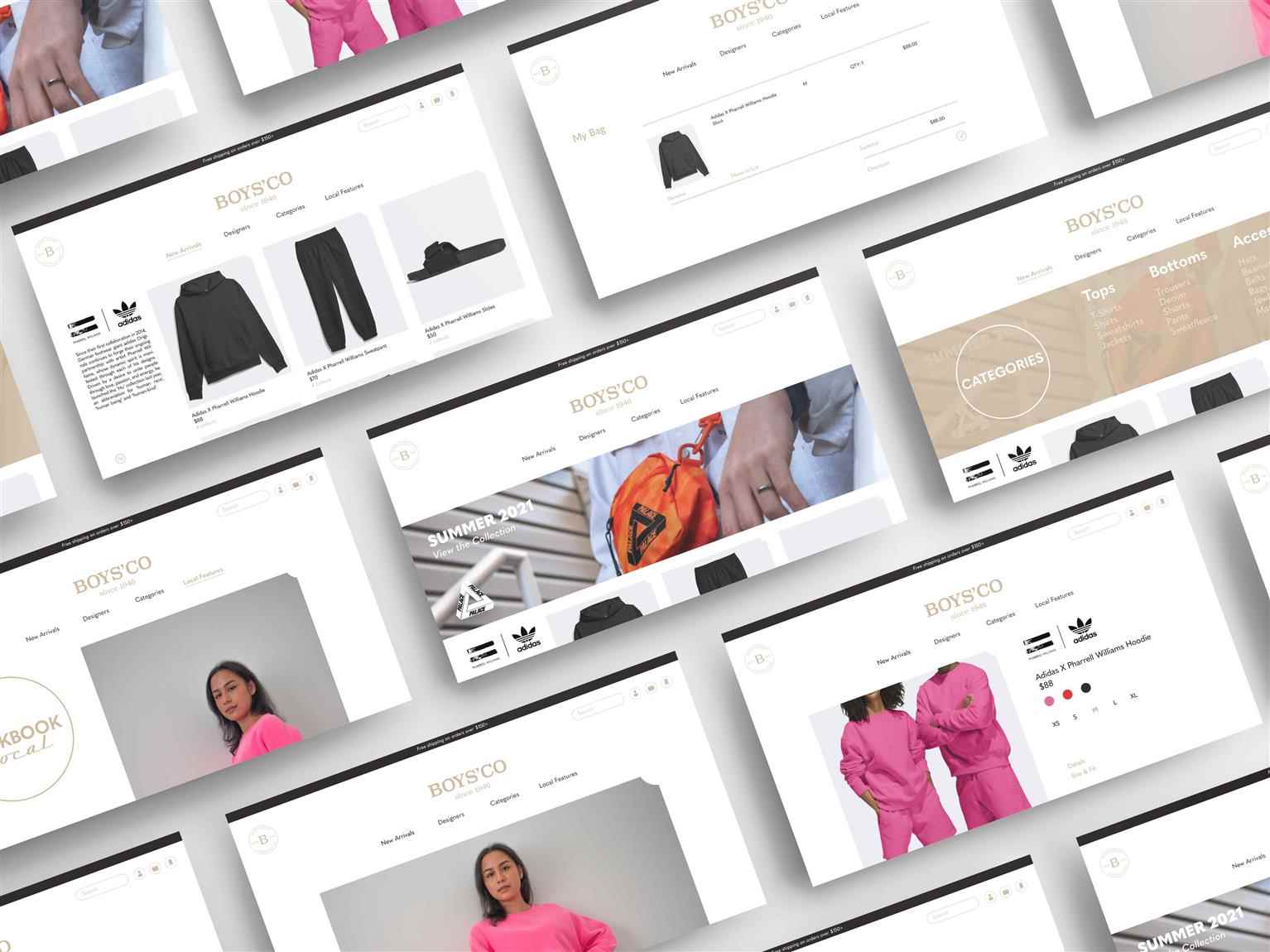
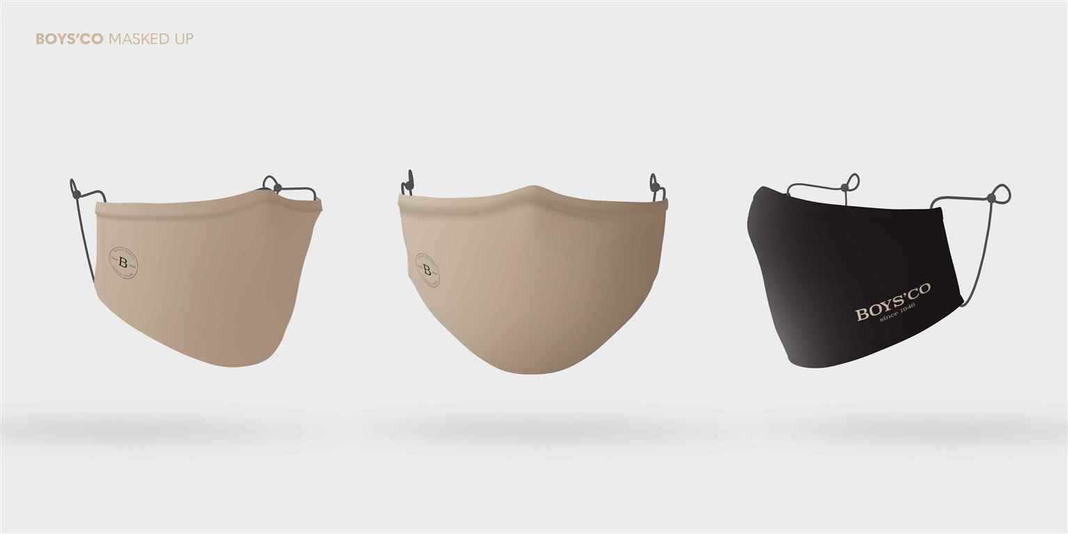
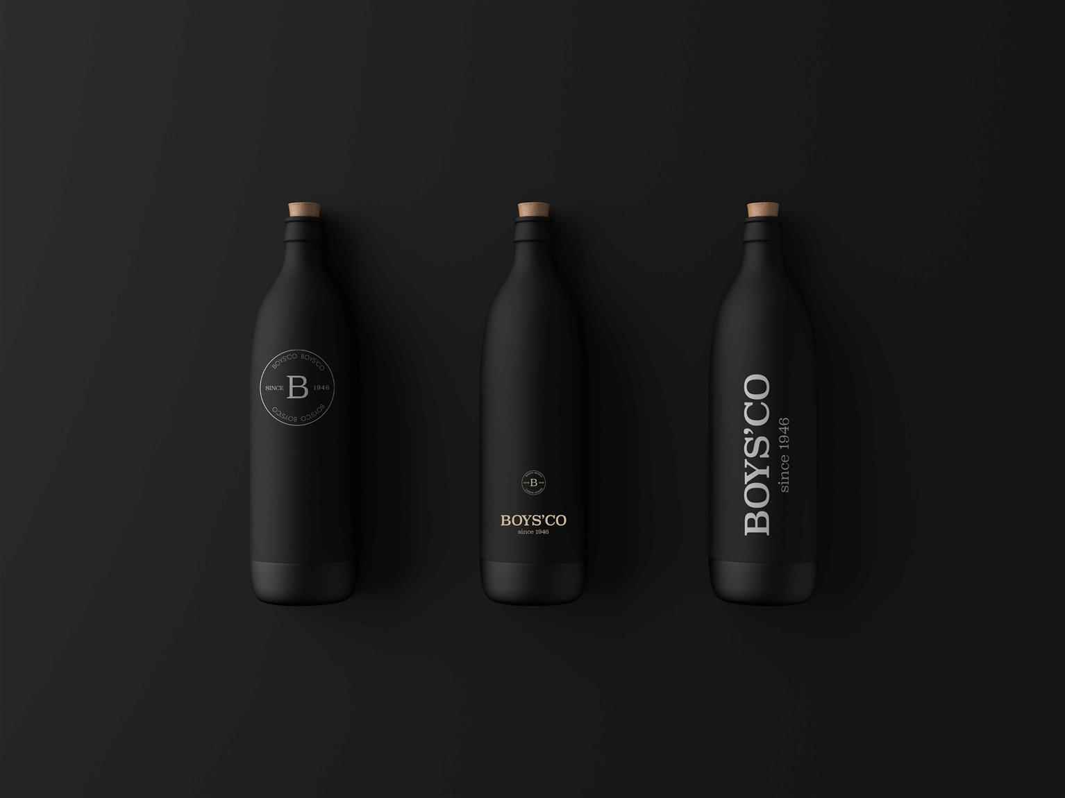
Boys'Co Rebrand
Boys’Co is a Canadian brand based in Vancouver. The company aims to be a leader in curating and promoting both international high-end, and local menswear brands. The company specializes in maintainin...
Boys’Co is a Canadian brand based in Vancouver. The company aims to be a leader in curating and promoting both international high-end, and local menswear brands. The company specializes in maintainin...
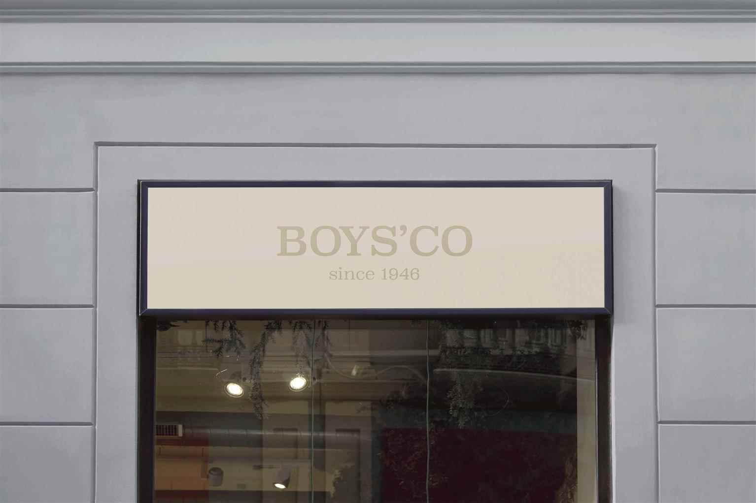
Boys’Co is a Canadian brand based in Vancouver. The company aims to be a leader in curating and promoting both international high-end, and local menswear brands. The company specializes in maintaining and representing relevant styles in streetwear and casual sportswear for men. Boys’Co’s goal is to showcase designer products globally and locally, and providing the best customer experience, while simultaneously empowering their employees. Timeless and luxurious are what the re-brand aims for. Deliverables include a newly formatted website, and brand identity for both their employees and clientele. Through the deliverables, the goal is to bring visual elements together to show high quality pieces in reference to the timelines in fashion, and support of local businesses. The primary logo uses a serif font that defines the fashion industry from the past, to the future in modernity. The secondary emblem adds on to the timeline referencing more intricate details, while the colour palette remains sleek, clean, and masculine. The border element encloses the content found in the website, and selected branded deliverables to differentiate Boys’Co from other brands. Boys’Co is catered to men in their 20’s–30’s and are typically part of the middle class. They have an eye for style in fashion, quality, and appreciation for the arts made by new and well-known potential-driven creatives in the game. They are considered busy body, city folk that can live off their smartphones to stay in the know of latest trends.
Share:
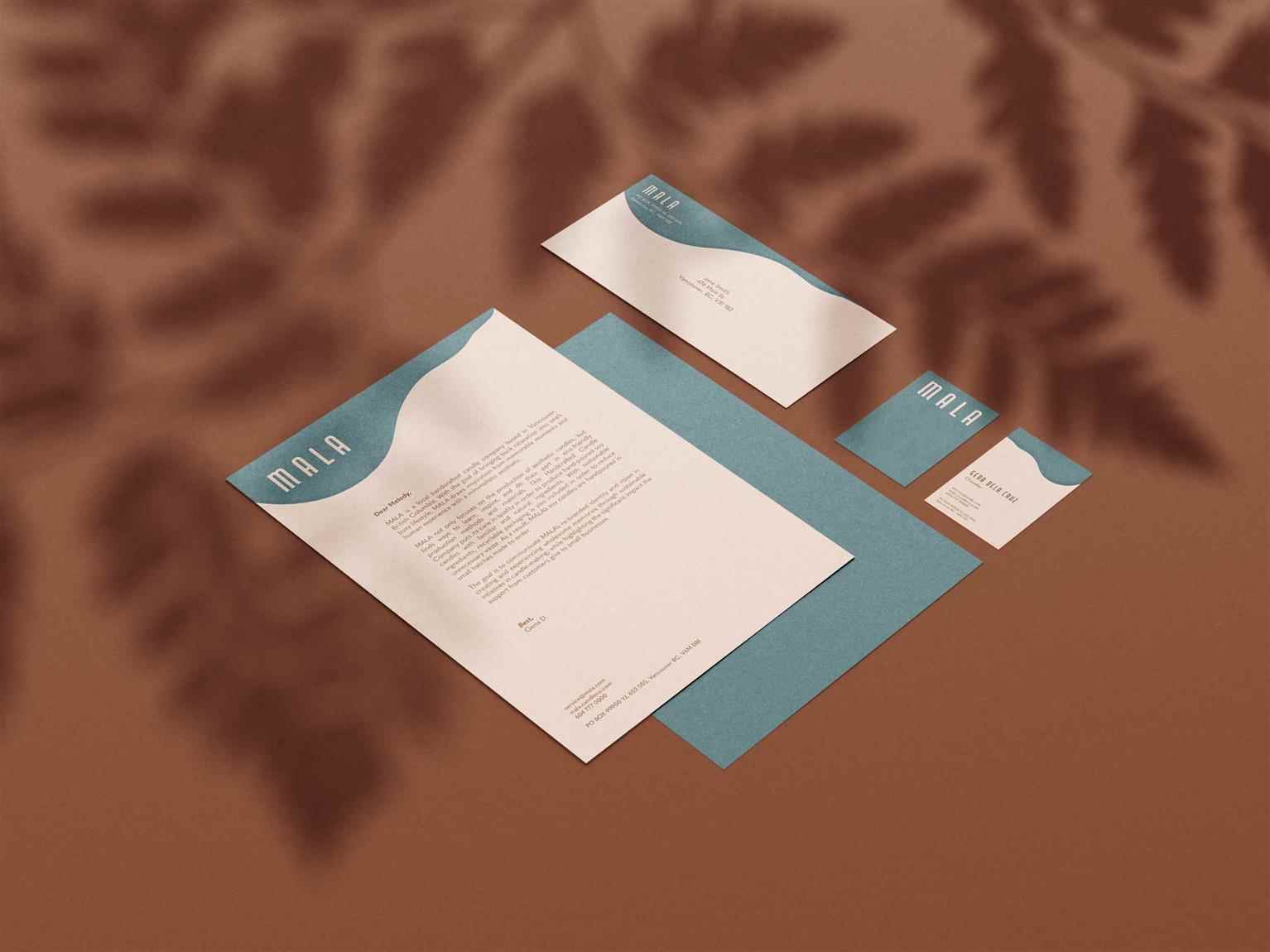
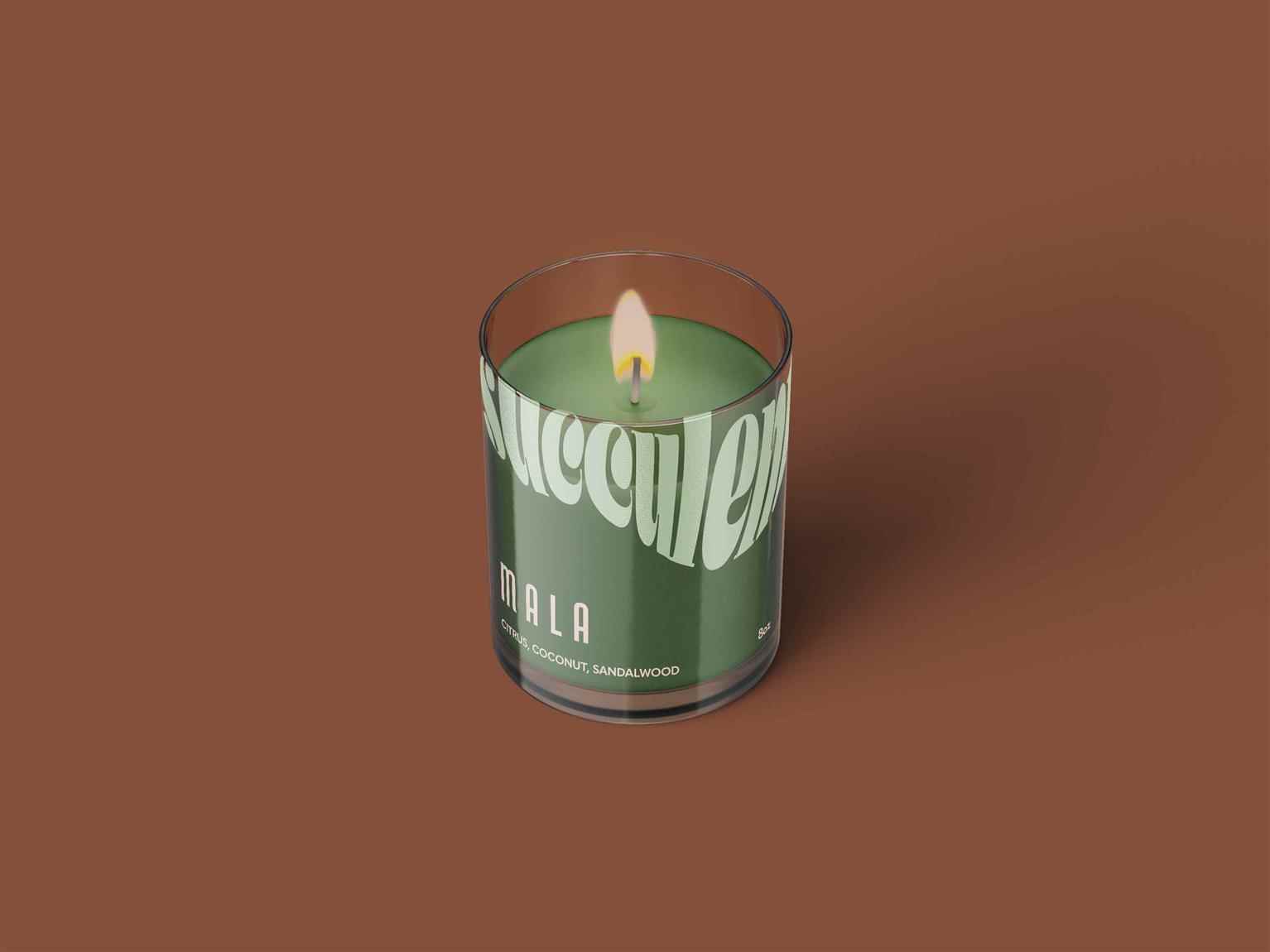
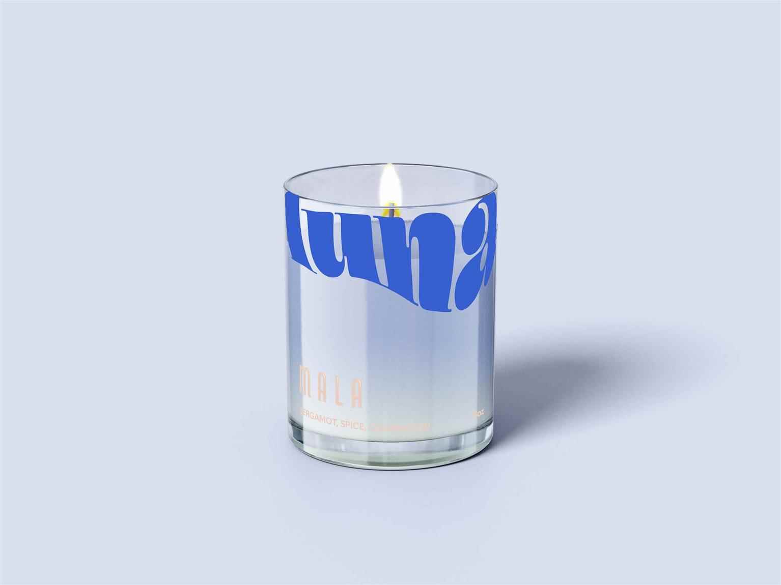
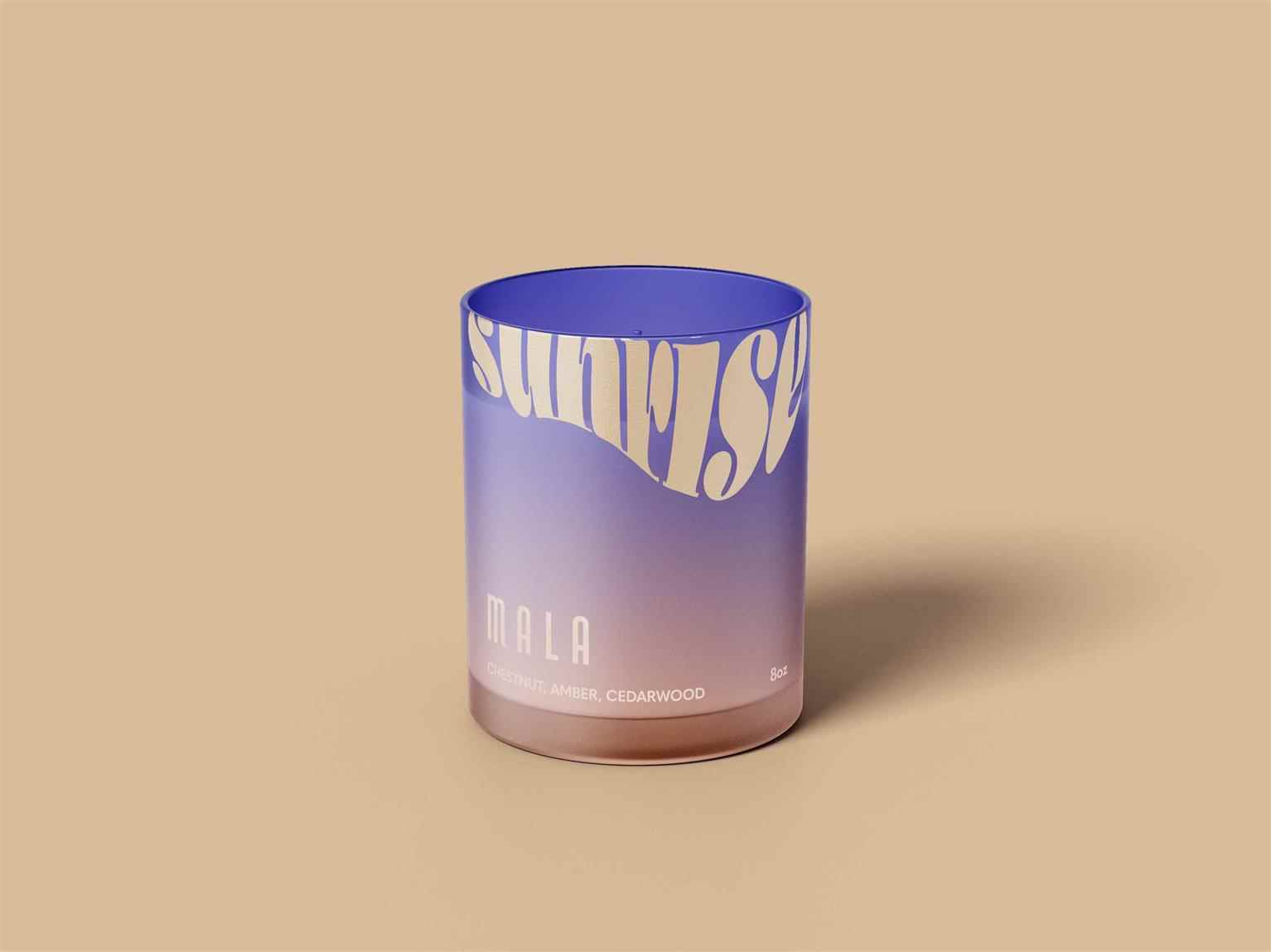
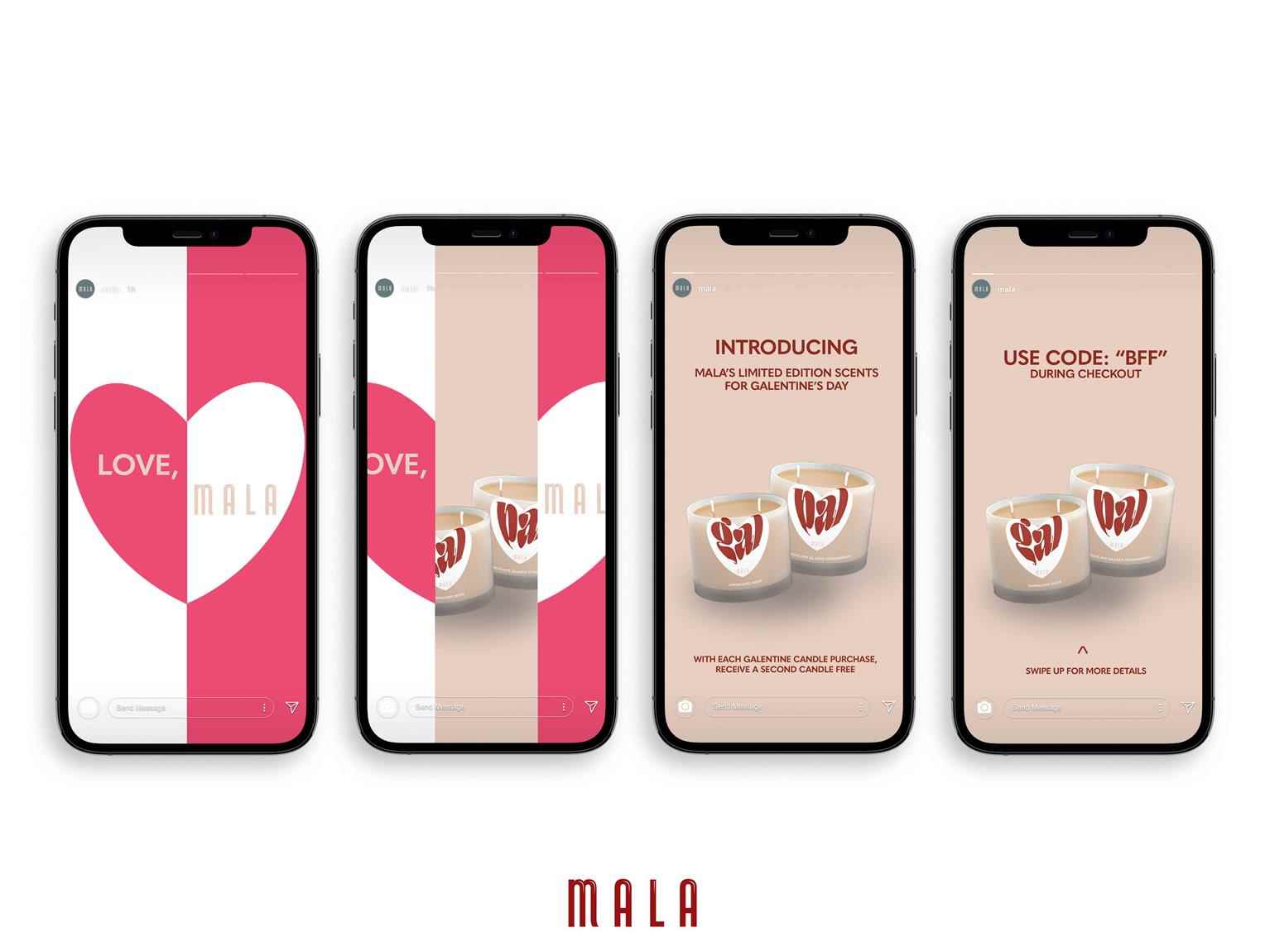
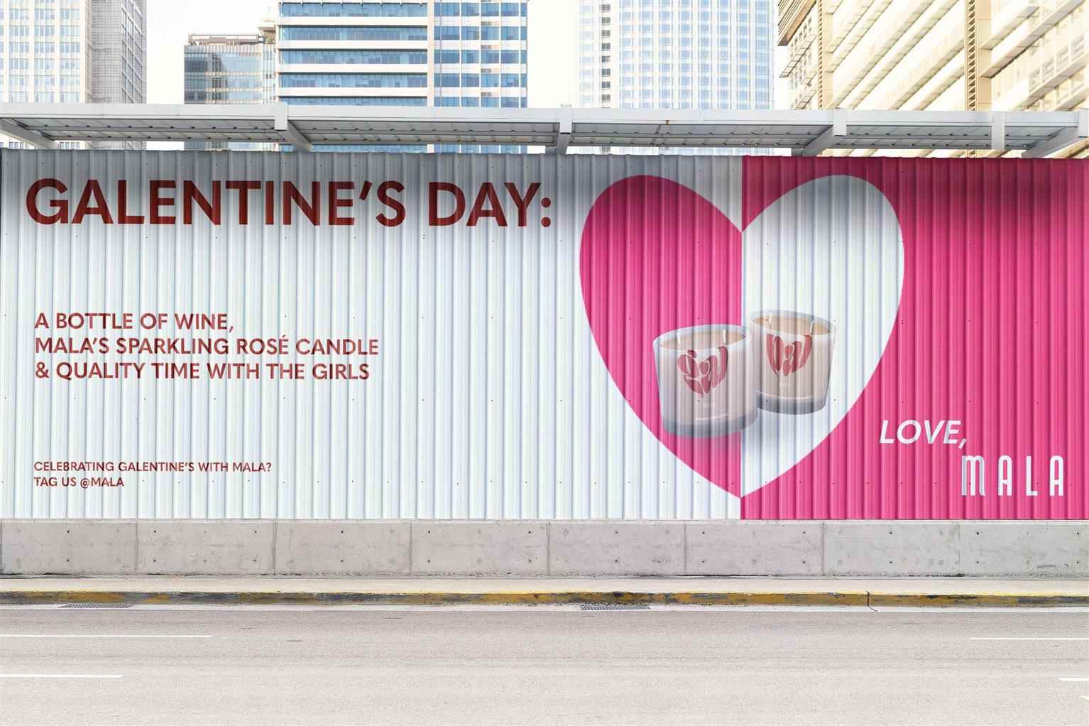
MALA
MALA is a local handcrafted soy candle company based in Vancouver, British Columbia. With the goal of bringing back relaxation into one’s busy lifestyle, MALA draws inspiration from memorable moments...
MALA is a local handcrafted soy candle company based in Vancouver, British Columbia. With the goal of bringing back relaxation into one’s busy lifestyle, MALA draws inspiration from memorable moments...
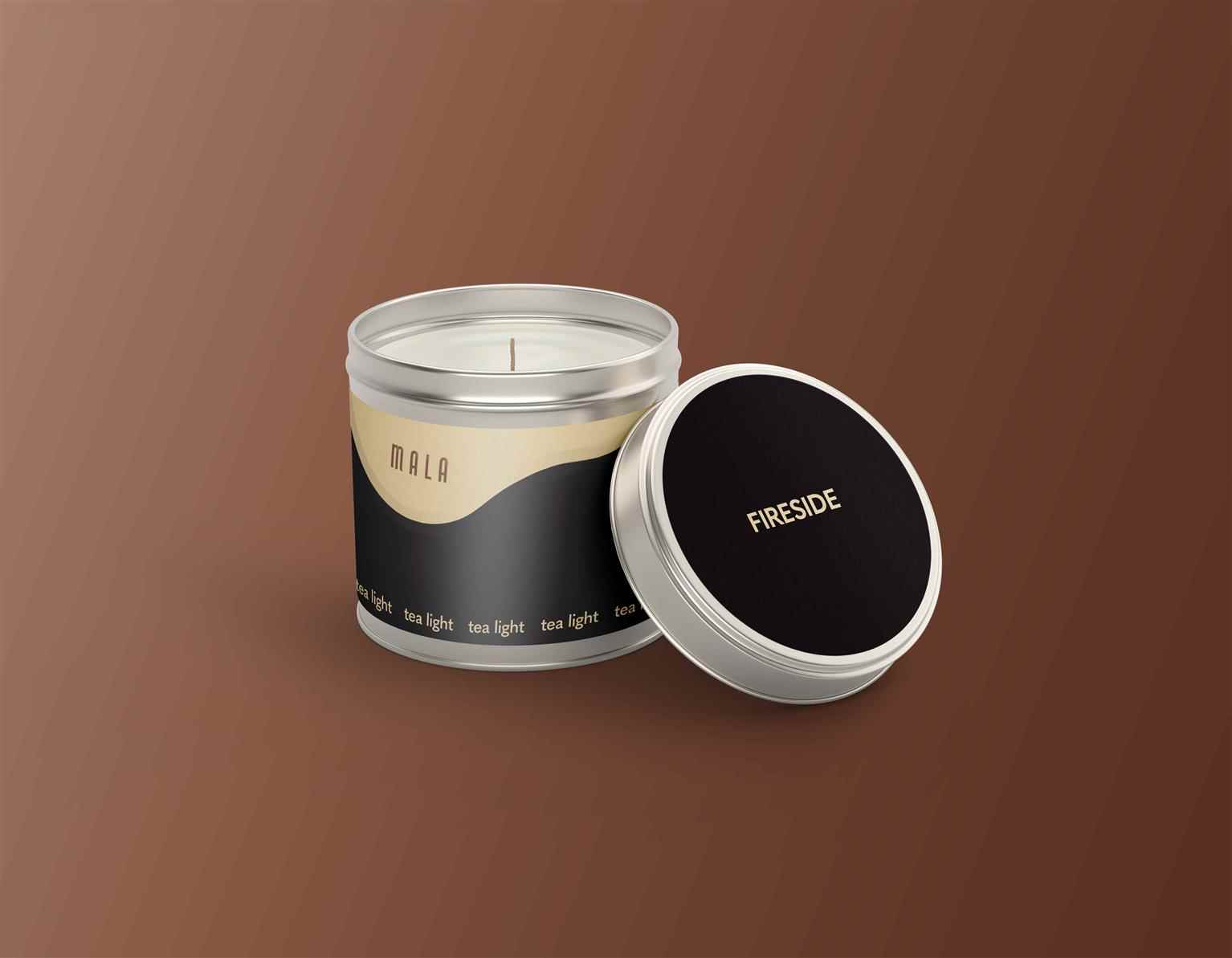
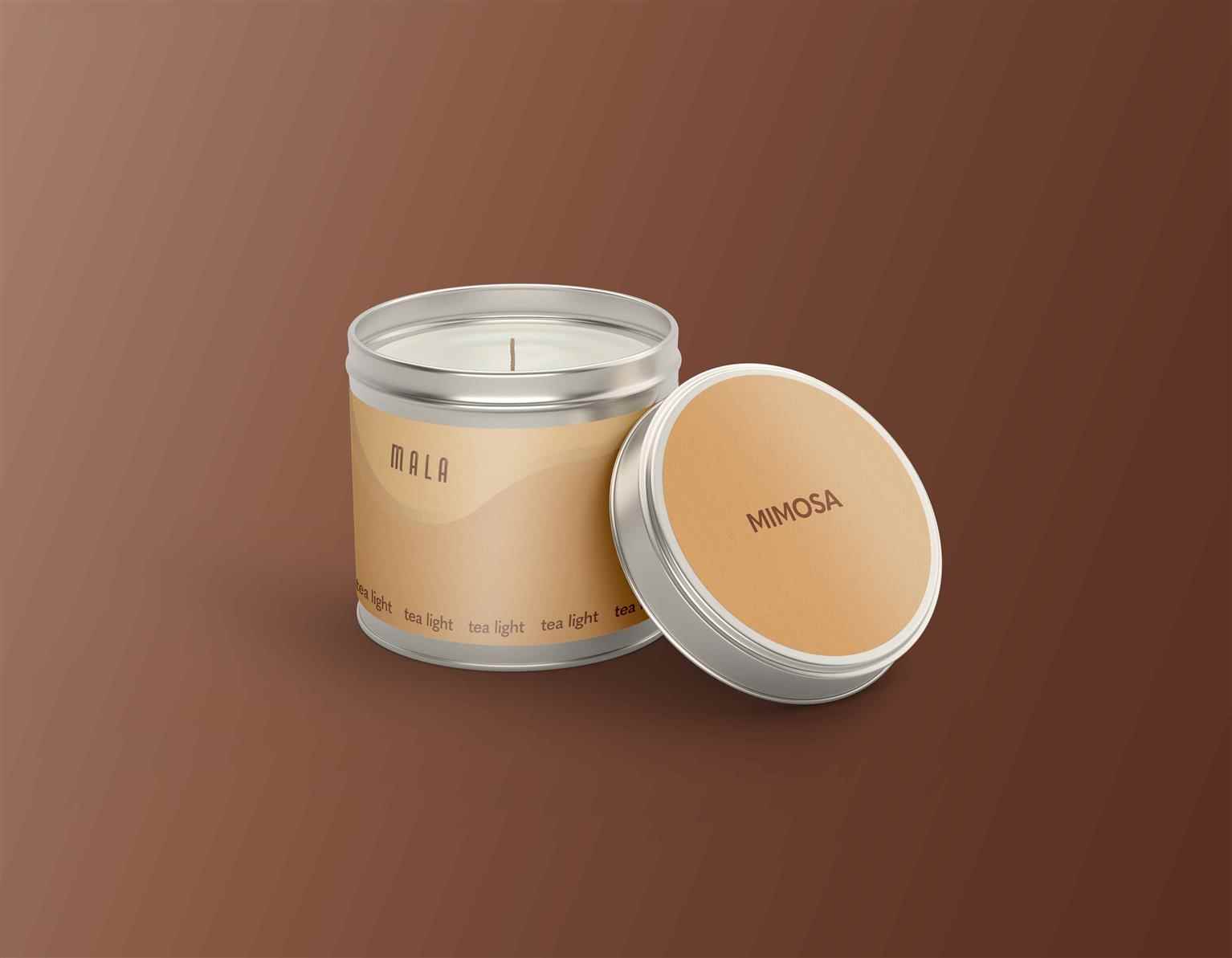
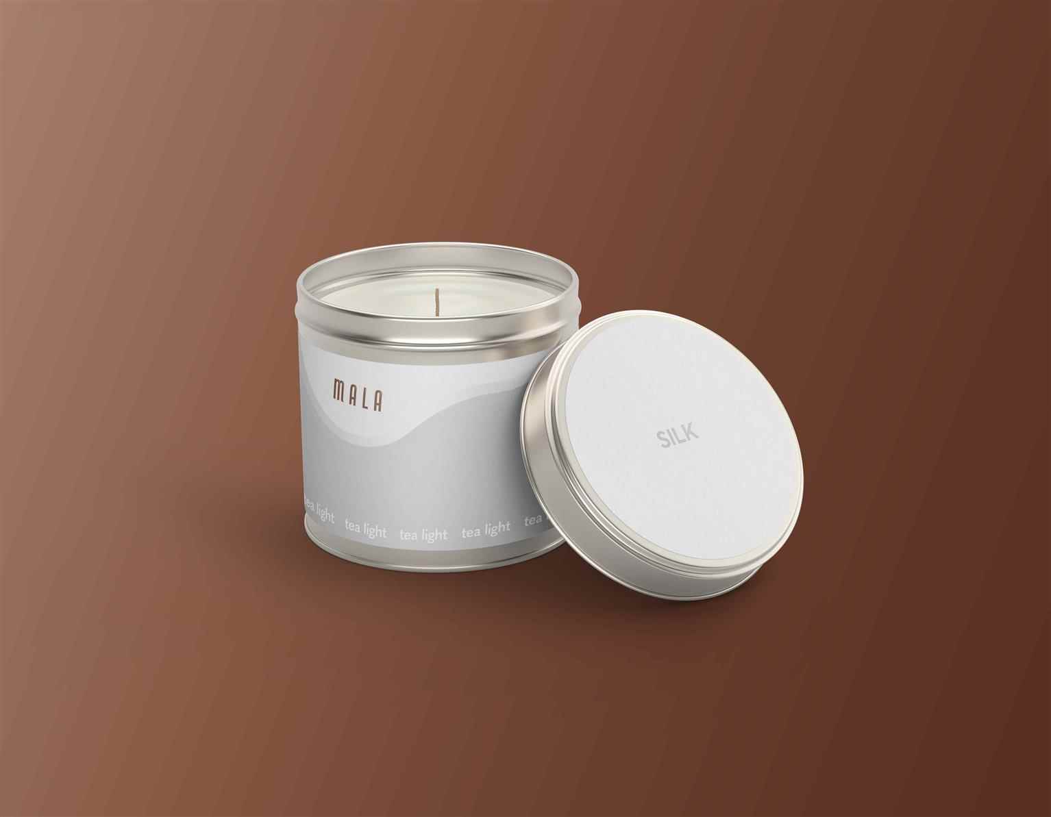
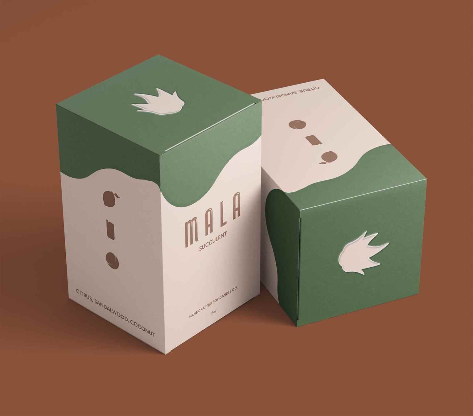
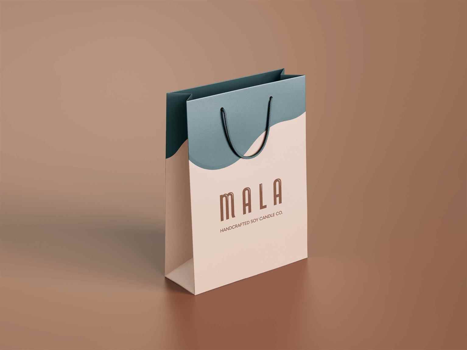
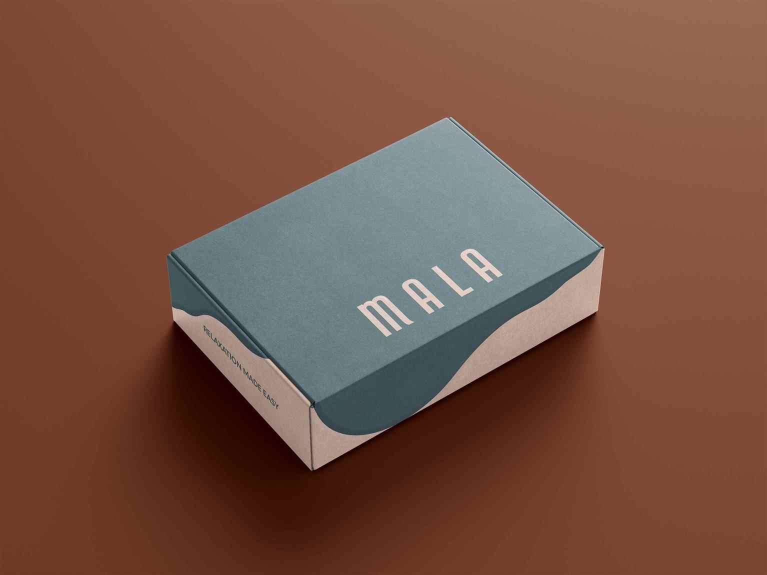
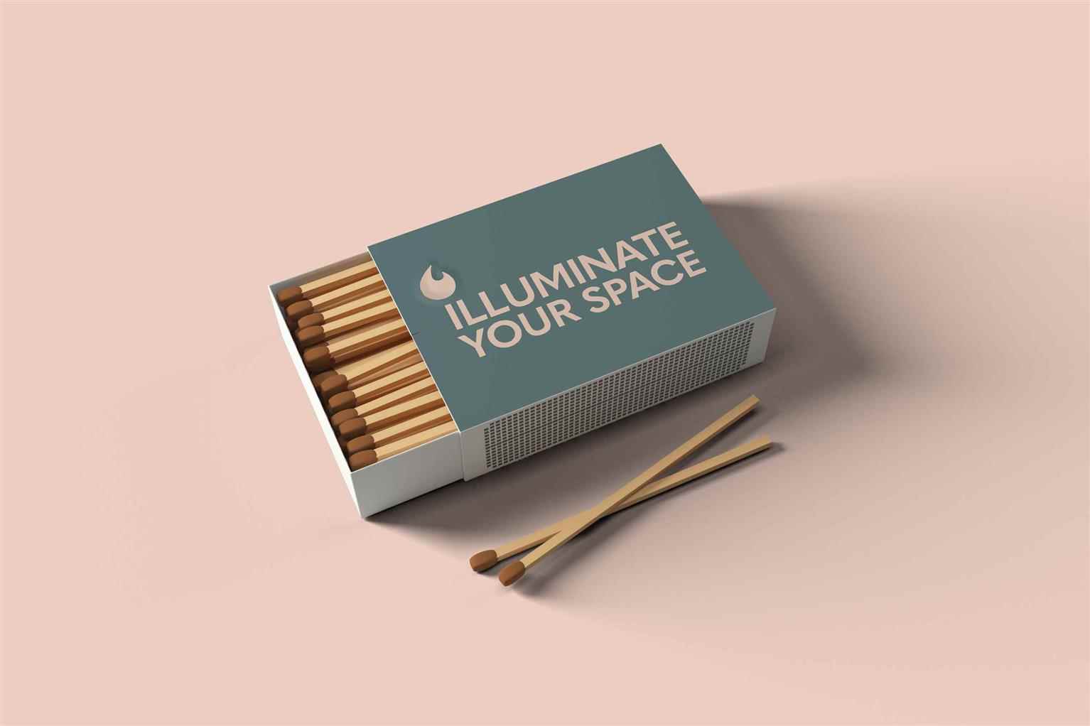
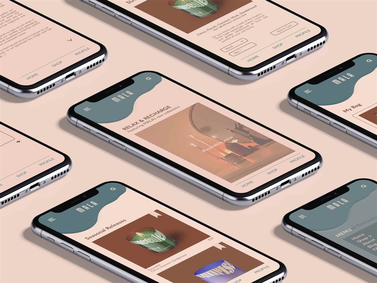
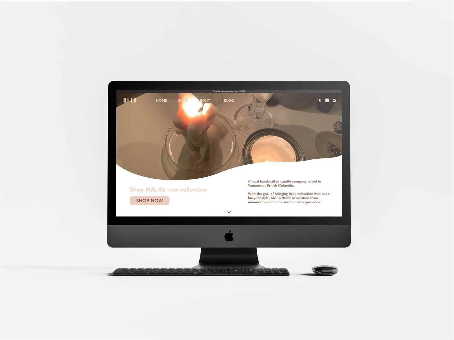
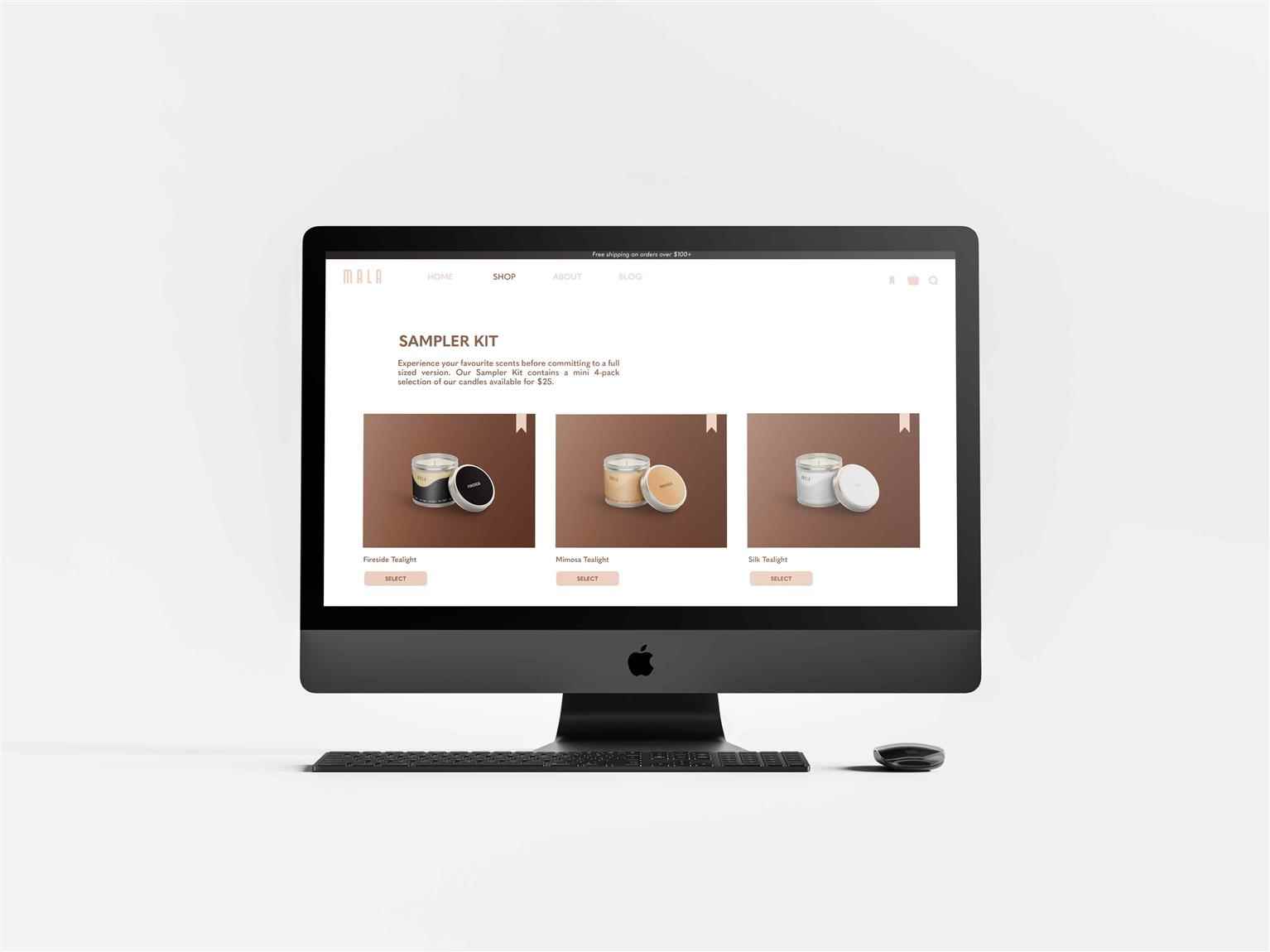
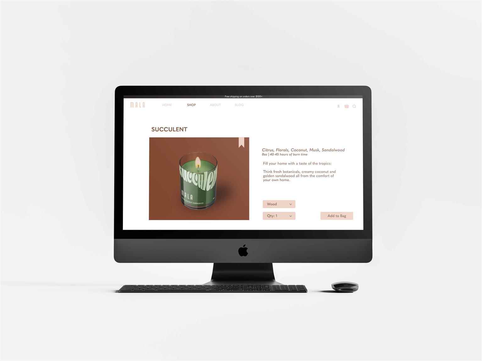
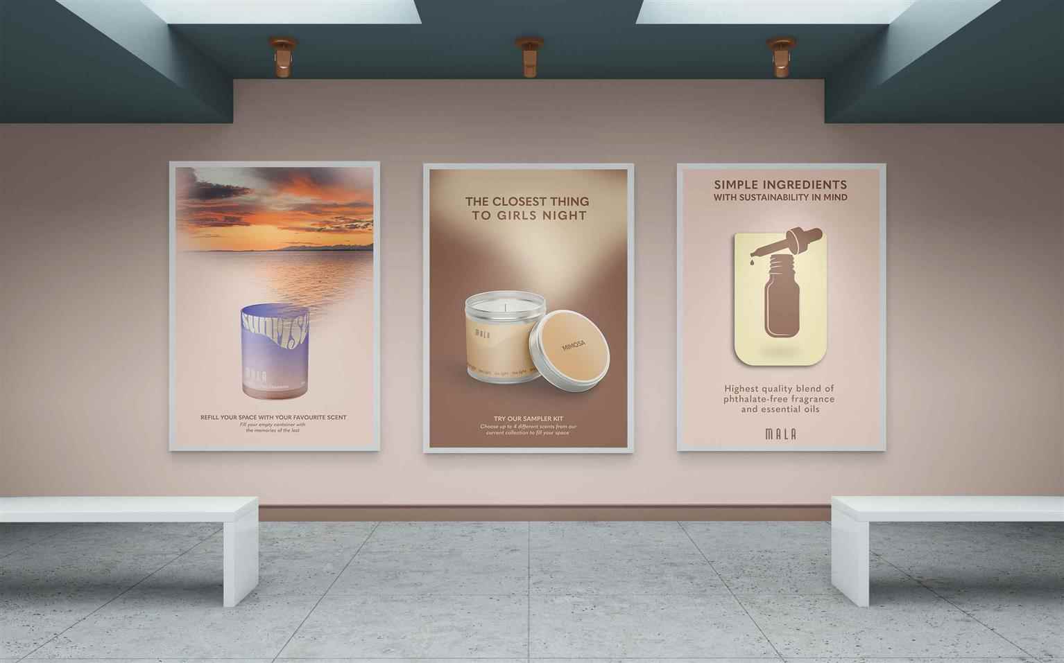
MALA is a local handcrafted soy candle company based in Vancouver, British Columbia. With the goal of bringing back relaxation into one’s busy lifestyle, MALA draws inspiration from memorable moments and human experience with a minimalistic aesthetic. The MALA re-brand will focus on 4 pillars in which also draws in its current target demographic. This includes, (1) sustainability, (2) quality, (3) lifestyle, and (4) personal life experience. The overflow of re-living moments through the brand’s eco-friendly initiatives is demonstrated in the re-branded design elements, as well as an established brand identity and aesthetic. The focus on these 4 pillars are shown through the idea of an overflow that is repeatedly used in branding and advertising. An overflow of emotions with cherished memories that can be re–filled through the brand’s sustainable initiatives. The soft edges of the logo is in reference to melted wax, while the colour palette has an earthy, and contemporary combination. This brings the brand back to the aesthetic and lifestyle portion in which the overall elements can fit into one’s life. MALA attracts two types of audiences that first include individuals who seek quality products from a company that is mindful of the sustainability aspect in production and materials. The second audience include the lifestyle and modernity aesthetic to radiate in their space that stimulate all senses (most especially smell).
Share:
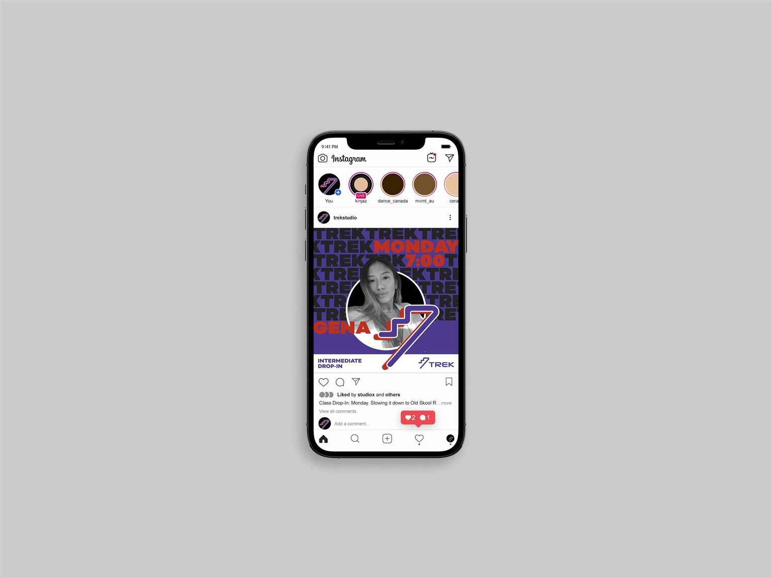
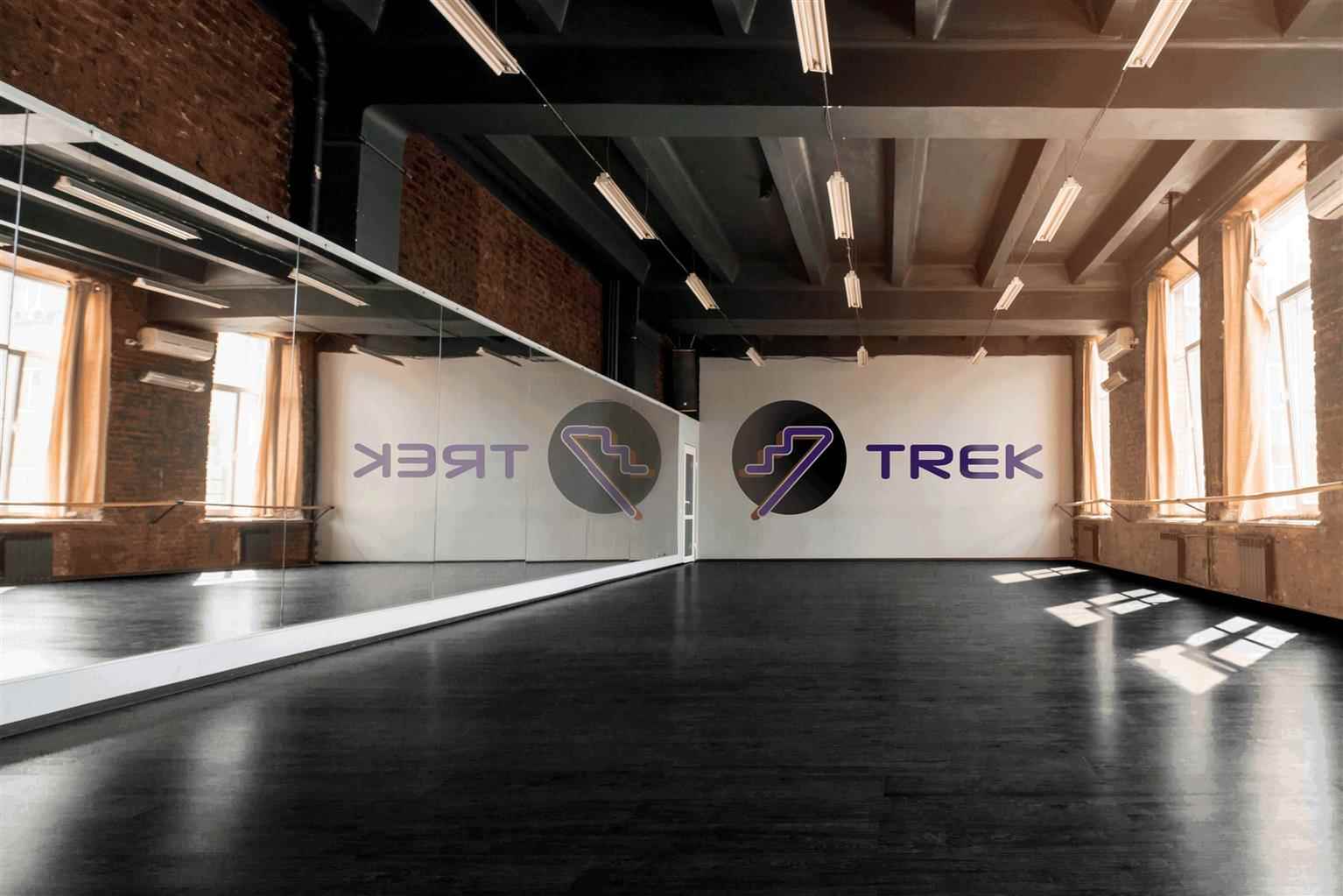
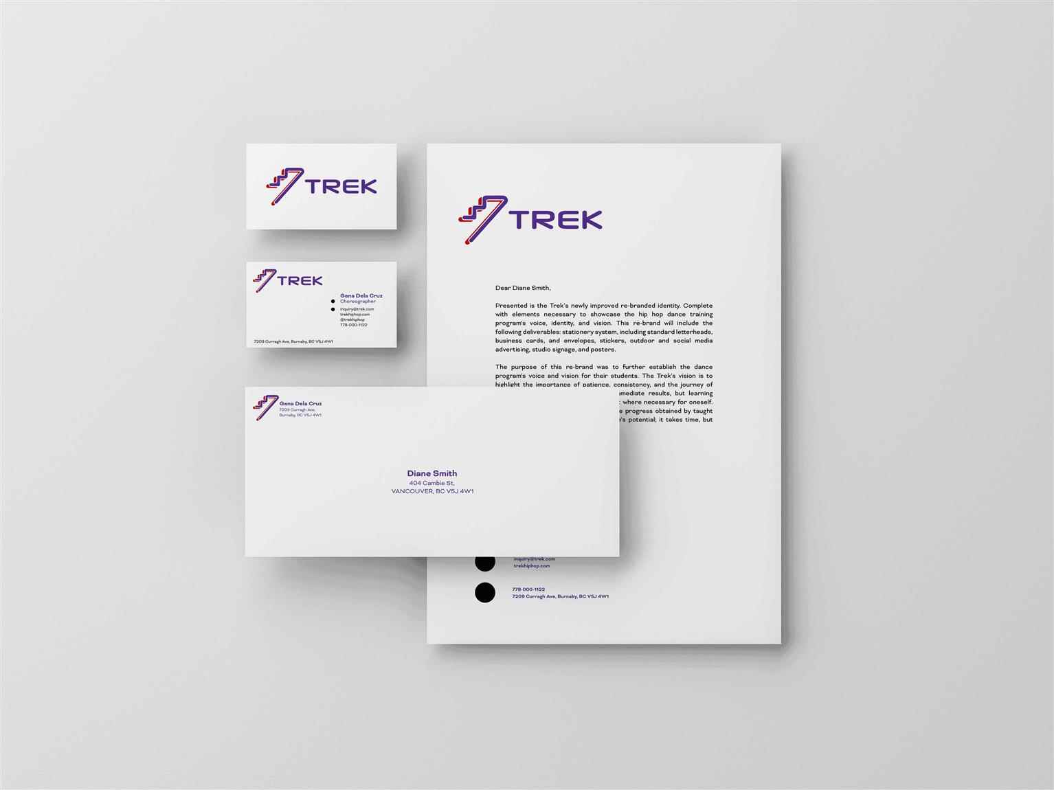
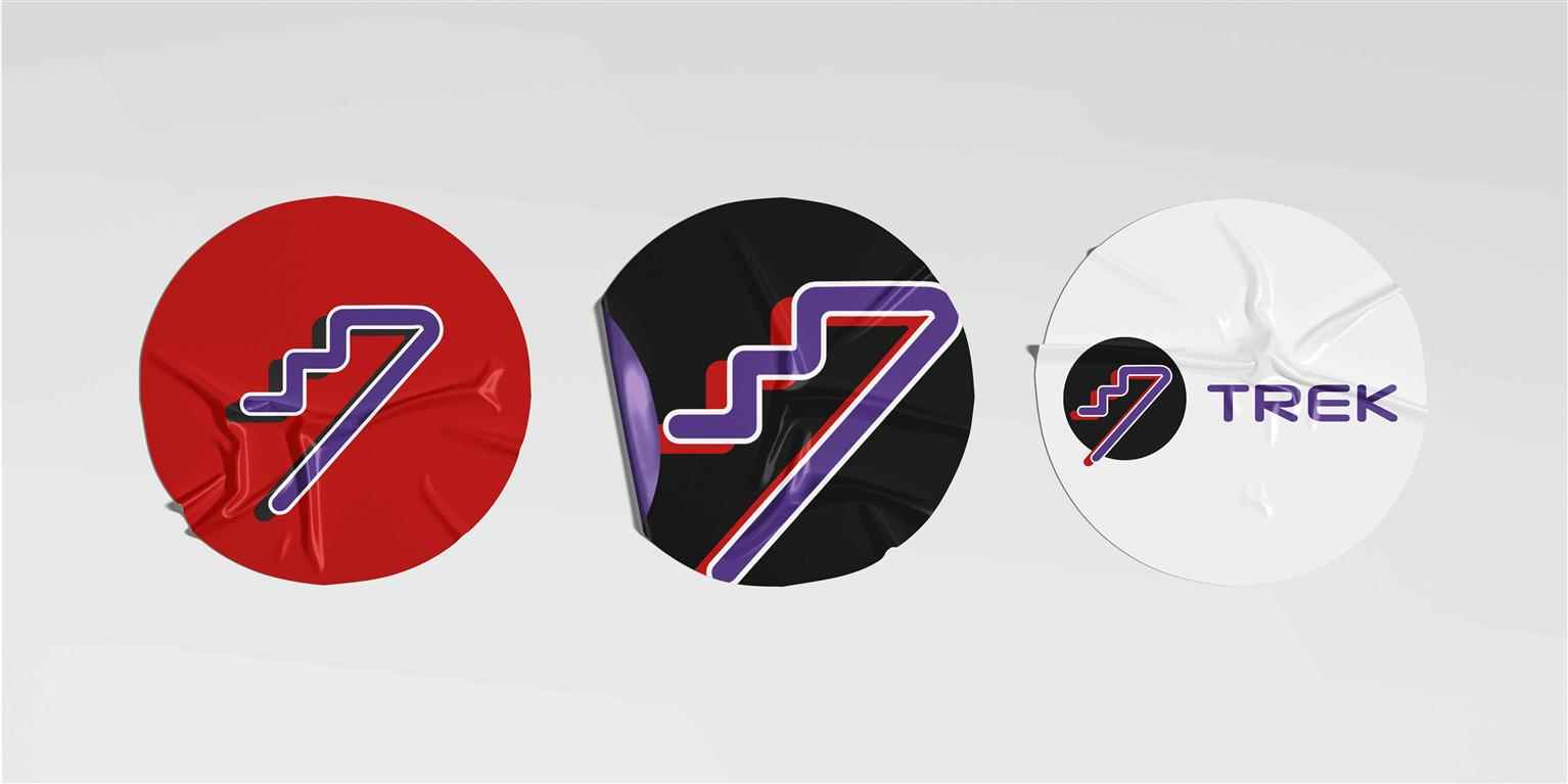
TREK Dance Studio
The Trek is a hip hop dance program led by dancer and choreographer Jerome Esplana. The Trek equips dancers with new skillsets in order to grow and explore in their craft through a variety of activit...
The Trek is a hip hop dance program led by dancer and choreographer Jerome Esplana. The Trek equips dancers with new skillsets in order to grow and explore in their craft through a variety of activit...
The Trek is a hip hop dance program led by dancer and choreographer Jerome Esplana. The Trek equips dancers with new skillsets in order to grow and explore in their craft through a variety of activities not exclusive to solely watching, dancing, and then performing. While it’s a place of growth in physical movement, it’s just as much as learning the history, foundations and origins of the art that dancers are immersed in. The Trek’s branding deliverables include the aspiration of becoming its own Dance Studio. Complete with poster signage to communicate its new brand identity and vision, as well as social media presence when a workshop is available to book. The colour palette, round shapes, and flowing upward staircase are intended to show movement, progress, confidence, and being bold, with reference to hip hop elements. With focuses on the importance of patience, consistency, and the journey of growth. Trek offers levels from beginner, intermediate to advanced students ranging from ages 16–27. The emphasis is not based on immediate results, but learning valuable skillsets and applying it where necessary for oneself. The key message to takeaway is that the progress obtained by taught skillsets in this program is to reach one’s potential; it takes time, but shows the most worthwhile results.

Share:
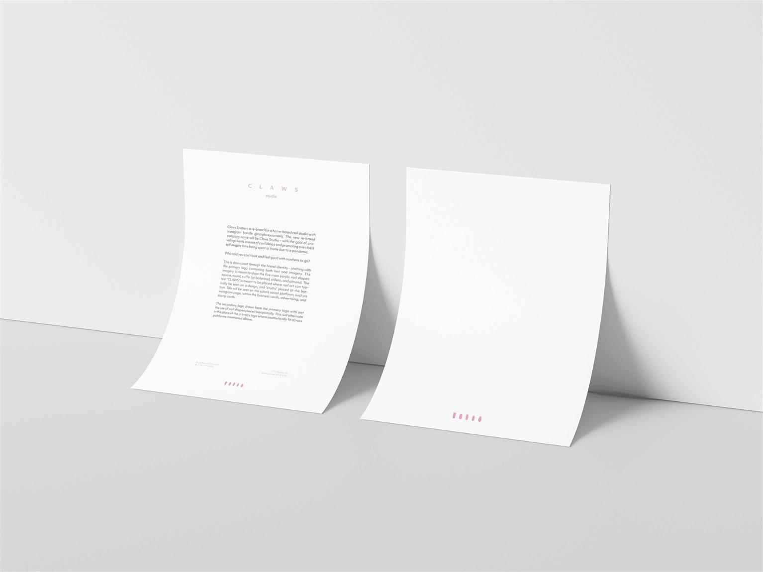
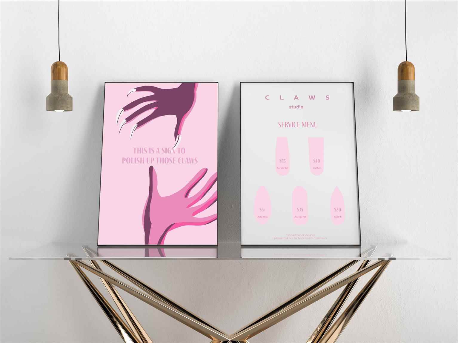
CLAWS Studio
Claws Studio is a complete re-branded project for a home-based nail studio — @omgloveyournails. With the increase in pursuing talents and polishing up new skills, the boom of side businesses has...
Claws Studio is a complete re-branded project for a home-based nail studio — @omgloveyournails. With the increase in pursuing talents and polishing up new skills, the boom of side businesses has...
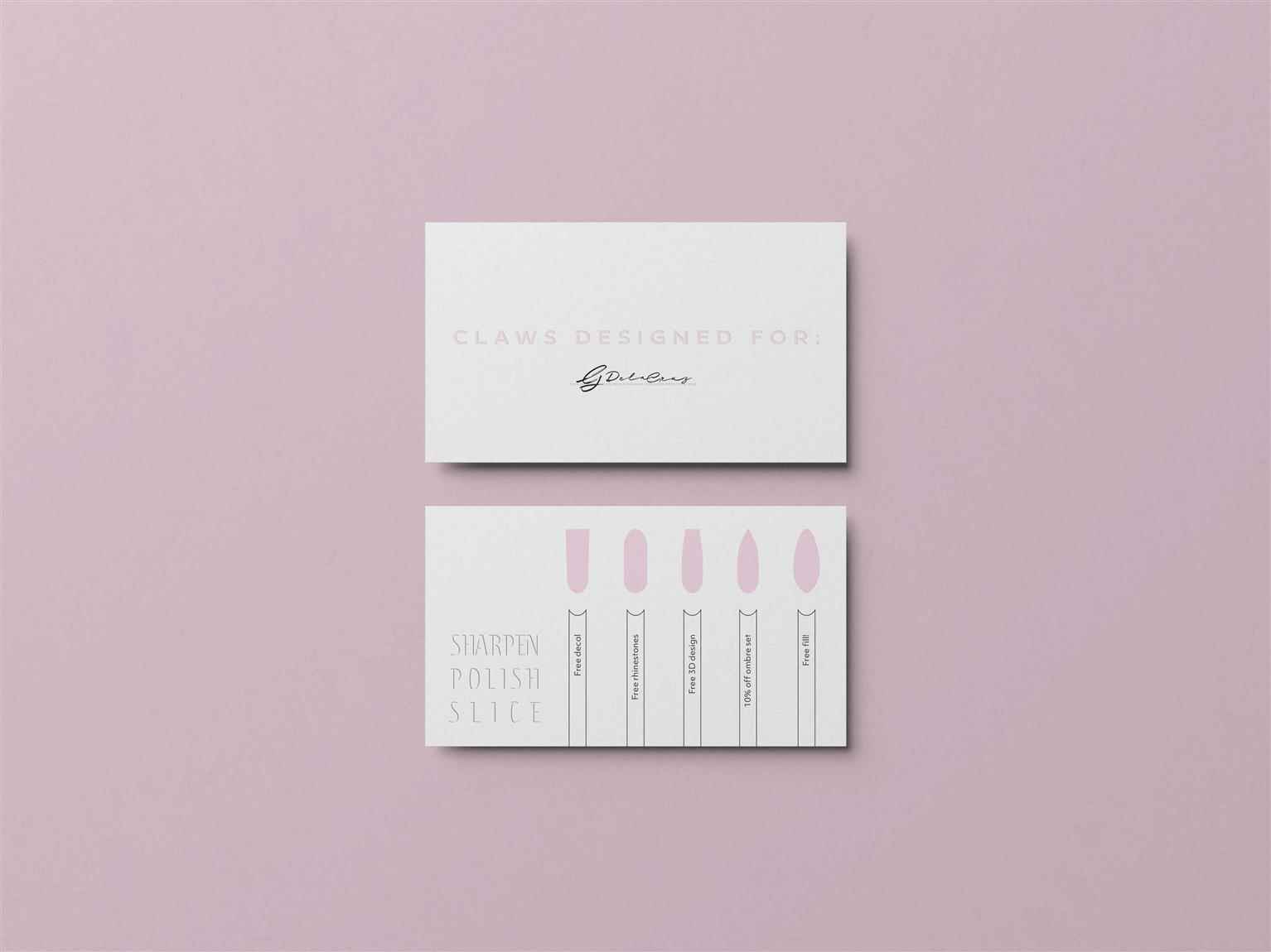
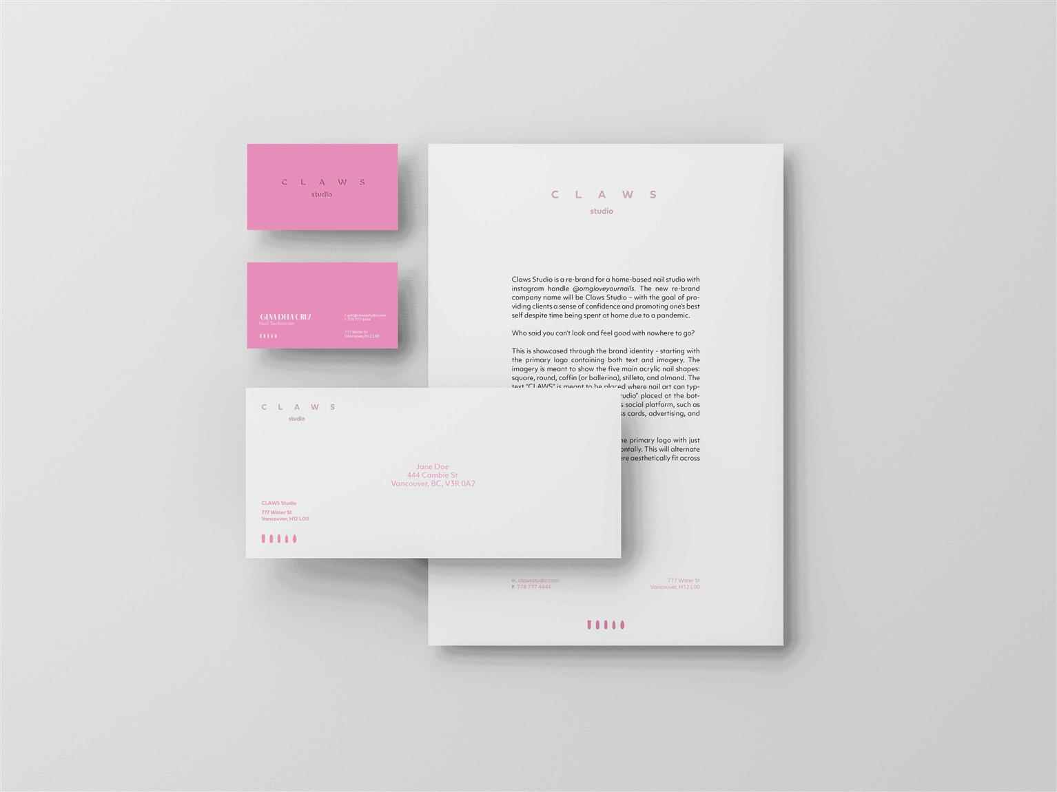
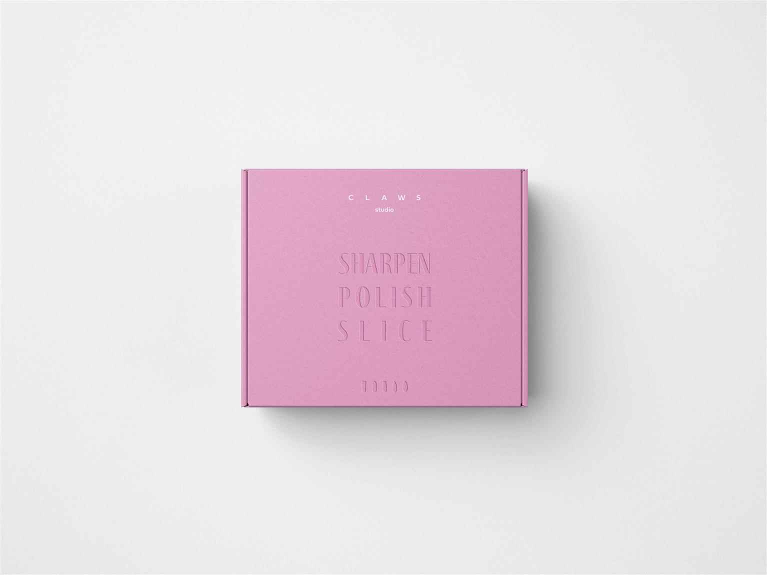
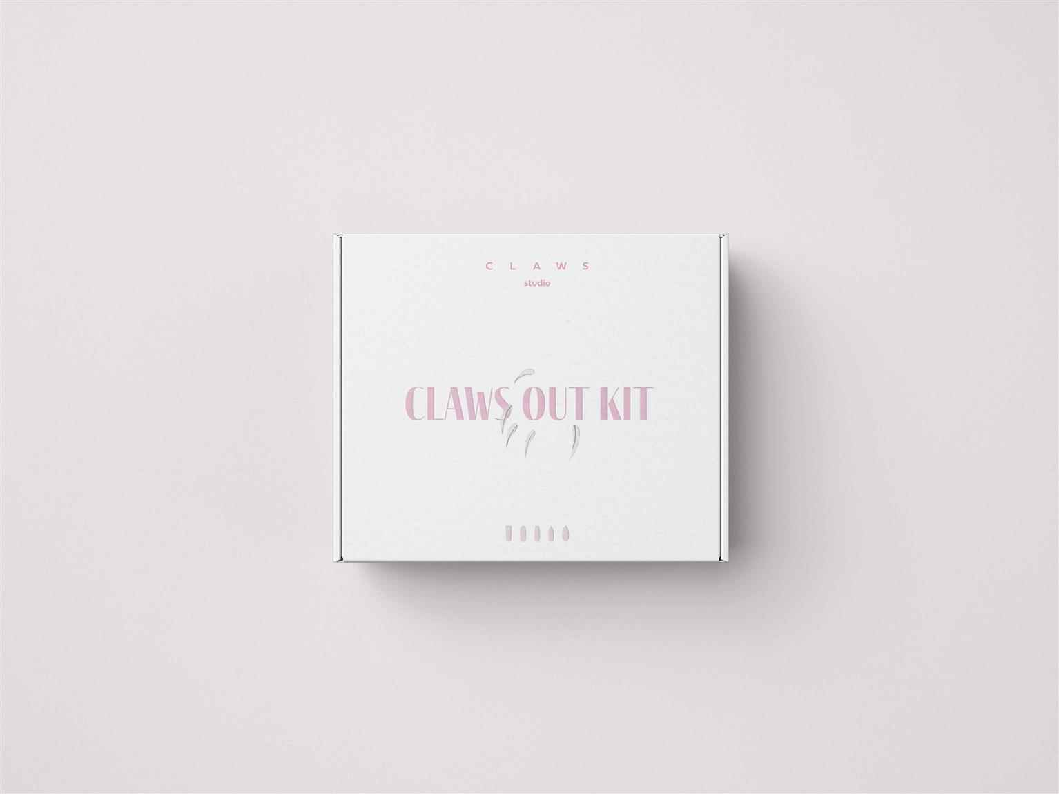
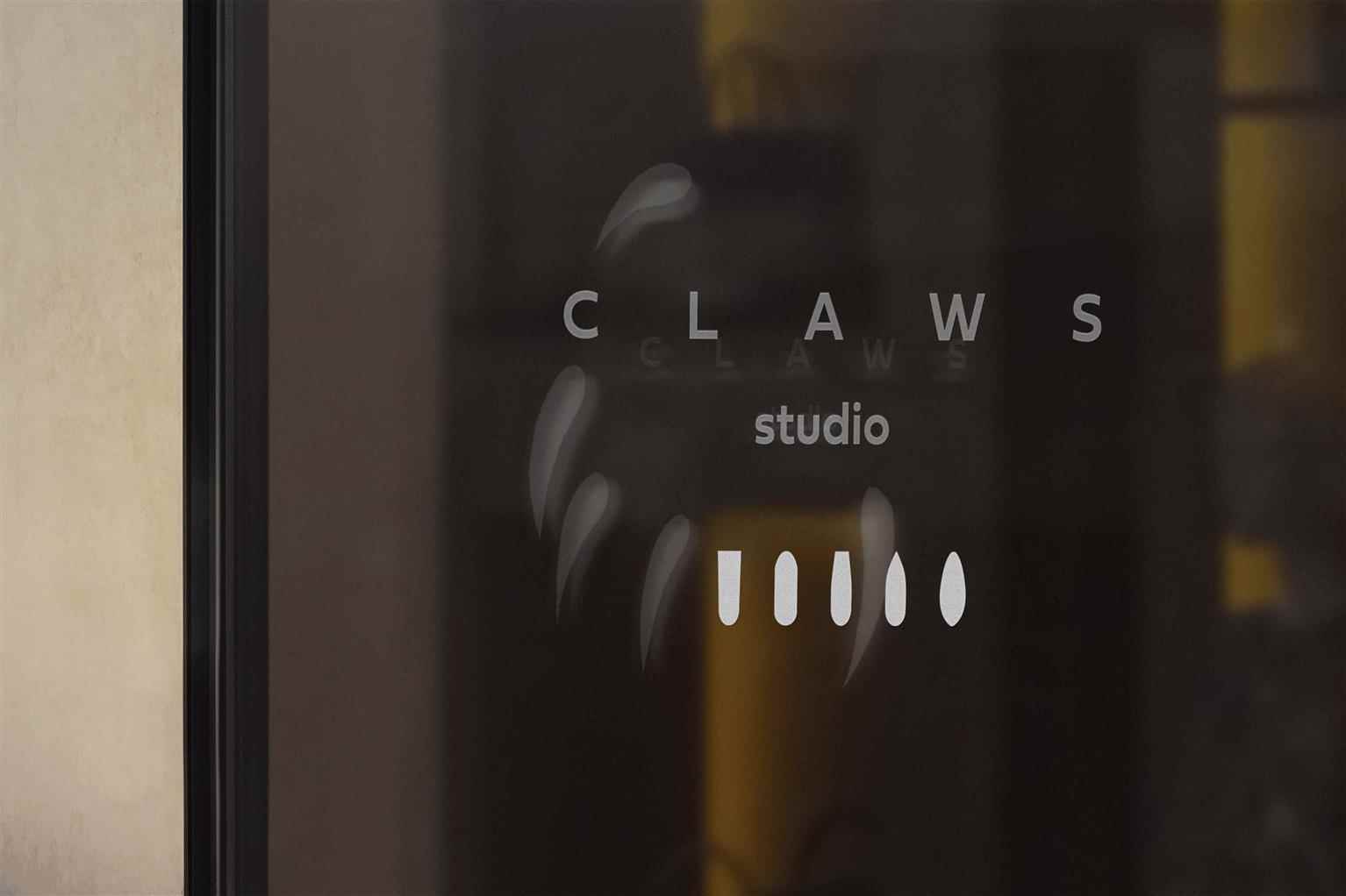
Claws Studio is a complete re-branded project for a home-based nail studio — @omgloveyournails. With the increase in pursuing talents and polishing up new skills, the boom of side businesses has increased in the midst of a pandemic. Claws Studio is born out of the pursuit of a new skill. Janine, the face behind the home-based studio, is a paralegal by weekday and nail artist by the weekend. As she builds clientele along with her newly found skill, Claws Studio is catered towards women, between the ages of 16–40, with a middle-income, Work from Home job, in order to invest a little more in their self care routine. The colour palette and sharp edges in design emulate boldness and embracing one’s full femininity. This is seen in the logo font choice, in–house service menu, and care kits. Additional visuals also include typical acrylic nail shapes that are bolder in length, while adding on art in the salon that affirm the choice of treating oneself. The goal is to provide clients a sense of confidence and promoting one’s best self despite time being spent at home due to a pandemic.
Share:
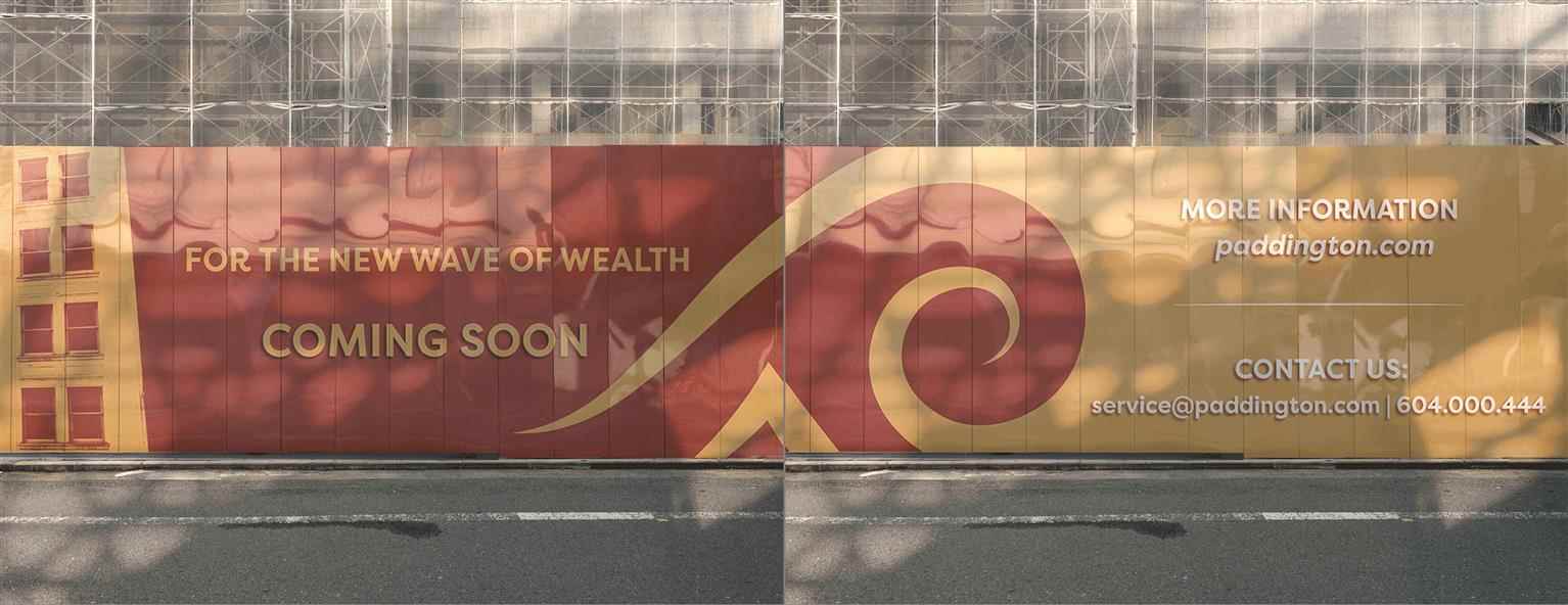
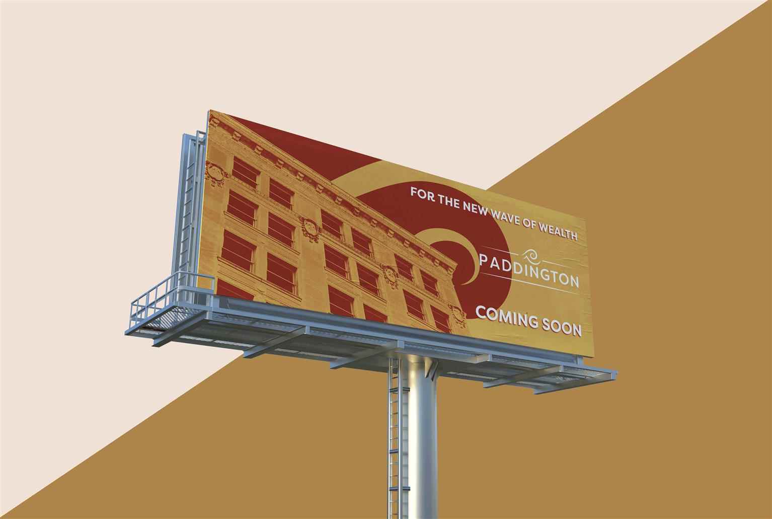
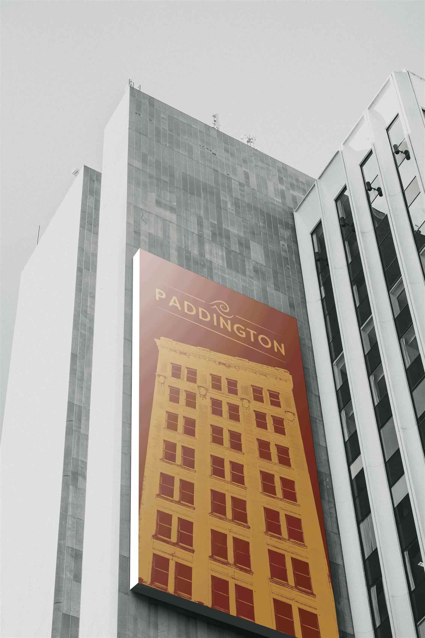
Paddington
The Paddington Building is an advertising-focused, re-brand project. Deliverable elements include brand identity, research of a new target market, Digital and Print advertising, and established media...
The Paddington Building is an advertising-focused, re-brand project. Deliverable elements include brand identity, research of a new target market, Digital and Print advertising, and established media...
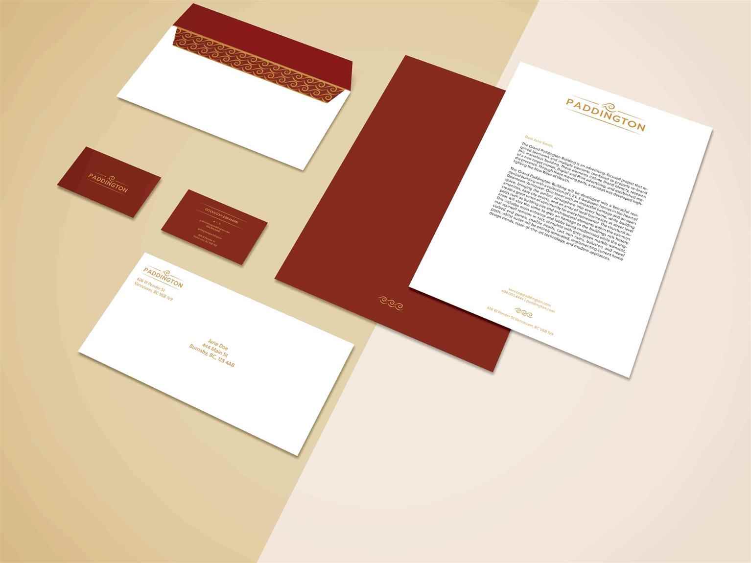
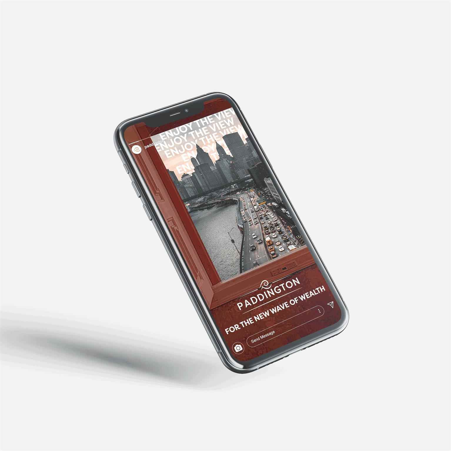
The Paddington Building is an advertising-focused, re-brand project. Deliverable elements include brand identity, research of a new target market, Digital and Print advertising, and established media presence. Through these moving parts, a concept was developed highlighting the New Wave of Wealth. The Paddington will be developed into a beautiful residential building with a collection of 1, 2 and 3-bedroom homes in the heart of Downtown Vancouver. The emphasis in architectural design, accessibility, and community is seen in the re-branded elements. While paying homage to the building’s rich history, the objective is to combine this with a modernized appearance. The use of of the building’s architectural elements provides structure to the logo choice, while the wave pattern and visual represents location. The duotone colour palette includes a rich gold paired with a deep red that resemble velvet and luxury. For high earning individuals, The Paddington is the perfect, growing residential unit that provides a home that reflects them. Unlike other residential units, The Paddington provides this target market with homes that fit their lifestyle in a diverse community. Campaign directed with Golnoush Ebrahimi and Jonah Dominic Flores Photography by Jonah Dominic Flores
Share:
Would you like to get more information or apply?
Click on the button below and we'll get back to you as soon as possible.
Speak To An Advisor
