Kyja
LeslieGraphic Design
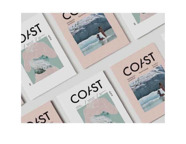
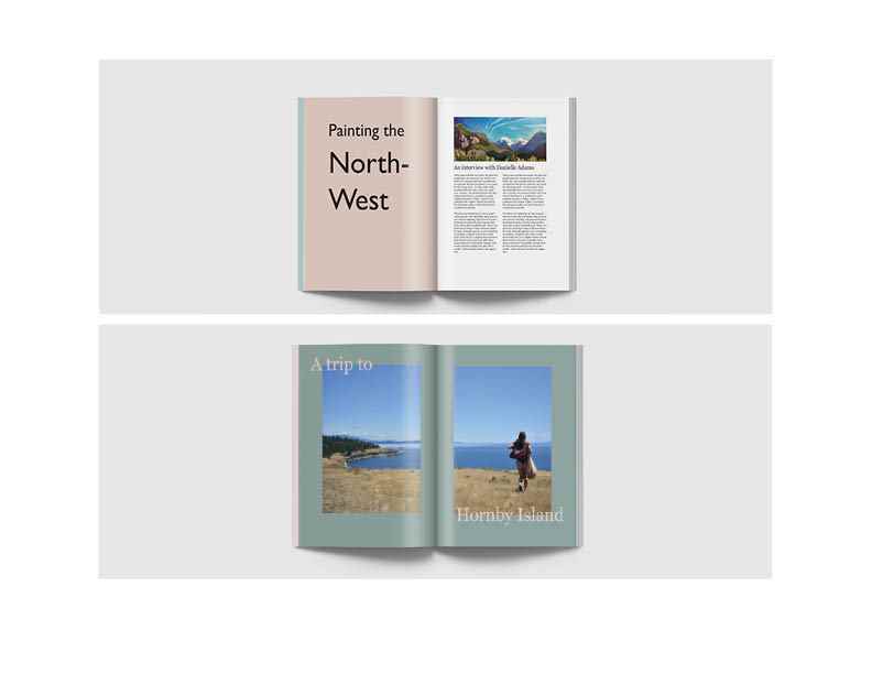
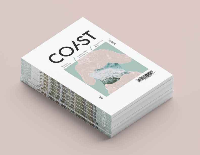
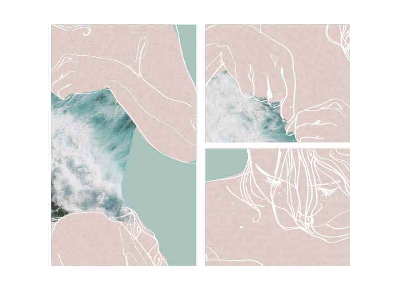
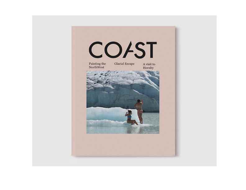
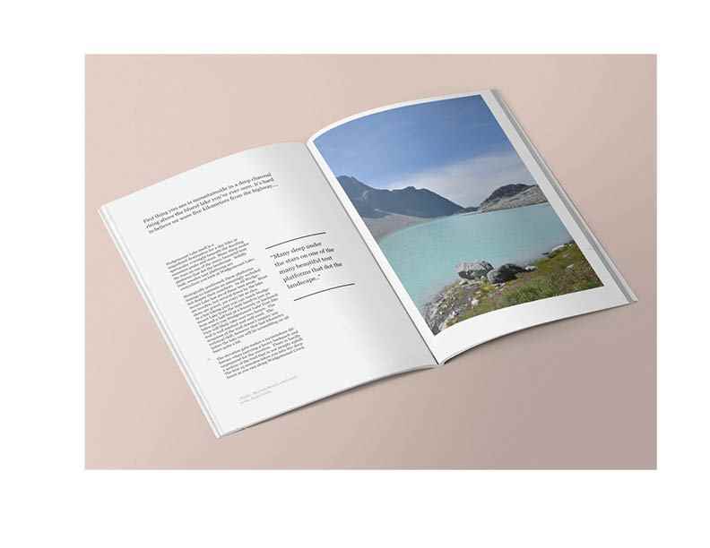
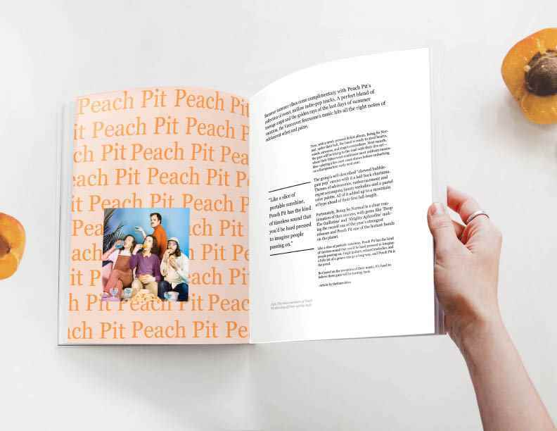
Coast Magazine
Description: Coast is a lifestyle magazine for people who live on the North West coast. The magazine highlights local culture such as music, art, trends, and outdoor living/ adventures. The idea of C...
Description: Coast is a lifestyle magazine for people who live on the North West coast. The magazine highlights local culture such as music, art, trends, and outdoor living/ adventures. The idea of C...
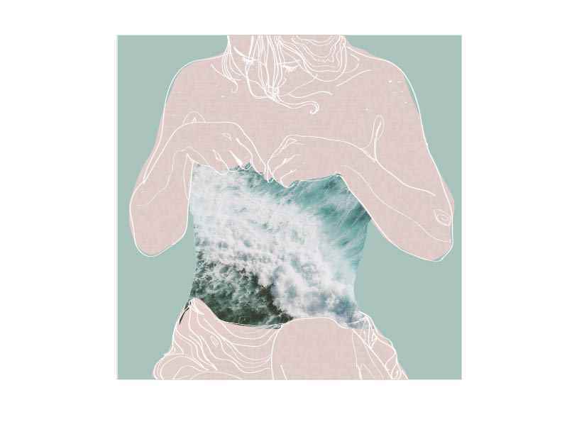
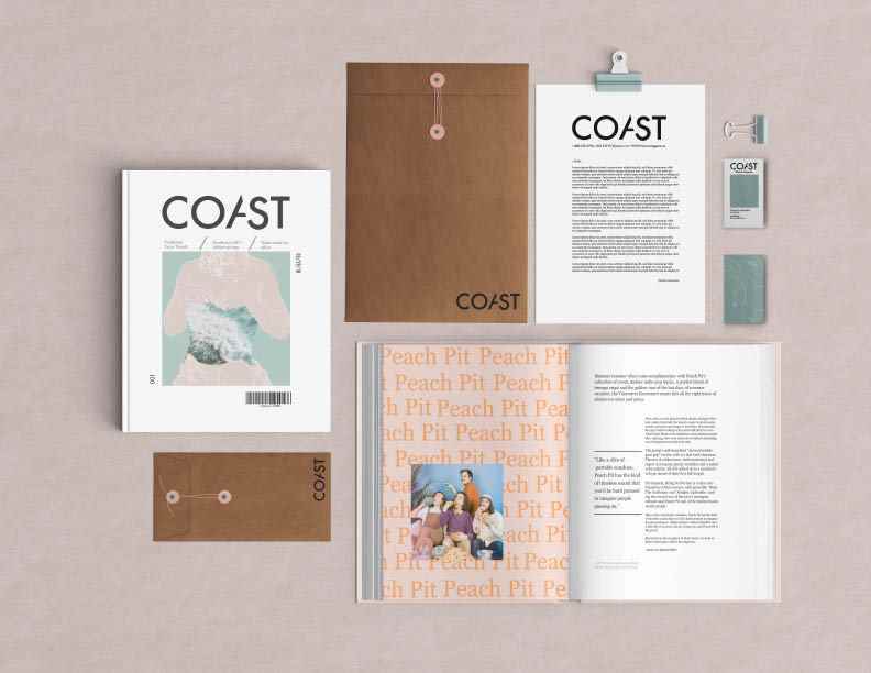
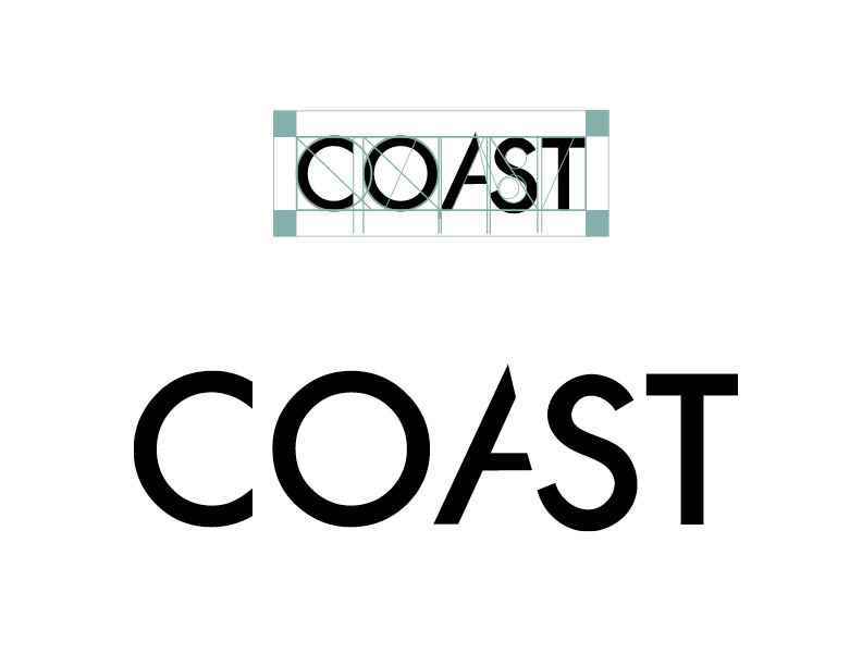
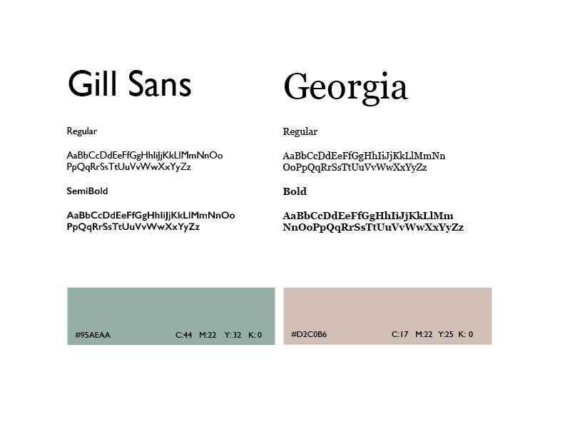
Description: Coast is a lifestyle magazine for people who live on the North West coast. The magazine highlights local culture such as music, art, trends, and outdoor living/ adventures. The idea of Coast is to immerse readers into the spirit of the northwest and provide escapism and inspiration. Target Audience: Coast target audience lives on the north west coast in the Vancouver-Whistler-Seattle area. Generally they are 18-28 looking for fun ways to adventure and find unique things to do in the area. Aiming for a male-female split. Those interested in the magazine will generally be more artistic or outdoorsy people. Competition: Coast main competition comes from other well designed once too four times a year published adventure magazines. Publications such as Hayo can overlap with content and aesthetic of the magazine. Being a local publication Coast’s target audience is much more refined than a worldwide publication such as Hayo. They do however share the same target audience as some smaller more local publications such as Vancouver magazine and MountainLife. These are often targeted at a slightly older audience and do not go as in depth into the outdoor and adventurous lifestyle coast attempts to bring. Design Problem; To create a well designed eye catching magazine that will stand out to adventurous free spirited young adults in the Vancouver market that will make them feel like tourists in their own home. Design Solution: Coast uses an organic design that provides the reader with a feeling of escapism on the north west coast. It’s designed to make readers feel like they’re experiencing where they live for the first time again bringing excitement and adventure without having to travel. Providing readers with an assortment of articles related to Art, Culture, and Adventure to keep it interesting. The colours are taken directly from the west coast with seafoam green being the number one branding colour the palettes flow through the magazine giving it a holistic feeling. A small local magazine that provides a big escape from everyday life.
Share:
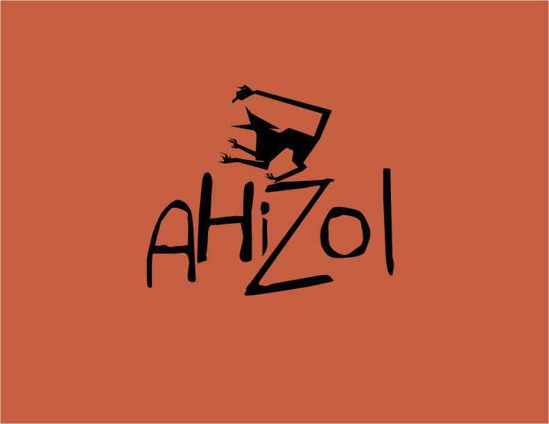
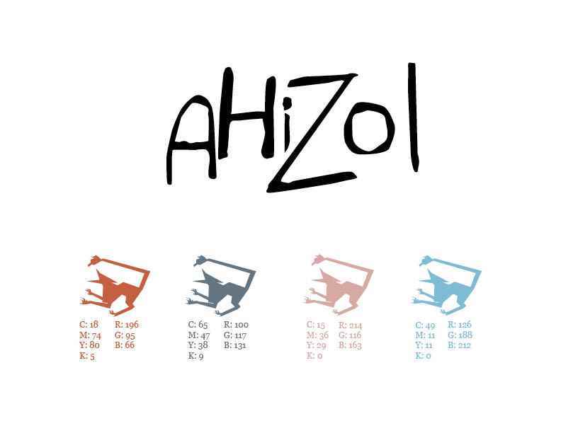
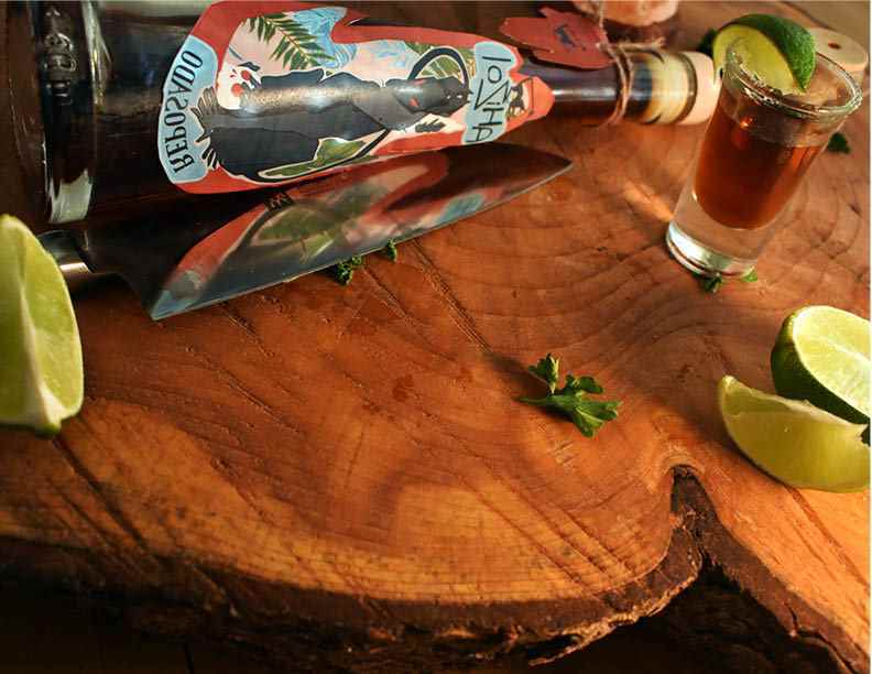
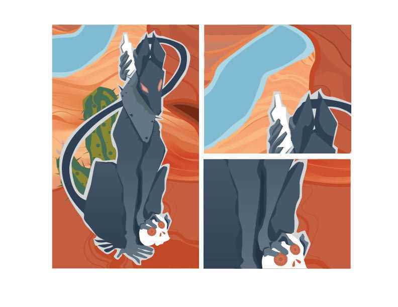
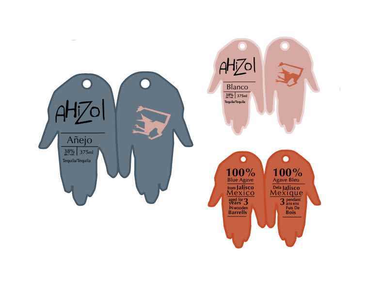
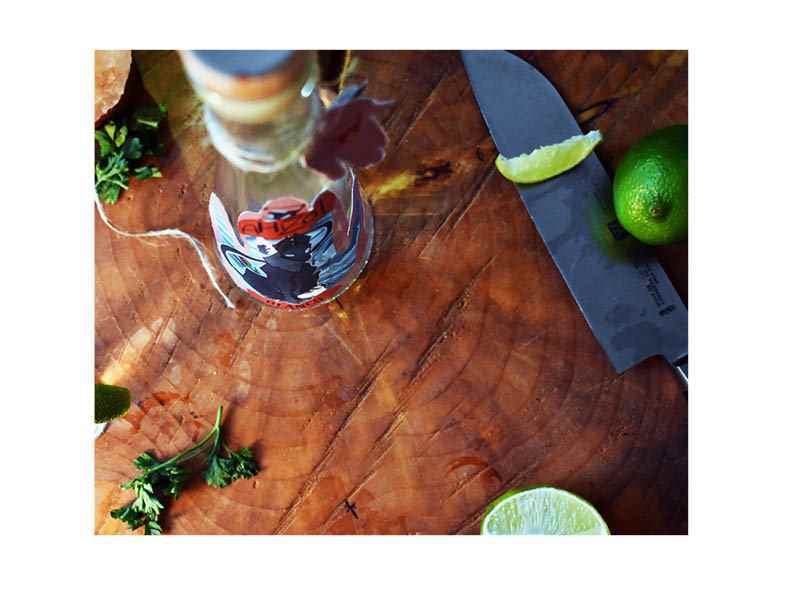
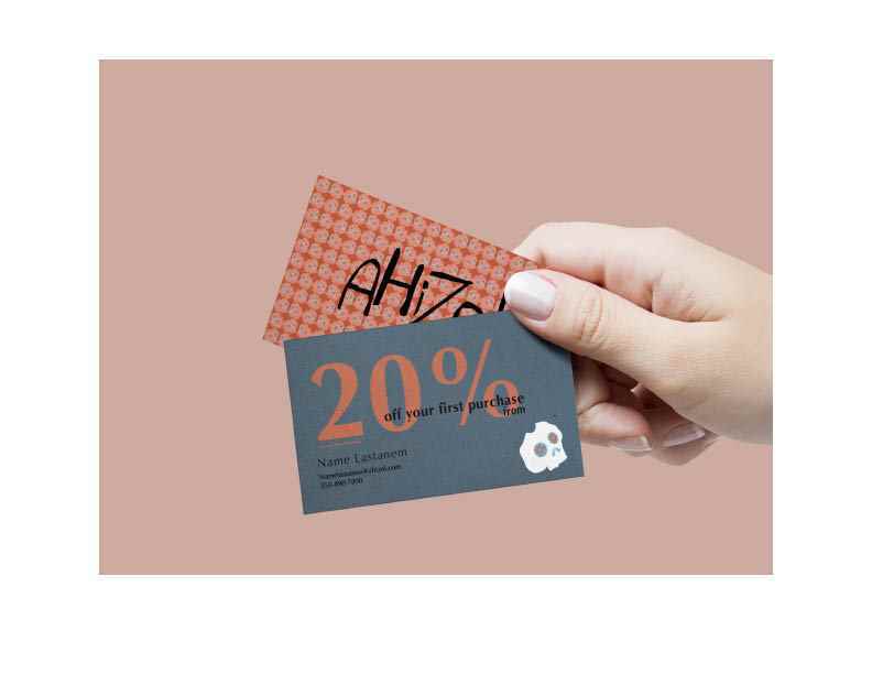
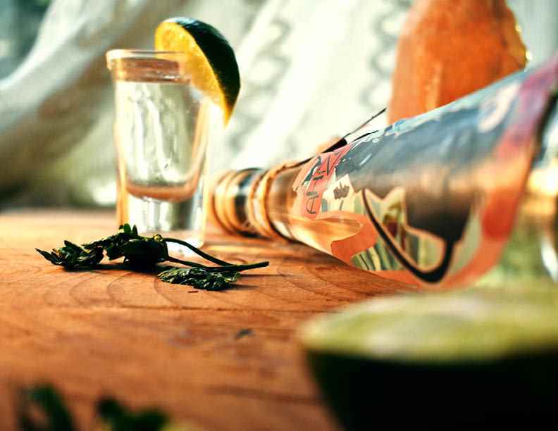
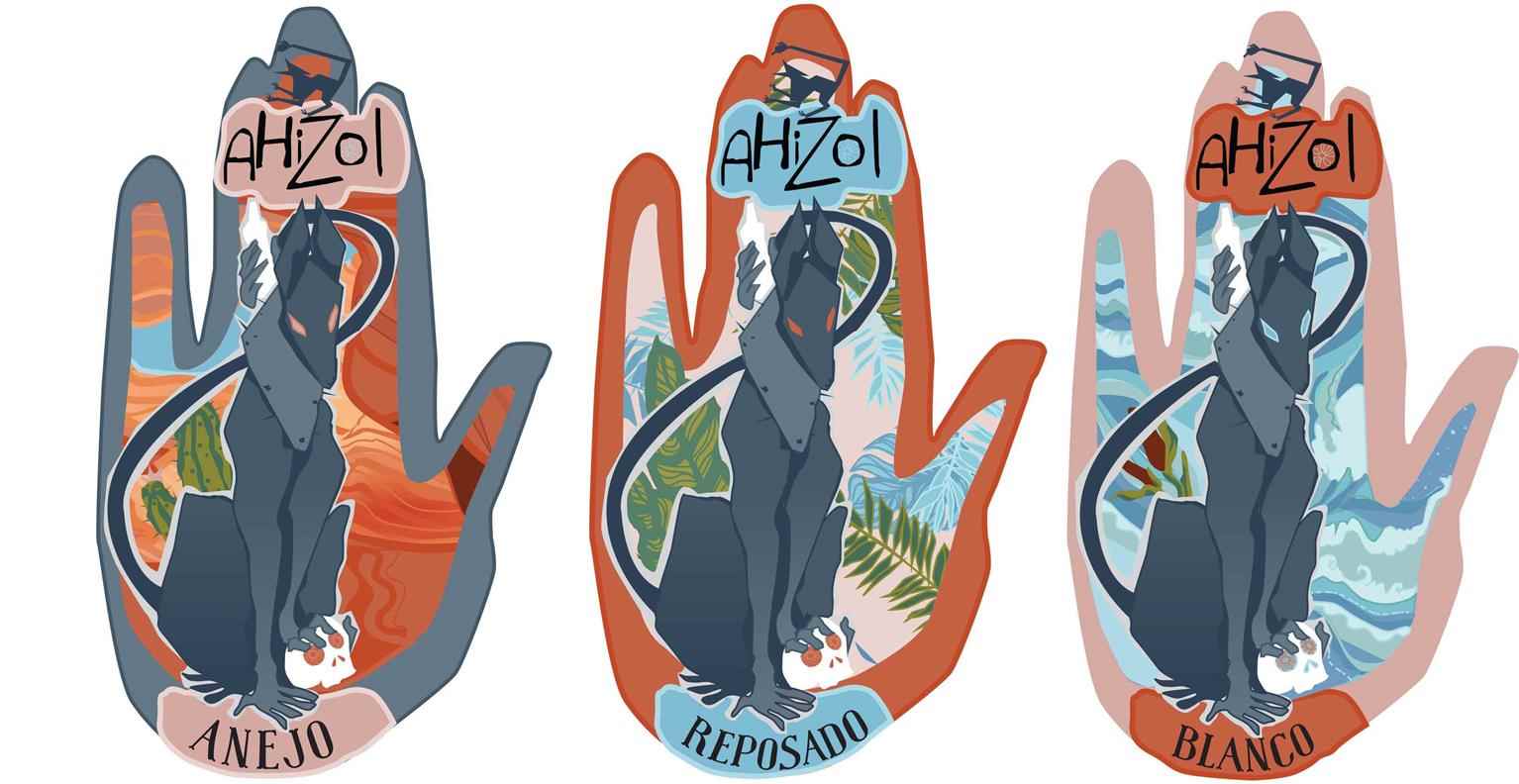
Ahizol Tequila
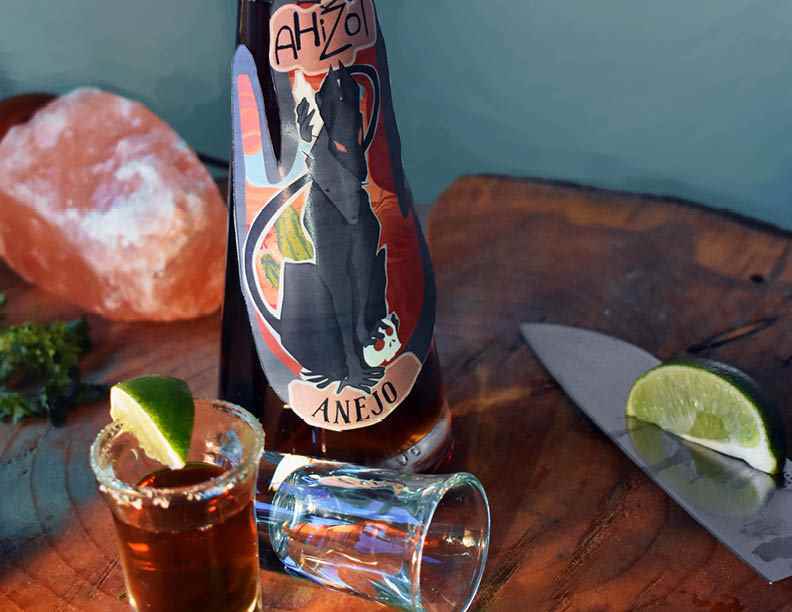
Description: A Tequila brand based off of mexican folklore Ahizol sells three types of premium tequila. Reposado, Blanco, and Anejo. The purpose of the project is to brand and package the product b...
Description: A Tequila brand based off of mexican folklore Ahizol sells three types of premium tequila. Reposado, Blanco, and Anejo. The purpose of the project is to brand and package the product b...
Description: A Tequila brand based off of mexican folklore Ahizol sells three types of premium tequila. Reposado, Blanco, and Anejo. The purpose of the project is to brand and package the product based of the folk legend of the Ahizotle. To create a fun vibrant package will draw attention to the bottle and make people want to learn more. Target Audience: Young adults looking for a drink for a night out and socializing. Competition: Other alcohol brands such as Kraken Rum. Though it’s not tequila Kraken rum uses a creature of folklore to advertise their product with a story and mystery. Because Hazel’s brand story is similar it will be competing with Kraken in many areas of marketing. Ahizol is a lot more colourful and brighter than Kraken and uses a much more modern illustration style. In terms of tequila Ahizols greatest competition is Don Julio. Being the number one bough tequila brand in the states makes it tough direct competition for Ahizol. Design problem: Finding a fun creative design that stands out and tells a story of the brand while still being functional. Design solution: Using the Ahizoltle monster that the brand bases its story off, Ahizol branding features the creature on it’s labels stylized with bright bold colours chosen from mexican street murals. The creature is displayed front and center in the middle of a palm shaped label to draw interest and raise questions as to what it is. This should help bring up web traffic as the name is a carefully chosen misspelling so you must go to the brand site to know which creature they are using. The hand shaped label is unique and relates back to the anatomy of the creature. Each label is presented with different colours and backgrounds for clear visual separation of the types of tequila.
Share:
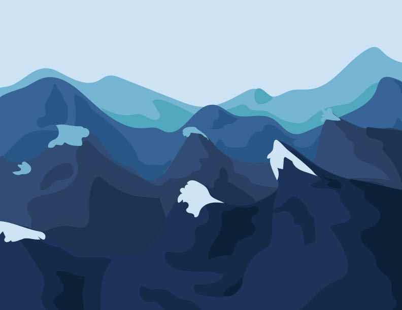
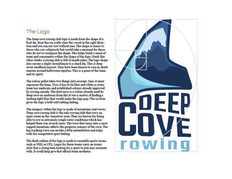
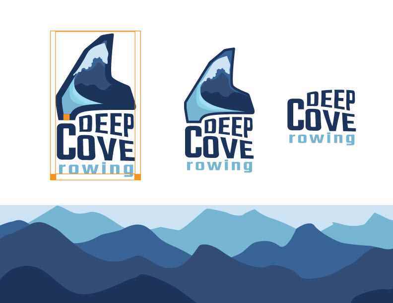
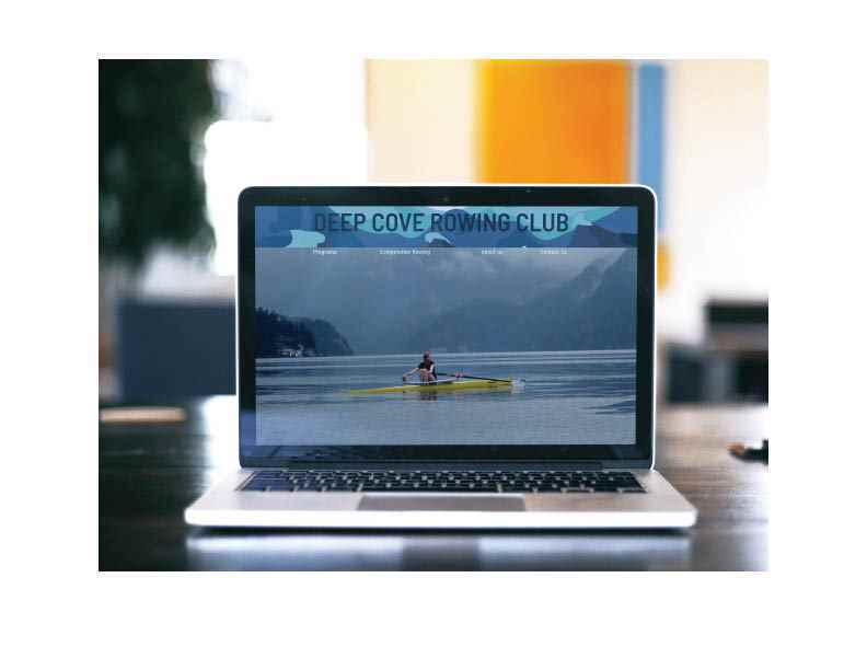
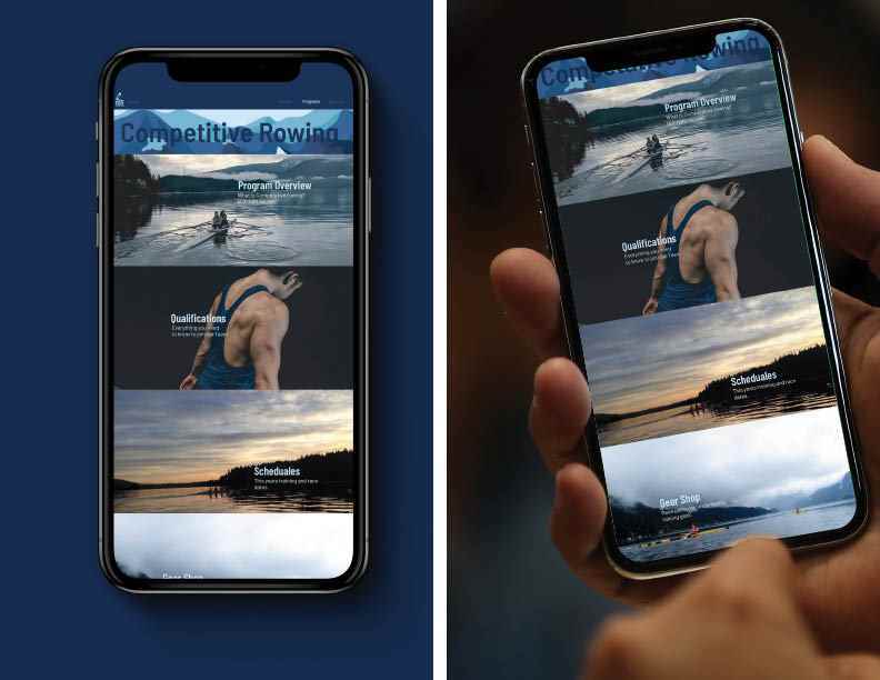
Deep Cove Rowing Rebrand
Description: Deep cove rowing club is a small rowing club located in deep cove on the north shore of vancouver. It offers multiple programs to people of all ages. After completing a market study for...
Description: Deep cove rowing club is a small rowing club located in deep cove on the north shore of vancouver. It offers multiple programs to people of all ages. After completing a market study for...
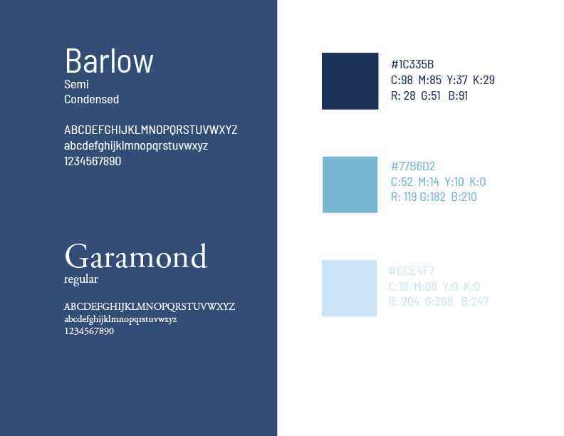
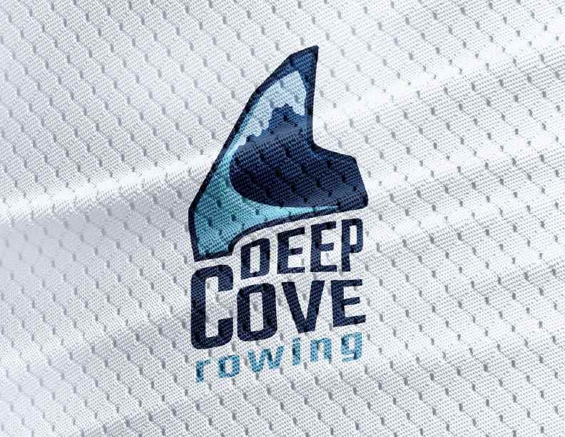
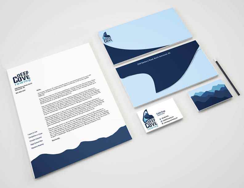
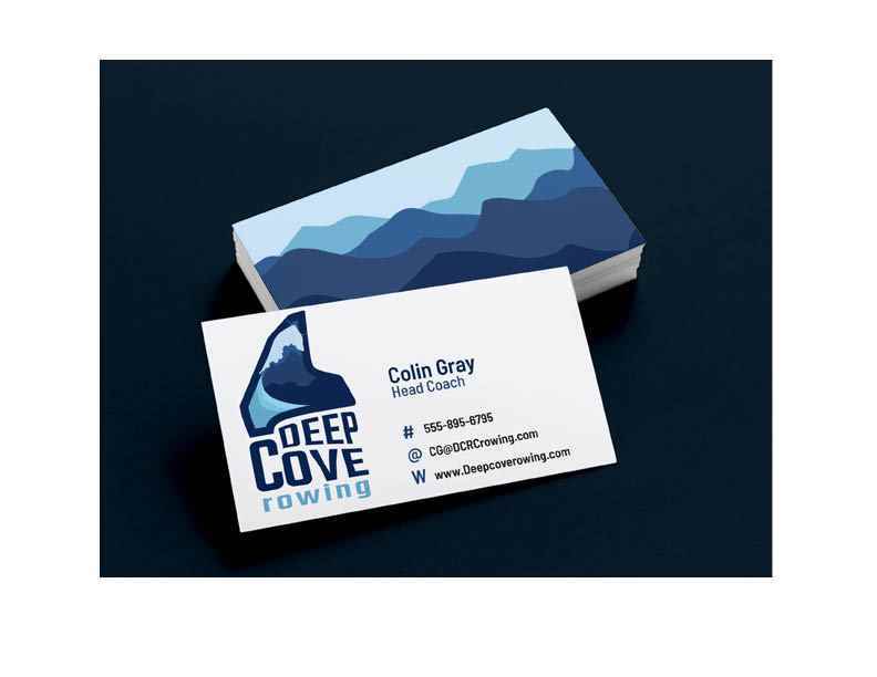
Description: Deep cove rowing club is a small rowing club located in deep cove on the north shore of vancouver. It offers multiple programs to people of all ages. After completing a market study for the club it became apparent that the biggest audience was high school competitive rowers. With this information in mind a rebrand was done. Target Audience; Young competitive rowers looking to get a scholarship to university. Competitive rowing is not an easy task and involves being up early and in very bad weather conditions. This is not something that would usually appeal to a highschool student unless they are driven, motivated, hard workers. Or if they have parents who rowed. Design Problem; Taking DCRC style, landscape,and team spirit and combining into a new brand identity that will resonate with their main target audience. Design Solution: Putting together the brand identity was tricky due to it being both a competitive sport for teens and a popular after school sport/fun sport for older folks. Finding a delicate balance between action sports logo and scenic nice logo presented itself as a great challenge. The logo was built out of shapes from the boat fins, the landscape of deep cove, and an icy high colour contrast palette. The website is meant to show the primary use of finding where the club is and/or contacting the club. The rest of the site is super simple and easy to find all information for busy parents looking for information for their kids. The overall aesthetic is sporty with thick outlines and bold colours for a fun and exciting look.
Share:
Would you like to get more information or apply?
Click on the button below and we'll get back to you as soon as possible.
Speak To An Advisor
