Taha
MasoodGraphic Design
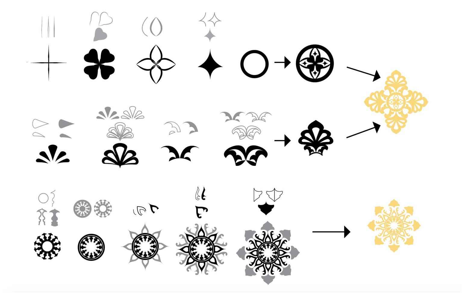
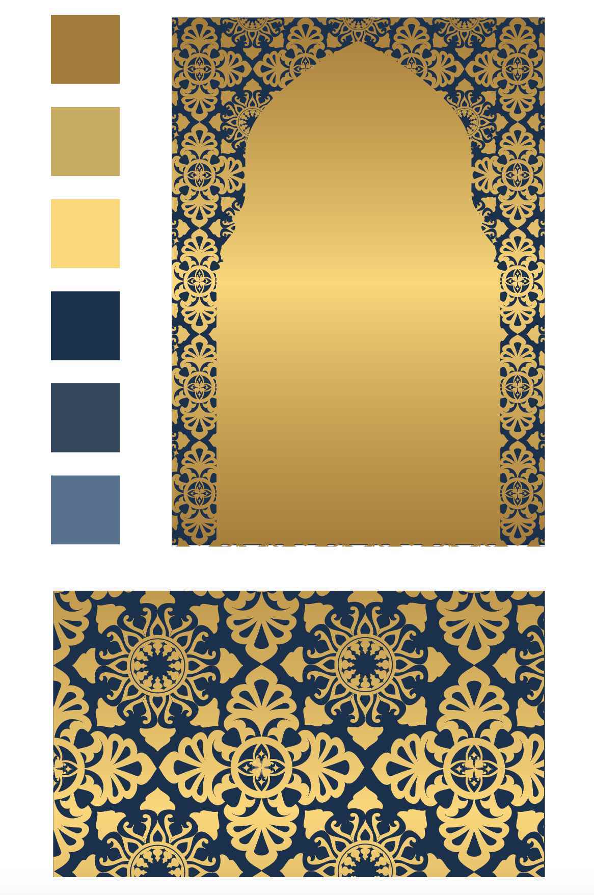
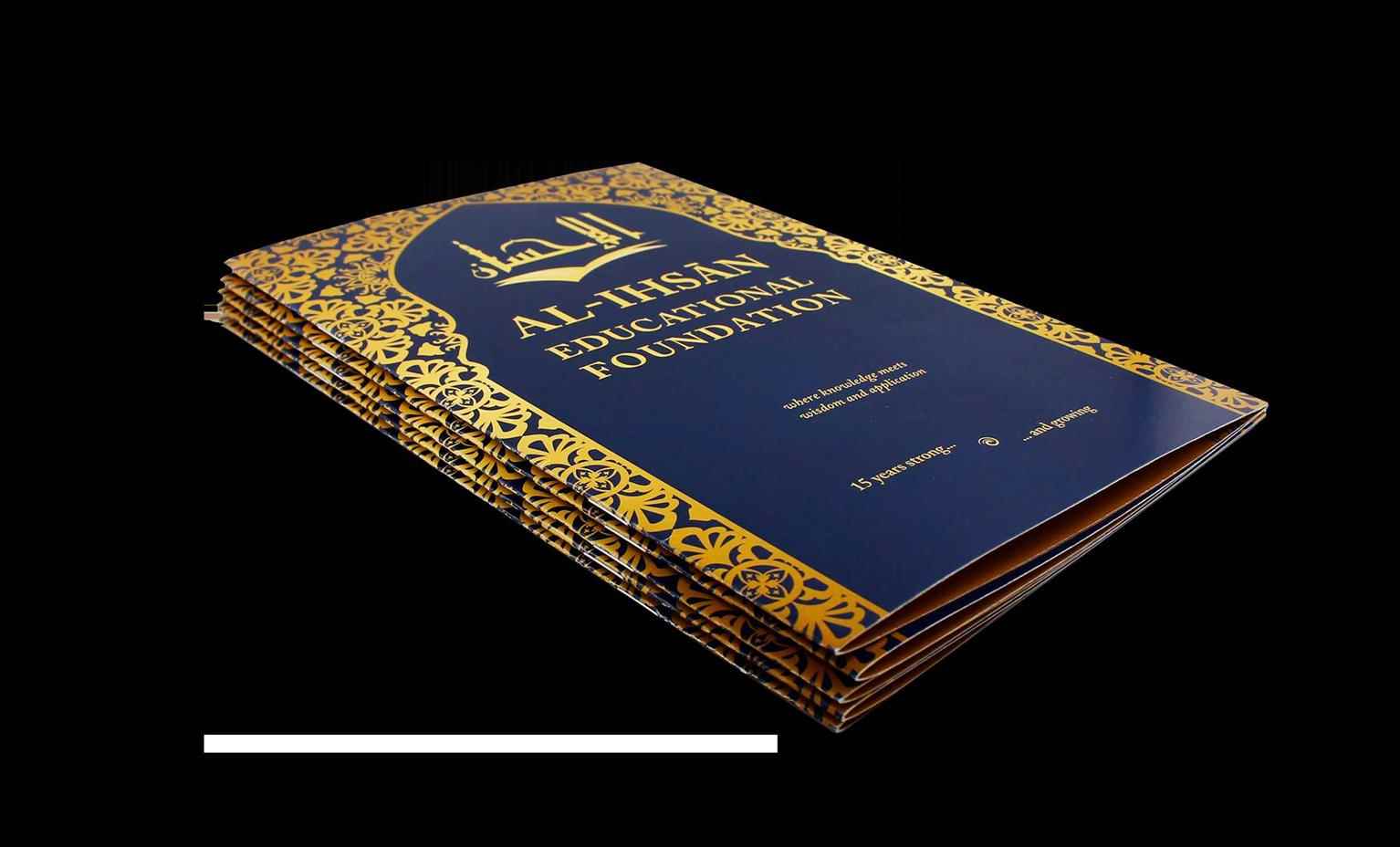
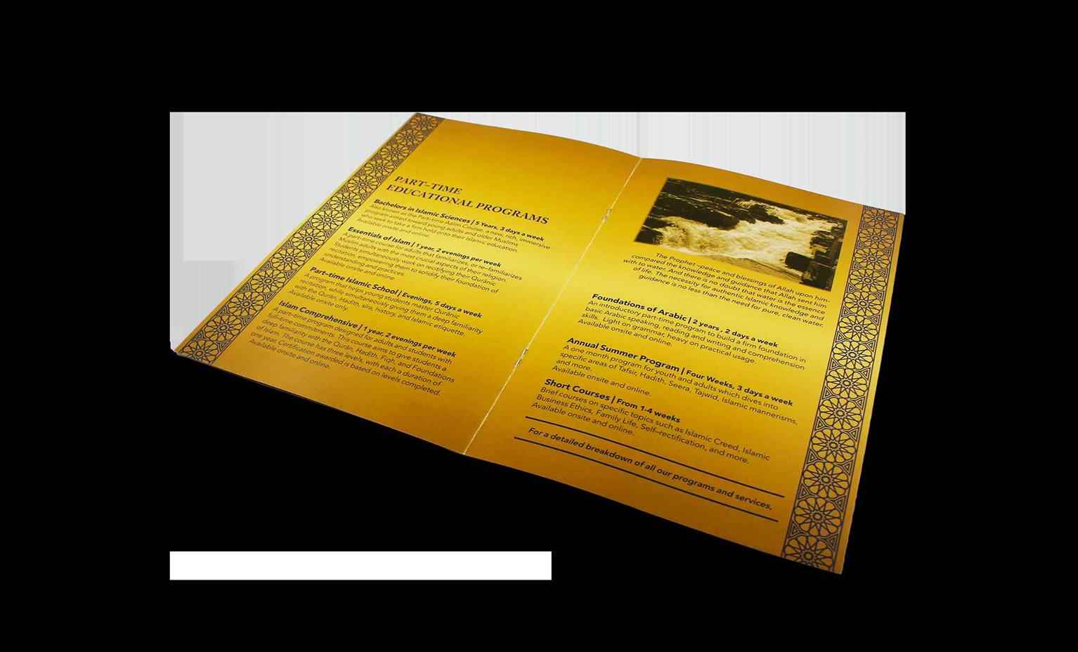
Al–Ihsan Branding
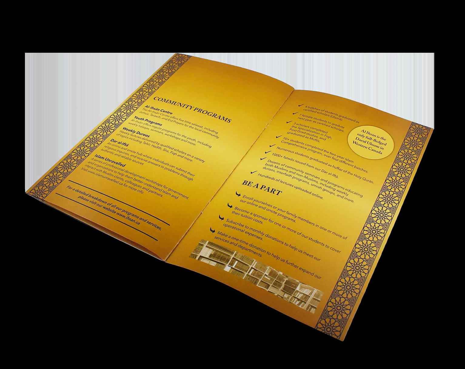
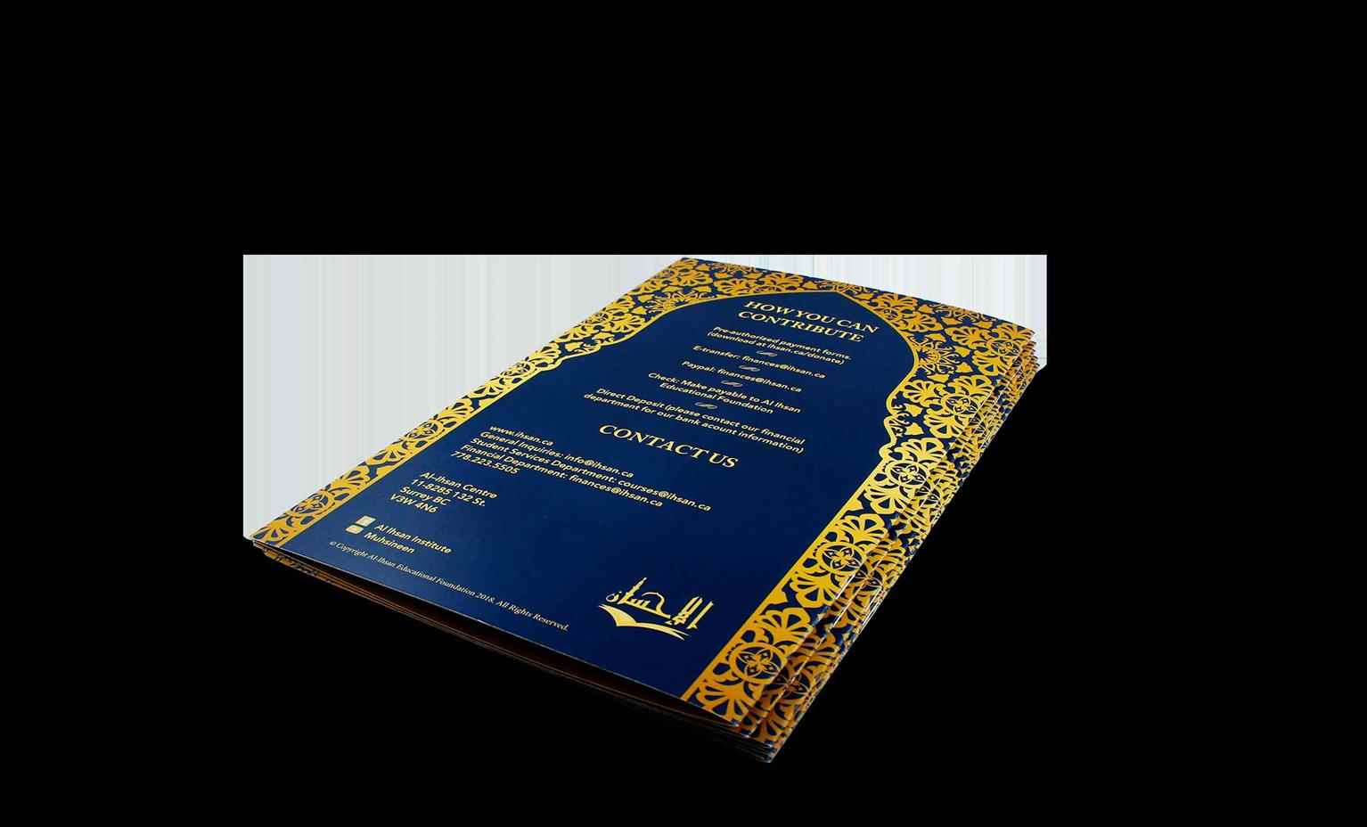
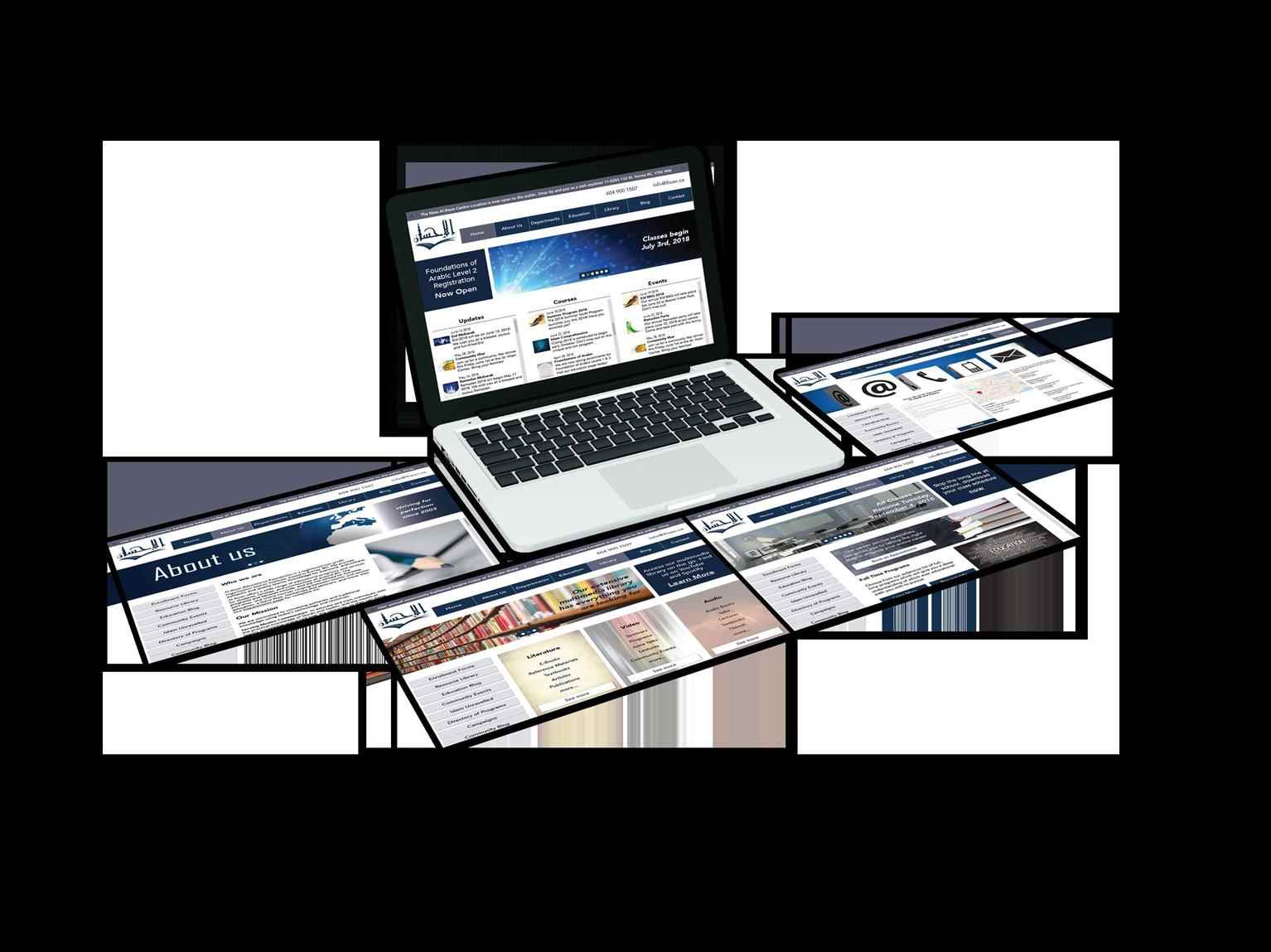
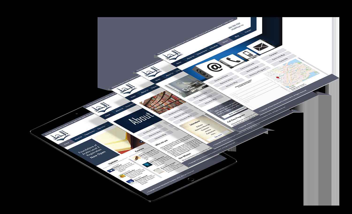
Al Ihsan Educational Foundation is a non-profit organization in Surrey, BC, which offers educational programs and community programs for the community. The institute underwent a major overhaul in 201...
Al Ihsan Educational Foundation is a non-profit organization in Surrey, BC, which offers educational programs and community programs for the community. The institute underwent a major overhaul in 201...
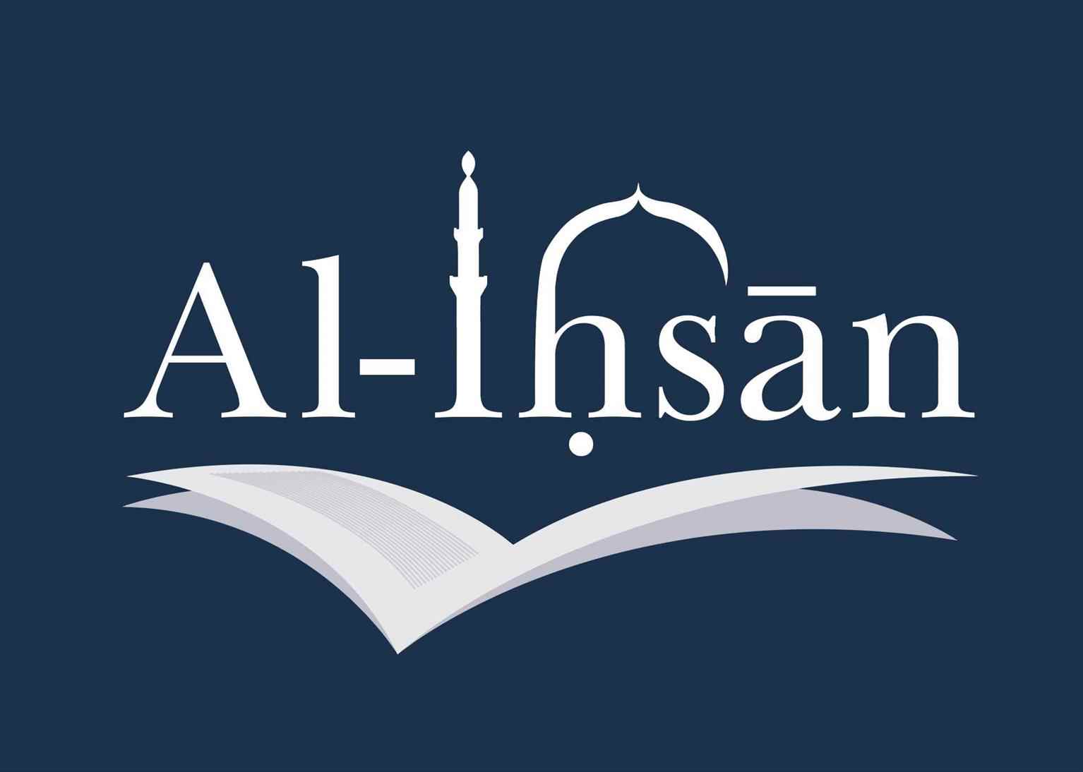
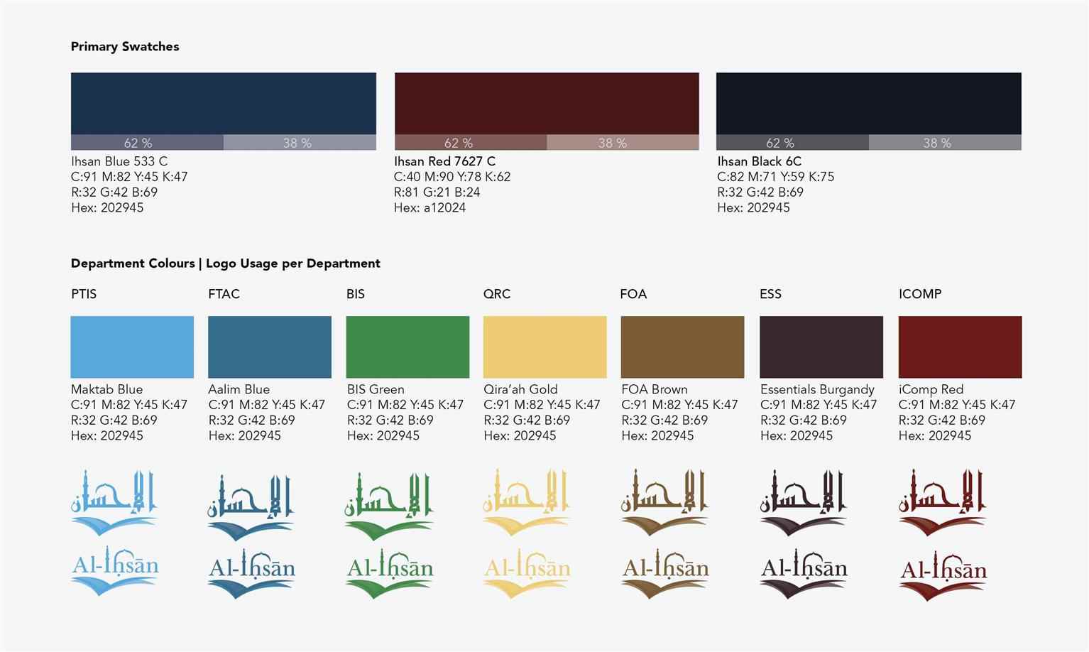
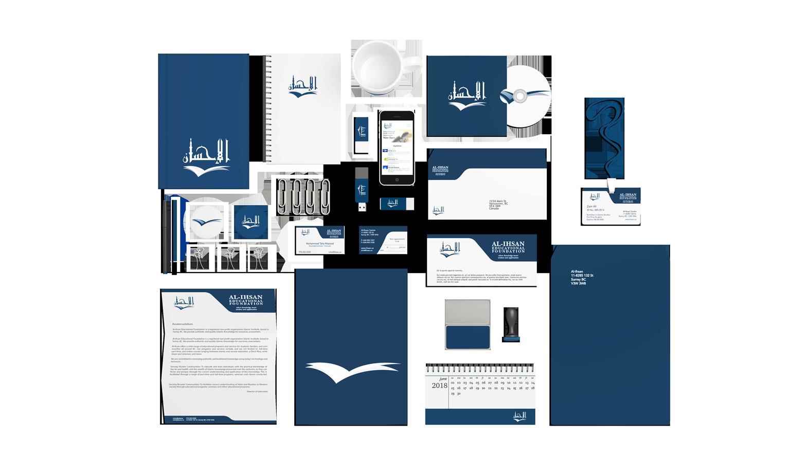
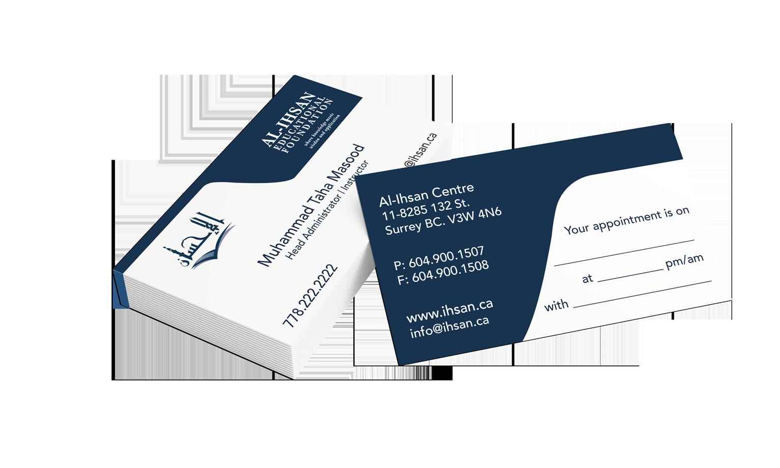
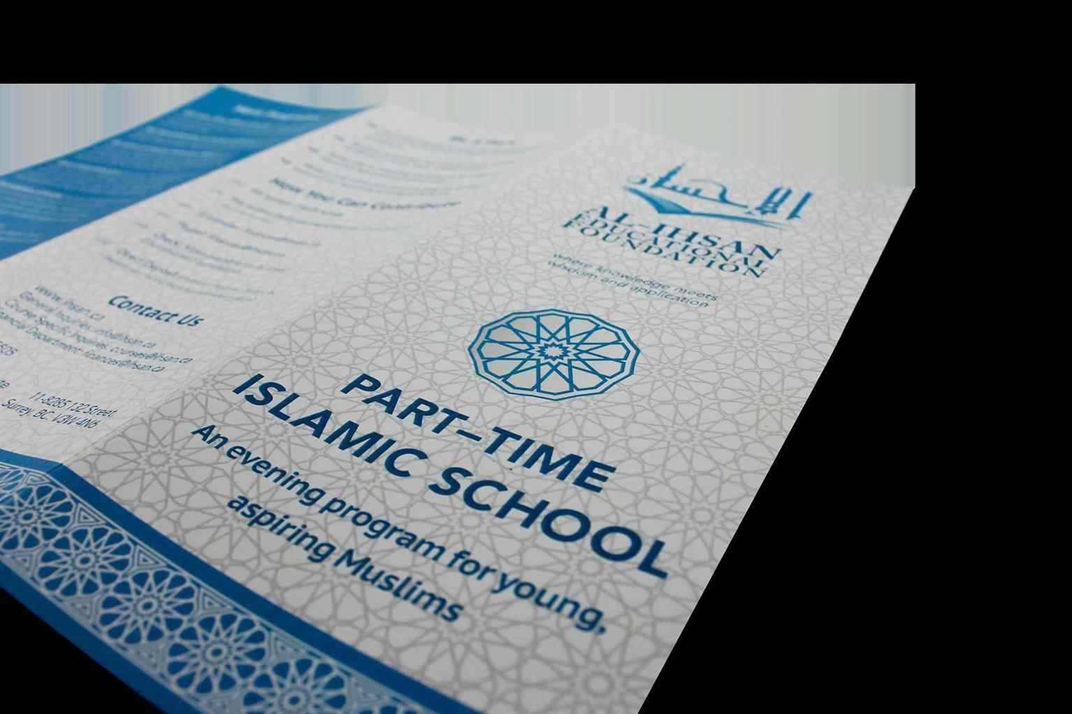
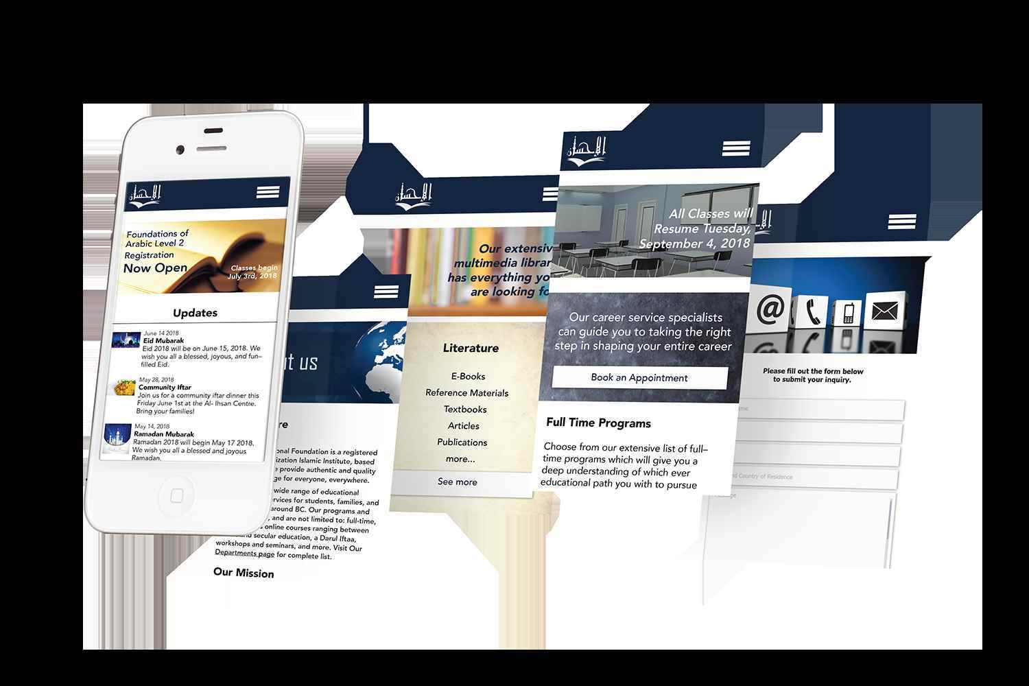
Al Ihsan Educational Foundation is a non-profit organization in Surrey, BC, which offers educational programs and community programs for the community. The institute underwent a major overhaul in 2018, which required a number of design jobs. The work consisted of creating a new branding and identity system including collateral materials, web design, UI design, creative marketing materials, and new designs for their publications. A theme of blue was used throughout the rebranding to conform with the subject of education, indicating productivity and trust.The new logo design is more representative of education and religion, the two main components of the institute. The illustration of the book in the logo may also be interpreted as a check mark, indicating perfection, the literal English translation of Al–Ihsan.


Share:
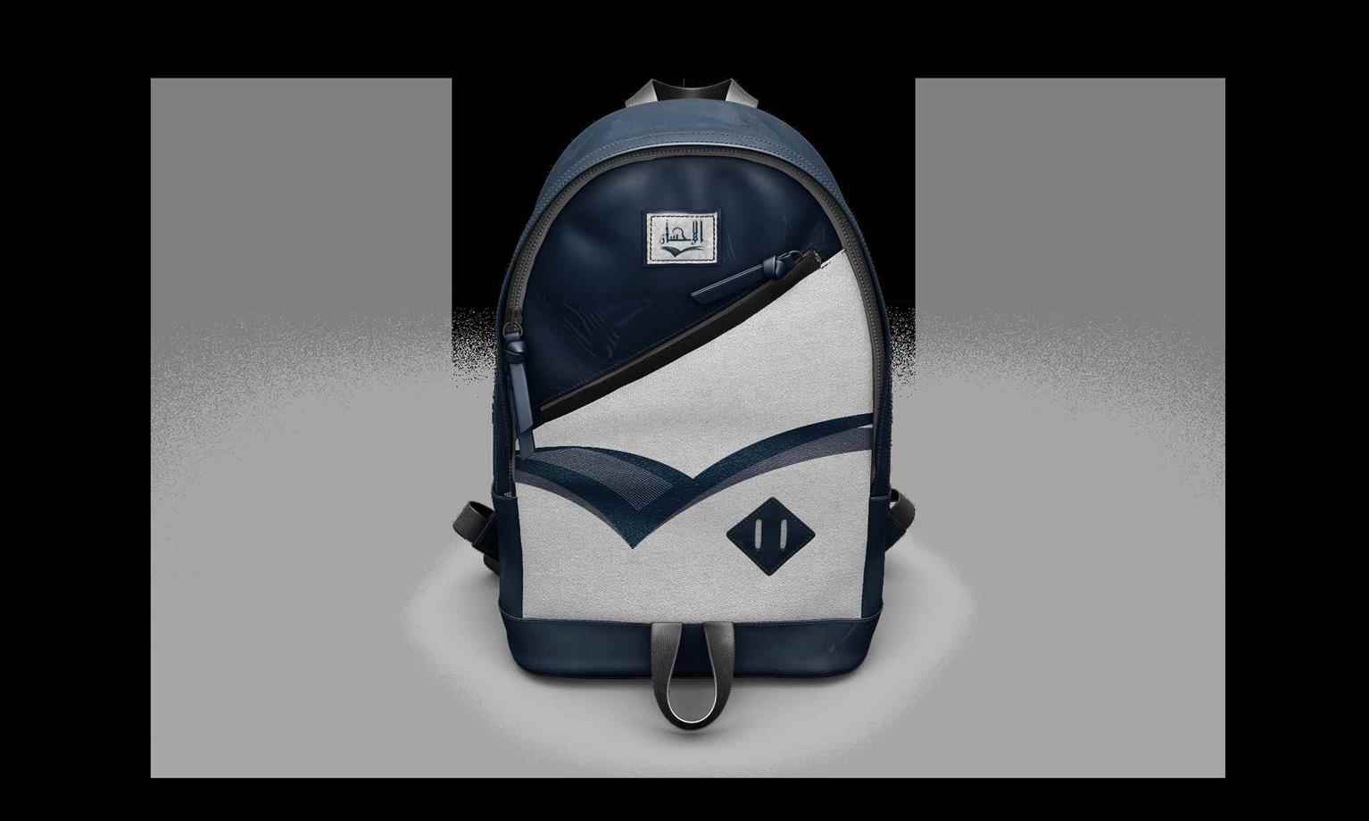
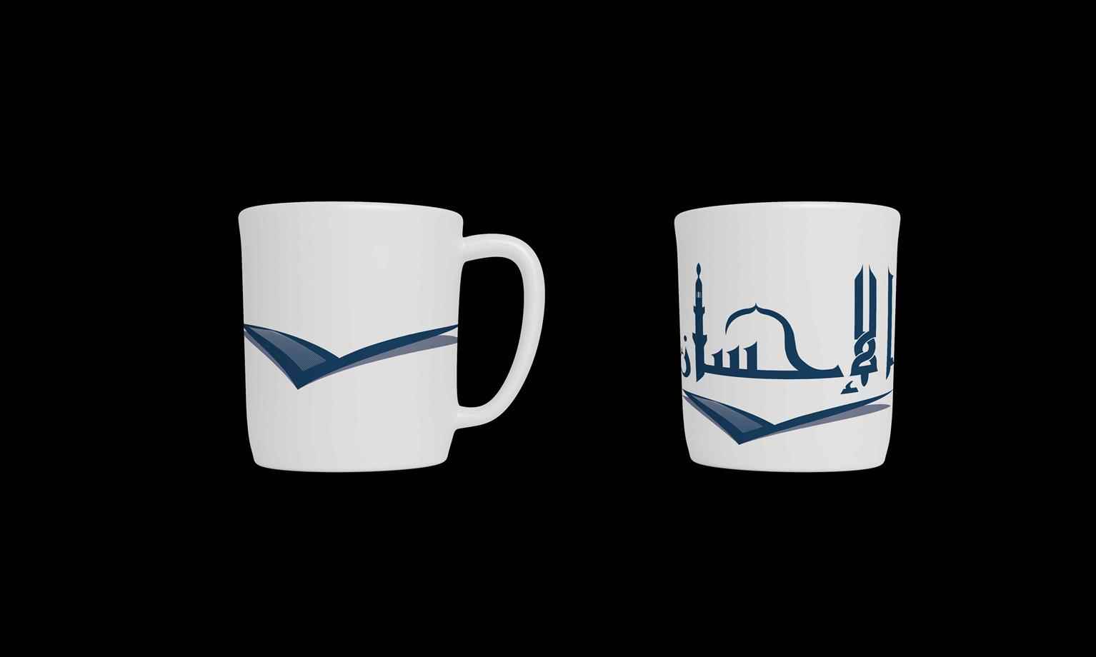
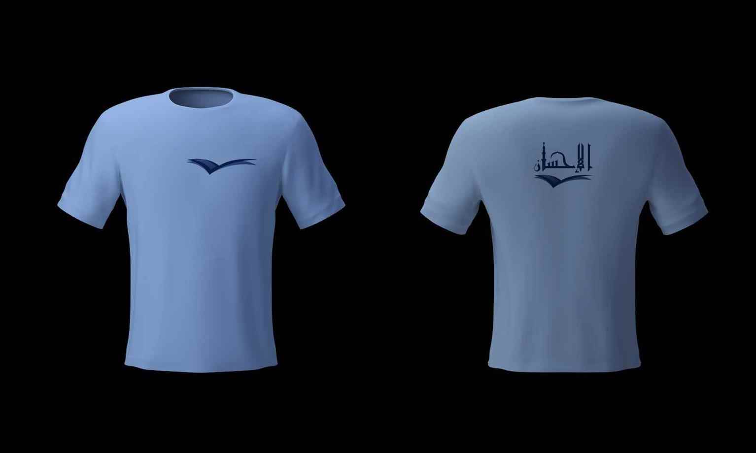
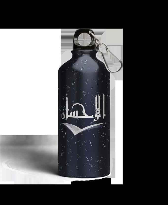
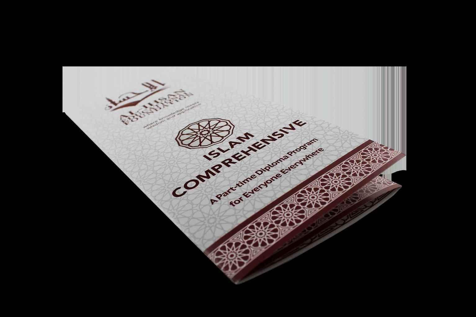
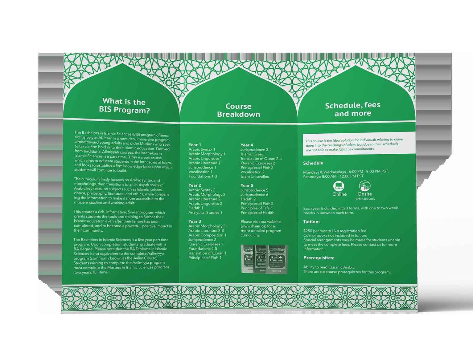
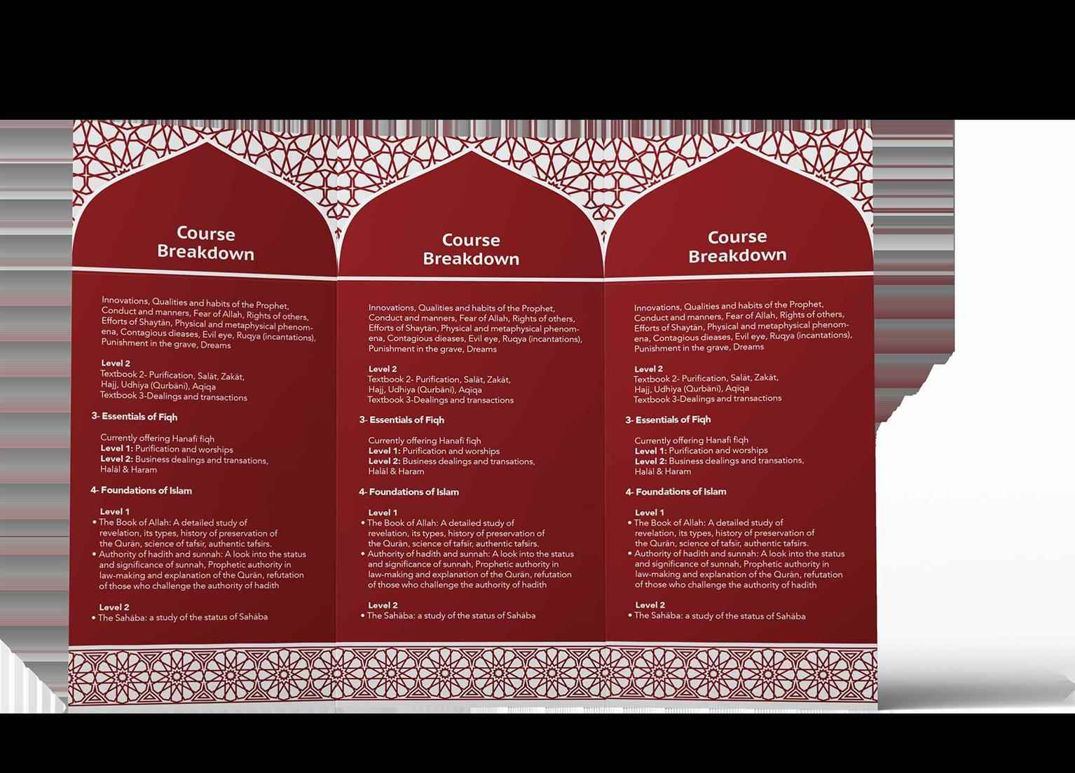
Al–Ihsan Marketing Materials
A student of Graphic Design at VCAD. Explore the projects of VCAD's talented alumni from below and get a first-hand look at their original work.
Share:
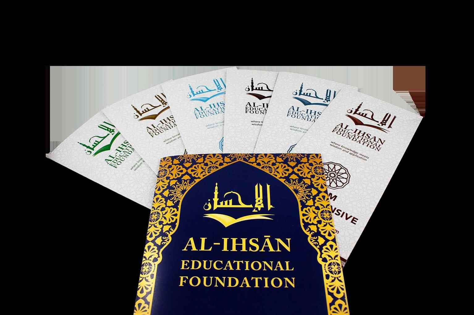
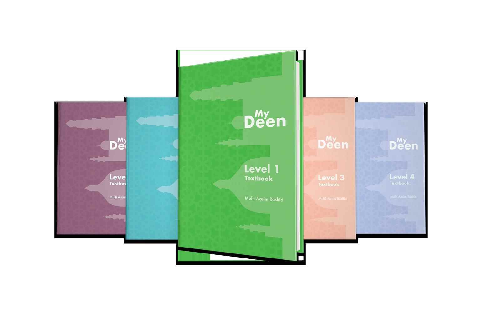
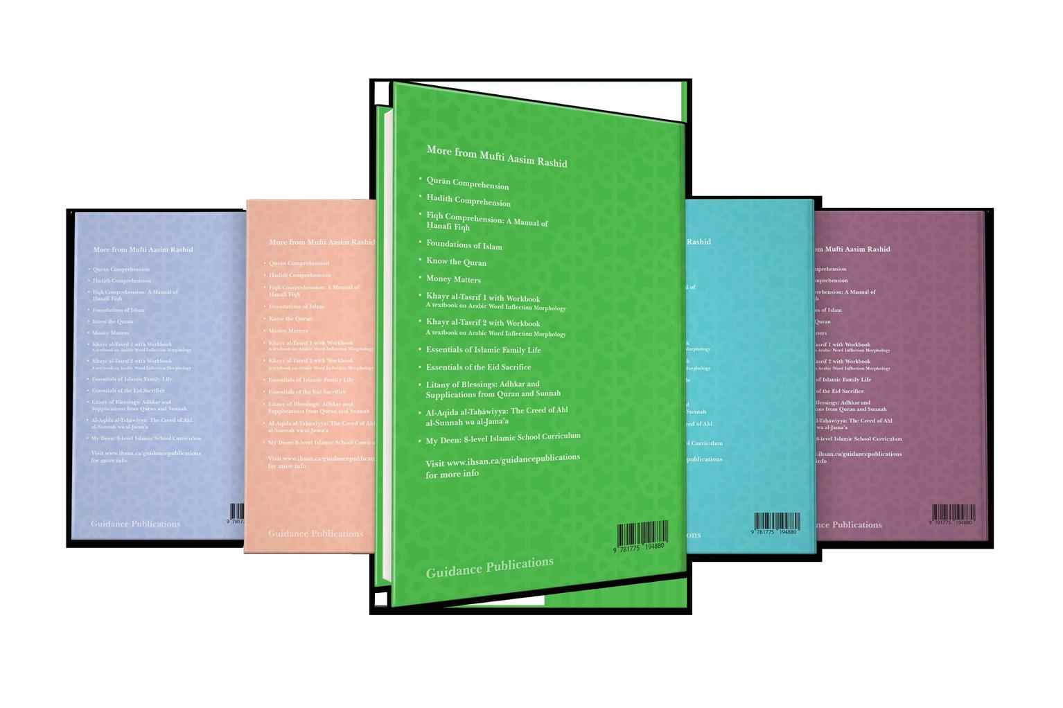
Al–Ihsan Publications
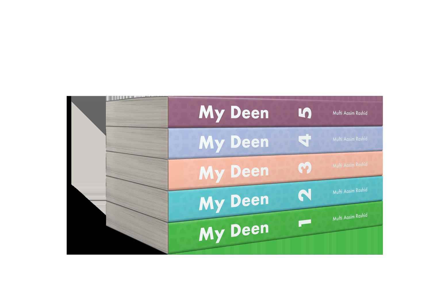
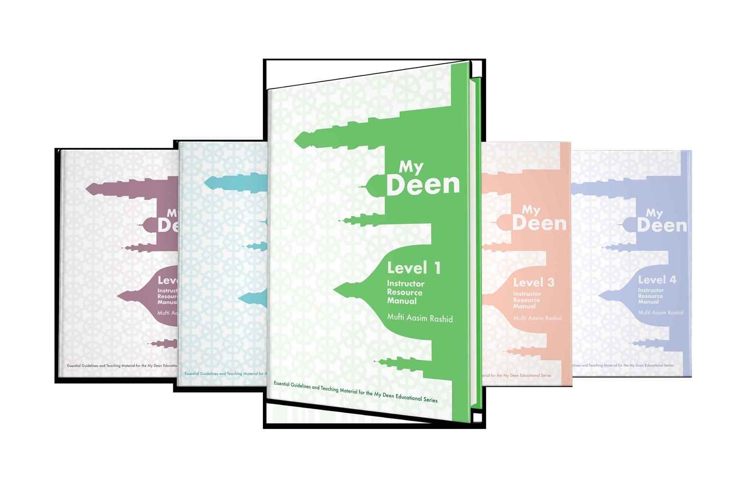
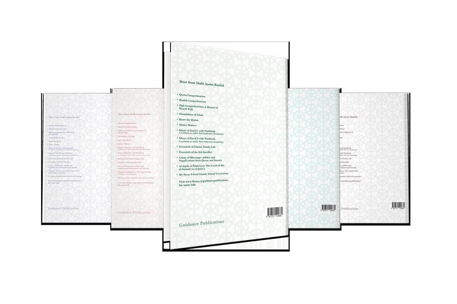
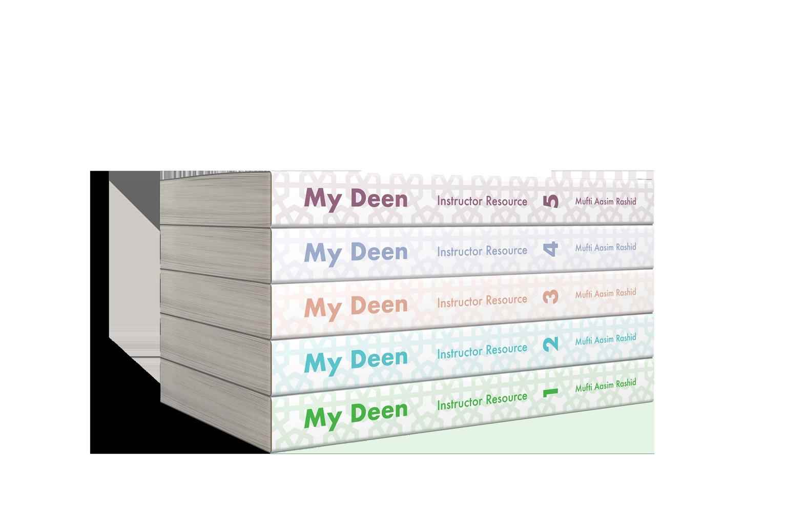
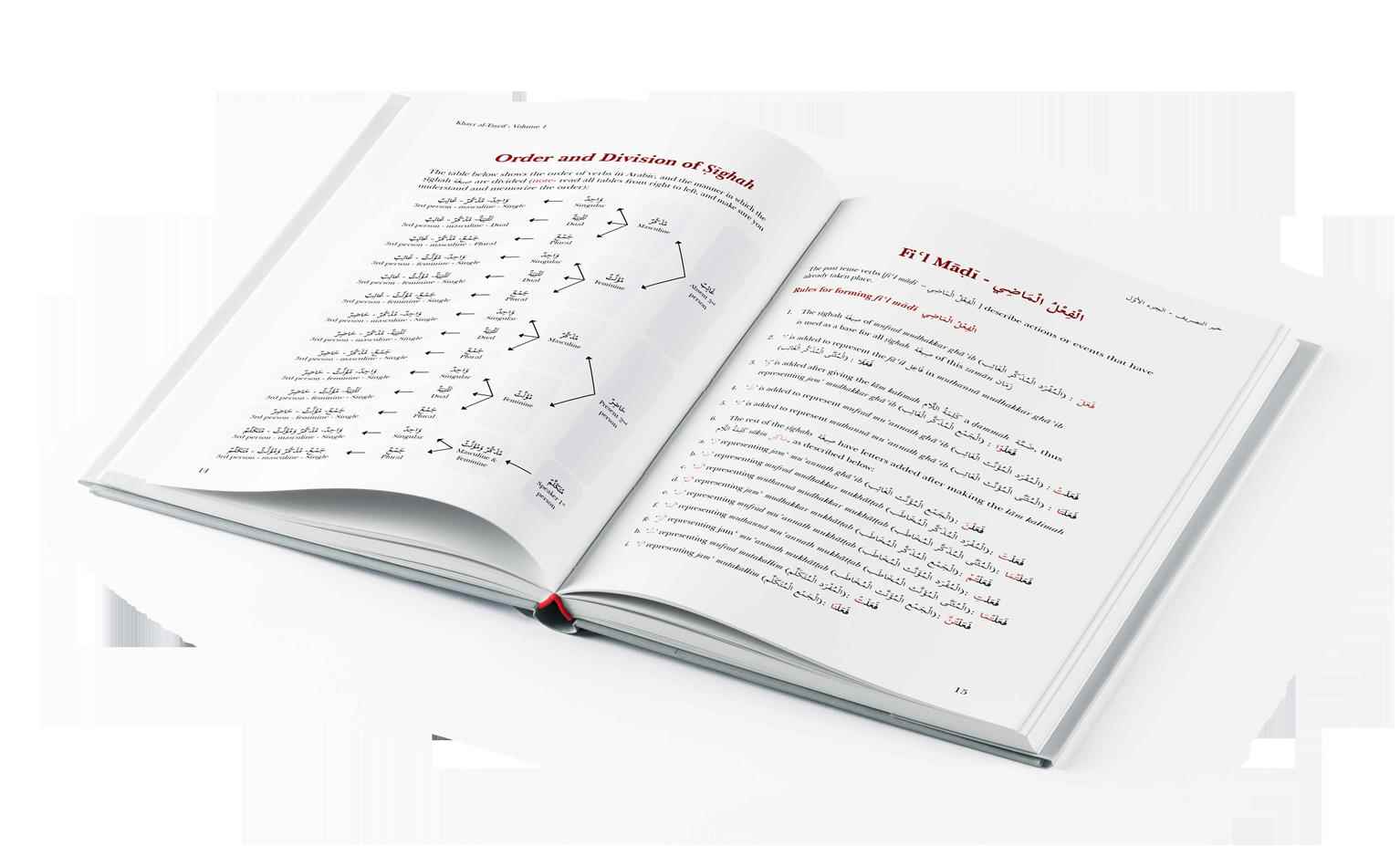
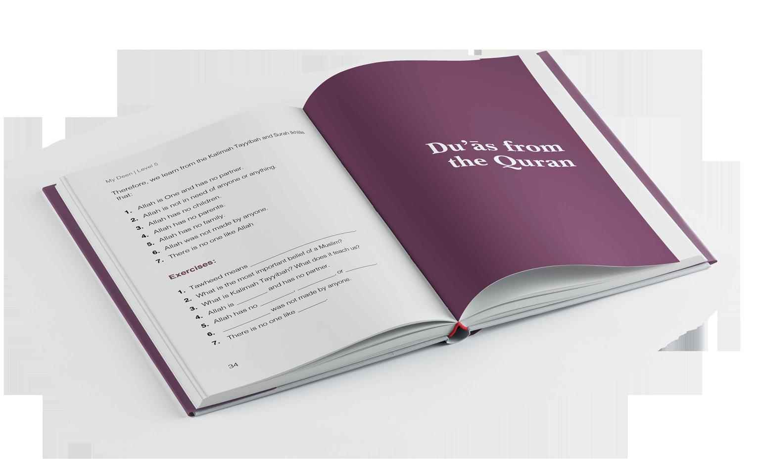
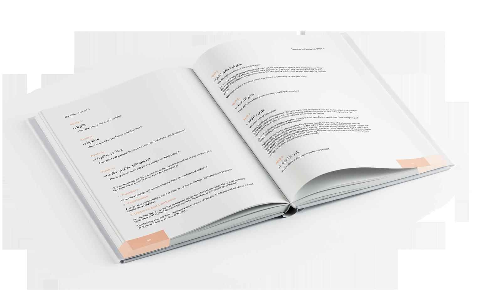
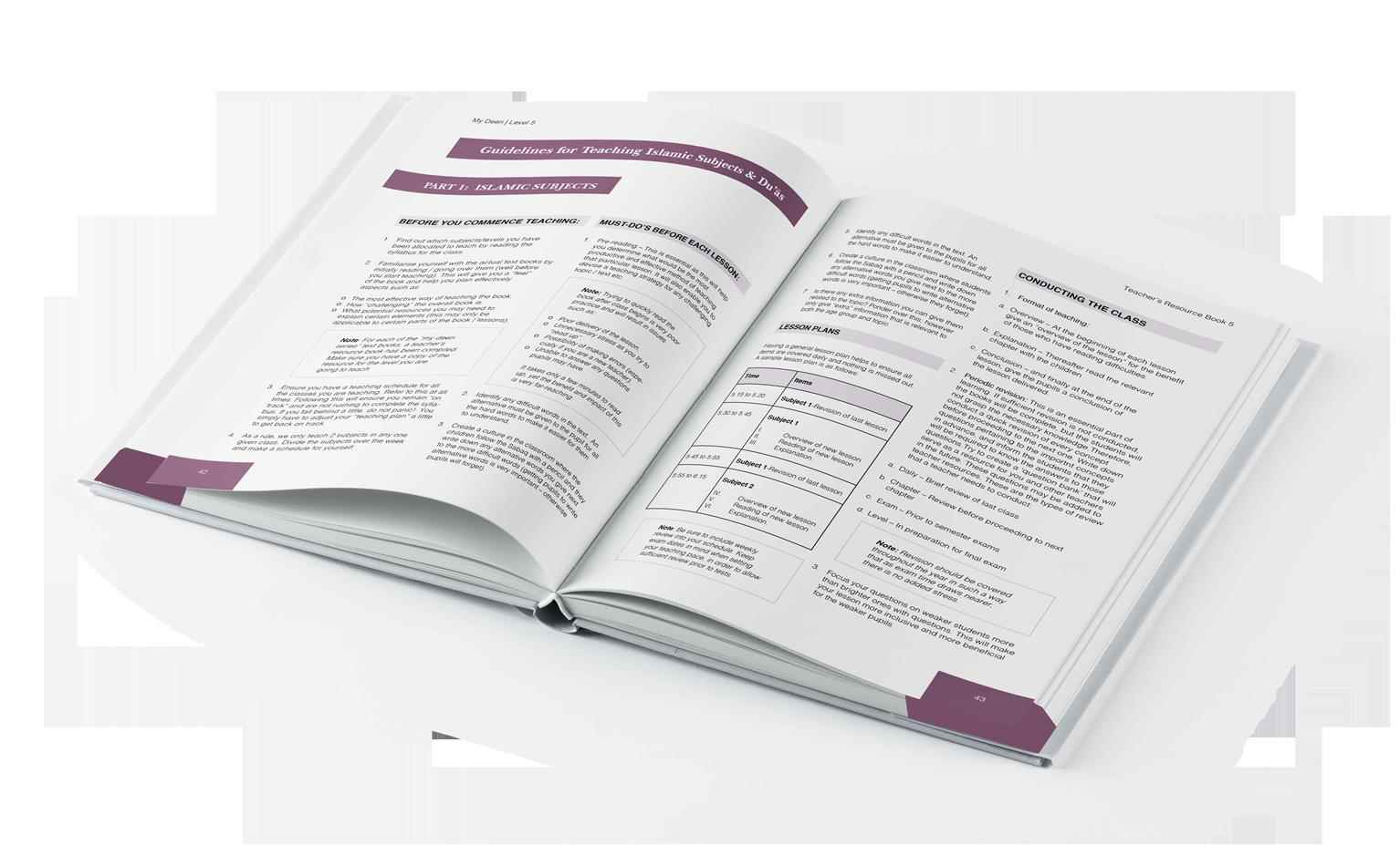
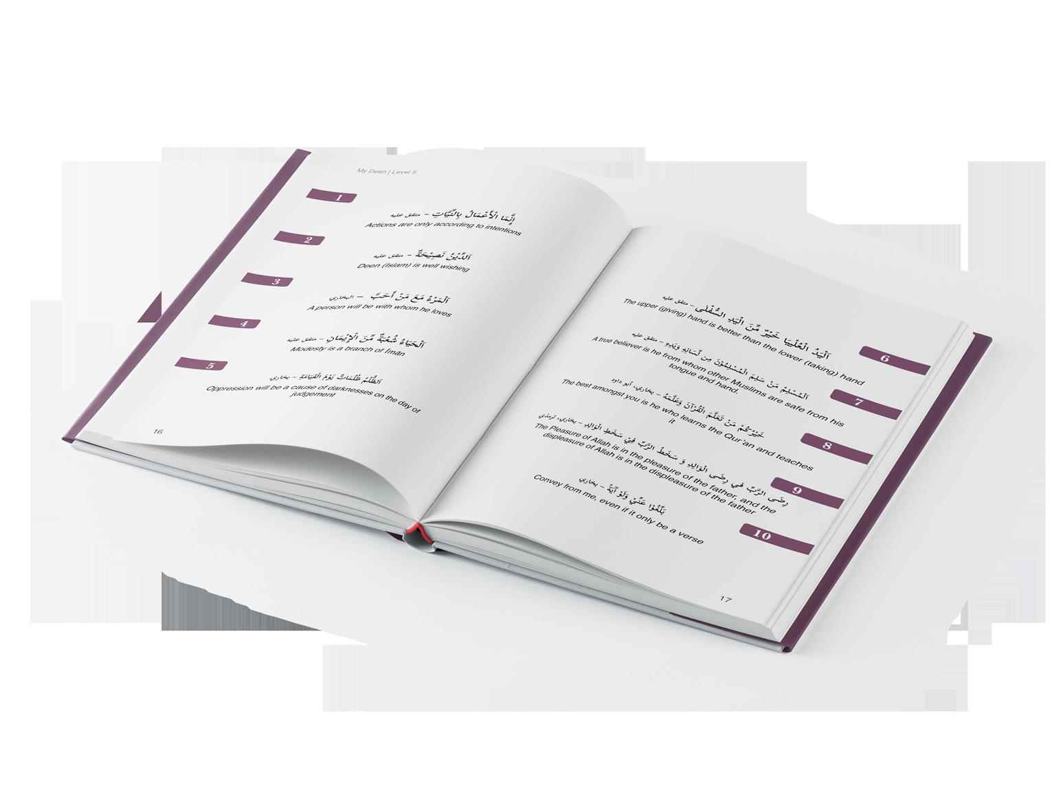
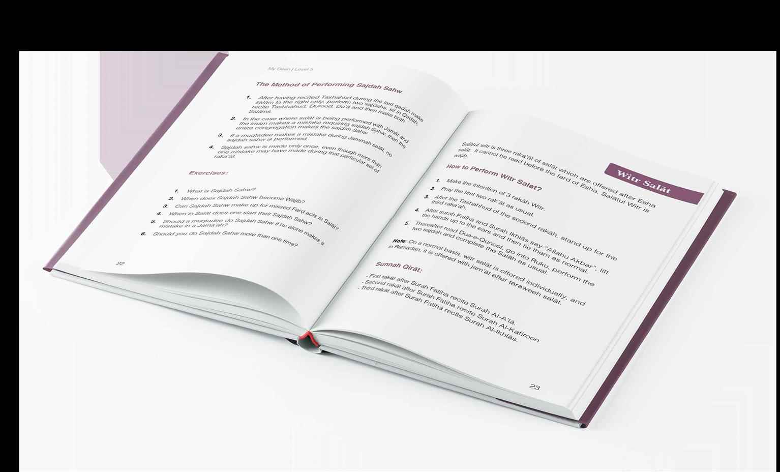
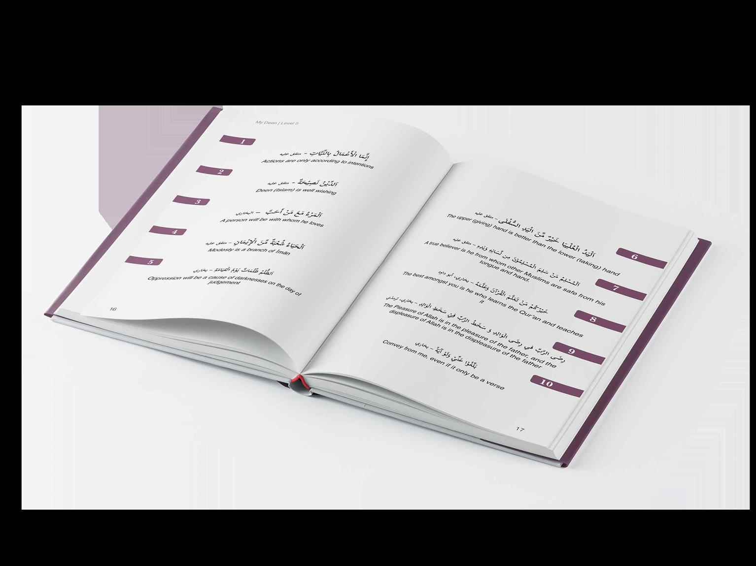
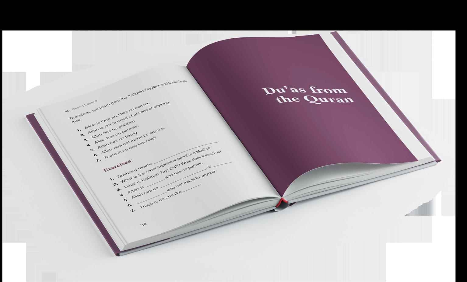
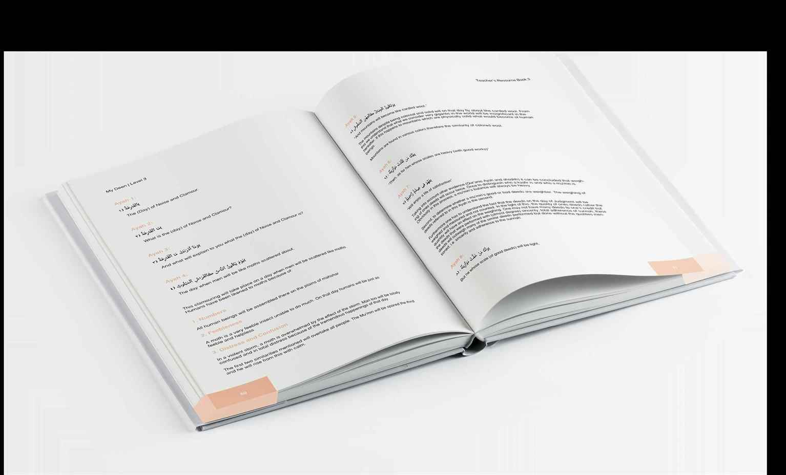
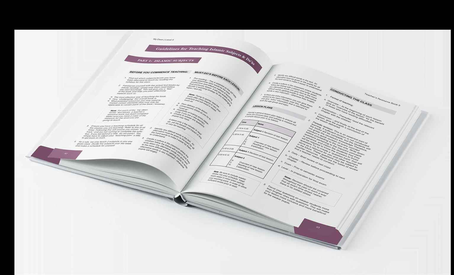
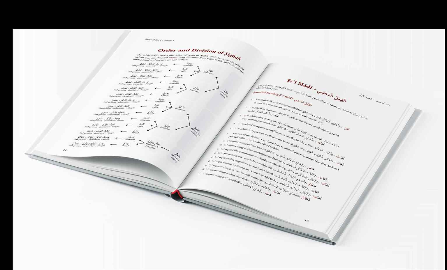
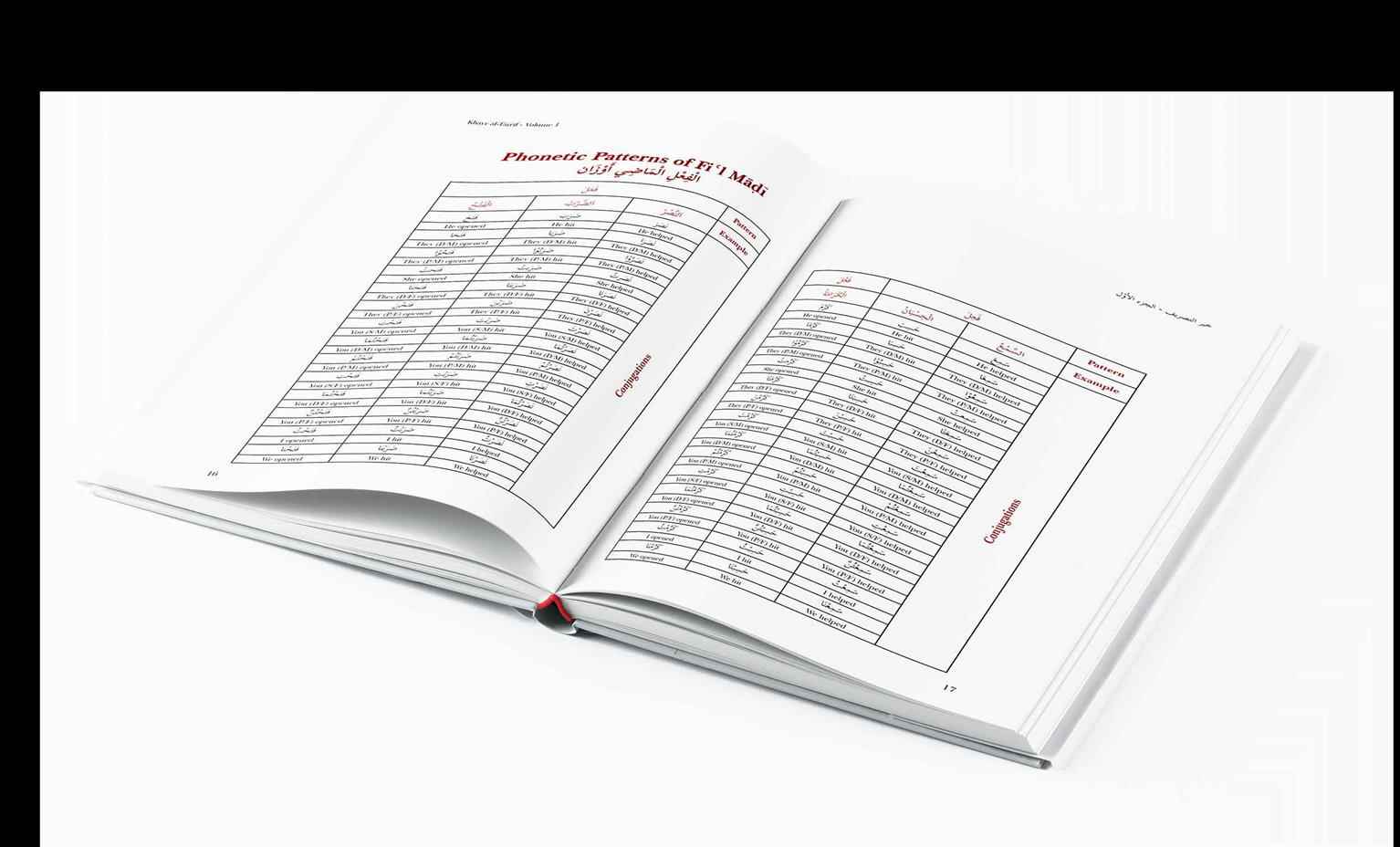
The covers and layout of 5 student textbooks and 5 Instructor Resource Manuals were redesigned for the institute’s evening youth programs. A soft, but rich colour palette was chosen for the textbooks...
The covers and layout of 5 student textbooks and 5 Instructor Resource Manuals were redesigned for the institute’s evening youth programs. A soft, but rich colour palette was chosen for the textbooks...
The covers and layout of 5 student textbooks and 5 Instructor Resource Manuals were redesigned for the institute’s evening youth programs. A soft, but rich colour palette was chosen for the textbooks in order to make the books more appealing to the desired target audience, being children aged 8-15. Illustrative and graphical elements were utilized thoroughly throughout the books for this same purpose. The use of colours was limited in the Instructor Manuals, as they are to be used by adults only. However, some graphic elements were included with matching colours in an effort to make the series of books seem more as a whole. Additionally, the layout of 3 student textbooks and workbooks was redone for the Foundations of Arabic program offered by Al–Ihsan. A wireframe structure was used to maintain consistency on pages, whether the content on those pages consists of text or tables, or both. The typeface Scheherazade was used for the Arabic text, providing a clean elegant, and professional look throughout the books. For the English text, a custom typeface, IEQ was used. This typeface was designed specifically for the purpose of Arabic transliteration into English; a concept used thoroughly throughout the textbooks and workbooks.

Share:
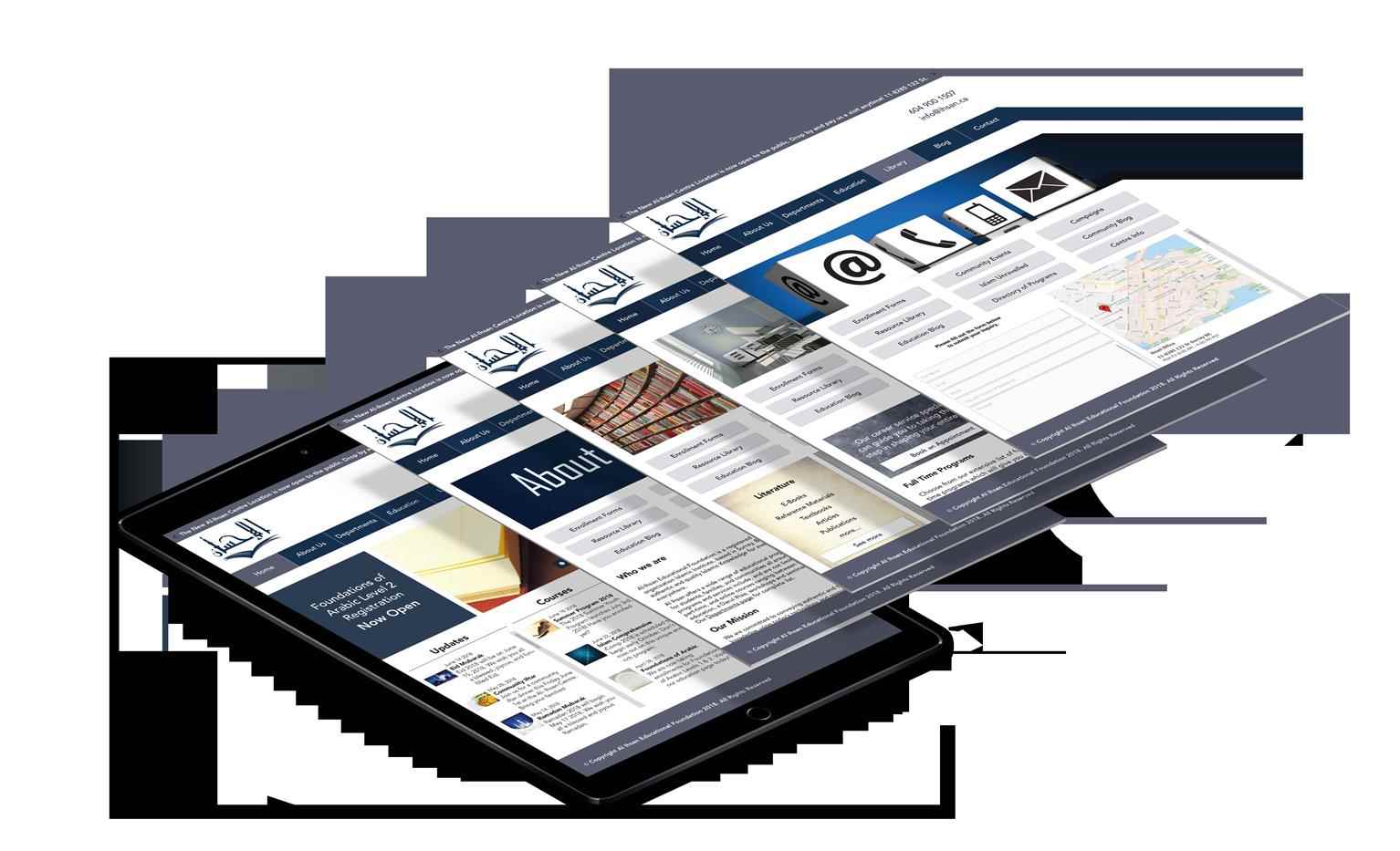
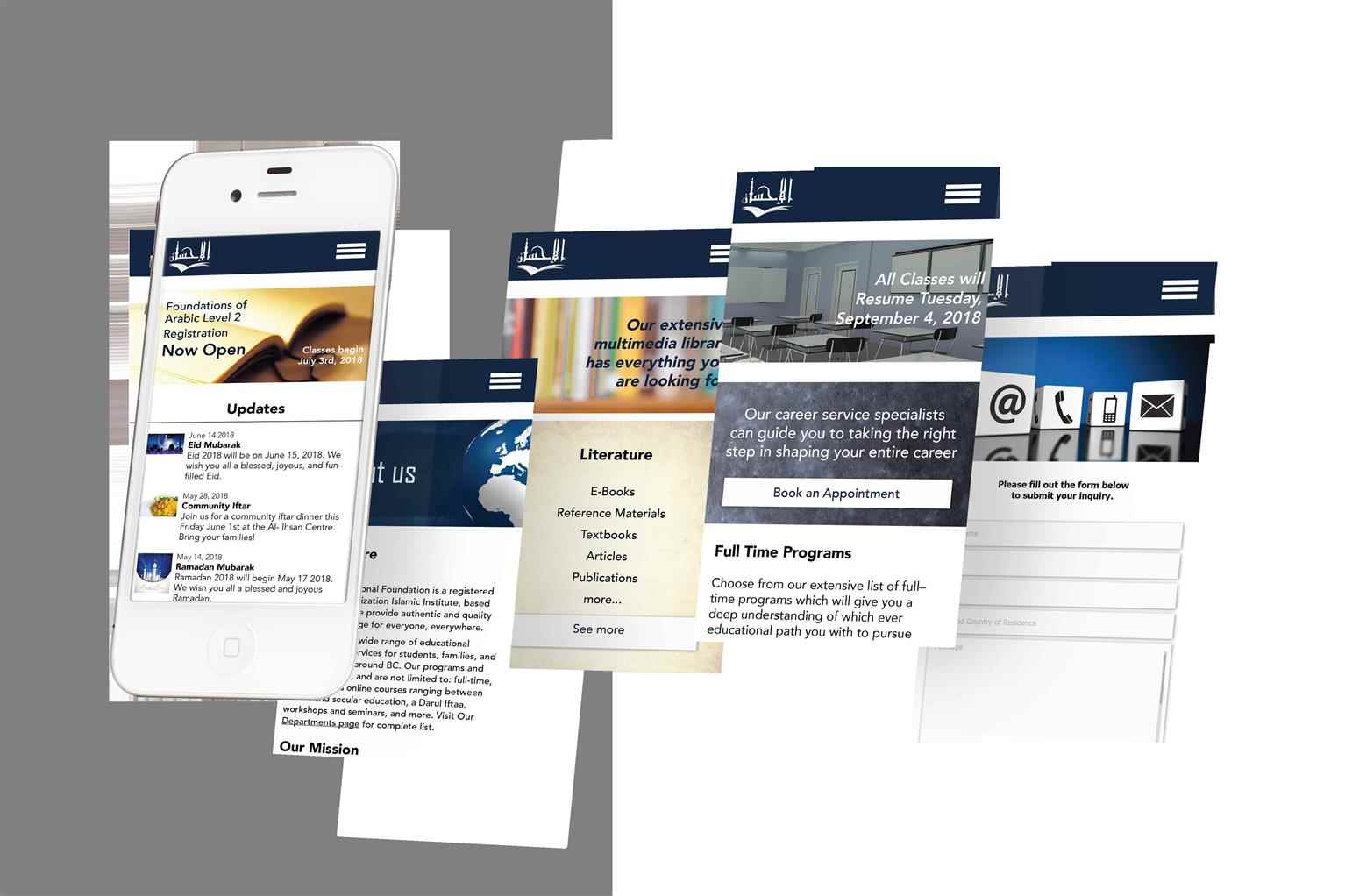
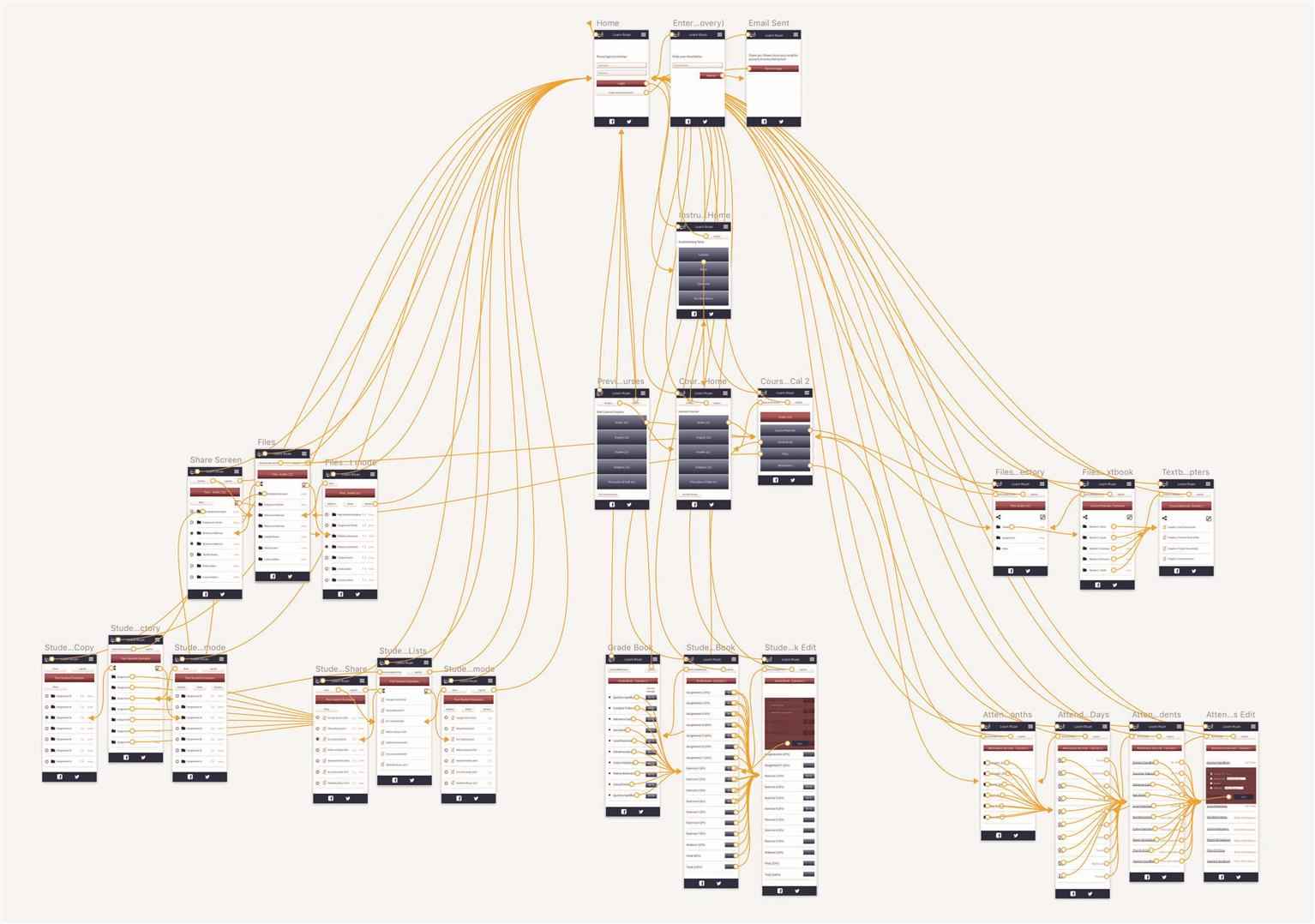
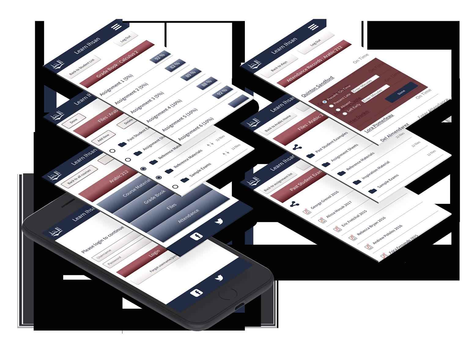
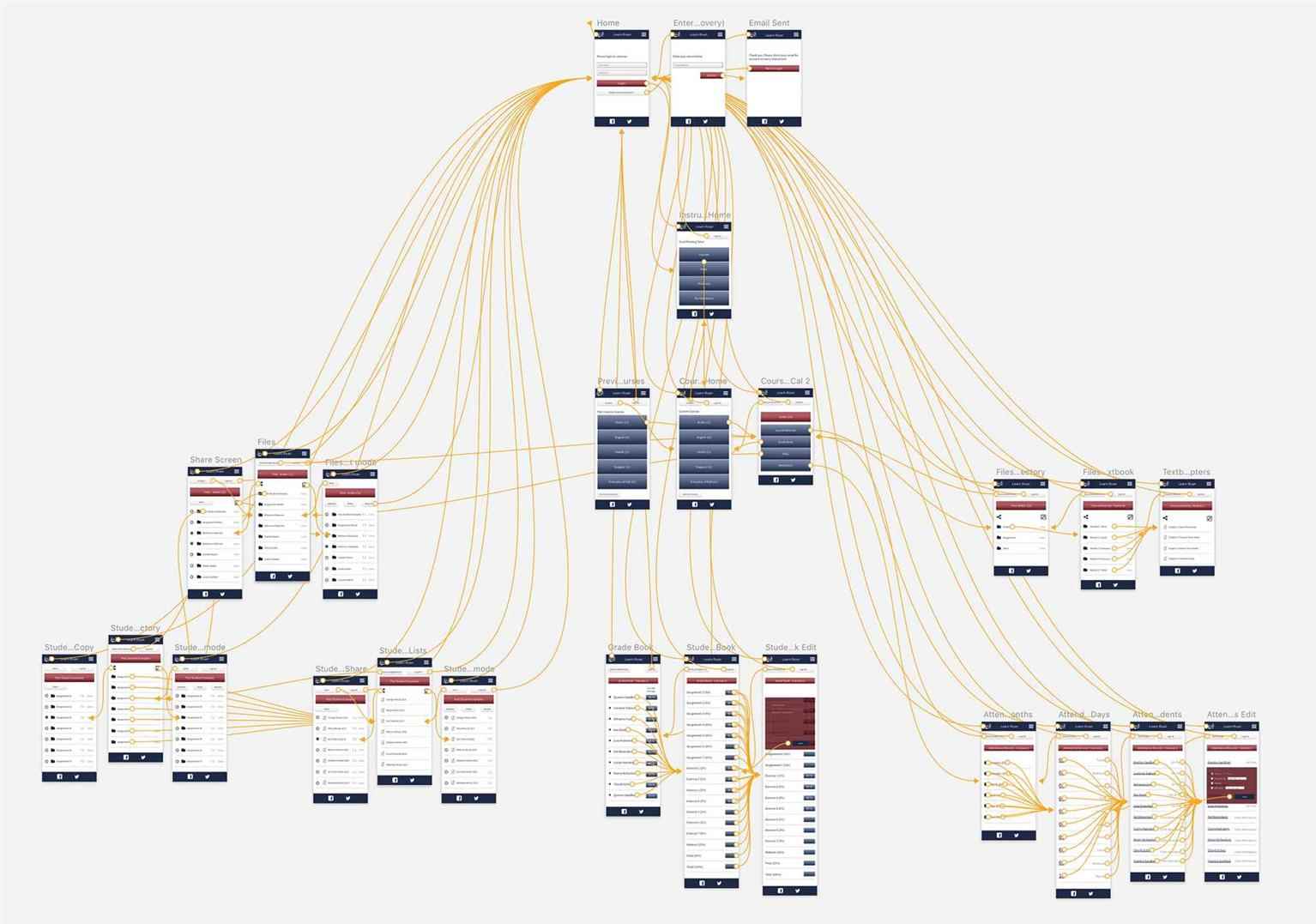
Al-Ihsan Website and Mobile App
A student of Graphic Design at VCAD. Explore the projects of VCAD's talented alumni from below and get a first-hand look at their original work.
Share:
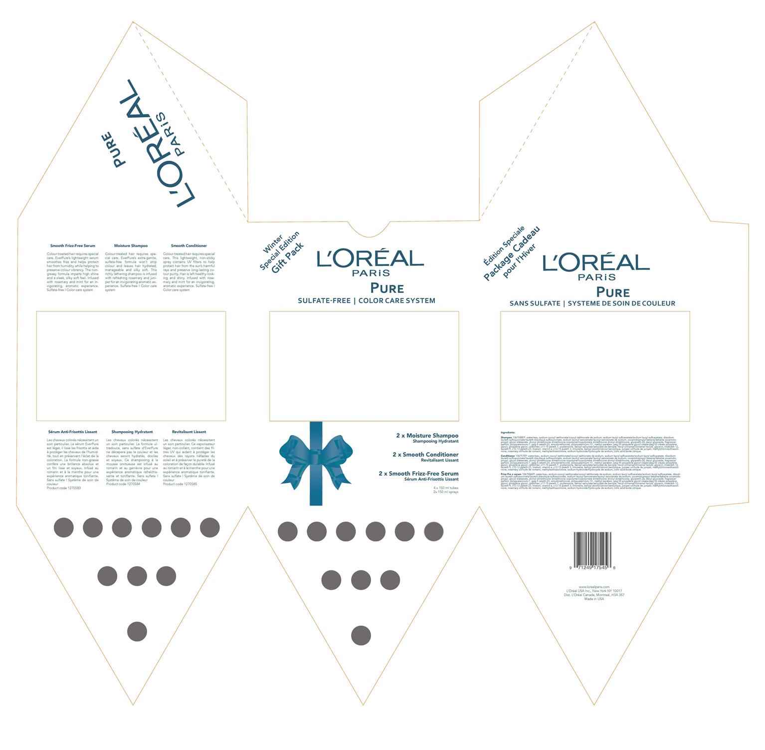
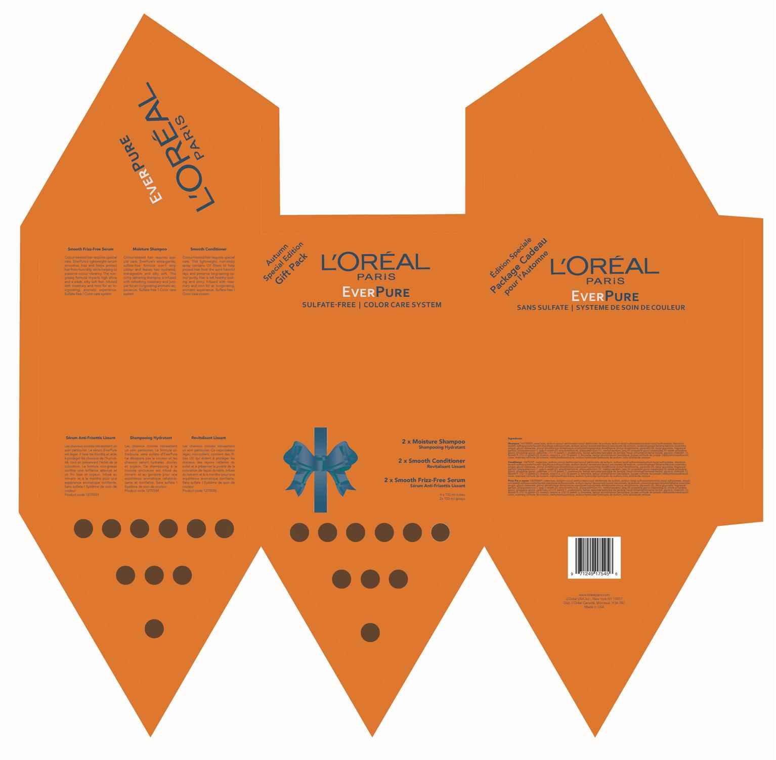
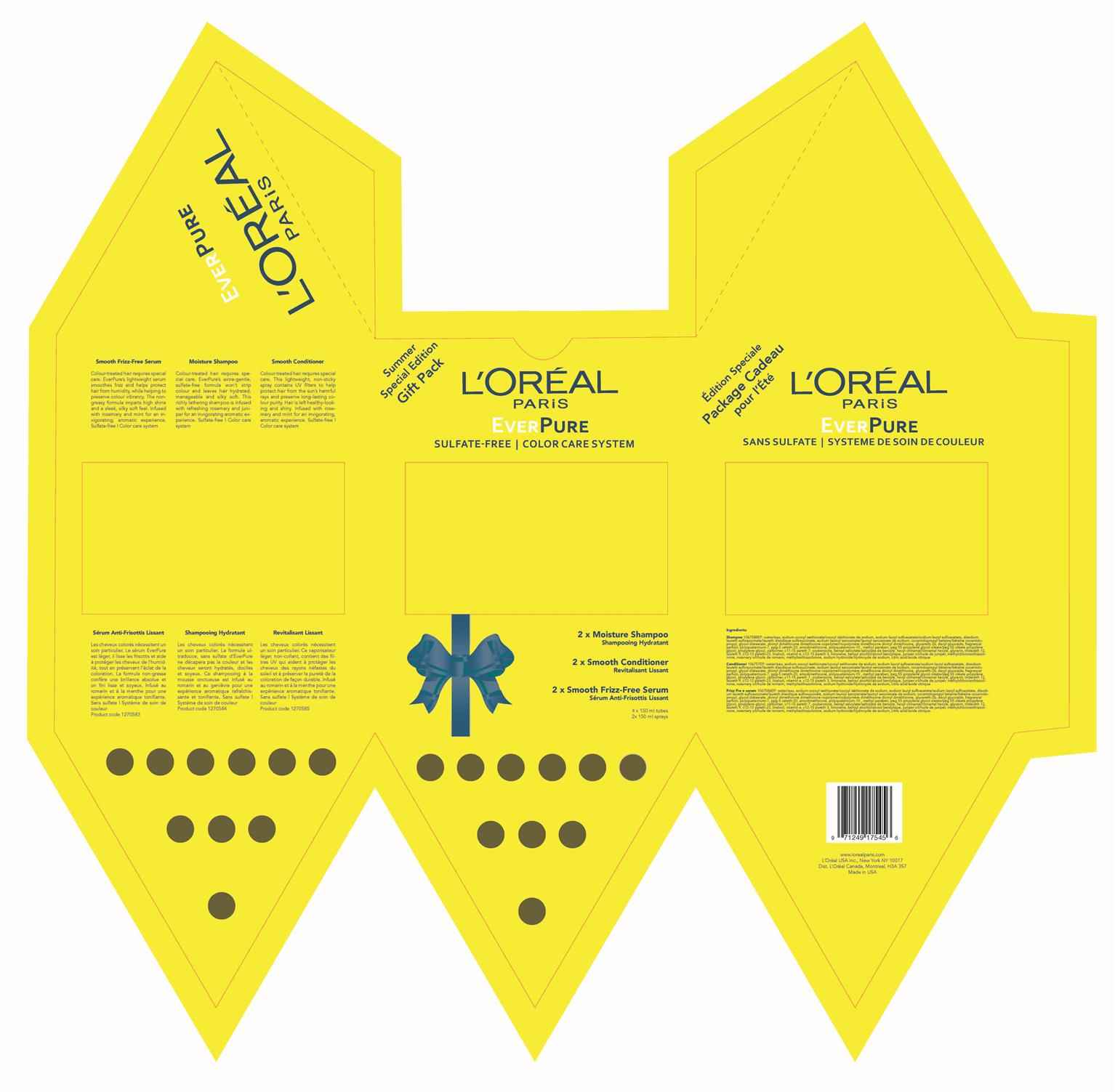
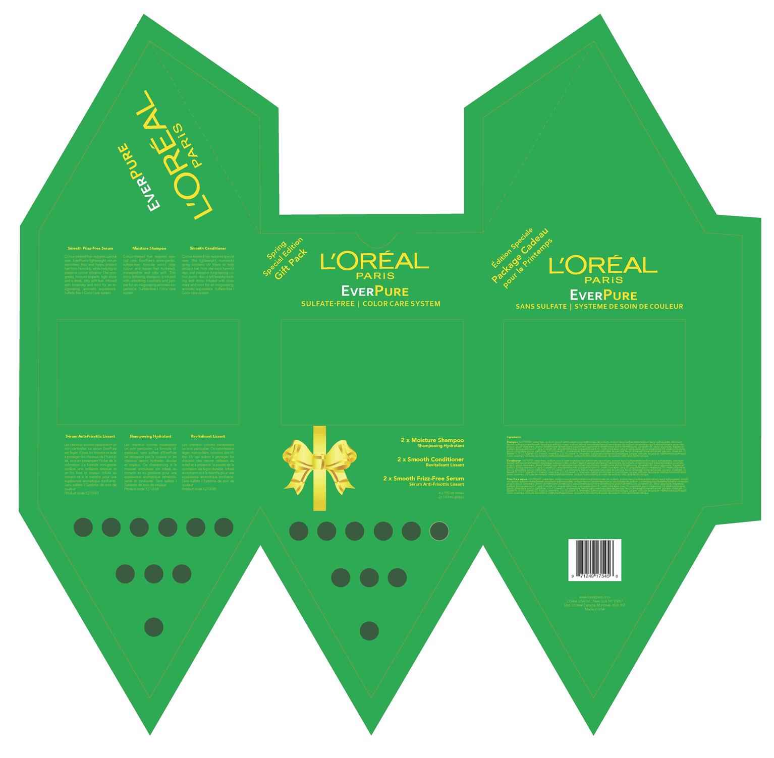
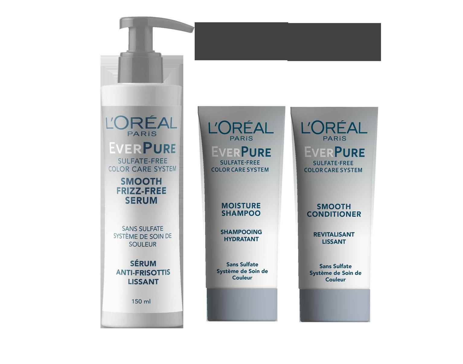
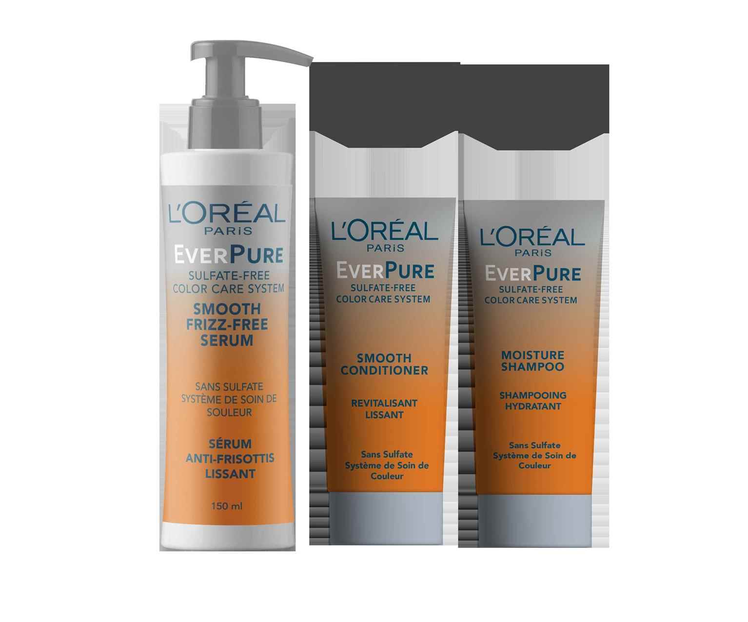
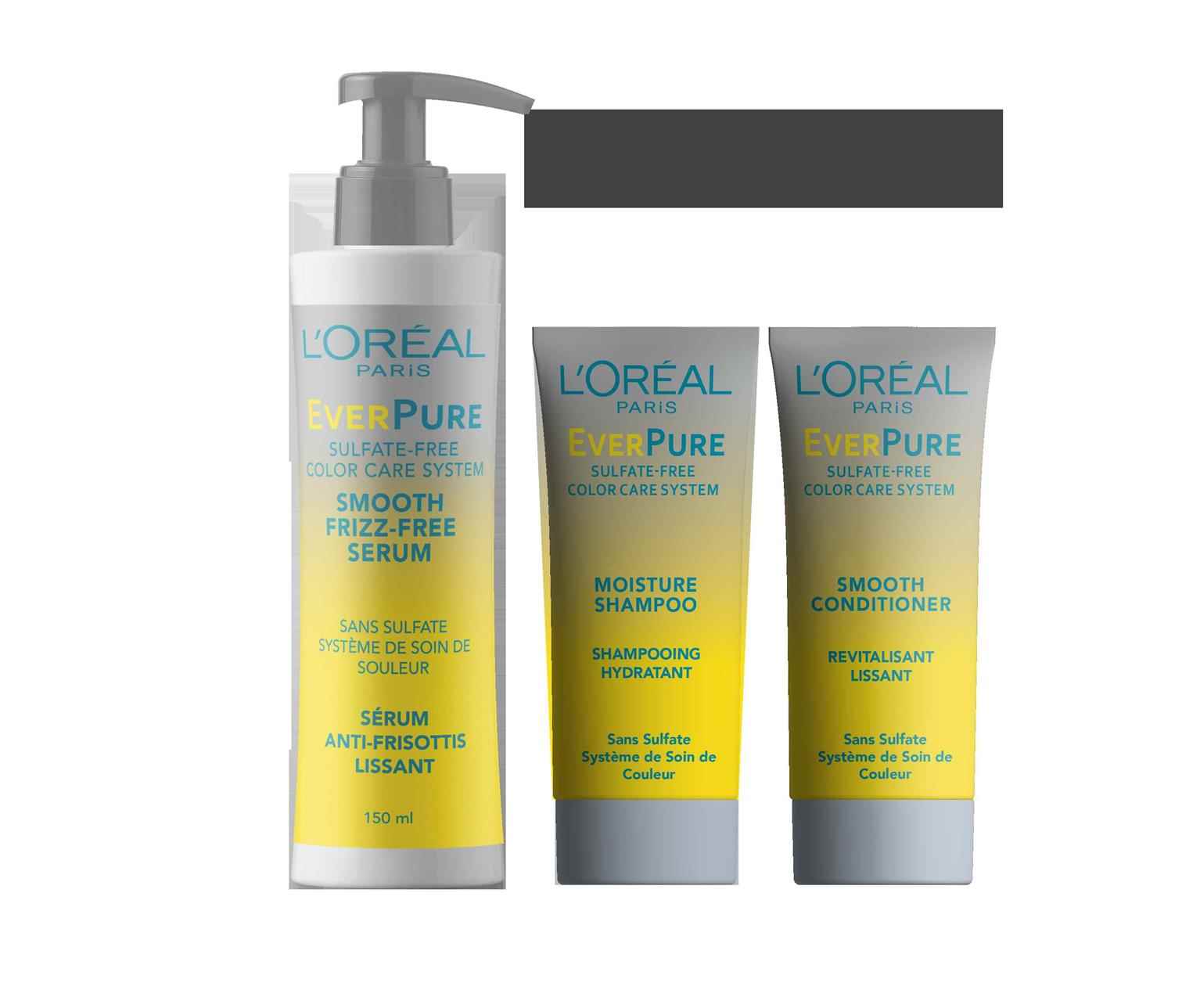
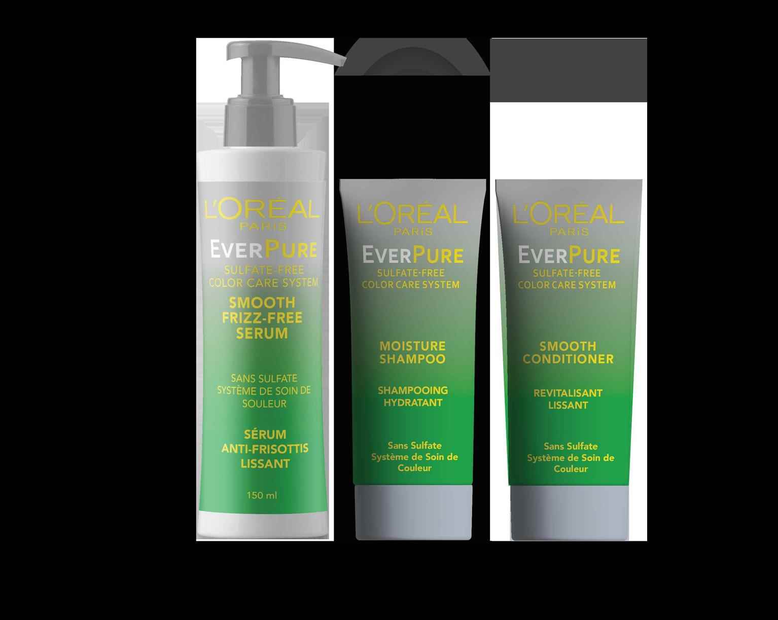
L'Oreal EverPure
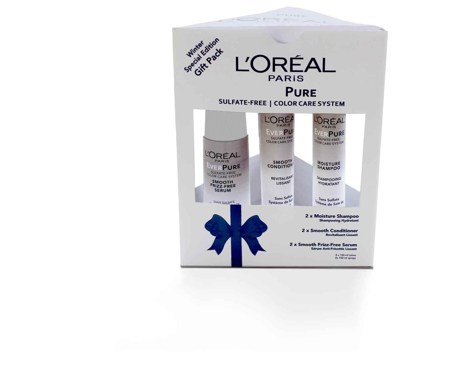
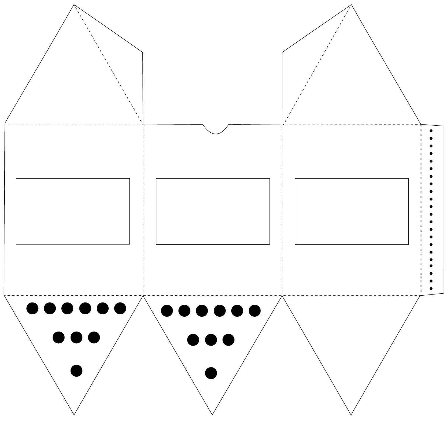
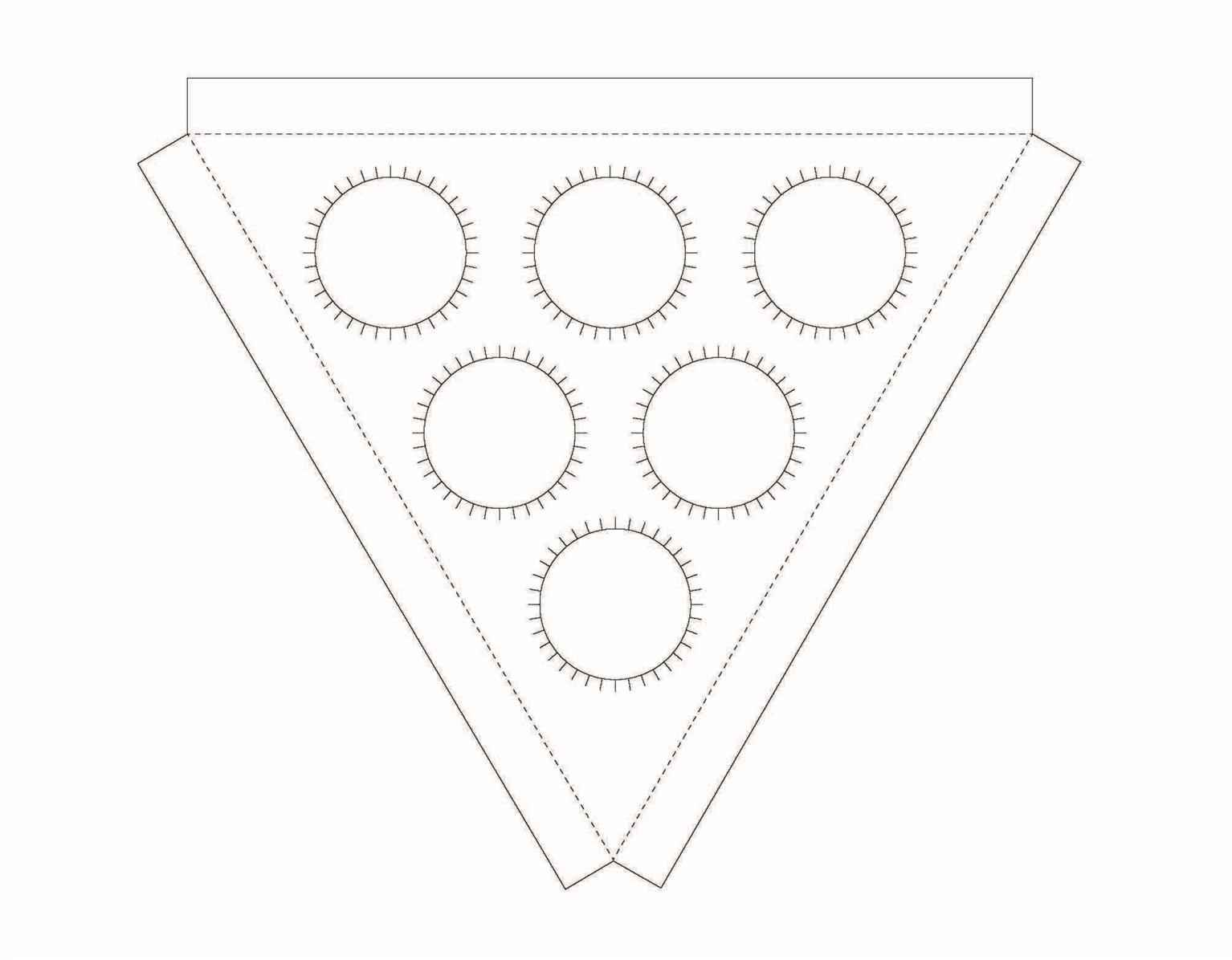
A set of four seasonal gift packages were designed for L’oreal’s EverPure line of products. Unique colours were chosen for each season’s package, to primarily make the gift pack see...
A set of four seasonal gift packages were designed for L’oreal’s EverPure line of products. Unique colours were chosen for each season’s package, to primarily make the gift pack see...
A set of four seasonal gift packages were designed for L’oreal’s EverPure line of products. Unique colours were chosen for each season’s package, to primarily make the gift pack seem appropriate for the given season, and secondarily to make the products more visually appealing in the effort of increasing sales. Boxes’ die-cuts were designed in a triangular shape to produce an economically efficient packaging for 6 tubes/spray bottles, while at the same time maintaining a strong visual aesthetic for a gift pack. L’oreal’s Everpure gift-pack set is the ultimate solution to the difficulty of picking out gifts for your loved ones at occasions throughout the year.
Share:
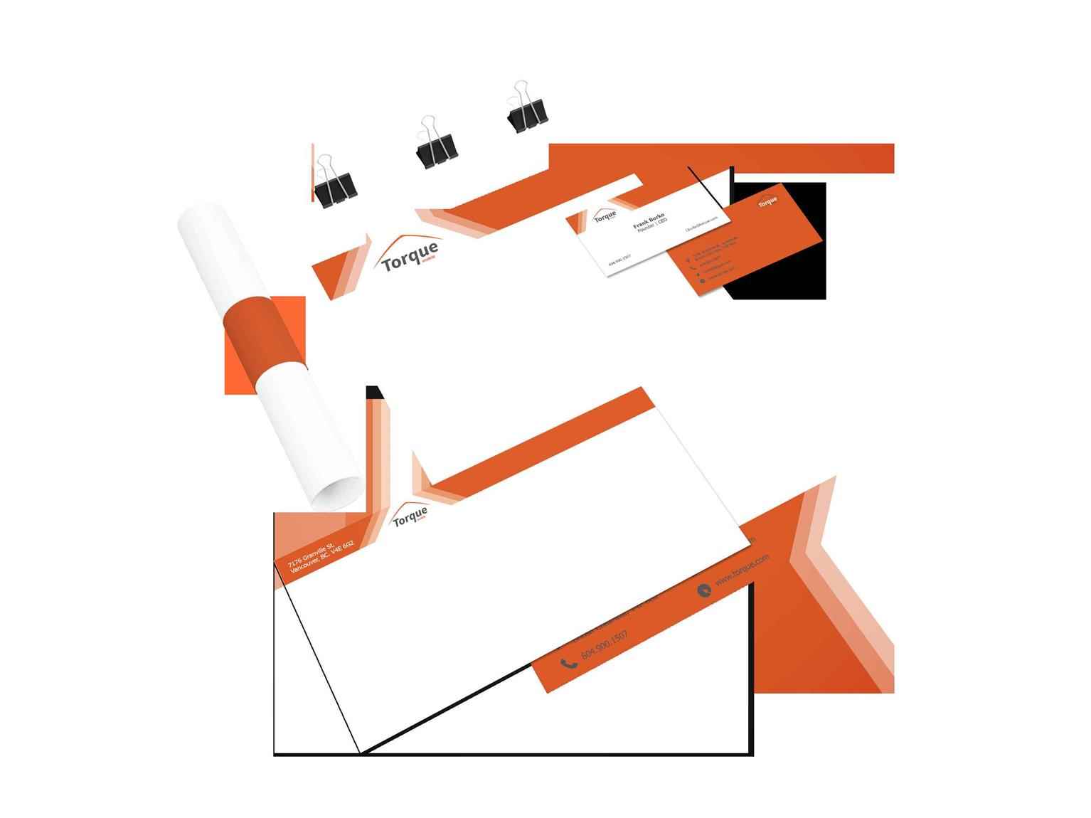
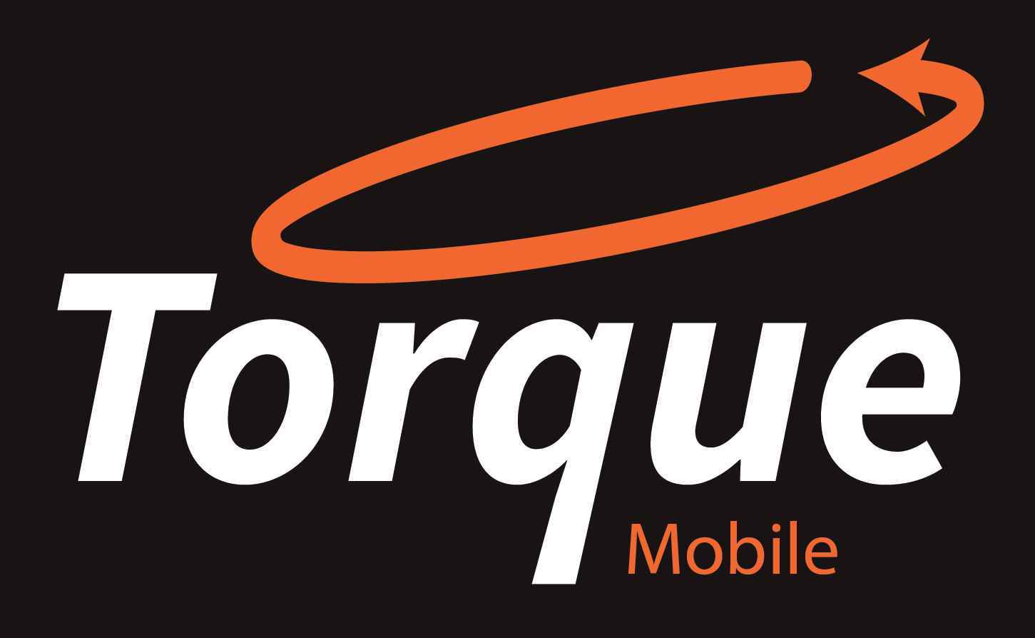
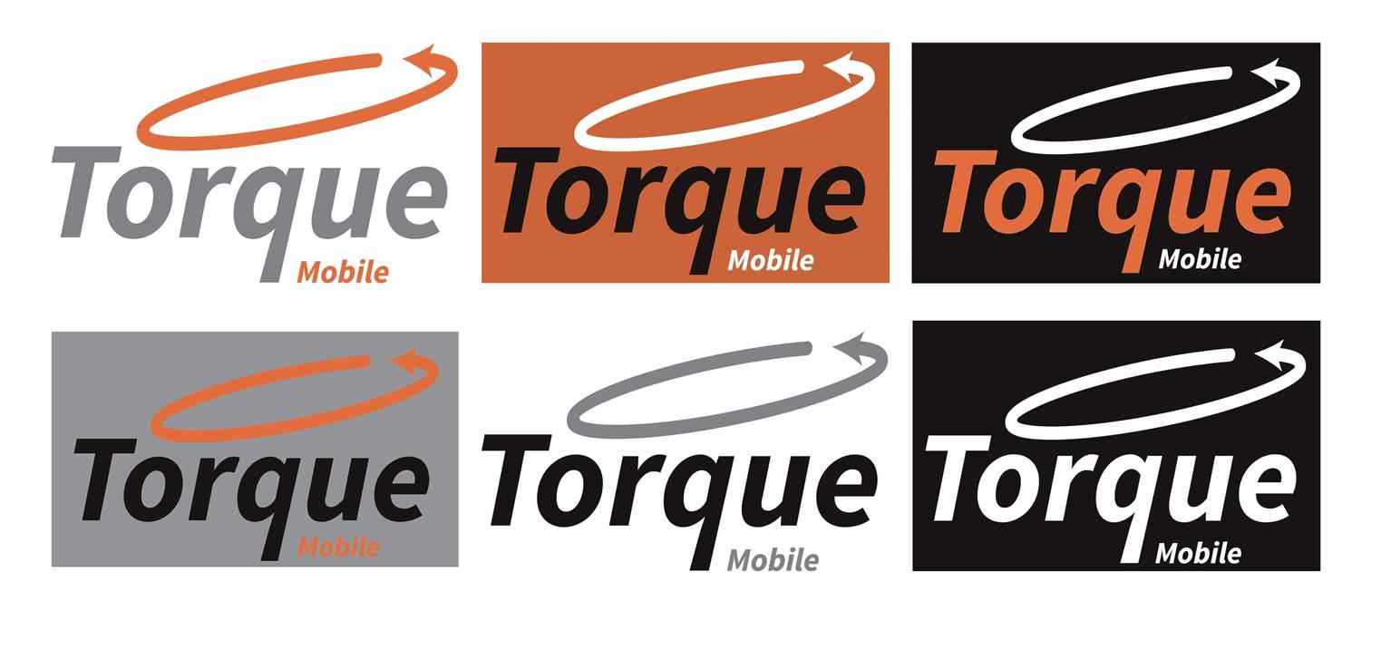
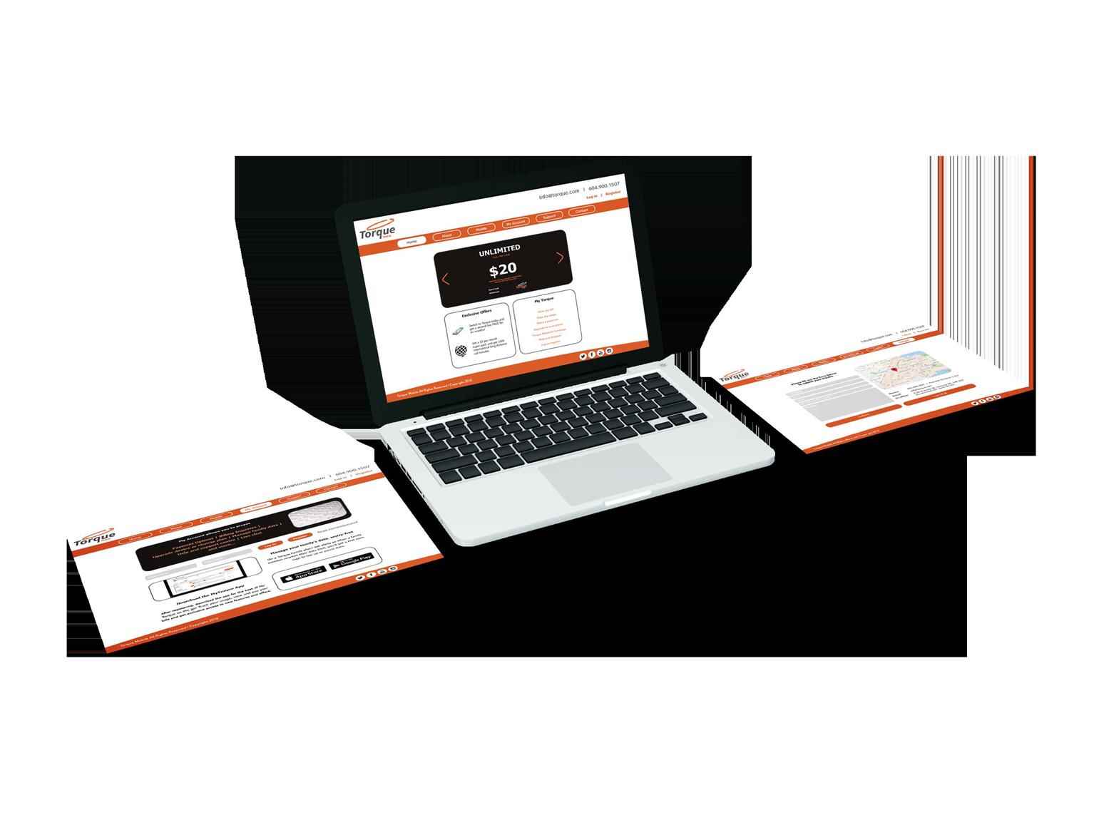
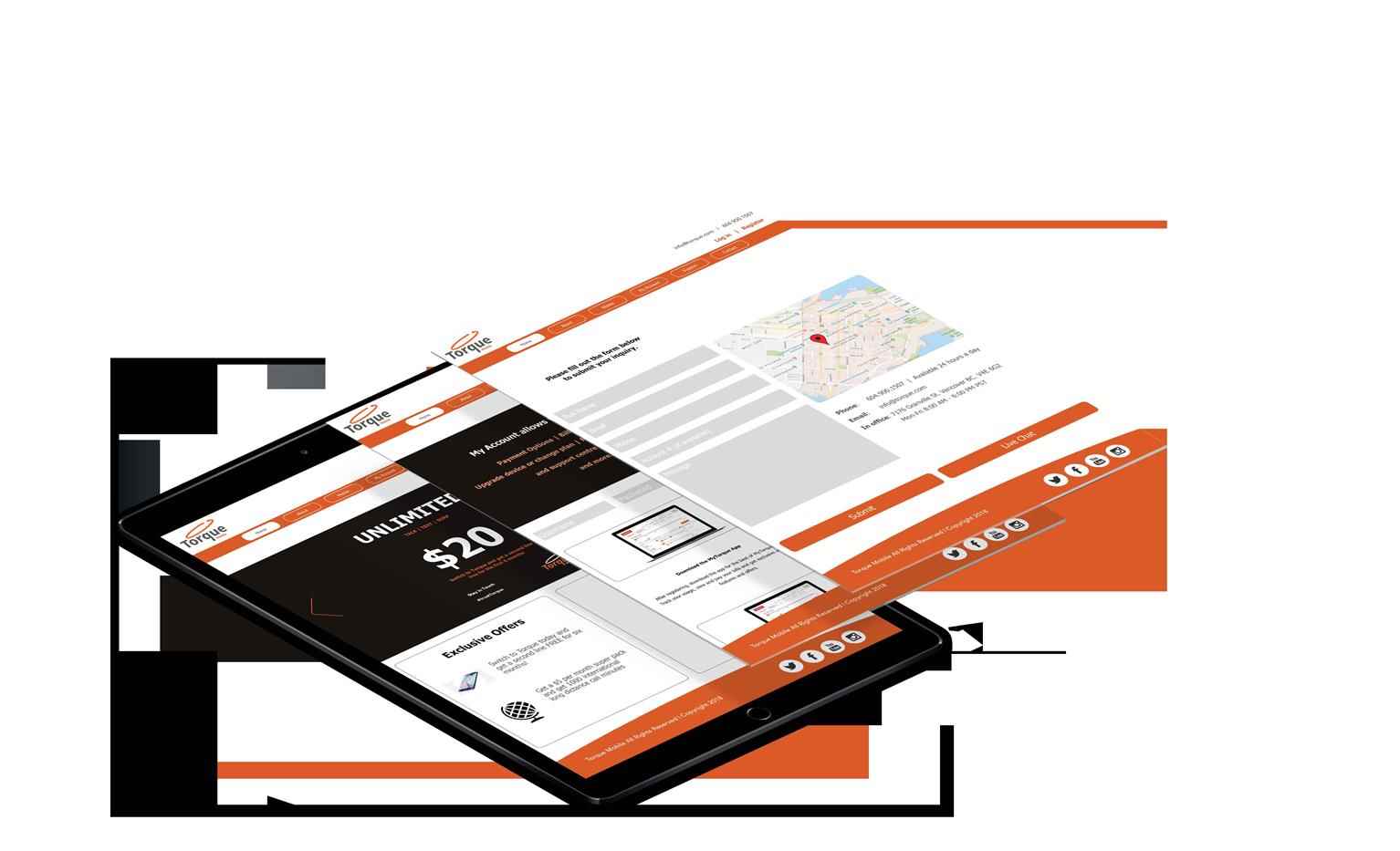
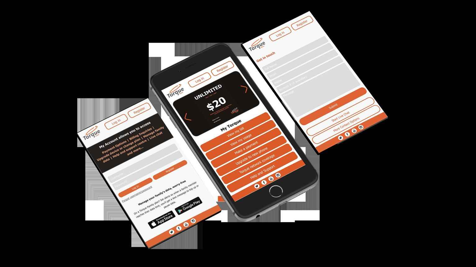
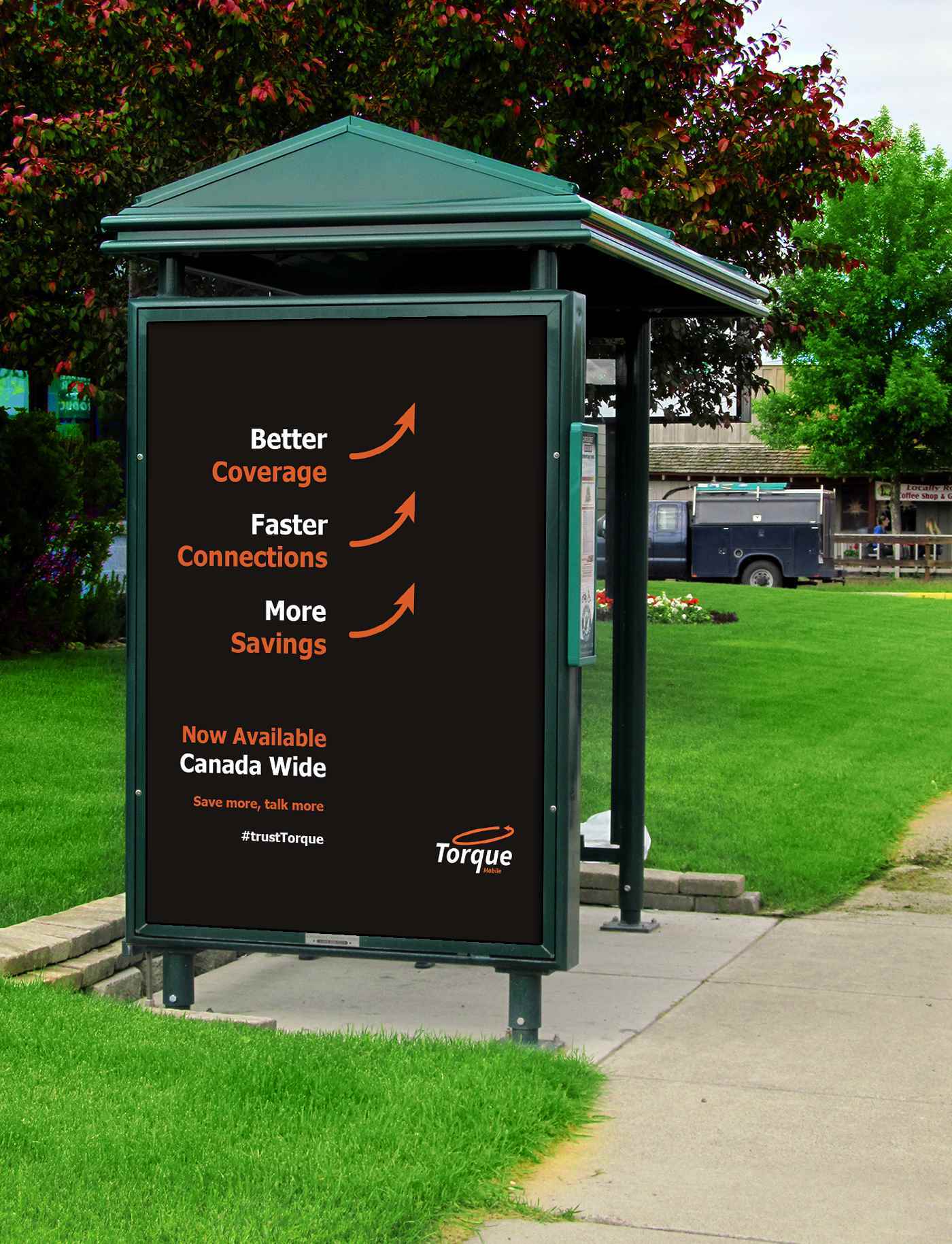
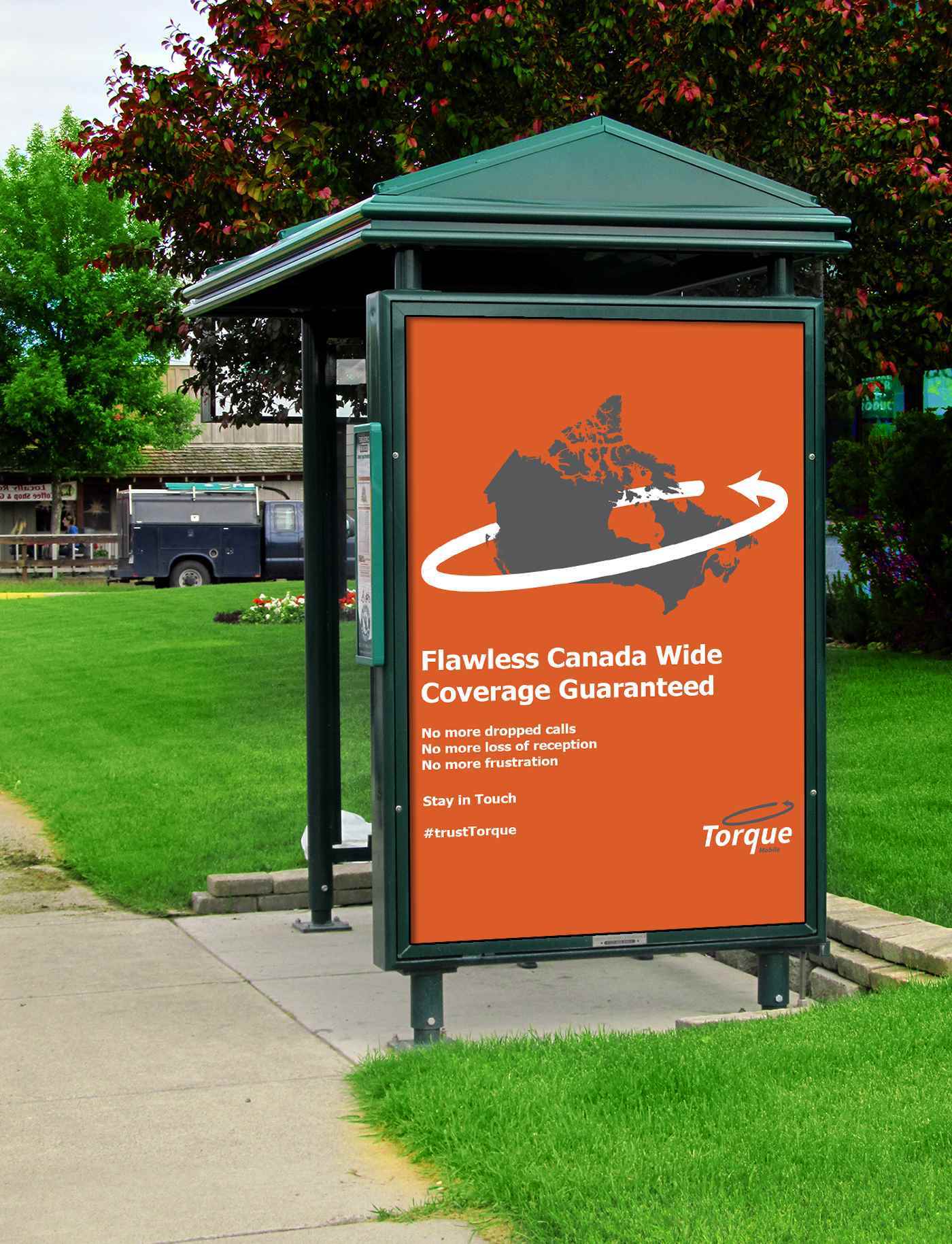
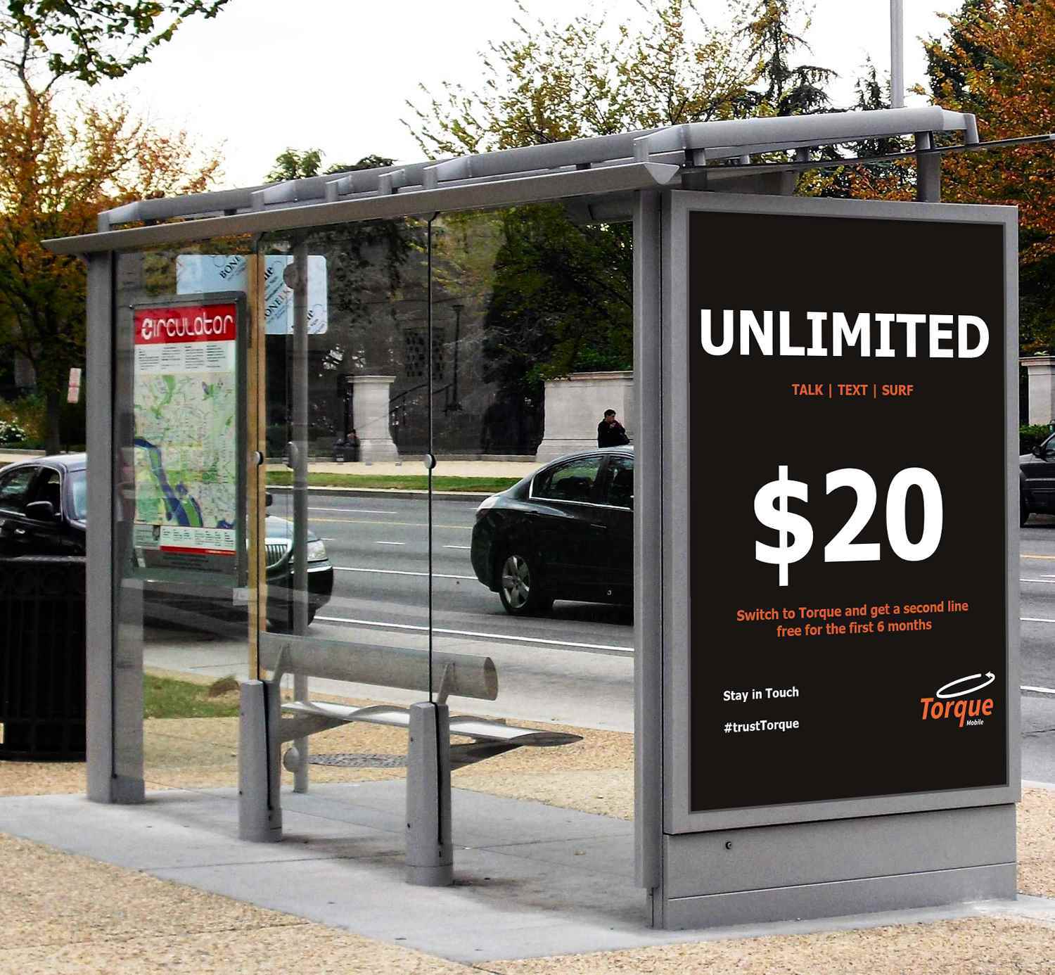
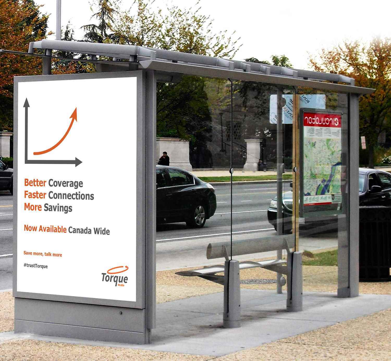
Torque Mobile
A branding package for a new startup company called Torque was designed, consisting of an identity system, stationary, web design, and advertisements. Torque is a mobile service provider which prides...
A branding package for a new startup company called Torque was designed, consisting of an identity system, stationary, web design, and advertisements. Torque is a mobile service provider which prides...
A branding package for a new startup company called Torque was designed, consisting of an identity system, stationary, web design, and advertisements. Torque is a mobile service provider which prides itself on three matters which other mainstream mobile service providers do not; excellent coverage, the fastest connections, and the lowest prices. In accordance with these USP’s, the design was primarily based on the colour orange, depicting optimism. This is branding package perfect for any startup mobile service provider, as the design of the medias and advertisements will greatly appeal to new potential customers.

Share:
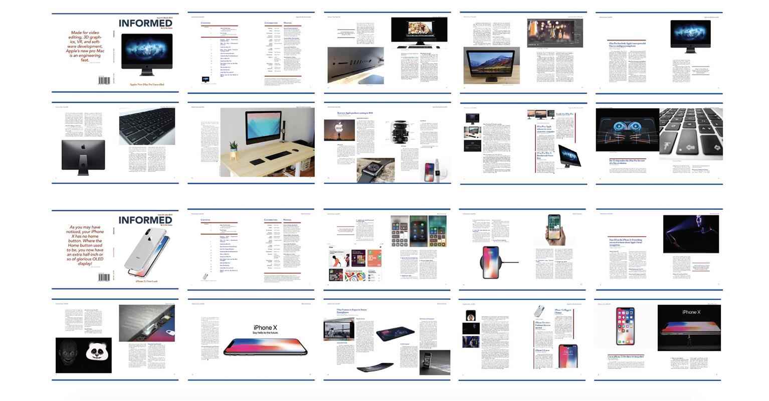
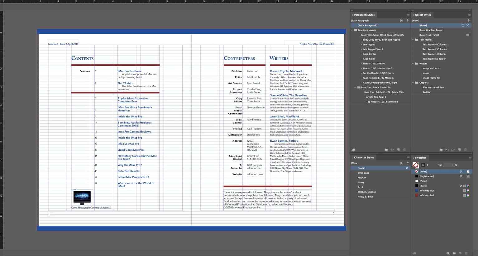
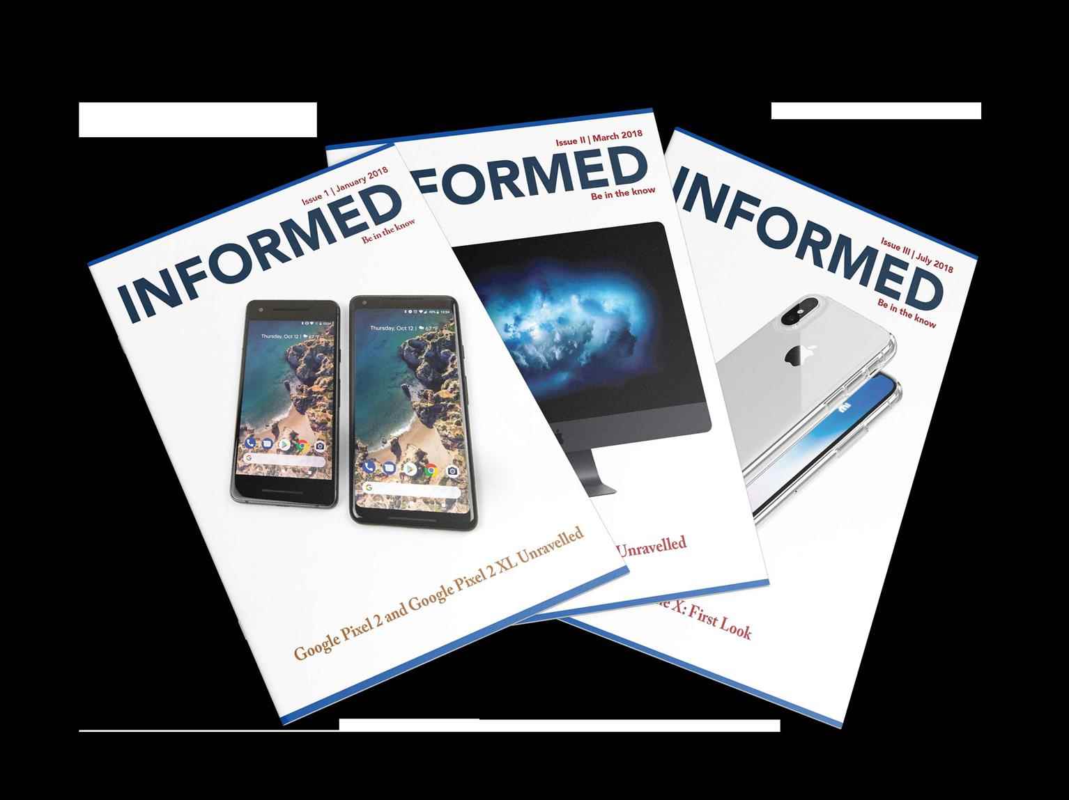
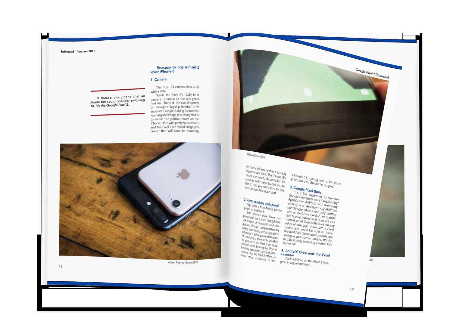
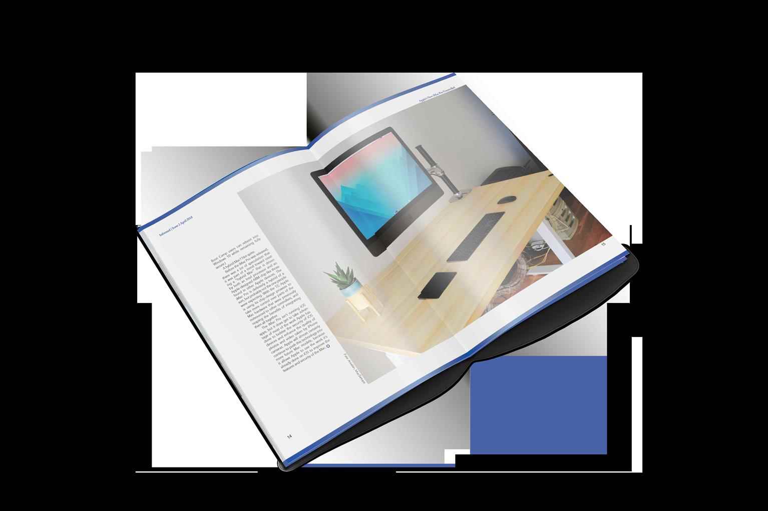
Informed Magazine
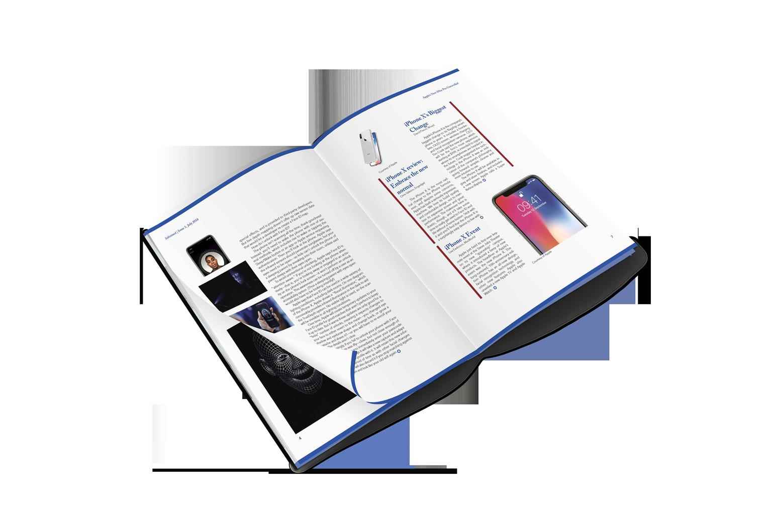
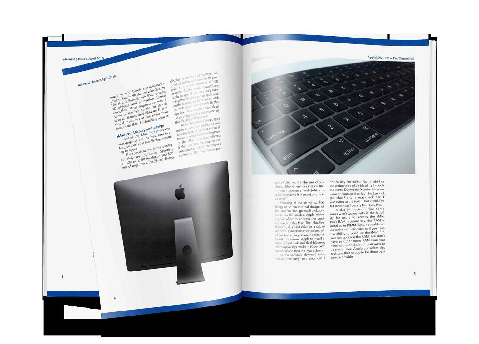
A design template as well as three sample issues for a new magazine, Informed, was created to serve as guides for all future issues of the magazine. The template was designed following a strict wiref...
A design template as well as three sample issues for a new magazine, Informed, was created to serve as guides for all future issues of the magazine. The template was designed following a strict wiref...
A design template as well as three sample issues for a new magazine, Informed, was created to serve as guides for all future issues of the magazine. The template was designed following a strict wireframe structure, with the aim of maintaining consistency throughout the documents and future issues of the magazine. A clean, sophisticated, luxurious look with large amagazine with the intent of matching the theme of the content, i.e. flagship electronic devices, and to ultimately appeal more to the demo-graphic which uses these devices. This template may serve as inspiration for other magazines’ designs seeking a similar clean look for a related target audience.
Share:
Would you like to get more information or apply?
Click on the button below and we'll get back to you as soon as possible.
Speak To An Advisor
